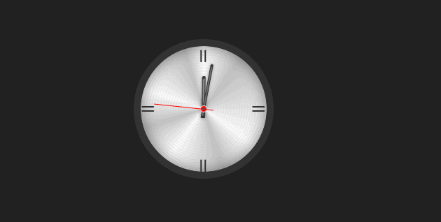
效果演示
这段代码是一个模拟时钟的 HTML 和 CSS 代码。它创建了一个简单的数字时钟界面,包括时针、分针和秒针。
HTML
html
<div class="face">
    <p class="v-index">II
    </p>
    <p class="h-index">II
    </p>
    <div class="hand">
        <div class="hand">
            <div class="hour"></div>
            <div class="minute"></div>
            <div class="second"></div>
        </div>
    </div>
</div>- face:这是时钟的主体部分,包含了时钟的所有元素。
- v-index和h-index:这些是时钟的刻度,分别表示垂直(V)和水平(H)方向的刻度。这里的"II"可能是罗马数字2,但通常时钟的刻度会用数字或点来表示,这里可能是一个示例。
- hand:这个容器包含了时钟的指针。
- hour:时针。
- minute:分针。
- second:秒针。
CSS
css
.face {
  position: relative;
  width: 180px;
  height: 180px;
  border-radius: 50%;
  outline: 10px solid #333;
  background: repeating-radial-gradient(circle at 50% 50%,
  rgba(200,200,200,.2) 0%, rgba(200,200,200,.2) 2%,
  transparent 2%, transparent 3%, rgba(200,200,200,.2) 3%,
  transparent 3%), conic-gradient(white 0%, silver 10%,
  white 35%, silver 45%, white 60%, silver 70%,
  white 80%, silver 95%, white 100%);
  box-shadow: inset 0 0 20px #0007;
}

.hour {
  position: absolute;
  width: 5px;
  height: 60px;
  background: #aaa;
  left: 87.5px;
  top: 43px;
  border-radius: 3px 3px 1px 1px;
  transform-origin: 2px 47px;
  box-shadow: 0 0 5px #0005,inset 1.5px 3px 0px #333, inset -1.5px -3px 0px #333;
  z-index: 1;
  animation: watch 43200s linear infinite;
}

.minute {
  position: absolute;
  width: 4px;
  height: 78px;
  background: #aaa;
  left: 88px;
  top: 25px;
  border-radius: 3px 3px 1px 1px;
  transform-origin: 2px 65px;
  box-shadow: 0 0 5px #0005, inset 1.5px 3px 0px #333, inset -1.5px -3px 0px #333;
  z-index: 2;
  animation: watch 3600s linear infinite;
}

.second {
  position: absolute;
  width: 10px;
  height: 10px;
  background: red;
  left: 85px;
  top: 85px;
  border-radius: 50%;
  border: 1px solid #eee;
  z-index: 3;
  animation: watch 60s steps(60, end) 0s infinite;
}

.second::before {
  content: "";
  position: absolute;
  width: 1px;
  height: 85px;
  left: 3px;
  bottom: -10px;
  background: red;
  border-radius: 2px;
  box-shadow: 5px 0 2px rgba(128, 128, 128, 0.2);
}

.second::after {
  content: "";
  position: absolute;
  width: 4px;
  height: 4px;
  left: 2px;
  top: 2px;
  background: #555;
  border-radius: 50%;
}

.v-index {
  position: absolute;
  color: #333;
  font-size: 24px;
  left: 83.5px;
  top: -3px;
  text-shadow: 0 157px 0 #333;
  z-index: 1
}

.h-index {
  position: absolute;
  color: #333;
  font-size: 24px;
  top: 72px;
  left: 5px;
  transform: rotate(-90deg);
  text-shadow: 0 158px 0 #333;
  z-index: 1;
}

@keyframes watch {
  0% {
    transform: rotate(0deg);
  }

  100% {
    transform: rotate(360deg);
  }
}- .face:定义时钟的主体样式。它是一个相对定位的元素,宽高都是180px,并且有50%的圆角,使其看起来像一个圆形。边框是10px的实线,颜色为深灰色。背景是一个复杂的渐变效果,包括重复的径向渐变和圆锥渐变,以及一个内阴影效果。
- .hour、.minute 和 .second:这些类定义了时钟指针的基本样式。它们都是绝对定位的元素,有不同的宽度、高度和位置。它们都有圆角和阴影效果,以及一个transform-origin属性,这决定了旋转的中心点。.hour和.minute的动画是watch,分别持续43200秒(12小时)和3600秒(1小时),模拟时针和分针的运动。
- .second:定义了秒针的样式,它是一个红色的圆形,有一个小的黑色圆点在顶部,模拟秒针的尖端。它的动画是watch,持续60秒,模拟秒针的运动。
- @keyframes watch:定义了一个关键帧动画watch,它使元素从0度旋转到360度,形成一个完整的圆周运动。