一、双滚动条左右布局
实现效果

实现代码
html
<!DOCTYPE html>
<html lang="en">
<head>
<meta charset="UTF-8" />
<meta name="viewport" content="width=device-width, initial-scale=1.0" />
<title>Document</title>
<style>
body,
html {
padding: 0;
margin: 0;
}
.father {
display: flex;
flex: 1;
overflow: hidden;
}
.left {
flex: 1;
background-color: red;
max-height: 100vh;
overflow-y: scroll;
}
.right {
width: 300px;
background-color: green;
max-height: 100vh;
overflow-y: scroll;
}
.ceshi {
width: 100px;
height: 100px;
border: 1px solid black;
}
</style>
</head>
<body>
<div class="father">
<div class="left">
left
<div class="ceshi">111</div>
<div class="ceshi">111</div>
<div class="ceshi">111</div>
<div class="ceshi">111</div>
<div class="ceshi">111</div>
<div class="ceshi">111</div>
<div class="ceshi">111</div>
</div>
<div class="right">
right
<div class="ceshi">111</div>
<div class="ceshi">111</div>
<div class="ceshi">111</div>
<div class="ceshi">111</div>
<div class="ceshi">111</div>
<div class="ceshi">111</div>
</div>
</div>
</body>
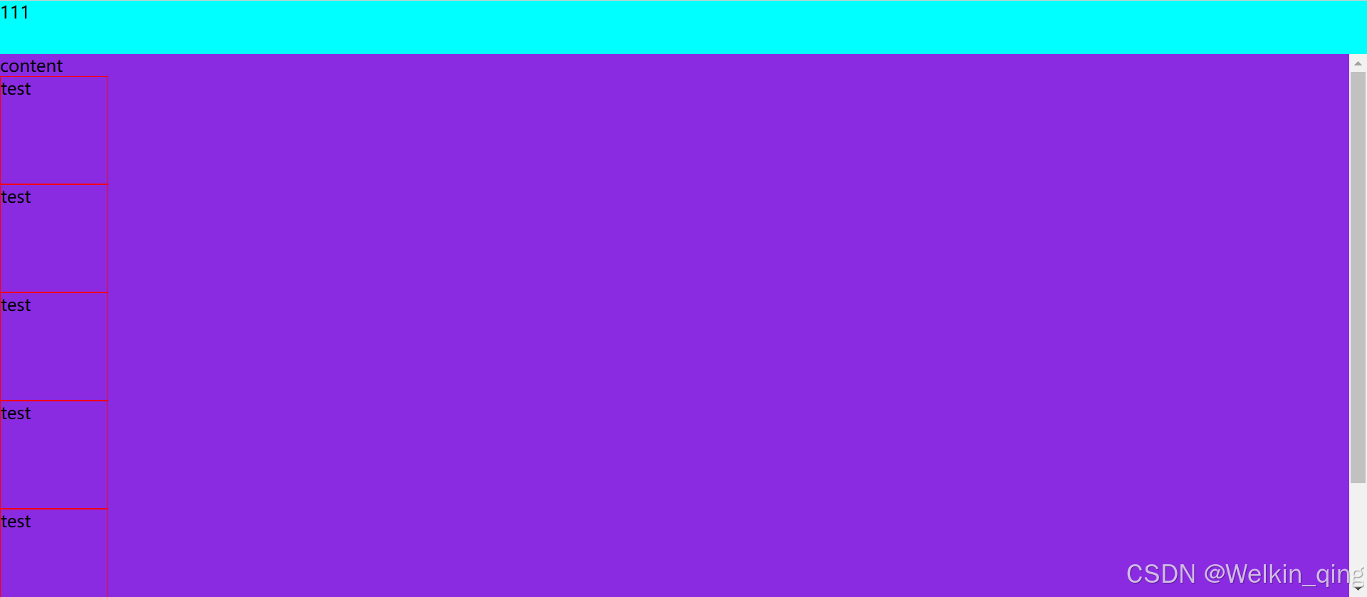
</html>二、双滚动条上下布局
实现效果
实现代码
html
<!DOCTYPE html>
<html lang="en">
  <head>
    <meta charset="UTF-8" />
    <meta name="viewport" content="width=device-width, initial-scale=1.0" />
    <title>Document</title>
    <style>
      html,
      body {
        margin: 0;
        padding: 0;
      }
      .father {
        display: flex;
        width: 100%;
        flex-direction: column;
        overflow: hidden;
      }

      .top {
        height: 50px;
        background-color: aqua;
      }
      .content {
        flex: 1;
        max-height: calc(100vh - 50px);
        background-color: blueviolet;
        overflow-y: scroll;
      }
      .test {
        width: 100px;
        height: 100px;
        border: 1px solid red;
      }
    </style>
  </head>
  <body>
    <div class="father">
      <div class="top">111</div>
      <div class="content">
        content
        <div class="test">test</div>
        <div class="test">test</div>
        <div class="test">test</div>
        <div class="test">test</div>
        <div class="test">test</div>
        <div class="test">test</div>
      </div>
    </div>
  </body>
</html>