Matplotlib是一个用于数据可视化的强大Python库,其基本功能之一是创建带有趋势线的散点图。散点图对于可视化变量之间的关系非常有用,添加趋势线有助于突出数据中的潜在模式或趋势。本文将指导您使用Matplotlib绘制散点趋势线的过程,涵盖线性和多项式趋势线。
Matplotlib绘制散点趋势线
散点图是一种数据可视化,它使用点来表示两个不同变量的值。水平轴和垂直轴上每个点的位置表示单个数据点的值。散点图用于观察变量之间的关系。
1.创建基本散点图
让我们从创建一个基本的散点图开始。为了简单起见,我们将使用随机数据。
python
import matplotlib.pyplot as plt
import numpy as np

x = np.random.rand(50)
y = np.random.rand(50)

plt.scatter(x, y)
plt.title("Basic Scatter Plot")
plt.xlabel("X-axis")
plt.ylabel("Y-axis")
plt.show()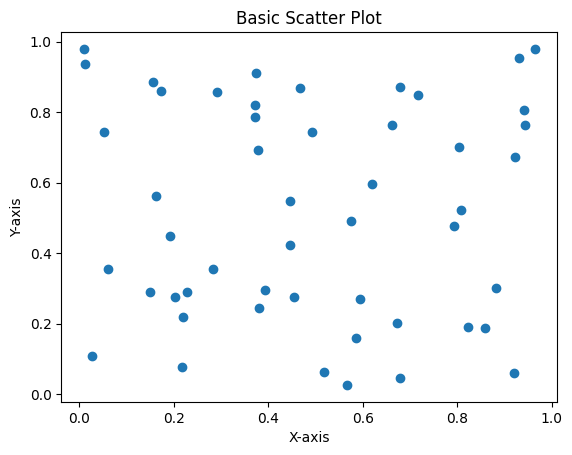
2.添加线性趋势线
线性趋势线是最能代表散点图上数据的直线。要添加线性趋势线,我们可以使用NumPy的polyfit()函数来计算最佳拟合线。
python
# Calculate the best-fit line
z = np.polyfit(x, y, 1)
p = np.poly1d(z)

# Plot the scatter plot and the trend line
plt.scatter(x, y)
plt.plot(x, p(x), "r--")  # 'r--' is for a red dashed line
plt.title("Scatter Plot with Linear Trend Line")
plt.xlabel("X-axis")
plt.ylabel("Y-axis")
plt.show()
3.添加多项式趋势线
有时,线性趋势线可能不足以捕捉变量之间的关系。在这种情况下,多项式趋势线可能更合适。我们可以使用polyfit()函数,它的阶数更高。
python
# Calculate the polynomial trend line (degree 2)
z = np.polyfit(x, y, 2)
p = np.poly1d(z)

# Plot the scatter plot and the polynomial trend line
plt.scatter(x, y)
plt.plot(x, p(x), "g-")  # 'g-' is for a green solid line
plt.title("Scatter Plot with Polynomial Trend Line")
plt.xlabel("X-axis")
plt.ylabel("Y-axis")
plt.show()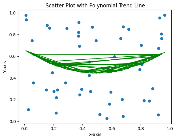
自定义趋势线
Matplotlib允许对图进行广泛的自定义,包括趋势线的外观。您可以修改趋势线的颜色、线型和宽度。
python
# Calculate the best-fit line
z = np.polyfit(x, y, 1)
p = np.poly1d(z)

# Plot the scatter plot and the customized trend line
plt.scatter(x, y)
plt.plot(x, p(x), color="purple", linewidth=2, linestyle="--")
plt.title("Scatter Plot with Customized Trend Line")
plt.xlabel("X-axis")
plt.ylabel("Y-axis")
plt.show()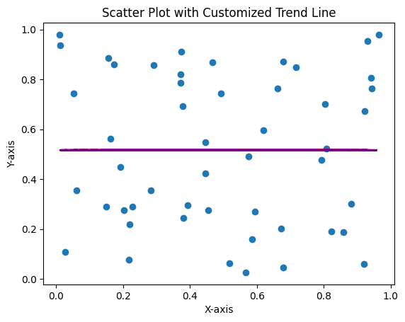
多条趋势线
在某些情况下,您可能希望比较同一散点图上的不同趋势线。这可以通过计算和绘制多条趋势线来实现。
python
# Generate random data
x = np.random.rand(50)
y = np.random.rand(50)

# Calculate the linear and polynomial trend lines
z1 = np.polyfit(x, y, 1)
p1 = np.poly1d(z1)
z2 = np.polyfit(x, y, 2)
p2 = np.poly1d(z2)

# Plot the scatter plot and both trend lines
plt.scatter(x, y)
plt.plot(x, p1(x), "r--", label="Linear Trend Line")
plt.plot(x, p2(x), "g-", label="Polynomial Trend Line")
plt.title("Scatter Plot with Multiple Trend Lines")
plt.xlabel("X-axis")
plt.ylabel("Y-axis")
plt.legend()
plt.show()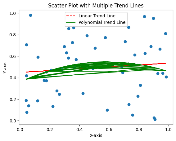
总结
在Matplotlib中向散点图添加趋势线是可视化和理解变量之间关系的强大方法。无论您需要简单的线性趋势线还是更复杂的多项式趋势线,Matplotlib都提供了创建信息丰富且视觉上吸引人的图表所需的工具。