目录
播放器背景
html
<div class="play_box"></div>设置居中,圆角,阴影等参数
css
.play_box {
    position: absolute;
    top: 50%;
    left: 50%;
    transform: translate(-50%, -50%);
    width: 800px;
    height: 80px;
    display: flex;
    border-radius: 5px;
    box-shadow: 0 0 15px #666565;
}
用专辑封面作为播放器的背景填充,通过设置模糊做出一种毛玻璃效果
css
.play_box {
    background-image: url(./1.png);
    background-size: 100% 100%;
    filter: blur(10px);
}我尝试加上了这三行代码,把背景图片填充后再用filter属性进行模糊,产生了如下的效果

可以看到,整个播放器都变模糊了,并不是我们所希望的毛玻璃效果,为了不让边缘模糊,可以采用下面的办法。
css
.play_box {
    position: absolute;
    top: 43%;
    left: 18%;
    width: 800px;
    height: 80px;
    display: flex;
    border-radius: 5px;
    overflow: hidden;
    background-image: url(./1.png);
    background-size: cover;
    box-shadow: 0 0 15px #666565;
}
.play_box::after{
    position: absolute;
    width: 101%;
    height: 100%;
    content: "";
    backdrop-filter: blur(20px);
    z-index: 1;
}
在播放器上覆盖了一个伪元素,并将内容设为了空,然后给这个伪元素添加模糊效果

这样就好看多了。
而由于后续需要在其上面添加其他元素,所以说必须设置这个"毛玻璃"的定位和z-index。
至于为什么width设成了101%是因为一个小细节,当设成100%的时候仔细观察发现右边存在瑕疵,所以拉长一点点毛玻璃的宽度就能避免这个情况了。

旋转音乐封面
html
<div class="album_cover"></div>
css
.album_cover{
    width: 80px;
    height: 80px;
    border-radius: 360px;
    background-image: url(./1.png);
    background-size: contain;
    z-index: 2;
    box-shadow: 0 0 10px #ffffffa2;
    animation: rotate 5s linear infinite;
}
@keyframes rotate {
    0% {
        transform: rotate(0deg);
    }
    100% {
        transform: rotate(360deg);
    }
}
按钮
加入一些字体图标作为按钮

html
<span class="iconfont icon-pause pause_icon"></span>
<span class="iconfont icon-icon-test play_icon"></span>
<span class="iconfont icon-icon-test1 pre_song"></span>
<span class="iconfont icon-icon-test1 next_song"></span>
对于这些图标的样式就全部写在html文件的head里面了
html
<link rel="stylesheet" href="./font/iconfont.css">
<style>
    .iconfont{
        position: absolute;
        top: 50%;
        font-size: 25px;
        color: #f99f50;
        transform: translateY(50%);
        z-index: 2;
        text-shadow: 0 0 10px #eecc7d;
    }
    .pause_icon{
        left: 25px;
        transform: translateY(-50%);
        font-size: 30px;
        cursor: pointer;
    }

    .play_icon{
        left: 25px;
        transform: translateY(-50%);
        font-size: 30px;
        display:none;
        cursor: pointer;
    }

    .pre_song{
        left: 100px;
        rotate: 180deg;
        cursor: pointer;
    }

    .next_song{
        left: 160px;
        transform: translateY(-50%);
        cursor: pointer;
    }

.louder_icon,.turn_of_icon,.quieter_icon{
    right: 25px;
    transform: translateY(-50%);
    color:white;
    cursor: pointer;
    text-shadow: 0 0 5px white;
    display: none;
}
.louder_icon{
    display: block;
}
</style>
效果如上
进度条
html
<div class="progress-bar">
    <div class="progress-fill">
        <div class="progress-thumb"></div>
    </div>
</div>
css
.progress-bar {
    position:absolute;
    z-index: 3;
    top: 50%;
    left: 60%;
    transform: translate(-50%, -50%);
    width: 400px;
    height: 12px;
    background-color: white;
    border-radius: 50px;
    box-shadow: 0 0 15px #edebeb;
}
.progress-fill {
    position:absolute;
    z-index: 3;
    width: 50%;
    height: 12px;
    background: linear-gradient(to right, #fdd162,#faab35,#f94f47);
    border-radius: 50px;
}
.progress-thumb{
    position: absolute;
    top: 50%;
    left: 100%;
    transform: translate(-50%, -50%);
    width: 20px;
    height: 20px;
    border-radius: 50%;
    background-color: white;
    cursor: pointer;
    box-shadow: 0 0 5px #939393;
}用两个<div>来展示进度条的外壳和填充条,在填充条的最右侧再用一个<div>显示可拖拽的进度条圆点。

效果如上
音量调节
通过设置overflow:visible可以让超出盒子的部分显示出来,所以我们可以把音量图标专门放进一个<div>中然后在里面放上一个滑动条,以及显示百分比的<p>标签。这样子就不用担心缩放页面导致音量条的位置错位了。当鼠标悬停在音量图标上的时候,通过一些衔接动画来改变透明度并设置display属性,从而让音量调节条能够显示出来。通过:active可以实现当鼠标按下后即使离开了hover的区域,依然能让音量调节框显示出来。
html
<div class="volume-button">
    <span class="iconfont icon-louder louder_icon"></span>
    <span class="iconfont icon-turn_of turn_of_icon"></span>
    <span class="iconfont icon-quieter quieter_icon"></span>
    <div class="volume-box">
        <div class="volume-bar">
            <div class="volume-fill">
                <div class="volume-thumb"></div>
            </div>
        </div>
        <p class="volume-percent">50%</p>
    </div>
</div>
css
.volume-button{
    position: absolute;
    top: 0;
    right: 0;
    width: 80px;
    height: 80px;
    cursor: pointer;
    z-index:4;
}

.volume-box{
    position: absolute;
    bottom: 90%;
    right:20%;
    width:40px;
    height: 0px;
    z-index: 4;
    background-color: white;
    border-radius: 15px;
    box-shadow: 0 0 10px #818080;
    border: solid 1px #ffffff;
    display:none;
    opacity: 1;
}

.volume-button:hover,.volume-button:active{
    transform: scale(1.5);
    transition: all 0.3s ease;
}

.volume-button:hover .volume-box{
    height: 140px;
    display: block;
    animation: show_volume_bar.5s ease forwards;
}
.volume-button:active .volume-box{
    height: 140px;
    display: block;
}

@keyframes show_volume_bar {
    0% {
        opacity: 0;
        transform: scale(0);
        transform-origin: bottom;
    }
    100% {
        opacity: 1;
        transform: scale(1);
        transform-origin: bottom;
    }
}
.volume-bar {
    position:absolute;
    top: 55%;
    left: 50%;
    transform: translate(-50%, -55%);
    width: 10px;
    height: 100px;
    background-color: white;
    border-radius: 50px;
    box-shadow: 0 0 15px #edebeb;
}
.volume-fill {
    position:absolute;
    bottom: 0;
    width: 12px;
    height: 50%;
    background: linear-gradient(to top, #fdd162,#faab35,#f94f47);
    border-radius: 50px;
}
.volume-thumb{
    position: absolute;
    top:0;
    left:50%;
    width: 13px;
    transform: translateX(-50%);
    height: 13px;
    border-radius: 50%;
    background-color: white;
    cursor: pointer;
    box-shadow: 0 0 5px #939393;
}

.volume-thumb:hover{
    border: 0.5px solid #f1b04e;
    box-shadow: 0 0 5px #f1b04e;
}

.volume-percent{
    position: absolute;
    bottom:2%;
    width: 20px;
    left: 50%;
    transform: translateX(-60%);
    font-size: 11px;
    color:#464545;
}
音乐信息
html
<div class="song-info">
    <p class="song-name">歌曲名</p>
    <p class="song-time">1:30/3:00</p>
</div>
css
.song-info{
    position: absolute;
    top: 50%;
    left: 50%;
    transform: translate(-32%, -50%);
    width: 400px;
    height: 70px;
    z-index:2;
    color:#464545;
}
.song-name{
    position: absolute;
    top:0;
    left:50%;
    transform: translateX(-50%);
    text-shadow: 2px 2px 5px #ffffff, -2px -2px 5px #f1f1f1;
}
.song-time{
    position: absolute;
    bottom: 0px;
    left: 50%;
    transform: translateX(-50%);
    text-shadow: 2px 2px 5px #ffffff, -2px -2px 5px #f1f1f1;
}
按钮的效果
给两个滑动点加一些效果
css
.progress-thumb:hover{
    border: 1px solid #f1b04e;
    box-shadow: 0 0 5px #f1b04e;
}
.volume-thumb:hover{
    border: 0.5px solid #f1b04e;
    box-shadow: 0 0 5px #f1b04e;
}
通过:not()伪类选择器,把出了音量图标以外的图标鼠标悬停时设置成下面的样式
css
.iconfont:hover:not(.louder_icon,.turn_of_icon,.quieter_icon){
    color: #f38524;
    text-shadow: 0 0 10px #e28e44;
}
给音量滑动条显示出来时加一个动画
css
.volume-button:hover .volume-box{
    height: 140px;
    display: block;
    animation: show_volume_bar .5s ease forwards;
}
@keyframes show_volume_bar {
    0% {
        opacity: 0;
        transform: scale(0);
        transform-origin: bottom;
    }
    100% {
        opacity: 1;
        transform-origin: bottom;
        transform: scale(1);
    }
}
JavaScript部分
引入js代码
html
<script src="./script.js"></script>播放和暂停
默认显示三角形播放图标,暂停图标则隐藏
css
.pause_icon{
    left: 25px;
    transform: translateY(-50%);
    font-size: 30px;
    cursor: pointer;
    display:none;
}

.play_icon{
    left: 25px;
    transform: translateY(-50%);
    font-size: 30px;
    cursor: pointer;
}
默认图片是不旋转的
css
.album_cover{
    animation: rotate 5s linear infinite;
    animation-play-state: paused;
}
对于两个图标,分别设置相应的点击事件
js
const pauseIcon = document.querySelector('.pause_icon');
const playIcon = document.querySelector('.play_icon');
const albumCover = document.querySelector('.album_cover');
pauseIcon.addEventListener('click', function() {
    pauseIcon.style.display = 'none';
    playIcon.style.display = 'block';
    albumCover.style.animationPlayState = 'paused';
});
playIcon.addEventListener('click', function() {
    pauseIcon.style.display = 'block';
    playIcon.style.display = 'none';
    albumCover.style.animationPlayState = 'running';
});
加入一个用于播放音乐的标签<audio>在<body>的开头
html
<audio id="audioPlayer"></audio>优化一下代码结构
js
const pauseIcon = document.querySelector('.pause_icon');
const playIcon = document.querySelector('.play_icon');
const albumCover = document.querySelector('.album_cover');
const audioPlayer = document.getElementById('audioPlayer');

pauseIcon.addEventListener('click', pauseSong);
playIcon.addEventListener('click', playSong);

// 播放歌曲
function playSong() {
    audioPlayer.play();
    pauseIcon.style.display = 'block';
    playIcon.style.display = 'none';
    albumCover.style.animationPlayState = 'running';
}

// 暂停歌曲
function pauseSong() {
    audioPlayer.pause();
    pauseIcon.style.display = 'none';
    playIcon.style.display = 'block';
    albumCover.style.animationPlayState = 'paused';
}
音乐切换
通过一个加载歌曲的函数,就可以实现歌曲切换了,用一个列表存放一下所有的歌曲名,然后用一个变量作为这个列表的索引传入加载歌曲的函数,在点击切歌按钮的时候就可以加载对应的歌曲,通过取模运算避免索引越界。
js
const songList = ["花月","honey"];// 歌曲列表
let currentIndex = 0;// 当前歌曲索引

const playBox = document.querySelector('.play_box');
// 加载歌曲
function loadSong(index) {
    const songName = songList[index];
    audioPlayer.src="./music/"+songName+".m4a";
    playBox.style.backgroundImage = `url('./music/${songName}.png')`;
    albumCover.style.backgroundImage = `url('./music/${songName}.png')`;
}


const nextIcon = document.querySelector('.next_song');
const preIcon = document.querySelector('.pre_song');
// 为 pre_song 和 next_song元素添加点击事件监听器
preIcon.addEventListener('click', preSong);
nextIcon.addEventListener('click', nextSong);

// 下一首歌曲
function nextSong() {
    currentIndex = (currentIndex + 1) % songList.length;
    loadSong(currentIndex);
    playSong();
}
// 上一首歌曲
function preSong() {
    currentIndex = (currentIndex - 1 + songList.length) % songList.length;
    loadSong(currentIndex);
    playSong();
}
音乐信息
通过audioPlayer.currentTime, audioPlayer.duration这两个参数就能轻松获得音乐的当前时长和总时长了。可以加一个特判避免没有获取到数据的时候就显示出Na。
js
const songTime = document.querySelector('.song-time');
const songNameLabel = document.querySelector('.song-name');

// 加载歌曲
function loadSong(index) {
    const songName = songList[index];
    audioPlayer.src="./music/"+songName+".m4a";
    playBox.style.backgroundImage = `url('./music/${songName}.png')`;
    albumCover.style.backgroundImage = `url('./music/${songName}.png')`;
    updateTimeDisplay(0, audioPlayer.duration);
    songNameLabel.textContent = songName;
}
// 格式化时间为分钟:秒的形式
function formatTime(time) {
    const minutes = Math.floor(time / 60);
    const seconds = Math.floor(time % 60);
    return `${minutes}:${seconds < 10? '0' + seconds : seconds}`;
}

// 更新时间显示
function updateTimeDisplay(currentTime, totalTime) {
    if (isNaN(currentTime) || isNaN(totalTime)) {
        return;
    }
    songTime.textContent = `${formatTime(currentTime)}/${formatTime(totalTime)}`;
}

// 监听音频播放进度更新
audioPlayer.ontimeupdate = function() {
    updateTimeDisplay(audioPlayer.currentTime, audioPlayer.duration);
};
进度条
由于之前在css中设置了小圆点的定位一定在进度条fill的最右侧,所以只需要更新fill的长度就行了,而这个长度需要实时更新,所以在音频监听的部分加上一条
js
audioPlayer.ontimeupdate = function() {
    updateTimeDisplay(audioPlayer.currentTime, audioPlayer.duration);
    updateProgressBar();
};
操控小圆点移动的部分主要通过获取鼠标点下和松开时的坐标以及相应的播放进度从而改变fill的长度,具体看下面的代码。
js
const progressBar = document.querySelector('.progress-bar');
const progressFill = document.querySelector('.progress-fill');
const progressThumb = document.querySelector('.progress-thumb');

// 更新进度条
function updateProgressBar() {
    const progress = (audioPlayer.currentTime / audioPlayer.duration) * 100;
    progressFill.style.width = `${progress}%`;
}

// 处理进度条控点的拖动
let isDragging = false;
let startX;
let startProgress;

progressThumb.addEventListener('mousedown', function(e) {
    isDragging = true;
    startX = e.clientX;// 鼠标按下时的坐标
    startProgress = audioPlayer.currentTime;// 鼠标按下时的进度
    document.body.style.userSelect = 'none';// 禁止选中文本
});

document.addEventListener('mousemove', function(e) {
    if (isDragging) {
        const dx = e.clientX - startX;// 鼠标移动的距离
        const progressBarWidth = progressBar.offsetWidth - progressThumb.offsetWidth;// 进度条宽度
        const progress = (startProgress + (dx / progressBarWidth) * audioPlayer.duration*0.95);// 新的进度
        audioPlayer.currentTime = progress;// 更新播放进度
    }
});

document.addEventListener('mouseup', function() {
    isDragging = false;
    document.body.style.userSelect = 'auto';// 允许选中文本
});
音量调节
避免拖拽时的杂音
通过audioPlayer.volume即可获取音乐当前的音量
为了避免拖拽进度条的时候产生声音,可以做如下调整:
新建一个变量let volumeBeforeMute;
当鼠标按到进度条控点上时记录下当前音量
js
volumeBeforeMute = audioPlayer.volume;拖拽过程中音量设为0
js
audioPlayer.volume = 0;鼠标松开后重新社会一开始的音量
js
audioPlayer.volume = volumeBeforeMute;音量调节条
和进度条类似的做法
js
const volumeButton = document.querySelector('.volume-button');
const volumeBar = document.querySelector('.volume-bar');
const volumeFill = document.querySelector('.volume-fill');
const volumeThumb = document.querySelector('.volume-thumb');
const volumePercent = document.querySelector('.volume-percent');
// 更新音量条
function updateVolumeBar() {
    curVolume = audioPlayer.volume;
    volumeFill.style.height = (curVolume*volumeBar.offsetHeight+volumeThumb.offsetHeight)+'px';
    volumePercent.textContent = `${Math.round(curVolume * 100)}%`;
}

// 处理音量条控点的拖动
let isDraggingVolume = false;
let startY;
let startVolume;

volumeThumb.addEventListener('mousedown', function(e) {
    isDraggingVolume = true;
    startY = e.clientY;
    startVolume = audioPlayer.volume;
    document.body.style.userSelect = 'none';
});


document.addEventListener('mousemove', function(e) {
    if (isDraggingVolume) {
        const dy = e.clientY - startY;// 鼠标移动的距离
        const volumeBarHeight = volumeBar.offsetHeight;
        let volume = startVolume - (dy / volumeBarHeight*0.7);
        volume = Math.max(0, Math.min(1, volume)); // 确保音量在 0 到 1 之间
        audioPlayer.volume = volume;
        curVolume = volume;
        if (volume == 0){
            mute()
        }
        else if(volume < 0.5){
            muteIcon.style.display = 'none';
            louderIcon.style.display = 'none';
            quieterIcon.style.display = 'block';

        }
        else{
            muteIcon.style.display = 'none';
            louderIcon.style.display = 'block';
            quieterIcon.style.display = 'none';
        }
    }
    updateVolumeBar();
});

document.addEventListener('mouseup', function() {
    isDraggingVolume = false;
    document.body.style.userSelect = 'auto';
});
静音和解除静音
js
const louderIcon = document.querySelector('.louder_icon');
const muteIcon = document.querySelector('.turn_of_icon');
// 为 louder 和 turn_of_icon 元素添加点击事件监听器

louderIcon.addEventListener('click', mute);
muteIcon.addEventListener('click', louder);
let volumeAfterMute;
//静音
function mute() {
    muteIcon.style.display = 'block';
    louderIcon.style.display = 'none';
    quieterIcon.style.display = 'none';
    volumeBeforeMute = audioPlayer.volume;
    audioPlayer.volume = 0;
    updateVolumeBar();
}
//解除静音
function louder() {
    if (volumeBeforeMute == 0){
        mute()
    }
    else if(volumeBeforeMute < 0.5){
        muteIcon.style.display = 'none';
        louderIcon.style.display = 'none';
        quieterIcon.style.display = 'block';
    }
    else{
        muteIcon.style.display = 'none';
        louderIcon.style.display = 'block';
        quieterIcon.style.display = 'none';
    }
    audioPlayer.volume =volumeBeforeMute;
    updateVolumeBar();
}
自动下一首
在监听函数中加上一个判断语句就行了
js
// 监听音频播放进度更新
audioPlayer.ontimeupdate = function() {
    updateTimeDisplay(audioPlayer.currentTime, audioPlayer.duration);
    updateProgressBar();
    if (audioPlayer.ended) {
        nextSong();
    }
};
实现一个小效果
我想实现将鼠标放到播放或暂停键上时,音乐图片角度归零,放大, 并停止旋转。
搞了很久一直不起作用,最后只能用!important来提升属性的优先级从而在CSS中实现。
css
.play_icon:hover ~.album_cover,.pause_icon:hover ~.album_cover {
    width: 100px;
    height: 100px;
    margin-left: -10px;
    margin-top: -10px;
    border-radius: 5%;
    rotate: 0deg;
    animation-play-state: paused!important;
    transform: rotate(0deg)!important;
}
最终效果
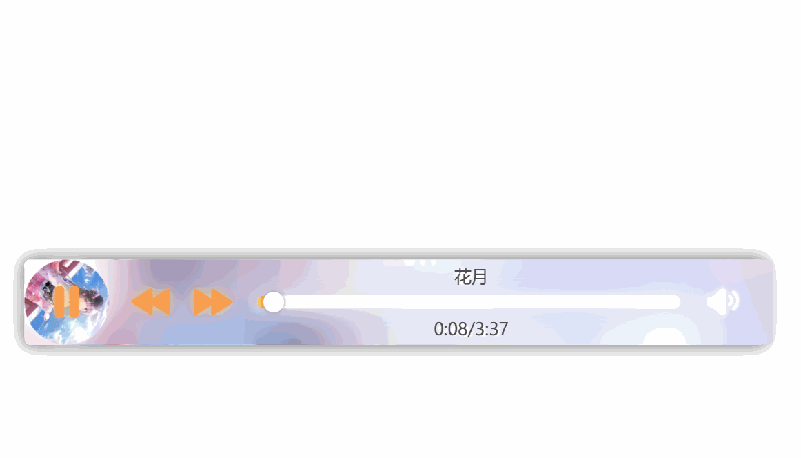
至此整个项目就完成啦!