转载请注明出处,未经同意,不可修改文章内容。🔥🔥🔥"前端一万小时"两大明星专栏------"从零基础到轻松就业"、"前端面试刷题",已于本月大改版,合二为一,干货满满,欢迎点击公众号菜单栏各模块了解。
plain
涉及面试题:
什么是递归组件?

编号:[travel_22]
1 需求
就"详情页"剩余部分的布局和逻辑而言,我不会倾注太多精力。大伙儿可以根据自己的需求,结合前面编写"组件"的经验和 "Vue 基础语法"在项目基础上进行拓展。
- 使用"递归组件"实现详情页列表;
- 完成用户评论布局。

2 使用递归组件实现"详情页列表"
❓什么是递归组件?
答:递归组件,实际就是组件调用组件自身。我们使用递归组件,主要是因为很多时候,数据是递归结构(比如,"数码产品"分类下有"手机"、"电脑"等,"手机"分类下可分为安卓、iOS 等,安卓/iOS下可继续细分为各种型号,诸如此类)。
❓Vue 中如何实现递归组件?
答:每次创建一个组件时,我们都会给它添加 name 属性,起一个"名字"。
通过组件的名字,当我们使用 Vue.js devtools 进行调试时,可以清晰的看到每个组件:

组件名字的第二个用途,就是可以让我们能够通过它的名字,调用它自己来实现递归组件。
1️⃣我们在 detail 下的 components 中,新建一个列表组件 List.vue :

html
<template>
  <div>
    <!-- 1️⃣-③:外层 div 中添加一个类名为 item 的 div,对 list 进行循环,动态绑定 key 值
    为 index; -->
    <div class="item" v-for="(item, index) of list" :key="index">

      <div class="item-title border-bottom"> <!-- 1️⃣-④:.item 中添加一个类名为
                                  .item-title 的 div,里边是一个 span 标签和"门票"标题;
                                  1️⃣-⑧:添加 border-bottom 类名,给"门票"标题下方增加一像素
                                  分割线; -->

        <span class="item-title-icon"></span> <!-- 1️⃣-⑤:span 标签类名为
                                              .item-title-icon,它是一个"门票 icon";
                                              -->
        {{item.title}} <!-- 1️⃣-⑨:渲染每个循环项的 title(即"门票"标题); -->
      </div>
    </div>
  </div>
</template>

<script>
export default {
  name: 'DetailList', // 1️⃣-①:组件命名为 DetailList;

  props: { /*
  				 1️⃣-②:它接收一个从父组件传来的 list,它的类型为数组(❗️list 是一个数组,
           里边包含两个对象,每个对象各有一个"门票标题 title");
            */
    list: Array
  }
}
</script>

<style lang="stylus" scoped>
.item-title /*
            1️⃣-⑥:.item-title 行高 0.8rem,font-size 0.32rem,左右 padding 0.2rem;
             */
  line-height: .8rem
  font-size: .32rem
  padding: 0 .2rem

.item-title-icon /* 1️⃣-⑦:.item-title-icon 设为相对定位,top 为 0.06rem,
                 display 为 inline-block,宽、高为 0.36rem,margin-right 0.1rem,
                 background 和 background-size 设置门票图标图片的位置和大小;
                  */
  position: relative
  top: .06rem
  display: inline-block
  width: .36rem
  height: .36rem
  margin-right: .1rem
  background: url(https://qdywxs.github.io/travel-images/commentIcon.png) 0 -.45rem no-repeat
  background-size: .4rem 3rem
</style>
1️⃣-⑩:打开 detail 下的 Detail.vue 使用列表组件;
html
<template>
  <div>
    <detail-banner></detail-banner>
    <detail-header></detail-header>
    <div class="content">

      <detail-list :list="list"></detail-list> <!-- 1️⃣-⑬:使用列表组件;
																							 1️⃣-⑯:通过属性 :list 传递向列表组件传递
																							 数据 list。 -->
    </div>
  </div>
</template>

<script>
import DetailBanner from './components/Banner'
import DetailHeader from './components/Header'

import DetailList from './components/List' // 1️⃣-⑪:引入列表组件;

export default {
  name: 'Detail',

  data () { // 1️⃣-⑭:data 中定义一个数据 list;
    return {
      list: [{ // 1️⃣-⑮:list 是一个数组,里边有两个对象,内容是"门票标题 title";
        title: '故宫当日票'
      }, {
        title: '故宫预售成人票'
      }]
    }
  },
  components: {
    DetailBanner,
    DetailHeader,

    DetailList // 1️⃣-⑫:注册列表组件;
  }
}
</script>

<style lang="stylus" scoped>
.content
  height: 20rem
</style>
保存后,返回页面查看。我们可以看到页面显示出一个普通的列表组件:

2️⃣返回 detail 下中的 Detail.vue ,继续添加数据:
html
<template>
  <div>
    <detail-banner></detail-banner>
    <detail-header></detail-header>
    <div class="content">
      <detail-list :list="list"></detail-list>
    </div>
  </div>
</template>

<script>
import DetailBanner from './components/Banner'
import DetailHeader from './components/Header'
import DetailList from './components/List'
export default {
  name: 'Detail',
  data () {
    return {
      list: [{ /*
      				 2️⃣-①:list 里的第一个对象中,除了 title,再添加一个 children,
               children 也是一个数组;
                */
        title: '故宫当日票',

        children: [{ // 2️⃣-②:children 的内容与 list 一样,还是两个 title;
          title: '成人票'
        }, {
          title: '学生票'
        }]
      }, {
        title: '故宫预售成人票'
      }]
    }
  },
  components: {
    DetailBanner,
    DetailHeader,
    DetailList
  }
}
</script>

<style lang="stylus" scoped>
.content
  height: 20rem
</style>
2️⃣-③:返回 detail 下 components 中的 List.vue ;
html
<template>
  <div>
    <div class="item" v-for="(item, index) of list" :key="index">
      <div class="item-title border-bottom">
        <span class="item-title-icon"></span>
        {{item.title}}
      </div>

      <!-- 2️⃣-④:在 .item 中增加一个 div,类名为 item-children。添加 v-if 指令,
			当 item 中有 children 时显示; -->
      <div class="item-children" v-if="item.children">

        <!-- 2️⃣-⑤:通过列表组件的名字使用组件自身,内容是循环项中的 children; -->
        <detail-list :list="item.children"></detail-list>
      </div>
    </div>
  </div>
</template>

<script>
export default {
  name: 'DetailList',
  props: {
    list: Array
  }
}
</script>

<style lang="stylus" scoped>
.item-title
  line-height: .8rem
  font-size: .32rem
  padding: 0 .2rem
.item-title-icon
  position: relative
  top: .06rem
  display: inline-block
  width: .36rem
  height: .36rem
  margin-right: .1rem
  background: url(https://qdywxs.github.io/travel-images/commentIcon.png) 0 -.45rem no-repeat
  background-size: .4rem 3rem

.item-children /*
  						 2️⃣-⑥:给 .item-children 添加左、右 padding 为  0.2rem
  						 (与上一层级标题作区分);
  							*/
  padding: 0 .2rem
</style>
保存后,返回页面查看。可以看到 list.children 的内容正常显示:

递归组件的使用就是这样,当我们数据中的"成人票"下面还有更细的分类时,也不需要再做额外的改动。
2️⃣-⑦:返回 detail 下的 Detail.vue 添加一点数据;
html
<template>
  <div>
    <detail-banner></detail-banner>
    <detail-header></detail-header>
    <div class="content">
      <detail-list :list="list"></detail-list>
    </div>
  </div>
</template>

<script>
import DetailBanner from './components/Banner'
import DetailHeader from './components/Header'
import DetailList from './components/List'
export default {
  name: 'Detail',
  data () {
    return {
      list: [{
        title: '故宫当日票',

        children: [{
          title: '成人票',
          children: [{ // ❗️在 list.children 里的第一个对象中,再添加一个 children。
            title: '故宫成人票+钟表馆+珍宝馆'
          }]
        }, {
          title: '学生票'
        }]
      }, {
        title: '故宫预售成人票'
      }]
    }
  },
  components: {
    DetailBanner,
    DetailHeader,
    DetailList
  }
}
</script>

<style lang="stylus" scoped>
.content
  height: 20rem
</style>
保存后,返回页面查看:

3 用户评论组件
需求分析:用户评论组件大致可分为"标题"和"评论"两个部分。其中,每个用户评论可分为"星级+日期"、评论内容和评论图片三部分。

3️⃣在 detail 下的 components 中新建用户评论组件 Comment.vue (添加这部分内容来撑开详情页的内容高度):

html
<template>
  <div> <!-- 3️⃣-③:最外层 div 中有两个 div,一个类名为 title 一个为 comment; -->
    <div class="title">用户评论</div> <!-- 3️⃣-④:.title 的内容为标题"用户评论"; -->

    <div
      class="comment border-bottom"
      v-for="item of commentList"
      :key="item.id"
    > <!-- 3️⃣-⑤:.comment 是整个评论内容,使用 v-for 指令循环 commentList,
			动态绑定 key 值为循环项的 id,添加类名 border-bottom 增加一像素分割线; -->

      <div class="stardate"> <!-- 3️⃣-⑥:.comment 中第一部分是星级日期,类名为 stardate,
														 里边是两个 p 标签包裹的"星级"和"日期"; -->
         <p class="star-level">{{item.star}}</p>
         <p class="comment-date">{{item.date}}</p>
      </div>

      <!-- 3️⃣-⑦:.comment 第二部分是评论内容; -->
      <p class="comment-content">{{item.content}}</p>

      <div class="imgs"> <!-- 3️⃣-⑧:.comment 第三部分是评论的图片区; -->

        <div
        	class="img-wrapper"
          v-for="(innerItem, index) of item.imgUrl"
          :key="index"
        > <!-- 3️⃣-⑨:.imgs 中,用一个 div 包裹所有图片,类名为 img-wrapper,撑开图片区域,
					对 item 中的 imgUrl 进行循环,动态绑定 key 值为 index; -->

          <!-- 3️⃣-⑩:img 标签类名为 comment-img,动态绑定 src 为循环项 innerItem; -->
          <img :src="innerItem" class="comment-img">
        </div>
      </div>

    </div>
  </div>
</template>

<script>
export default {
  name: 'DetailComment', // 3️⃣-①:组件命名为 DetailComment;

  data () { /*
  					3️⃣-②:data 中定义一个数据 commentList,它是一个数组,里边是评论内容
            (包含评论的 id、星级 star、日期 date、内容 content 和 评论图片链接 imgUrl);
             */
    return {
      commentList: [{
        id: '0001',
        star: '★★★★★',
        date: 'q*9  2019-11-01',
        content: '我们是早上8:30的第一场,有珍宝馆的套票,王蕾导游讲解很到位,妙语连珠,互动性强,服务热情,路线和讲解安排合理,游玩很开心有意义,对故宫有了深入全面的了解,不虚此行,不留遗憾,深有体会,故宫博物院完美打卡。',
        imgUrl: ['https://qdywxs.github.io/travel-images/commentImg01.jpg', 'https://qdywxs.github.io/travel-images/commentImg02.jpg', 'https://qdywxs.github.io/travel-images/commentImg03.jpg', 'https://qdywxs.github.io/travel-images/commentImg04.jpg', 'https://qdywxs.github.io/travel-images/commentImg05.jpg', 'https://qdywxs.github.io/travel-images/commentImg06.jpg']
      }, {
        id: '0002',
        star: '★★★★★',
        date: 'z*3  2019-11-01',
        content: '非常好的体验,推荐大福晋导游。故宫太大,又是历史文化浓重的宫殿,如果没有导游,自己瞎逛浪费时间和体力,也不明白很多殿的故事,每个人一个无线耳麦,离导游三十米内都听的很清楚,导游讲解的风趣幽默,不错的一次体验。',
        imgUrl: ['https://qdywxs.github.io/travel-images/commentImg01.jpg', 'https://qdywxs.github.io/travel-images/commentImg02.jpg', 'https://qdywxs.github.io/travel-images/commentImg03.jpg', 'https://qdywxs.github.io/travel-images/commentImg04.jpg', 'https://qdywxs.github.io/travel-images/commentImg05.jpg', 'https://qdywxs.github.io/travel-images/commentImg06.jpg']
      }]
    }
  }
}
</script>

<style lang="stylus" scoped>
.title /*
  		 3️⃣-⑪:.title 的 margin-top 为 0.2rem,line-height 为 0.8rem,背景色设为灰色 #eee,
  		 文本缩进 0.2rem;
  			*/
  margin-top: .2rem
  line-height: .8rem
  background: #eee
  text-indent: .2rem

.comment /* 3️⃣-⑫:设置评论区的 padding 顶部 0.1rem,左、右和底部为 0.2rem; */
  padding: .1rem .2rem .2rem .2rem

  .stardate /* 3️⃣-⑬:设置 .stardate 相对定位,高和行高都为 0.6rem; */
    position: relative
    height: .6rem
    line-height: .6rem

    .star-level /*
  							3️⃣-⑭:设置星级为绝对定位,左浮动,距离顶部 0.15rem,与左边距离为 0,
  							行高 0.3rem,颜色为橙黄色 #ffb436;
  							 */
      position: absolute
      float: left
      top: .15rem
      left: 0
      line-height: .3rem
      color: #ffb436

    .comment-date /*
  								3️⃣-⑮:设置日期为绝对定位,有浮动,距离顶部 0.15rem,与右边距离为 0,
  								行高 0.3rem,字体大小为 0.24rem;
  								 */
      position: absolute
      float: right
      top: .15rem
      right: 0
      line-height: .3rem
      font-size: .24rem

  .comment-content /* 3️⃣-⑯:设置评论内容行高为 0.44rem; */
    line-height: .44rem

  .imgs /* 3️⃣-⑰:设置评论区的图片区域溢出隐藏,宽为 100%,高为宽的 50%; */
    overflow: hidden
    width: 100%
    height: 0
    padding-bottom: 50%

    .img-wrapper /*
  							 3️⃣-⑱:设置图片的容器为左浮动,宽度为 32.85%,高度为 23%,添加 0.1rem 顶部
  							 和左边的 margin;
  								*/
      overflow: hidden
      float: left
      width: 32.85%
      height: 0
      padding-bottom: 23%
      margin: .1rem 0 0 .1rem

      &:nth-child(1),
      &:nth-child(4) /*
  										3️⃣-⑲:设置 .img-wrapper 第一个和第四个孩子的左 margin 为 -0.1rem,
  										让图片向左移 0.1rem;
  										 */
        margin-left: -.1rem

      .comment-img /* 3️⃣-⑳:设置图片宽度为 100%。 */
        width: 100%
</style>
3️⃣-㉑:打开 detail 下的 Detail.vue 使用用户评论组件 Comment.vue ;
html
<template>
  <div>
    <detail-banner></detail-banner>
    <detail-header></detail-header>

    <!-- ❗️去掉类名为 content 的 div -->
    <detail-list :list="list"></detail-list>

    <detail-comment></detail-comment> <!-- 3️⃣-㉔:使用评论组件。 -->
  </div>
</template>

<script>
import DetailBanner from './components/Banner'
import DetailHeader from './components/Header'
import DetailList from './components/List'

import DetailComment from './components/Comment' // 3️⃣-㉒:引入评论组件;

export default {
  name: 'Detail',
  data () {
    return {
      list: [{
        title: '故宫当日票',
        children: [{
          title: '成人票',
          children: [{
            title: '故宫成人票+钟表馆+珍宝馆'
          }]
        }, {
          title: '学生票'
        }]

      }, {
        title: '故宫预售成人票'
      }]
    }
  },
  components: {
    DetailBanner,
    DetailHeader,
    DetailList,
    DetailComment // 3️⃣-㉓:注册评论组件;
  }
}
</script>

<style lang="stylus" scoped>
/* ❗️删除 .content 的样式。 */
</style>
保存后,返回页面查看:
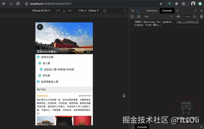
以上,我们完成了详情页列表组件和用户评论组件。
祝好,qdywxs ♥ you!