渐变
-
线性渐变
-
径向渐变
-
重复渐变
-
使用:
background-image: xx 渐变
background-image: linear-gradient(red,yellow,green);
-
公共代码
markdown.box { width: 300px; height: 200px; border: 1px solid black; float: left; margin-left: 30px; margin-top: 30px; text-align: center; line-height: 200px; font-size: 20px; } <body> <div class="box box1">线性渐变-默认方式,从上到下</div> <div class="box box2">线性渐变-使用关键字</div> <div class="box box3">线性渐变-使用角度</div> <div class="box box4">线性渐变-使用像素位置 </div> <div class="box box5">线性渐变演示效果</div> </body>
2.1 线性渐变
一条线一条线的变化,看起来是同一水平线;
使用:background-image: linear-gradient(颜色1,颜色2,颜色3)
默认多个颜色渐变
background-image: linear-gradient(red,yellow,green);
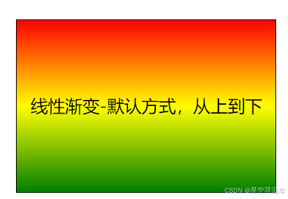
总结:多个颜色之间的渐变, 默认从上到下渐变
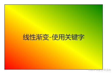
使用关键词设置渐变方向
/* 第二种方式 关键词设置方向 */
.box2 {
/* 从下到上 */
/* background-image: linear-gradient(to top,red,yellow,green); */
/* 到右上角 那么右上角就是 绿色 */
background-image: linear-gradient(to right top,red,yellow,green);
}
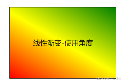
使用角度单位设置渐变方向
/* 第三种方式 使用角度 */
.box3 {
background-image: linear-gradient(30deg,red,yellow,green);
}
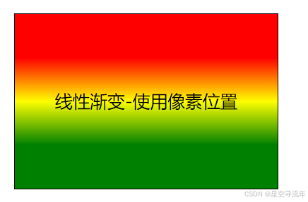
使用像素位置设置渐变方向
/* 第四种方式 使用位置 */
.box4 {
background-image: linear-gradient(red 50px,yellow 100px,green 150px);
}
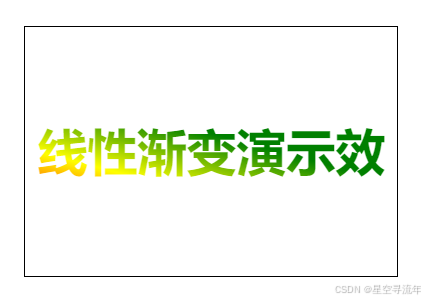
小设计综合
.box5 {
background-image: linear-gradient(375deg,red 50px,yellow 100px,green 150px);
font-size: 40px;
color: transparent;
font-weight: bold;
/* */
-webkit-background-clip: text;
}
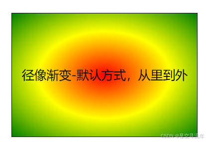
2.2 径向渐变
多个颜色从圆心散开,最终是一个圆形,从而为径向渐变,有半径
默认多个颜色渐变
- 默认从圆心四散。(注意:不一定是正圆,要看容器本身宽高比)
/* 第一种方式 默认 从圆心向四周发散 */
.box1 {
background-image: radial-gradient(red,yellow,green);
}
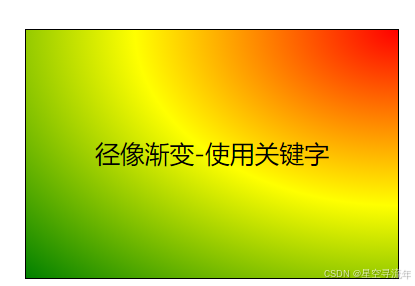
关键字设置渐变位置
/* 第二种方式 关键字 从右上角发散 */
.box2 {
background-image: radial-gradient(at right top,red,yellow,green);
}

使用像素值调整渐变圆的圆心位置
/* 第三种方式 像素 从x轴开始 */
.box3 {
background-image: radial-gradient(red 50px,yellow 100px,green 150px);
}
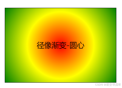
调整渐变形状为正圆
/* 第四种方式 正圆,本来默认是根据容器的宽高计算,如果是正方形默认就是圆心了 */
.box4 {
background-image: radial-gradient(circle,red,yellow,green);
}
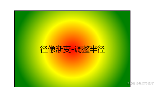
圆心半径
/* 圆心半径 */
.box5 {
background-image: radial-gradient(150px,red,yellow,green);
}
2.3 重复渐变
无论线性渐变,还是径向渐变,在没有发生渐变的位置,继续进行渐变,就为重复渐变。
- 使用 repeating-linear-gradient 进行重复线性渐变,具体参数同 linear-gradient 。
- 使用 repeating-radial-gradient 进行重复径向渐变,具体参数同 radial-gradient 。
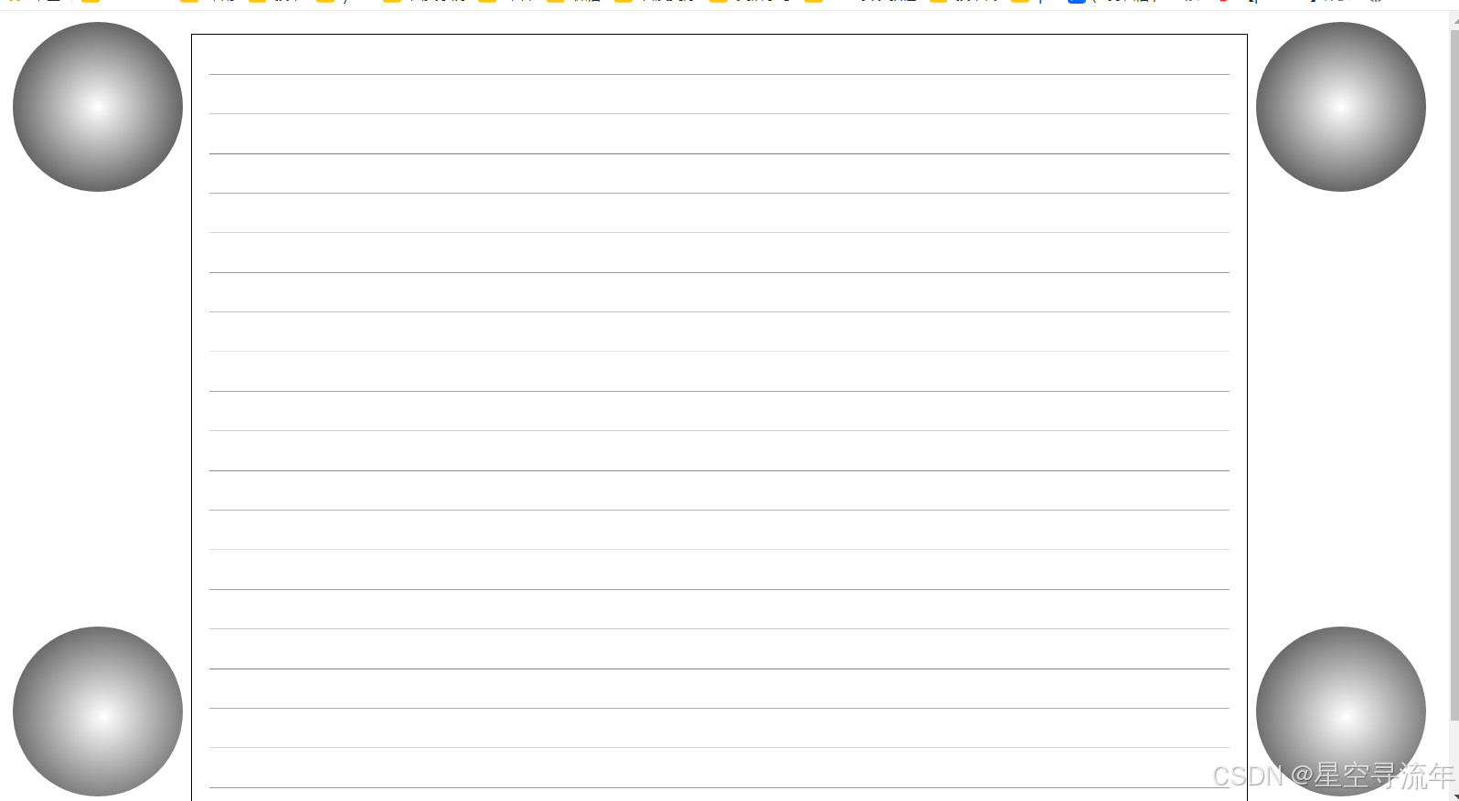
我们可以利用渐变,做出很多有意思的效果:例如:横格纸、立体球等等。
重复径向线性渐变
- 使用方法
- repeating-linear-gradient:单位
markdown
.box {
width: 300px;
height: 200px;
border: 1px solid black;
float: left;
margin-left: 30px;
margin-top: 30px;
text-align: center;
line-height: 200px;
font-size: 20px;
}
<body>
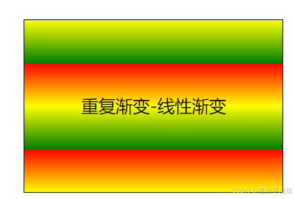
<div class="box box1">重复渐变-线性渐变</div>
</body>/* 第四种方式 使用位置 */
.box1 {
background-image: repeating-linear-gradient(red 50px,yellow 100px,green 150px);
}
重复径向渐变
.box {
width: 300px;
height: 200px;
border: 1px solid black;
float: left;
margin-left: 30px;
margin-top: 30px;
text-align: center;
line-height: 200px;
font-size: 20px;
}
/* 第四种方式 使用位置 */
.box1 {
background-image: repeating-linear-gradient(red 50px,yellow 100px,green 150px);
}
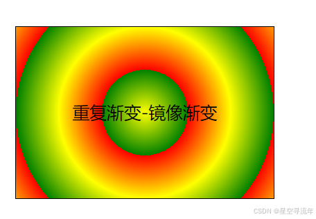
.box2 {
background-image: repeating-radial-gradient(circle,red 50px,yellow 100px,green 150px);
}
重复渐变-线性渐变
重复渐变-镜像渐变
应用小案例
-
代码
markdown<style> .box { width: 900px; height: 700px; border: 1px solid black; margin: 20px auto; padding: 15px; } .box1 { background-image: repeating-linear-gradient(transparent 0,transparent 34px,gray 35px); background-clip: content-box; } .ball { width: 150px; height: 150px; border-radius: 50%; position: relative; } .ball-1,.ball-2 { background-image: repeating-radial-gradient(white 0,#333 100px); } .ball-3,.ball-4 { background-image: repeating-radial-gradient(at 80px 80px ,white,#333); } .ball-1 { position: absolute; top: 10px; left: 20px; } .ball-2 { position: absolute; top: 10px; right: 20px; } .ball-3 { position: absolute; bottom: 10px; left: 20px; } .ball-4 { position: absolute; bottom: 10px; right: 20px; } </style> </head> <body> <div class="box box1"></div> <div class="float-ball"> <div class="ball ball-1"></div> <div class="ball ball-2"></div> <div class="ball ball-3"></div> <div class="ball ball-4"></div> </div> </body>