vue实现瀑布流的四种方式
背景介绍
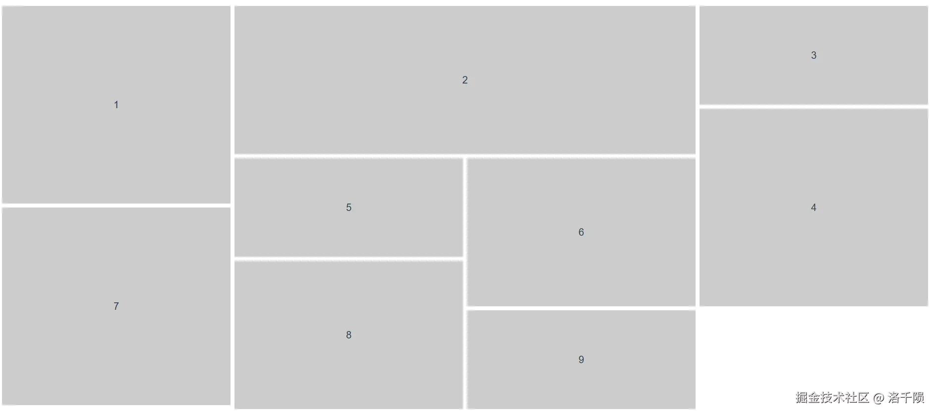
当布局内出现元素高度不一的时候,如果采取惯用的flex布局则会出现下列这种存在大量空白的情况,整个布局就留白显得不够紧凑  这个时候可能就希望下面的元素能够顶上去填补空白,也就类似于下面图中的结构那样,这样的布局可以称之为瀑布流布局
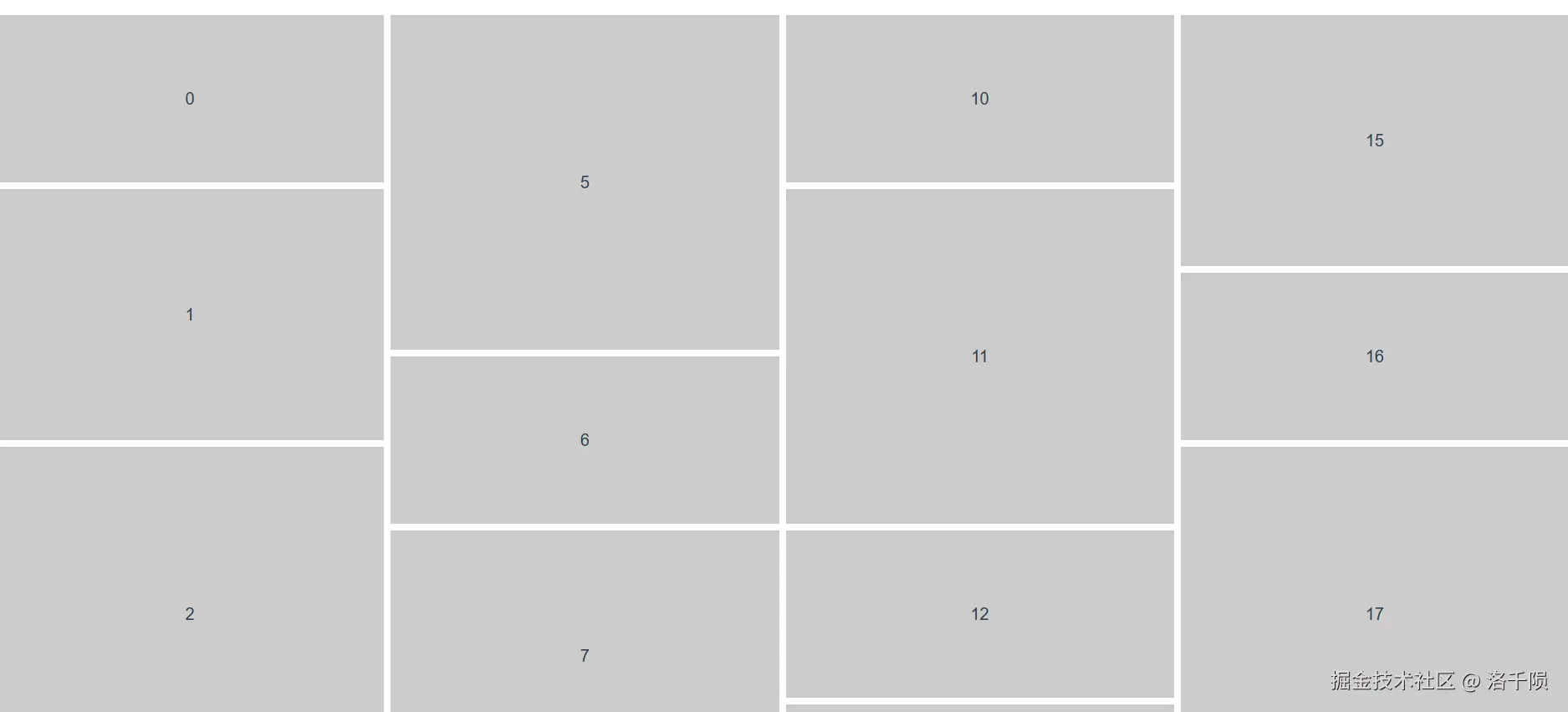
方案比较
在开始描述瀑布流布局的具体实现之前,先总结各种方案的特点,可根据项目中的需要找到对应的方法进行使用。其中推荐grid布局以及masonry-layout
| 方案 | JS逻辑 | 上手难度 | 自上而下 | 从左到右 | 宽度一致 | 触底加载 |
|---|---|---|---|---|---|---|
| 多列布局 | 不需要 | 低 | 支持 | 不支持 | 需要 | 不支持 |
| grid布局 | 需要 | 中等 | 支持 | 支持 | 不需要 | 支持 |
| flex布局 | 需要 | 较低 | 支持 | 支持 | 需要 | 不支持 |
| masonry-layout | 需要 | 中等 | 支持 | 支持 | 不需要 | 支持 |
方案样例展示中元素为普通的div元素,如果元素为图片则需将元素切换为图片。图片需设置对应的宽高等比例放大缩小填充的样式(此处不赘述),与高度宽度计算有关的方案还需读取图片的宽高等
1.多列布局
概述
- 实现方式:多列布局采取的是css样式
columns: 4将容器拆分为对应列数,并将元素平均地放入各列当中。同时各元素要设置break-inside: avoid避免各元素被分割 - 方案特点:该方法能够最为简单地实现瀑布流的效果,但是元素只能从上到下排列
- 实际应用:在实际项目场景中,往往是将前面的元素优先展示,即从左到右的排列方式。若是需要实现触底加载功能时,除了新增元素外原来的很多元素位置也会发生改变。同时各元素宽度若不一致,会存在横向的留白。该方法比较适用于静态限定数量图片的展示
实现
javascript
<template>
    <div class="masonry_1">
      <div class="item" v-for="(item, index) in 20" :key="index">
        {{ index }}
      </div>
    </div>
</template>

<style scoped lang="less">
.masonry_1 {
  width: 100%;
  columns: 4;
  column-gap: 8px;
  .item {
    width: 100%;
    break-inside: avoid;
    margin-bottom: 8px;
    background-color: #ccc;
    display: flex;
    justify-content: center;
    align-items: center;
    font-size: 20px;

    &:nth-child(n) {
      height: 200px;
    }
    &:nth-child(2n) {
      height: 300px;
    }
    &:nth-child(3n) {
      height: 400px;
    }
  }
}
</style>
2.grid布局
概述
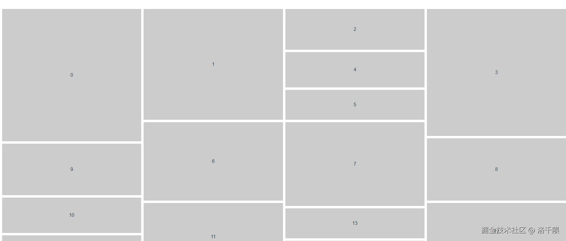
- 实现方式:利用grid布局将容器切割成足够小的网格,各元素的高度均为该网格的倍数,计算各元素的高度并给该元素分配对应的网格即可
- 方案特点:自由度很高,不仅能实现竖向的瀑布流,还能实现横向的瀑布流,只需要按照宽高计算占据的网格,便能在grid布局中填充
- 实际应用:能够适用于大多数的场景,但若元素较多时逐一计算并设置元素样式可能造成卡顿
实现
javascript
<template>
    <div class="masonry_2">
      <div class="item" v-for="(item, index) in 20" :key="index">
        {{ index }}
      </div>
    </div>
</template>

<script>
import { defineComponent, ref, onMounted } from "vue";

export default defineComponent({
  name: "MasonryComponent",
  setup() {
    onMounted(() => {
      // grid布局
      const masonry = document.querySelector(".masonry_2");
      const items = masonry.querySelectorAll(".masonry_2 .item");
      items.forEach((item) => {
        // 模拟高度获取,若为图片可获取图片高度
        const height = Math.floor(Math.random() * 200 + 50);
        // 根据元素高度设置元素的需占行数
        const rows = Math.ceil(height / 10);
        item.style.gridRowStart = `span ${rows}`;
      });
    });

    return {};
  },
});
</script>

<style scoped lang="less">
.masonry_2 {
  display: grid;
  grid-template-columns: repeat(4, 1fr);
  gap: 8px;
  grid-auto-rows: 10px;
  .item {
    background: #ccc;
    display: flex;
    justify-content: center;
    align-items: center;
  }
}
</style>- 需要设置横向的瀑布流时
javascript
<script>
// 计算高度更改为计算宽度即可
const width= Math.floor(Math.random() * 200 + 50);
// 根据元素高度设置元素的需占行数
const columns = Math.ceil(width / 10);
item.style.gridColumnStart = `span ${columns}`;
</script>

<style scoped lang="less">
.masonry_2 {
  display: grid;
  grid-template-rows: repeat(4, 1fr);
  gap: 8px;
  grid-auto-columns: 10px;
  grid-auto-flow: column;
  height: 100vh;
  .item {
    background: #ccc;
    display: flex;
    justify-content: center;
    align-items: center;
  }
}
</style>
3.flex布局
概述
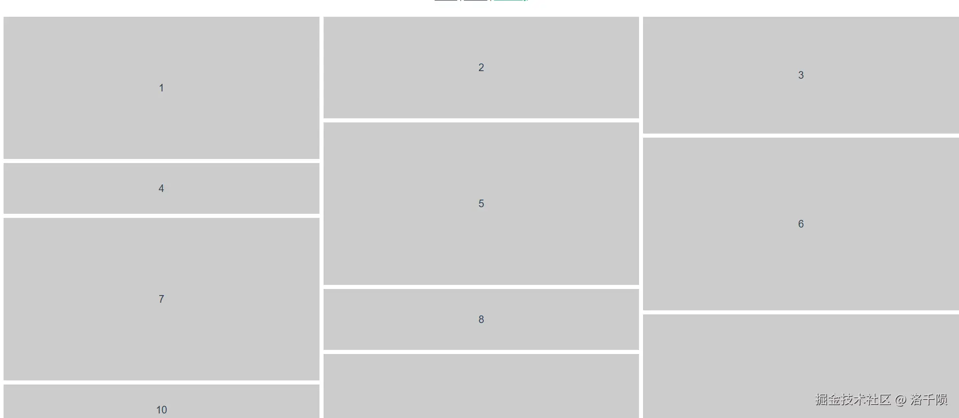
- 实现方式:将数据按照要求分成对应的列数,并按顺序依次放入对应列当中,flex布局中渲染拆分成对应列数的容器,从上到下地排列元素
- 方案特点:使用熟悉的flex布局,手动控制元素的渲染顺序,采用修改布局构造以及手动拆分数据的方式实现瀑布流
- 实际应用:虽然能实现瀑布流的效果,但是仅按照各列元素个数进行平分,并不能智能计算各列的高度对空白进行补充,如下图所示可能出现各列高度相差极大的情况。其他方面的支持情况和多列布局相似

实现
javascript
<template>
    <div class="masonry_3">
      <div class="column column_1">
        <div class="item" v-for="item in column1" :key="item">
          {{ item }}
        </div>
      </div>
      <div class="column column_2">
        <div class="item" v-for="item in column2" :key="item">
          {{ item }}
        </div>
      </div>
      <div class="column column_3">
        <div class="item" v-for="item in column3" :key="item">
          {{ item }}
        </div>
      </div>
    </div>
</template>

<script>
import { defineComponent, ref } from "vue";

export default defineComponent({
  name: "MasonryComponent",
  setup() {
    // felx布局
    const data = ref([
      1, 2, 3, 4, 5, 6, 7, 8, 9, 10, 11, 12, 13, 14, 15, 16, 17, 18, 19, 20,
    ]);
    let column1 = ref([]), //第一列
      column2 = ref([]), //第二列
      column3 = ref([]); //第三列
    let i = 0;
    while (i < data.value.length) {
      column1.value.push(data.value[i++]);
      if (i < data.value.length) {
        column2.value.push(data.value[i++]);
      }
      if (i < data.value.length) {
        column3.value.push(data.value[i++]);
      }
    }

    return {
      column1,
      column2,
      column3,
    };
  },
});
</script>

<style lang="less" scoped>
.masonry_3 {
  display: flex;
  gap: 8px;
  .column {
    display: flex;
    flex-direction: column;
    flex: 1;
    gap: 8px;
    .item {
      width: 100%;
      background-color: #ccc;
      display: flex;
      justify-content: center;
      align-items: center;
      font-size: 20px;
    }
  }
  .column_1 {
    .item {
      &:nth-child(n) {
        height: 280px;
      }
      &:nth-child(2n) {
        height: 100px;
      }
      &:nth-child(3n) {
        height: 320px;
      }
    }
  }
  .column_2 {
    .item {
      &:nth-child(n) {
        height: 200px;
      }
      &:nth-child(2n) {
        height: 320px;
      }
      &:nth-child(3n) {
        height: 120px;
      }
    }
  }
  .column_3 {
    .item {
      &:nth-child(n) {
        height: 230px;
      }
      &:nth-child(2n) {
        height: 340px;
      }
      &:nth-child(3n) {
        height: 400px;
      }
    }
  }
}
</style>
4.masonry-layout
概述
- 实现方式:使用第三方库masonry-layout,内部封装对元素的位置计算实现瀑布流布局
- 方案特点:无需自己做JS计算,若需延展其他功能需学习相应的官方文档
- 实际应用:与grid布局同样能支持大多数场景,但需注意的是各元素的宽度应为参数
columnWidth的倍数,否则会出现留白
实现
javascript
<template>
    <div class="masonry_4">
      <div class="grid-sizer"></div>
      <div class="gutter-sizer"></div>
      <div class="grid-item">1</div>
      <div class="grid-item grid-item-width2">2</div>
      <div class="grid-item">3</div>
      <div class="grid-item">4</div>
      <div class="grid-item">5</div>
      <div class="grid-item">6</div>
      <div class="grid-item">7</div>
      <div class="grid-item">8</div>
      <div class="grid-item">9</div>
    </div>
</template>

<script>
import { defineComponent, reative, onMounted } from "vue";
import Masonry from "masonry-layout";

export default defineComponent({
  name: "MasonryComponent",
  setup() {
    let masonry = reative({})
    onMounted(() => {
      // 第三方库
      masonry = new Masonry(".masonry_4", {
        columnWidth: ".grid-sizer", // 列宽度,未设置时将第一个项的宽度作为列宽度,也支持设置固定宽度
        gutter: ".gutter-sizer", // 添加项元素间的横向间隔,也支持设置固定宽度
        itemSelector: ".grid-item", // 指定将在布局中作为项的子元素
        percentPosition: true, // 将项的位置设为百分比优于设为像素值
        transitionDuration: "0.2s", // 过渡效果持续时间
        stagger: 30, // 项转换位置时为其提供交错效果,用以毫秒为单位的数字
      });
    });
  },
});
</script>

<style scoped lang="less">
.masonry_4 {
  width: 100%;
  height: 100%;
  position: relative;
  .grid-sizer {
    width: calc(25% - 12px);
  }
  .gutter-sizer {
    width: 8px;
  }
  .grid-item {
    width: calc(25% - 12px);
    margin-bottom: 8px;
    display: flex;
    justify-content: center;
    align-items: center;
    font-size: 20px;
    background-color: #ccc;
    &:nth-child(n) {
      height: 200px;
    }
    &:nth-child(2n) {
      height: 300px;
    }
    &:nth-child(3n) {
      height: 400px;
    }
  }
  .grid-item-width2 {
    width: calc(50% - 16px);
    height: 300px;
  }
}
</style>- 当渲染的是图片时
javascript
import imagesLoaded from 'imagesLoaded'

// 当内部存在图片时,等待图片加载完全再进行排列,否则可能出现项堆叠的情况
imagesLoaded('.masonry_4', () => {
    new Masonry('.masonry_4', {
      columnWidth: '.grid-sizer', // 列宽度,未设置时将第一个项的宽度作为列宽度,也支持设置固定宽度
      gutter: '.gutter-sizer', // 添加项元素间的横向间隔,也支持设置固定宽度
      itemSelector: '.grid-item', // 指定将在布局中作为项的子元素
      percentPosition: true, // 将项的位置设为百分比优于设为像素值
      transitionDuration: '0.2s', // 过渡效果持续时间
      stagger: 30 // 项转换位置时为其提供交错效果,用以毫秒为单位的数字
    })
})- 触底加载更多时
javascript
// 加载更多元素后重载各元素并重新布局
masonry.reloadItems()
masonry.layout()