1、uview-plus官网地址,有详细介绍,感兴趣的可以深入了解学习
介绍 | uview-plus - 全面兼容nvue/鸿蒙/uni-app-x的uni-app生态框架 - uni-app UI框架
2、Hbuilder X 方式安装下载引入uview-plus
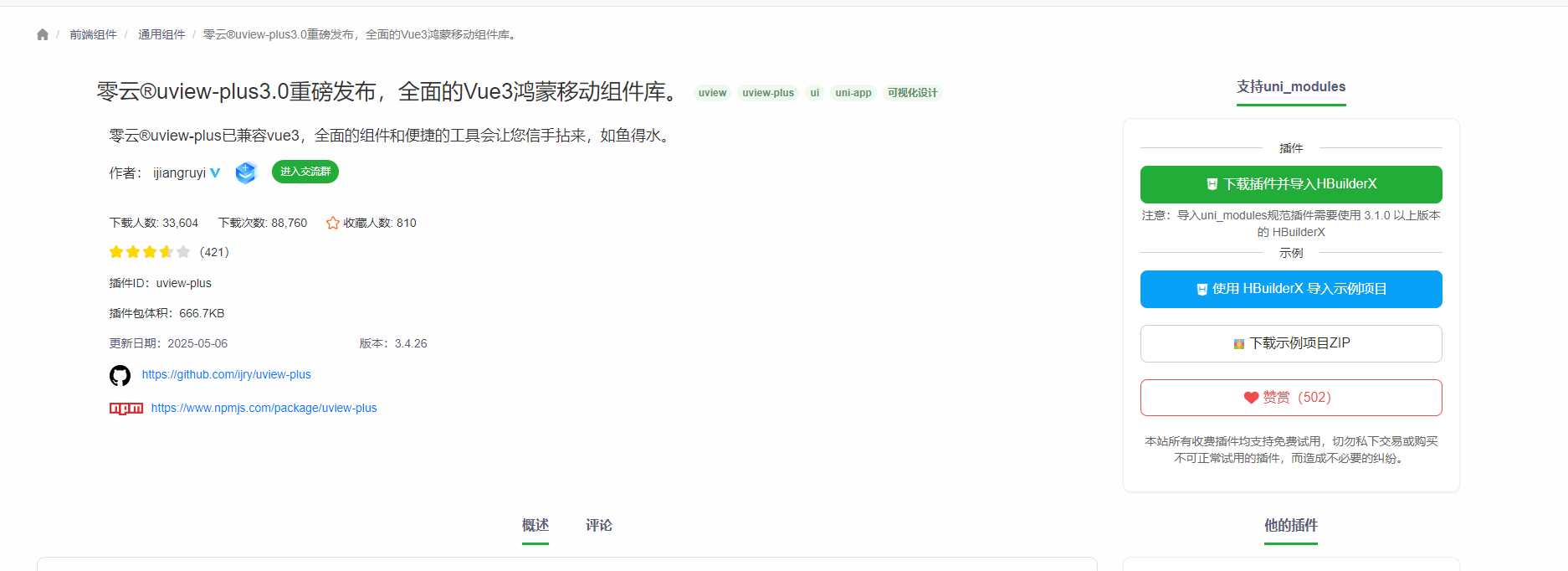
①进入该网址,点击 下载插件并导入Hbuilder X
(注意:需要登录账号才可以下载,第一次使用需要按步骤注册账号)
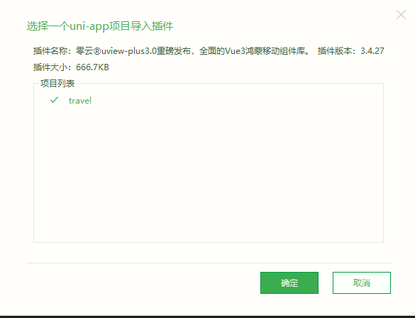
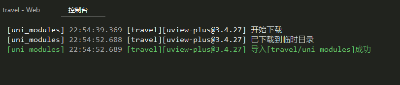
②勾选上自己的项目,就会开始下载,直到提示下载成功
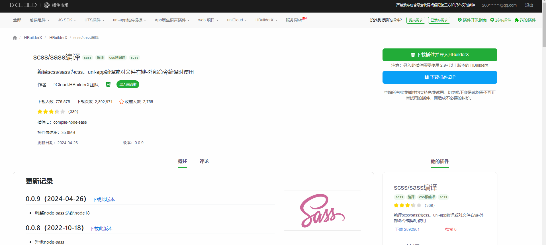
3、配置文件
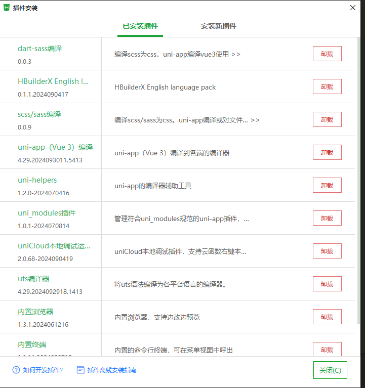
①由HBuilder X创建的项目,已经安装scss插件【有了直接跳过②】
如图所示:第三行scss/sass编译
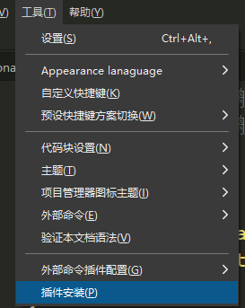
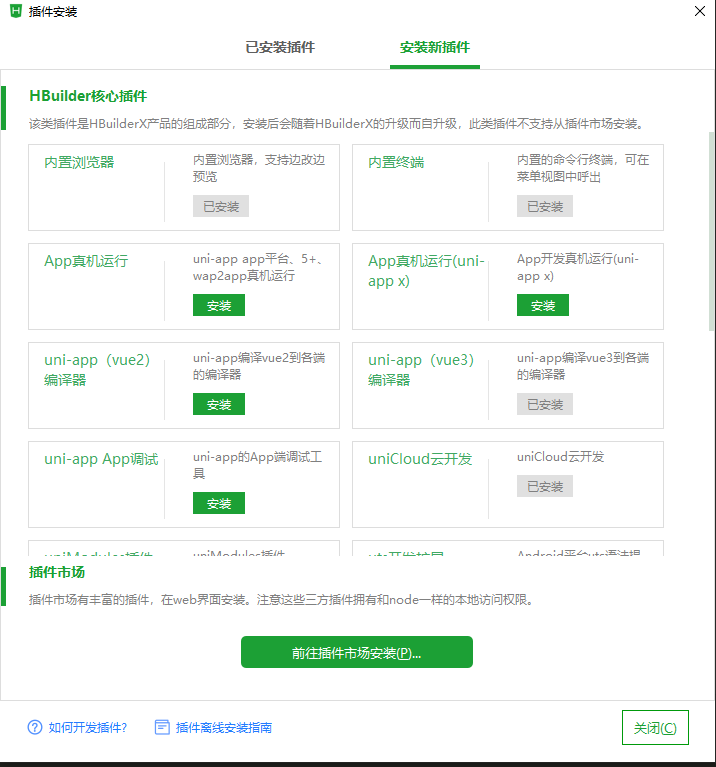
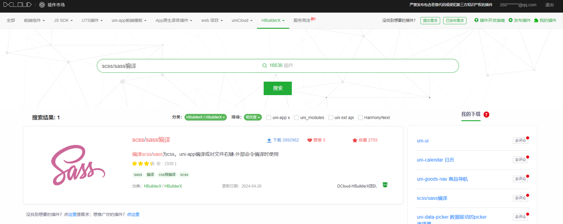
②如果没有 ,请按图的步骤一步一步来安装,顶部菜单----->工具---->插件安装----->安装新插件----->前往插件市场安装(会跳转到dcloud插件市场)----->文字搜索:scss/sass编译---->点击进详情----->点击 下载插件并导入Hbuilder X ---->右下角会有下载弹窗----->下载完成之后重启软件
再进行:顶部菜单----->工具---->插件安装,就会看到已经安装好的scss/sass编译
③安装依赖(如果最后还没有效果,可以重新安装这两个依赖)
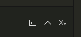
点击这里的第一个图标,打开命令行
npm i dayjs

npm i clipboard
④再pages.json中添加代码来配置easycom组件模式
需要添加的代码,放在pages前边,或者后边,看你需要,别忘记逗号分隔
"easycom": {
		"autoscan": true,
		// 注意一定要放在custom里,否则无效,https://ask.dcloud.net.cn/question/131175
		"custom": {
			"^u--(.*)": "@/uni_modules/uview-plus/components/u-$1/u-$1.vue",
			"^up-(.*)": "@/uni_modules/uview-plus/components/u-$1/u-$1.vue",
	    "^u-([^-].*)": "@/uni_modules/uview-plus/components/u-$1/u-$1.vue"
		}
	},
pages.json完整代码
{
"easycom": {
"autoscan": true,
// 注意一定要放在custom里,否则无效,https://ask.dcloud.net.cn/question/131175
"custom": {
"^u--(.*)": "@/uni_modules/uview-plus/components/u-$1/u-$1.vue",
"^up-(.*)": "@/uni_modules/uview-plus/components/u-$1/u-$1.vue",
"^u-([^-].*)": "@/uni_modules/uview-plus/components/u-$1/u-$1.vue"
}
},
"pages": [ //pages数组中第一项表示应用启动页,参考:https://uniapp.dcloud.io/collocation/pages
{
// 页面路径
"path": "pages/index/index",
"style": {
// 页面标题
"navigationBarTitleText": "首页"
}
},
{
// 页面路径
"path": "pages/favourite/favourite",
"style": {
// 页面标题
"navigationBarTitleText": "我的收藏"
}
},
{
// 页面路径
"path": "pages/personal_center/personal_center",
"style": {
// 页面标题
"navigationBarTitleText": "个人中心"
}
}
],
// 底部导航tabBar
"tabBar": {
// 所有底部导航文字颜色
"color": "#8183ff",
// 所有底部导航文字选中后的颜色
"selectedColor": "#0901ff",
// 所有底部导航背景色颜色
"backgroundColor": "#fff",
// 底部导航列表
"list": [
// 第一个导航:
// text:底部导航文本,
// pagePath:底部导航链接路径,例如如果是favourte页面路径,那么点击就会跳转到我的收藏页面
// iconPath:底部导航图标,这里是uniapp默认的
{
"text": "首页",
"pagePath": "pages/index/index",
"iconPath": "static/logo.png"
},
{
"text": "我的收藏",
"pagePath": "pages/favourite/favourite",
"iconPath": "static/logo.png"
},
{
"text": "个人中心",
"pagePath": "pages/personal_center/personal_center",
"iconPath": "static/logo.png"
}
]
},
"globalStyle": {
"navigationBarTextStyle": "black",
"navigationBarTitleText": "uni-app",
"navigationBarBackgroundColor": "#F8F8F8",
"backgroundColor": "#F8F8F8"
},
"uniIdRouter": {}
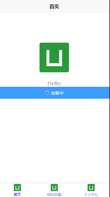
}4、在pages/inde/index.vue页面中,测试并使用uview-plus的组件:加载中按钮组件
在index.vue中测试使用一个组件:例如【加载按钮】
<up-button type="primary" loading loadingText="加载中"></up-button>官网组件介绍,自己想试试其他的也可以
 http://uview-plus.jiangruyi.com/components/button.html
①index.vue完整代码
javascript
<template>
	<view class="content">
		<image class="logo" src="/static/logo.png"></image>
		<view class="text-area">
			<text class="title">{{title}}</text>
		</view>
		<up-button type="primary" loading loadingText="加载中"></up-button>
	</view>
</template>

<script>
	export default {
		data() {
			return {
				title: 'Hello'
			}
		},
		onLoad() {

		},
		methods: {

		}
	}
</script>

<style>
	.content {
		display: flex;
		flex-direction: column;
		align-items: center;
		justify-content: center;
	}

	.logo {
		height: 200rpx;
		width: 200rpx;
		margin-top: 200rpx;
		margin-left: auto;
		margin-right: auto;
		margin-bottom: 50rpx;
	}

	.text-area {
		display: flex;
		justify-content: center;
	}

	.title {
		font-size: 36rpx;
		color: #8f8f94;
	}
</style>
②运行并预览效果