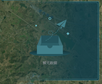
大屏中常有渐变色圆角边框,图片会变形,直角边框可以直接使用border-image实现渐变色,圆角边框是不支持的,需要使用mask实现,结果如图:
实现代码如下:
javascript
<template>
  <div class="screen-item-right">
    <div class="screen-item-right-content">
      <slot></slot>
    </div>
  </div>
</template>

<style style="scss" scoped>
.screen-item-right {
  position: relative;
  background: #ffffff00;
  padding: 5px;
  height: 100%;
  width: 100%;
  background: linear-gradient(270deg, rgba(14, 60, 74, 0.8) 20.45%, rgba(14, 60, 74, 0) 88.954%);
  border-radius: 6px;
  .screen-item-right-content {
    position: relative;
    height: 100%;
    width: 100%;
    padding: 10px;
    z-index: -1;
    &::after {
      --mask-bg: linear-gradient(red, red);
      --mask-clip: content-box, padding-box;
      content: '';
      position: absolute;
      top: 0;
      left: 0;
      width: 100%;
      height: 100%;
      border-radius: 6px;
      padding: 1px 1px 1px 0px;
      background: linear-gradient(270deg, #5cadbc99 20.45%, rgba(14, 60, 74, 0) 88.954%);
      mask-composite: exclude;
      mask-clip: var(--mask-clip);
      mask-image: var(--mask-bg), var(--mask-bg);
      -webkit-mask-image: var(--mask-bg), var(--mask-bg);
      -webkit-mask-clip: var(--mask-clip);
      -webkit-mask-composite: destination-out;
    }
  }
  &::after {
    --mask-bg: linear-gradient(red, red);
    --mask-clip: content-box, padding-box;
    content: '';
    position: absolute;
    top: 0;
    left: 0;
    width: 100%;
    height: 100%;
    border-radius: 6px;
    padding: 1px 1px 1px 0px;
    background: linear-gradient(270deg, #5cadbc 20.45%, rgba(14, 60, 74, 0) 88.954%);
    mask-composite: exclude;
    mask-clip: var(--mask-clip);
    mask-image: var(--mask-bg), var(--mask-bg);
    -webkit-mask-image: var(--mask-bg), var(--mask-bg);
    -webkit-mask-clip: var(--mask-clip);
    -webkit-mask-composite: destination-out;
  }
}
</style>mask用法参考mask - CSS:层叠样式表 | MDN