前端布局完全指南:从浮动到Grid的全面解析
精通布局技术是前端开发的核心能力,也是面试中的必考内容
一、前端布局技术演进史
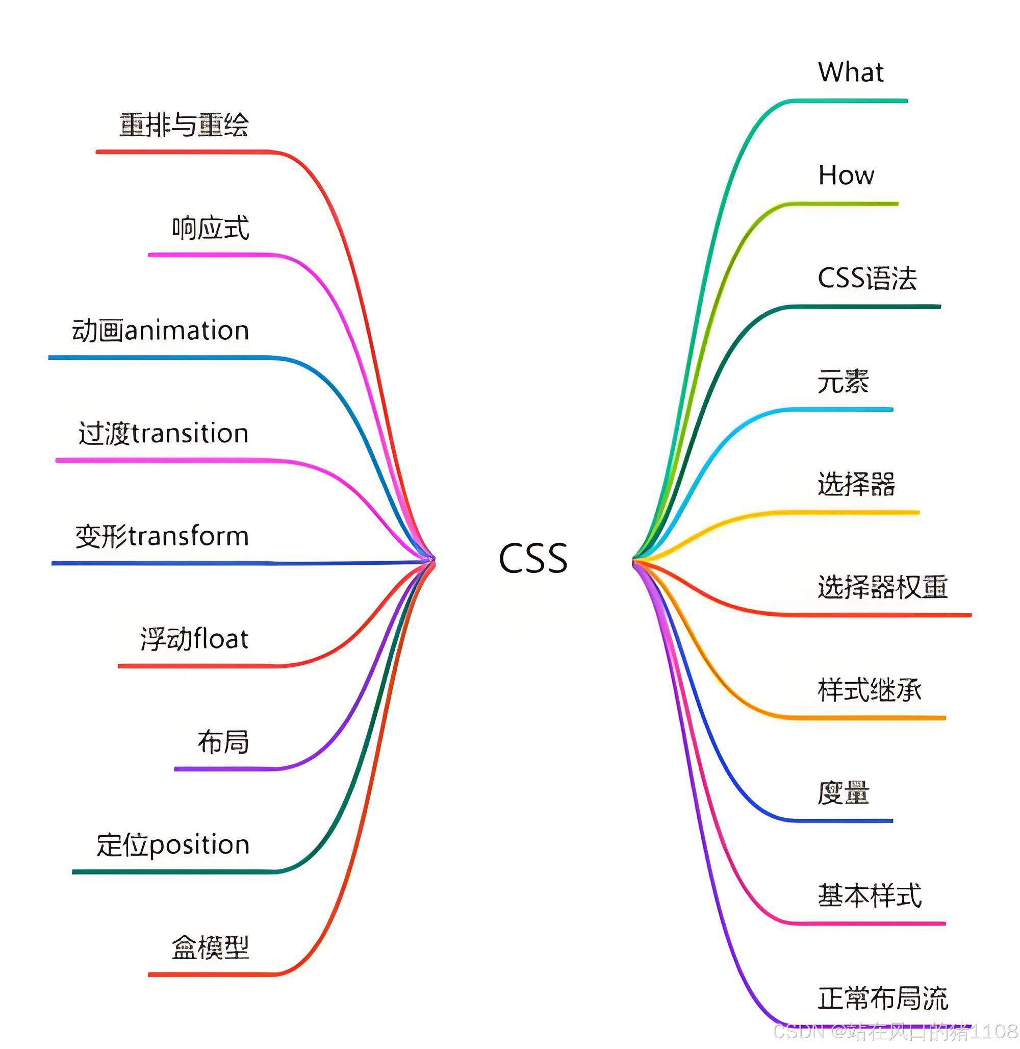
图:CSS布局可能所需技术
前端布局技术经历了从简单到复杂、从固定到响应式的演变过程:
- 表格布局时代(1990s):使用HTML表格实现页面布局
- 定位与浮动时代(2000s):position和float成为主流
- Flexbox时代(2012+):一维布局的革命
- Grid布局时代(2017+):二维布局的终极解决方案
二、传统布局技术详解
1. 表格布局(已淘汰)
html
<table>
  <tr>
    <td>左侧</td>
    <td>中间</td>
    <td>右侧</td>
  </tr>
</table>缺点:
- 语义错误(表格用于展示数据而非布局)
- 代码冗余
- 响应式困难
- 渲染性能差
2. 浮动布局(Float Layout)
核心原理:
- 元素浮动后脱离文档流
- 其他元素环绕排列
- 需要清除浮动避免布局错乱
示例:三栏浮动布局
html
<div class="container">
  <div class="left">左侧</div>
  <div class="right">右侧</div>
  <div class="main">主内容</div>
</div>
css
.container {
  overflow: hidden; /* 触发BFC清除浮动 */
}

.left {
  float: left;
  width: 200px;
  background: #f0f0f0;
}

.right {
  float: right;
  width: 250px;
  background: #e0e0e0;
}

.main {
  margin: 0 260px 0 210px; /* 左右留出空间 */
  background: #fff;
}清除浮动技巧:
css
/* 现代clearfix */
.container::after {
  content: "";
  display: table;
  clear: both;
}

/* 空div法 */
.clear {
  clear: both;
}

/* BFC容器 */
.container {
  overflow: auto;
  display: flow-root;
}
3. 定位布局(Position Layout)
核心属性:
css
position: static | relative | absolute | fixed | sticky
top | right | bottom | left
z-index
示例:居中弹窗
css
.modal {
  position: fixed;
  top: 50%;
  left: 50%;
  transform: translate(-50%, -50%);
  width: 600px;
  max-width: 90vw;
  z-index: 1000;
}
三、现代布局技术:Flexbox
1. Flex布局基础概念
Flexbox主轴(Main Axis)与交叉轴(Cross Axis)示意图
+----------------------- Flex容器 (display: flex) -----------------------+
| 主轴方向(flex-direction) →  row (默认) / row-reverse / column / column-reverse  |
|                                                                       |
|  +---------+   +---------+   +---------+                              |
|  | 项目1   |   | 项目2   |   | 项目3   |  ← 项目沿主轴排列                |
|  +---------+   +---------+   +---------+                              |
|                                                                       |
|  主轴起点(main-start) →                               ← 主轴终点(main-end)  |
|                                                                       |
|  交叉轴起点(cross-start)                                            |
|  ↓                                                                   |
|  交叉轴方向(垂直于主轴)                                               |
|  ↑                                                                   |
|  交叉轴终点(cross-end)                                              |
+-----------------------------------------------------------------------+核心属性:
css
/* 容器属性 */
display: flex | inline-flex
flex-direction: row | column | row-reverse | column-reverse
flex-wrap: nowrap | wrap | wrap-reverse
justify-content: flex-start | center | space-between | space-around | space-evenly
align-items: stretch | flex-start | center | flex-end | baseline
align-content: 多行对齐

/* 项目属性 */
order: 排序
flex-grow: 放大比例
flex-shrink: 收缩比例
flex-basis: 初始尺寸
flex: 简写 (grow shrink basis)
align-self: 单独对齐
2. Flex布局实战示例
导航栏布局:
html
<nav class="navbar">
  <div class="logo">Logo</div>
  <ul class="menu">
    <li>首页</li>
    <li>产品</li>
    <li>关于</li>
  </ul>
  <div class="user">登录</div>
</nav>
css
.navbar {
  display: flex;
  justify-content: space-between;
  align-items: center;
  padding: 1rem;
  background: #f8f9fa;
}

.menu {
  display: flex;
  gap: 1.5rem;
  list-style: none;
}

@media (max-width: 768px) {
  .navbar {
    flex-direction: column;
    gap: 1rem;
  }
}圣杯布局(Flex实现):
html
<div class="holy-grail">
  <header>头部</header>
  <div class="container">
    <main>主内容</main>
    <aside class="left">左侧</aside>
    <aside class="right">右侧</aside>
  </div>
  <footer>底部</footer>
</div>
css
.holy-grail {
  min-height: 100vh;
  display: flex;
  flex-direction: column;
}

.container {
  flex: 1;
  display: flex;
}

main {
  flex: 1;
  order: 2;
}

.left {
  width: 200px;
  order: 1;
}

.right {
  width: 250px;
  order: 3;
}

footer {
  margin-top: auto;
}
四、现代布局技术:Grid
1. Grid布局核心概念
CSS Grid 行(Rows)、列(Columns)与区域(Areas)示意图
+----------------------- Grid容器 (display: grid) -----------------------+
|                                                                       |
|  列线(column lines):  1      2      3      4                        |
|                      +------+------+------+------+                   |
|  行线(row lines): 1 |  A   |  B   |  B   |  C   | ← 命名区域          |
|                      +------+------+------+------+                   |
|                    2 |  D   |  E   |  E   |  F   |                   |
|                      +------+------+------+------+                   |
|                    3 |  G   |  H   |  H   |  I   |                   |
|                      +------+------+------+------+                   |
|                                                                       |
|  隐式网格轨道(自动填充)                                               |
+-----------------------------------------------------------------------+核心属性:
css
/* 容器属性 */
display: grid | inline-grid
grid-template-columns: 定义列
grid-template-rows: 定义行
grid-template-areas: 区域命名
grid-gap / gap: 间距
justify-items: 水平对齐项目
align-items: 垂直对齐项目
justify-content: 整个网格水平对齐
align-content: 整个网格垂直对齐

/* 项目属性 */
grid-column: 列位置
grid-row: 行位置
grid-area: 区域位置
justify-self: 单个项目水平对齐
align-self: 单个项目垂直对齐
2. Grid布局实战示例
响应式网格系统:
css
.container {
  display: grid;
  grid-template-columns: repeat(auto-fill, minmax(250px, 1fr));
  gap: 20px;
}

.card {
  background: white;
  border-radius: 8px;
  box-shadow: 0 2px 10px rgba(0,0,0,0.1);
  padding: 20px;
}双飞翼布局(Grid实现):
html
<div class="double-wings">
  <header>头部</header>
  <div class="container">
    <main>主内容</main>
    <aside>左侧</aside>
    <aside>右侧</aside>
  </div>
  <footer>底部</footer>
</div>
css
.double-wings {
  min-height: 100vh;
  display: grid;
  grid-template-rows: auto 1fr auto;
}

.container {
  display: grid;
  grid-template-columns: 200px 1fr 250px;
}

@media (max-width: 768px) {
  .container {
    grid-template-columns: 1fr;
    grid-template-rows: auto 1fr auto;
  }

  aside {
    order: -1; /* 移动端将侧边栏放在主内容前 */
  }
}
五、经典布局方案解析
1. 圣杯布局(Holy Grail Layout)
特点:
- 三栏布局
- 中间列优先渲染(HTML中先写)
- 两侧宽度固定,中间自适应
- 等高列
实现代码:
html
<div class="holy-grail">
  <header>头部</header>
  <div class="container">
    <div class="center">主内容</div>
    <div class="left">左侧</div>
    <div class="right">右侧</div>
  </div>
  <footer>底部</footer>
</div>
css
.holy-grail {
  min-height: 100vh;
}

.container {
  padding: 0 250px 0 200px; /* 为左右栏预留空间 */
  overflow: hidden;
}

.center {
  float: left;
  width: 100%;
}

.left {
  float: left;
  width: 200px;
  margin-left: -100%;
  position: relative;
  left: -200px;
}

.right {
  float: left;
  width: 250px;
  margin-left: -250px;
  position: relative;
  right: -250px;
}

footer {
  clear: both;
}
2. 双飞翼布局(Double Flying Wings Layout)
特点:
- 圣杯布局的改进版
- 减少相对定位使用
- 中间内容需嵌套一层div
实现代码:
html
<div class="double-wings">
  <div class="container">
    <div class="main">
      <div class="content">主内容</div>
    </div>
    <div class="left">左侧</div>
    <div class="right">右侧</div>
  </div>
</div>
css
.container {
  overflow: hidden;
}

.main {
  float: left;
  width: 100%;
}

.content {
  margin: 0 250px 0 200px; /* 左右留出空间 */
}

.left {
  float: left;
  width: 200px;
  margin-left: -100%; /* 移动到主内容左侧 */
}

.right {
  float: left;
  width: 250px;
  margin-left: -250px; /* 移动到主内容右侧 */
}
六、响应式布局策略
1. 媒体查询(Media Queries)
css
.container {
  display: grid;
  grid-template-columns: 1fr 1fr;
}

@media (max-width: 768px) {
  .container {
    grid-template-columns: 1fr;
  }
}
2. 流式布局(Fluid Layout)
css
.container {
  width: 90%;
  max-width: 1200px;
  margin: 0 auto;
}

.column {
  float: left;
  width: 31.33%; /* 响应式宽度 */
  margin: 0 1%;
}
3. 响应式单位
css
.container {
  padding: 2rem clamp(1rem, 5vw, 3rem);
}

.title {
  font-size: clamp(1.5rem, 4vw, 2.5rem);
}
4. 响应式图片
html
<picture>
  <source media="(min-width: 1200px)" srcset="large.jpg">
  <source media="(min-width: 768px)" srcset="medium.jpg">
  <img src="small.jpg" alt="响应式图片">
</picture>
七、布局技术对比分析
| 特性 | Float | Position | Flexbox | Grid |
|---|---|---|---|---|
| 维度 | 一维 | 一维 | 一维 | 二维 |
| 响应式 | 困难 | 中等 | 优秀 | 优秀 |
| 学习曲线 | 中等 | 中等 | 简单 | 中等 |
| 兼容性 | 优秀 | 优秀 | IE10+ | IE11+ |
| 内容流 | 破坏 | 破坏 | 保留 | 保留 |
| 适用场景 | 简单布局 | 精确定位 | 组件布局 | 复杂布局 |
八、经典面试题解析
1. 实现垂直居中的5种方式
css
/* 1. Flexbox */
.container {
  display: flex;
  align-items: center;
  justify-content: center;
}

/* 2. Grid */
.container {
  display: grid;
  place-items: center;
}

/* 3. 绝对定位 */
.container {
  position: relative;
}

.child {
  position: absolute;
  top: 50%;
  left: 50%;
  transform: translate(-50%, -50%);
}

/* 4. 表格布局 */
.container {
  display: table;
}

.child {
  display: table-cell;
  vertical-align: middle;
}

/* 5. line-height */
.container {
  height: 300px;
  line-height: 300px;
}

.child {
  display: inline-block;
  vertical-align: middle;
  line-height: normal;
}
2. Flex布局中flex: 1的含义
答案 :flex: 1 是 flex: 1 1 0% 的简写,表示:
- flex-grow: 1(可放大)
- flex-shrink: 1(可缩小)
- flex-basis: 0%(初始尺寸为0)
3. Grid布局中fr单位是什么?
答案:fr是分数单位(fraction unit),表示网格容器中的可用空间比例。例如:
css
grid-template-columns: 1fr 2fr;表示第二列宽度是第一列的两倍。
4. 清除浮动的方法有哪些?
- 空div法:
<div style="clear:both"></div> - overflow法:
overflow: hidden/auto - 伪元素法:
.clearfix::after { content: ""; display: table; clear: both } - 新的display值:
display: flow-root
5. 如何实现左侧固定200px,右侧自适应的布局?
css
/* Flex方案 */
.container {
  display: flex;
}

.left {
  width: 200px;
  flex-shrink: 0;
}

.right {
  flex: 1;
}

/* Grid方案 */
.container {
  display: grid;
  grid-template-columns: 200px 1fr;
}

/* Float方案 */
.left {
  float: left;
  width: 200px;
}

.right {
  margin-left: 200px;
}
九、布局最佳实践
- 移动优先:从小屏幕开始设计,逐步增强
- 渐进增强:为旧浏览器提供基础布局,为新浏览器增强
- 语义化HTML:使用正确的标签描述内容
- 性能优化:避免过度嵌套和复杂选择器
- 布局系统化:建立设计系统,统一布局规范
- 工具利用:使用CSS预处理器和PostCSS增强功能
十、未来布局技术展望
1. 容器查询(Container Queries)
css
.component {
  container-type: inline-size;
}

@container (min-width: 400px) {
  .component {
    display: flex;
    gap: 1rem;
  }
}
2. 子网格(Subgrid)
css
.grid {
  display: grid;
  grid-template-columns: 1fr 1fr;
}

.item {
  display: grid;
  grid-template-columns: subgrid; /* 继承父网格 */
}
3. 层叠上下文(@layer)
css
@layer base, layout, components;

@layer layout {
  .container {
    display: grid;
  }
}
总结
前端布局技术从简单的表格布局发展到如今的Flexbox和Grid,为开发者提供了强大的布局能力。理解不同布局技术的适用场景和优缺点,能够帮助我们在实际项目中做出最佳选择:
- 简单组件布局:优先使用Flexbox
- 复杂页面结构:使用Grid布局
- 传统项目维护:掌握浮动和定位技术
- 经典布局方案:理解圣杯和双飞翼布局原理
- 响应式设计:结合媒体查询和现代CSS特性
布局技术的选择没有绝对的对错,只有是否适合当前场景。掌握多种布局技术,根据项目需求灵活运用,才是前端开发者的核心竞争力。