先来看效果:
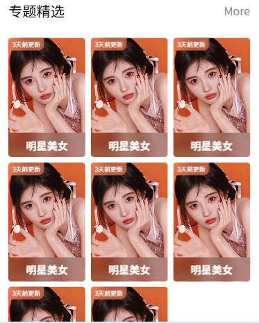
效果图中呈三行排版,前2行每行3张图片,最后一行2张图片。每张图片顶部和底部都有一些文字,文字又有磨砂效果的背景样式。
下面介绍实现过程:
1.创建一个公共组件:theme-item,写入下面的代码:
html
<template>
	<view class="themeItem">
		<navigator url="" class="box">
			<image class="pic" src="/common/images/classify1.jpg" mode="aspectFill"></image>
			<view class="tab">
				3天前更新
			</view>
			<view class="mask">
				明星美女
			</view>
		</navigator>
	</view>
</template>
CSS样式:
css
<style lang="scss" scoped>
   .themeItem{
	   .box{
		   height: 340rpx;
		   border-radius: 10rpx;
		   overflow: hidden;
		   position: relative;
		   .pic{
			   width: 100%;
			   height: 100%;
		   }
		   .mask{
			   width: 100%;
			   height: 70rpx;
			   position: absolute;
			   bottom: 0;
			   left: 0;
			   background: rgba(0, 0, 0, 0.2);
			   color: #fff;
			   display: flex;
			   align-items: center;
			   justify-content: center;
			   backdrop-filter: blur(20rpx);
			   font-weight: 600;
			   font-size: 30rpx;
		   }
		   .tab{
			   position: absolute;
			   left:0;
			   top:0;
			   background: rgba(250,129,90,0.7);
			   color: #fff;
			   backdrop-filter: blur(20rpx);
			   font-size: 22rpx;
			   padding: 6rpx 14rpx;
			   border-radius: 0 0 20rpx 0;
			   transform: scale(0.8);
			   transform-origin: left top;
		   }
	   }
   }
</style>
CSS代码说明:
- 整体结构
外层容器 .themeItem:作为样式的作用域容器
- 主盒子 .box:
固定高度 340rpx(rpx 是响应式单位)
圆角 10rpx
overflow: hidden 确保内容不超出边界
相对定位(为内部绝对定位元素提供基准)
- 内部元素
1 图片.pic:
宽高 100% 填满父容器
显示为裁剪适应的图片
2 底部遮罩层 .mask:
绝对定位在底部
高度 70rpx,宽度 100%
半透明黑色背景 (rgba(0,0,0,0.2))
白色文字,字体加粗 (font-weight: 600),字号 30rpx
磨砂效果 (backdrop-filter: blur(20rpx))
使用 flex 布局使内容水平垂直居中
3 左上角标签 .tab:
绝对定位在左上角
橙红色半透明背景 (rgba(250,129,90,0.7))
白色文字,较小字号 (22rpx)
右下角圆角 (border-radius: 0 0 20rpx 0)
缩放 80% (transform: scale(0.8)) 并保持左上角不动
同样有磨砂效果
2.在主页面中引入theme-item组件:
html
<view class="content">
	<theme-item v-for="item in 8"></theme-item>
</view>
CSS样式:
css
.content{
		margin-top: 50rpx;
		padding: 0 30rpx;
		display: grid;
		gap:15rpx;
		grid-template-columns: repeat(3,1fr);
	}
上面的代码引入grid进行排版布局:
网格布局 display: grid
启用 CSS Grid 布局系统
列定义 grid-template-columns: repeat(3, 1fr)
创建 3 列等宽 的网格
1fr 表示每列平均分配可用空间
间隙控制 gap: 15rpx
网格项之间的行/列间隙均为 15rpx
(比传统的 grid-gap 更简洁的写法)