📅 我们继续 50 个小项目挑战!------ AnimatedNavigation组件
仓库地址:https://github.com/SunACong/50-vue-projects
项目预览地址:https://50-vue-projects.vercel.app/
在本篇文章中,我们将使用 Vue 3 的 <script setup> 语法和 TailwindCSS 构建一个具有优雅折叠动画效果的响应式导航栏。该导航栏支持点击按钮切换展开与收起状态,并为菜单项添加了过渡动画。
🎯 组件目标
- 创建一个可交互的导航栏。
- 支持点击按钮展开/收起菜单。
- 菜单项具备入场动画效果。
- 使用 TailwindCSS 快速构建现代 UI 界面。
- 添加背景色块提升整体视觉层次感。
⚙️ 技术实现点
| 技术点 | 描述 |
|---|---|
Vue 3 Composition API (<script setup>) |
使用响应式变量管理组件状态 |
ref 和 toggle 方法 |
控制导航栏展开/收起状态 |
v-for 渲染菜单项 |
动态生成多个导航链接 |
:class 动态绑定类名 |
根据状态切换样式 |
transition 动画类 |
使用 TailwindCSS 实现平滑过渡 |
| 自定义 CSS 动画 | 增强菜单项的出场/入场效果 |
🧱 组件实现
模板结构 <template>
html
<template>
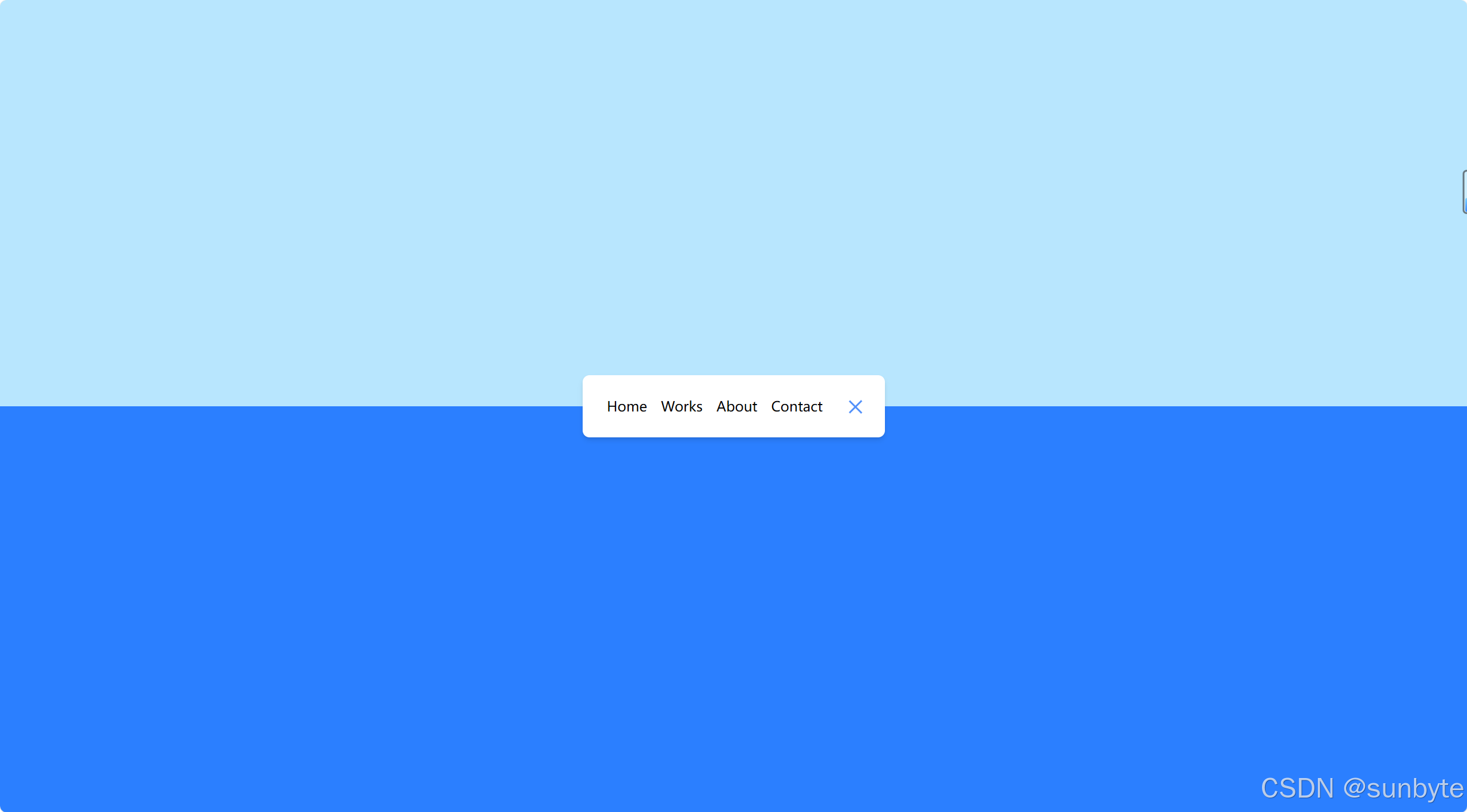
<div class="relative min-h-screen overflow-hidden">
<!-- 上半部分背景 -->
<div class="absolute top-0 left-0 z-0 h-1/2 w-full bg-sky-200"></div>
<!-- 下半部分背景 -->
<div class="absolute bottom-0 left-0 z-0 h-1/2 w-full bg-blue-500"></div>
<!-- 主体内容 -->
<div class="relative z-10 flex min-h-screen items-center justify-center">
<nav
:class="[
'flex items-center justify-between overflow-hidden rounded-md bg-white p-5 shadow-md transition-all duration-500',
isActive ? 'w-[350px]' : 'w-[80px]',
]">
<ul
:class="[
'flex overflow-hidden transition-all duration-500',
isActive ? 'w-full' : 'w-0',
]">
<li
v-for="(item, index) in menuItems"
:key="index"
:class="[
'transform transition-all duration-500',
isActive ? 'rotate-[360deg] opacity-100' : 'rotate-0 opacity-0',
]">
<a href="#" class="mx-2 whitespace-nowrap text-black">{{ item }}</a>
</li>
</ul>
<button class="relative h-8 w-8" @click="toggleNav">
<span
:class="[
'absolute top-[10px] left-[5px] h-[2px] w-5 bg-[#5290f9] transition-transform duration-500',
isActive ? 'translate-y-[5.5px] rotate-[-765deg]' : '',
]"></span>
<span
:class="[
'absolute bottom-[9px] left-[5px] h-[2px] w-5 bg-[#5290f9] transition-transform duration-500',
isActive ? '-translate-y-[5.5px] rotate-[765deg]' : '',
]"></span>
</button>
</nav>
</div>
</div>
</template>脚本逻辑 <script setup>
js
<script setup>
import { ref } from 'vue'

const isActive = ref(true)

const toggleNav = () => {
    isActive.value = !isActive.value
}

const menuItems = ['Home', 'Works', 'About', 'Contact']
</script>
样式增强 <style scoped>
css
<style scoped>
li {
    transition:
        transform 0.6s,
        opacity 0.6s;
}
</style>
🔍 重点效果实现
✅ 导航栏展开与收起
我们通过 isActive 响应式变量控制导航栏宽度:
js
const isActive = ref(true)
const toggleNav = () => {
    isActive.value = !isActive.value
}
并结合 Tailwind 的 transition-all duration-500 类实现平滑的宽度变化动画。
🎭 菜单项动画展示
当导航栏处于展开状态时,菜单项会从隐藏状态旋转并显示出来:
html
<li
    :class="[
        'transform transition-all duration-500',
        isActive ? 'rotate-[360deg] opacity-100' : 'rotate-0 opacity-0',
    ]">
💡 自定义按钮动画
按钮由两个 <span> 构成,代表"汉堡图标"。通过 translate 和 rotate 实现点击后变为"X"的动画效果:
html
<span
    :class="[
        'absolute top-[10px] left-[5px] h-[2px] w-5 bg-[#5290f9] transition-transform duration-500',
        isActive ? 'translate-y-[5.5px] rotate-[-765deg]' : '',
    ]"></span>
<span
    :class="[
        'absolute bottom-[9px] left-[5px] h-[2px] w-5 bg-[#5290f9] transition-transform duration-500',
        isActive ? '-translate-y-[5.5px] rotate-[765deg]' : '',
    ]"></span>
🎨 TailwindCSS 样式重点讲解
| 类名 | 作用 |
|---|---|
min-h-screen |
最小高度为视口全高 |
overflow-hidden |
隐藏超出容器的内容 |
relative, absolute |
定位背景层和导航栏 |
z-0, z-10 |
设置层级关系,确保导航栏在最上层 |
flex, items-center, justify-center |
居中布局导航栏 |
rounded-md, shadow-md |
添加圆角和阴影 |
bg-white, bg-sky-200, bg-blue-500 |
设置不同区域的背景颜色 |
p-5 |
内边距为 1.25rem |
transition-all duration-500 |
过渡动画持续时间为 0.5 秒 |
whitespace-nowrap |
防止文字换行 |
h-8, w-8 |
设置按钮大小为 2rem × 2rem |
这些 Tailwind 工具类帮助我们快速构建了一个现代、动态的导航栏组件。
📁 常量定义 + 组件路由
constants/index.js 添加组件预览常量:
js
{
        id: 14,
        title: 'Animated Navigation',
        image: 'https://50projects50days.com/img/projects-img/14-animated-navigation.png',
        link: 'AnimatedNavigation',
    },
router/index.js 中添加路由选项:
js
{
        path: '/AnimatedNavigation',
        name: 'AnimatedNavigation',
        component: () => import('@/projects/AnimatedNavigation.vue'),
    },
🏁 总结
涵盖 Vue 3 的响应式系统、条件渲染、动态类绑定以及 TailwindCSS 的丰富动画能力。
👉 下一篇,我们将完成IncrementingCounter组件,一个动态的订阅增长逐渐过渡到最终的目标值!🚀