以 user_profile 项目为例,梳理暗黑主题、
NestedScrollView嵌套滚动及网格布局等常用技巧。示例代码:github.com/wutao23yzd/...
1 整体结构速览
主页入口是 UserProfilePage → UserProfileView:
dart
class UserProfileView extends StatefulWidget { ... }

class _UserProfileViewState extends State<UserProfileView>
    with SingleTickerProviderStateMixin {

  @override
  Widget build(BuildContext context) {
    return AppScaffold(
      body: DefaultTabController(
        length: 2,
        child: NestedScrollView(
          controller: _nestedScrollController,
          headerSliverBuilder: ...,
          body: const TabBarView(
            children: [PostsPage(), UserProfileMentionedPostsPage()],
          ),
        ),
      ),
    );
  }
}AppScaffold:项目自定义的外壳,负责 SafeArea、沉浸式系统栏、焦点回收等通用行为。NestedScrollView:实现顶部资料区 + TabBar + 子页面(网格 / 空态)的多层滚动。
2 暗黑主题:用 FlexColorScheme 与扩展函数
2.1 基础主题
dart
class AppDarkTheme  {
  const AppDarkTheme();

  ThemeData get theme => FlexThemeData.dark(
        scheme: FlexScheme.custom,
        darkIsTrueBlack: true,
        colors: FlexSchemeColor.from(
          brightness: Brightness.dark,
          primary: AppColors.white,
          appBarColor: AppColors.transparent,
          swapOnMaterial3: true,
        ),
        useMaterial3: true,
      ).copyWith(
        textTheme: const AppDarkTheme().textTheme,
        iconTheme: const IconThemeData(color: AppColors.white),
      );
}- 纯黑 (
darkIsTrueBlack) +Material 3,适配 OLED。 - 通过
copyWith单点覆盖textTheme/iconTheme,保持全局一致色系。
2.2 自定义颜色获取
lib/packages/app_ui/text_style_extension.dart 中为 BuildContext 扩展了适配方法:
dart
extension BuildContextX on BuildContext {
  bool get isLight => theme.brightness == Brightness.light;
  Color customAdaptiveColor({Color? light, Color? dark}) =>
      isDark ? (light ?? AppColors.white) : (dark ?? AppColors.black);
}
当你在控件里写
context.customAdaptiveColor(light: grey, dark: black),暗/亮主题下会自动切换。
2.3 系统状态栏 & 导航栏
在 _MaterialScaffold 结尾包裹:
dart
.withAdaptiveSystemTheme(context);内部通过 AnnotatedRegion<SystemUiOverlayStyle> 将不同平台 + 主题的状态栏样式抽象成常量:
dart
context.isLight
  ? SystemUiOverlayTheme.androidLightSystemBarTheme
  : SystemUiOverlayTheme.androidDarkSystemBarTheme
3 NestedScrollView 多层滚动避坑指南
3.1 吸收 / 注入重叠
顶部区使用 SliverOverlapAbsorber ,子 Tab 使用 SliverOverlapInjector,两者一一对应:
dart
headerSliverBuilder: (context, _) => [
  SliverOverlapAbsorber(
    handle: NestedScrollView.sliverOverlapAbsorberHandleFor(context),
    sliver: MultiSliver( ... ),
  ),
],
子页面:
dart
SliverOverlapInjector(
  handle: NestedScrollView.sliverOverlapAbsorberHandleFor(context),
),
这样就能让内部 CustomScrollView 正确计算可滚动范围,解决 "抖动 / 顶部遮挡" 问题。
3.2 固定 TabBar
dart
SliverPersistentHeader(
  pinned: true,
  delegate: _SliverAppBarDelegate(
    const TabBar(tabs: [ ... ]),
  ),
)
minExtent == maxExtent,即始终保持同一高度。pinned: true 让 TabBar 吸顶;但若外层路由为根页,SliverAppBar 设置 floating,即可实现 下拉出现 / 上推隐藏 的丝滑效果。
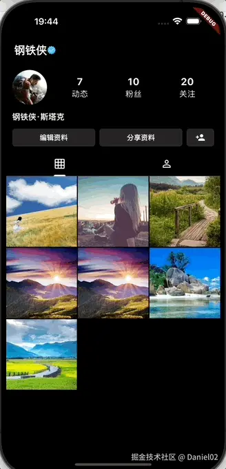
4 SliverGrid 实现九宫格图片流
dart
SliverGrid.builder(
  gridDelegate: const SliverGridDelegateWithFixedCrossAxisCount(
    crossAxisCount: 3,
    mainAxisSpacing: 2,
    crossAxisSpacing: 2,
  ),
  itemCount: 7,
  itemBuilder: (context, index) => PostSmallImage(index: index),
),
crossAxisCount: 3从视觉上对齐 Instagram / 小红书风格。PostSmallImage根据设备pixelRatio计算合适图片尺寸,防止超分辨率加载。
dart
final screenWidth = (MediaQuery.of(context).size.width - 2.0) / 3;
final pixelRatio = MediaQuery.devicePixelRatioOf(context);
final size = min((screenWidth * pixelRatio) ~/ 1, 1920);
如果你想改成瀑布流,只需替换为 SliverWaterfallFlow 之类组件即可。
5 可点击渐变:Tappable.faded
按钮不仅可点,还能在按下时渐隐:
dart
FadeTransition(opacity: _animation, child: child)FadeStrength 枚举把透明度抽象成 sm / md / lg,代码阅读体验更友好:
dart
enum FadeStrength { sm(.2), md(.4), lg(1); ... }在 UI 中使用:
dart
Tappable.faded(
  fadeStrength: FadeStrength.sm,
  borderRadius: BorderRadius.circular(6),
  backgroundColor: effectiveColor,
  child: Text('编辑资料'),
)
6 简单而纯粹的 Bloc
UserProfileBloc 当前仅保存状态,后续若接入 API,可在 on<Event> 里调用 emit(state.copyWith(...)) 完成刷新。初始值:
dart
const UserProfileState.initial()
  : this._(
      user: User(name: '钢铁侠', fullName: '钢铁侠·斯塔克'),
      postsCount: 7,
      followersCount: 10,
      followingsCount: 20,
    );
页面侧获取数据极简:
dart
final user = context.select((UserProfileBloc b) => b.state.user);Bloc + context.select 能精准订阅字段,避免整树重建。
7 总结
本篇以 UserProfile 代码为蓝本,梳理了:
- 暗黑主题 :
FlexThemeData.dark+ 扩展色值 + 系统栏适配 - 多层滚动 :
NestedScrollView+SliverOverlapAbsorber / Injector+ 固定TabBar - 网格布局 :
SliverGrid九宫格图片流与分辨率优化 - 交互体验 :
Tappable.faded渐隐反馈 - 状态管理:轻量 Bloc 读取 / 更新
希望对你在实际项目中落地这些模式有所帮助。如果想进一步探索,可以考虑:
- 在
PostsPage引入懒加载分页 - 将
UserProfileBloc拆分为多事件、多状态 - 针对不同屏幕尺寸自动切换列数或使用
SliverResponsiveGrid
Happy Coding!