✍️作者简介:小北编程(专注于HarmonyOS、Android、Java、Web、TCP/IP等技术方向) 🐳博客主页: 开源中国、稀土掘金、51cto博客、博客园、知乎、简书、慕课网、CSDN
🔔如果文章对您有一定的帮助请👉关注✨、点赞👍、收藏📂、评论💬。
🔥如需转载请参考【转载须知】
🕒 HarmonyOS 自定义日期选择器组件详解
📌 背景与目标
在 HarmonyOS 中,原生的 DatePicker 存在样式限制和扩展性不足的问题。开发者常需要:
- 隐藏分割线;
- 自定义滑动选项样式
- 无法调节各选择项高度等诸多限制
本篇将基于 TextPicker 来实现时间选择器功能,后期还可以做更多的设置,可以只选择月份和日期等。
🧱 整体结构
| 组件名 | 功能说明 |
|---|---|
DatePickDemo |
页面入口,包含开始时间与结束时间的选择按钮。 |
DatePickButton |
可展开折叠的时间选择器按钮,显示选中时间。 |
TimePickerComponent |
包含三个 TextPicker 的"年月日"三级联动面板。 |
TimeUtil.format |
工具类,用于日期格式化为字符串。 |
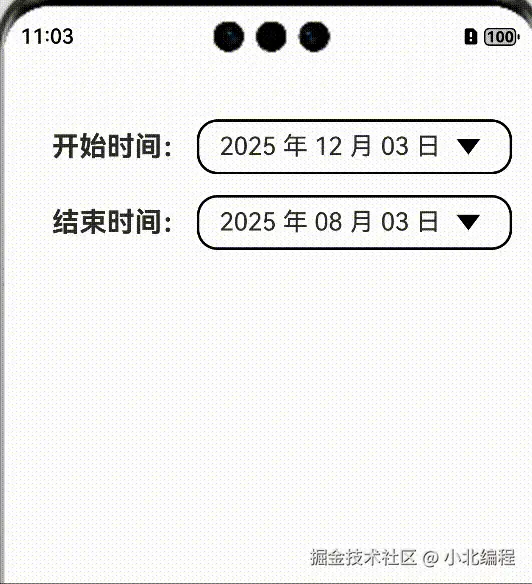
🖼️ 页面入口组件:DatePickDemo
less
@ComponentV2
struct DatePickDemo {
  @Local startDate: Date = new Date()
  @Local endDate: Date = new Date()

  build() {
    Column({ space: 5 }) {
      DatePickButton({ title: "开始时间:", selectDate: this.startDate })
      DatePickButton({ title: "结束时间:", selectDate: this.endDate })
    }
    .padding({ top: 20 })
    .height('100%')
    .alignItems(HorizontalAlign.Center)
  }
}- 使用两个
DatePickButton分别控制开始和结束时间; @Local用于管理选中日期状态;- 布局使用
Column+ 垂直间距统一排布。
🔘 日期按钮组件:DatePickButton
该组件集成了标题、显示当前选中日期的按钮、点击展开/收起时间选择器的逻辑。
✅ 显示与点击逻辑
less
@Param title: string
@Param selectDate: Date
@Local isPickerShow: boolean = falsetitle:按钮左侧标题;selectDate:当前选中的日期;isPickerShow:控制是否展开TimePickerComponent。
⬇️ 展开内容
- 使用
animateTo动画切换展开/收起状态; - 时间选择器的高度通过
isPickerShow动态设置; - 附加装饰性背景
Rect()增强视觉反馈。
📌 UI 与布局要点
- 使用
RelativeContainer实现内部锚点布局(如alignRules控制标题与按钮对齐); - 使用
Path绘制可旋转的小箭头指示图标; - 时间显示格式化使用
TimeUtil.format(selectDate, 'YYYY 年 MM 月 DD 日')。
🧩 日期选择组件:TimePickerComponent
封装三个 TextPicker 实现 年月日 联动选择器。
📋 数据初始化
less
@Param startDate: Date = new Date('1970-1-1')
@Param endDate: Date = new Date('2100-12-31')
@Param selectDate: Date = new Date()

@Local years: number[] = []
@Local months: number[] = []
@Local Days: number[] = []- 构建年份、月份、天数数组;
aboutToAppear初始化数据并设置当前选中项索引。
🔄 联动逻辑
- 年份选择:变更后更新当前日期,并刷新天数列表;
- 月份选择:变更后更新月份与天数;
- 日期选择:直接设置选中日期;
👇 updateDaysInMonth 实现
typescript
private updateDaysInMonth(year: number, month: number) {
  if (month === 2 && this.isLeapYear(year)) {
    this.Days = Array.from({ length: 29 }, (_, i) => i + 1)
  } else {
    const daysInMonth = [31, 28, 31, ..., 31]
    this.Days = Array.from({ length: daysInMonth[month - 1] }, (_, i) => i + 1)
  }
}
🌟 闰年判断
sql
private isLeapYear(year: number): boolean {
  return (year % 4 === 0 && year % 100 !== 0) || (year % 400 === 0)
}
✅ 样式统一扩展
使用 @Extend(TextPicker) 为三个 Picker 设置统一样式:
less
@Extend(TextPicker)
function textPickerStyles() {
  .divider(null)
  .layoutWeight(1)
  .selectedTextStyle({
    color: Color.Black,
    font: { weight: FontWeight.Bold }
  })
}
🛠️ 时间格式化工具类:TimeUtil
用于格式化日期对象,输出为 YYYY 年 MM 月 DD 日 等格式。
lua
TimeUtil.format(date, 'YYYY-MM-DD')支持格式:
- 年份:
YYYY、YY - 月份:
MM、M - 日期:
DD、D - 时间:
HH、mm、ss、SSS
内部逻辑支持:
- 传入
Date、时间戳或字符串; - 提供
useUTC切换时区处理; - 正则匹配并动态替换格式符号。
📊 效果展示
使用上述组件构建的页面,支持如下交互效果:
- 点击"开始时间"按钮 ➜ 展开时间选择面板;
- 选择年/月时自动刷新可选日;
- 点击按钮再次收起;
- 时间显示立即更新,无需额外回调。
🧩 可扩展性建议
| 方向 | 实现建议 |
|---|---|
| 时间范围限制 | 可在年份构建阶段加入 startDate ~ endDate 校验 |
| 显示自定义格式 | 提供格式化模板参数或回调函数 |
| 周视图/时分选择 | 扩展为 时间轴选择器 或集成小时分钟 picker |
| 绑定双向数据 | 可结合 @Link 与 @State 提高响应性 |
整体代码
js
@ComponentV2
struct DatePickDemo{
  @Local startDate: Date = new Date()
  @Local endDate: Date = new Date()

  build() {
    Column({ space: 5 }) {
      DatePickButton({
        title: "开始时间:",
        selectDate: this.startDate
      })
      DatePickButton({
        title: "结束时间:",
        selectDate: this.endDate
      })
    }
    .padding({ top: 20 })
    .height('100%')
    .width('100%')
    .alignItems(HorizontalAlign.Center)
    .justifyContent(FlexAlign.Start)
  }
}

@ComponentV2
export struct DatePickButton {
  @Param title: string = "开始时间:"
  @Param selectDate: Date = new Date()
  @Local isPickerShow: boolean = false

  build() {
    RelativeContainer() {
      Text(this.title)
        .fontSize(20)
        .fontWeight(FontWeight.Bold)
        .id("Title")
      Button() {
        Row() {
          Text(TimeUtil.format(this.selectDate,'YYYY 年 MM 月 DD 日 '))
            .fontSize(18)
          Path()
            .width(30)
            .height(30)
            .commands(`M${vp2px(7.5)} ${vp2px(10)} L${vp2px(15)} ${vp2px(20)} L${vp2px(22.5)} ${vp2px(10)} Z`)
            .rotate(this.isPickerShow ? {
              centerX: "50%",
              centerY: "50%",
              angle: 180
            } : {
              angle: 0
            })
        }
        .alignItems(VerticalAlign.Center)
        .justifyContent(FlexAlign.SpaceBetween)
      }
      .border({
        color: Color.Black,
        width: 2,
        radius: 15
      })
      .backgroundColor(Color.White)
      .type(ButtonType.Normal)
      .height(40)
      .margin({ left: 5 })
      .padding({ left: 15, right: 15 })
      .alignRules({
        left: { anchor: "Title", align: HorizontalAlign.End },
        center: { anchor: "Title", align: VerticalAlign.Center }
      })
      .onClick(() => {
        animateTo({ duration: 100 }, () => {
          this.isPickerShow = !this.isPickerShow;
        })
      })
      .id("PickerBtn")

      TimePickerComponent({
        selectDate: this.selectDate
      })
        .height(this.isPickerShow ? 150 : 0)
        .margin({ top: 10 })
        .alignRules({
          top: { anchor: "PickerBtn", align: VerticalAlign.Bottom },
          left: { anchor: "Title", align: HorizontalAlign.Start },
          right: { anchor: "PickerBtn", align: HorizontalAlign.End }
        })
        .id("DatePicker")

      Rect()
        .width("100%")
        .height(this.isPickerShow ? 35 : 0)
        .radiusWidth(20)
        .fill("#56FFEB")
        .fillOpacity(0.5)
        .stroke(Color.Black)
        .strokeWidth(2)
        .alignRules({
          middle: { anchor: "DatePicker", align: HorizontalAlign.Center },
          center: { anchor: "DatePicker", align: VerticalAlign.Center },
        })
    }
    .height(this.isPickerShow ? 200 : 50)
    .width("100%")
    .padding({ left: 15, right: 15 })
  }
}

@ComponentV2
struct TimePickerComponent {
  @Param startDate: Date = new Date('1970-1-1')
  @Param endDate: Date = new Date('2100-12-31')
  @Param selectDate: Date = new Date()
  @Local years: number[] = []
  @Local months: number[] = []
  @Local days: number[] = []
  @Local yearSelectIndex: number = 0
  @Local monthSelectIndex: number = 0
  @Local daySelectIndex: number = 0

  aboutToAppear(): void {
    this.years =
      Array.from<number, number>({ length: this.endDate.getFullYear() - this.startDate.getFullYear() + 1 },
        (_, k) => this.startDate.getFullYear() + k)
    this.months = Array.from<number, number>({ length: 12 }, (_, k) => k + 1)
    this.updateDaysInMonth(this.selectDate.getFullYear(), this.selectDate.getMonth() + 1);
    this.selectIndexInit();
  }

  build() {
    Row() {
      // 年份选择
      TextPicker({ range: this.years.map(x => `${x}年`), selected: this.yearSelectIndex })
        .onChange((value, index) => {
          const newYear = this.years[index as number]
          this.selectDate.setFullYear(newYear)
          this.updateDaysInMonth(newYear, this.selectDate.getMonth() + 1)
        })
        .textPickerStyles()

      // 月份选择
      TextPicker({ range: this.months.map(v => `${v}月`), selected: this.monthSelectIndex })
        .onChange((value, index) => {
          if (index as number || index == 0) {
            const newMonth = index as number + 1
            this.selectDate.setMonth(newMonth - 1)
            this.updateDaysInMonth(this.selectDate.getFullYear(), newMonth)
          }
        })
        .textPickerStyles()

      // 日期选择
      TextPicker({ range: this.days.map(x => `${x}日`), selected: this.daySelectIndex })
        .onChange((value, index) => {
          console.info(index.toString())
          this.selectDate.setDate(index as number + 1)
        })
        .textPickerStyles()
    }
    .height('100%')
    .width('100%')
  }

  /**
   * 选择索引初始化
   */
  private selectIndexInit() {
    let yearIndex: number = this.years.findIndex((value: number) => {
      return this.selectDate.getFullYear() == value
    });
    let monthIndex: number = this.months.findIndex((value: number) => {
      return this.selectDate.getMonth() + 1 == value
    });
    let dayIndex: number = this.days.findIndex((value: number) => {
      return this.selectDate.getDate() == value
    });
    this.yearSelectIndex = yearIndex;
    this.monthSelectIndex = monthIndex;
    this.daySelectIndex = dayIndex;
  }

  private updateDaysInMonth(year: number, month: number) {
    const daysInMonth = [31, 28, 31, 30, 31, 30, 31, 31, 30, 31, 30, 31];
    if (month === 2 && this.isLeapYear(year)) {
      this.days = Array.from<number, number>({ length: 29 }, (_, i) => i + 1); // 闰年2月有29天
    } else {
      this.days = Array.from<number, number>({ length: daysInMonth[month - 1] }, (_, i) => i + 1);
    }
    let dayIndex: number = this.days.findIndex((value: number) => {
      return this.selectDate.getDate() == value
    });
    this.daySelectIndex = dayIndex;
  }

  /**
   * 判断是否是闰年
   * @param year
   * @returns
   */
  private isLeapYear(year: number): boolean {
    return (year % 4 === 0 && year % 100 !== 0) || (year % 400 === 0);
  }
}

@Extend(TextPicker)
function textPickerStyles() {
  .divider(null)
  .layoutWeight(1)
  .selectedTextStyle({
    color: Color.Black,
    font: {
      weight: FontWeight.Bold
    }
  })
}


// 工具类
export class TimeUtil {
  static readonly SECOND: number = 1000
  static readonly MINUTES: number = 60 * TimeUtil.SECOND
  static readonly HOUR: number = 60 * TimeUtil.MINUTES
  static readonly DAY: number = 24 * TimeUtil.HOUR

  static format(value?: number | string | Date, format: string = 'YYYY-MM-DD HH:mm:ss', useUTC: boolean = false): string {
    try {
      const date: Date = new Date(value ?? Date.now())
      if (isNaN(date.getTime())) {
        throw new Error('Invalid date')
      }

      const padZero = (val: number, len: number = 2): string => {
        return String(val).padStart(len, '0')
      }

      const getFullYear = (): number => useUTC ? date.getUTCFullYear() : date.getFullYear()
      const getMonth = (): number => useUTC ? date.getUTCMonth() : date.getMonth()
      const getDate = (): number => useUTC ? date.getUTCDate() : date.getDate()
      const getHours = (): number => useUTC ? date.getUTCHours() : date.getHours()
      const getMinutes = (): number => useUTC ? date.getUTCMinutes() : date.getMinutes()
      const getSeconds = (): number => useUTC ? date.getUTCSeconds() : date.getSeconds()
      const getMilliseconds = (): number => useUTC ? date.getUTCMilliseconds() : date.getMilliseconds()

      const tokens: Record<string, () => string> = {
        'YYYY': (): string => padZero(getFullYear()),
        'YY': (): string => padZero(getFullYear()).slice(2),
        'MM': (): string => padZero(getMonth() + 1),
        'M': (): string => String(getMonth() + 1),
        'DD': (): string => padZero(getDate()),
        'D': (): string => String(getDate()),
        'HH': (): string => padZero(getHours()),
        'H': (): string => String(getHours()),
        'mm': (): string => padZero(getMinutes()),
        'm': (): string => String(getMinutes()),
        'ss': (): string => padZero(getSeconds()),
        's': (): string => String(getSeconds()),
        'SSS': (): string => padZero(getMilliseconds(), 3)
      }

      return format.replace(
        /[(.*?)]|(YYYY|YY|M{1,2}|D{1,2}|H{1,2}|m{1,2}|s{1,2}|SSS)/g,
        (match: string, escape: string, token: string): string => {
          return escape || (tokens[token] ? tokens[token]() : token)
        }
      )
    } catch (error) {
      console.error('TimeUtil.format error:', error)
      return ''
    }
  }
}
✅ 总结
通过该方案,我们实现了一个样式自定义、数据联动、动画交互良好的日期选择器。相较于原生 DatePicker,更具灵活性和扩展性,适用于日程安排、时间过滤等场景。
你可以根据项目需求:
- 拆分封装为通用组件库;
- 增加日期范围、禁用日期逻辑;
- 进一步美化样式提升用户体验。
👍 点赞,是我创作的动力! ⭐️ 收藏,是我努力的指引! ✏️ 评论,是我进步的宝藏! 💖 衷心感谢你的阅读以及支持!