完全免费!
为什么选择Trae?
我对比了Cursor, Windsurf和Trae, 发现:
- Trae是免费的, 提供顶级供应商的顶级模型免费访问权限, 且拥有最佳的UI/UX.
- Cursor 在模型与代码生成配合方面略胜一筹(可能因人而异).
- Windsurf 在 Flutter 代码生成方面表现最差(可能只是偶尔如此).
因此, 我将 Trae 设为主要 IDE. 此前我使用 VS Code, 偶尔用 Cursor 进行代码生成. 现在我将使用 Trae, 并主要以英语编写代码.
更新:刚收到邮件, Trae 变成了付费软件.
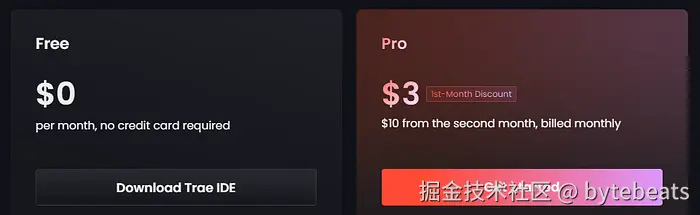
真快. 我以为它会免费更久. 可能是 Anthropic 的账单很难支付.
为什么选择Claude-3.5-Sonnet?
我用Trae对比了不同模型, 发现Claude-Sonnet系列效果最佳. 3.7和4.0版本需求量大且需排队等待, 但3.5版本几乎与它们相当且可立即使用.
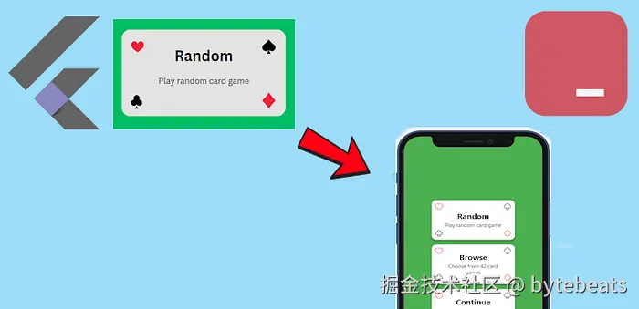
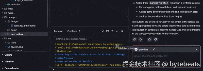
代码生成
我想要一个自定义按钮, 外观如下:
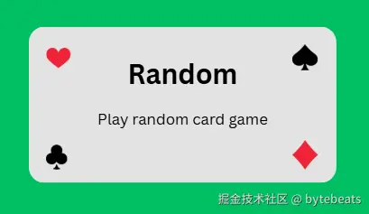
在Canva中创建的自定义按钮图片
我将图片文件添加到Trae中
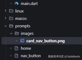
由于它将作为提示的一部分使用, 我将其放在prompts文件夹中.
并创建了一个名为nav_button的提示文件, 内部包含以下提示:
vbnet
Please, generate custom button that looks
like supplied image
简洁明了. 😁
Trae的请求区域有用于上下文和图片的按钮.
但我发现直接将文件拖放到该区域更方便.
然后只需点击发送按钮, 结果如下:
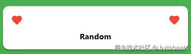
虽然不是我们想要的, 但只花了2秒钟.
那么, 让我们再写一个提示:
vbnet
Make decorative icons more close to corners.
Should be four of them.
Use hugeicons package for icons.

HugeIcons.strokeRoundedFavourite
HugeIcons.strokeRoundedSpades
HugeIcons.strokeRoundedDiamond
HugeIcons.strokeRoundedClubs

Heart and diamond should be red and spade and club -- black.
There is no need to provide neither icons nor colors as parameter.

Button should have only three paramaters:
title - short bold text with larger font
description - regular text
route - will be used in onTap

Description should be displayed under the title

Leave onTap empty

width : height ratio of the button should be 1.8 : 1

Make button width to be 60% of the screen width
我将这个提示与一张图片和之前生成的代码一起提交.
结果如下:
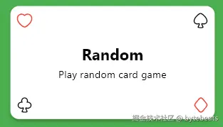
遗憾的是, 我没有找到合适的图标. HugeIcons 有这些图标, 但它们在 Flutter 中不可用, 可能是付费的.
不过其他方面都很好.
以下是代码:
less
class CardNavButton extends StatelessWidget {
  final String title;
  final String description;
  final String route;

  const CardNavButton({
    super.key,
    required this.title,
    required this.description,
    required this.route,
  });

  @override
  Widget build(BuildContext context) {
    return Padding(
      padding: const EdgeInsets.all(8.0),
      child: LayoutBuilder(
        builder: (context, constraints) {
          final screenWidth = MediaQuery.of(context).size.width;
          final buttonWidth = screenWidth * 0.6;
          final buttonHeight = buttonWidth / 1.8;

          return SizedBox(
            width: buttonWidth,
            height: buttonHeight,
            child: Material(
              color: Colors.white,
              elevation: 4,
              borderRadius: BorderRadius.circular(12),
              child: InkWell(
                onTap: () {},
                borderRadius: BorderRadius.circular(12),
                child: Stack(
                  children: [
                    Positioned(
                      left: 8,
                      top: 8,
                      child: Icon(HugeIcons.strokeRoundedFavourite, color: Colors.red),
                    ),
                    Positioned(
                      right: 8,
                      top: 8,
                      child: Icon(HugeIcons.strokeRoundedSpades, color: Colors.black),
                    ),
                    Positioned(
                      left: 8,
                      bottom: 8,
                      child: Icon(HugeIcons.strokeRoundedClubs02, color: Colors.black),
                    ),
                    Positioned(
                      right: 8,
                      bottom: 8,
                      child: Icon(HugeIcons.strokeRoundedDiamond01, color: Colors.red),
                    ),
                    Center(
                      child: Padding(
                        padding: const EdgeInsets.symmetric(horizontal: 32.0),
                        child: Column(
                          mainAxisSize: MainAxisSize.min,
                          children: [
                            Text(
                              title,
                              style: Theme.of(context).textTheme.titleLarge?.copyWith(
                                    color: Colors.black,
                                    fontWeight: FontWeight.bold,
                                  ),
                              textAlign: TextAlign.center,
                            ),
                            const SizedBox(height: 4),
                            Text(
                              description,
                              style: Theme.of(context).textTheme.bodyMedium?.copyWith(
                                    color: Colors.black,
                                  ),
                              textAlign: TextAlign.center,
                            ),
                          ],
                        ),
                      ),
                    ),
                  ],
                ),
              ),
            ),
          );
        },
      ),
    );
  }
}
Claude 使用了 InkWell 类来创建自定义按钮.
简单而常识性的警告:
我们应该始终检查并理解由LLMs生成的代码.
总结一下
我不确定如何看待这个结果. 是令人惊叹的成功还是令人羞愧的失败? 我的意思是, 第一次尝试并不成功, 而第二次提示如此详细, 以至于图片可能根本不需要.
好吧, 今天的内容就分享到这里啦!
一家之言, 欢迎拍砖!
Happy Coding! Stay GOLDEN!