鸿蒙开发实践:基于V2状态管理的List组件用法实例解析
在鸿蒙系统(HarmonyOS)的声明式UI开发中,List组件是构建列表类界面的核心容器,广泛应用于商品展示、联系人列表、消息流等场景。本文是基于最新的官方API文档,结合当下开发者最常用的V2状态管理机制,详细介绍List组件的核心特性、常用属性及使用方法,并通过完整代码示例帮助一些基础相对薄弱或者说对此有疑问的开发者快速掌握其用法。 (以下所涉及代码均在5.0.5(17)版本下运行)
一、List组件的核心特性与适用场景
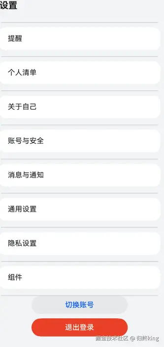
List组件是一种可滚动的列表容器,支持包含一系列相同宽度的列表项(ListItem),适合连续、多行呈现同类数据(如文本、图片等)。其子组件仅限于ListItem、ListItemGroup及自定义组件,且当子组件高度超过父容器时会自动触发滚动效果。 我们来看一组示例代码:
typescript
build() {
  NavDestination() {
    Scroll(){            //scroll组件当子组件的布局尺寸超过父组件的尺寸时,内容可以滚动
      List(){          //list组件
        ForEach(this.settingTextList, (item: SettingTextList) => {
          ListItem(){          //list下的listItem可以有若干个
            Column(){
              Row(){
                Text(item.text)
                  .width('100%')
                  .fontSize(16)
                  .fontWeight(20)
              }
            }
          }
        })

        ListItem(){          //第二个listItem
          Column(){
            Button('切换账号')
              .width('55%')
            Button('退出登录')
              .width('55%')
          }
          .width('100%')
        }
      }
    }
  }
}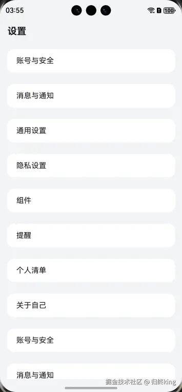
如图所示,我们将代码中一些圆角和字体等全部删除,以便大家可以直观地了解list及其listItem的用法
二、List组件的常用属性与用法详解
1. listDirection:控制列表项排列方向
通过listDirection属性可设置List的主轴方向为垂直(Vertical)或水平(Horizontal),决定列表项的排列方式。例如,垂直方向适合长列表,水平方向适合轮播或横向导航。如下代码所示:
typescript
@Entry
@ComponentV2
export struct Setting {

  build() {
    NavDestination() {
      Scroll() {
        List() {
          //...
        }
        .listDirection(Axis.Horizontal)//Vertical表示垂直分布,而代码中Horizontal表示水平分布
        .margin({ top: 0, bottom: 10 })  // 调整项间距
        .layoutWeight(1)
      }
    }
    .title('设置')
    .backgroundColor($r('sys.color.background_secondary'))
  }
}
注:默认状态下listDirection为垂直分布
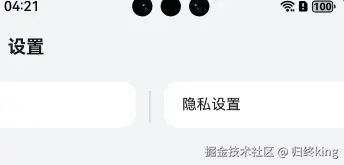
2. scrollBar:滚动条状态控制
用于设置滚动条是否显示(BarState.On)或隐藏(BarState.Off)。在需要简洁界面的场景中(如设计图要求无滚动条),可通过此属性关闭。以下为其用法:
typescript
@Entry
@ComponentV2
export struct Setting {

  build() {
    NavDestination() {
      Scroll() {
        List() {
          //...
        }
        .listDirection(Axis.Horizontal)//Vertical表示垂直分布,而代码中Horizontal表示水平分布
        .margin({ top: 0, bottom: 10 })  // 调整项间距
        .layoutWeight(1)
        .scrollBar(BarState.On)    //scrollbar
      }
    }
    .title('设置')
    .backgroundColor($r('sys.color.background_secondary'))
  }
}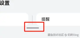
如图,红色框处表示这是水平分布下的滑动条,事实上。如果想保留滑动条,可不写这个代码,因为Harmony OS中默认使用List组件有滑动条,但一般情况下我们会将它去掉,以保证界面的美观
3. edgeEffect:边缘滑动效果
定义列表滚动到边缘时的反馈效果,例如弹性回弹(EdgeEffect.Spring)或无效果(EdgeEffect.None),提升用户交互体验。 以下是弹性回弹效果演示
typescript
@Entry
@ComponentV2
export struct Setting {

  build() {
    NavDestination() {
      Scroll() {
        List() {
          //...
        }
        .margin({ top: 0, bottom: 10 })  // 调整项间距
        .layoutWeight(1)
        .scrollBar(BarState.On)    //scrollbar
      }
      .edgeEffect(EdgeEffect.Spring)//边缘滑动手势
    }
    .title('设置')
    .backgroundColor($r('sys.color.background_secondary'))
  }
}
如上两张图片,分别为上划和下滑后的图片,会有弹簧效果,通常会加上这句代码以保持UI界面的灵活性
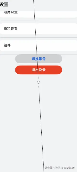
4. Divider:分隔线组件
提供分隔线组件,分隔不同内容块/内容元素
typescript
@Entry
@ComponentV2
export struct Setting {

  build() {
    NavDestination() {
      Scroll() {
        List() {
          //...
        }
        .divider({
          strokeWidth: 1,  // 分割线宽度
          color: $r('sys.color.comp_divider'),  // 使用系统分割线颜色
          startMargin: 20,  // 左侧缩进
          endMargin: 20     // 右侧缩进
        })
        .margin({ top: 0, bottom: 10 })  // 调整项间距
        .margin({ top: 0, bottom: 10 })  // 调整项间距
        .layoutWeight(1)
        .scrollBar(BarState.On)    //scrollbar
      }
      .edgeEffect(EdgeEffect.Spring)//边缘滑动手势
    }
    .title('设置')
    .backgroundColor($r('sys.color.background_secondary'))
  }
}
如上图,我们可以看到几个组件之间都有一条灰色的线,我们在很多应用中都会用到这个,它可以帮我们区分好组件之间的界限,又不会产生割裂感,尽管图中的有一些割裂感,也仅仅是为了让大家看得比较醒目,用法已经在代码中体现
三、基于V2状态管理的List组件完整代码
以下代码演示了List组件的核心属性(垂直方向、滚动条隐藏、边缘弹性效果、交叉轴居中对齐)及事件监听(onScrollIndex),并通过v2状态管理动态控制初始滚动位置。
typescript
interface SettingTextList {
 text: string
}

@Entry
@ComponentV2
export struct Setting {
 settingTextList: SettingTextList[] = [
   { text: '账号与安全' },
   { text: '消息与通知' },
   { text: '通用设置' },
   { text: '隐私设置' },
   { text: '组件' },
   { text: '提醒' },
   { text: '个人清单' },
   { text: '关于自己' },
   { text: '账号与安全' },
   { text: '消息与通知' },
   { text: '通用设置' },
   { text: '隐私设置' },
   { text: '组件' }
 ]

 build() {
   NavDestination() {
     Scroll() {
       List() {
         ForEach(this.settingTextList, (item: SettingTextList) => {
           ListItem() {
             Column() {
               Row() {
                 Text(item.text)
                   .width('100%')
                   .fontSize(16)
                   .fontWeight(20)
                   .layoutWeight(1)
                   .fontColor($r('sys.color.font_primary'))
               }
             }
             .height('100%')
             .width('100%')
             .height(50)
             .border({ radius: 15 })
             .margin({ top: 10, bottom: 15 })
             .padding({ left: 20, right: 15 })
             .justifyContent(FlexAlign.Center)
             .backgroundColor($r('sys.color.comp_background_list_card'))
           }
           .padding({ left: 15, right: 15 })
         })

         ListItem() {
           Column() {
             Button('切换账号')
               .width('55%')
               .backgroundColor($r('sys.color.comp_background_tertiary'))
               .fontColor($r('sys.color.brand'))
               .margin({ bottom: 10 })
             Button('退出登录')
               .width('55%')
               .fontColor($r('sys.color.comp_background_primary_contrary'))
               .backgroundColor($r('sys.color.warning'))
           }
           .width('100%')
         }
       }
       .divider({
         strokeWidth: 1,  // 分割线宽度
         color: $r('sys.color.comp_divider'),  // 使用系统分割线颜色
         startMargin: 20,  // 左侧缩进
         endMargin: 20     // 右侧缩进
       })
       .margin({ top: 0, bottom: 10 })  // 调整项间距
       .layoutWeight(1)
       .scrollBar(BarState.Off)
     }
     .edgeEffect(EdgeEffect.Spring)
   }
   .title('设置')
   .backgroundColor($r('sys.color.background_secondary'))
 }
}
快来加入我的班级吧: developer.huawei.com/consumer/cn...