R
######000包载入######
# 加载 devtools
library(devtools)
# 从 GitHub 安装 kBET
install_github("theislab/kBET")
install.packages("doFuture")
install.packages("multiprocessing")
if (!require("BiocManager")) install.packages("BiocManager")
BiocManager::install("SingleCellExperiment") #
install.packages("kBET.zip", repos = NULL, type = "source") #
library(Seurat) # 单细胞组学数据分析包
library(harmony) # 用于批次校正
library(clustree) # 用于聚类树分析
library(cowplot) # 用于高级绘图
library(ggplot2) # 画图包
library(glmGamPoi)
library(patchwork) # 图形组合
library(RColorBrewer)
library(kBET) # 批次效应检测
library(future)
library(doFuture) # 启用多进程支持
#####001多样本10xGenomics数据加载与处理#####
remove(list = ls()) #清除 Global Environment
getwd() #查看当前工作路径
setwd("D:/Rdata/jc/单细胞演示数据/10xGenomics/多样本演示数据(1)/") #设置需要的工作路径
list.files() #查看当前工作目录下的文件
#创建样本元数据表
samples_meta <- data.frame(
sample_name = c(
"D12_rep1", "D12_rep2",
"D14_rep1", "D14_rep2",
"D16_rep1", "D16_rep2"
),
group = rep(c("D12", "D14","D16"), each = 2), # 每个发育阶段3个重复
path = c(
"GSM7465267_D12A", "GSM7465268_D12B",
"GSM7465269_D14A", "GSM7465270_D14B",
"GSM7465271_D16A","GSM7465272_D16B"
),
stringsAsFactors = FALSE
)
##循环读取每个样本的数据并创建Seurat对象##
seurat_list <- list() #初始化一个空列表
for (i in 1:nrow(samples_meta)) {
sample_name <- samples_meta$sample_name[i]
sample_path <- samples_meta$path[i]
group <- samples_meta$group[i]
cat("Processing sample:", sample_name, "\n")
#读取 10x 格式数据
counts <- Read10X(data.dir = sample_path)
#创建 Seurat 对象,并添加样本名作为元数据
seurat_obj <- CreateSeuratObject(
counts = counts,
project = sample_name, #项目名称,用于标识 Seurat 对象所属的项目。
min.features = 200, #至少有多少个基因被检测到的细胞才能被包含
min.cells = 3 #至少包含多少个细胞的基因表达才能被包含
)
# 添加元数据
seurat_obj$group <- samples_meta$group[i]
seurat_obj$sample_name <- samples_meta$sample_name[i]
#计算线粒体基因比例
seurat_obj[["percent.mt"]] <- PercentageFeatureSet(
seurat_obj,
pattern = "(?i)^MT-|^mt-" # 人类: "^MT-", 小鼠: "^mt-"
)
# 添加核糖体基因比例计算
#seurat_obj[["percent.rb"]] <- PercentageFeatureSet(
# seurat_obj,
# pattern = "(?i)^RP[SL]|^Rps|^Rpl" ) # 覆盖人和小鼠(Rps和Rpl)
seurat_list[[sample_name]] <- seurat_obj #将Seurat对象存入列表
}
#####002质量控制与过滤#####
###原始QC指标过滤和可视化###
#(1)创建轻量级QC数据(占用内存小)#
qc_data_raw <- do.call(rbind, lapply(seurat_list, function(obj) {
data.frame(
sample = obj@project.name,
nFeature_RNA = obj$nFeature_RNA,
nCount_RNA = obj$nCount_RNA,
percent.mt = obj$percent.mt
)
}))
qc_violin_raw <- ggplot(qc_data_raw, aes(x = sample, y = nFeature_RNA)) +
geom_violin(trim = TRUE, scale = "width") +
geom_boxplot(width = 0.1, outlier.size = 0.5) +
labs(title = "nFeature_RNA - Before Filtering") +
ggplot(qc_data_raw, aes(x = sample, y = nCount_RNA)) +
geom_violin(trim = TRUE, scale = "width") +
geom_boxplot(width = 0.1, outlier.size = 0.5) +
scale_y_continuous(trans = "log10") + # 对数转换更清晰
labs(title = "nCount_RNA - Before Filtering") +
ggplot(qc_data_raw, aes(x = sample, y = percent.mt)) +
geom_violin(trim = TRUE, scale = "width") +
geom_boxplot(width = 0.1, outlier.size = 0.5) +
labs(title = "percent.mt - Before Filtering") +
plot_layout(ncol = 3) +
plot_annotation(title = "QC Metrics - Before Filtering")
ggsave("QC_violin_raw.png", qc_violin_raw, width = 14, height = 6)
#(2)创建标准QC数据(占用内存大)#
{
#qc_violin_raw <- VlnPlot(
# object = merge(seurat_list[[1]], y = seurat_list[-1]), #merge合并占用内存,可用do.call代替
# features = c("nFeature_RNA", "nCount_RNA", "percent.mt"),
# group.by = "sample_name",
# pt.size = 0.1,
# ncol = 3
# ) +
# plot_annotation(title = "QC Metrics - Before Filtering")
#ggsave("QC_violin_raw.png", qc_violin_raw, width = 14, height = 6)
}
###样本级自适应过滤###
#(1)自适应过滤#
filtered_list <- lapply(seurat_list, function(obj) {
sample_name <- obj@project.name
if (grepl("D12", sample_name)) {stage <- "D12"}
else
if (grepl("D14", sample_name)) {stage <- "D14"}
else
if (grepl("D16", sample_name)) {stage <- "D16"}
else
{stop("未知发育阶段: ", sample_name)}
cat("\n过滤样本:", sample_name, "| 发育阶段:", stage, "\n")
# 基于中位数±3MAD的稳健阈值计算
calc_threshold <- function(values, lower_bound, upper_bound) {
med <- median(values, na.rm = TRUE)
mad_val <- mad(values, na.rm = TRUE)
if (is.na(mad_val) || mad_val == 0) {
if (length(values) > 50) {
mad_val <- sd(values, na.rm = TRUE)
} else {
mad_val <- IQR(values, na.rm = TRUE)/1.349
}
if (is.na(mad_val) || mad_val == 0) mad_val <- diff(quantile(values, c(0.25, 0.75), na.rm = TRUE))/2
}
lower <- max(lower_bound, med - 3 * mad_val, na.rm = TRUE)
upper <- min(upper_bound, med + 3 * mad_val, quantile(values, 0.99, na.rm = TRUE), na.rm = TRUE)
c(lower, upper)
}
# 阶段特异性参数设置
if (stage == "D12") {
nFeature_upper <- 9000
mt_upper <- 15
} else {
nFeature_upper <- 8000
mt_upper <- 12
}
# 计算各指标阈值
nFeature_thresh <- calc_threshold(obj$nFeature_RNA, 200, nFeature_upper) #表示每个细胞中检测到的基因数量
nCount_thresh <- calc_threshold(obj$nCount_RNA, 300, 50000) #表示每个细胞中检测到的分子总数(即总表达量)
#mt_threshold <- min(mt_upper, median(obj$percent.mt, na.rm = TRUE) + 3 * mad(obj$percent.mt, na.rm = TRUE))
mt_val <- obj$percent.mt #表示细胞中线粒体基因的比例。
mt_threshold <- min(
mt_upper,
median(mt_val, na.rm = TRUE) + 3 * mad(mt_val, na.rm = TRUE)
)
mt_threshold <- max(0.5, mt_threshold) # 确保最小阈值为0.5%
cat(sprintf("阈值设置: nFeature_RNA %g-%g, nCount_RNA %g-%g, percent.mt < %.1f\n",
nFeature_thresh[1], nFeature_thresh[2],
nCount_thresh[1], nCount_thresh[2],
mt_threshold))
# 应用过滤
init_cells <- ncol(obj)
obj <- subset(obj,
nFeature_RNA > nFeature_thresh[1] &
nFeature_RNA < nFeature_thresh[2] &
nCount_RNA > nCount_thresh[1] &
nCount_RNA < nCount_thresh[2] &
percent.mt < mt_threshold)
cat(sprintf("细胞保留率: %.1f%% (%g -> %g)\n",
100 * ncol(obj)/init_cells,
init_cells, ncol(obj)))
return(obj) # 显式返回结果对象
})
#(2)自适应过滤#
{
#filtered_list <- lapply(seurat_list, function(obj) {
# cat("\n过滤样本:", obj$sample_name[1], "\n")
# 计算样本特异性阈值
# mt_threshold <- min(15, quantile(obj$percent.mt, 0.95) * 1.2)
# nFeature_upper <- min(7500, quantile(obj$nFeature_RNA, 0.99) * 1.3)
# nFeature_lower <- max(200, quantile(obj$nFeature_RNA, 0.01))
# nCount_lower <- max(300, quantile(obj$nCount_RNA, 0.01))
# nCount_upper <- min(50000, quantile(obj$nCount_RNA, 0.99) * 1.5) # 胚胎细胞UMI更高
# cat(sprintf("阈值设置: nFeature_RNA %g-%g, nCount_RNA %g-%g, percent.mt < %.1f\n", #nCount_RNA < %g
# nFeature_lower, nFeature_upper, nCount_lower, nCount_upper, mt_threshold))
# 应用过滤
# obj <- subset(
# obj,
# subset = nFeature_RNA > nFeature_lower & #过滤低特征数的细胞(可能为低质量细胞)
# nFeature_RNA < nFeature_upper & #过滤高特征数的异常细胞(可能是双细胞或多拷贝)
# nCount_RNA > nCount_lower & #过滤低UMI计数的细胞(可能为低质量或空细胞)
# nCount_RNA < nCount_upper & #过滤高UMI计数的异常细胞(可能是多细胞或技术噪声)
# percent.mt < mt_threshold
# )
# return(obj) })
}
#(3)特异性样本级自适应过滤,该方法可与上头两个方案联合使用#
{
#filtered_list <- lapply(seurat_list, function(obj) {
#stage <- unique(obj$developmental_stage)
# 胚胎细胞特异性阈值设置
#if(stage == "E13.5") {
#nFeature_upper <- 9000 # E13.5细胞可能有更多基因
# mt_threshold <- 15 # E13.5线粒体阈值稍宽松
#} else {
#nFeature_upper <- 8000
#mt_threshold <- 12 }
# 应用过滤
#obj <- subset(obj, subset = nFeature_RNA > 300 & # 胚胎细胞提高下限
# nFeature_RNA < nFeature_upper &
# percent.mt < mt_threshold)
#return(obj)})
}
###过滤后QC指标可视化###
#(1)merge合并(占用内存大)#
{
#qc_violin_filtered <- VlnPlot(
# object = merge(filtered_list[[1]], y = filtered_list[-1]),
# features = c("nFeature_RNA", "nCount_RNA", "percent.mt"),
# group.by = "sample_name",
# pt.size = 0.1,
# ncol = 3
# ) + plot_annotation(title = "QC Metrics - After Filtering")
#ggsave("QC_violin_filtered.png", qc_violin_filtered, width = 14, height = 6)
}
#(2)do.call合并(轻量化合并)#
qc_data_filtered <- do.call(rbind, lapply(filtered_list, function(obj) {
data.frame(
sample = obj@project.name,
nFeature_RNA = obj$nFeature_RNA,
nCount_RNA = obj$nCount_RNA,
percent.mt = obj$percent.mt
)
}))
qc_violin_filtered <- ggplot(qc_data_filtered, aes(x = sample, y = nFeature_RNA)) +
geom_violin(trim = TRUE, scale = "width") +
geom_boxplot(width = 0.1, outlier.size = 0.5) +
labs(title = "nFeature_RNA - After Filtering") +
ggplot(qc_data_filtered, aes(x = sample, y = nCount_RNA)) +
geom_violin(trim = TRUE, scale = "width") +
geom_boxplot(width = 0.1, outlier.size = 0.5) +
scale_y_continuous(trans = "log10") +
labs(title = "nCount_RNA - After Filtering") +
ggplot(qc_data_filtered, aes(x = sample, y = percent.mt)) +
geom_violin(trim = TRUE, scale = "width") +
geom_boxplot(width = 0.1, outlier.size = 0.5) +
labs(title = "percent.mt - After Filtering") +
plot_layout(ncol = 3) +
plot_annotation(title = "QC Metrics - After Filtering")
ggsave("QC_violin_filtered.png", qc_violin_filtered, width = 14, height = 6)
### 保存中间结果 ###
timestamp <- format(Sys.time(), "%Y%m%d_%H%M")
saveRDS(seurat_list, paste0("raw_seurat_list_", timestamp, ".rds"))
saveRDS(filtered_list, paste0("filtered_seurat_list_", timestamp, ".rds"))
#样本统计#
total_pre <- sum(sapply(seurat_list, ncol))
total_post <- sum(sapply(filtered_list, ncol))
cat("\n===== 质量控制摘要 =====\n")
cat("处理的样本数:", length(seurat_list), "\n")
cat("初始细胞总数:", total_pre, "\n")
cat("过滤后细胞总数:", total_post, "\n")
cat("过滤细胞数量:", total_pre - total_post, "\n")
cat("总体保留率:", round(100 * total_post/total_pre, 1), "%\n")
#####003样品级SCTransform归一化#####
# 添加细胞周期基因
{
#data(cc.genes)
#s.genes <- tolower(cc.genes$s.genes)
#g2m.genes <- tolower(cc.genes$g2m.genes)
# 添加小鼠特异性细胞周期基因
#s.genes <- unique(c(s.genes, "mcm5", "pcna"))
#g2m.genes <- unique(c(g2m.genes, "hmgb2", "cdk1"))
# 细胞周期评分
#filtered_list <- lapply(filtered_list, function(obj) {
# DefaultAssay(obj) <- "RNA" # 确保使用正确的assay和slot
# obj <- CellCycleScoring(obj,
# s.features = s.genes,
# g2m.features = g2m.genes,
# set.ident = FALSE,
# assay = "RNA", # 明确指定assay
# slot = "counts" ) # 明确使用原始计数
# return(obj)})
# 检查基因是否存在于数据中
#for(obj in filtered_list) {
# missing_s <- setdiff(s.genes, rownames(obj))
# missing_g2m <- setdiff(g2m.genes, rownames(obj))
# if(length(missing_s) > 0 || length(missing_g2m) > 0) {
# cat("警告:样本", obj$sample_name[1], "缺失基因:\n")
# cat("S期缺失:", paste(missing_s, collapse=", "), "\n")
# cat("G2M期缺失:", paste(missing_g2m, collapse=", "), "\n")}}
# 检查细胞周期分数分布
#post_cc <- do.call(rbind, lapply(filtered_list, function(obj) {
# data.frame(
# sample = obj$sample_name[1],
# S.Score = median(obj$S.Score),
# G2M.Score = median(obj$G2M.Score) )}))
#print(post_cc)
}
# SCTransform #
sct_list <- lapply(filtered_list, function(obj) {
cat("\nSCTransform处理样本:", obj$sample_name[1], "\n")
#pre_genes <- nrow(obj) # 记录处理前基因数
obj_sct <- SCTransform(
obj,
method = "glmGamPoi", # 加速计算
vars.to.regress = c("percent.mt"), #如果c("percent.mt", "S.Score", "G2M.Score")
conserve.memory = TRUE, # 适合样本级处理(大样本需关闭)
return.only.var.genes = FALSE, #必须保留所有基因用于整合
verbose = FALSE,
seed.use = 42 # 设置随机种子保证可重现性
)
# 记录处理后信息
#cat("处理后维度:", dim(obj_sct), "\n")
#cat("基因保留率:", round(100 * nrow(obj_sct)/pre_genes, 1), "%\n")
return(obj_sct)
})
# 选择跨样本高变基因
features <- SelectIntegrationFeatures(
object.list = sct_list,
nfeatures = 2500
)
options(future.globals.maxSize = 20 * 1024^3) # 20 GB
sct_list <- PrepSCTIntegration(
object.list = sct_list,
anchor.features = features,
verbose = TRUE # 打开详细输出以便跟踪进度
)
### 保存中间结果 ###
timestamp <- format(Sys.time(), "%Y%m%d_%H%M")
saveRDS(sct_list, paste0("sct_list_", timestamp, ".rds"))
#####004数据整合与批次校正#####
# 合并数据集
merged_seurat <- merge(
x = sct_list[[1]],
y = sct_list[-1],
merge.data = TRUE,
add.cell.ids = names(seurat_list) # 用样本名作为前缀
)
VariableFeatures(merged_seurat, assay = "SCT") <- features # 设置可变基因(使用之前整合时使用的features)
# 运行PCA
merged_seurat <- RunPCA(
merged_seurat,
assay = "SCT",
npcs = 50,
verbose = FALSE,
)
pca_elbow <- ElbowPlot(merged_seurat, ndims = 50) + #可视化PCA结果
ggtitle("PCA Elbow Plot")
ggsave("PCA_elbow.png", pca_elbow, width = 8, height = 6)
# Harmony批次校正
colnames(merged_seurat@meta.data) # 检查元数据列名
harmony_dims <- 1:10 # 根据肘部图调整
set.seed(123) # 确保可重复性
merged_seurat <- RunHarmony(
object = merged_seurat,
group.by.vars = "sample_name", # 批次变量,同时校正样本和发育阶段group.by.vars = c("sample_name", "group"),
reduction = "pca", # 降维方法(必须与 RunPCA 的结果一致)
dims = harmony_dims, # 使用的 PCA 维度
theta = 2, # 样本间校正强度,theta = c(2, 1)
lambda = 0.5, # 保留阶段间生物学差异,c(0.5, 1.5)
sigma = 0.1, # 软聚类宽度(默认0.1)/恢复默认值 (theta/lambda二选一)
nclust = 100, # 聚类数(默认100)
max.iter = 20, # 最大迭代次数
plot_convergence = TRUE, # 是否绘制收敛图
reduction.save = "harmony" # 保存结果名称
)
print(merged_seurat[["harmony"]]) #检查Harmony结果
names(merged_seurat@reductions) # 检查降维结果
#肘部图再评估 (整合后)#
harmony_elbow <- ElbowPlot(merged_seurat, ndims = 50, reduction = "harmony") +
ggtitle("Harmony Reduction Elbow")
ggsave("Harmony_elbow.png", harmony_elbow, width=8, height=6)
# 批次效应评估
p1 <- DimPlot(merged_seurat, reduction = "pca", group.by = "sample_name")+
ggtitle("PCA")
p2 <- DimPlot(merged_seurat, reduction = "harmony", group.by = "sample_name") +
ggtitle("harmony")
p3 <- p1 + p2
# 2. 生物学保留评估
p2 <- FeaturePlot(merged_seurat, features = c("Pecam1", "Ptprc"), reduction = "harmony")
# 3. 发育阶段分离
p4 <- DimPlot(merged_seurat, reduction = "pca", group.by = "group")+
ggtitle("PCA_group")
p5 <- DimPlot(merged_seurat, reduction = "harmony", group.by = "group")+
ggtitle("harmony_group")
p6 <- p4 + p5
#####005降维与聚类分析#####
# 使用Harmony结果运行UMAP
merged_seurat <- RunUMAP(
merged_seurat,
reduction = "harmony",
dims = harmony_dims,
reduction.name = "umap_harmony",
min.dist = 0.4, # 控制UMAP嵌入空间中点的紧密程度,胚胎细胞需要更大间距
n.neighbors = 30, #定义每个点的邻居数,影响局部和全局结构的平衡;值较小强调局部结构(保留小簇),值较大强调全局结构(合并大簇)。
verbose = FALSE
)
merged_seurat <- RunTSNE(
merged_seurat,
reduction = "harmony",
dims = harmony_dims,
reduction.name = "tsne_harmony", #为生成的 UMAP 结果命名,便于后续调用
min.dist = 0.4,
n.neighbors = 30,
verbose = FALSE
)
# 构建KNN图
merged_seurat <- FindNeighbors(
merged_seurat,
reduction = "harmony",
dims = harmony_dims,
verbose = FALSE
)
# 多分辨率聚类
merged_seurat <- FindClusters(
merged_seurat,
resolution = seq(0.1, 1.2, by = 0.1), # 测试不同聚类分辨率resolution = seq(0.1, 1.2, by = 0.1),
verbose = FALSE
)
# 聚类树分析(clustree)
cluster_cols <- grep("_snn_res\\.",
colnames(merged_seurat@meta.data),
value = TRUE
)
prefix <- sub("\\d+\\.\\d+$", "",
cluster_cols[1]
)
clustree_plot <- clustree(merged_seurat, # 使用动态获取的前缀可视化
prefix = prefix
)
ggsave("clustree_plot.png", clustree_plot, width = 12, height = 10)
print(cluster_cols)
# 选择合适的分辨率(根据聚类树结果)#
Idents(merged_seurat) <- paste0(prefix, "0.6")
colnames(merged_seurat@meta.data)
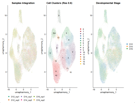
#####006结果可视化#####
library(cowplot)
theme_set(theme_cowplot())
# 创建统一的颜色方案
cluster_colors <- colorRampPalette(brewer.pal(9, "Set1"))(length(unique(merged_seurat$seurat_clusters)))
sample_colors <- brewer.pal(6, "Dark2")
# UMAP按样本分组
p_sample <- DimPlot(
merged_seurat,
reduction = "umap_harmony",
group.by = "sample_name",
cols = sample_colors,
pt.size = 0.3
) +
ggtitle("Samples Integration") +
theme(legend.position = "bottom")
# UMAP按细胞聚类
p_cluster <- DimPlot(
merged_seurat,
reduction = "umap_harmony",
#group.by = "seurat_clusters",
label = TRUE,
cols = cluster_colors,
pt.size = 0.3
) +
ggtitle("Cell Clusters (Res 0.6)")
# 组合可视化
integrated_plot <- (p_sample | p_cluster) + plot_layout(widths = c(1, 1))
ggsave("Integration_results.png", integrated_plot, width = 14, height = 6)
# 按样本分面显示
p_split <- DimPlot(
merged_seurat,
reduction = "umap_harmony",
split.by = "sample_name",
ncol = 3,
pt.size = 0.2
) +
ggtitle("Integration by Sample")
ggsave("Integration_by_sample.png", p_split, width = 12, height = 4)
# 按发育阶段着色
p_development <- DimPlot(
merged_seurat,
reduction = "umap_harmony",
group.by = "group",
cols = c("#1f77b4", "#ff7f0e", "#2ca02c"),
pt.size = 0.3
) + ggtitle("Developmental Stage")
# 组合可视化
final_plot <- (p_sample | p_cluster | p_development) + plot_layout(widths = c(1, 1, 1))
ggsave("Final_integration_results.png", final_plot, width = 18, height = 6)
# 标记基因表达可视化
marker_genes <- c(
"Pecam1", "Cdh5", # 内皮细胞
"Tnnt2", "Actc1", # 心肌细胞
"Col1a1", "Pdgfra", # 成纤维细胞
"Ptprc", "Ly6a", # 造血细胞
"Sox9", "Col2a1", # 软骨细胞
"Tubb3", "Mapt", # 神经元
"Gata4", "Nkx2-5", # 心脏前体细胞
"Myh11", "Tagln" # 平滑肌细胞
)
feature_plots <- FeaturePlot(
merged_seurat,
features = marker_genes,
reduction = "umap_harmony",
order = TRUE,
pt.size = 0.1,
ncol = 4
) +
plot_annotation(title = "Marker Gene Expression")
ggsave("Marker_expression.png", feature_plots, width = 16, height = 8)
#####007保存结果#####
# 保存完整Seurat对象
timestamp <- format(Sys.time(), "%Y%m%d_%H%M")
saveRDS(merged_seurat, paste0("integrated_merged_seurat_", timestamp, ".rds"))
# 导出元数据和嵌入
write.csv(merged_seurat@meta.data, file = "cell_metadata.csv")
write.csv(Embeddings(merged_seurat, "umap_harmony"), file = "umap_coordinates.csv")
# 保存R工作环境
save.image("scRNAseq_analysis_workspace.RData")
cat("\n===== 分析完成! =====\n")以下是上头代码可视化的截选代码
R
# 批次效应评估
p1 <- DimPlot(merged_seurat, reduction = "pca", group.by = "sample_name")+
  ggtitle("PCA")
p2 <- DimPlot(merged_seurat, reduction = "harmony", group.by = "sample_name") +
  ggtitle("harmony")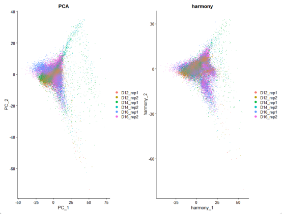
R
# 发育阶段分离
p4 <- DimPlot(merged_seurat, reduction = "pca", group.by = "group")+
  ggtitle("PCA_group")
p5 <- DimPlot(merged_seurat, reduction = "harmony", group.by = "group")+
  ggtitle("harmony_group")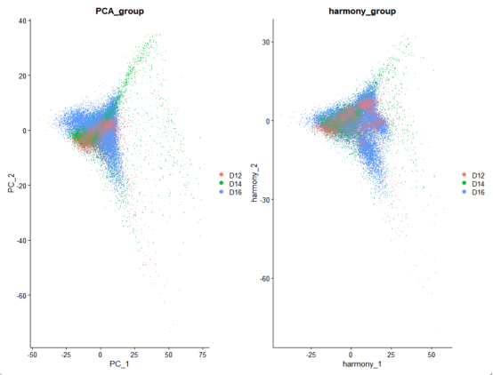
R
# 聚类树分析(clustree)
cluster_cols <- grep("_snn_res\\.",
                     colnames(merged_seurat@meta.data),
                     value = TRUE
                     )
prefix <- sub("\\d+\\.\\d+$", "",
              cluster_cols[1]
              )
clustree_plot <- clustree(merged_seurat, # 使用动态获取的前缀可视化
                          prefix = prefix
                          )
ggsave("clustree_plot.png", clustree_plot, width = 12, height = 10)
print(cluster_cols)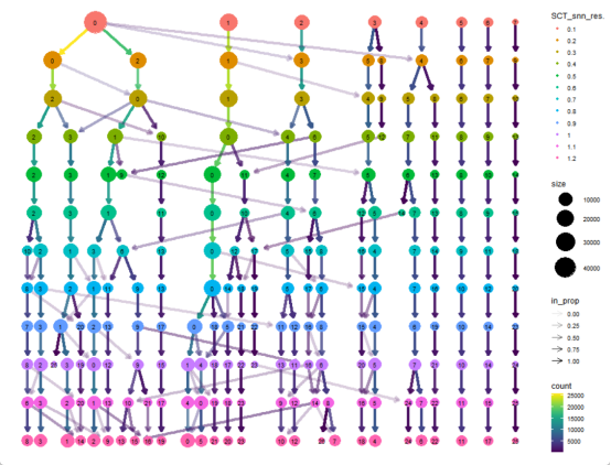
R
# 创建统一的颜色方案
cluster_colors <- colorRampPalette(brewer.pal(9, "Set1"))(length(unique(merged_seurat$seurat_clusters)))
sample_colors <- brewer.pal(6, "Dark2")
# UMAP按样本分组
p_sample <- DimPlot(
  merged_seurat,
  reduction = "umap_harmony",
  group.by = "sample_name",
  cols = sample_colors,
  pt.size = 0.3
) +
  ggtitle("Samples Integration") +
  theme(legend.position = "bottom")

# UMAP按细胞聚类
p_cluster <- DimPlot(
  merged_seurat,
  reduction = "umap_harmony",
  #group.by = "seurat_clusters",
  label = TRUE,
  cols = cluster_colors,
  pt.size = 0.3
) +
  ggtitle("Cell Clusters (Res 0.6)")
# 组合可视化
integrated_plot <- (p_sample | p_cluster) + plot_layout(widths = c(1, 1))
ggsave("Integration_results.png", integrated_plot, width = 14, height = 6)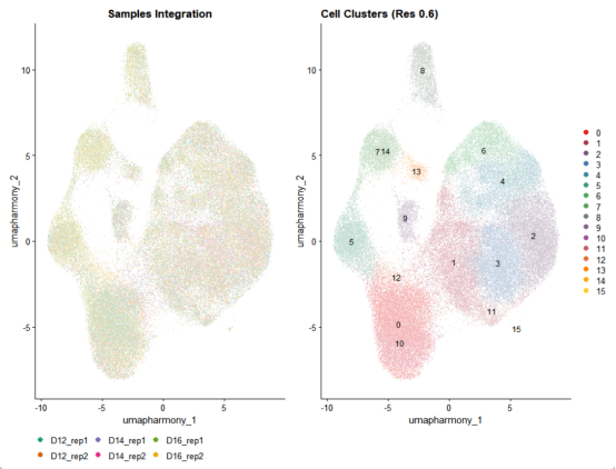
R
# 按样本分面显示
p_split <- DimPlot(
  merged_seurat,
  reduction = "umap_harmony",
  split.by = "sample_name",
  ncol = 3,
  pt.size = 0.2
) +
  ggtitle("Integration by Sample")
ggsave("Integration_by_sample.png", p_split, width = 12, height = 4)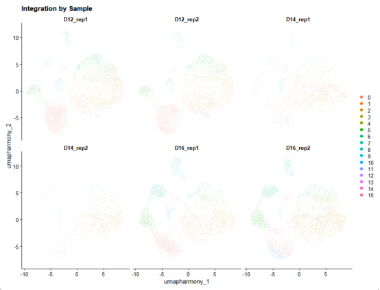
R
# 按发育阶段着色
p_development <- DimPlot(
  merged_seurat,
  reduction = "umap_harmony",
  group.by = "group",
  cols = c("#1f77b4", "#ff7f0e", "#2ca02c"),
  pt.size = 0.3
) + ggtitle("Developmental Stage")

# 组合可视化
final_plot <- (p_sample | p_cluster | p_development) + plot_layout(widths = c(1, 1, 1))
ggsave("Final_integration_results.png", final_plot, width = 18, height = 6)