这个HTML页面通过精心设计的视觉效果和交互体验,创造了一个温馨、友好的用户一键登录界面。
大家复制代码时,可能会因格式转换出现错乱,导致样式失效。建议先少量复制代码进行测试,若未能解决问题,私信回复源码两字,我会发送完整的压缩包给你。
演示效果
HTML&CSS
html
<!DOCTYPE html>
<html lang="zh-CN">
<head>
<meta charset="UTF-8">
<meta name="viewport" content="width=device-width, initial-scale=1.0">
<title>一键登录</title>
<link rel="stylesheet" href="https://cdnjs.cloudflare.com/ajax/libs/font-awesome/6.4.0/css/all.min.css">
<link href="https://fonts.googleapis.com/css2?family=Pacifico&family=Quicksand:wght@400;500;700&display=swap"
rel="stylesheet">
<style>
* {
margin: 0;
padding: 0;
box-sizing: border-box;
}
body {
background: linear-gradient(135deg, #ffd1dc, #e0bbe4, #d291bc);
color: #5a3d5c;
min-height: 100vh;
display: flex;
justify-content: center;
align-items: center;
font-family: 'Quicksand', sans-serif;
overflow: hidden;
position: relative;
}
/* 装饰元素 */
.decoration {
position: absolute;
z-index: 0;
}
.heart {
position: absolute;
color: rgba(255, 105, 180, 0.3);
font-size: 24px;
animation: float 8s infinite ease-in-out;
}
.flower {
position: absolute;
color: rgba(255, 215, 0, 0.3);
font-size: 28px;
animation: rotate 20s infinite linear;
}
.cloud {
position: absolute;
color: rgba(255, 255, 255, 0.6);
font-size: 50px;
animation: drift 30s infinite linear;
}
/* 登录容器 */
.login-container {
position: relative;
z-index: 10;
width: 90%;
max-width: 420px;
background: rgba(255, 255, 255, 0.85);
backdrop-filter: blur(10px);
border-radius: 30px;
padding: 40px 30px;
box-shadow: 0 10px 30px rgba(146, 84, 150, 0.2);
text-align: center;
}
.logo {
margin-bottom: 25px;
display: flex;
justify-content: center;
}
.logo-circle {
width: 100px;
height: 100px;
border-radius: 50%;
background: linear-gradient(135deg, #ffb6c1, #ff69b4);
display: flex;
align-items: center;
justify-content: center;
box-shadow: 0 8px 25px rgba(255, 105, 180, 0.4);
position: relative;
overflow: hidden;
border: 3px solid white;
}
.logo-circle::before {
content: '';
position: absolute;
width: 80%;
height: 80%;
border-radius: 50%;
background: rgba(255, 255, 255, 0.3);
}
.logo-inner {
width: 70px;
height: 70px;
border-radius: 50%;
background: white;
display: flex;
align-items: center;
justify-content: center;
z-index: 2;
}
.logo-inner i {
font-size: 36px;
color: #ff69b4;
text-shadow: 0 2px 5px rgba(255, 105, 180, 0.3);
}
h1 {
font-family: 'Pacifico', cursive;
font-size: 42px;
font-weight: 400;
margin-bottom: 10px;
background: linear-gradient(90deg, #ff69b4, #d291bc);
-webkit-background-clip: text;
background-clip: text;
color: transparent;
letter-spacing: 1px;
}
.subtitle {
font-size: 16px;
color: #8a6d8b;
margin-bottom: 35px;
font-weight: 500;
letter-spacing: 0.5px;
line-height: 1.6;
}
.login-btn {
width: 100%;
padding: 18px;
background: linear-gradient(90deg, #ff69b4, #d291bc);
border: none;
border-radius: 18px;
color: white;
font-size: 20px;
font-weight: 700;
cursor: pointer;
transition: all 0.3s ease;
position: relative;
overflow: hidden;
box-shadow: 0 8px 20px rgba(255, 105, 180, 0.4);
margin-bottom: 25px;
z-index: 2;
letter-spacing: 1px;
}
.login-btn:hover {
transform: translateY(-5px);
box-shadow: 0 12px 25px rgba(255, 105, 180, 0.5);
}
.login-btn:active {
transform: translateY(2px);
}
.login-btn i {
margin-right: 12px;
font-size: 22px;
vertical-align: middle;
}
.login-btn::after {
content: '';
position: absolute;
top: 0;
left: -100%;
width: 100%;
height: 100%;
background: linear-gradient(90deg, transparent, rgba(255, 255, 255, 0.4), transparent);
transition: 0.5s;
z-index: -1;
}
.login-btn:hover::after {
left: 100%;
}
.divider {
display: flex;
align-items: center;
margin: 25px 0;
}
.divider-line {
flex: 1;
height: 1px;
background: linear-gradient(90deg, transparent, rgba(146, 84, 150, 0.3), transparent);
}
.divider-text {
padding: 0 15px;
color: #8a6d8b;
font-size: 14px;
font-weight: 500;
}
.other-options {
display: flex;
justify-content: center;
gap: 20px;
margin-top: 20px;
}
.option-btn {
width: 55px;
height: 55px;
border-radius: 50%;
background: white;
border: none;
display: flex;
align-items: center;
justify-content: center;
color: #ff69b4;
font-size: 22px;
cursor: pointer;
transition: all 0.3s ease;
box-shadow: 0 5px 15px rgba(146, 84, 150, 0.15);
}
.option-btn:hover {
transform: translateY(-5px);
box-shadow: 0 8px 20px rgba(255, 105, 180, 0.3);
background: #fff0f5;
}
.terms {
margin-top: 30px;
font-size: 13px;
color: #8a6d8b;
line-height: 1.6;
}
.terms a {
color: #ff69b4;
text-decoration: none;
font-weight: 600;
}
/* 动画 */
@keyframes float {
0%,
100% {
transform: translateY(0) rotate(0deg);
}
50% {
transform: translateY(-20px) rotate(10deg);
}
}
@keyframes rotate {
0% {
transform: rotate(0deg);
}
100% {
transform: rotate(360deg);
}
}
@keyframes drift {
0% {
transform: translateX(-100px);
}
100% {
transform: translateX(calc(100vw + 100px));
}
}
/* 响应式调整 */
@media (max-width: 480px) {
.login-container {
padding: 30px 20px;
}
h1 {
font-size: 36px;
}
.subtitle {
font-size: 14px;
}
.login-btn {
padding: 16px;
font-size: 18px;
}
.logo-circle {
width: 85px;
height: 85px;
}
.logo-inner {
width: 60px;
height: 60px;
}
}
</style>
</head>
<body>
<!-- 装饰元素 -->
<div class="decoration">
<div class="heart" style="top: 10%; left: 15%;"><i class="fas fa-heart"></i></div>
<div class="heart" style="top: 25%; left: 85%;"><i class="fas fa-heart"></i></div>
<div class="heart" style="top: 80%; left: 10%;"><i class="fas fa-heart"></i></div>
<div class="heart" style="top: 65%; left: 90%;"><i class="fas fa-heart"></i></div>
<div class="flower" style="top: 15%; left: 5%;"><i class="fas fa-seedling"></i></div>
<div class="flower" style="top: 75%; left: 80%;"><i class="fas fa-spa"></i></div>
<div class="cloud" style="top: 5%; left: -50px;"><i class="fas fa-cloud"></i></div>
<div class="cloud" style="top: 85%; left: -100px;"><i class="fas fa-cloud"></i></div>
</div>
<!-- 登录容器 -->
<div class="login-container">
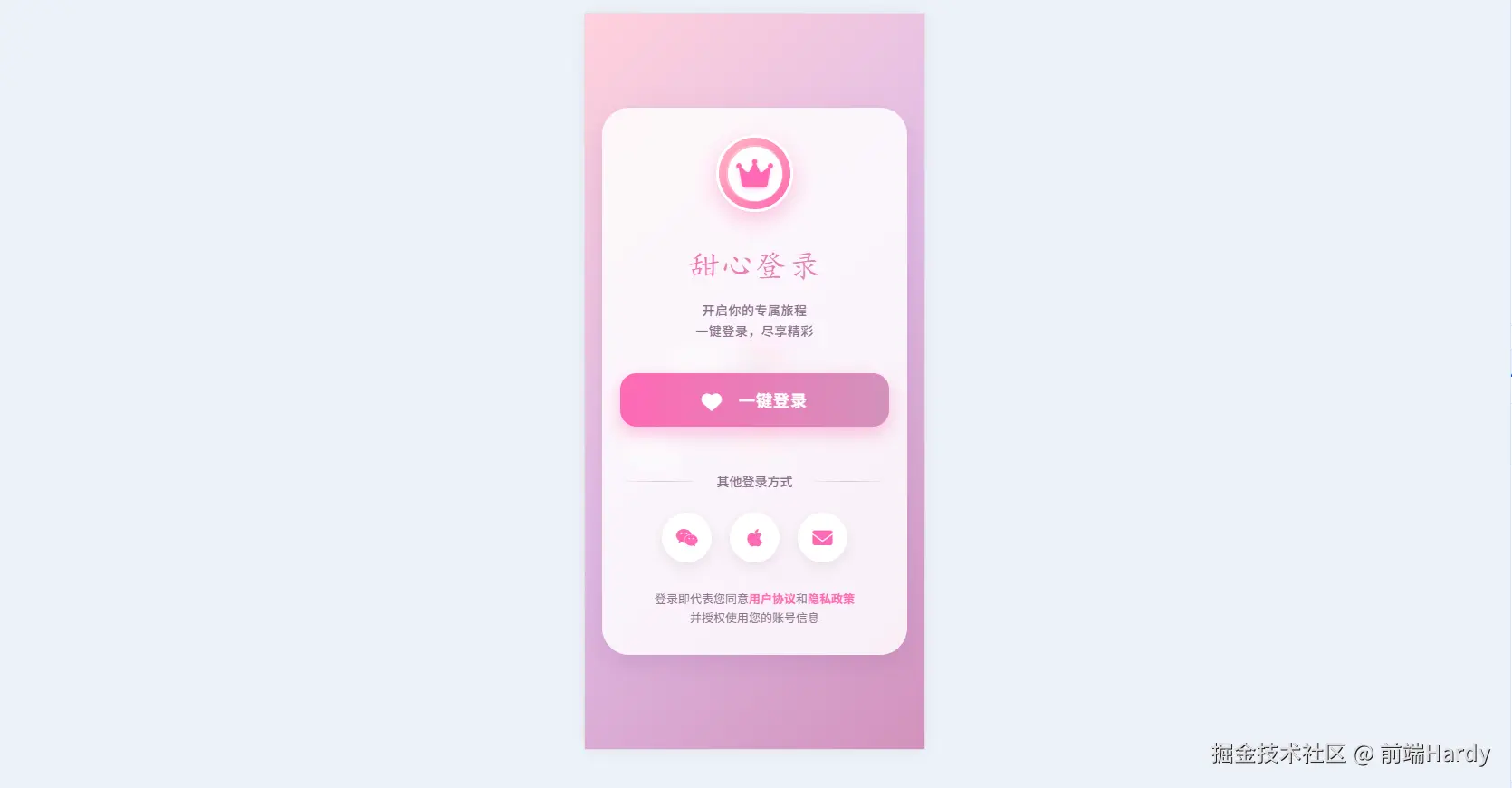
<div class="logo">
<div class="logo-circle">
<div class="logo-inner">
<i class="fas fa-crown"></i>
</div>
</div>
</div>
<h1>甜心登录</h1>
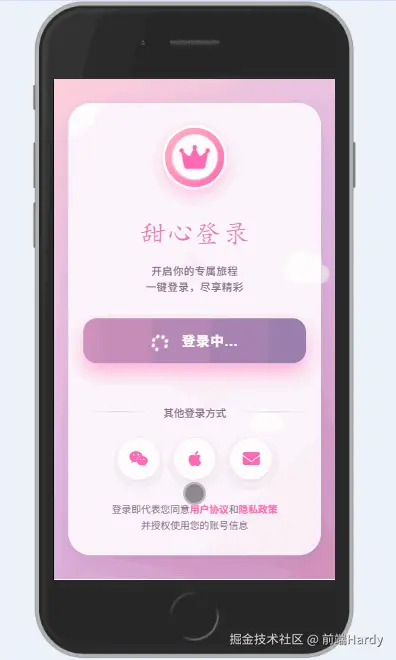
<p class="subtitle">开启你的专属旅程<br>一键登录,尽享精彩</p>
<button class="login-btn">
<i class="fas fa-heart"></i> 一键登录
</button>
<div class="divider">
<div class="divider-line"></div>
<div class="divider-text">其他登录方式</div>
<div class="divider-line"></div>
</div>
<div class="other-options">
<div class="option-btn">
<i class="fab fa-weixin"></i>
</div>
<div class="option-btn">
<i class="fab fa-apple"></i>
</div>
<div class="option-btn">
<i class="fas fa-envelope"></i>
</div>
</div>
<div class="terms">
登录即代表您同意<a href="#">用户协议</a>和<a href="#">隐私政策</a><br>并授权使用您的账号信息
</div>
</div>
<script>
// 创建更多装饰元素
function createDecorations() {
const container = document.querySelector('.decoration');
const types = ['heart', 'flower', 'star'];
for (let i = 0; i < 15; i++) {
const type = types[Math.floor(Math.random() * types.length)];
const element = document.createElement('div');
element.classList.add(type);
// 随机图标
let iconClass;
if (type === 'heart') {
iconClass = 'fas fa-heart';
} else if (type === 'flower') {
iconClass = Math.random() > 0.5 ? 'fas fa-seedling' : 'fas fa-spa';
} else {
iconClass = 'fas fa-star';
}
element.innerHTML = `<i class="${iconClass}"></i>`;
// 随机位置
element.style.left = `${Math.random() * 100}%`;
element.style.top = `${Math.random() * 100}%`;
// 随机大小
const size = Math.random() * 25 + 15;
element.style.fontSize = `${size}px`;
// 随机颜色和透明度
const colors = ['#ff69b4', '#d291bc', '#ffb6c1', '#e0bbe4', '#957dad'];
const color = colors[Math.floor(Math.random() * colors.length)];
element.style.color = color.replace(')', `, ${Math.random() * 0.4 + 0.2})`);
// 随机动画延迟和时长
element.style.animationDelay = `${Math.random() * 5}s`;
element.style.animationDuration = `${Math.random() * 10 + 10}s`;
container.appendChild(element);
}
}
// 登录按钮交互效果
function setupLoginButton() {
const loginBtn = document.querySelector('.login-btn');
loginBtn.addEventListener('click', function () {
// 添加点击效果
const originalHTML = this.innerHTML;
this.innerHTML = '<i class="fas fa-spinner fa-spin"></i> 登录中...';
this.style.background = 'linear-gradient(90deg, #d291bc, #957dad)';
// 模拟登录过程
setTimeout(() => {
this.innerHTML = '<i class="fas fa-check"></i> 登录成功';
this.style.background = 'linear-gradient(90deg, #9acd32, #32cd32)';
// 创建庆祝效果
createCelebration();
// 成功后跳转(此处模拟)
setTimeout(() => {
this.innerHTML = originalHTML;
this.style.background = 'linear-gradient(90deg, #ff69b4, #d291bc)';
}, 1000);
}, 1500);
});
}
// 创建庆祝效果
function createCelebration() {
for (let i = 0; i < 30; i++) {
setTimeout(() => {
const confetti = document.createElement('div');
confetti.innerHTML = '<i class="fas fa-heart"></i>';
confetti.style.position = 'fixed';
confetti.style.left = `${Math.random() * 100}%`;
confetti.style.top = '0';
confetti.style.fontSize = `${Math.random() * 20 + 15}px`;
confetti.style.color = ['#ff69b4', '#ff1493', '#c71585', '#db7093'][Math.floor(Math.random() * 4)];
confetti.style.zIndex = '100';
confetti.style.opacity = '0.8';
confetti.style.animation = `confetti-fall ${Math.random() * 2 + 1}s ease-in forwards`;
document.body.appendChild(confetti);
// 动画结束后移除元素
setTimeout(() => {
confetti.remove();
}, 3000);
}, i * 100);
}
// 添加CSS动画
const style = document.createElement('style');
style.innerHTML = `
@keyframes confetti-fall {
0% { transform: translateY(0) rotate(0deg); opacity: 0.8; }
100% { transform: translateY(100vh) rotate(${Math.random() > 0.5 ? '' : '-'}360deg); opacity: 0; }
}
`;
document.head.appendChild(style);
}
// 初始化
document.addEventListener('DOMContentLoaded', function () {
createDecorations();
setupLoginButton();
});
</script>
</body>
</html>HTML
- 装饰元素容器(.decoration):包含漂浮的心形、花朵和云朵图标
- 登录容器(.login-container):包含所有登录相关元素
- 登录表单元素:logo、标题、登录按钮、其他登录方式选项等
CSS
- *{margin:0;padding:0;box-sizing:border-box} 清零、统一盒模型。
- body:渐变背景、弹性居中、溢出隐藏,为后续动画做准备。
- .heart / .flower / .cloud 绝对定位,使用 animation-* 系列属性完成:
- heart:上下漂浮 float
- flower:匀速旋转 rotate
- cloud:水平漂移 drift
- 帧动画定义在 @keyframes float / rotate / drift。
- .login-container:玻璃拟态:background: rgba(255,255,255,.85); backdrop-filter: blur(10px);圆角、阴影、内边距,形成卡片。
- 外层 .logo-circle:径向渐变粉色背景 + 白色边框 + 阴影。
- 内层 .logo-inner:白色圆形叠在上面,放皇冠图标。
- h1:Pacifico 手写体,再用 linear-gradient + background-clip 做「渐变色填充字」。
- .subtitle:Quicksand 细体,颜色 #8a6d8b。
- .login-btn:粉色渐变、圆角、阴影,含 hover/active 位移+阴影变化;
- 使用 ::after 伪元素做「扫光」滑动高亮。
- .option-btn:圆形图标按钮,hover 上浮+背景微变。
- @media (max-width: 480px):缩小卡片、字号、按钮、logo 尺寸,保证手机端舒适。
JavaScript
createDecorations()
动态生成 15 个额外装饰元素(随机 heart / flower / star)。
随机位置、大小、颜色透明度、动画延迟/时长,追加到 .decoration 容器。
setupLoginButton()
给「一键登录」按钮绑定点击事件:
a. 立即替换 HTML 为fa-spinner fa-spin 登录中...,背景色改为紫灰渐变;
b. setTimeout 1.5s 模拟接口返回 → 显示绿色「登录成功」;
c. 再 setTimeout 1s 后恢复按钮原状(方便演示)。
createCelebration()
在「登录成功」瞬间触发:
• 循环 30 次,每 100 ms 创建一个fa-heart小图标;
• 随机水平位置、颜色、大小,应用 confetti-fall 动画:从顶部落到底部并旋转淡出;
• 动画完成后自动 remove(),避免内存泄漏。
动态插入style定义 @keyframes confetti-fall。
各位互联网搭子,要是这篇文章成功引起了你的注意,别犹豫,关注、点赞、评论、分享走一波,让我们把这份默契延续下去,一起在知识的海洋里乘风破浪!