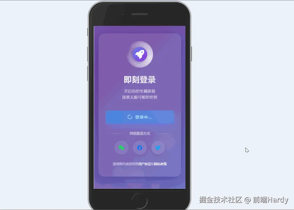
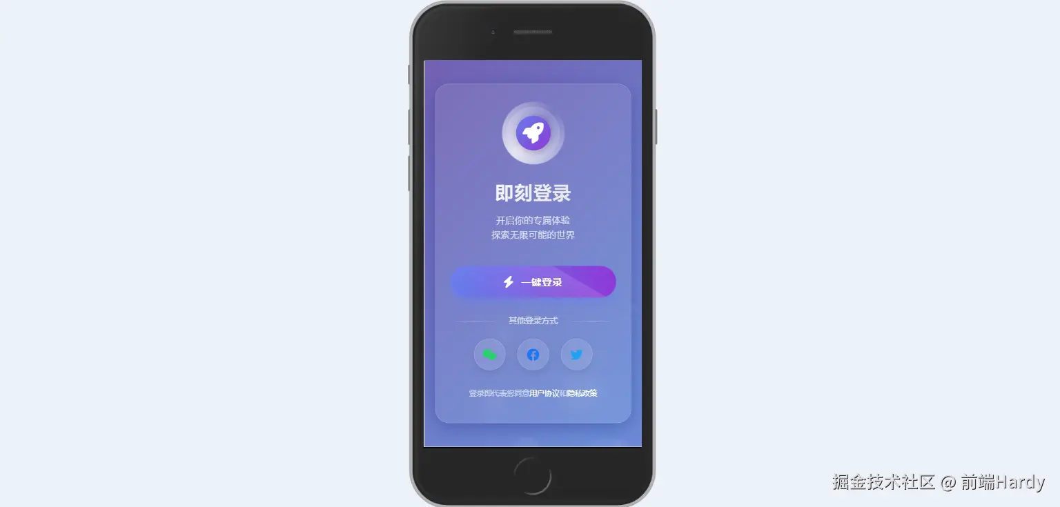
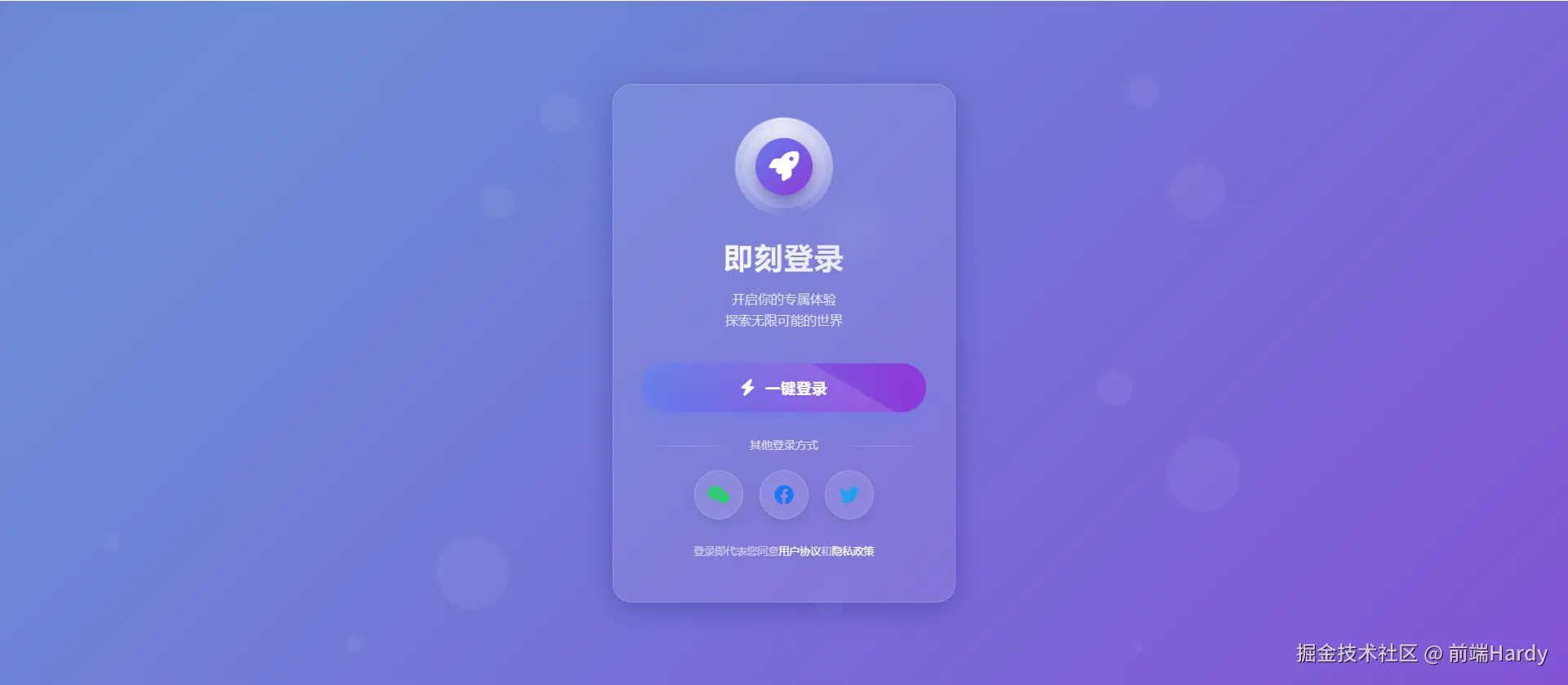
这个 HTML 文件通过 CSS 动画和 JavaScript 交互,创建了一个具有动态背景和交互效果的一键登录页面。
大家复制代码时,可能会因格式转换出现错乱,导致样式失效。建议先少量复制代码进行测试,若未能解决问题,私信回复源码两字,我会发送完整的压缩包给你。
演示效果
HTML&CSS
html
<!DOCTYPE html>
<html lang="zh-CN">
<head>
<meta charset="UTF-8">
<meta name="viewport" content="width=device-width, initial-scale=1.0">
<title>极简登录 | 一键登录</title>
<link rel="stylesheet" href="https://cdnjs.cloudflare.com/ajax/libs/font-awesome/6.4.0/css/all.min.css">
<link href="https://fonts.googleapis.com/css2?family=Poppins:wght@300;400;500;600;700&display=swap" rel="stylesheet">
<style>
* {
margin: 0;
padding: 0;
box-sizing: border-box;
}
body {
background: linear-gradient(135deg, #667eea, #764ba2, #6B8DD6, #8E37D7);
background-size: 400% 400%;
color: #fff;
min-height: 100vh;
display: flex;
justify-content: center;
align-items: center;
font-family: 'Poppins', sans-serif;
overflow: hidden;
position: relative;
animation: gradientBG 15s ease infinite;
}
/* 动态背景动画 */
@keyframes gradientBG {
0% { background-position: 0% 50%; }
50% { background-position: 100% 50%; }
100% { background-position: 0% 50%; }
}
/* 浮动气泡 */
.bubbles {
position: absolute;
width: 100%;
height: 100%;
overflow: hidden;
top: 0;
left: 0;
z-index: 1;
}
.bubble {
position: absolute;
bottom: -100px;
width: 40px;
height: 40px;
background: rgba(255, 255, 255, 0.1);
border-radius: 50%;
opacity: 0.5;
animation: rise 10s infinite ease-in;
}
.bubble:nth-child(1) {
width: 40px;
height: 40px;
left: 10%;
animation-duration: 8s;
}
.bubble:nth-child(2) {
width: 20px;
height: 20px;
left: 20%;
animation-duration: 5s;
animation-delay: 1s;
}
.bubble:nth-child(3) {
width: 50px;
height: 50px;
left: 35%;
animation-duration: 7s;
animation-delay: 2s;
}
.bubble:nth-child(4) {
width: 80px;
height: 80px;
left: 50%;
animation-duration: 11s;
animation-delay: 0s;
}
.bubble:nth-child(5) {
width: 35px;
height: 35px;
left: 55%;
animation-duration: 6s;
animation-delay: 1s;
}
.bubble:nth-child(6) {
width: 45px;
height: 45px;
left: 65%;
animation-duration: 8s;
animation-delay: 3s;
}
.bubble:nth-child(7) {
width: 90px;
height: 90px;
left: 70%;
animation-duration: 12s;
animation-delay: 2s;
}
.bubble:nth-child(8) {
width: 25px;
height: 25px;
left: 80%;
animation-duration: 6s;
animation-delay: 2s;
}
.bubble:nth-child(9) {
width: 15px;
height: 15px;
left: 70%;
animation-duration: 5s;
animation-delay: 1s;
}
.bubble:nth-child(10) {
width: 90px;
height: 90px;
left: 25%;
animation-duration: 10s;
animation-delay: 4s;
}
@keyframes rise {
0% {
bottom: -100px;
transform: translateX(0);
}
50% {
transform: translateX(100px);
}
100% {
bottom: 1080px;
transform: translateX(-200px);
}
}
/* 登录容器 */
.login-container {
position: relative;
z-index: 10;
width: 90%;
max-width: 420px;
background: rgba(255, 255, 255, 0.08);
backdrop-filter: blur(12px);
border-radius: 24px;
padding: 50px 35px;
box-shadow: 0 8px 32px rgba(31, 38, 135, 0.37);
border: 1px solid rgba(255, 255, 255, 0.18);
text-align: center;
transition: transform 0.4s ease, box-shadow 0.4s ease;
}
.login-container:hover {
transform: translateY(-10px);
box-shadow: 0 12px 40px rgba(31, 38, 135, 0.5);
}
/* Logo区域 */
.logo {
margin-bottom: 35px;
position: relative;
}
.logo-circle {
width: 100px;
height: 100px;
margin: 0 auto;
display: flex;
align-items: center;
justify-content: center;
background: rgba(255, 255, 255, 0.1);
border-radius: 50%;
position: relative;
box-shadow: 0 0 0 1px rgba(255, 255, 255, 0.2),
inset 0 0 0 10px rgba(255, 255, 255, 0.05);
}
.logo-circle::before {
content: '';
position: absolute;
width: 120%;
height: 120%;
border-radius: 50%;
background: conic-gradient(transparent, rgba(255,255,255,0.8), transparent);
animation: rotate 3s linear infinite;
}
.logo-inner {
width: 70px;
height: 70px;
border-radius: 50%;
background: linear-gradient(135deg, #667eea, #8E37D7);
display: flex;
align-items: center;
justify-content: center;
z-index: 2;
box-shadow: 0 5px 15px rgba(0, 0, 0, 0.2);
}
.logo-inner i {
font-size: 36px;
color: white;
}
@keyframes rotate {
0% { transform: rotate(0deg); }
100% { transform: rotate(360deg); }
}
/* 标题区域 */
.title-area {
margin-bottom: 40px;
}
h1 {
font-size: 36px;
font-weight: 700;
margin-bottom: 10px;
background: linear-gradient(90deg, #fff, #e0e0e0);
-webkit-background-clip: text;
background-clip: text;
color: transparent;
letter-spacing: 1px;
}
.subtitle {
font-size: 16px;
color: rgba(255, 255, 255, 0.8);
font-weight: 300;
line-height: 1.6;
}
/* 登录按钮 */
.login-btn {
width: 100%;
padding: 18px;
background: linear-gradient(90deg, #667eea, #8E37D7);
border: none;
border-radius: 50px;
color: white;
font-size: 18px;
font-weight: 600;
cursor: pointer;
transition: all 0.4s cubic-bezier(0.175, 0.885, 0.32, 1.275);
position: relative;
overflow: hidden;
box-shadow: 0 10px 25px rgba(102, 126, 234, 0.5);
margin-bottom: 30px;
z-index: 2;
letter-spacing: 1px;
display: flex;
align-items: center;
justify-content: center;
}
.login-btn i {
margin-right: 12px;
font-size: 20px;
transition: transform 0.3s ease;
}
.login-btn:hover {
transform: translateY(-5px) scale(1.03);
box-shadow: 0 15px 30px rgba(102, 126, 234, 0.7);
}
.login-btn:hover i {
transform: rotate(15deg);
}
.login-btn:active {
transform: translateY(0) scale(0.98);
}
.login-btn::after {
content: '';
position: absolute;
top: -50%;
left: -60%;
width: 200%;
height: 200%;
background: linear-gradient(rgba(255,255,255,0.13), rgba(255,255,255,0));
transform: rotate(30deg);
transition: all 0.7s ease;
}
.login-btn:hover::after {
left: 10%;
top: -20%;
}
/* 其他登录方式 */
.other-options {
margin: 30px 0;
}
.option-title {
color: rgba(255, 255, 255, 0.7);
font-size: 14px;
margin-bottom: 20px;
position: relative;
}
.option-title::before,
.option-title::after {
content: '';
position: absolute;
top: 50%;
width: 30%;
height: 1px;
background: linear-gradient(90deg, transparent, rgba(255,255,255,0.3), transparent);
}
.option-title::before {
left: 0;
}
.option-title::after {
right: 0;
}
.option-buttons {
display: flex;
justify-content: center;
gap: 20px;
}
.option-btn {
width: 60px;
height: 60px;
border-radius: 50%;
background: rgba(255, 255, 255, 0.1);
border: 1px solid rgba(255, 255, 255, 0.2);
display: flex;
align-items: center;
justify-content: center;
color: white;
font-size: 24px;
cursor: pointer;
transition: all 0.3s ease;
box-shadow: 0 5px 15px rgba(0, 0, 0, 0.1);
}
.option-btn:hover {
transform: translateY(-8px);
background: rgba(255, 255, 255, 0.15);
box-shadow: 0 10px 20px rgba(0, 0, 0, 0.2);
}
.option-btn:nth-child(1) { color: #25D366; }
.option-btn:nth-child(2) { color: #1877F2; }
.option-btn:nth-child(3) { color: #1DA1F2; }
/* 条款区域 */
.terms {
margin-top: 30px;
font-size: 13px;
color: rgba(255, 255, 255, 0.6);
line-height: 1.6;
}
.terms a {
color: white;
text-decoration: none;
font-weight: 500;
position: relative;
}
.terms a::after {
content: '';
position: absolute;
bottom: -2px;
left: 0;
width: 0;
height: 1px;
background: white;
transition: width 0.3s ease;
}
.terms a:hover::after {
width: 100%;
}
/* 响应式调整 */
@media (max-width: 480px) {
.login-container {
padding: 40px 25px;
}
h1 {
font-size: 32px;
}
.logo-circle {
width: 90px;
height: 90px;
}
.logo-inner {
width: 60px;
height: 60px;
}
.login-btn {
padding: 16px;
font-size: 17px;
}
.option-btn {
width: 55px;
height: 55px;
font-size: 22px;
}
}
</style>
</head>
<body>
<!-- 气泡背景 -->
<div class="bubbles">
<div class="bubble"></div>
<div class="bubble"></div>
<div class="bubble"></div>
<div class="bubble"></div>
<div class="bubble"></div>
<div class="bubble"></div>
<div class="bubble"></div>
<div class="bubble"></div>
<div class="bubble"></div>
<div class="bubble"></div>
</div>
<!-- 登录容器 -->
<div class="login-container">
<div class="logo">
<div class="logo-circle">
<div class="logo-inner">
<i class="fas fa-rocket"></i>
</div>
</div>
</div>
<div class="title-area">
<h1>即刻登录</h1>
<p class="subtitle">开启你的专属体验<br>探索无限可能的世界</p>
</div>
<button class="login-btn" id="loginBtn">
<i class="fas fa-bolt"></i> 一键登录
</button>
<div class="other-options">
<div class="option-title">其他登录方式</div>
<div class="option-buttons">
<div class="option-btn">
<i class="fab fa-weixin"></i>
</div>
<div class="option-btn">
<i class="fab fa-facebook"></i>
</div>
<div class="option-btn">
<i class="fab fa-twitter"></i>
</div>
</div>
</div>
<div class="terms">
登录即代表您同意<a href="#">用户协议</a>和<a href="#">隐私政策</a>
</div>
</div>
<script>
// 登录按钮交互效果
const loginBtn = document.getElementById('loginBtn');
loginBtn.addEventListener('click', function() {
// 保存原始内容
const originalHTML = this.innerHTML;
// 添加加载效果
this.innerHTML = '<i class="fas fa-spinner fa-spin"></i> 登录中...';
this.style.background = 'linear-gradient(90deg, #5a67d8, #805ad5)';
// 模拟登录过程
setTimeout(() => {
this.innerHTML = '<i class="fas fa-check"></i> 登录成功';
this.style.background = 'linear-gradient(90deg, #48BB78, #38A169)';
// 创建成功动画
createSuccessAnimation();
// 成功后跳转(此处模拟)
setTimeout(() => {
// alert('欢迎回来!即将进入您的个人空间');
this.innerHTML = originalHTML;
this.style.background = 'linear-gradient(90deg, #667eea, #8E37D7)';
}, 1000);
}, 1500);
});
// 创建成功动画
function createSuccessAnimation() {
const container = document.querySelector('.login-container');
for (let i = 0; i < 20; i++) {
const star = document.createElement('div');
star.innerHTML = '<i class="fas fa-star"></i>';
star.style.position = 'absolute';
star.style.left = `${Math.random() * 80 + 10}%`;
star.style.top = `${Math.random() * 80 + 10}%`;
star.style.fontSize = `${Math.random() * 20 + 10}px`;
star.style.color = '#FFD700';
star.style.opacity = '0';
star.style.zIndex = '5';
star.style.animation = `star-fall ${Math.random() * 1 + 0.5}s ease-out forwards`;
container.appendChild(star);
// 动画结束后移除元素
setTimeout(() => {
star.remove();
}, 1000);
}
// 添加CSS动画
const style = document.createElement('style');
style.innerHTML = `
@keyframes star-fall {
0% {
transform: translateY(-20px) scale(0);
opacity: 0;
}
50% {
opacity: 1;
transform: translateY(0) scale(1.2);
}
100% {
transform: translateY(20px) scale(0);
opacity: 0;
}
}
`;
document.head.appendChild(style);
}
// 创建更多气泡
function createBubbles() {
const bubblesContainer = document.querySelector('.bubbles');
for (let i = 0; i < 5; i++) {
const bubble = document.createElement('div');
bubble.classList.add('bubble');
// 随机大小
const size = Math.random() * 60 + 20;
bubble.style.width = `${size}px`;
bubble.style.height = `${size}px`;
// 随机位置
bubble.style.left = `${Math.random() * 100}%`;
// 随机动画延迟和时长
bubble.style.animationDelay = `${Math.random() * 5}s`;
bubble.style.animationDuration = `${Math.random() * 7 + 5}s`;
bubblesContainer.appendChild(bubble);
}
}
// 初始化
document.addEventListener('DOMContentLoaded', function() {
createBubbles();
});
</script>
</body>
</html>HTML
- bubbles:包含多个 bubble,用于创建动态背景的气泡效果。
- login-container:登录表单的容器,包含:
- logo:显示一个带有旋转动画的圆形 Logo。
- title-area:包含标题和副标题。
- login-btn:登录按钮,点击时会触发交互效果。
- other-options:提供其他登录方式(如微信、Facebook、Twitter)。
- terms:显示用户协议和隐私政策的链接。
CSS
- *:重置所有元素的外边距和内边距,设置盒模型为 border-box。
- body:设置背景渐变动画、字体、最小高度等,确保页面内容居中显示。
- .bubbles:绝对定位,覆盖整个页面。
- .bubble:圆形气泡,使用 animation 实现上升和水平移动的效果。
- @keyframes rise:定义气泡上升的动画路径。
- .login-container:居中显示,带有玻璃拟态背景、圆角、阴影等效果。
- .logo:包含一个圆形 Logo,使用 conic-gradient 和 animation 实现旋转效果。
- .title-area:标题和副标题的样式。
- .login-btn:登录按钮的样式,包括渐变背景、阴影、悬停和点击效果。
- .other-options:其他登录方式的样式,包括分隔线和
- .terms:用户协议和隐私政策的样式。
- 使用@media 查询,针对小屏幕设备调整登录容器的内边距、字体大小等。
JavaScript
1. 登录按钮交互效果
JavaScript
const loginBtn = document.getElementById('loginBtn');

loginBtn.addEventListener('click', function() {
    // 保存原始内容
    const originalHTML = this.innerHTML;

    // 添加加载效果
    this.innerHTML = '<i class="fas fa-spinner fa-spin"></i> 登录中...';
    this.style.background = 'linear-gradient(90deg, #5a67d8, #805ad5)';

    // 模拟登录过程
    setTimeout(() => {
        this.innerHTML = '<i class="fas fa-check"></i> 登录成功';
        this.style.background = 'linear-gradient(90deg, #48BB78, #38A169)';

        // 创建成功动画
        createSuccessAnimation();

        // 成功后跳转(此处模拟)
        setTimeout(() => {
            // alert('欢迎回来!即将进入您的个人空间');
            this.innerHTML = originalHTML;
            this.style.background = 'linear-gradient(90deg, #667eea, #8E37D7)';
        }, 1000);
    }, 1500);
});
创建成功动画
JavaScript
function createSuccessAnimation() {
    const container = document.querySelector('.login-container');

    for (let i = 0; i < 20; i++) {
        const star = document.createElement('div');
        star.innerHTML = '<i class="fas fa-star"></i>';
        star.style.position = 'absolute';
        star.style.left = `${Math.random() * 80 + 10}%`;
        star.style.top = `${Math.random() * 80 + 10}%`;
        star.style.fontSize = `${Math.random() * 20 + 10}px`;
        star.style.color = '#FFD700';
        star.style.opacity = '0';
        star.style.zIndex = '5';
        star.style.animation = `star-fall ${Math.random() * 1 + 0.5}s ease-out forwards`;

        container.appendChild(star);

        // 动画结束后移除元素
        setTimeout(() => {
            star.remove();
        }, 1000);
    }

    // 添加CSS动画
    const style = document.createElement('style');
    style.innerHTML = `
        @keyframes star-fall {
            0% {
                transform: translateY(-20px) scale(0);
                opacity: 0;
            }
            50% {
                opacity: 1;
                transform: translateY(0) scale(1.2);
            }
            100% {
                transform: translateY(20px) scale(0);
                opacity: 0;
            }
        }
    `;
    document.head.appendChild(style);
}
创建更多气泡
JavaScript
function createBubbles() {
    const bubblesContainer = document.querySelector('.bubbles');

    for (let i = 0; i < 5; i++) {
        const bubble = document.createElement('div');
        bubble.classList.add('bubble');

        // 随机大小
        const size = Math.random() * 60 + 20;
        bubble.style.width = `${size}px`;
        bubble.style.height = `${size}px`;

        // 随机位置
        bubble.style.left = `${Math.random() * 100}%`;

        // 随机动画延迟和时长
        bubble.style.animationDelay = `${Math.random() * 5}s`;
        bubble.style.animationDuration = `${Math.random() * 7 + 5}s`;

        bubblesContainer.appendChild(bubble);
    }
}

// 初始化
document.addEventListener('DOMContentLoaded', function() {
    createBubbles();
});各位互联网搭子,要是这篇文章成功引起了你的注意,别犹豫,关注、点赞、评论、分享走一波,让我们把这份默契延续下去,一起在知识的海洋里乘风破浪!