aspect-ratio 是 CSS 中用于控制元素宽高比的属性,通过一行代码即可实现响应式比例布局,无需复杂计算。它确保元素在不同屏幕尺寸下保持固定比例,提升响应式设计效率。
一、基本语法与取值
css
selector {
  aspect-ratio: <width> / <height>;
}-
参数说明
-
<width>/<height>:以斜杠分隔 的宽高比,如16/9(宽度:高度=16:9)。 -
单值语法 :
aspect-ratio: 1等价于1/1(正方形)。
-
二、核心特性与使用规则
1.优先级规则
-
若同时设置
width、height和aspect-ratio,宽高比可能失效(浏览器优先使用显式尺寸)。 -
最佳实践:仅设置
width或height之一,另一维度由aspect-ratio自动计算。
css
.box {
  width: 100%;
  aspect-ratio: 4/3; /* 高度 = 宽度 × 3/4 */
}
2.响应式适配
-
默认根据宽度 计算高度(若设置
height: 100%则根据高度计算宽度)2。 -
结合
max-width/max-height限制极值:
css
.responsive-video {
  width: 100%;
  aspect-ratio: 16/9;
  max-height: 500px; /* 高度上限 */
}
3.与 object-fit配合
媒体元素(如图片、视频)需搭配 object-fit 避免变形:
css
img {
  width: 100%;
  aspect-ratio: 3/2;
  object-fit: cover; /* 裁剪多余部分 */
}
三、常见应用场景与示例
1. 保持图片/视频宽高比
html
<div class="video-container">
  <iframe src="video.mp4"></iframe>
</div>
css
.video-container {
  width: 80%;
  aspect-ratio: 16/9; /* 经典视频比例 */
}
2. 创建自适应正方形
css
.square {
  background: teal;
  aspect-ratio: 1; /* 简写,等价于1/1 */
}
3. 响应式卡片布局
css
.card {
  width: calc(33% - 20px);
  aspect-ratio: 4/3; /* 统一卡片比例 */
}
@media (max-width: 768px) {
  .card {
    width: 100%; /* 小屏单列 */
    aspect-ratio: 3/4; /* 竖屏比例 */
  }
}
4. 动态高度元素
css
.hero-banner {
  height: 60vh; /* 基于视口高度 */
  aspect-ratio: 2/1; /* 宽度 = 高度 × 2 */
}
四、注意事项
-
兼容性 :现代浏览器(Chrome、Firefox、Safari、Edge)均支持,IE 不兼容2。
-
冲突属性 :避免与
padding百分比布局混淆(padding百分比基于父容器宽度)。 -
替换元素 :对
<img>、<video>等元素直接生效,无需额外容器。
五、完整代码示例
html
<!DOCTYPE html>
<html lang="en">
<head>
<meta charset="UTF-8">
<meta name="viewport" content="width=device-width, initial-scale=1.0">
<title>Document</title>
<style>
.gallery {
display: grid;
grid-template-columns: repeat(3, 1fr);
gap: 16px;
}
.gallery-item {
background: #f0f0f0;
aspect-ratio: 3/2;
/* 统一比例 */
object-fit: cover;
/* 图片裁剪适配 */
}
@media (max-width: 600px) {
.gallery {
grid-template-columns: 1fr;
}
.gallery-item {
aspect-ratio: 1/1;
/* 移动端改为正方形 */
}
}
</style>
</head>
<body>
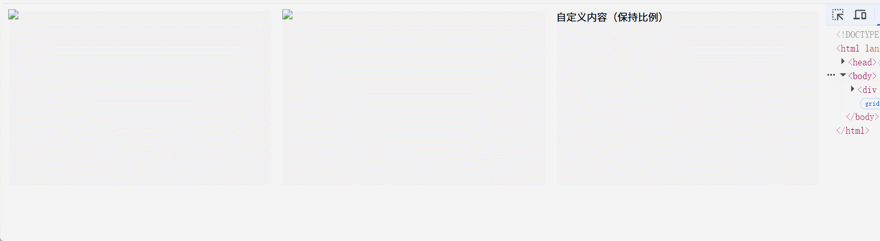
<div class="gallery">
<img class="gallery-item" src="image1.jpg">
<img class="gallery-item" src="image2.jpg">
<div class="gallery-item">自定义内容(保持比例)</div>
</div>
</body>
</html>效果展示: