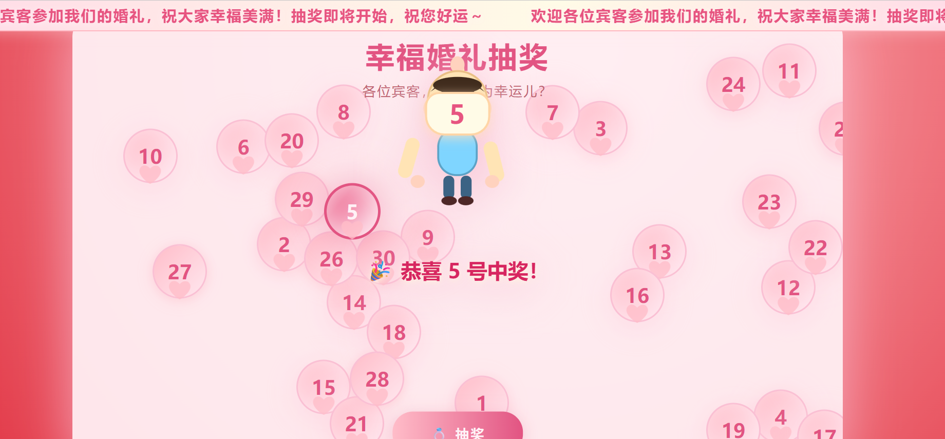
使用html实现抽奖程序,没有后台,如果需要后续写个后台可以配置,没有过多的介绍,看代码吧
html
<!DOCTYPE html>
<html lang="zh">
<head>
    <meta charset="UTF-8">
    <title>婚礼抽奖</title>
    <style>
        html, body {
            height: 100%;
            margin: 0;
            padding: 0;
            /* 这里改成红色渐变 */
            background: radial-gradient(circle at 60% 10%, #ffb2b2 0%, #d7000f 100%);
            overflow: hidden;
        }
        body {
            font-family: '微软雅黑','Segoe UI',Arial,sans-serif;
        }
        /* 跑马灯样式 */
        .marquee-bar-wrap {
            position: fixed;
            left:0; top: 0;
            width:100vw;
            height: 46px;
            background: linear-gradient(90deg,#ffdce7 0%,#fffbe7 60%,#ffdce7 100%);
            border-bottom: 2px solid #ffb6c1;
            z-index: 3000;
            box-shadow: 0 4px 20px #ffe4e950;
            display: flex;
            align-items: center;
            overflow: hidden;
            pointer-events: none;
        }
        .marquee-bar-content {
            position: absolute;
            white-space: nowrap;
            font-size: 1.45em;
            color: #e75480;
            font-weight: bold;
            letter-spacing: 2px;
            text-shadow: 0 2px 10px #fff0f7f0;
            left: 100vw;
            animation: marqueeMove 16s linear infinite;
        }
        @keyframes marqueeMove {
            from { left: 100vw; }
            to   { left: -100vw;}
        }
        .container {
            position: absolute;
            left: 50%; top: 50%;
            transform: translate(-50%,-50%);
            width: 1200px;
            height: 700px;
            background: rgba(255,255,255,0.93);
            border-radius: 36px;
            box-shadow: 0 10px 80px #f8bbd0bb;
            overflow: hidden;
            z-index: 1;
        }
        .title-area {
            position: absolute;
            width: 100%;
            top: 0;
            left: 0;
            text-align: center;
            z-index: 10;
            pointer-events: none;
        }
        h1 {
            margin: 36px 0 10px 0;
            font-size: 2.8em;
            color: #d72660;
            letter-spacing: 3px;
            font-weight: bold;
        }
        .subtitle {
            font-size: 1.3em;
            color: #a93a48;
            margin-bottom: 10px;
            letter-spacing: 2px;
        }
        .draw-btn {
            position: absolute;
            left: 50%; top: 620px;
            transform: translateX(-50%);
            font-size: 1.35em;
            background: linear-gradient(90deg, #ffb6c1 0%, #d72660 100%);
            border: none;
            color: #fff;
            padding: 18px 58px;
            border-radius: 32px;
            cursor: pointer;
            box-shadow: 0 4px 25px #d7266040;
            font-weight: bold;
            letter-spacing: 2px;
            outline: none;
            opacity: 1;
            transition: 0.2s;
            z-index: 20;
        }
        .draw-btn:active { filter: brightness(0.93);}
        .float-num {
            position: absolute;
            width: 80px; height: 80px;
            border-radius: 50%;
            background: linear-gradient(135deg,#ffb6c1 0%,#fff0f5 100%);
            color: #d72660;
            font-size: 1.9em;
            font-weight: bold;
            display: flex;
            align-items: center;
            justify-content: center;
            box-shadow: 0 3px 18px #ffb6c1a0;
            border: 3px solid #f8bbd0;
            user-select: none;
            pointer-events: none;
            transition: box-shadow 0.18s, transform 0.18s;
            animation: breatheBubble 2.2s infinite alternate;
        }
        @keyframes breatheBubble {
            0% { box-shadow: 0 3px 18px #ffb6c1a0; }
            100% { box-shadow: 0 8px 50px #ffd1e0a0, 0 0 28px #fff0f5cc inset;}
        }
        .float-num .heart {
            position: absolute;
            left: 50%; bottom: -12px;
            transform: translateX(-50%);
            font-size: 1.2em;
            color: #ffb6c1;
            opacity: 0.8;
            pointer-events: none;
        }
        .float-num.selected {
            background: linear-gradient(130deg,#e75480 30%,#fff0f7 100%);
            color: #fff;
            border: 4px solid #d72660;
            z-index: 99;
            animation: popBubble 0.4s cubic-bezier(.41,1.67,.37,1.01), breatheSelected 1.1s infinite alternate;
        }
        @keyframes popBubble {
            0% { transform: scale(1);}
            60% { transform: scale(1.33) rotate(-16deg);}
            100% { transform: scale(1) rotate(0);}
        }
        @keyframes breatheSelected {
            0% { box-shadow: 0 0 20px #ffa6c9, 0 0 0 #fff; }
            100% { box-shadow: 0 0 65px #e75480aa, 0 0 38px #fff0f5cc inset;}
        }
        .rings {
            position: absolute;
            top: -30px; right: 55px;
            width: 75px; height: 75px;
            z-index: 20;
            pointer-events: none;
        }
        .rings svg {
            width: 100%; height: 100%;
        }
        .boy-anim-mask {
            position: fixed;
            left: 0; top: 0; right: 0; bottom: 0;
            width: 100vw; height: 100vh;
            background: rgba(255,208,220,0.27);
            z-index: 2000;
            display: flex;
            align-items: flex-start;
            justify-content: center;
            cursor: pointer;
            animation: boyFadeInBg 0.38s;
        }
        @keyframes boyFadeInBg {
            from {background: rgba(255,208,220,0);}
            to   {background: rgba(255,208,220,0.27);}
        }
        .boy-anim-content {
            margin-top: -350px;
            animation: boySlideIn 1.0s cubic-bezier(.22,1.1,.45,1.01) forwards;
            display: flex;
            flex-direction: column;
            align-items: center;
            filter: drop-shadow(0 10px 32px #f8bbd0dd);
        }
        @keyframes boySlideIn {
            from { margin-top: -350px; opacity: 0; }
            80% { opacity: 1; }
            to { margin-top: 80px; opacity: 1; }
        }
        .boy-svg-wrap {
            width: 230px;
            height: 300px;
            position: relative;
        }
        .boy-num-holder {
            position: absolute;
            left: 50%;
            top: 62px;
            transform: translateX(-50%);
            width: 95px; height: 62px;
            background: #fffbe7;
            border-radius: 22px 22px 30px 30px;
            border: 3.5px solid #ffd5a6;
            display: flex;
            align-items: center;
            justify-content: center;
            font-size: 2.5em;
            font-weight: bold;
            color: #e75480;
            z-index: 2;
            box-shadow: 0 4px 16px #ffe1c1c1;
            letter-spacing: 2px;
        }
        .boy-win-text {
            margin-top: 18px;
            font-size: 2em;
            color: #d72660;
            font-weight: bold;
            text-shadow: 0 2px 10px #fff7e0;
            animation: textPop 1s;
        }
        @keyframes textPop {
            0%{ transform: scale(0.7); opacity: 0;}
            80%{ transform: scale(1.08);}
            100%{ transform: scale(1); opacity: 1;}
        }
        @media (max-width: 1300px) {
          .container { width: 98vw; min-width:320px; }
          .draw-btn { top: 83vh;}
        }
        @media (max-width: 800px) {
          .container { width: 100vw; height: 95vh; }
        }
    </style>
</head>
<body>
    <!-- 顶部跑马灯 -->
    <div class="marquee-bar-wrap" id="marqueeBarWrap">
        <div class="marquee-bar-content" id="marqueeBarContent"></div>
    </div>

    <div class="container" id="float-area" style="top:calc(50% + 23px);">
        <div class="title-area">
            <h1>幸福婚礼抽奖</h1>
            <div class="subtitle">各位宾客,谁会成为幸运儿?</div>
        </div>
        <button class="draw-btn" id="drawBtn">💍 抽奖</button>
        <div class="rings">
            <svg viewBox="0 0 80 60">
                <ellipse cx="30" cy="30" rx="18" ry="18" fill="#ffe4e9" stroke="#d72660" stroke-width="3"/>
                <ellipse cx="50" cy="30" rx="18" ry="18" fill="#fff0f5" stroke="#b23a48" stroke-width="3"/>
                <rect x="24" y="10" width="12" height="8" rx="2" fill="#ffe4b5" stroke="#b23a48" stroke-width="2" transform="rotate(-15 30 14)"/>
            </svg>
        </div>
    </div>
    <!-- 动画小男孩中奖展示 -->
    <div id="boyMask" style="display:none;"></div>
<script>
// -------- 跑马灯部分 --------
const marqueeContent = '欢迎各位宾客参加我们的婚礼,祝大家幸福美满!抽奖即将开始,祝您好运~';
// ↑↑↑↑↑↑↑↑↑↑↑↑↑↑↑↑↑↑↑↑↑↑↑↑↑↑↑↑↑↑↑↑↑↑↑↑↑↑↑↑
// 在此修改要轮播展示的内容

function setMarqueeText(txt){
    const ele = document.getElementById('marqueeBarContent');
    // 复制内容两遍用于连续无缝循环
    ele.innerHTML = txt + '\xa0\xa0\xa0\xa0\xa0\xa0\xa0\xa0'+ txt;
    // 动态调整动画时长(越长越慢)
    setTimeout(function(){
        let w = ele.offsetWidth;
        let speed = Math.max(12, w/80); // 保证长内容也较慢
        ele.style.animationDuration = speed+'s';
    },80);
}
setMarqueeText(marqueeContent);

// -------- 主抽奖部分 --------
const floatArea = document.getElementById('float-area');
const areaW = ()=>floatArea.clientWidth;
const areaH = ()=>floatArea.clientHeight;
const BALL_SIZE = 80;
const BALL_NUM = 30;
let balls = [];
let ballElements = [];
let animReq = null;

// 1. 生成不重叠的初始位置和速度
function genBalls() {
    balls = [];
    ballElements = [];
    for(let i=1; i<=BALL_NUM; i++) {
        let tries = 0, maxTry=500, ok = false, bx,by;
        do {
            bx = 80 + Math.random()*(areaW()-BALL_SIZE-180);
            by = 90 + Math.random()*(areaH()-BALL_SIZE-200);
            ok = balls.every(b => Math.hypot(b.x-bx, b.y-by)>BALL_SIZE*1.07);
            tries++;
        } while(!ok && tries<maxTry);
        let speed = 1.3+Math.random()*0.8;
        let angle = Math.random()*2*Math.PI;
        balls.push({
            num: i,
            x: bx, y: by,
            vx: speed*Math.cos(angle),
            vy: speed*Math.sin(angle)
        });
    }
}

// 2. 渲染气泡
function renderBalls() {
    for(const ele of ballElements) floatArea.removeChild(ele);
    ballElements = [];
    for(let i=0;i<balls.length;i++) {
        let b = balls[i];
        let div = document.createElement('div');
        div.className = 'float-num';
        div.style.left = b.x+'px';
        div.style.top  = b.y+'px';
        div.innerHTML = `<span>${b.num}</span><span class="heart">❤</span>`;
        floatArea.appendChild(div);
        ballElements.push(div);
    }
}
genBalls();
renderBalls();

// 3. 漂浮动画循环
function floatLoop() {
    for(let i=0;i<balls.length;i++) {
        let b = balls[i];
        // 边界反弹
        if(b.x+b.vx<2) { b.vx = Math.abs(b.vx);}
        if(b.x+b.vx > areaW()-BALL_SIZE-2) { b.vx = -Math.abs(b.vx);}
        if(b.y+b.vy<40) { b.vy = Math.abs(b.vy);}
        if(b.y+b.vy > areaH()-BALL_SIZE-2) { b.vy = -Math.abs(b.vy);}
        // 与其它小球简单互斥距离(弹弹弹)
        for(let j=0;j<balls.length;j++) if(i!==j){
            let b2=balls[j],dx=b.x-b2.x,dy=b.y-b2.y;
            let d = Math.hypot(dx,dy);
            if(d>0 && d<BALL_SIZE*0.98){
                let overlap = (BALL_SIZE*0.98-d)/2;
                b.x += dx/d*overlap;
                b.y += dy/d*overlap;
            }
        }
        // 随机微调速度让气泡轨迹更活泼
        if(Math.random()<0.009) {
            let angle = Math.atan2(b.vy, b.vx)+((Math.random()-0.5)*0.7);
            let speed = (1.1+Math.random()*0.9);
            b.vx = speed*Math.cos(angle);
            b.vy = speed*Math.sin(angle);
        }
        b.x += b.vx;
        b.y += b.vy;
        let div = ballElements[i];
        div.style.left = b.x+'px';
        div.style.top = b.y+'px';
    }
    animReq = requestAnimationFrame(floatLoop);
}
floatLoop();

// 4. 抽奖核心
let currentSelectedIdx = null;
const boyMask = document.getElementById('boyMask');

function drawLottery() {
    // 动画高亮闪烁
    let idx = 0, step=0;
    let rounds = Math.floor(Math.random()*2)+2;
    let totalSteps = rounds*balls.length + Math.floor(Math.random()*balls.length);
    document.getElementById('drawBtn').disabled = true;
    function highlightNext() {
        ballElements.forEach((div,i)=>div.classList.remove('selected'));
        idx = step%balls.length;
        ballElements[idx].classList.add('selected');
        step++;
        if(step<=totalSteps){
            let delay;
            if(step < totalSteps * 0.2) delay = 27;
            else if(step > totalSteps * 0.85) delay = 130;
            else delay = 47;
            setTimeout(highlightNext, delay);
        }else{
            currentSelectedIdx = idx;
            setTimeout(()=>showBoyAnim(balls[idx].num),320);
        }
    }
    highlightNext();
}

// 5. 小男孩动画中奖展示
function showBoyAnim(num){
    // 1. 内容填充
    boyMask.innerHTML = `
      <div class="boy-anim-mask" onclick="closeBoyAnim()">
        <div class="boy-anim-content" onclick="event.stopPropagation()">
          <div class="boy-svg-wrap">
            <svg width="230" height="300" viewBox="0 0 230 300">
              <rect x="108" y="15" width="16" height="72" rx="9" fill="#ffe4b5" transform="rotate(-7 108 15)" />
              <ellipse cx="115" cy="20" rx="11" ry="13" fill="#ffd2be" />
              <ellipse cx="115" cy="75" rx="46" ry="45" fill="#ffe4b5" stroke="#eac086" stroke-width="3"/>
              <ellipse cx="70" cy="88" rx="8" ry="13" fill="#ffd2be" />
              <ellipse cx="160" cy="88" rx="8" ry="13" fill="#ffd2be" />
              <path d="M73 62 Q115 17 157 62 Q142 50 115 53 Q88 50 73 62Z" fill="#3f2b1c"/>
              <ellipse cx="115" cy="52" rx="38" ry="13" fill="#3f2b1c"/>
              <ellipse cx="99" cy="60" rx="9" ry="7.5" fill="#3f2b1c"/>
              <ellipse cx="131" cy="60" rx="10" ry="8" fill="#3f2b1c"/>
              <ellipse cx="100" cy="88" rx="6" ry="9" fill="#fff"/>
              <ellipse cx="130" cy="88" rx="6" ry="9" fill="#fff"/>
              <ellipse cx="100" cy="90" rx="2.3" ry="3" fill="#3f2b1c"/>
              <ellipse cx="130" cy="90" rx="2.3" ry="3" fill="#3f2b1c"/>
              <path d="M105 110 Q115 122 125 110" stroke="#b26d59" stroke-width="2.2" fill="none"/>
              <ellipse cx="115" cy="101" rx="3.5" ry="1.6" fill="#b26d59" opacity="0.3"/>
              <rect x="85" y="120" width="60" height="72" rx="28" fill="#7fd5ff" stroke="#5ca3c7" stroke-width="3"/>
              <rect x="37" y="135" width="22" height="64" rx="11" fill="#ffe4b5" transform="rotate(16 50 135)" />
              <ellipse cx="53" cy="202" rx="11" ry="10" fill="#ffd2be"/>
              <rect x="153" y="140" width="22" height="64" rx="11" fill="#ffe4b5" transform="rotate(-14 164 140)" />
              <ellipse cx="169" cy="202" rx="11" ry="10" fill="#ffd2be"/>
              <rect x="93" y="193" width="17" height="36" rx="8" fill="#3c6384"/>
              <rect x="120" y="193" width="17" height="36" rx="8" fill="#3c6384"/>
              <ellipse cx="102" cy="232" rx="12" ry="7" fill="#4e2727"/>
              <ellipse cx="128" cy="232" rx="12" ry="7" fill="#4e2727"/>
            </svg>
            <div class="boy-num-holder">${num}</div>
          </div>
          <div class="boy-win-text">🎉 恭喜 ${num} 号中奖!</div>
        </div>
      </div>
    `;
    boyMask.style.display = 'block';
    setTimeout(()=>{ document.getElementById('drawBtn').disabled = false; },1500);
}
function closeBoyAnim(){
    boyMask.style.display = "none";
    ballElements.forEach(div=>div.classList.remove('selected'));
}
window.closeBoyAnim = closeBoyAnim;

document.getElementById('drawBtn').addEventListener('click', function(){
    drawLottery();
});

window.addEventListener('resize', ()=>{
    cancelAnimationFrame(animReq);
    genBalls();
    renderBalls();
    floatLoop();
});
</script>
</body>
</html>
程序截图