Vue3 + Element Plus 实现可搜索、可折叠、可拖拽的部门树组件
在后台管理系统中,左侧树型菜单 是常见的 UI 组件。本文将手把手教你使用 Vue3 + Element Plus 来实现一个美观、可搜索、可折叠、可拖拽的部门树组件。
功能特点
我们的树组件具有以下功能:
- 可搜索:输入部门名称实时过滤树节点。
- 选中高亮:点击节点高亮显示,选中状态可切换。
- 可折叠/展开:可以收起左侧树,也可以展开。
- 可拖拽调整宽度:鼠标拖拽可以改变树的宽度。
- 美观风格:简洁清爽,箭头和叶子图标统一。
组件目录结构
假设组件命名为 DeptTree.vue,父组件使用 el-container 布局:
javascript
---

## 代码实现

下面是完整的 `DeptTree.vue` 代码:

```vue
<!-- DeptTree.vue -->
<template>
  <el-aside :style="{ width: leftWidth + 'px', height: props.height }" class="left-pane">
    <!-- 搜索 -->
    <el-input
      v-if="props.showFilter"
      v-model="deptName"
      placeholder="请输入部门名称"
      clearable
      size="small"
      prefix-icon="Search"
      class="filter-tree"
    />

    <!-- 树 -->
    <el-tree
      ref="deptTreeRef"
      :data="deptOptions"
      :props="{ label: 'name', children: 'children' }"
      node-key="id"
      highlight-current
      :default-expanded-keys="expandedKeys"
      @node-click="onNodeClick"
      :filter-node-method="filterNode"
      :expand-on-click-node="false"
    >
      <template #default="{ node }">
        <div
          class="tree-node"
          :class="{ 'is-current': node.isCurrent }"
          @click.stop="selectNode(node)"
        >
          <el-icon v-if="node.children && node.children.length" class="arrow">
            <component :is="node.expanded ? ArrowDown : ArrowRight" />
          </el-icon>
          <el-icon v-else class="leaf"><Tickets /></el-icon>
          <span class="label">{{ node.label }}</span>
        </div>
      </template>
    </el-tree>
  </el-aside>

  <!-- 拖拽栏 -->
  <div class="resize-bar" @mousedown="startResize">
    <el-icon class="collapse-icon" @click.stop="toggleCollapse">
      <component :is="leftWidth === 0 ? ArrowRight : ArrowLeft" />
    </el-icon>
  </div>
</template>

<script setup>
import { ref, defineProps, defineEmits, watch } from "vue";
import { ArrowLeft, ArrowRight, ArrowDown, Tickets, Search } from "@element-plus/icons-vue";

const props = defineProps({
  deptOptions: Array,
  leftWidth: { type: Number, default: 280 },
  height: { type: String, default: "100%" },
  showFilter: { type: Boolean, default: true },
  defaultExpand: { type: Boolean, default: false },
});
const emit = defineEmits(["node-click", "update:leftWidth"]);

const deptName = ref("");
const deptTreeRef = ref(null);
const leftWidth = ref(props.leftWidth);
const expandedKeys = ref([]);

// 默认展开一级
watch(() => props.deptOptions, val => {
  if (val?.length) expandedKeys.value = val.map(i => i.id);
}, { immediate: true });

// 过滤节点
const filterNode = (val, data) => !val || data.name.includes(val);
watch(deptName, val => deptTreeRef.value?.filter(val));

// 拖拽
let startX = 0, isResizing = false;
const startResize = e => {
  isResizing = true;
  startX = e.clientX;
  document.addEventListener("mousemove", updateResize);
  document.addEventListener("mouseup", stopResize);
};
const updateResize = e => {
  if (!isResizing) return;
  leftWidth.value += e.clientX - startX;
  startX = e.clientX;
};
const stopResize = () => {
  isResizing = false;
  document.removeEventListener("mousemove", updateResize);
  document.removeEventListener("mouseup", stopResize);
};

// 折叠/展开
const toggleCollapse = () => {
  leftWidth.value = leftWidth.value === 0 ? 280 : 0;
  emit("update:leftWidth", leftWidth.value);
};

// 节点选中逻辑
const clearCurrent = nodes => nodes?.forEach(n => {
  n.isCurrent = false;
  n.children && clearCurrent(n.children);
});
const selectNode = node => {
  clearCurrent(props.deptOptions);
  node.isCurrent = true;
  emit("node-click", node);
};
const onNodeClick = node => selectNode(node);
</script>

<style scoped lang="scss">
.left-pane { background:#fff; overflow:hidden; border-right:1px solid #eee; padding:12px; }
.filter-tree { margin-bottom:12px; }
.tree-node {
  display:flex; align-items:center; padding:4px 8px; border-radius:4px; cursor:pointer; transition: all .2s;
  &.is-current { background:#f0f5ff; color:var(--el-color-primary); }
  &:hover { background:#f5f7fa; }
  .arrow, .leaf { font-size:14px; margin-right:6px; }
  .label { flex:1; white-space:nowrap; overflow:hidden; text-overflow:ellipsis; font-size:14px; }
}
.resize-bar { width:8px; cursor:ew-resize; background:#f0f2f5; display:flex; align-items:center; justify-content:center; }
.collapse-icon { font-size:20px; color:#aaa; cursor:pointer; padding:4px; }
</style>
功能分析
1. 树结构渲染
- 使用
el-tree渲染数据。 props指定标签和子节点。- 使用
node-key保证每个节点唯一。 - 通过
highlight-current高亮选中节点。
2. 搜索过滤
- 使用
filter-node-method实现关键字过滤。 - 搜索框绑定
deptName,实时调用treeRef.filter(val)。
3. 节点选中高亮
- 点击节点触发
selectNode。 - 使用递归函数清空其他节点的
isCurrent,保证只有当前节点高亮。
4. 可折叠与拖拽
- 左侧宽度
leftWidth可通过拖拽调整。 - 点击折叠图标可以收起或展开树。
- 鼠标拖动监听
mousemove,动态更新宽度。
5. 样式优化
- 父容器
el-aside背景白色,树节点圆角和 hover 高亮。 - 箭头和叶子节点图标统一,界面简洁现代。
- 选中节点颜色与 Element Plus 主色调一致。
6. 父组件使用示例
javascript
<template>
  <el-container style="height: 100vh">
    <DeptTree
      :deptOptions="deptOptions"
      :leftWidth="leftWidth"
      ref="deptTreeRef"
      @node-click="handleNodeClick"
    />
    <el-main>
      <h3>右侧内容区域</h3>
    </el-main>
  </el-container>
</template>

<script setup>
import { ref } from "vue";
import DeptTree from "./components/DeptTree.vue";

const deptOptions = ref([
  { id: 1, name: "技术部", children: [{ id: 11, name: "前端组" }, { id: 12, name: "后端组" }] },
  { id: 2, name: "市场部" },
]);
const leftWidth = ref(280);

const handleNodeClick = node => console.log("点击节点", node);
</script>
总结与效果
通过 Vue3 + Element Plus,我们实现了一个可搜索、可选中高亮、可折叠、可拖拽的部门树组件。
组件特点:
- 逻辑清晰,代码优雅;
- 样式现代美观;
- 可复用性强,可快速应用到后台系统。
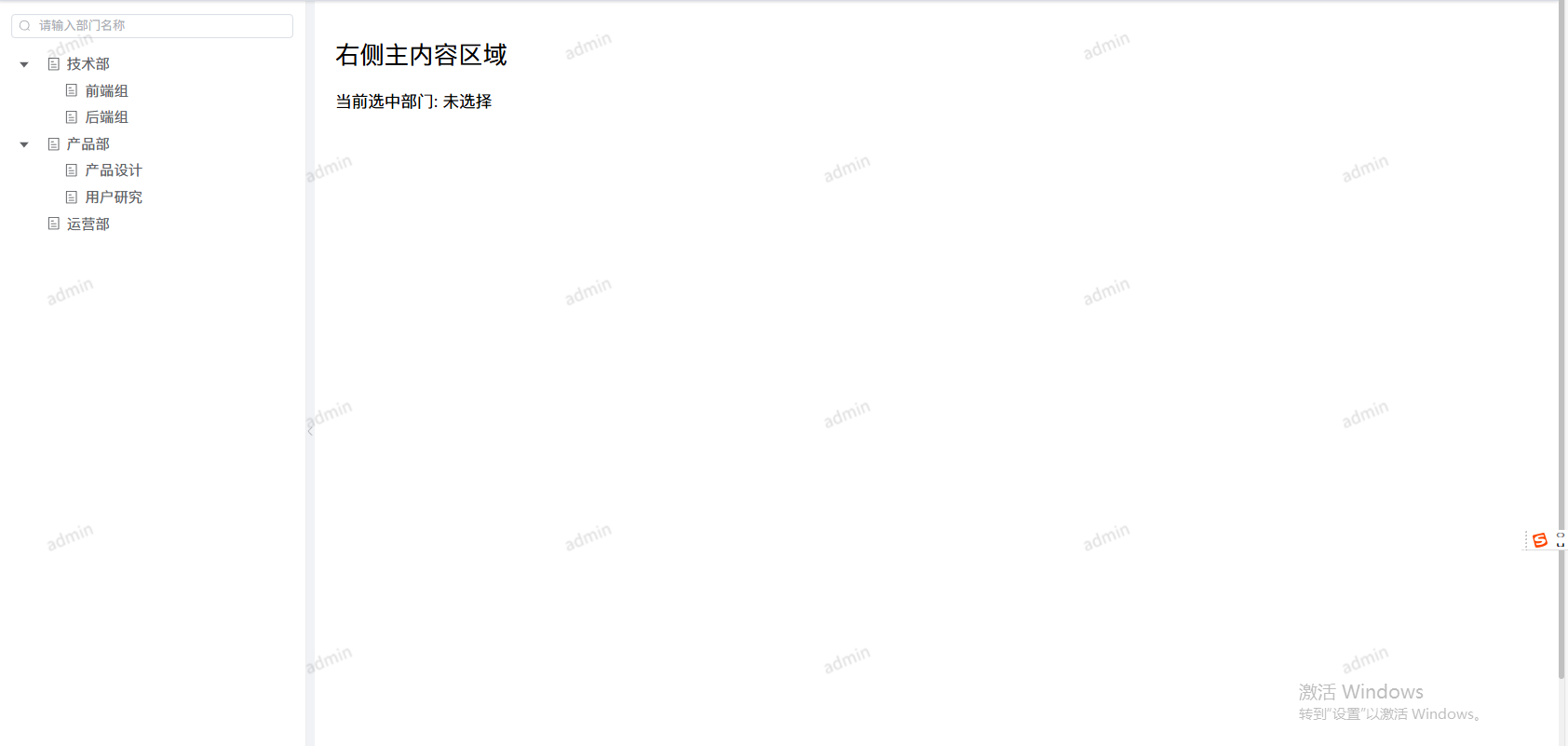
效果展示
-
搜索过滤效果
输入部门名称即可实时过滤树节点,便于快速定位目标部门。
-
选中高亮效果
点击节点高亮显示,之前选中的节点高亮会自动取消,保证视觉清晰。
-
折叠与展开效果
点击左侧折叠按钮即可收起或展开树,界面简洁灵活。
-
拖拽调整宽度效果
鼠标拖拽左侧树边缘可以调整宽度,适应不同屏幕布局。