一、完成"个人中心"页面的结构搭建及样式配置
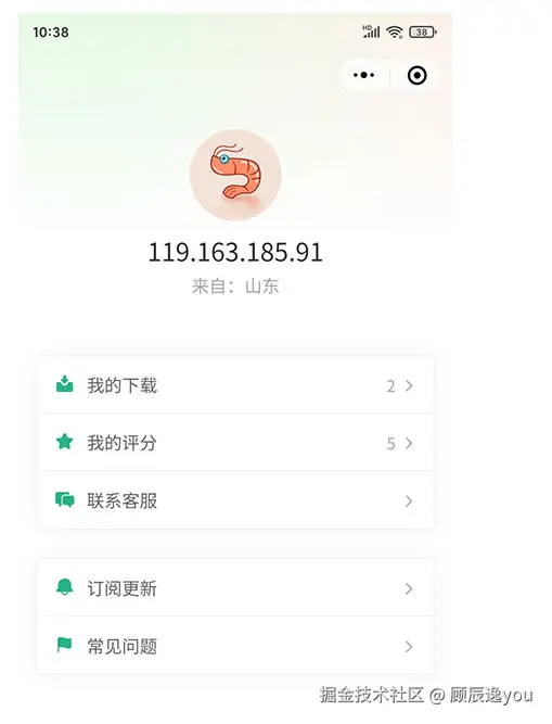
先完成结构搭建 pages/user/user.vue
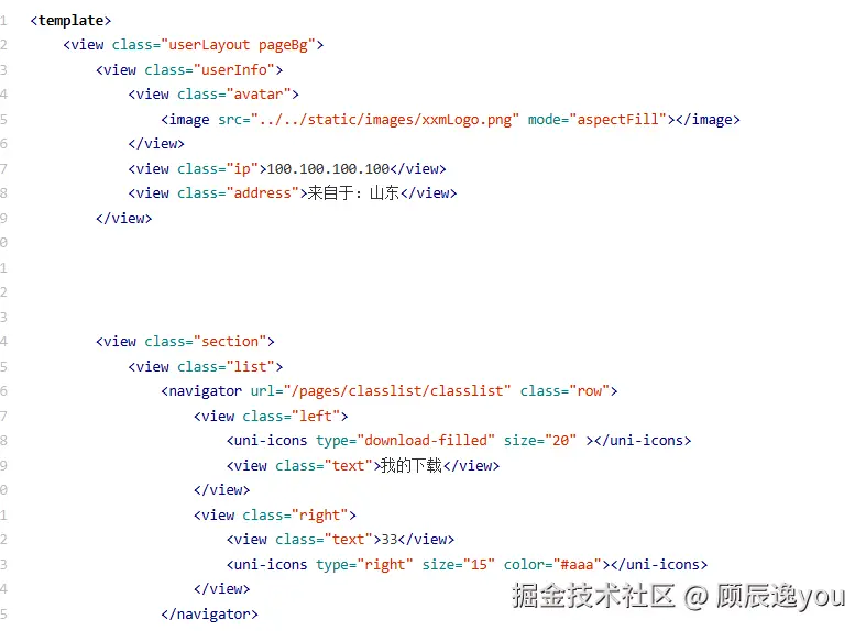
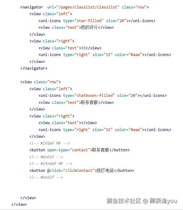
然后实现ifdef条件编译实现多终端匹配和客服消息:
实现在H5网页上就显示拨打电话,在小程序上就显示联系客服
**利用uniapp中的条件编译ifdef **
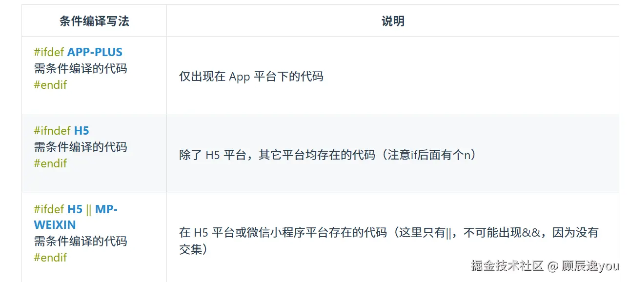
所以在user/user.vue中使用条件编译:
xml
   <!-- #ifdef MP -->
   <button open-type="contact">联系客服</button>
   <!-- #endif -->
   <!-- #ifndef MP -->
   <button @click="clickContact">拨打电话</button>
   <!-- #endif -->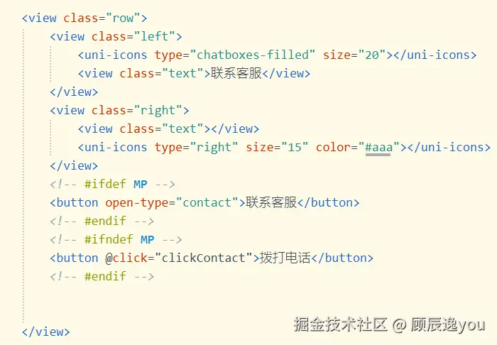
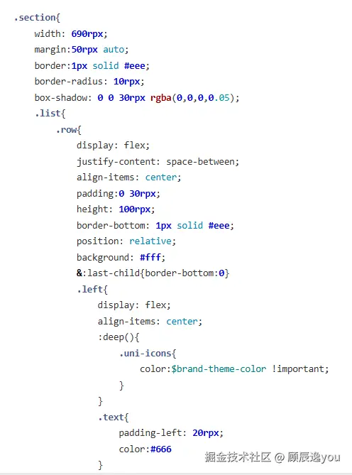
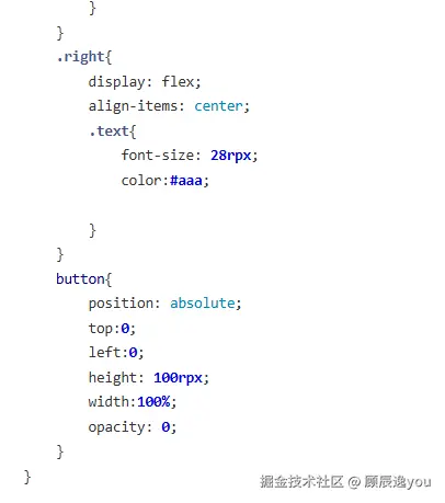
然后将button按钮覆盖先前的"联系客服盒子",通过定位来实现覆盖
less
button{
  position:absolute
  left:0
  top:0
  height:100rpx //与盒子高度一致
  width:100%
  opacity:0 //设置按钮颜色为透明,这样就不会影响原本盒子内容的显示
 }
如果是H5网页,点击按钮后,就执行拨打电话(利用uniapp中的uni.makePhoneCall)
ini
  const clickContact=()=>{
    uni.makePhoneCall({
       phoneNumber:...
     )}
实现联系客服的效果:
浏览器中搜索mp.weixin.qq.com-->登录-->左侧栏中找到"客服"-->点击添加客服-->输入自己的微信号或者用于当客服的微信号-->点击确定 然后点击"登录网页端或移动端小程序客服"-->扫码登录

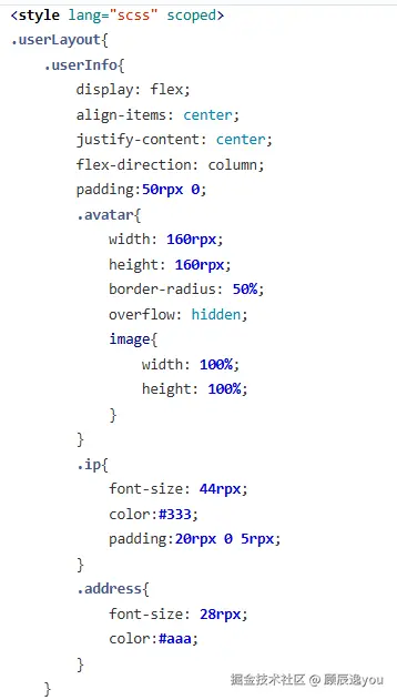
二、实现设置项目页面的背景颜色
由于每一个页面中的背景颜色都是一样的,所以可以将背景颜色设置成通用样式,写在common/common-style.scss文件中
然后又因为页面的背景颜色都是渐变颜色,所以要用到css3中的渐变色设置
(渐变色的设置用法可见css官网)
然后设置好了通用样式背景色后,给每一个页面都添加上该类。
pages/index/index.vue
ini
<view class="homeLayout pageBg"></>pages/classify/classify.vue
ini
<view class="classLayout pageBg"></>pages/user/user.vue
ini
<view class="userLayout pageBg"></>渐变色颜色可以去colordrop官网中自行选择
三、完成分类页结构及样式的搭建
从效果图中可以发现,"分类页"和"首页"中的头部结构是一致的,因此也可以将头部结构封装成一个公共组件存放在components文件夹下
components/custom-nav-bar/custom-nav-bar.vue
先搭建头部结构:
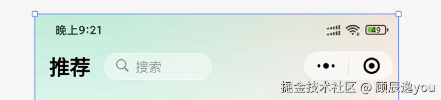
发现头部结构是由:状态栏(电量,时间)和导航栏(标题,搜索框)组成
xml
<view class="layout">
    <view class="navBar">
	<!-- 时间,电量状态栏 -->
	<view class="statusBar"></view>
	<!-- 头部导航栏 -->
	<view class="titleBar">
	   <view class="title">标题</view>
	   <view class="search">
            <uni-icons class="icon" type="search" color="#888" size="18">
            </uni-icons>
	          <text class="text">搜索</text>
      </view>
	</view>
 </view>
		<!-- 填充层,防止轮播区域内容部分被覆盖 -->
		<view class="fill">

		</view>
	</view>
然后要设置状态栏和导航栏的高度:
这里是通过封装了一个工具方法来实现的高度设置:(一般项目中设置状态栏和头部导航栏的高度都是这样设置的。该工具方法是通用的。)
utils/system.js:
scss
  const SYSTEM_INFO = uni.getSystemInfoSync();

export const getStatusBarHeight = ()=> SYSTEM_INFO.statusBarHeight || 15;

export const getTitleBarHeight = ()=>{
	if(uni.getMenuButtonBoundingClientRect){
		let {top,height} = uni.getMenuButtonBoundingClientRect();
		return height + (top - getStatusBarHeight())*2
	}else{
		return 40;
	}
}

export const  getNavBarHeight = ()=> getStatusBarHeight()+getTitleBarHeight();

export const getLeftIconLeft = ()=> {
	// #ifdef MP-TOUTIAO
		let {leftIcon:{left,width}}  = tt.getCustomButtonBoundingClientRect();
		return left+ parseInt(width);
	// #endif

	// #ifndef MP-TOUTIAO
		return 0
	// #endif
}
然后再将工具方法引入到custom-nav-bar.vue组件中:
javascript
import {getStatusBarHeight,getTitleBarHeight,getNavBarHeight,getLeftIconLeft} from "@/utils/system.js"
ruby
<view class="statusBar" :style="{height:getStatusBarHeight()+'px'}"></view>
less
<view class="titleBar" :style="{height:getTitleBarHeight()+'px',marginLeft:getLeftIconLeft()+'px'}">
...
</view>
ruby
<view class="fill" :style="{height:getNavBarHeight()+'px'}">
</view>
//该部分是填充层,作用是防止内容被遮挡住。一定要设置这个填充层盒子!!!且一定要给它设置高度样式。
头部栏是固定在页面上方的,无论页面下滑到了哪个位置,都可以看见头部栏固定显示。所以要给头部栏设置fixed定位,以后如果碰到其他项目中有要设置头部栏固定在顶部显示的,都可以用下面这个样式。
less
  .layout{
     .navbar{
        position:fixed
        top:0
        left:0
        z-index:10
     }
   }
xml
<style lang="scss" scoped>
.layout{
.navBar{
position: fixed;
left: 0;
top:0;
width: 100%;
//设置显示层级关系 z-index:数值 数值越大,越显示在外面。
z-index: 10;
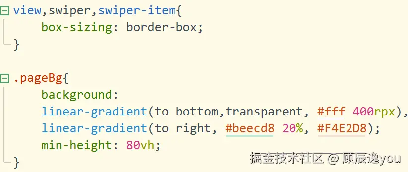
// 头部导航区域的背景颜色也是渐变色,所以引用先前设置的渐变背景色
background:
linear-gradient(to bottom,transparent, #fff 400rpx),
linear-gradient(to right, #beecd8 20%, #F4E2D8);
.statusBar{}
.titleBar{
display: flex;
align-items: center;
padding: 0 30rpx;
.title{
font-size: 22px;
font-weight: 700;
color: $text-font-color-1; //通用颜色变量名
}
.search{
width: 220rpx;
height: 50rpx;
border-radius: 60rpx;
background: rgba(255,255,255,0.4);
border:1px solid #fff;
margin-left:30rpx;
color:#999;
font-size: 28rpx;
display: flex;
align-items: center;
.icon{
margin-left:5rpx;
}
.text{
padding-left:10rpx;
}
}
}
}
}
</style>然后再把该头部结构引入到 首页,分类页:
pages/index/index.vue
ini
<view class="homeLayout pageBg">
  <custom-nav-bar title="推荐"></custom-nav-bar>
</view>
pages/classify/classify.vue
ini
  <view class="pageBg classLayout">
     <custom-nav-bar title="分类"></custom-nav-bar>
  </view>
再到头部结构组件中接收传来的内容
custom-nav-bar.vue:
php
defineProps({
   title:{
     type:string
     default:"壁纸"  //默认值
   }
 })

 <view class="title">{{text}}</view>
完成了之后,再来实现"分类页"主体内容。
发现分类页中的主体部分也是利用了图片item组件
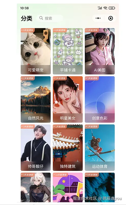
classify/classify.vue:
ini
 <view class="classify">
    <theme-item v-for="item in classifyList" :key="" :item=item />
 </view>
再完成样式配置:
xml
<style lang="scss" scoped>
   .classLayout{
	   .classify{
		   display: grid;
		   grid-template-columns: repeat(3,1fr);
		   gap:5rpx;
		   padding: 30rpx;
	   }
   }
</style>
四、新建"分类列表页",完成结构搭建及样式,功能配置
pages/classify/classlist.vue
先搭建分类列表页的结构:分类列表页是由图片组成的,且点击每一张图片,都可以跳转到其对应的图片预览页。
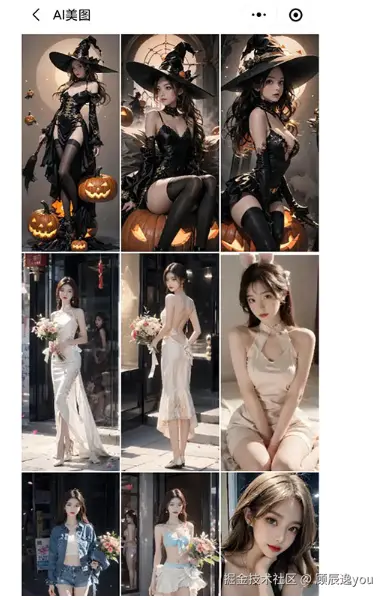
ini
<view class="classlist">
   <view class="content">
     <navigator url="" v-for="item in 15">
        <image src="" />
     </navigator>
   </view>
</view>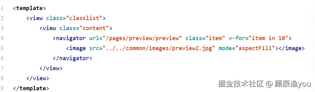
然后开始搭建样式:
xml
<style lang="scss" scoped>
   .classlist{
	   .content{
		   display: grid;
		   grid-template-columns: repeat(3,1fr);
		   gap:5rpx;
		   .item{
			   height: 440rpx;
			   image{
				   width: 100%;
				   height: 100%;
				   display: block;
			   }
		   }
	   }
   }
</style>
在"专题精选"部分以及"分类页"中点击每张图片,可以跳转到其对应的分类列表页。
又因为"专题精选"部分和"分类页"中的图片都是theme-item组件,所以点击图片跳转到其分类列表页,需要在theme-item组件中设置。
theme-item.vue:
ini
<navigator
		:url="'/pages/classify/classlist?id='+item._id+'&name='+item.name"
		class="box"
		v-if="!isMore">
	       <image class="pic" :src="item.picurl" mode="aspectFill"></image>
		<view class="mask">{{item.name}}</view>
		<view class="tab" v-if="compareTimestamp(item.updateTime)">{{compareTimestamp(item.updateTime)}} 前更新</view>
</navigator>
跳转到其分类列表页时,还要携带每一张图片的id和name值作为参数传入。
ini
<navigator :url="'pages/classify/classlist?id='+item._id+'&name='+item.name" />然后点击theme-item.vue组件中的"更多效果"的图片,跳转到"分类页":
由于"分类页"属于tabBar导航栏中的路由页面,因此跳转时需要设置open-type="reLaunch"
ini
<navigator url="pages/classify/classify" open-type="reLaunch" />封装一个接口方法用于请求分类列表页中的图片数据
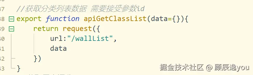
在"分类列表"页中封装函数用于调用接口方法,获取图片数据
ini
   const getClassList=async()=>{
      let res=await apiGetClassList(queryParams)
      classList.value=res.data
    }
1、准备一个接口需要的请求参数对象:
ini
 let queryParams={
    pageSize:12
    pageNum:1
  }
2、在onLoad生命周期函数中接收其他路由页面跳转到当前页面时携带传来的参数;
javascript
  import {onLoad} from "@dcloudio/uni-app"
  onLoad((e)=>{
     //将需要的数据从e中解构出来
     let {id=null,name=null}=e
     if(id) queryParams.classid=id   //判断是否有id值传入,如果有,则参数对象中的classid值=id
     //利用uni.setNavigationBarTitle({})来更改页面当前的导航栏标题信息
     uni.setNavigationBarTitle({
        title:name
      })
      //在onLoad生命周期函数中调用封装好的函数发送请求,获取数据。
  getClassList()
  }
3、实现触底加载更多图片:
当页面触底时,会触发onReachBottom()生命周期函数 然后页面触底后,又会加载出新的图片数据,所以要再次调用封装好的用于发送请求获取数据的函数。
在调用函数之前,需要先判断是否还有新数据?如果还有,则pageNum++,调用函数。
准备一个变量用来表示是否还有新的图片数据:
let noData=ref(false) //初始值是false,表示还有新的图片数据存在。
javascript
import {onReachBottom} from "@dcloudio/uni-app"
 onReachBottom(()=>{
    if(noData) return;  //如果noData的值为true,则表示没有新的图片数据存在了。
    else{
       queryParams.pageNum++
       getClassList()
    }
}
再到getClassList函数中进行判断是否还有新的图片数据存在:
scss
  const getClassList=async()=>{
    let res=await apiGetClassList(queryParams)
    //进行新旧数据拼接
    classList.value=[...classList.value,...res.data]
    //进行判断是否还有新的图片数据存在
    //如果页面中要求显示的图片数据数量>目前获取到的图片数据数量,则表示没有新的图片数据存在了
    if(queryParams.value.pageSize>res.data.length) noData.value=true
  }
4、实现将获取到的图片数据存储在本地中:
javascript
const getClassList=async()=>{
   ...
   uni.setStorageSync("storgClassList",classList.value)
 }
5、实现退出页面时,清理本地缓存:
scss
onUnload(()=>{
  uni.removeStorageSync("storgClassList")
  })
6、实现分享到朋友圈,和分享给好友:
实现分享到朋友圈和分享给好友,要用到onShareAppMessage和onShareTimeline生命周期函数。(用法可见官网)
用户点击右上角的分享按钮,会触发onShareAppMessage分享给好友或onShareTimeline函数(分享到朋友圈),
javascript
onShareAppMessage((e)=>{
    return {
       title:"咸虾米壁纸"-列表标题,
       path:"要分享的页面路径"
    }
声明一个变量pageName,用于存储列表名字。
javascript
let pageName;
onLoad((e)=>{
  let {id=null,name=null}=e
  pageName=name
  ...
  }
所以实现分享给好友:
javascript
onShareAppMessage((e)=>{
   return {
     title:"咸虾米壁纸"-pageName,
     path:"/pages/classify/classlist?id="+queryParams.classid+"&name="+pageName
     }
   })
为什么要传递参数? 因为"分类列表"页中调用接口,获取数据时,需要传入参数,而参数中要求有图片id值。 然后,导航栏标题需要替换,所以要传入图片name值。
实现分享到朋友圈:
javascript
onShareTimeline(()=>{
	return {
		title:"咸虾米壁纸-"+pageName,
		query:"id="+queryParams.classid+"&name="+pageName
	}
})
7、实现刚进入"分类列表"页时,上方出现刷新图标:
在页面中准备一个用于显示"刷新状态"的盒子:(刷新图标是使用了uniapp组件中的uni-load-more组件,要先在官网中搜索uni-load-more组件,然后下载,最后再使用。)
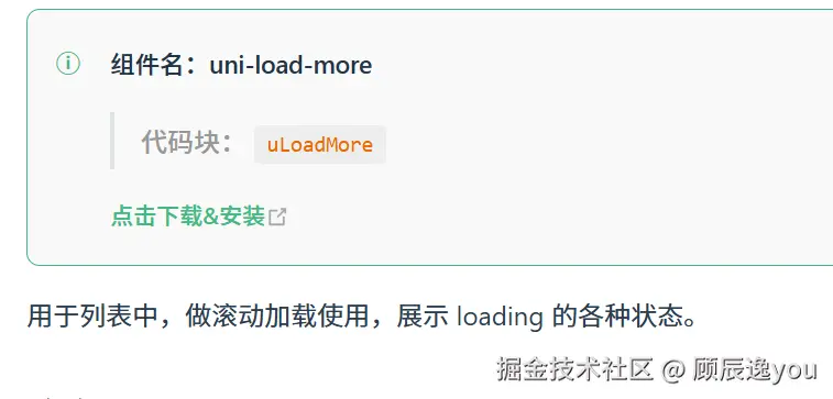
ini
  <view class="loadingLayout">
		<uni-load-more status="loading"></uni-load-more>
	</view>
然后设置图标的位置样式:
由于加载图标在多个页面中都有显示,所以位置样式可以设置成通用样式,写在common/common-style.scss文件下。
css
 .loadingLayout{
   padding:30rpx 0
  }
然后再给加载盒子添加类名loadingLayout
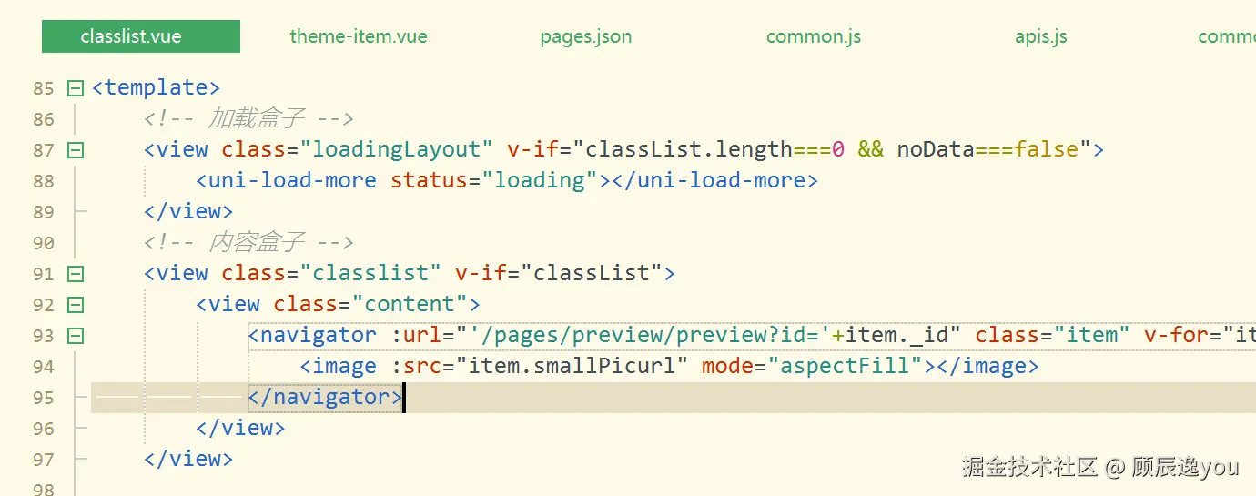
该加载状态只有在刚进入分类列表页,页面中暂时没有数据显示(classlist.length==0)且有新数据可以被加载出来(noData==false)时才会显示。
ini
  <view class="loadingLayout" v-if="classList.length==0 && noData==false">
     <uni-load-more status="loading"></uni-load-more>
  </view>
8、实现当页面出现触底现象时,也会有一个加载状态显示,表示正在加载新数据,并且如果没有新数据了,加载状态就会变成"没有更多了":
同样也是在页面底部准备一个加载盒子:并且设置图标位置(添加通用样式位置类名loadingLayout)
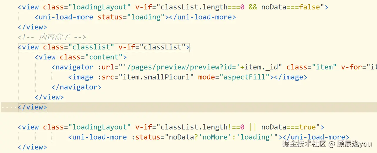
该盒子只有在页面中有图片数据(classList.length!==0)或者没有新数据可以加载了(noData==true)时才会显示。
ruby
<view class="loadingLayout" v-if="classList.length!==0 || noData==true">
   <uni-load-more :status="noData?'noMore' : 'loading'"></uni-load-more>
</view>
9、实现在移动端设备上显示页面时,页面下方的内容不会被遮挡(通过准备一个空盒子,给它设置一个安全高度,来实现)
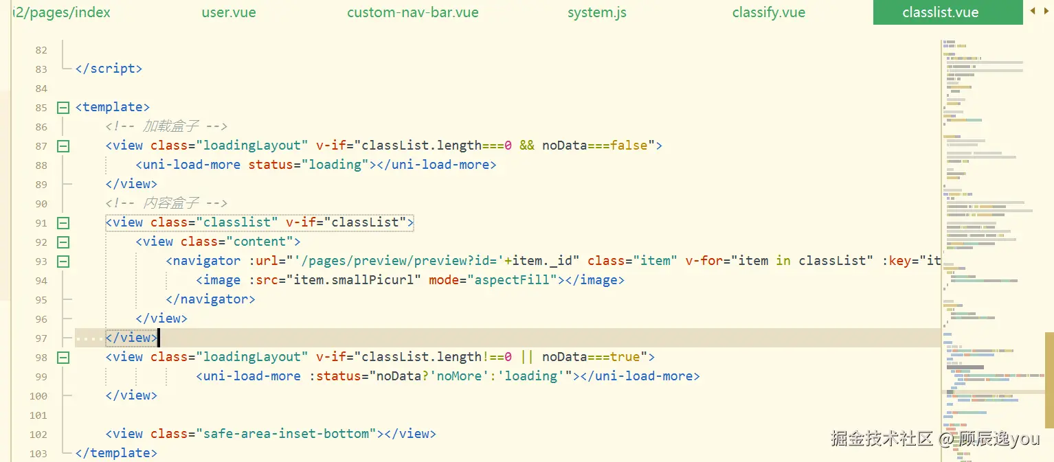
又因为多个页面中都要准备一个具备安全高度的空盒子来避免页面内容被遮挡,所以高度可以被设置成通用样式,放在common/common-style.scss文件下。
css
  .safe-area-inset-bottom{
     height:env(safe-area-inset-bottom);
    }
然后给准备的空盒子添加类名.safe-area-inset-bottom。
五、图片预览页的结构搭建及样式、功能配置:
1、先搭建图片预览页的结构:
新建图片预览页在pages/preview/preview.vue:
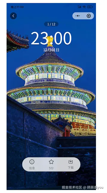
发现图片预览页由:图片大图,遮罩层(包含返回图标、图片张数显示、时间,日期,下方状态栏)组成。
图片预览页的功能是图片左右滑动显示,使用了uniapp中的swiper组件。
xml
  <swiper>
     <swiper-item>
        <image src="" />
     </swiper-item>
 </swiper>
遮罩层结构:
javascript
<view class="mask">
   //返回图标
   <view class="goBack">
     <uni-icons type="back" color="#fff" size="20"></uni-icons>
   </view>
   //图片张数显示
   <view class="count">3/9</view>
   //时间
   <view class="time">
      //使用了uni-dateformat组件(也需要先在官网中下载组件)
     <uni-dateformat :date="new Date()" format="hh:mm"></uni-dateformat>
   </view>
   //日期
   <view class="date">
     <uni-dateformat :date="new Date()" format="MM月dd日"></uni-dateformat>
   </view>
   //下方状态栏
   <view class="footer">
      <view class="box">
        <uni-icons type="info" size="28"></uni-icons>
        <view class="text">信息</view>
      </view>
       <view class="box">
        <uni-icons type="star" size="28"></uni-icons>
        <view class="text">评分</view>
      </view>
       <view class="box">
       <uni-icons type="download" size="28"></uni-icons>
        <view class="text">下载</view>
      </view>
   </view>
 </view>
2、完成点击"信息"图标后,从底部弹出的信息框结构搭建:(使用了uniapp中的uni-popup组件)
xml
<uni-popup ref="infoPopup" type="bottom">

			<view class="infoPopup">

				<view class="popHeader">
                           //下面这个空盒子是一个占位盒子,没有内容。

					<view></view>

					<view class="title">壁纸信息</view>

					<view class="close" @click="clickInfoClose">

						<uni-icons type="closeempty" size="18"													color="#999"></uni-icons>

					</view>

				</view>

				<scroll-view scroll-y>

					<view class="content">

						<view class="row">

							<view class="label">壁纸ID:</view>

                         //<text selectable></>添加selectable属性表示该处内容可以被选中。

							<text selectable class="value">12312312adfa</text>

						</view>


						<view class="row">

							<view class="label">分类:</view>

							<text class="value class">明星美女</text>

						</view>


						<view class="row">

							<view class="label">发布者:</view>

							<text class="value">咸虾米</text>

						</view>


						<view class="row">

							<text class="label">评分:</text>

							<view class='value roteBox'>

                                           //评分组件可以利用uniapp中的uni-rate组件(也需要先下载才能使用)

								<uni-rate readonly touchable value="3.5" size="16"/>

								<text class="score">5分</text>

							</view>

						</view>


						<view class="row">

							<text class="label">摘要:</text>

							<view class='value'>

								摘要文字内容填充部分,摘要文字内容填充部分,摘要文字内容填充部分,摘要文字内容填充部分。

							</view>

						</view>


						<view class="row">

							<text class="label">标签:</text>

							<view class='value tabs'>

								<view class="tab" v-for="item in 3">标签名</view>

							</view>

						</view>


						<view class="copyright">声明:本图片来用户投稿,非商业使用,用于免费学习交流,如侵犯了您的权益,您可以拷贝壁纸ID举报至平台,邮箱513894357@qq.com,管理将删除侵权壁纸,维护您的权益。


						</view>

					</view>

				</scroll-view>

			</view>

		</uni-popup>
3、完成点击"评分"图标后,在页面中央显示的评分弹框的结构搭建:
xml
<uni-popup ref="scorePopup" :is-mask-click="false">

			<view class="scorePopup">

				<view class="popHeader">

					<view></view>

					<view class="title">壁纸评分</view>

					<view class="close" @click="clickScoreClose">

						<uni-icons type="closeempty" size="18"													color="#999"></uni-icons>

					</view>

				</view>


				<view class="content">

					<uni-rate v-model="userScore" allowHalf/>

					<text class="text">{{userScore}}分</text>

				</view>


				<view class="footer">

					<button @click="submitScore" :disabled="!userScore" type="default" size="mini" plain >确认评分</button>

				</view>

			</view>

		</uni-popup>
4、现在实现样式的配置:
xml
<style lang="scss" scoped>
	.preview {
		width: 100%;
		height: 100vh;
		position: relative;

		swiper {
			width: 100%;
			height: 100%;

			image {
				width: 100%;
				height: 100%;
				overflow: hidden;
			}
		}

		.mask {
			.goBack {
				position: absolute;
				width: 38px;
				height: 38px;
				background: rgba(0, 0, 0, 0.3);
				left: 30rpx;
				margin-left: 0;
				border-radius: 100px;
				top: 4vh;
				// 给背景区域添加模糊效果,利用backdrop-filter:blur()
				backdrop-filter: blur(10rpx);
				border: 1rpx solid rgba(255, 255, 255, 0.3);
				display: flex;
				align-items: center;
				justify-content: center;
			}

			.count {
				position: absolute;
				top: 10vh;
				left: 0;
				right: 0;
				margin: auto;
				width: fit-content;
				color: #fff;
				background: rgba(0, 0, 0, 0.3);
				font-size: 38rpx;
				border-radius: 40rpx;
				padding: 8rpx 28rpx;
				backdrop-filter: blur(10rpx);
			}

			.time {
				position: absolute;
				top: calc(10vh + 80rpx);
				left: 0;
				right: 0;
				margin: auto;
				// 设置width:fit-content作用是让元素的宽度根据其内容的宽度自适应调整
				width: fit-content;
				font-weight: 100;
				line-height: 1em;
				// 设置文字阴影,利用text-shadow
				text-shadow: 0 4rpx rgba(0, 0, 0, 0.3);
				font-size: 140rpx;
				color: #fff;
			}

			.date {
				position: absolute;
				top: calc(10vh + 230rpx);
				left: 0;
				right: 0;
				margin: auto;
				width: fit-content;
				text-shadow: 0 2rpx rgba(0, 0, 0, 0.3);
				color: #fff;
				font-size: 40rpx;
			}

			.footer {
				position: absolute;
				bottom: 10vh;
				left: 0;
				right: 0;
				margin: auto;
				display: flex;
				align-items: center;
				justify-content: space-around;
				width: 65vw;
				height: 120rpx;
				border-radius: 120rpx;
				color: #fff;
				background: rgba(255, 255, 255, 0.8);
				box-shadow: 0 2rpx 0 rgba(0, 0, 0, 0.1);
				backdrop-filter: blur(20rpx);

				.box {
					display: flex;
					flex-direction: column;
					align-items: center;
					justify-content: center;
					padding: 2rpx 12rpx;

					.text {
						font-size: 26rpx;
						color: $text-font-color-2;
					}
				}
			}
		}

		.popHeader {
			display: flex;
			align-items: center;
			justify-content: space-between;

			.title {
				color: $text-font-color-2;
				font-size: 26rpx;
			}

			.close {
				padding: 6rpx;
			}
		}

		.infoPopup {
			background: #fff;
			padding: 30rpx;
			border-radius: 30rpx 30rpx 0 0;
			overflow: hidden;

			scroll-view {
				//设置滚动区域的最大高度为60vh
				max-height: 60vh;

				.content {
					.row {
						display: flex;
						padding: 16rpx 0;
						font-size: 32rpx;
						line-height: 1.7em;

						.label {
							color: $text-font-color-3;
							width: 140rpx;
							text-align: right;
							font-size: 30rpx;
						}

						.value {
							flex: 1;
							width: 0;
						}

						.roteBox {
							display: flex;
							align-items: center;

							.score {
								font-size: 26rpx;
								color: $text-font-color-2;
								padding-left: 10rpx;
							}
						}

						.tabs {
							display: flex;
							flex-wrap: wrap;

							.tab {
								border: 1px solid $brand-theme-color;
								color: $brand-theme-color;
								font-size: 22rpx;
								padding: 10rpx 30rpx;
								border-radius: 40rpx;
								line-height: 1em;
								margin: 0 10rpx 10rpx 0;
							}
						}

						.class {
							color: $brand-theme-color;
						}


					}

					.copyright {
						font-size: 28rpx;
						padding: 20rpx;
						background: #F6F6F6;
						color: #666;
						border-radius: 10rpx;
						margin: 20rpx 0;
						line-height: 1.6em;
					}

				}
			}
		}

		.scorePopup {
			background: #fff;
			padding: 30rpx;
			width: 70vw;
			border-radius: 30rpx;

			.content {
				padding: 30rpx 0;
				display: flex;
				justify-content: center;
				align-items: center;

				.text {
					color: #FFCA3E;
					padding-left: 10rpx;
					width: 80rpx;
					line-height: 1em;
					text-align: right;
				}
			}

			.footer {
				padding: 10rpx 0;
				display: flex;
				align-items: center;
				justify-content: center;
			}
		}

	}
</style>
实现让元素能够水平定位在页面中间显示,就设置样式:
less
{
   position:absolute
   left:0
   right:0
   margin:auto
   width:fit-content
}
5、实现当点击图片时,遮罩层会切换显示,隐藏:
因此需要定义一个变量来表示遮罩层的显示状态:
let makeState=ref(true) //初始状态下,数值为true,表示遮罩层处于显示状态
ini
//如果makeState的值为true,则遮罩层显示。
<view class="mask" v-if="makeState"></view>


<image ... @click="maskChange" />

const maskChange=()=>{
   maskState.value=!maskState.value
}
6、实现当点击下方信息图标时,信息弹框显示:
bash
<uni-popup ref="infoPopup" type="bottom">...</uni-popup>
// type属性指定弹框的弹出方式  type="bottom" 表示弹框会从底部滑出。
控制弹框对象:
ini
  //通过ref来绑定弹框对象

  const infoPopup=ref(null)
  <uni-popup ref={infoPopup} type="bottom"></uni-popup>

  <view class="box" @click="clickInfo">信息</view>

  const clickInfo=()=>{
     infoPopup.value.open()
   }
7、实现点击弹框的"关闭按钮",信息弹框关闭:
xml
<uni-popup ref="infoPopup" type="bottom">
			<view class="infoPopup">
				<view class="content">
					<!-- 顶部区域 -->
					<view class="popHeader">
						<view></view>
						<view class="title">壁纸信息</view>
                                                //关闭按钮
						<view class="close" @click="clickInfoClose">
							<uni-icons type="closeempty" size="18"></uni-icons>
						</view>
					</view>
go
const clickInfoClose=()=>{
   infoPopup.value.close()
 }
8、实现当点击"评分"图标时,评分弹框显示:
xml
<!-- 评分弹框显示 -->
<uni-popup ref="scorePopup"></uni-popup>

const scorePopup=ref(null)

<view class="box" @click="clickScore">评分</view>

const scorePopup=()=>{
   scorePopup.value.open()
 }
9、点击"关闭图标"时,弹框关闭:
ini
<view class="close" @click="clickScoreClose"></>

const clickScoreClose=()=>{
   scorePopup.value.close()
 }