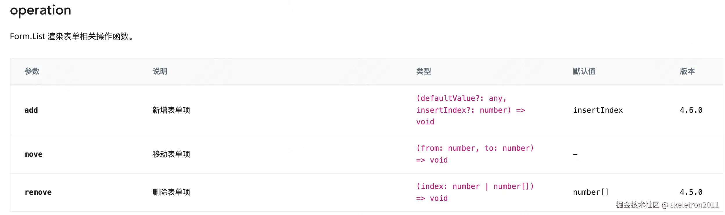
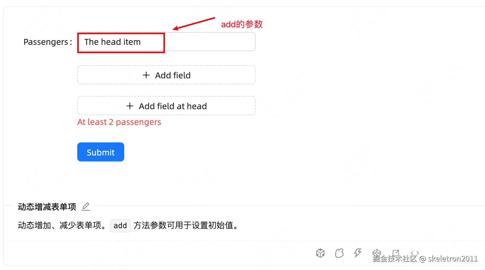
动态增减表单项
动态增加、减少表单项。add 方法参数可用于设置初始值。
tsx
import React from 'react';
import { MinusCircleOutlined, PlusOutlined } from '@ant-design/icons';
import { Button, Form, Input } from 'antd';
const formItemLayout = {
labelCol: {
xs: { span: 24 },
sm: { span: 4 },
},
wrapperCol: {
xs: { span: 24 },
sm: { span: 20 },
},
};
const formItemLayoutWithOutLabel = {
wrapperCol: {
xs: { span: 24, offset: 0 },
sm: { span: 20, offset: 4 },
},
};
const App: React.FC = () => {
const onFinish = (values: any) => {
console.log('Received values of form:', values);
};
return (
<Form
name="dynamic_form_item"
{...formItemLayoutWithOutLabel}
onFinish={onFinish}
style={{ maxWidth: 600 }}
>
<Form.List
name="names"
rules={[
{
validator: async (_, names) => {
if (!names || names.length < 2) {
return Promise.reject(new Error('At least 2 passengers'));
}
},
},
]}
>
{(fields, { add, remove }, { errors }) => (
<>
{fields.map((field, index) => (
<Form.Item
{...(index === 0 ? formItemLayout : formItemLayoutWithOutLabel)}
label={index === 0 ? 'Passengers' : ''}
required={false}
key={field.key}
>
<Form.Item
{...field}
validateTrigger={['onChange', 'onBlur']}
rules={[
{
required: true,
whitespace: true,
message: "Please input passenger's name or delete this field.",
},
]}
noStyle
>
<Input placeholder="passenger name" style={{ width: '60%' }} />
</Form.Item>
{fields.length > 1 ? (
<MinusCircleOutlined
className="dynamic-delete-button"
onClick={() => remove(field.name)}
/>
) : null}
</Form.Item>
))}
<Form.Item>
<Button
type="dashed"
onClick={() => add()}
style={{ width: '60%' }}
icon={<PlusOutlined />}
>
Add field
</Button>
<Button
type="dashed"
onClick={() => {
add('The head item', 0);
}}
style={{ width: '60%', marginTop: '20px' }}
icon={<PlusOutlined />}
>
Add field at head
</Button>
<Form.ErrorList errors={errors} />
</Form.Item>
</>
)}
</Form.List>
<Form.Item>
<Button type="primary" htmlType="submit">
Submit
</Button>
</Form.Item>
</Form>
);
};
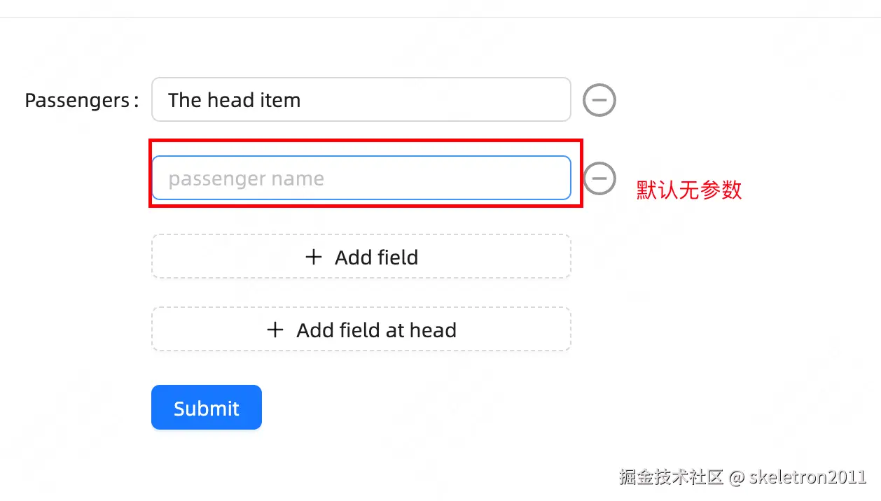
export default App;动态增减嵌套字段
嵌套表单字段需要对 field 进行拓展,将 field.name 应用于控制字段。
tsx
import React from 'react';
import { MinusCircleOutlined, PlusOutlined } from '@ant-design/icons';
import { Button, Form, Input, Space } from 'antd';

const onFinish = (values: any) => {
  console.log('Received values of form:', values);
};

const App: React.FC = () => (
  <Form
    name="dynamic_form_nest_item"
    onFinish={onFinish}
    style={{ maxWidth: 600 }}
    autoComplete="off"
  >
    <Form.List name="users">
      {(fields, { add, remove }) => (
        <>
          {fields.map(({ key, name, ...restField }) => (
            <Space key={key} style={{ display: 'flex', marginBottom: 8 }} align="baseline">
              <Form.Item
                {...restField}
                name={[name, 'first']}
                rules={[{ required: true, message: 'Missing first name' }]}
              >
                <Input placeholder="First Name" />
              </Form.Item>
              <Form.Item
                {...restField}
                name={[name, 'last']}
                rules={[{ required: true, message: 'Missing last name' }]}
              >
                <Input placeholder="Last Name" />
              </Form.Item>
              <MinusCircleOutlined onClick={() => remove(name)} />
            </Space>
          ))}
          <Form.Item>
            <Button type="dashed" onClick={() => add()} block icon={<PlusOutlined />}>
              Add field
            </Button>
          </Form.Item>
        </>
      )}
    </Form.List>
    <Form.Item>
      <Button type="primary" htmlType="submit">
        Submit
      </Button>
    </Form.Item>
  </Form>
);

export default App;
复杂的动态增减表单项
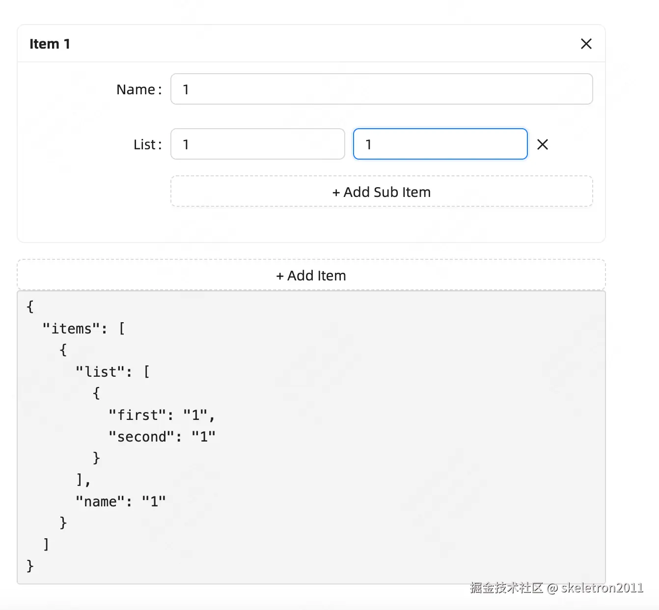
tsx
import React from 'react';
import { CloseOutlined } from '@ant-design/icons';
import { Button, Card, Form, Input, Space, Typography } from 'antd';
const App: React.FC = () => {
const [form] = Form.useForm();
return (
<Form
labelCol={{ span: 6 }}
wrapperCol={{ span: 18 }}
form={form}
name="dynamic_form_complex"
style={{ maxWidth: 600 }}
autoComplete="off"
initialValues={{ items: [{}] }}
>
<Form.List name="items">
{(fields, { add, remove }) => (
<div style={{ display: 'flex', rowGap: 16, flexDirection: 'column' }}>
{fields.map((field) => (
<Card
size="small"
title={`Item ${field.name + 1}`}
key={field.key}
extra={
<CloseOutlined
onClick={() => {
remove(field.name);
}}
/>
}
>
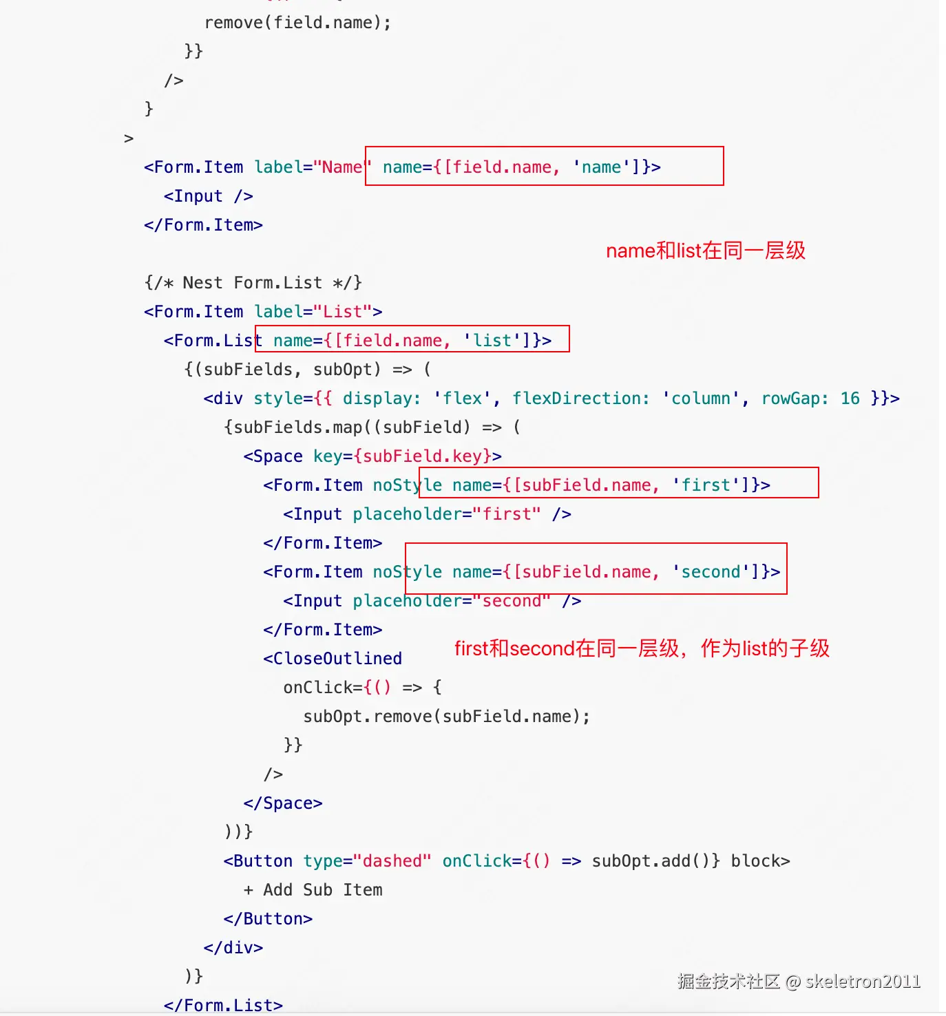
<Form.Item label="Name" name={[field.name, 'name']}>
<Input />
</Form.Item>
{/* Nest Form.List */}
<Form.Item label="List">
<Form.List name={[field.name, 'list']}>
{(subFields, subOpt) => (
<div style={{ display: 'flex', flexDirection: 'column', rowGap: 16 }}>
{subFields.map((subField) => (
<Space key={subField.key}>
<Form.Item noStyle name={[subField.name, 'first']}>
<Input placeholder="first" />
</Form.Item>
<Form.Item noStyle name={[subField.name, 'second']}>
<Input placeholder="second" />
</Form.Item>
<CloseOutlined
onClick={() => {
subOpt.remove(subField.name);
}}
/>
</Space>
))}
<Button type="dashed" onClick={() => subOpt.add()} block>
+ Add Sub Item
</Button>
</div>
)}
</Form.List>
</Form.Item>
</Card>
))}
<Button type="dashed" onClick={() => add()} block>
+ Add Item
</Button>
</div>
)}
</Form.List>
<Form.Item noStyle shouldUpdate>
{() => (
<Typography>
<pre>{JSON.stringify(form.getFieldsValue(), null, 2)}</pre>
</Typography>
)}
</Form.Item>
</Form>
);
};
export default App;Form.Item 属性
| 参数 | 说明 | 类型 | 默认值 | 版本 | |
|---|---|---|---|---|---|
| colon | 配合 label 属性使用,表示是否显示 label 后面的冒号 |
boolean | true | ||
| dependencies | 设置依赖字段,说明见下 | NamePath\[\] | - | ||
| extra | 额外的提示信息,和 help 类似,当需要错误信息和提示文案同时出现时,可以使用这个。 |
ReactNode | - | ||
| getValueFromEvent | 设置如何将 event 的值转换成字段值 | (..args: any\[\]) => any | - | ||
| getValueProps | 为子元素添加额外的属性 (不建议通过 getValueProps 生成动态函数 prop,请直接将其传递给子组件) |
(value: any) => Record<string, any> | - | 4.2.0 | |
| hasFeedback | 配合 validateStatus 属性使用,展示校验状态图标,建议只配合 Input 组件使用 此外,它还可以通过 Icons 属性获取反馈图标。 |
boolean | { icons: FeedbackIcons } | false | icons: 5.9.0 |
| help | 提示信息,如不设置,则会根据校验规则自动生成 | ReactNode | - | ||
| hidden | 是否隐藏字段(依然会收集和校验字段) | boolean | false | 4.4.0 | |
| htmlFor | 设置子元素 label htmlFor 属性 |
string | - | ||
| initialValue | 设置子元素默认值,如果与 Form 的 initialValues 冲突则以 Form 为准 |
string | - | 4.2.0 | |
| label | label 标签的文本,当不需要 label 又需要与冒号对齐,可以设为 null |
ReactNode | - | null: 5.22.0 | |
| labelAlign | 标签文本对齐方式 | left |
right |
right |
|
| labelCol | label 标签布局,同 <Col> 组件,设置 span offset 值,如 {span: 3, offset: 12} 或 sm: {span: 3, offset: 12}。你可以通过 Form 的 labelCol 进行统一设置,不会作用于嵌套 Item。当和 Form 同时设置时,以 Item 为准 |
object | - | ||
| messageVariables | 默认验证字段的信息,查看详情 | Record<string, string> | - | 4.7.0 | |
| name | 字段名,支持数组 | NamePath | - | ||
| normalize | 组件获取值后进行转换,再放入 Form 中。不支持异步 | (value, prevValue, prevValues) => any | - | ||
| noStyle | 为 true 时不带样式,作为纯字段控件使用。当自身没有 validateStatus 而父元素存在有 validateStatus 的 Form.Item 会继承父元素的 validateStatus |
boolean | false | ||
| preserve | 当字段被删除时保留字段值 | boolean | true | 4.4.0 | |
| required | 必填样式设置。如不设置,则会根据校验规则自动生成 | boolean | false | ||
| rules | 校验规则,设置字段的校验逻辑。点击此处查看示例 | Rule\[\] | - | ||
| shouldUpdate | 自定义字段更新逻辑,说明见下 | boolean | (prevValue, curValue) => boolean | false | |
| tooltip | 配置提示信息 | ReactNode | TooltipProps & { icon: ReactNode } | - | 4.7.0 |
| trigger | 设置收集字段值变更的时机。点击此处查看示例 | string | onChange |
||
| validateFirst | 当某一规则校验不通过时,是否停止剩下的规则的校验。设置 parallel 时会并行校验 |
boolean | parallel |
false | parallel: 4.5.0 |
| validateDebounce | 设置防抖,延迟毫秒数后进行校验 | number | - | 5.9.0 | |
| validateStatus | 校验状态,如不设置,则会根据校验规则自动生成,可选:'success' 'warning' 'error' 'validating' | string | - | ||
| validateTrigger | 设置字段校验的时机 | string | string\[\] | onChange |
|
| valuePropName | 子节点的值的属性。注意:Switch、Checkbox 的 valuePropName 应该是 checked,否则无法获取这个两个组件的值。该属性为 getValueProps 的封装,自定义 getValueProps 后会失效 |
string | value |
||
| wrapperCol | 需要为输入控件设置布局样式时,使用该属性,用法同 labelCol。你可以通过 Form 的 wrapperCol 进行统一设置,不会作用于嵌套 Item。当和 Form 同时设置时,以 Item 为准 |
object | - | ||
| layout | 表单项布局 | horizontal |
vertical |
- | 5.18.0 |
被设置了 name 属性的 Form.Item 包装的控件,表单控件会自动添加 value(或 valuePropName 指定的其他属性) onChange(或 trigger 指定的其他属性),数据同步将被 Form 接管,这会导致以下结果:
- 你不再需要也不应该 用
onChange来做数据收集同步(你可以使用 Form 的onValuesChange),但还是可以继续监听onChange事件。 - 你不能用控件的
value或defaultValue等属性来设置表单域的值,默认值可以用 Form 里的initialValues来设置。注意initialValues不能被setState动态更新,你需要用setFieldsValue来更新。 - 你不应该用
setState,可以使用form.setFieldsValue来动态改变表单值。
Form.List 属性
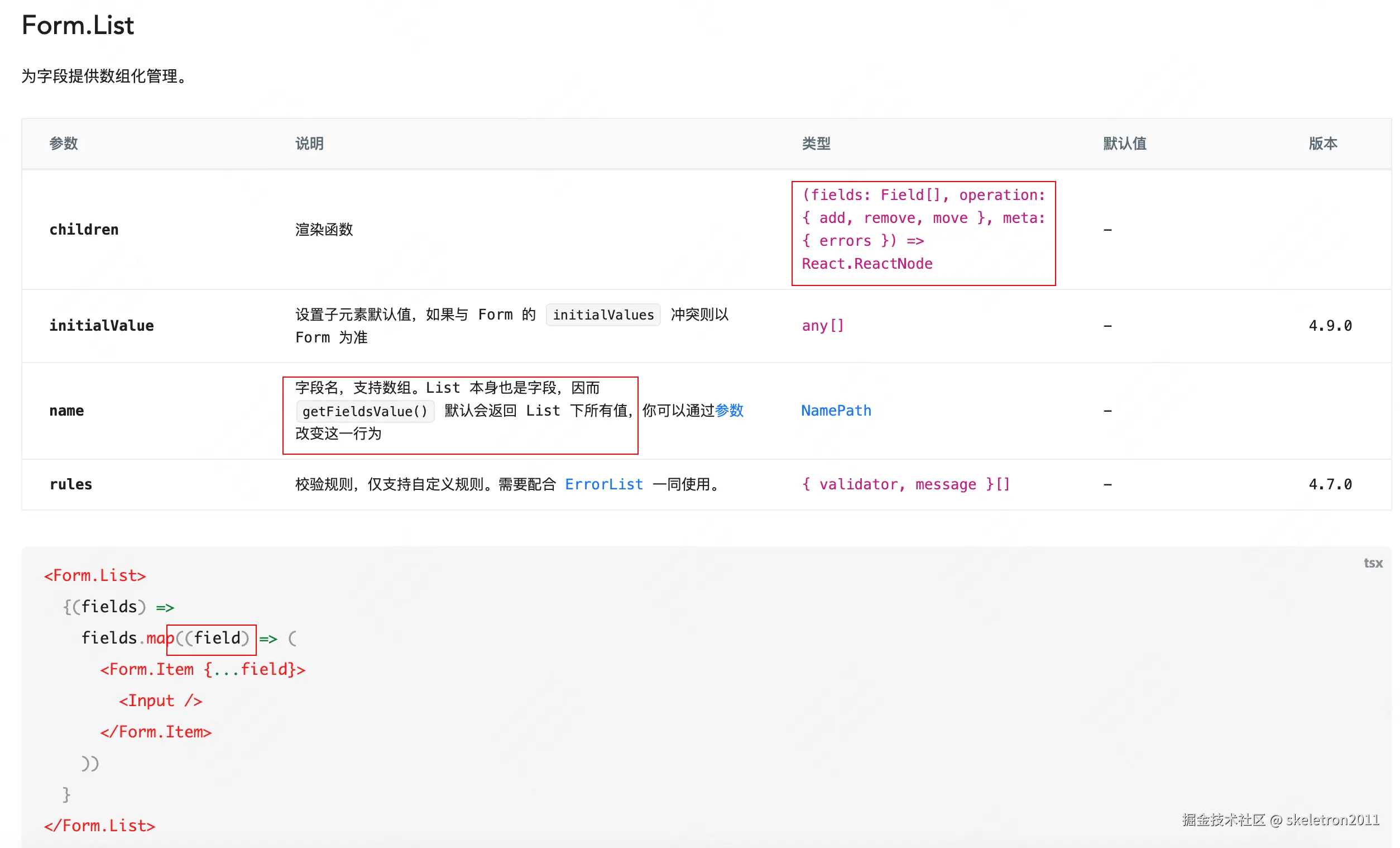
操作