本文译自「Compose Unstyled: The missing Design System layer for Compose UI」,原文链接composables.com/blog/introd...,由Alex Styl发布于2025年8月7日。
使用Compose UI 构建应用的最大问题是 Material Compose 的灵活性不足。Material Compose 的可定制性不足以让你在其上构建自己的设计系统,因此你最终只能对其组件进行修改。另一方面,Compose Foundation 又过于"原始"------它有行和列,但没有按钮或底部表单。而且,由于主题设置与 Material 绑定,如果不完全遵循 Material 的设计决策,你甚至无法为你的应用设置主题。
你可以从头开始构建所有内容,但谁有时间这样做呢?考虑到不同的状态、可访问性和边缘情况,像底部表单这样的单个组件可能需要 3-4 周才能完成。这个问题在 Compose Multiplatform 中变得更加严重------Material 在 iOS 上看起来笨拙,在桌面上显得不成比例。
我需要一个灵活的解决方案,可以在任何平台上使用,而不受 Material 的限制。于是我撸起袖子,自己动手构建了一个:
Compose Unstyled 是基于 Compose Foundation 的 API,可轻松构建任何设计系统 。它提供无样式、可访问的组件,并配有灵活的主题> API------所有关于用户体验和可访问性的繁琐工作都已为你处理。
Unstyled 中的组件完全无需渲染,默认情况下不会在屏幕上显示任何内容。你可以将它们视为"组件模式",它们将"底部表单"或"进度条"的概念引入你的应用,而无需你担心用户体验、键盘导航或可访问性实现。只需添加样式即可。
简洁的 API,提供你所需的样式
Compose Unstyled 不提供任何特殊的样式 API。所有操作都通过 Modifier 完成。如果你知道如何设置 Box() 的样式,那么你就知道如何设置 Compose Unstyled 中每个组件的样式。
下面是一个使用 Compose Unstyled 构建模态底部表单的简单示例,其中包含自定义定位点(表单在屏幕上"停留"的位置)以及你选择的样式:
kotlin
val Peek = SheetDetent("peek") { containerHeight, sheetHeight ->
    containerHeight * 0.6f
}
BoxWithConstraints(modifier = Modifier.fillMaxSize().background(Brush.linearGradient(listOf(Color(0xFF800080), Color(0xFFDA70D6))))) {
    val modalSheetState = rememberModalBottomSheetState(
        initialDetent = Hidden,
        detents = listOf(Hidden, Peek, FullyExpanded)
    )
    LaunchedEffect(Unit) {
        delay(50)
        modalSheetState.targetDetent = Peek
    }
    Button(onClick = { modalSheetState.targetDetent = Peek }, modifier = Modifier.align(Alignment.Center).padding(WindowInsets.navigationBars.only(WindowInsetsSides.Horizontal).asPaddingValues()), shape = RoundedCornerShape(6.dp), contentPadding = PaddingValues(horizontal = 14.dp, vertical = 10.dp), backgroundColor = Color.White) {
        Text("Show Sheet", fontWeight = FontWeight(500))
    }
    val isCompact = maxWidth < 600.dp
    ModalBottomSheet(state = modalSheetState) {
        Scrim(
            scrimColor = Color.Black.copy(0.3f),
            enter = fadeIn(),
            exit = fadeOut()
        )
        Box(Modifier.fillMaxSize().padding(top = 12.dp).let { if (isCompact) it else it.padding(horizontal = 56.dp) }.displayCutoutPadding().statusBarsPadding().padding(WindowInsets.navigationBars.only(WindowInsetsSides.Horizontal).asPaddingValues())) {
            Sheet(
                modifier = Modifier
                    .shadow(4.dp, RoundedCornerShape(topStart = 28.dp, topEnd = 28.dp))
                    .widthIn(max = 640.dp)
                    .fillMaxWidth(),
                shape = RoundedCornerShape(topStart = 28.dp, topEnd = 28.dp),
                backgroundColor = Color.White,
                contentColor = Color.Black
            ) {
                Box(Modifier.fillMaxWidth().height(600.dp), contentAlignment = Alignment.TopCenter) {
                    DragIndication(
                        modifier = Modifier.padding(top = 22.dp)
                            .background(Color.Black.copy(0.4f), RoundedCornerShape(100)).width(32.dp).height(4.dp)
                    )
                }
            }
        }
    }
}
现在,我知道你可能会想。"Alex!这 API 真奇怪。为什么我需要一个 ModalBottomSheet 和一个 Sheet?为什么不直接用 Slots 呢?"
这个设计选择是经过深思熟虑的:
设计理念
Compose Unstyled 不会替你做出任何设计决策,而是让你完全掌控布局。事实上,如果你被迫使用无法根据需求更改的样式,则会被视为错误(请提交 GitHub 问题,以便我进行调查)。
例如,你可能希望将底部表单放置在屏幕的左侧或右侧。当你想要求开发者提供一个在布局上具有严格位置的组件时,基于插槽的 API 非常实用。
在这种情况下,你可以将 ModalBottomSheet 组件视为表单可以移动的区域。Sheet 是用户可以与之交互的实际表单。通过提供这样的组件,它为开发者提供了清晰的 API,并清楚地说明了组件的功能。例如,Scrim() 组件具有 enter 和 exit 过渡参数。 Compose Unstyled 会在恰当的时机为纱幕添加和隐藏动画,以实现最佳用户体验。你只需指定"如何"实现即可。
由于 Compose Unstyled 在外观方面非常开放,因此与原始的 Compose Foundation 组件相比,它没有任何平台限制。Foundation 中的"对话框"具有固定的最大尺寸,这使得它们在诸如全屏对话框等情况下难以工作。
Compose Unstyled 中的所有组件在所有平台上的工作方式完全相同。这是有意为之,因为此类决策应该属于设计系统层的一部分。尽管这会给开发者带来更多负担,但由于没有"陷阱",它大大缩短了开发时间。组件的样式与你描述的完全一致。
这不会使 Compose Unstyled 与底层平台脱节。在使用对话框和模态底部菜单等模态窗口时,设置系统窗口的样式是 Android 样式设置的重要组成部分。在这种情况下,Compose Unstyled 提供了一个 LocalModalWindow 组合本地接口,允许你访问渲染模态窗口的 Window。请注意,此类 API 仅适用于 Android 目标平台,不属于通用目标平台 API。
最后,每个组件的代码都包含在其自己的文件中,即使你不是 Compose 专家,也能轻松理解。你无需担心任何限制。如果你现在需要更改某些内容,并且迫不及待地想要提交错误并在库级别修复它,你只需将组件的单个文件复制粘贴到你的代码库中即可。这为你节省了通常需要你自己完成的 4 周工作时间。
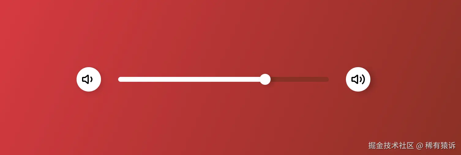
滑块
以下是如何构建一个具有你所选样式的滑块。
它与 Compose 的"InteractionState"集成,以便你可以按照自己想要的方式完善组件。键盘交互功能开箱即用,用户可以通过按下键盘上的"向上"或"向下"键来增加或减少值:
kotlin
Box(modifier = Modifier.fillMaxSize().background(Brush.linearGradient(listOf(Color(0xFFED213A), Color(0xFF93291E)))), contentAlignment = Alignment.Center) {
val interactionSource = remember { MutableInteractionSource() }
val isFocused by interactionSource.collectIsFocusedAsState()
val isPressed by interactionSource.collectIsPressedAsState()
val state = rememberSliderState(initialValue = 0.7f)
Row(verticalAlignment = Alignment.CenterVertically, horizontalArrangement = Arrangement.spacedBy(12.dp), modifier = Modifier.padding(horizontal = 16.dp).widthIn(max = 480.dp).fillMaxWidth()) {
Button(onClick = { state.value -= 0.1f }, modifier = Modifier.shadow(4.dp, CircleShape), shape = CircleShape, backgroundColor = Color.White, contentPadding = PaddingValues(8.dp),) {
Icon(VolumeDown, "Decrease")
}
Slider(
interactionSource = interactionSource,
state = state,
modifier = Modifier.weight(1f),
track = {
Box(Modifier.fillMaxWidth().height(8.dp).padding(horizontal = 16.dp).clip(RoundedCornerShape(100.dp))) {
// the 'not yet completed' part of the track
Box(Modifier.fillMaxHeight().fillMaxWidth().background(Color(0xFF93291E)))
// the 'completed' part of the track
Box(Modifier.fillMaxHeight().fillMaxWidth(state.value).background(Color.White))
}
},
thumb = {
val thumbSize by animateDpAsState(targetValue = if (isPressed) 22.dp else 18.dp)
val thumbInteractionSource = remember { MutableInteractionSource() }
val isHovered by thumbInteractionSource.collectIsHoveredAsState()
val glowColor by animateColorAsState(
if (isFocused || isHovered) Color.White.copy(0.33f) else Color.Transparent
)
// keep the size fixed to ensure that the resizing animation is always centered
Box(
modifier = Modifier.size(36.dp).clip(CircleShape).background(glowColor),
contentAlignment = Alignment.Center
) {
Thumb(
color = Color.White,
modifier = Modifier.size(thumbSize).shadow(4.dp, CircleShape).hoverable(thumbInteractionSource),
shape = CircleShape,
)
}
}
)
Button(onClick = { state.value += 0.1f }, modifier = Modifier.shadow(4.dp, CircleShape), shape = CircleShape, backgroundColor = Color.White, contentPadding = PaddingValues(8.dp),) {
Icon(VolumeUp, "Increase")
}
}
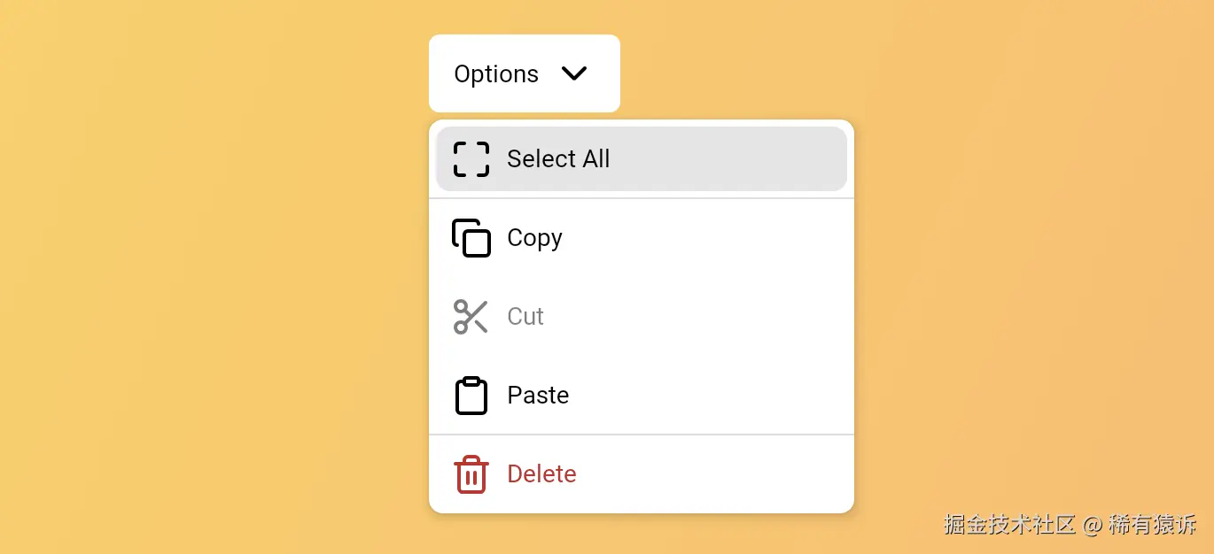
}下拉菜单
下拉菜单的正确实现非常复杂,尤其是在键盘导航和焦点管理方面。
要充分体验此组件,请在桌面上试用:点击"Options"按钮以聚焦演示,然后使用键盘的上下箭头键进行导航:
kotlin
class DropdownOption(val text: String, val icon: ImageVector, val enabled: Boolean = true, val dangerous: Boolean = false)
val options = listOf(
    DropdownOption("Select All", Maximize),
    DropdownOption("Copy", Copy),
    DropdownOption("Cut", Scissors, enabled = false),
    DropdownOption("Paste", Clipboard),
    DropdownOption("Delete", Trash2, dangerous = true),
)
var expanded by remember { mutableStateOf(true) }
DropdownMenu(onExpandRequest = { expanded = true }) {
    Button(shape = RoundedCornerShape(6.dp), backgroundColor = Color.White, onClick = { expanded = true }, contentPadding = PaddingValues(horizontal = 14.dp, vertical = 10.dp),) {
        Text("Options", fontWeight = FontWeight(500))
        Spacer(Modifier.width(8.dp))
        Icon(ChevronDown, null)
    }
    DropdownMenuPanel(
        expanded = expanded,
        onDismissRequest = { expanded = false },
        backgroundColor = Color.White,
        shape = RoundedCornerShape(8.dp),
        modifier = Modifier
            .padding(vertical = 4.dp)
            .width(240.dp)
            .shadow(4.dp, RoundedCornerShape(8.dp)),
        enter = scaleIn(
            animationSpec = tween(durationMillis = 120, easing = LinearOutSlowInEasing),
            initialScale = 0.8f,
            transformOrigin = TransformOrigin(0f, 0f)
        ) + fadeIn(tween(durationMillis = 30)),
        exit = scaleOut(animationSpec = tween(durationMillis = 1, delayMillis = 75), targetScale = 1f) + fadeOut(tween(durationMillis = 75))
    ) {
        options.forEachIndexed { index, option ->
            if (index == 1 || index == options.lastIndex) {
                Separator(color = Color(0xFFBDBDBD))
            }
            Button(onClick = { expanded = false }, enabled = option.enabled, modifier = Modifier.padding(4.dp), contentPadding = PaddingValues(horizontal = 8.dp, vertical = 2.dp), contentColor = (if (option.dangerous) Color(0xFFC62828) else LocalContentColor.current).copy(alpha = if (option.enabled) 1f else 0.5f), shape = RoundedCornerShape(8.dp),) {
                Icon(option.icon, null)
                Spacer(Modifier.width(4.dp))
                Text(text = option.text, modifier = Modifier.fillMaxWidth().padding(vertical = 8.dp, horizontal = 4.dp))
            }
        }
    }
}
以及更多未样式化的组件,例如:
- TextField,全面支持屏幕阅读器的无障碍功能
- Button
- Dialog
- Radio Group
- TabGroup,用于构建标签式导航,例如底部应用栏或顶部标签桌面
- 复选框
- 三态复选框
- 切换开关
- 滚动条(没错,就是滚动条。)
每个组件在构建时都充分考虑了可访问性,包括合理的语义和完整的键盘导航支持。
你可以在文档中找到完整的组件列表 ->(链接:composables.com/docs/com.co...
使用你的设计令牌自定义 Compose 主题
Compose Unstyled 包含一个灵活的主题系统,可与任何设计系统令牌兼容。
以下是如何使用你选择的设计令牌创建完全自定义的主题:
以下是创建 Compose Theme 函数的示例:
kotlin
// define your theme properties
private val colors = ThemeProperty<Color>("colors")
private val typography = ThemeProperty<TextStyle>("typography")
private val shapes = ThemeProperty<Shape>("shapes")
private val elevation = ThemeProperty<Dp>("elevation")
// define your theme tokens.
// those are the potential values of your theme properties
private val background = ThemeToken<Color>("background")
private val card = ThemeToken<Color>("surface")
private val onCard = ThemeToken<Color>("onCard")
private val outline = ThemeToken<Color>("outline")
private val accent = ThemeToken<Color>("accent")
private val primary = ThemeToken<Color>("primary")
private val onPrimary = ThemeToken<Color>("onPrimary")
private val onSecondary = ThemeToken<Color>("onSecondary")
private val secondary = ThemeToken<Color>("secondary")
private val subtle = ThemeToken<Dp>("subtle")
private val titleMedium = ThemeToken<TextStyle>("titleMedium")
private val bodyMedium = ThemeToken<TextStyle>("bodyMedium")
private val cardShape = ThemeToken<Shape>("cardShape")
private val albumCoverShape = ThemeToken<Shape>("albumCoverShape")
private val buttonShape = ThemeToken<Shape>("buttonShape")
// create your Compose Theme and assign values to each token
private val LightTheme = buildTheme {
    name = "LightTheme"
    properties[colors] = mapOf(
        accent to Color(0xFF3B82F6),
        card to Color.White,
        onCard to Color(0xFF1E293B),
        outline to Color(0xFFE2E8F0),
        primary to Color(0xFF2563EB),
        onPrimary to Color.White,
        secondary to Color(0xFFE2E8F0),
        onSecondary to Color(0xFF64748B),
        background to Color(0xFFF8F9FA),
    )
    properties[typography] = mapOf(
        titleMedium to TextStyle(
            fontSize = 18.sp,
            fontWeight = FontWeight.SemiBold,
            fontFamily = loadInterFont(),
        ),
        bodyMedium to TextStyle(
            fontSize = 14.sp,
            fontWeight = FontWeight.Normal,
            fontFamily = loadInterFont(),
        )
    )
    properties[shapes] = mapOf(
        cardShape to RoundedCornerShape(16.dp),
        albumCoverShape to RoundedCornerShape(12.dp),
        buttonShape to CircleShape
    )
    properties[elevation] = mapOf(
        subtle to 8.dp
    )
}
然后,你可以使用新的主题函数包装你的应用:
kotlin
@Composable
fun MusicPlayerApp() {
    LightTheme {
        MusicPlayerCard()
    }
}
然后,它会使用 Theme 对象授予其子组件对主题的访问权限:
kotlin
@Composable
fun MusicPlayerCard(modifier: Modifier = Modifier) {
    val sliderState = rememberSliderState(initialValue = 0.3f)
    Box(
        modifier = modifier
            .outline(1.dp, Theme[colors][outline], Theme[shapes][cardShape])
            .shadow(Theme[elevation][subtle], Theme[shapes][cardShape])
            .background(Theme[colors][card], Theme[shapes][cardShape])
            .padding(24.dp)
    ) {
        ProvideContentColor(Theme[colors][onCard]) {
            Column(verticalArrangement = Arrangement.spacedBy(20.dp)) {
                Row(verticalAlignment = Alignment.CenterVertically, horizontalArrangement = Arrangement.spacedBy(16.dp)) {
                    Image(
                        painter = painterResource(Res.drawable.just_hoist_it_cover),
                        modifier = Modifier
                            .clip(Theme[shapes][albumCoverShape])
                            .background(Theme[colors][primary])
                            .size(80.dp),
                        contentDescription = "Album Cover",
                        contentScale = ContentScale.Crop
                    )
                    Column(modifier = Modifier.weight(1f)) {
                        Text("Just hoist it!", style = Theme[typography][titleMedium])
                        Spacer(Modifier.height(4.dp))
                        Text(
                            "The Deprecated",
                            style = Theme[typography][bodyMedium],
                            color = Theme[colors][onSecondary]
                        )
                    }
                }
                Slider(
                    state = sliderState,
                    modifier = Modifier.fillMaxWidth(),
                    track = {
                        Box(Modifier.fillMaxWidth().height(4.dp).clip(RoundedCornerShape(2.dp))) {
                            // the empty part of the track
                            Box(Modifier.fillMaxSize().background(Theme[colors][secondary]))
                            // the filled part of the track
                            Box(
                                Modifier.fillMaxWidth(sliderState.value).fillMaxSize().background(Theme[colors][accent])
                            )
                        }
                    },
                    thumb = {
                        Thumb(
                            color = Theme[colors][accent],
                            modifier = Modifier.size(16.dp),
                            shape = Theme[shapes][buttonShape]
                        )
                    }
                )
                Row(modifier = Modifier.fillMaxWidth(), horizontalArrangement = Arrangement.SpaceEvenly, verticalAlignment = Alignment.CenterVertically) {
                    Button(onClick = { }, contentPadding = PaddingValues(12.dp), shape = Theme[shapes][buttonShape]) {
                        Icon(imageVector = Lucide.SkipBack, contentDescription = "Previous", modifier = Modifier.size(20.dp))
                    }
                    Button(onClick = { }, backgroundColor = Theme[colors][primary], contentColor = Theme[colors][onPrimary], contentPadding = PaddingValues(16.dp), shape = Theme[shapes][buttonShape]) {
                        Icon(imageVector = Lucide.Pause, contentDescription = "Pause", modifier = Modifier.size(24.dp))
                    }
                    Button(onClick = { }, contentPadding = PaddingValues(12.dp), shape = Theme[shapes][buttonShape]) {
                        Icon(imageVector = Lucide.SkipForward, contentDescription = "Next", modifier = Modifier.size(20.dp))
                    }
                }
            }
        }
    }
}
轮廓修饰符
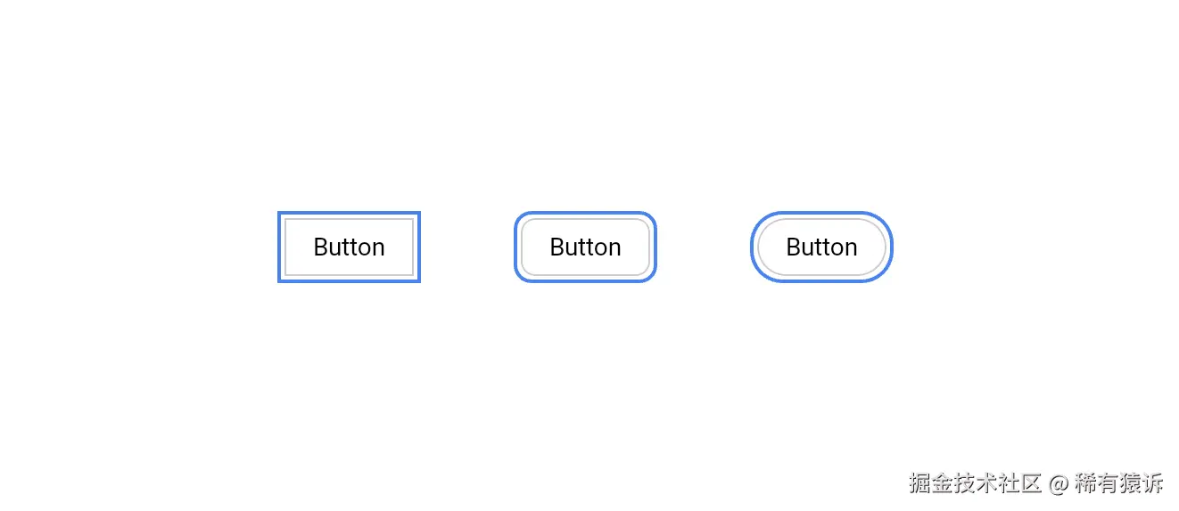
最后但同样重要的是,Compose Unstyled 引入了一些 Compose Foundation 中缺少的样式 Modifier,但这些修饰符对于构建视觉丰富的界面必不可少:
轮廓
与 Compose Foundation 的 border() 修饰符不同,此修饰符不会影响布局。它还会在组件周围而不是内部进行绘制。当你需要一个与阴影完美融合的半透明轮廓时,这个功能非常方便:
kotlin
SimpleButton(
  shape = RectangleShape,
  modifier = Modifier.outline(2.dp, Color(0xFF3B82F6), shape = RectangleShape)
)
SimpleButton(
  shape = RoundedCornerShape(8.dp),
  modifier = Modifier.outline(2.dp, Color(0xFF3B82F6), shape = RoundedCornerShape(8.dp))
)
SimpleButton(
  shape = CircleShape,
  modifier = Modifier.outline(2.dp, Color(0xFF3B82F6), shape = CircleShape)
)
焦点环
焦点环在处理键盘导航和焦点时非常重要。它们只有在获得焦点时才会渲染轮廓。
kotlin
val interactionSource = remember { MutableInteractionSource() }
SimpleButton(
    modifier = Modifier.focusRing(
        interactionSource = interactionSource,
        width = 2.dp,
        color = Color(0xFF3B82F6),
        shape = RoundedCornerShape(8.dp),
        offset = 2.dp
    ),
    interactionSource = interactionSource
)
然后呢?
即将推出的组件包括:
- 侧边栏
- 工具提示
- 上下文菜单
以及更多。
如果你愿意为该项目提供资金支持,我们还提供正在制作中的 UI Kit。该 UI Kit 是一套完整的设计系统,适用于触控和指针应用。
为了使这些 API 完美无缺,我们投入了大量的工作和专业知识。通过资金支持该项目,你将在未来几年获得更多资源,而我则可以继续从事开源工作,同时支付房租。
想要随时了解最新动态?请务必在 Github 上关注 Unstyled。
想要评论这篇文章吗?在 GitHub 上讨论 →
欢迎搜索并关注 公众号「稀有猿诉」 获取更多的优质文章!
保护原创,请勿转载!