先说使用的2个animation关键属性♥️
⭐animation-delay:指定从应用动画到元素开始执行动画之前等待的时间量。动画可以稍后开始、立即从开头开始或立即开始并在动画中途播放。
⭐animation-play-state:属性设置动画是运行还是暂停。
先创建一个简单的动画场景,效果如下
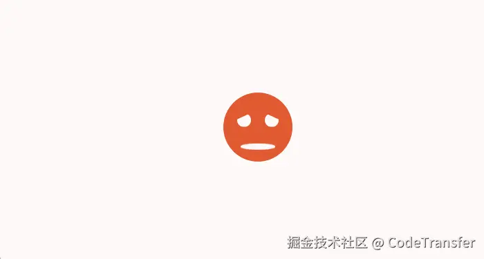
就是一个哭脸到笑脸的变化animation动画
代码
js
<template>
<div class="content">
<div class="outer_box"></div>
<div class="face">
<div class="eye_left"></div>
<div class="eye_right"></div>
<div class="mouse"></div>
</div>
</div>
</template>
<style lang="scss" scoped>
.wrap {
padding: 30px;
}
.content {
width: 100%;
height: 100%;
display: flex;
align-items: center;
justify-content: center;
flex-direction: column;
.face {
width: 100px;
height: 100px;
background: #d52f31;
border-radius: 50%;
position: relative;
}
.eye_left,
.eye_right {
width: 20px;
position: absolute;
top: 30px;
height: 20px;
background: #fff;
border-radius: 50%;
}
.face {
animation: changeFace 1s linear alternate-reverse infinite;
animation-delay: v-bind(delay);
}
.eye_left {
left: 20px;
animation: changeEyeLeft 1s linear alternate-reverse infinite;
clip-path: polygon(0 54%, 100% 0, 100% 100%, 0% 100%);
animation-delay: v-bind(delay);
}
.eye_right {
right: 20px;
animation: changeEyeRight 1s linear alternate-reverse infinite;
clip-path: polygon(0 0, 100% 54%, 100% 100%, 0% 100%);
animation-delay: v-bind(delay);
}
.mouse {
position: absolute;
bottom: 20px;
left: 50%;
width: 50px;
height: 10px;
border-radius: 50%;
margin-left: -25px;
background: #fff;
animation: changeMouse 1s linear alternate-reverse infinite;
animation-delay: v-bind(delay);
}
}
@keyframes changeFace {
0% {
background: #d52f31;
}
50% {
background: #ffcc33;
}
100% {
background: #26b66a;
}
}
@keyframes changeMouse {
50% {
height: 4px;
box-shadow: inset 0 4px 0 #fff;
transform: translateY(10px);
clip-path: inset(10% 0% 0% 0%);
}
50.1% {
height: 4px;
box-shadow: inset 0 -4px 0 #fff;
transform: translateY(10px);
clip-path: inset(50% 0% 0% 0%);
}
to {
height: 40px;
box-shadow: inset 0 -50px 0 #fff;
transform: translateY(10px);
clip-path: inset(50% 0% 0% 0%);
}
}
@keyframes changeEyeLeft {
0% {
clip-path: polygon(0 54%, 100% 0, 100% 100%, 0% 100%);
}
100% {
clip-path: polygon(0 0, 100% 0, 100% 100%, 0% 100%);
}
}
@keyframes changeEyeRight {
0% {
clip-path: polygon(0 0, 100% 54%, 100% 100%, 0% 100%);
}
100% {
clip-path: polygon(0 0, 100% 0, 100% 100%, 0% 100%);
}
}
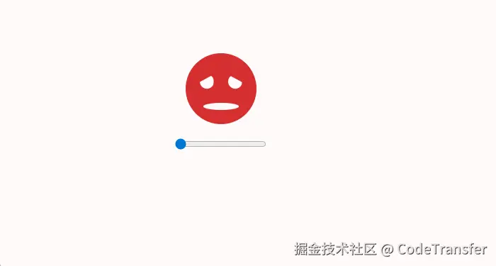
</style>使用js绑定并控制动画进度⚡
将animation-play-state设置为pause使动画暂停住
js
...
  .face {
    animation: changeFace 1s linear forwards paused;
  }
  .eye_left {
    left: 20px;
    animation: changeEyeLeft 1s linear forwards paused;
    clip-path: polygon(0 54%, 100% 0, 100% 100%, 0% 100%);
  }
  .eye_right {
    right: 20px;
    animation: changeEyeRight 1s linear forwards paused;
    clip-path: polygon(0 0, 100% 54%, 100% 100%, 0% 100%);
  }
...这里我们加一个input并且类型为range的滑动条来控制
js
<template>
  <div class="content">
    <div class="outer_box"></div>
    <div class="face">
      <div class="eye_left"></div>
      <div class="eye_right"></div>
      <div class="mouse"></div>
    </div>
    <input
      type="range"
      style="margin-top: 20px"
      min="0"
      :step="0.01"
      max="1"
      @input="changeInput"
    />
  </div>
</template>这里我们需要控制动画在1s内的变化,所以设置min为0,max为1,然后变化的step为0.01,这样input的事件拿到的value值范围就是从0-1的值
然后设置一个统一的
delay,它的值是由-e.target.value决定,然后将它应用到animation里就能控制动画了
js
<script lang="ts" setup>
import { ref } from "vue";
const delay = ref("");
const changeInput = (e) => {
  delay.value = -e.target.value + "s";
};
</script>
<style>
...
 .face {
    animation: changeFace 1s  linear forwards paused;
    animation-delay: v-bind(delay);
  }
  .eye_left {
    left: 20px;
    animation: changeEyeLeft 1s linear forwards paused;
    clip-path: polygon(0 54%, 100% 0, 100% 100%, 0% 100%);
    animation-delay: v-bind(delay);
  }
  .eye_right {
    right: 20px;
    animation: changeEyeRight 1s linear forwards paused;
    clip-path: polygon(0 0, 100% 54%, 100% 100%, 0% 100%);
    animation-delay: v-bind(delay);
  }
  ...
</style>
效果✨
全部代码
js
<template>
  <div class="content">
    <div class="outer_box"></div>
    <div class="face">
      <div class="eye_left"></div>
      <div class="eye_right"></div>
      <div class="mouse"></div>
    </div>
    <input
      type="range"
      style="margin-top: 20px"
      min="0"
      :step="0.01"
      max="1"
      @input="changeInput"
    />
  </div>
</template>
<script lang="ts" setup>
import { ref } from "vue";
const delay = ref("");
const changeInput = (e) => {
  console.log(e.target.value);
  delay.value = -e.target.value + "s";
};
</script>
<style lang="scss" scoped>
.wrap {
  padding: 30px;
}

.content {
  width: 100%;
  height: 100%;
  display: flex;
  align-items: center;
  justify-content: center;
  flex-direction: column;
  .face {
    width: 100px;
    height: 100px;
    background: #d52f31;
    border-radius: 50%;
    position: relative;
  }
  .eye_left,
  .eye_right {
    width: 20px;
    position: absolute;
    top: 30px;
    height: 20px;
    background: #fff;
    border-radius: 50%;
  }
  .face {
    animation: changeFace 1s linear forwards paused;
    animation-delay: v-bind(delay);
  }
  .eye_left {
    left: 20px;
    animation: changeEyeLeft 1s linear forwards paused;
    clip-path: polygon(0 54%, 100% 0, 100% 100%, 0% 100%);
    animation-delay: v-bind(delay);
  }
  .eye_right {
    right: 20px;
    animation: changeEyeRight 1s linear forwards paused;
    clip-path: polygon(0 0, 100% 54%, 100% 100%, 0% 100%);
    animation-delay: v-bind(delay);
  }
  .mouse {
    position: absolute;
    bottom: 20px;
    left: 50%;
    width: 50px;
    height: 10px;
    border-radius: 50%;
    margin-left: -25px;
    background: #fff;
    animation: changeMouse 1s linear forwards paused;
    animation-delay: v-bind(delay);
  }
}
@keyframes changeFace {
  0% {
    background: #d52f31;
  }
  50% {
    background: #ffcc33;
  }
  100% {
    background: #26b66a;
  }
}
@keyframes changeMouse {
  50% {
    height: 4px;
    box-shadow: inset 0 4px 0 #fff;
    transform: translateY(10px);
    clip-path: inset(10% 0% 0% 0%);
  }
  50.1% {
    height: 4px;
    box-shadow: inset 0 -4px 0 #fff;
    transform: translateY(10px);
    clip-path: inset(50% 0% 0% 0%);
  }
  to {
    height: 40px;
    box-shadow: inset 0 -50px 0 #fff;
    transform: translateY(10px);
    clip-path: inset(50% 0% 0% 0%);
  }
}
@keyframes changeEyeLeft {
  0% {
    clip-path: polygon(0 54%, 100% 0, 100% 100%, 0% 100%);
  }
  100% {
    clip-path: polygon(0 0, 100% 0, 100% 100%, 0% 100%);
  }
}
@keyframes changeEyeRight {
  0% {
    clip-path: polygon(0 0, 100% 54%, 100% 100%, 0% 100%);
  }
  100% {
    clip-path: polygon(0 0, 100% 0, 100% 100%, 0% 100%);
  }
}
</style>