写在开头
Hello,各位好呀! 😊
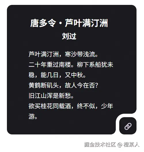
本次要分享的是 CSS 径向渐变的小技巧,瞧着有趣就记录下来,效果如下,请诸君按需食用哈。
径向渐变
上面的效果核心是利用 radial-gradient 径向渐变来创建透明的圆形缺口实现的。
简单来说,就是在指定位置 "挖" 出一个透明的圆形,从而形成弯曲的视觉效果。这种方法比传统的图片或SVG方案更加灵活,而且性能更好!
咱们先简单写个 DEMO 来理解这个概念:
html
<!DOCTYPE html>
<html>
<head>
    <style>
        html, body {
            margin: 0;
            height: 100vh;
            display: flex;
            justify-content: center;
            align-items: center;
        }
        .box {
            width: 200px;
            height: 100px;
            background: radial-gradient(circle at right bottom, transparent 20px, red 20px);
        }
    </style>
</head>
<body>
    <div class="box"></div>
</body>
</html>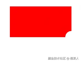
原理解释:
circle at right bottom:在右下角创建一个圆形渐变。transparent 20px:从圆心开始20px范围内完全透明red 20px:20px之外的区域显示红色
这样就能在右下角创建了一个直径40px的透明圆形缺口,很好理解哈!🎯
弯曲框效果
接下来,咱们一步步看看开头案例是如何实现的...😋
第1步:创建HTML结构
html
<div class="box">
    <div class="content"></div>
</div>
第2步:添加基础样式
css
html, body {
margin: 0;
height: 100vh;
display: flex;
justify-content: center;
align-items: center;
}
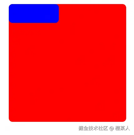
.box {
width: 375px;
height: 375px;
border-radius: 12px;
background-color: red;
}
.content {
width: 160px;
height: 60px;
border-radius: 12px;
background-color: blue;
}看效果:
第3步:给小盒子添加 outline 边框
css
.content {
    /* ...其他样式保持不变... */
    outline: 8px solid white;
}
这里使用 outline 而不是 border,是因为 outline 不会影响元素的布局,而且可以更好地配合后面的径向渐变效果。
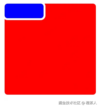
Em...存在一些尖角,这还不是我们想要的弯曲效果,现在就需要径向渐变上场了!🎯
第4步:应用径向渐变创建弯曲效果
css
.box {
        /* ... */
        background:
            /* 第一个缺口 */
            -8px 60px / 20px 20px
            radial-gradient(circle at right bottom, transparent 12px, white 12px),
            /* 第二个缺口 */
            160px -8px / 20px 20px
            radial-gradient(circle at right bottom, transparent 12px, white 12px),
            /* 底色 */
            red;
        background-repeat: no-repeat;
}
前面,咱们介绍使用单个径向渐变创建了一个缺口,但要实现完整的弯曲框效果,我们需要组合多个径向渐变。
语法解析:
-8px 60px:第一个缺口的位置(x轴偏移-8px,y轴偏移60px)20px 20px:径向渐变区域的尺寸(宽20px,高20px)160px -8px:第二个缺口的位置(向右偏移160px,向上偏移8px)transparent 12px:透明区域半径12pxwhite 12px:12px之外显示白色(与页面背景色一致)
💡关键点:
- 使用负值偏移让缺口"伸出"元素边界
- 缺口的颜色必须与页面背景色一致
- 透明区域的半径要与圆角大小匹配
效果:
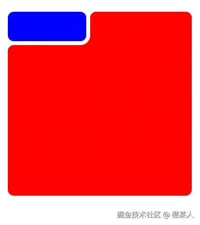
还可以哈,Em...就是位置...不大对。
进阶优化
在上面的基础实现中,咱们已经掌握了弯曲框的基本原理。但是实际项目中,咱们可能需要实现不同方向的弯曲效果,比如左下角弯曲、右上角弯曲等等。
css
/* 右下角弯曲 */
.curved-bottom-right {
    background:
        152px 68px / 20px 20px
            radial-gradient(circle at left top, transparent 12px, white 12px),
        168px 52px / 20px 20px
            radial-gradient(circle at left top, transparent 12px, white 12px),
        #4ecdc4;
    background-repeat: no-repeat;
}

/* 左下角弯曲 */
.curved-bottom-left {
    background:
        -8px 52px / 20px 20px
            radial-gradient(circle at right top, transparent 12px, white 12px),
        160px 68px / 20px 20px
            radial-gradient(circle at right top, transparent 12px, white 12px),
        #45b7d1;
    background-repeat: no-repeat;
}
为了更方便地调整参数,咱们使用CSS变量来管理这些数值:
css
.box {
    width: 300px;
    aspect-ratio: 1;

    --w: 40px;          /* 内层元素宽度 */
    --h: 40px;          /* 内层元素高度 */
    --outline: 8px;     /* 边框宽度 */
    --radius: 12px;     /* 圆角大小 */
    --offset: calc(-1 * var(--outline));  /* 负偏移量,用于缺口定位 */
    --size: calc(var(--radius) + var(--outline));  /* 径向渐变区域大小 */

    contain: layout;
    background:
        /* 右上角缺口 */
        calc(100% - var(--offset)) calc(100% - var(--h))
            radial-gradient(
                circle at left top,
                transparent var(--radius),
                white var(--radius)
            ),
        /* 右下角缺口 */
        calc(100% - var(--w)) calc(100% - var(--offset))
            radial-gradient(
                circle at left top,
                transparent var(--radius),
                white var(--radius)
            ),
        /* 主背景渐变 */
        linear-gradient(
            to top right,
            #1a1a1e 20%,
            #1a1a1e
        );

    background-repeat: no-repeat;
    background-size: var(--size) var(--size), var(--size) var(--size), cover;
    border-radius: var(--radius);
    align-content: end;  /* 内容对齐到底部 */
}
.content {
    outline: var(--outline) solid white;
    border-radius: var(--radius);
    width: var(--w);
    height: var(--h);
    text-align: center;
    line-height: var(--h);
    margin-left: auto;
}
变量详解:
--w和--h:控制右下角小按钮的宽高尺寸。--outline:控制白色边框的厚度,影响弯曲效果的视觉层次。--radius:统一控制所有圆角大小,包括容器和按钮。--offset:通过负值计算,让缺口"伸出"容器边界。--size:径向渐变的作用区域,确保缺口完全覆盖需要的范围。contain: layout:CSS性能优化属性,限制布局计算范围。
完整源码
经过前面的步骤优化,咱们来看看最终的完整代码:
html
<!DOCTYPE html>
<html>
<head>
<style>
body {
height: 100vh;
margin: 0;
display: grid;
place-content: center;
place-items: center;
font: 14px "poppins";
user-select: none;
}
.box {
width: 300px;
aspect-ratio: 1;
--w: 40px;
--h: 40px;
--outline: 8px;
--radius: 12px;
--offset: calc(-1 * var(--outline));
--size: calc(var(--radius) + var(--outline));
contain: layout;
background: calc(100% - var(--offset)) calc(100% - var(--h))
radial-gradient(
circle at left top,
transparent var(--radius),
white var(--radius)
),
calc(100% - var(--w)) calc(100% - var(--offset))
radial-gradient(
circle at left top,
transparent var(--radius),
white var(--radius)
),
linear-gradient(to top right, #1a1a1e 20%, #1a1a1e);
background-repeat: no-repeat;
background-size: var(--size) var(--size), var(--size) var(--size), cover;
border-radius: var(--radius);
align-content: end;
}
.content {
outline: var(--outline) solid white;
border-radius: var(--radius);
width: var(--w);
height: var(--h);
text-align: center;
line-height: var(--h);
margin-left: auto;
}
section {
width: 80%;
position: absolute;
top: 10px;
left: 10px;
color: #ffffff;
}
h1 {
font-size: 20px;
font-weight: 600;
text-align: center;
padding-left: 28px;
}
ul, li {
list-style: none;
line-height: 24px;
}
button {
all: unset;
cursor: pointer;
width: 100%;
font-size: 1.2em;
color: #fff;
transition: all 0.2s;
}
button:hover {
background-color: #29282e;
}
</style>
</head>
<body>
<div class="box">
<div class="content"><button>🔗</button></div>
<section>
<h1>唐多令・芦叶满汀洲<small><br />刘过</small></h1>
<ul>
<li>芦叶满汀洲,寒沙带浅流。</li>
<li>二十年重过南楼。柳下系船犹未稳,能几日,又中秋。</li>
<li>黄鹤断矶头,故人今在否?</li>
<li>旧江山浑是新愁。</li>
<li>欲买桂花同载酒,终不似,少年游。</li>
</ul>
</section>
</div>
</body>
</html>至此,本篇文章就写完啦,撒花撒花。

希望本文对你有所帮助,如有任何疑问,期待你的留言哦。
老样子,点赞+评论=你会了,收藏=你精通了。