在移动应用开发中,吸引人的视觉效果是提升用户体验的关键因素之一。如何使用uni-app和Vue3实现一个令人惊叹的3D圆柱形旋转画廊效果,这种效果能让你的应用在视觉上脱颖而出。
效果概述
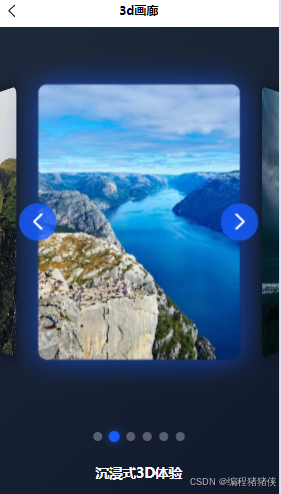
这个3D圆柱形旋转画廊利用CSS 3D变换技术,将图片排列在一个虚拟的圆柱体表面,创造出令人惊叹的3D视觉效果。用户可以通过点击导航按钮或指示器来旋转画廊,查看不同角度的图片,带来沉浸式的浏览体验。
实现原理
1. 3D变换基础
实现这一效果的核心是CSS的3D变换属性。我们通过以下关键属性创建3D空间:
-
perspective: 定义3D元素的透视效果,值越大,3D效果越柔和 -
transform-style: preserve-3d: 确保子元素保持在3D空间中 -
rotateY(): 绕Y轴旋转元素,创建圆柱形排列效果 -
translateZ(): 沿Z轴移动元素,控制元素距离视点的远近
2. 圆柱形排列计算
3. 旋转控制
通过改变容器的rotateY值来实现整体旋转效果
完整代码
TypeScript
<template>
  <view class="container">
    <view class="gallery-container">
      <view
        id="carousel"
        class="carousel"
        :style="{ transform: `rotateY(${currentRotation}deg)` }"
      >
        <view
          v-for="(item, index) in items"
          :key="index"
          :class="[
            `carousel-item`,
            index === getClassName ? `carousel-item-active` : '',
          ]"
          :style="getItemStyle(index)"
        >
          <image :src="item.src" mode="aspectFill" class="carousel-image" />
        </view>
      </view>

      <button class="nav-btn prev" @tap="rotateCarousel(rotationStep)">
        <uni-icons type="left" color="#ffffff" size="30"></uni-icons>
      </button>
      <button class="nav-btn next" @tap="rotateCarousel(-rotationStep)">
        <uni-icons type="right" color="#ffffff" size="30"></uni-icons>
      </button>
    </view>

    <view class="gallery-indicators">
      <view
        v-for="(item, index) in items"
        :key="index"
        class="indicator"
        :class="{ active: isActive(index) }"
        @tap="goToItem(index)"
      ></view>
    </view>

    <view class="gallery-info">
      <h2 class="gallery-title">沉浸式3D体验</h2>
      <p class="gallery-desc">
        这个创意画廊利用CSS
        3D变换技术,将图片排列在一个虚拟的圆柱体表面,创造出令人惊叹的3D视觉效果。
        你可以通过点击导航按钮来旋转画廊,查看不同角度的图片。
      </p>
    </view>
  </view>
</template>

<script setup lang="ts">
import { ref, onMounted, onUnmounted, computed } from "vue";

// 图片数据
const items = ref([
  { src: "https://picsum.photos/id/1018/600/800" },
  { src: "https://picsum.photos/id/1015/600/800" },
  { src: "https://picsum.photos/id/1019/600/800" },
  { src: "https://picsum.photos/id/1039/600/800" },
  { src: "https://picsum.photos/id/1043/600/800" },
  { src: "https://picsum.photos/id/1045/600/800" },
]);

const currentRotation = ref(0);
// 增加旋转角度,使每次旋转后只显示三个卡片
const rotationStep = 60;
const totalItems = items.value.length;

// 自动播放计时器
let autoPlayInterval: number | null = null;

// 获取每个项目的样式 - 调整角度和距离使一次只显示三个
const getItemStyle = (index: number) => {
  // 计算每个项目的角度,6个项目每个间隔60度
  const angle = index * (360 / totalItems);
  // 减小Z轴距离,使卡片更靠近中心,不会铺满全屏
  const translateZ = 220;

  return `transform: rotateY(${angle}deg) translateZ(${translateZ}px)`;
};

// 检查指示器是否激活
const isActive = (index: number) => {
  const activeIndex = Math.round((-currentRotation.value % 360) / rotationStep);
  return index === ((activeIndex % totalItems) + totalItems) % totalItems;
};

// 旋转画廊
const rotateCarousel = (step: number) => {
  currentRotation.value += step;
};

// 跳转到指定项目
const goToItem = (index: number) => {
  const targetRotation = index * -rotationStep;
  const diff = targetRotation - currentRotation.value;
  const steps = diff / rotationStep;
  rotateCarousel(steps * rotationStep);
};

// 自动播放功能
const startAutoPlay = () => {
  if (autoPlayInterval) {
    clearInterval(autoPlayInterval);
  }

  autoPlayInterval = setInterval(() => {
    rotateCarousel(-rotationStep);
  }, 5000) as unknown as number;
};

// // 初始化开启播放
// onMounted(() => {
//   startAutoPlay();
// });

//通过computed计算,当前卡片的样式
const getClassName = computed(() => {
  // 计算当前激活的元素索引
  const currentIndex = (currentRotation.value / 60) % totalItems;
  // 使用 Math.floor 来确保索引是整数 Math.abs保证是正数
  const activeIndex = Math.abs(Math.floor(currentIndex));
  console.log("🚀 ~ activeIndex:", activeIndex);

  return activeIndex;
});

onUnmounted(() => {
  if (autoPlayInterval) {
    clearInterval(autoPlayInterval);
  }
});
</script>

<style lang="scss" scoped>
.container {
  background: linear-gradient(135deg, #1e293b 0%, #0f172a 100%);
  min-height: 100vh;
  color: #f8fafc;
  padding: 20rpx;
  box-sizing: border-box;
}

.gallery-container {
  position: relative;
  width: 100%;
  height: 500px;
  display: flex;
  justify-content: center;
  align-items: center;
  perspective: 1200px; /* 增加透视距离,增强3D效果 */
}

.carousel {
  position: relative;
  width: 220px; /* 缩小卡片宽度 */
  height: 300px; /* 缩小卡片高度 */
  transform-style: preserve-3d;
  transition: transform 0.8s ease-out; /* 减慢过渡速度,使旋转更平滑 */
}

.carousel-item {
  position: absolute;
  width: 100%;
  height: 100%;
  backface-visibility: hidden;
  border-radius: 10px;
  overflow: hidden;
  box-shadow: 0 0 20px rgba(0, 0, 0, 0.5);
  transition: transform 0.5s ease, box-shadow 0.5s ease;
  opacity: 0.9; /* 稍微降低不透明度,突出当前卡片 */
}

/* 选中卡片的样式强化 */
.carousel-item-active {
  opacity: 1;
  box-shadow: 0 0 30px rgba(22, 93, 255, 0.7);
}

.carousel-image {
  width: 100%;
  height: 100%;
  transition: transform 0.5s ease;
}

.nav-btn {
  position: absolute;
  top: 50%;
  transform: translateY(-50%);
  background: rgba(22, 93, 255, 0.8);
  color: white;
  border: none;
  border-radius: 50%;
  width: 50px;
  height: 50px;
  display: flex;
  justify-content: center;
  align-items: center;
  z-index: 10;
  transition: all 0.3s ease;
}

.nav-btn:active {
  background: rgba(22, 93, 255, 1);
  transform: translateY(-50%) scale(1.1);
  box-shadow: 0 0 15px rgba(22, 93, 255, 0.7);
}

.nav-btn.prev {
  left: 5%;
}

.nav-btn.next {
  right: 5%;
}

.gallery-indicators {
  display: flex;
  justify-content: center;
  margin-top: 30px;
  gap: 10px;
}

.indicator {
  width: 12px;
  height: 12px;
  border-radius: 50%;
  background: rgba(248, 250, 252, 0.3);
  transition: all 0.3s ease;
}

.indicator.active {
  background: rgba(22, 93, 255, 1);
  transform: scale(1.2);
  box-shadow: 0 0 10px rgba(22, 93, 255, 0.7);
}

.gallery-info {
  max-width: 800px;
  margin: 30px auto;
  text-align: center;
  padding: 0 20px;
}

.gallery-title {
  font-size: 36rpx;
  font-weight: 700;
  margin-bottom: 15px;
  color: #f8fafc;
  text-shadow: 0 2px 10px rgba(0, 0, 0, 0.3);
}

.gallery-desc {
  font-size: 28rpx;
  color: rgba(248, 250, 252, 0.8);
  line-height: 1.6;
}
</style>
实际应用场景
这种3D圆柱形旋转画廊适用于:
-
产品展示页面
-
相册或图片集应用
-
酒店或旅游应用的房间/景点展示
-
电商应用的商品展示
效果展示