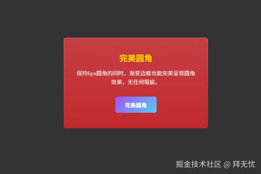
不直接使用 border 属性,因为它的渐变和圆角在旧浏览器上表现不佳。我们反过来,用"两层背景的视觉差"来模拟出边框。
-
外层容器 (
.card) ------ 充当"边框"- 设置渐变背景 :我们给这个最外层的
div设置了您想要的从上到下的渐变背景。这个渐变就是我们最终看到的"边框"颜色。 - 定义边框宽度 :通过设置
padding: 1px;,我们让这个渐变背景层有了1px的厚度。这个padding的大小,就是"边框"的宽度。 - 设置外圆角 :给它设置最终想要的
border-radius: 6px;。
- 设置渐变背景 :我们给这个最外层的
-
内层容器 (
.card-content) ------ 充当"内容区域"- 设置内容背景 :这个
div位于外层容器的padding内部,我们给它设置了卡片内容的实际背景色(半透明的红色)。 - 设置内圆角 :它的圆角比外层容器小
1px(即border-radius: 5px;),这样就能严丝合缝地贴在外层容器的内侧。
- 设置内容背景 :这个
最终效果:
当这个内层的 .card-content 覆盖住外层的 .card 的中心区域后,.card 的渐变背景就只有 padding 定义的那 1px 边缘能够被看见。
这样一来,视觉上就形成了一个拥有完美平滑圆角、颜色从上到下渐变的边框,并且这个方法只用了最基础的 CSS 属性,可以很好地兼容到您要求的 Chrome 60 等旧版浏览器。
xml
<!DOCTYPE html>
<html lang="zh">
<head>
<meta charset="UTF-8">
<meta name="viewport" content="width=device-width, initial-scale=1.0">
<title>兼容性渐变圆角边框</title>
<style>
    body {
        display: flex;
        justify-content: center;
        align-items: center;
        height: 100vh;
        margin: 0;
        background: #333;
        font-family: -apple-system, BlinkMacSystemFont, "Segoe UI", Roboto, "Helvetica Neue", Arial, sans-serif;
    }

    .card {
        width: 420px;
        box-sizing: border-box;
        text-align: center;
        color: white;

        /* 关键点 1: 渐变背景作为"边框",从上到下渐变并融入背景 */
        background: linear-gradient(to bottom, #E09393, #c1292e);

        border-radius: 6px; /* 外层容器圆角 */
        padding: 1px; /* 边框的宽度 */

        /* 确保背景从 padding 区域开始绘制,增强兼容性 */
        -webkit-background-clip: padding-box;
        background-clip: padding-box;
    }

    .card-content {
        padding: 40px 30px;
        /* 关键点 2: 内部内容的背景 */
        background: rgba(193, 41, 46, 0.8);
        border-radius: 5px; /* 内层圆角比外层小 1px,完美贴合 */
        backdrop-filter: blur(10px); /* 毛玻璃效果,现代浏览器支持 */
        -webkit-backdrop-filter: blur(10px);
    }

    .card-title {
        font-size: 24px;
        font-weight: bold;
        color: #ffd700; /* 金色标题 */
        margin: 0 0 15px 0;
    }

    .card-text {
        font-size: 16px;
        line-height: 1.6;
        opacity: 0.9;
        margin: 0 0 30px 0;
    }

    .perfect-button {
        display: inline-block;
        padding: 12px 28px;
        border: none;
        border-radius: 6px; /* 与卡片一致的圆角 */
        font-size: 16px;
        font-weight: bold;
        color: white;
        cursor: pointer;
        text-decoration: none;
        position: relative;
        overflow: hidden; /* 隐藏伪元素超出的部分 */
        z-index: 1;
        transition: color 0.3s ease;
    }

    .perfect-button::before {
        content: '';
        position: absolute;
        top: 0;
        left: 0;
        right: 0;
        bottom: 0;
        /* 关键点 3: 按钮也用同样的技巧 */
        background: linear-gradient(135deg, #a052ff, #56ccf2);
        z-index: -1;
        transition: opacity 0.3s ease;
    }

    .perfect-button:hover::before {
        opacity: 0.8;
    }

</style>
</head>
<body>

    <div class="card">
        <div class="card-content">
            <h2 class="card-title">完美圆角</h2>
            <p class="card-text">
                保持6px圆角的同时,渐变边框也能完美呈现圆角效果,无任何瑕疵。
            </p>
            <a href="#" class="perfect-button">完美圆角</a>
        </div>
    </div>

</body>
</html>