html
<!DOCTYPE html>
<html lang="en">
  <head>
    <meta charset="UTF-8" />
    <meata http-equiv="X-UA-Compatible" content="IE=edge" />
    <meta name="viewport" content="width=device-width, initial-scale=1.0" />
    <title>Document</title>
    <link rel="stylesheet" href="./btn.css" />
    <link refl="stylesheet" href="./index.css" />
  </head>

  <body>
    <button class="btn type-1">按钮</button>
    <button class="btn type-2">按钮</button>
    <button class="btn type-3">按钮</button>
    <button class="btn type-4">按钮</button>
    <button class="btn type-5">按钮</button>
  </body>
</html>比方说第一个按钮变成禁用的disabaled。
disabled 进入状态之后,它的颜色又变了。

普通css写法:
css
.btn.type-1 {
	background: #409eff;
	color: #fff;
}
.btn.type-1:hover {
	background: #73b8ff;
}
.btn.type-1:active {
	background: #0d84ff;
}
.btn.type-1:disabled {
	background: #a6d2ff;
	color: white;
}

.btn.type-2 {
	background: #67c23a;
	color: #fff;
}
.btn.type-2:hover {
	background: #85cf60;
}
.btn.type-2:disabled {
	background: #a3db87;
	color: #dff3d5;
}

.btn.type-3 {
	background: #8b590f;
	color: #fff;
}
.btn.type-3:hover {
	background: #b97614;
	color: #fff;
}
.btn.type-3:disabled {
	background: #e6941a;
	color: #f0bf76;
}

.btn.type-4 {
	background: #f54343;
	color: #fff;
}
.btn.type-4:hover {
	background: #f87373;
}
.btn.type-4:active {
	background: #f21313;
}
.btn.type-4:diabled {
	background: #faa4a4;
	color: white;
}

.btn.type-5 {
	background: #6c6d71;
	color: #fff;
}
.btn.typ-5:hover {
	background: #535457;
}
.btn.type-5:disabled {
	background: #9fa0a4;
	color: #d4d4d5;
}
单看一个:
css
.btn.type-1 {
	background: #409eff;
	color: #fff;
}
.btn.type-1:hover {
	background: #73b8ff;
}
.btn.type-1:active {
	background: #0d84ff;
}
.btn.type-1:disabled {
	background: #a6d2ff;
	color: white;
}
写成scss
css
.btn.type-1 {
	background: #409eff;
	color: #fff;
        .btn.type-1:hover {
                background: #73b8ff;
        }
        .btn.type-1:active {
                background: #0d84ff;
        }
        .btn.type-1:disabled {
                background: #a6d2ff;
                color: white;
        }
}
这样改:
css
.btn.type-1 {
	background: #409eff;
	color: #fff;
        &:hover {
                background: #73b8ff;
        }
        &:active {
                background: #0d84ff;
        }
        &:disabled {
                background: #a6d2ff;
                color: white;
        }
}
编译出来的效果完全一样。 scss会被编译成css。
css
.btn.type-1 {
	background: #409eff;
	color: #fff;
}
.btn.type-1:hover {
	background: #73b8ff;
}
.btn.type-1:active {
	background: #0d84ff;
}
.btn.type-1:disabled {
	background: #a6d2ff;
	color: white;
}
接下来处理颜色(这些颜色之间存在某种一定的关系,比方说第一个背景颜色,它是一个普通状态下的颜色,那么当鼠标移入,它就相当于普通颜色的变种,所以不要把颜色给它写死了,)。
所以我们就把普通状态下的颜色写成一个变量。
css
.btn.type-1 {
    $color: #409eff;
    background: $color;
    color: #fff;
    &:hover {
        background: #73b8ff;
    }
    &:active {
        background: #0d84ff;
    }
    &:disabled {
        background: #a6d2ff;
        color: white;
    }
}鼠标移入的时候,我们就基于普通颜色的color进行去改动运算。
重点:SASS中的lighten函数
利用sass里边一个函数叫lighten(意思就是把颜色变淡一些些),俩参数,一个是颜色$color,一个是变淡的百分比$amount。
css
.btn.type-1 {
    $color: #409eff;
    background: $color;
    color: #fff;
    &:hover {
        background: lighten($color, 10%);
    }
    &:active {
        background: #0d84ff;
    }
    &:disabled {
        background: #a6d2ff;
        color: white;
    }
}
然后编译后的结果:
css
background: lighten($color, 10%);会编译成
css
background: #73b88ff;解释 10%
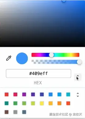
颜色有很多表达方式:
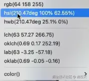
比方说HSL色相环表达方式:
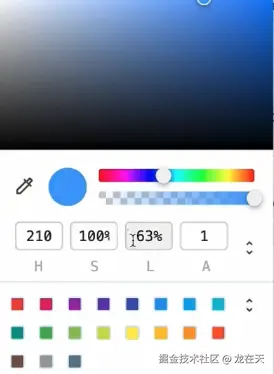
其中L的百分比就表示亮度,L表示lighten亮度。百分比越高,就相当于颜料里边加白色。那边这个亮度就会越来越高,那个圈圈就会越往左上边走。到达100%的时候就完全变成白色了。
反之呢,如果说这个百分比越低呢,就相当于是往颜料里边加黑色,那么到达0%的时候呢,就是黑色。
重点:darken就是把颜色变深一点
css
.btn.type-1 {
    $color: #409eff;
    background: $color;
    color: #fff;
    &:hover {
        background: lighten($color, 10%);
    }
    &:active {
        background: darken($color, 10%);
    }
    &:disabled {
        background: #a6d2ff;
        color: white;
    }
}
就是鼠标移上去变淡了,按下去就变深了。
接着改disabled,
css
.btn.type-1 {
    $color: #409eff;
    background: $color;
    color: #fff;
    &:hover {
        background: lighten($color, 10%);
    }
    &:active {
        background: darken($color, 10%);
    }
    &:disabled {
        background: lighten($color, 20%);
        color: white;
    }
}这样就完成了。第一个按钮,就只有一个颜色,叫做基准颜色。基准颜色一变,那么其他的都相应跟着改动。
重点:其他按钮 循环写 用@for
其他按钮也可以按照这个原理去写,但是尽量不要手动一个一个去写,尽量用循环去循。
sass里边就有一个数组功能:
首先先定义一组颜色colors:
css
$colors: #409eff, #67c23a, #8b590f, #f54343, #6c6d71;

.btn.type-1 {
    $color: #409eff;
    background: $color;
    color: #fff;
    &:hover {
        background: lighten($color, 10%);
    }
    &:active {
        background: darken($color, 10%);
    }
    &:disabled {
        background: lighten($color, 20%);
        color: white;
    }
}
css
$colors: #409eff, #67c23a, #8b590f, #f54343, #6c6d71;

@for $i from 1 through length($colors) {
  .btn.type-#{$i} {
    $color: nth($colors, $i);
    background: $color;
    color: #fff;
    &:hover {
        background: lighten($color, 10%);
    }
    &:active {
        background: darken($color, 10%);
    }
    &:disabled {
        background: lighten($color, 20%);
        color: white;
    }
  }
}
自动,维护省事,尽量自动不要手动。
写完。