如何使用纯CSS制作"天狗食日"动画的详细步骤和代码实现,模拟日食过程中月亮(天狗)逐渐遮挡太阳的效果:
实现思路
- 创建太阳(黄色圆形)和月亮(黑色圆形)
- 使用CSS动画让月亮沿水平方向移动遮挡太阳
- 添加背景渐变色模拟日食时的天空明暗变化
- 使用滤镜增强光影效果
完整代码
html
<!DOCTYPE html>
<html lang="zh-CN">
<head>
    <meta charset="UTF-8">
    <title>天狗食日CSS动画</title>
    <style>
        .sky {
            position: relative;
            width: 100vw;
            height: 100vh;
            background: linear-gradient(to bottom, #1a2980, #26d0ce);
            overflow: hidden;
            display: flex;
            justify-content: center;
            align-items: center;
        }

        .sun {
            width: 150px;
            height: 150px;
            background: radial-gradient(circle, #FFD700, #FF8C00);
            border-radius: 50%;
            box-shadow: 0 0 50px #FF4500, 0 0 100px rgba(255, 215, 0, 0.5);
            position: relative;
            z-index: 2;
        }

        .moon {
            width: 150px;
            height: 150px;
            background: #000;
            border-radius: 50%;
            position: absolute;
            z-index: 3;
            animation: eclipse 8s ease-in-out infinite;
            filter: blur(1px); /* 边缘柔化 */
        }

        .flare {
            position: absolute;
            width: 200px;
            height: 200px;
            background: radial-gradient(circle, transparent 60%, rgba(255, 69, 0, 0.3) 90%);
            border-radius: 50%;
            animation: pulse 3s ease-in-out infinite;
            z-index: 1;
        }

        @keyframes eclipse {
            0% { transform: translateX(-200px); }
            50% { transform: translateX(0); }
            100% { transform: translateX(200px); }
        }

        @keyframes pulse {
            0%, 100% { transform: scale(1); opacity: 0.7; }
            50% { transform: scale(1.2); opacity: 0.9; }
        }

        .stars {
            position: absolute;
            top: 0;
            left: 0;
            width: 100%;
            height: 100%;
            opacity: 0;
            animation: stars-appear 8s infinite;
        }

        @keyframes stars-appear {
            45%, 55% { opacity: 0.8; }
            0%, 40%, 60%, 100% { opacity: 0; }
        }
    </style>
</head>
<body>
    <div class="sky">
        <div class="stars"></div>
        <div class="flare"></div>
        <div class="sun"></div>
        <div class="moon"></div>
    </div>

    <script>
        // 动态创建星空背景
        document.addEventListener('DOMContentLoaded', () => {
            const stars = document.querySelector('.stars');
            for (let i = 0; i < 200; i++) {
                const star = document.createElement('div');
                star.style.position = 'absolute';
                star.style.width = `${Math.random() * 3}px`;
                star.style.height = star.style.width;
                star.style.background = '#FFF';
                star.style.borderRadius = '50%';
                star.style.top = `${Math.random() * 100}%`;
                star.style.left = `${Math.random() * 100}%`;
                star.style.boxShadow = '0 0 5px white';
                stars.appendChild(star);
            }
        });
    </script>
</body>
</html>
视频效果
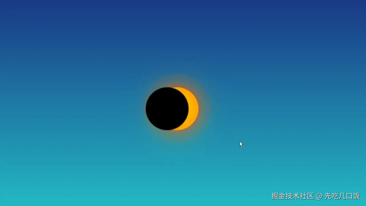
核心原理说明
-
太阳实现
radial-gradient创建发光效果,box-shadow模拟日冕 -
月亮移动动画
@keyframes eclipse控制月亮从左到右的水平移动:css@keyframes eclipse { 0% { transform: translateX(-200px); } /* 起始位置(左侧) */ 50% { transform: translateX(0); } /* 完全遮挡太阳 */ 100% { transform: translateX(200px); } /* 移出右侧 */ } -
光影效果增强
.flare元素使用半透明渐变模拟日珥filter: blur(1px)柔化月亮边缘animation: pulse实现光晕脉动效果
-
星空特效
JavaScript动态生成200个随机位置的白色圆点,在日全食阶段浮现(通过
stars-appear动画控制透明度)