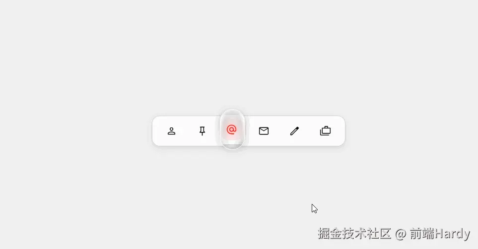
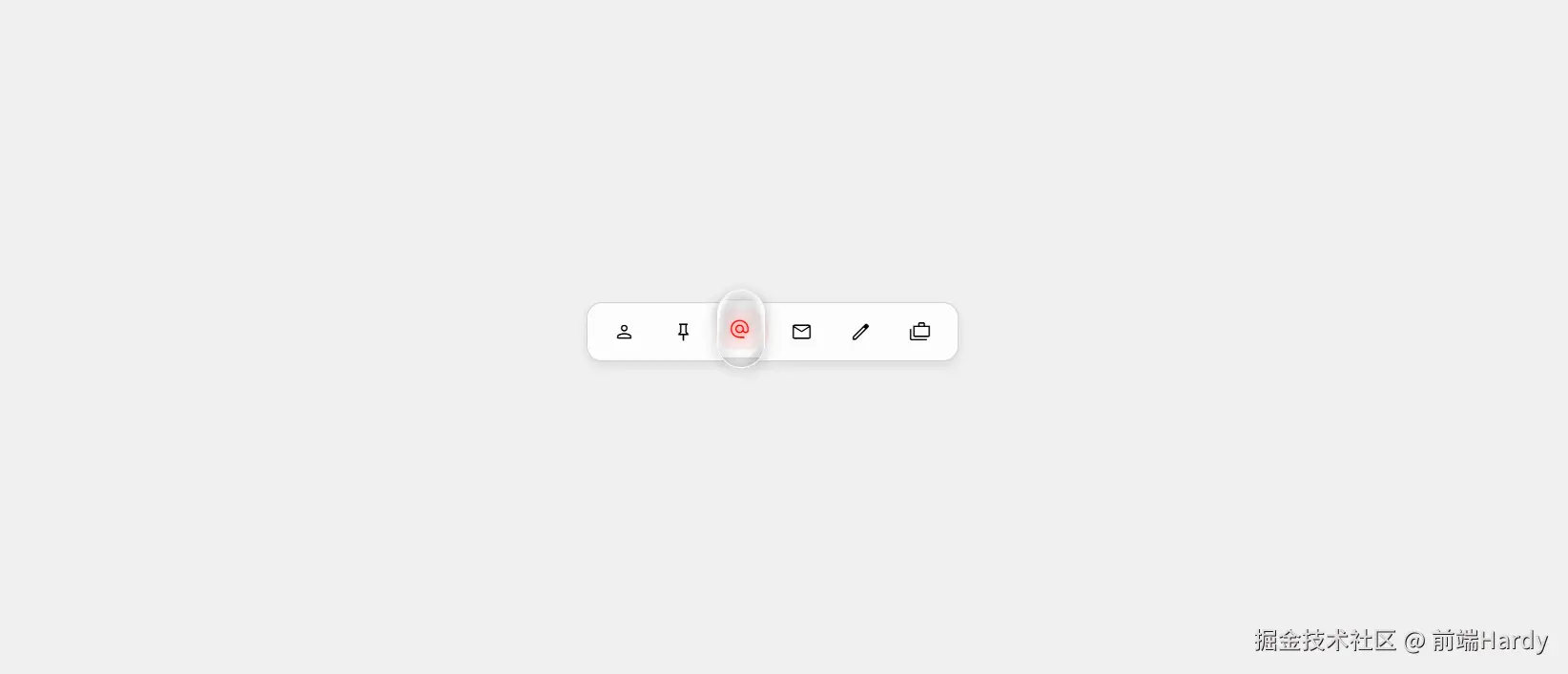
该 HTML 文件是一个具备高级交互效果的导航操作栏(Action Bar)实现,核心特点是通过现代 CSS 特性与 JavaScript 逻辑结合,打造了跟随选中 / 交互元素动态移动的视觉指示器,整体交互流畅且视觉效果精致。
大家复制代码时,可能会因格式转换出现错乱,导致样式失效。建议先少量复制代码进行测试,若未能解决问题,私信回复源码两字,我会发送完整的压缩包给你。
演示效果
HTML&CSS
html
<!DOCTYPE html>
<html lang="en">

<head>
    <meta charset="UTF-8">
    <meta http-equiv="X-UA-Compatible" content="IE=edge">
    <meta name="viewport" content="width=device-width, initial-scale=1.0">
    <link rel="stylesheet"
        href="https://fonts.googleapis.com/css2?family=Material+Symbols+Outlined:opsz,wght,FILL,GRAD@20..48,100..700,0..1,-50..200" />
    <title>Document</title>
    <style>
        :root {
            --spring-easing: linear(0, 0.0018, 0.0069 1.15%, 0.026 2.3%, 0.0637, 0.1135 5.18%, 0.2229 7.78%, 0.5977 15.84%, 0.7014, 0.7904, 0.8641, 0.9228, 0.9676 28.8%, 1.0032 31.68%, 1.0225, 1.0352 36.29%, 1.0431 38.88%, 1.046 42.05%, 1.0448 44.35%, 1.0407 47.23%, 1.0118 61.63%, 1.0025 69.41%, 0.9981 80.35%, 0.9992 99.94%);
        }

        .anchored-pointer {
            position: absolute;
            position-anchor: --selected;
            top: anchor(top);
            left: anchor(left);
            width: 3rem;
            height: 5rem;
            margin-top: calc(anchor-size(height) * -0.5);
            display: block;
            background: none;
            border: 1px solid white;
            border-radius: 2rem;
            transition: all 1s var(--spring-easing);
            filter: drop-shadow(0 3px 6px gray);
            pointer-events: none;
            overflow: hidden;
            backdrop-filter: url(#filter);
        }

        .anchored-pointer::before {
            content: '';
            position: absolute;
            inset: 0;
            background: radial-gradient(1rem 3rem ellipse at 50% 85% in oklch, oklch(100% 0 0 / 0%) 10% 50%, 150%, oklch(100% 0 0 / 100%) 175% 165%), radial-gradient(2rem 3.5rem ellipse at 45% 35% in oklch, oklch(0% 0 0 / 0%) 80%, gray 150%);
        }

        body {
            background-color: #f0f0f0;
            display: flex;
            justify-content: center;
            align-items: center;
            height: 100vh;
            margin: 0;
            font-family: sans-serif;
        }

        .action-bar {
            display: flex;
            align-items: center;
            background-color: #fcfcfc;
            border: 1px solid lightgray;
            border-radius: 1rem;
            padding: 0.5rem;
            box-shadow: 0 4px 10px rgba(0, 0, 0, 0.1);
        }

        button {
            position: relative;
            padding: 10px 15px;
            display: flex;
            align-items: center;
            justify-content: center;
            border: none;
            background: none;
            border-radius: 50px;
            margin: 0 4px;
            cursor: pointer;
            transition: background-color 0.3s ease, color 0.3s ease;
        }

        .material-symbols-outlined {
            background: none;
            transition: filter 0.1s ease;
        }

        button:hover,
        button:focus {
            background-color: #f5f5f5;
        }

        button:focus {
            outline: none;
        }

        .selected {
            background-color: #fcebeb;
            color: red;
        }

        .selected:hover,
        .selected:focus {
            background-color: #fcebeb;
        }

        .selected .material-symbols-outlined {
            filter: drop-shadow(0 0 4px tomato);
        }

        button::before {
            content: '';
            position: absolute;
            inset: -0.4rem;
        }

        .material-symbols-outlined {
            font-size: 24px;
            font-variation-settings: 'FILL' 0, 'wght' 300, 'GRAD' 0, 'opsz' 24;
        }

        .selected .material-symbols-outlined {
            font-variation-settings: 'FILL' 1, 'wght' 300, 'GRAD' 0, 'opsz' 24;
        }
    </style>
</head>

<body>
    <div class="action-bar">
        <button>
            <span class="material-symbols-outlined">person</span>
        </button>
        <button>
            <span class="material-symbols-outlined">push_pin</span>
        </button>
        <button class="selected">
            <span class="material-symbols-outlined">alternate_email</span>
        </button>
        <button>
            <span class="material-symbols-outlined">mail</span>
        </button>
        <button>
            <span class="material-symbols-outlined">edit</span>
        </button>
        <button>
            <span class="material-symbols-outlined">cases</span>
        </button>
    </div>
    <div class="anchored-pointer">
    </div>
    <script>
        const buttons = document.querySelectorAll('button');
        let selectedButton = document.querySelector('.selected');
        const setAnchorOnSelected = () => {
            if (selectedButton) {
                selectedButton.style.anchorName = '--selected';
            }
        };
        setAnchorOnSelected();
        buttons.forEach(button => {
            button.addEventListener('click', () => {
                if (selectedButton) {
                    selectedButton.classList.remove('selected');
                    selectedButton.style.anchorName = '';
                }
                selectedButton = button;
                selectedButton.classList.add('selected');
                setAnchorOnSelected();
            });
            const handleInteractionStart = () => {
                if (button !== selectedButton) {
                    if (selectedButton) {
                        selectedButton.style.anchorName = '';
                    }
                    button.style.anchorName = '--selected';
                }
            };
            button.addEventListener('mouseenter', handleInteractionStart);
            button.addEventListener('focus', handleInteractionStart);

            const handleInteractionEnd = () => {
                if (button !== selectedButton) {
                    button.style.anchorName = '';
                    setAnchorOnSelected();
                }
            };
            button.addEventListener('mouseleave', handleInteractionEnd);
            button.addEventListener('blur', handleInteractionEnd);
        });
    </script>
</body>

</html>
HTML
- action-bar:操作栏容器,包裹所有功能按钮,是核心交互区域的父容器
- button:功能按钮,每个按钮对应一个操作(如个人中心、邮件、编辑等),内部嵌套图标
- material-symbols-outlined:图标容器,使用引入的 Material 图标字体显示具体图标(如 person 对应个人图标)
- anchored-pointer:视觉指示器容器,用于显示跟随选中按钮移动的 "高亮框",是交互效果的核心视觉元素
CSS
- .action-bar:操作栏容器:白色背景(#fcfcfc)、浅灰色边框、圆角(1rem)、阴影(box-shadow),内部用 flex 布局排列按钮,整体视觉精致且有层次感。
- button:按钮基础样式:无边框(border: none)、无背景(background: none)、圆角(50px),内边距(10px 15px),通过 flex 居中图标;position: relative 为后续伪元素和锚点定位做准备。
- .anchored-pointer:视觉指示器:用 position-anchor: --selected 绑定到 "选中锚点",实现跟随定位; 宽 3rem、高 5rem,白色边框、圆角(2rem),添加阴影(drop-shadow)增强立体感;backdrop-filter 应用 SVG 滤镜,overflow: hidden 裁剪内部渐变;伪元素::before 用 radial-gradient 实现 "半透明高光 + 阴影" 效果,模拟玻璃拟物风格。
- .material-symbols-outlined:图标样式:默认大小 24px,通过 font-variation-settings 控制图标填充(FILL)、粗细(wght),未选中时 FILL: 0(线框),选中时 FILL: 1(实心)。
- hover/focus:未选中按钮 hover 或 focus 时,背景变为浅灰色(#f5f5f5),提供明确的交互反馈。
- .selected(选中状态):选中按钮背景变为浅红色(#fcebeb)、文字(图标)变为红色,图标添加 drop-shadow(0 0 4px tomato)红色阴影,强化选中视觉标识。
JavaScript
- 初始状态初始化
javascript
const buttons = document.querySelectorAll('button'); // 获取所有按钮
let selectedButton = document.querySelector('.selected'); // 获取初始选中按钮(默认是"alternate_email")

// 为选中按钮设置"锚点名称"(--selected),供指示器定位
const setAnchorOnSelected = () => {
    if (selectedButton) {
        selectedButton.style.anchorName = '--selected';
    }
};
setAnchorOnSelected(); // 初始化锚点- 按钮点击选中逻辑
监听按钮 click 事件,实现 "单选" 效果:
- 移除原选中按钮的.selected 类和锚点(anchorName: '');
- 将当前点击按钮设为新的 selectedButton,添加.selected 类;
- 调用 setAnchorOnSelected(),让指示器重新定位到新选中按钮。
- 鼠标 / 焦点交互逻辑
-
为提升交互流畅度,监听按钮的 mouseenter(鼠标进入)、focus(键盘聚焦)、mouseleave(鼠标离开)、blur(失去焦点)事件:
-
交互开始(mouseenter/focus):若当前按钮未选中,临时将其设为锚点(anchorName: '--selected'),让指示器跟随移动到该按钮,提前给予视觉反馈;
-
交互结束(mouseleave/blur):若当前按钮未选中,清除其锚点,重新将锚点设回 selectedButton,指示器回归选中按钮位置。
各位互联网搭子,要是这篇文章成功引起了你的注意,别犹豫,关注、点赞、评论、分享走一波,让我们把这份默契延续下去,一起在知识的海洋里乘风破浪!