1. 动态生成花朵网格 (HTML & JavaScript)
我们不能在HTML里手动写死成百上千朵花,这不现实也无法适应不同尺寸的屏幕。所以,第一步是用JavaScript来动态创建它们。
-
获取容器尺寸 :首先,获取屏幕(或特定容器
div)的宽度和高度。 -
计算行列数 :根据预设的单个花朵大小(例如
60px * 60px),计算出屏幕上可以容纳多少行、多少列的花朵。 -
循环创建元素 :使用嵌套的
for循环(一个循环行,一个循环列)来创建代表花朵的<div>元素。 -
定位花朵 :在循环中,为每一朵花计算出它在屏幕上的绝对定位坐标 (
left和top)。- 小技巧:为了避免花朵排列得过于死板,可以给奇数行或偶数行增加一个小的水平偏移量,形成类似蜂巢的交错网格布局,视觉上会更自然。
-
注入SVG :为了让花朵更精美,我们不使用简单的图片或色块,而是预先定义好一个带有渐变色的花朵SVG图形字符串。在创建每个
<div>时,将这个SVG字符串作为其innerHTML插入进去。 -
响应式设计 :监听浏览器的
resize事件。当窗口大小改变时,清空容器里所有的花朵并重新执行上述步骤,以确保花海能始终铺满屏幕。
2. 定义两种状态的样式 (CSS)
我们需要定义花朵的两种视觉状态:"默认状态"和"高亮状态",并通过CSS的 transition 属性让它们之间的切换变得平滑。
-
默认状态 (
.flower) :position: absolute;:这是实现精确定位的基础。filter: grayscale(60%) brightness(0.7);:使用滤镜让花朵呈现出"未被激活"的灰色、较暗的状态。transform: scale(0.9);:稍微缩小一点,为高亮时的放大效果做铺垫。transition: all 0.6s ease-out;:这是关键 。它告诉浏览器,当这个元素的任何CSS属性(如filter,transform)发生变化时,都不是瞬间完成,而是要在0.6秒内平滑地过渡。
-
高亮状态 (
.flower.highlight) :- 这是一个额外的CSS类,当它被添加到花朵元素上时,会覆盖默认样式。
filter: grayscale(0%) brightness(1.2) drop-shadow(...);:移除灰度滤镜,让花朵恢复鲜艳色彩,同时增加亮度和一个漂亮的光晕效果。transform: scale(1.1);:让花朵稍微放大,产生一种"绽放"的动态感。
3. 实现点击扩散的交互逻辑 (JavaScript)
这是整个效果的灵魂所在,它将点击事件、距离计算和动画延迟完美地结合在一起。
-
绑定点击事件 :在第一步生成每朵花时,就为其绑定一个
click事件监听器。 -
触发扩散效果 (核心函数
triggerRipple) :- 确定原点:当任意一朵花被点击时,获取这朵"被点击的花"在屏幕上的中心坐标 (x, y)。这个点就是我们扩散波纹的原点。
- 重置状态 :在开始新的动画之前,先移除所有花朵的
.highlight高亮类,让整个花海恢复到默认的灰色状态。 - 遍历所有花朵:循环遍历页面上存在的每一朵花。
- 计算距离 :在循环中,获取当前这朵花(非点击的那朵)的中心坐标,然后使用勾股定理
( distance = √((x₂-x₁)² + (y₂-y₁)² )计算它到"原点"的直线距离。 - 计算延迟时间 :这是最巧妙的一步 。我们将上一步计算出的
distance乘以一个速度系数(RIPPLE_SPEED),得到一个delay值。这意味着,距离原点越远的花,它获得的延迟时间就越长。 - 延迟添加高亮 :使用
setTimeout()函数,在delay毫秒之后,为当前循环到的这朵花添加.highlight类。
-
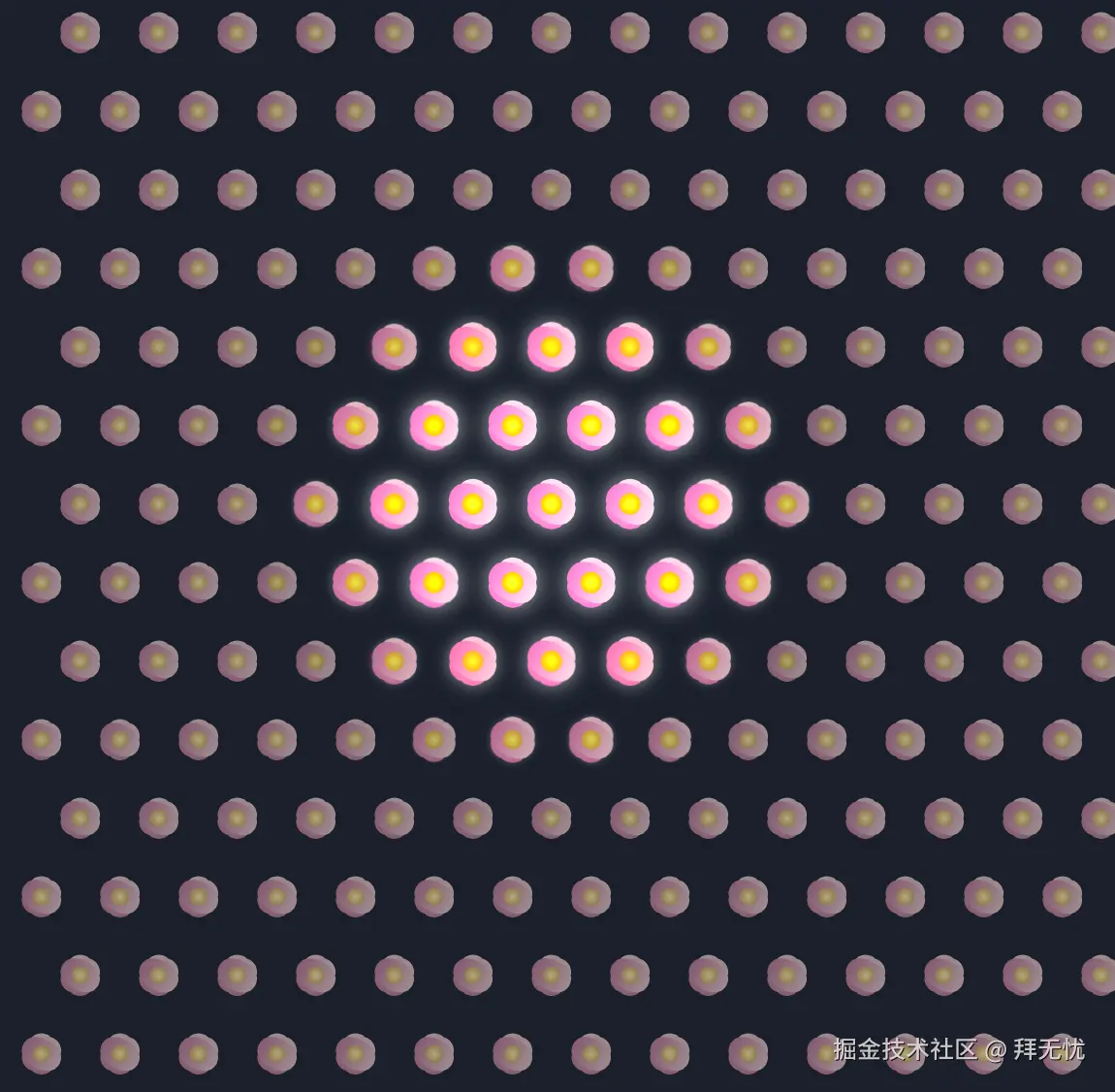
最终效果:因为每朵花的高亮延迟都与其到点击点的距离成正比,所以从视觉上看,高亮效果就像一个波纹一样,从你点击的那朵花开始,以恒定的速度向四周均匀扩散开来,最终点亮整个花海。
ini
<!DOCTYPE html>
<html lang="zh-CN">
<head>
    <meta charset="UTF-8">
    <meta name="viewport" content="width=device-width, initial-scale=1.0">
    <title>花海扩散效果</title>
    <style>
        /* --- 基础样式 --- */
        html, body {
            margin: 0;
            padding: 0;
            width: 100%;
            height: 100%;
            overflow: hidden;
            /* 使用深邃的夜空蓝作为背景,更能衬托花朵的高亮效果 */
            background-color: #1a202c;
            font-family: 'Inter', sans-serif;
        }

        /* --- 花朵容器 --- */
        #flower-container {
            position: relative;
            width: 100%;
            height: 100%;
            /* 鼠标悬停时显示为可点击的手指形状 */
            cursor: pointer;
        }

        /* --- 单个花朵样式 --- */
        .flower {
            position: absolute;
            width: 50px;
            height: 50px;
            display: flex;
            align-items: center;
            justify-content: center;

            /* 初始状态:灰色、亮度较低、略微缩小 */
            filter: grayscale(60%) brightness(0.7);
            transform: scale(0.9);

            /* 平滑过渡效果,让高亮变化更加自然 */
            transition: filter 0.6s ease-out, transform 0.6s ease-out;
        }

        /* --- 花朵高亮状态 --- */
        .flower.highlight {
            /* 高亮状态:恢复色彩、提升亮度,并添加白色光晕 */
            filter: grayscale(0%) brightness(1.2) drop-shadow(0 0 8px rgba(255, 255, 255, 0.7));
            transform: scale(1.1);
        }

        /* --- SVG花朵本身样式 --- */
        .flower svg {
            width: 100%;
            height: 100%;
        }
    </style>
</head>
<body>

    <div id="flower-container"></div>

    <script>
        document.addEventListener('DOMContentLoaded', () => {
            const container = document.getElementById('flower-container');
            const flowers = [];

            // 使用SVG定义一朵花,包含渐变色,使其更具美感
            const flowerSVG = `
                <svg viewBox="0 0 100 100" xmlns="http://www.w3.org/2000/svg">
                    <defs>
                        <!-- 定义花蕊的径向渐变 -->
                        <radialGradient id="grad-center" cx="50%" cy="50%" r="50%" fx="50%" fy="50%">
                            <stop offset="0%" style="stop-color:rgb(255,255,0);stop-opacity:1" />
                            <stop offset="100%" style="stop-color:rgb(255,165,0);stop-opacity:1" />
                        </radialGradient>
                        <!-- 定义花瓣的线性渐变 -->
                        <linearGradient id="grad-petal" x1="0%" y1="0%" x2="0%" y2="100%">
                            <stop offset="0%" style="stop-color:rgb(255,192,203);stop-opacity:1" />
                            <stop offset="100%" style="stop-color:rgb(255,105,180);stop-opacity:1" />
                        </linearGradient>
                    </defs>
                    <!-- 将花瓣组合并移动到中心 -->
                    <g transform="translate(50,50)">
                        <path d="M0,-35 C20,-35 25,-15 25,0 C25,15 20,35 0,35 C-20,35 -25,15 -25,0 C-25,-15 -20,-35 0,-35 Z"
                            transform="rotate(0)" fill="url(#grad-petal)" />
                        <path d="M0,-35 C20,-35 25,-15 25,0 C25,15 20,35 0,35 C-20,35 -25,15 -25,0 C-25,-15 -20,-35 0,-35 Z"
                            transform="rotate(60)" fill="url(#grad-petal)" />
                        <path d="M0,-35 C20,-35 25,-15 25,0 C25,15 20,35 0,35 C-20,35 -25,15 -25,0 C-25,-15 -20,-35 0,-35 Z"
                            transform="rotate(120)" fill="url(#grad-petal)" />
                    </g>
                    <!-- 绘制花蕊 -->
                    <circle cx="50" cy="50" r="15" fill="url(#grad-center)"/>
                </svg>
            `;

            // --- 全局配置 ---
            const FLOWER_SIZE = 60; // 花朵的尺寸,包含间距
            const RIPPLE_SPEED = 3; // 扩散速度,数值越小速度越快

            let debounceTimer;

            // --- 创建花朵函数 ---
            function createFlowers() {
                // 清理旧的花朵,以便重新生成
                container.innerHTML = '';
                flowers.length = 0;

                const containerWidth = container.clientWidth;
                const containerHeight = container.clientHeight;
                const cols = Math.floor(containerWidth / FLOWER_SIZE);
                const rows = Math.floor(containerHeight / FLOWER_SIZE);

                // 计算偏移量,使花海在屏幕中居中
                const offsetX = (containerWidth - cols * FLOWER_SIZE) / 2;
                const offsetY = (containerHeight - rows * FLOWER_SIZE) / 2;

                for (let r = 0; r < rows; r++) {
                    for (let c = 0; c < cols; c++) {
                        const flower = document.createElement('div');
                        flower.classList.add('flower');
                        flower.innerHTML = flowerSVG;

                        // 使用交错网格布局,让花朵排列更自然
                        const x = c * FLOWER_SIZE + offsetX + (r % 2 === 0 ? FLOWER_SIZE / 2 : 0);
                        const y = r * FLOWER_SIZE + offsetY;

                        flower.style.left = `${x}px`;
                        flower.style.top = `${y}px`;

                        // 确保因交错偏移的花朵不会超出容器边界
                        if (x + FLOWER_SIZE <= containerWidth) {
                             container.appendChild(flower);
                             flowers.push(flower);

                             // 为每朵花添加点击事件监听器
                             flower.addEventListener('click', (e) => {
                                e.stopPropagation(); // 防止事件冒泡
                                triggerRipple(flower);
                             });
                        }
                    }
                }
            }

            // --- 触发扩散效果函数 ---
            function triggerRipple(clickedFlower) {
                // 首先重置所有花朵的高亮状态
                flowers.forEach(f => f.classList.remove('highlight'));

                const originX = clickedFlower.offsetLeft + clickedFlower.offsetWidth / 2;
                const originY = clickedFlower.offsetTop + clickedFlower.offsetHeight / 2;

                flowers.forEach(f => {
                    const flowerX = f.offsetLeft + f.offsetWidth / 2;
                    const flowerY = f.offsetTop + f.offsetHeight / 2;

                    // 使用勾股定理计算每朵花到点击中心的距离
                    const dx = originX - flowerX;
                    const dy = originY - flowerY;
                    const distance = Math.sqrt(dx * dx + dy * dy);

                    // 根据距离和速度计算延迟时间
                    const delay = distance * RIPPLE_SPEED;

                    // 使用 setTimeout 来延迟添加高亮效果,形成扩散波纹
                    setTimeout(() => {
                        f.classList.add('highlight');
                    }, delay);
                });
            }

            // --- 初始化与响应式处理 ---
            createFlowers(); // 页面加载时首先创建花朵

            // 监听窗口大小变化,使用 debounce 防止频繁触发
            window.addEventListener('resize', () => {
                clearTimeout(debounceTimer);
                debounceTimer = setTimeout(createFlowers, 250);
            });
        });
    </script>
</body>
</html>
鼠标悬浮版本
ini
<!DOCTYPE html>
<html lang="zh-CN">
<head>
    <meta charset="UTF-8">
    <meta name="viewport" content="width=device-width, initial-scale=1.0">
    <title>花海扩散效果</title>
    <style>
        /* --- 基础样式 --- */
        html, body {
            margin: 0;
            padding: 0;
            width: 100%;
            height: 100%;
            overflow: hidden;
            /* 使用深邃的夜空蓝作为背景,更能衬托花朵的高亮效果 */
            background-color: #1a202c;
            font-family: 'Inter', sans-serif;
        }

        /* --- 花朵容器 --- */
        #flower-container {
            position: relative;
            width: 100%;
            height: 100%;
            /* 鼠标悬停时显示为可点击的手指形状 */
            cursor: pointer;
        }

        /* --- 单个花朵样式 --- */
        .flower {
            position: absolute;
            width: 50px;
            height: 50px;
            display: flex;
            align-items: center;
            justify-content: center;

            /* 初始状态:灰色、亮度较低、略微缩小 */
            filter: grayscale(60%) brightness(0.7);
            transform: scale(0.9);

            /* 平滑过渡效果,让高亮和消失的变化更加自然 */
            transition: filter 0.6s ease-out, transform 0.6s ease-out;
        }

        /* --- 花朵高亮状态 --- */
        .flower.highlight {
            /* 高亮状态:恢复色彩、提升亮度,并添加白色光晕 */
            filter: grayscale(0%) brightness(1.2) drop-shadow(0 0 8px rgba(255, 255, 255, 0.7));
            transform: scale(1.1);
        }

        /* --- SVG花朵本身样式 --- */
        .flower svg {
            width: 100%;
            height: 100%;
        }
    </style>
</head>
<body>

    <div id="flower-container"></div>

    <script>
        document.addEventListener('DOMContentLoaded', () => {
            const container = document.getElementById('flower-container');
            const flowers = [];

            const flowerSVG = `
                <svg viewBox="0 0 100 100" xmlns="http://www.w3.org/2000/svg">
                    <defs>
                        <radialGradient id="grad-center" cx="50%" cy="50%" r="50%" fx="50%" fy="50%">
                            <stop offset="0%" style="stop-color:rgb(255,255,0);stop-opacity:1" />
                            <stop offset="100%" style="stop-color:rgb(255,165,0);stop-opacity:1" />
                        </radialGradient>
                        <linearGradient id="grad-petal" x1="0%" y1="0%" x2="0%" y2="100%">
                            <stop offset="0%" style="stop-color:rgb(255,192,203);stop-opacity:1" />
                            <stop offset="100%" style="stop-color:rgb(255,105,180);stop-opacity:1" />
                        </linearGradient>
                    </defs>
                    <g transform="translate(50,50)">
                        <path d="M0,-35 C20,-35 25,-15 25,0 C25,15 20,35 0,35 C-20,35 -25,15 -25,0 C-25,-15 -20,-35 0,-35 Z"
                            transform="rotate(0)" fill="url(#grad-petal)" />
                        <path d="M0,-35 C20,-35 25,-15 25,0 C25,15 20,35 0,35 C-20,35 -25,15 -25,0 C-25,-15 -20,-35 0,-35 Z"
                            transform="rotate(60)" fill="url(#grad-petal)" />
                        <path d="M0,-35 C20,-35 25,-15 25,0 C25,15 20,35 0,35 C-20,35 -25,15 -25,0 C-25,-15 -20,-35 0,-35 Z"
                            transform="rotate(120)" fill="url(#grad-petal)" />
                    </g>
                    <circle cx="50" cy="50" r="15" fill="url(#grad-center)"/>
                </svg>
            `;

            // --- 全局配置 ---
            const FLOWER_SIZE = 60; // 花朵的尺寸,包含间距
            const RIPPLE_SPEED = 3; // 扩散速度,数值越小速度越快
            const THROTTLE_INTERVAL = 50; // 鼠标移动事件的节流间隔(毫秒)

            let debounceTimer;

            // --- 动画相关的全局状态 ---
            let rippleOrigin = { x: null, y: null };
            let lastRippleTime = 0;
            let lastHoveredFlower = null;


            // --- 创建花朵函数 ---
            function createFlowers() {
                // 清理旧的花朵,以便重新生成
                container.innerHTML = '';
                flowers.length = 0;
                lastHoveredFlower = null;
                rippleOrigin.x = null; // 重置扩散原点

                const containerWidth = container.clientWidth;
                const containerHeight = container.clientHeight;
                const cols = Math.floor(containerWidth / FLOWER_SIZE);
                const rows = Math.floor(containerHeight / FLOWER_SIZE);

                const offsetX = (containerWidth - cols * FLOWER_SIZE) / 2;
                const offsetY = (containerHeight - rows * FLOWER_SIZE) / 2;

                for (let r = 0; r < rows; r++) {
                    for (let c = 0; c < cols; c++) {
                        const flower = document.createElement('div');
                        flower.classList.add('flower');
                        flower.innerHTML = flowerSVG;

                        const x = c * FLOWER_SIZE + offsetX + (r % 2 === 0 ? FLOWER_SIZE / 2 : 0);
                        const y = r * FLOWER_SIZE + offsetY;

                        flower.style.left = `${x}px`;
                        flower.style.top = `${y}px`;

                        if (x + FLOWER_SIZE <= containerWidth) {
                             container.appendChild(flower);
                             flowers.push(flower);
                        }
                    }
                }
            }

            // --- 动画循环,使用 requestAnimationFrame 以获得最佳性能 ---
            function animate(currentTime) {
                // 如果没有设置扩散原点,则不执行计算
                if (rippleOrigin.x === null) {
                    requestAnimationFrame(animate);
                    return;
                }

                flowers.forEach(f => {
                    const flowerX = f.offsetLeft + f.offsetWidth / 2;
                    const flowerY = f.offsetTop + f.offsetHeight / 2;

                    const dx = rippleOrigin.x - flowerX;
                    const dy = rippleOrigin.y - flowerY;
                    const distance = Math.sqrt(dx * dx + dy * dy);

                    // 计算这朵花应该被点亮的时间点
                    const activationTime = lastRippleTime + distance * RIPPLE_SPEED;

                    // 如果当前时间已经超过了它的点亮时间,则添加高亮
                    if (currentTime > activationTime) {
                        if (!f.classList.contains('highlight')) {
                            f.classList.add('highlight');
                        }
                    } else {
                        // 否则,移除高亮(这会自动触发CSS的平滑过渡效果)
                        if (f.classList.contains('highlight')) {
                            f.classList.remove('highlight');
                        }
                    }
                });

                requestAnimationFrame(animate);
            }

            // --- 鼠标移动事件监听器(使用节流优化性能) ---
            let throttleTimer = null;
            container.addEventListener('mousemove', (e) => {
                if (throttleTimer) return; // 如果计时器正在运行,则忽略此次事件

                throttleTimer = setTimeout(() => {
                    const targetElement = document.elementFromPoint(e.clientX, e.clientY);
                    const currentFlower = targetElement ? targetElement.closest('.flower') : null;

                    // 只有当鼠标移动到一朵新的花上时,才更新扩散原点
                    if (currentFlower && currentFlower !== lastHoveredFlower) {
                        lastHoveredFlower = currentFlower;

                        rippleOrigin.x = currentFlower.offsetLeft + currentFlower.offsetWidth / 2;
                        rippleOrigin.y = currentFlower.offsetTop + currentFlower.offsetHeight / 2;
                        lastRippleTime = performance.now(); // 记录当前时间作为新扩散的起始时间
                    }
                    throttleTimer = null; // 重置计时器
                }, THROTTLE_INTERVAL);
            });

            // --- 鼠标移出容器事件 ---
            container.addEventListener('mouseleave', () => {
                lastHoveredFlower = null;
                // 将起始时间设置为一个超大的未来值,使得所有花的高亮条件都不满足,从而实现平滑消失
                lastRippleTime = Number.MAX_SAFE_INTEGER;
            });

            // --- 初始化与响应式处理 ---
            createFlowers();
            requestAnimationFrame(animate); // 启动动画循环

            window.addEventListener('resize', () => {
                clearTimeout(debounceTimer);
                debounceTimer = setTimeout(createFlowers, 250);
            });
        });
    </script>
</body>
</html>