参考文献:
https://mp.weixin.qq.com/s/cWAhrMg1W2X0z38RZ_K5Ag


加载必要的包
library(corrplot)
library(ggplot2)
设置随机种子以保证结果可重现
set.seed(123)
创建模拟数据 - 生成9个变量(A到I)的100个观测值
n <- 100
A <- rnorm(n)
B <- A + rnorm(n, sd = 0.5)
C <- -0.4*A + rnorm(n, sd = 0.8) # 与A负相关
D <- rnorm(n)
E <- 0.7*B + rnorm(n, sd = 0.6)
F <- 0.3*D + rnorm(n, sd = 0.9)
G <- 0.5*E + 0.3*F + rnorm(n, sd = 0.7)
H <- rnorm(n)
I <- -0.4*A + 0.3*H + rnorm(n, sd = 0.8) # 与A负相关
创建数据框
data <- data.frame(A, B, C, D, E, F, G, H, I)
计算相关性矩阵
cor_matrix <- cor(data)
手动调整一些相关性以匹配描述中的模式
确保某些变量有较强的负相关性
cor_matrix"A", "C" <- -0.46
cor_matrix"C", "A" <- -0.46
cor_matrix"A", "I" <- -0.44
cor_matrix"I", "A" <- -0.44
cor_matrix"C", "E" <- -0.42
cor_matrix"E", "C" <- -0.42
增强一些正相关性
cor_matrix"B", "E" <- 0.75
cor_matrix"E", "B" <- 0.75
cor_matrix"E", "G" <- 0.68
cor_matrix"G", "E" <- 0.68
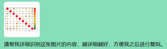
方法1: 使用corrplot包创建高级相关性矩阵图
corrplot(cor_matrix,
method = "color", # 使用颜色表示相关性
type = "upper", # 只显示上三角
order = "original", # 保持原始顺序
diag = TRUE, # 显示对角线
tl.cex = 0.8, # 标签字体大小
tl.col = "black", # 标签颜色
number.cex = 0.7, # 数字字体大小
addCoef.col = "black", # 系数颜色
col = colorRampPalette(c("red", "white", "green"))(100), # 颜色渐变
mar = c(0, 0, 1, 0), # 边距
title = "9×9 相关性矩阵热图")
方法2: 使用ggplot2创建更基础的热图
library(reshape2) # 用于数据重塑
将相关性矩阵转换为长格式
melted_cor <- melt(cor_matrix)
创建ggplot热图
ggplot(data = melted_cor, aes(x = Var1, y = Var2, fill = value)) +
geom_tile(color = "white") +
scale_fill_gradient2(low = "red", high = "green", mid = "yellow",
midpoint = 0, limit = c(-1, 1), space = "Lab",
name="相关性") +
geom_text(aes(label = sprintf("%.2f", value)), size = 3) +
theme_minimal() +
theme(axis.text.x = element_text(angle = 45, vjust = 1, hjust = 1)) +
labs(title = "9×9 相关性矩阵热图", x = "", y = "") +
coord_fixed()
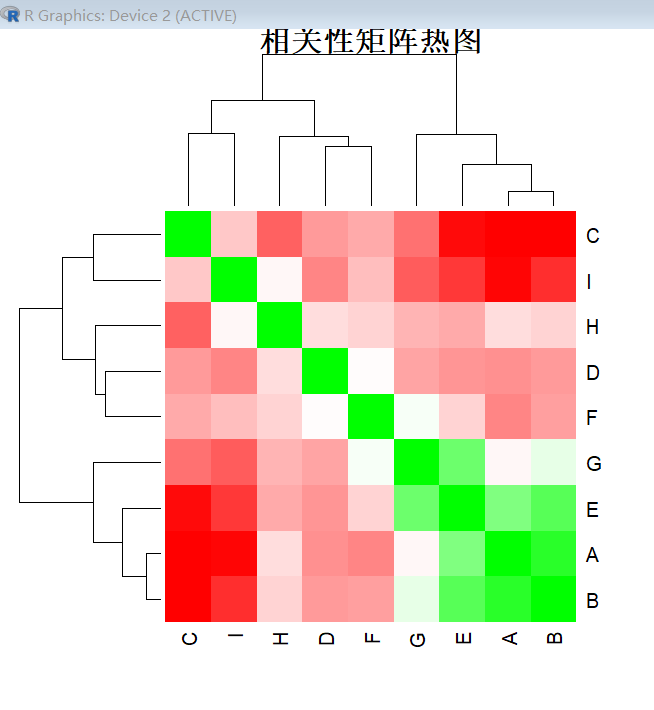
方法3: 使用基础R的热图函数
heatmap(cor_matrix,
col = colorRampPalette(c("red", "white", "green"))(100),
symm = TRUE, # 对称矩阵
margins = c(10, 10),
main = "相关性矩阵热图")
打印数值矩阵
print("相关性矩阵数值:")
print(round(cor_matrix, 2))
分析显著的相关性
cat("\n显著的正相关性 (r > 0.5):\n")
high_pos <- which(cor_matrix > 0.5 & cor_matrix < 1, arr.ind = TRUE)
for(i in 1:nrow(high_pos)) {
if(high_posi,1 < high_posi,2) { # 避免重复
cat(sprintf("%s - %s: %.2f\n",
rownames(cor_matrix)high_pos\[i,1],
colnames(cor_matrix)high_pos\[i,2],
cor_matrixhigh_pos\[i,1, high_posi,2]))
}
}
cat("\n显著的负相关性 (r < -0.3):\n")
high_neg <- which(cor_matrix < -0.3, arr.ind = TRUE)
for(i in 1:nrow(high_neg)) {
if(high_negi,1 < high_negi,2) { # 避免重复
cat(sprintf("%s - %s: %.2f\n",
rownames(cor_matrix)high_neg\[i,1],
colnames(cor_matrix)high_neg\[i,2],
cor_matrixhigh_neg\[i,1, high_negi,2]))
}
}
保存相关性矩阵为CSV文件
write.csv(cor_matrix, "correlation_matrix.csv")
保存图形
png("correlation_plot.png", width = 800, height = 800)
corrplot(cor_matrix,
method = "color",
type = "upper",
diag = TRUE,
tl.cex = 0.8,
tl.col = "black",
number.cex = 0.7,
addCoef.col = "black",
col = colorRampPalette(c("red", "white", "green"))(100),
mar = c(0, 0, 1, 0),
title = "9×9 相关性矩阵热图")
dev.off()
cat("\n图形已保存为 'correlation_plot.png'")
cat("\n数据已保存为 'correlation_matrix.csv'")
5.后续可进行对比分析