大家好,我是1024小神,技术群 / 私活群 / 股票群 或 交朋友 都可以私信我。 如果你觉得本文有用,一键三连 (点赞、评论、关注),就是对我最大的支持~
代码demo示例:
html
<!DOCTYPE html>
<html lang="zh-CN">
<head>
<meta charset="UTF-8">
<meta name="viewport" content="width=device-width, initial-scale=1.0">
<title>CSS Animation 常用简写效果</title>
<style>
* {
margin: 0;
padding: 0;
box-sizing: border-box;
}
body {
font-family: 'Segoe UI', Tahoma, Geneva, Verdana, sans-serif;
background: linear-gradient(135deg, #1a2a6c, #b21f1f, #fdbb2d);
color: white;
min-height: 100vh;
padding: 30px;
line-height: 1.6;
}
.container {
max-width: 1200px;
margin: 0 auto;
}
header {
text-align: center;
margin-bottom: 40px;
}
h1 {
font-size: 2.5rem;
margin-bottom: 10px;
text-shadow: 2px 2px 4px rgba(0, 0, 0, 0.3);
}
.subtitle {
font-size: 1.2rem;
opacity: 0.9;
max-width: 800px;
margin: 0 auto;
}
.animation-grid {
display: grid;
grid-template-columns: repeat(auto-fill, minmax(280px, 1fr));
gap: 25px;
margin-bottom: 40px;
}
.animation-card {
background: rgba(255, 255, 255, 0.1);
border-radius: 12px;
padding: 20px;
box-shadow: 0 8px 20px rgba(0, 0, 0, 0.2);
transition: transform 0.3s;
}
.animation-card:hover {
transform: translateY(-5px);
}
.animation-box {
width: 100%;
height: 150px;
background: rgba(255, 255, 255, 0.15);
border-radius: 8px;
display: flex;
justify-content: center;
align-items: center;
margin-bottom: 15px;
overflow: hidden;
}
.animated-element {
width: 60px;
height: 60px;
background: #4cc9f0;
border-radius: 6px;
box-shadow: 0 0 15px rgba(76, 201, 240, 0.7);
}
.animation-title {
font-size: 1.3rem;
margin-bottom: 10px;
color: #4cc9f0;
}
.animation-desc {
font-size: 0.95rem;
margin-bottom: 15px;
opacity: 0.9;
}
.code-block {
background: rgba(0, 0, 0, 0.3);
padding: 12px;
border-radius: 6px;
font-family: 'Courier New', monospace;
font-size: 0.85rem;
overflow-x: auto;
margin-top: 10px;
}
.code-key {
color: #ff9d00;
}
.code-value {
color: #4cc9f0;
}
.code-comment {
color: #aaa;
font-style: italic;
}
footer {
text-align: center;
margin-top: 40px;
padding-top: 20px;
border-top: 1px solid rgba(255, 255, 255, 0.2);
font-size: 0.9rem;
opacity: 0.8;
}
/* 动画效果定义 */
.bounce .animated-element {
animation: bounce 2s ease infinite;
}
.pulse .animated-element {
animation: pulse 1.5s ease infinite;
}
.rotate .animated-element {
animation: rotate 3s linear infinite;
}
.fade .animated-element {
animation: fade 2s ease-in-out infinite;
}
.slide .animated-element {
animation: slide 3s ease-in-out infinite;
}
.shake .animated-element {
animation: shake 0.8s ease-in-out infinite;
}
.color-change .animated-element {
animation: colorChange 4s linear infinite;
}
.flip .animated-element {
animation: flip 2.5s ease-in-out infinite;
}
.swing .animated-element {
transform-origin: top center;
animation: swing 3s ease-in-out infinite;
}
.zoom .animated-element {
animation: zoom 2s ease-in-out infinite;
}
/* 关键帧动画 */
@keyframes bounce {
0%, 100% { transform: translateY(0); }
50% { transform: translateY(-30px); }
}
@keyframes pulse {
0%, 100% { transform: scale(1); opacity: 1; }
50% { transform: scale(1.1); opacity: 0.8; }
}
@keyframes rotate {
from { transform: rotate(0); }
to { transform: rotate(360deg); }
}
@keyframes fade {
0%, 100% { opacity: 1; }
50% { opacity: 0.3; }
}
@keyframes slide {
0%, 100% { transform: translateX(0); }
50% { transform: translateX(40px); }
}
@keyframes shake {
0%, 100% { transform: translateX(0); }
10%, 30%, 50%, 70%, 90% { transform: translateX(-8px); }
20%, 40%, 60%, 80% { transform: translateX(8px); }
}
@keyframes colorChange {
0% { background-color: #4cc9f0; }
25% { background-color: #f72585; }
50% { background-color: #b5179e; }
75% { background-color: #7209b7; }
100% { background-color: #4cc9f0; }
}
@keyframes flip {
0% { transform: perspective(400px) rotateY(0); }
50% { transform: perspective(400px) rotateY(180deg); }
100% { transform: perspective(400px) rotateY(360deg); }
}
@keyframes swing {
0%, 100% { transform: rotate(0); }
25% { transform: rotate(10deg); }
75% { transform: rotate(-10deg); }
}
@keyframes zoom {
0%, 100% { transform: scale(1); }
50% { transform: scale(1.3); }
}
</style>
</head>
<body>
<div class="container">
<header>
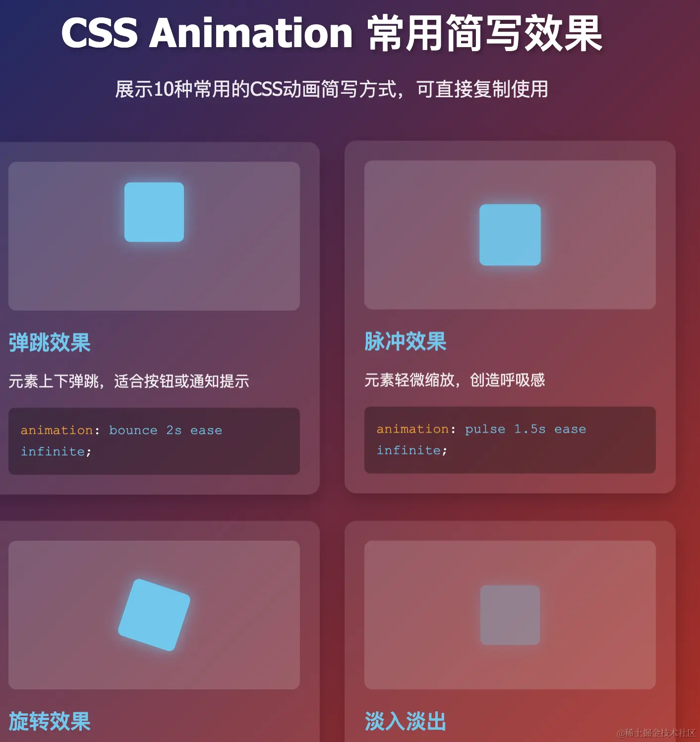
<h1>CSS Animation 常用简写效果</h1>
<p class="subtitle">展示10种常用的CSS动画简写方式,可直接复制使用</p>
</header>
<div class="animation-grid">
<!-- 弹跳效果 -->
<div class="animation-card bounce">
<div class="animation-box">
<div class="animated-element"></div>
</div>
<h3 class="animation-title">弹跳效果</h3>
<p class="animation-desc">元素上下弹跳,适合按钮或通知提示</p>
<div class="code-block">
<span class="code-key">animation</span>: <span class="code-value">bounce 2s ease infinite</span>;
</div>
</div>
<!-- 脉冲效果 -->
<div class="animation-card pulse">
<div class="animation-box">
<div class="animated-element"></div>
</div>
<h3 class="animation-title">脉冲效果</h3>
<p class="animation-desc">元素轻微缩放,创造呼吸感</p>
<div class="code-block">
<span class="code-key">animation</span>: <span class="code-value">pulse 1.5s ease infinite</span>;
</div>
</div>
<!-- 旋转效果 -->
<div class="animation-card rotate">
<div class="animation-box">
<div class="animated-element"></div>
</div>
<h3 class="animation-title">旋转效果</h3>
<p class="animation-desc">元素持续旋转,适合加载指示器</p>
<div class="code-block">
<span class="code-key">animation</span>: <span class="code-value">rotate 3s linear infinite</span>;
</div>
</div>
<!-- 淡入淡出 -->
<div class="animation-card fade">
<div class="animation-box">
<div class="animated-element"></div>
</div>
<h3 class="animation-title">淡入淡出</h3>
<p class="animation-desc">元素透明度变化,创造柔和效果</p>
<div class="code-block">
<span class="code-key">animation</span>: <span class="code-value">fade 2s ease-in-out infinite</span>;
</div>
</div>
<!-- 滑动效果 -->
<div class="animation-card slide">
<div class="animation-box">
<div class="animated-element"></div>
</div>
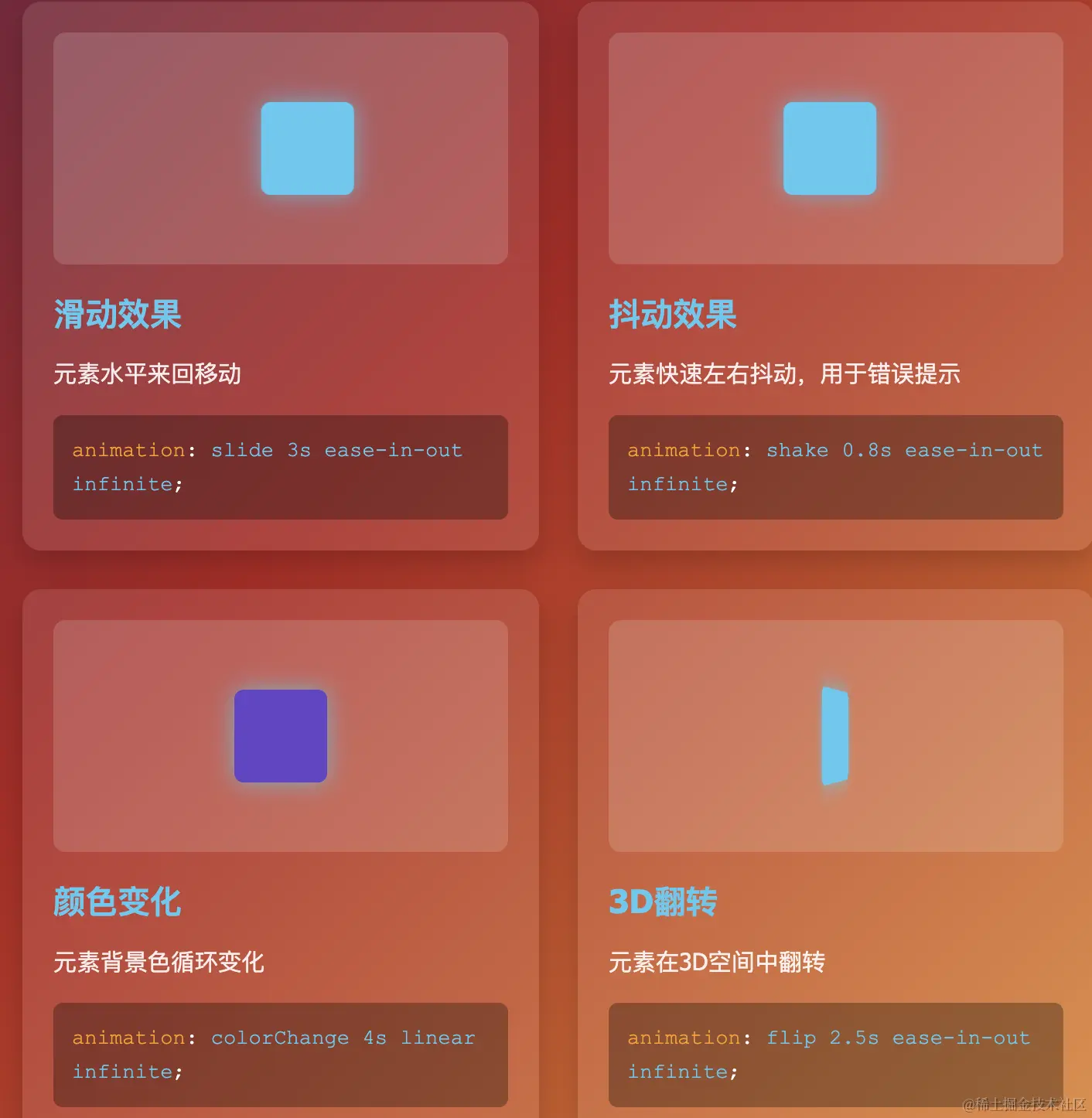
<h3 class="animation-title">滑动效果</h3>
<p class="animation-desc">元素水平来回移动</p>
<div class="code-block">
<span class="code-key">animation</span>: <span class="code-value">slide 3s ease-in-out infinite</span>;
</div>
</div>
<!-- 抖动效果 -->
<div class="animation-card shake">
<div class="animation-box">
<div class="animated-element"></div>
</div>
<h3 class="animation-title">抖动效果</h3>
<p class="animation-desc">元素快速左右抖动,用于错误提示</p>
<div class="code-block">
<span class="code-key">animation</span>: <span class="code-value">shake 0.8s ease-in-out infinite</span>;
</div>
</div>
<!-- 颜色变化 -->
<div class="animation-card color-change">
<div class="animation-box">
<div class="animated-element"></div>
</div>
<h3 class="animation-title">颜色变化</h3>
<p class="animation-desc">元素背景色循环变化</p>
<div class="code-block">
<span class="code-key">animation</span>: <span class="code-value">colorChange 4s linear infinite</span>;
</div>
</div>
<!-- 翻转效果 -->
<div class="animation-card flip">
<div class="animation-box">
<div class="animated-element"></div>
</div>
<h3 class="animation-title">3D翻转</h3>
<p class="animation-desc">元素在3D空间中翻转</p>
<div class="code-block">
<span class="code-key">animation</span>: <span class="code-value">flip 2.5s ease-in-out infinite</span>;
</div>
</div>
<!-- 摆动效果 -->
<div class="animation-card swing">
<div class="animation-box">
<div class="animated-element"></div>
</div>
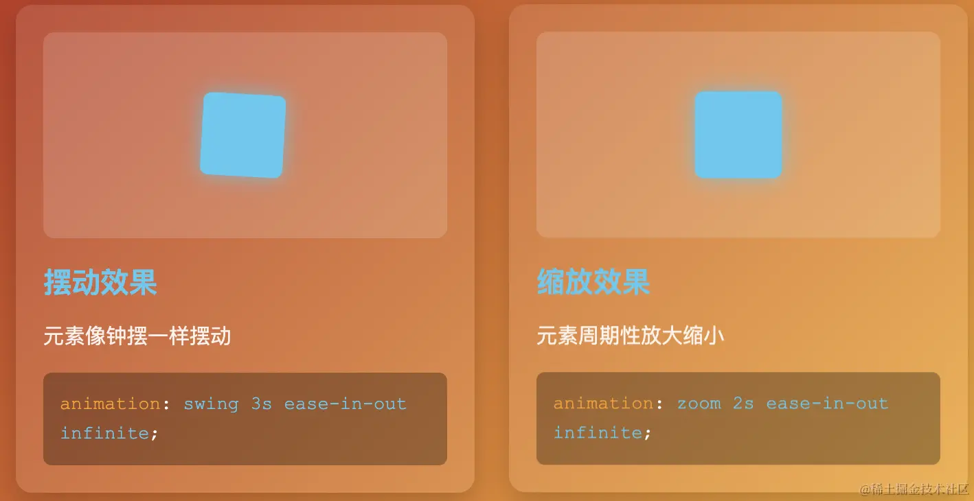
<h3 class="animation-title">摆动效果</h3>
<p class="animation-desc">元素像钟摆一样摆动</p>
<div class="code-block">
<span class="code-key">animation</span>: <span class="code-value">swing 3s ease-in-out infinite</span>;
</div>
</div>
<!-- 缩放效果 -->
<div class="animation-card zoom">
<div class="animation-box">
<div class="animated-element"></div>
</div>
<h3 class="animation-title">缩放效果</h3>
<p class="animation-desc">元素周期性放大缩小</p>
<div class="code-block">
<span class="code-key">animation</span>: <span class="code-value">zoom 2s ease-in-out infinite</span>;
</div>
</div>
</div>
<footer>
<p>CSS Animation 简写属性格式: animation: name duration timing-function delay iteration-count direction fill-mode;</p>
<p>实际使用时通常只需指定前几个参数,如: animation: bounce 2s infinite;</p>
</footer>
</div>
</body>
</html>大家好,我是1024小神,技术群 / 私活群 / 股票群 或 交朋友 都可以私信我。 如果你觉得本文有用,一键三连 (点赞、评论、关注),就是对我最大的支持~