背景:
App端需要日历组件,选择年月日,或者年月日时分秒。找到了两种组件,如下:
方式一:
DCloud插件市场的uni-datetime-picker组件,设置为日期时间选择器【datetimerange】,或者日期选择器【daterange】
<uni-datetime-picker
v-model="timeData"
type="datetimerange"
rangeSeparator="至"
:start="minDate"
:end="maxDate"
@change="maskChange"
@maskClick="maskClick"
 />
方式二:
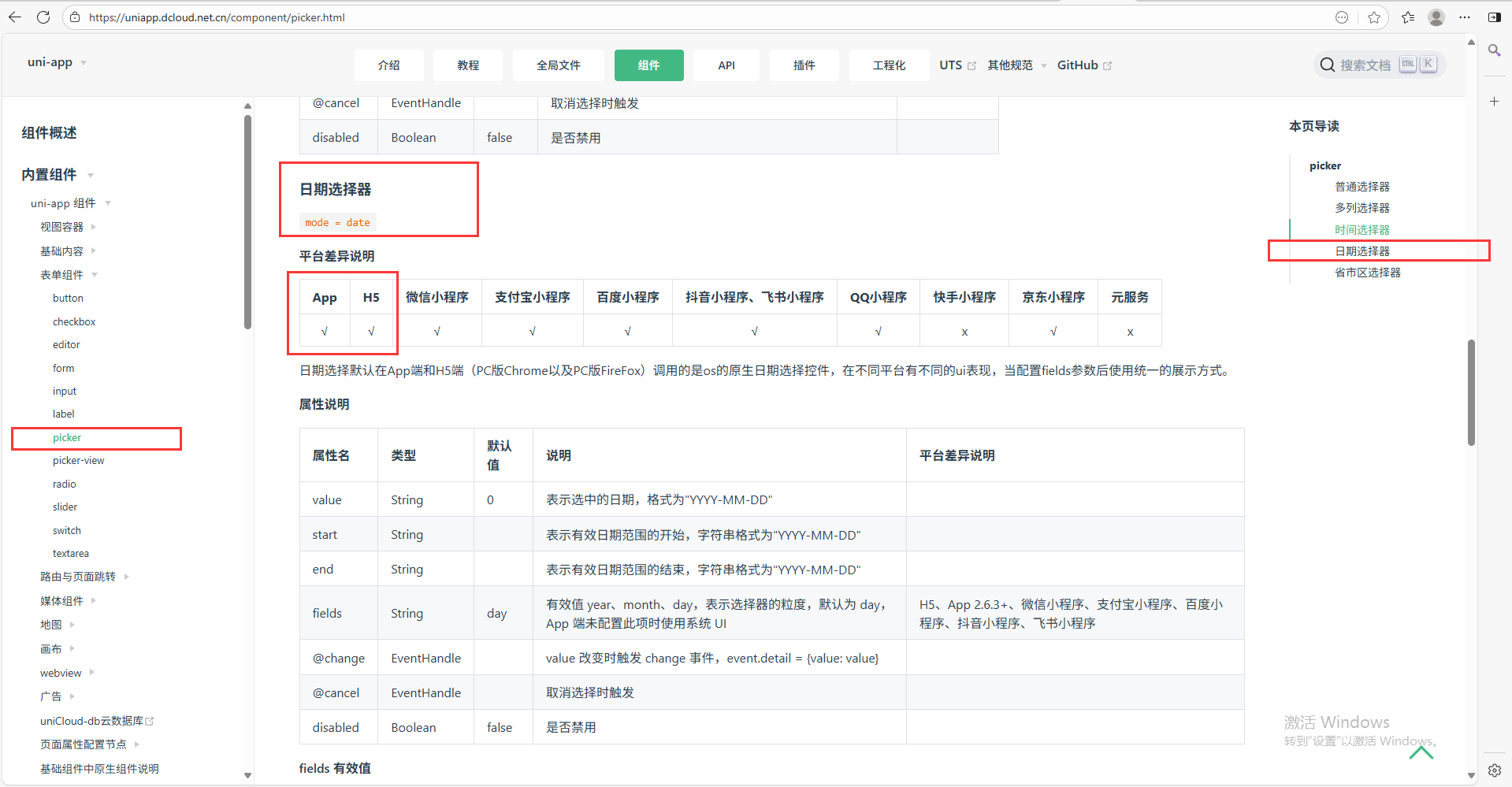
uniapp基础组件的picker组件,设置为日期选择器 mode="date"
<picker
mode="date"
:value="date"
:start="startDate"
:end="endDate"
@change="bindDateChange">
<view class="uni-input">{{date}}</view>
</picker>
插件市场有插件uni-datetime-picker,uniapp内置组件有picker组件。
一、插件市场uni-datetime-picker组件
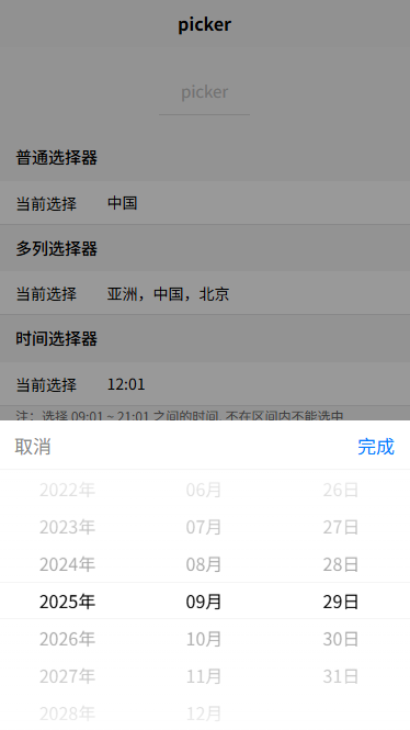
效果展示:【由两部分组成:一组件,二点击组件的弹框】
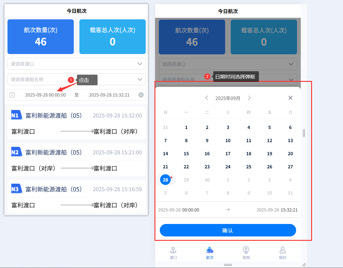
日期选择器:
设置type为:daterange 或者 datetimerange
javascript
<uni-datetime-picker
v-model="timeData"
type="datetimerange"
rangeSeparator="至"
:start="minDate"
:end="maxDate"
@change="maskChange"
@maskClick="maskClick"
/>js逻辑层:
javascript
<script>
export default {
data() {
return {
timeData: [],
minDate: '',
maxDate: '',
},
methods:{
formatTime(time, format = "YY-MM-DD hh:mm:ss") {
const args = {
y: time.getFullYear(),
M: time.getMonth() + 1,
d: time.getDate(),
h: time.getHours(),
m: time.getMinutes(),
s: time.getSeconds(),
};
for (const key in args) {
const value = args[key];
if (value < 10) args[key] = "0" + value;
}
const dateStr =
args.y +
"-" +
args.M +
"-" +
args.d +
" " +
args.h +
":" +
args.m +
":" +
args.s;
return dateStr;
},
maskChange(e) {
this.timeData = e
},
maskClick() {
},
},
created() {
const maxDate = this.formatTime(new Date(Date.now()))
const minDate1 = this.formatTime(new Date(Date.now() - 8.64e7))
const minDate7 = this.formatTime(new Date(Date.now() - 8.64e7 * 7))
this.minDate = minDate7
this.maxDate = maxDate
this.timeData = [minDate1, maxDate]
},
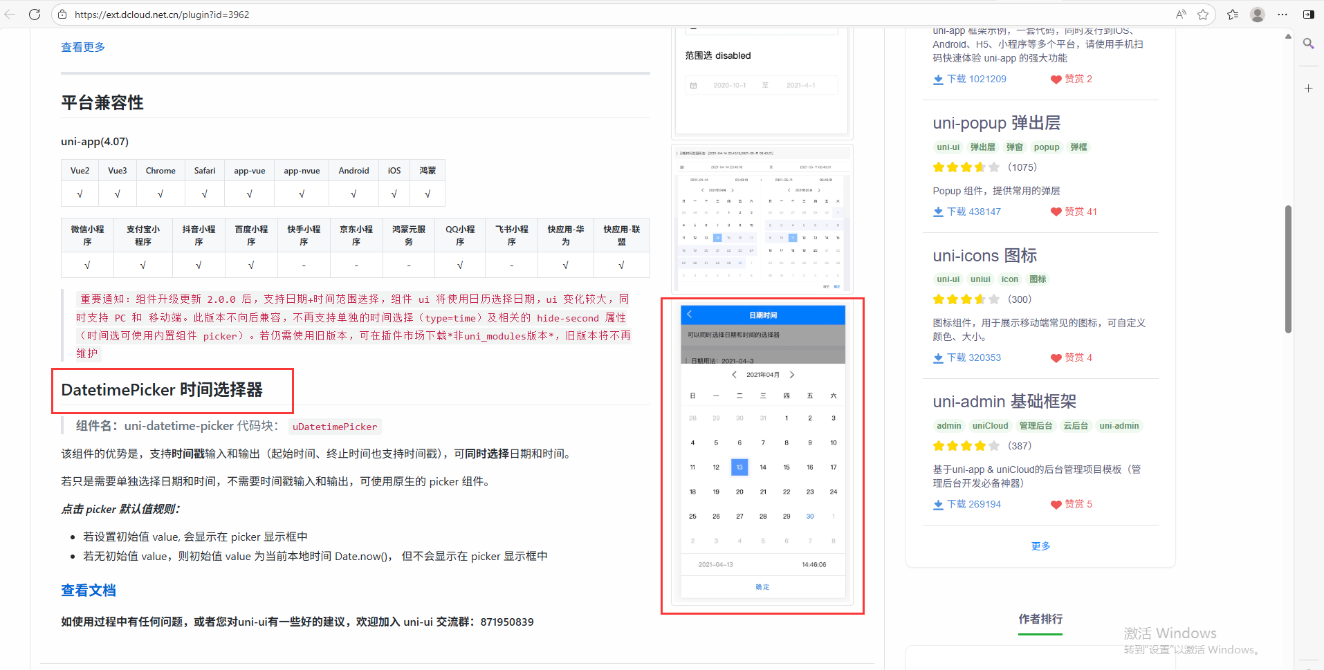
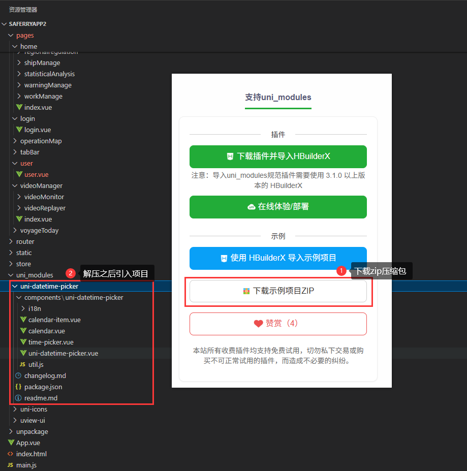
}插件市场官网:点击跳转
下载插件市场的插件,可以通过HBuilder下载,或者下载zip然后导入项目文件夹uni_modules
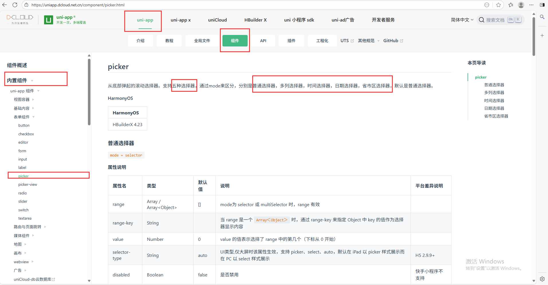
二、uniapp内置组件
效果展示:
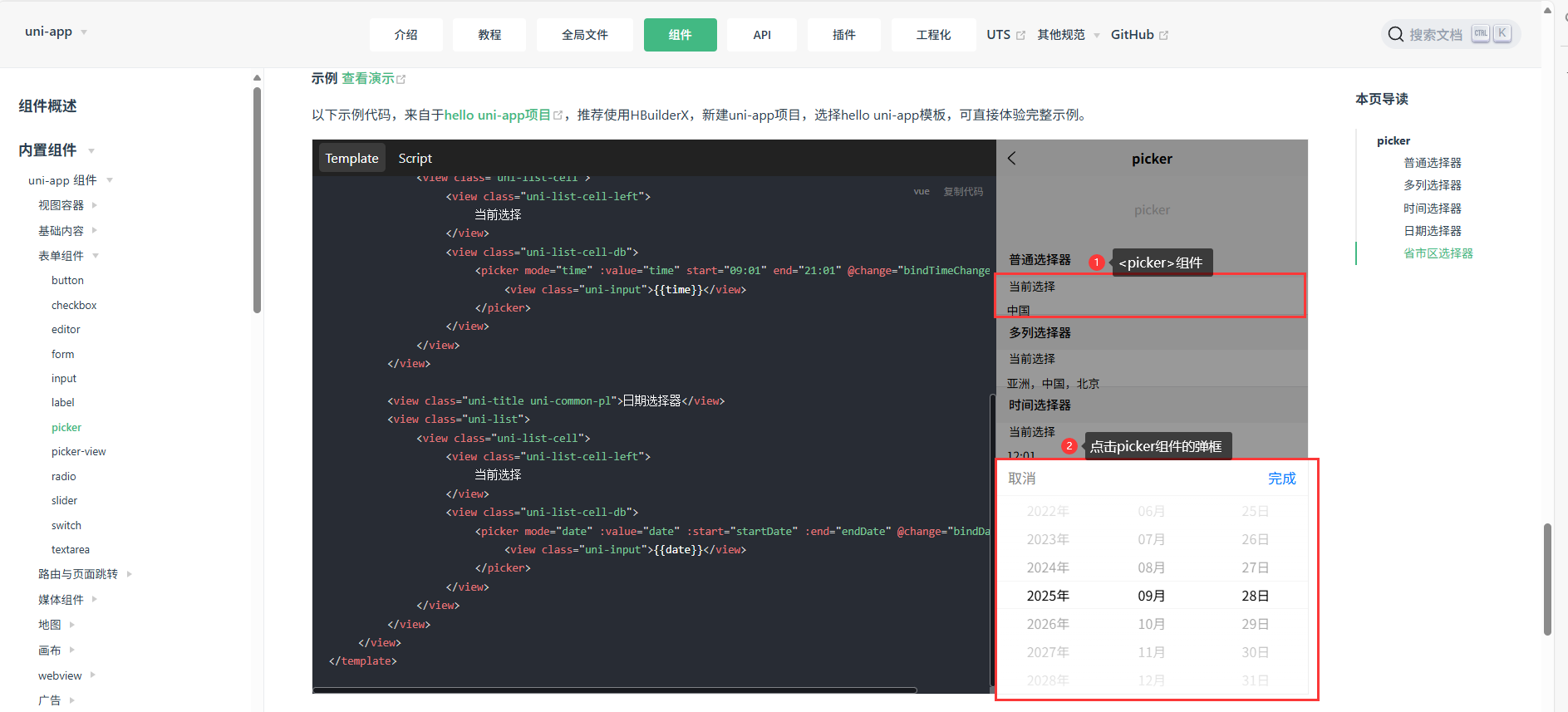
日期选择器:
javascript
<picker
  mode="date"
  :value="date"
  :start="minDate"
  :end="maxDate"
  @change="bindDateChange">
    <view class="uni-input">{{date}}</view>
</picker>
js逻辑层:
javascript
<script>
export default {
    data() {
        const currentDate = this.getDate({
            format: true
        })
        return {
            title: 'picker',
            array: ['中国', '美国', '巴西', '日本'],
            index: 0,
            date: currentDate,
            time: '12:01'
        }
    },
    computed: {
        minDate() {
            return this.getDate('start');
        },
        maxDate() {
            return this.getDate('end');
        }
    },
    methods: {
        bindPickerChange: function(e) {
            console.log('picker发送选择改变,携带值为', e.detail.value)
            this.index = e.detail.value
        },
        bindDateChange: function(e) {
            this.date = e.detail.value
        },
        bindTimeChange: function(e) {
            this.time = e.detail.value
        },
        getDate(type) {
            const date = new Date();
            let year = date.getFullYear();
            let month = date.getMonth() + 1;
            let day = date.getDate();

            if (type === 'start') {
                year = year - 10;
            } else if (type === 'end') {
                year = year + 10;
            }
            month = month > 9 ? month : '0' + month;
            day = day > 9 ? day : '0' + day;
            return `${year}-${month}-${day}`;
        }
    }
}
</script>uniapp组件官网链接:点击跳转
三、自行封装一个日历选择器
背景:
以上两种组件在H5端或者Android端组件的形式有所差异,可根据实际情况进行调整。
以下是自行封装了一个名为MyCalender的组件,组件只能选择具体的某一天。封装它的意图是想要弹出框尽量小,或者日历选择区域尽量小。
效果展示:
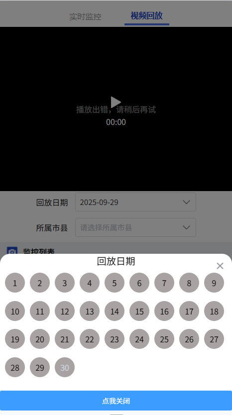
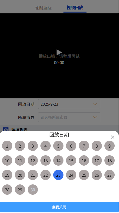
封装组件思路:
日期选择器只能选择一天。弹框根据实时日期渲染当月的总天数。大于当前日期的不可选并有提示信息,只能选择小于等于当前日期。
封装自定义组件:
javascript
<template>
    <view class="MyCalender">
        <view class="inputBox" @click='toggle()'>
            <u-input :readonly="true" style="pointer-events:none" v-model="inputValue" :placeholder="'请选择一个时间'"
                suffixIcon="arrow-down" :clearable="true">
                <!-- <u--text text="视频回放日期:" slot="prefix" margin="0 3px 0 0" type="tips"></u--text> -->
            </u-input>
        </view>
        <!-- <view class="calenderBox" v-if="isOpen">
            <view class="calender_item" v-for="(item, index) in timeCalender" :key="index" @click="clickCalenderI(item)"
                :class="item === currentD ? 'active' : ''">
                <view class="calender_item_inner" :class="item > currentDStyle ? 'disabled' : ''">
                    {{ item }}
                </view>
            </view>
        </view> -->
        <u-popup mode="bottom" :round="20" :show="showPop" :closeOnClickOverlay="false" @close="handlePopup(false)"
            :closeable="true">
            <view class="pop-title">回放日期</view>
            <view class="calenderBox">
                <view class="calender_item" v-for="(item, index) in timeCalender" :key="index"
                    @click="clickCalenderI(item)" :class="item === currentD ? 'active' : ''">
                    <view class="calender_item_inner" :class="item > currentDStyle ? 'disabled' : ''">
                        {{ item }}
                    </view>
                </view>
            </view>
            <view class="pop-footer" @click="toggle"><u-button text="点我关闭" type="primary"></u-button></view>
        </u-popup>
    </view>
</template>
<script>
export default {
    name: "MyCalender",
    props: {
        defaultTime: {
            type: String,
            default: ''
        },
        timeArr: {
            type: Number,
            default: 30,
        }
    },
    data() {
        return {
            showPop: false,
            clickData: '',
            inputValue: '',
            isOpen: false,
            timeCalender: 0,
            currentD: 0,
            currentDStyle: 0,
        }
    },
    methods: {
        handlePopup(state) {
            this.showPop = state;
        },
        toggle() {
            console.log('toggle');
            this.showPop = !this.showPop
        },
        handleOpenOption(data) {
            console.log('handleOpenOption', data);
            this.isOpen = !this.isOpen
        },
        clickCalenderI(item) {
            console.log('clickCalenderI', item);
            this.currentD = item
            //根据第几天得出日期
            const whichData = new Date(new Date().getFullYear(), new Date().getMonth(), item)
            this.clickData = whichData
            if (this.clickData > new Date()) {
                this.clickData = new Date()
                this.currentD = this.clickData.getDate()
                uni.showToast({
                    icon: 'none',
                    title: `请重新选择日期,不可大于今日${this.currentD}号`,
                })
            } else {
                this.clickData = this.clickData
            }
            const whichData_String = this.clickData.getFullYear() + '-' + (this.clickData.getMonth() + 1) + '-' + this.clickData.getDate()
            this.inputValue = whichData_String
            this.$emit('clickCalenderI', this.inputValue)
        }
    },
    created() {
        //timeCalender
        const currentDate = new Date();
        const currentY = currentDate.getFullYear();
        const currentM = currentDate.getMonth() + 1;
        const currentD = currentDate.getDate();
        const days = new Date(currentY, currentM, 0).getDate();
        console.log('days', days);
        this.timeCalender = days;
        this.currentDStyle = currentD
    },
    watch: {
        defaultTime: {
            handler(val) {
                if (val && val.split(' ').length) {
                    this.inputValue = val.split(' ')[0]
                }
            },
            immediate: true,
            deep: true
        }
    }
}
</script>
<style lang="scss" scoped>
.MyCalender {
    max-width: 80%;
    height: 100%;
    box-sizing: border-box;
    // padding: 0px 10px;
    overflow: hidden;
    background-color: #fff;
    display: flex;
    align-items: center;

    .inputBox {
        width: 100%;
    }

    .calenderBox {
        width: auto;
        height: 30vh;
        display: flex;
        flex-direction: row;
        flex-wrap: wrap;
        overflow-x: scroll;
        box-sizing: border-box;
        padding: 20rpx 0rpx 20rpx 20rpx;

        .active {
            background-color: #3670EB !important;
        }

        .disabled {
            color: #ccd5e0 !important;
        }

        .calender_item {
            width: 60rpx;
            height: 60rpx;
            background-color: #a9a2a2;
            border-radius: 50%;
            margin-right: 10px;
            box-sizing: border-box;
            padding: 20px;
            display: flex;
            justify-content: center;
            align-items: center;
        }
    }
}
</style>
<style lang="scss">
.pop-title {
    text-align: center;
    font-size: larger;
}

.pop-container {
    height: 30vh;
    overflow-x: hidden;
    overflow-y: auto;
}
</style>
使用自定义的组件:
<MyCalender :defaultTime="maxDate" @clickCalenderI="clickCalenderI"></MyCalender>
//vue2clickCalenderI(item) {
console.log('clickCalenderI', item);
this.timeData = \`${item} 00:00:00\`, \`${item} 23:59:59\`
},
this.maxDate = this.formatTime(new Date(Date.now()))
formatTime(time, format = "YY-MM-DD hh:mm:ss") {
const args = {
y: time.getFullYear(),
M: time.getMonth() + 1,
d: time.getDate(),
h: time.getHours(),
m: time.getMinutes(),
s: time.getSeconds(),
};
for (const key in args) {
const value = argskey;
if (value < 10) argskey = "0" + value;
}
const dateStr =
args.y +
"-" +
args.M +
"-" +
args.d +
" " +
args.h +
":" +
args.m +
":" +
args.s;
return dateStr;
},
写到这儿。。。我们就实现了三种uniapp选择日期的方式,根据实际情况自行选择。。。