
目录
[1 布局原则👀](#1 布局原则👀)
[1.1 WinForm与WPF布局方式对比](#1.1 WinForm与WPF布局方式对比)
[1.2 合成布局模型](#1.2 合成布局模型)
[1.2.1 根据内容调整尺寸原则](#1.2.1 根据内容调整尺寸原则)
[1.2.2 两段布局机制详解](#1.2.2 两段布局机制详解)
[2 布局机制深度解析🎉](#2 布局机制深度解析🎉)
[2.1 布局过程调用链详解](#2.1 布局过程调用链详解)
[2.2 实际布局过程示例](#2.2 实际布局过程示例)
[3 布局通用属性详解🐱🚀](#3 布局通用属性详解🐱🚀)
[3.1 Panel基类核心属性](#3.1 Panel基类核心属性)
[3.2 通用布局属性详解表](#3.2 通用布局属性详解表)
[3.3 属性使用示例代码](#3.3 属性使用示例代码)
[3.4 属性交互效果对比表](#3.4 属性交互效果对比表)
[3.4.1 不同属性组合效果演示:](#3.4.1 不同属性组合效果演示:)
[3.4.2 对齐方式对比网格:](#3.4.2 对齐方式对比网格:)
[4. WPF布局原理整合案例 🐱👤](#4. WPF布局原理整合案例 🐱👤)
[4.1 项目结构](#4.1 项目结构)
[4.2 完整代码文件](#4.2 完整代码文件)
[4.2.1 App.xaml](#4.2.1 App.xaml)
[4.2.2 App.xaml.cs](#4.2.2 App.xaml.cs)
[4.2.3 CustomPanel.cs - 自定义布局面板](#4.2.3 CustomPanel.cs - 自定义布局面板)
[4.2.4 LayoutTracker.cs - 布局跟踪器](#4.2.4 LayoutTracker.cs - 布局跟踪器)
[4.2.5 MainWindow.xaml - 主界面](#4.2.5 MainWindow.xaml - 主界面)
[4.2.6 MainWindow.xaml.cs - 主窗口代码](#4.2.6 MainWindow.xaml.cs - 主窗口代码)
[4.3 运行说明](#4.3 运行说明)
[4.3.1 创建项目步骤:](#4.3.1 创建项目步骤:)
[4.3.2 运行效果:](#4.3.2 运行效果:)
[5. 💖总结与展望](#5. 💖总结与展望)
引言
在WPF应用程序开发中,界面布局直接影响着用户体验和应用的可维护性。与传统的WinForms开发不同,WPF采用了一种流式布局模型,这意味着控件可以动态调整大小和位置,适应不同的窗口尺寸和内容变化。
在WPF中,窗口只能包含单个元素,要放置多个元素,需要在窗口上放置一个容器,然后在这个容器中添加其他元素。这一设计特点决定了我们必须遵循特定的布局原则,才能创建出富有吸引力、灵活实用的用户界面。
1 布局原则👀
1.1 WinForm与WPF布局方式对比
传统WinForm布局的局限性
WinForm采用基于坐标的绝对布局方式,控件位置和大小固定,无法自适应窗口变化。
cpp
// WinForm示例 - 固定坐标布局
Button button = new Button();
button.Location = new Point(100, 50); // 固定坐标
button.Size = new Size(80, 30);      // 固定尺寸
this.Controls.Add(button);
WPF流式布局的优势
WPF采用基于流的相对布局方式,元素自动适应容器变化,提供更好的用户体验。
XML
<!-- WPF示例 - 流式布局 -->
<StackPanel>
    <Button Content="按钮1" Margin="5"/>
    <Button Content="按钮2" Margin="5"/>
    <Button Content="按钮3" Margin="5"/>
</StackPanel>
布局方式对比表:
| 特性 | WinForm | WPF |
|---|---|---|
| 布局基础 | 绝对坐标 | 相对关系 |
| 自适应能力 | 弱 | 强 |
| 设计理念 | 桌面应用 | Web式流布局 |
| 复杂布局 | 需要手动计算 | 自动适应 |
1.2 合成布局模型
1.2.1 根据内容调整尺寸原则
WPF中控件大小自动适应其内容,这是核心设计理念。
XML
<!-- 示例:控件根据内容自动调整 -->
<Border BorderBrush="Black" BorderThickness="1" Padding="10">
    <TextBlock Text="这段文本的长度决定了Border的大小"
               TextWrapping="Wrap"/>
</Border>

<Button Content="按钮文本长度决定按钮宽度" Margin="10"/>
1.2.2 两段布局机制详解
布局过程数学关系:
期望尺寸(Desired Size) ≤ 实际尺寸(Actual Size) ≤ 可用尺寸(Available Size)
代码示例演示两段布局:
cpp
// 自定义面板,演示两段布局过程
public class CustomPanel : Panel
{
    // 测量阶段:计算子元素期望尺寸
    protected override Size MeasureOverride(Size availableSize)
    {
        Size desiredSize = new Size(0, 0);

        foreach (UIElement child in Children)
        {
            // 测量每个子元素
            child.Measure(availableSize);

            // 累加期望尺寸(示例:垂直排列)
            desiredSize.Width = Math.Max(desiredSize.Width, child.DesiredSize.Width);
            desiredSize.Height += child.DesiredSize.Height;
        }

        Console.WriteLine($"测量阶段 - 可用尺寸: {availableSize}, 期望尺寸: {desiredSize}");
        return desiredSize;
    }

    // 排列阶段:确定子元素最终位置和尺寸
    protected override Size ArrangeOverride(Size finalSize)
    {
        double yPosition = 0;

        foreach (UIElement child in Children)
        {
            // 排列每个子元素
            child.Arrange(new Rect(0, yPosition, finalSize.Width, child.DesiredSize.Height));
            yPosition += child.DesiredSize.Height;

            Console.WriteLine($"排列阶段 - 元素实际尺寸: {child.RenderSize}");
        }

        return finalSize;
    }
}
XML
// XAML中使用自定义面板
<local:CustomPanel>
    <Button Content="按钮1" Height="30"/>
    <Button Content="按钮2" Height="40"/>
    <Button Content="按钮3" Height="50"/>
</local:CustomPanel>
2 布局机制深度解析🎉
2.1 布局过程调用链详解
完整的布局调用时序图:
测量阶段(Measure Phase):
UIElement.Measure(Size availableSize)
    ↓
FrameworkElement.MeasureCore(Size availableSize)
    ↓
FrameworkElement.MeasureOverride(Size availableSize)
                     ↓  (面板重写此方法)
Panel.MeasureOverride(Size constraint)

排列阶段(Arrange Phase):
UIElement.Arrange(Rect finalRect)
    ↓
FrameworkElement.ArrangeCore(Rect finalRect)
    ↓
FrameworkElement.ArrangeOverride(Size finalSize)
                     ↓  (面板重写此方法)
Panel.ArrangeOverride(Size finalSize)
2.2 实际布局过程示例
cpp
// 创建简单的布局跟踪器
public class LayoutTracker : StackPanel
{
    protected override Size MeasureOverride(Size availableSize)
    {
        Console.WriteLine($"=== 测量阶段开始 ===");
        Console.WriteLine($"可用尺寸: {availableSize}");

        Size result = base.MeasureOverride(availableSize);

        Console.WriteLine($"测量结果 - 宽度: {result.Width}, 高度: {result.Height}");
        Console.WriteLine($"=== 测量阶段结束 ===\n");

        return result;
    }

    protected override Size ArrangeOverride(Size finalSize)
    {
        Console.WriteLine($"=== 排列阶段开始 ===");
        Console.WriteLine($"最终尺寸: {finalSize}");

        Size result = base.ArrangeOverride(finalSize);

        foreach (UIElement child in Children)
        {
            Console.WriteLine($"子元素实际尺寸: {child.RenderSize}");
        }

        Console.WriteLine($"=== 排列阶段结束 ===\n");
        return result;
    }
}
3 布局通用属性详解🐱🚀
3.1 Panel基类核心属性
Panel类层次结构:
System.Object
    ↓
DispatcherObject
    ↓
DependencyObject
    ↓
Visual
    ↓
UIElement
    ↓
FrameworkElement
    ↓
Panel (抽象基类)
    ↓
StackPanel, Grid, Canvas, DockPanel, WrapPanel
3.2 通用布局属性详解表
| 属性分类 | 属性名称 | 数据类型 | 默认值 | 说明 |
|---|---|---|---|---|
| 对齐方式 | HorizontalAlignment | HorizontalAlignment | Stretch | 水平对齐方式 |
| VerticalAlignment | VerticalAlignment | Stretch | 垂直对齐方式 | |
| 尺寸控制 | Width | double | Auto | 元素宽度 |
| Height | double | Auto | 元素高度 | |
| MinWidth | double | 0 | 最小宽度 | |
| MaxWidth | double | ∞ | 最大宽度 | |
| MinHeight | double | 0 | 最小高度 | |
| MaxHeight | double | ∞ | 最大高度 | |
| 边距控制 | Margin | Thickness | 0 | 元素外边距 |
| Padding | Thickness | 0 | 元素内边距 |
3.3 属性使用示例代码
XML
<!-- 综合布局属性示例 -->
<Grid ShowGridLines="True" Background="LightGray">
    <Grid.RowDefinitions>
        <RowDefinition Height="Auto"/>
        <RowDefinition Height="*"/>
        <RowDefinition Height="100"/>
    </Grid.RowDefinitions>

    <Grid.ColumnDefinitions>
        <ColumnDefinition Width="Auto"/>
        <ColumnDefinition Width="*"/>
        <ColumnDefinition Width="2*"/>
    </Grid.ColumnDefinitions>

    <!-- 示例1:对齐和边距 -->
    <Button Grid.Row="0" Grid.Column="0"
            Content="左对齐"
            HorizontalAlignment="Left"
            VerticalAlignment="Top"
            Margin="10"
            Padding="5"/>

    <!-- 示例2:尺寸限制 -->
    <Border Grid.Row="0" Grid.Column="1"
            Background="LightBlue"
            MinWidth="50"
            MaxWidth="200"
            Height="40">
        <TextBlock Text="尺寸受限区域" VerticalAlignment="Center"/>
    </Border>

    <!-- 示例3:复杂边距 -->
    <StackPanel Grid.Row="1" Grid.ColumnSpan="3"
                Margin="15,5,15,5"
                Background="White">
        <TextBlock Text="边距示例:" FontWeight="Bold" Margin="0,0,0,10"/>

        <Button Content="上边距10" Margin="0,10,0,0"/>
        <Button Content="左右边距20" Margin="20,5,20,5"/>
        <Button Content="下边距15" Margin="0,0,0,15"/>
    </StackPanel>
</Grid>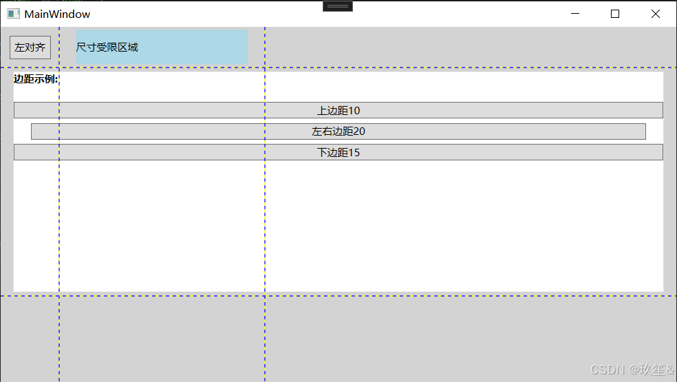
3.4 属性交互效果对比表
3.4.1 不同属性组合效果演示:
XML
<StackPanel Orientation="Horizontal">
    <!-- 固定尺寸 -->
    <Border Width="100" Height="50" Background="Red" Margin="5">
        <TextBlock Text="固定尺寸" HorizontalAlignment="Center" VerticalAlignment="Center"/>
    </Border>

    <!-- 自动尺寸 -->
    <Border Background="Green" Margin="5">
        <TextBlock Text="自动尺寸" Padding="10"/>
    </Border>

    <!-- 最小最大限制 -->
    <Border MinWidth="50" MaxWidth="150" Height="50" Background="Blue" Margin="5">
        <TextBlock Text="尺寸限制" HorizontalAlignment="Center" VerticalAlignment="Center"/>
    </Border>
</StackPanel>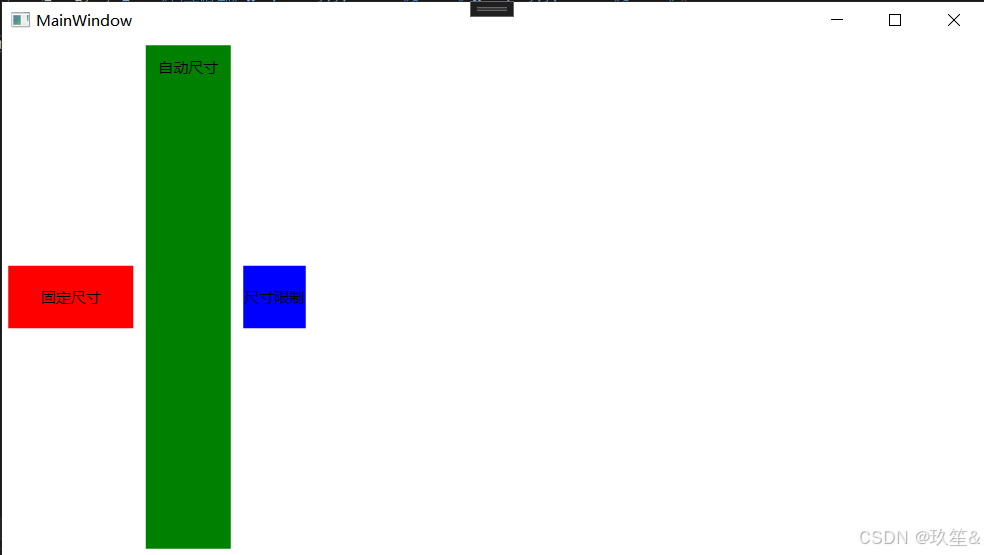
3.4.2 对齐方式对比网格:
XML
<Grid>
    <Grid.RowDefinitions>
        <RowDefinition Height="*"/>
        <RowDefinition Height="*"/>
        <RowDefinition Height="*"/>
    </Grid.RowDefinitions>

    <Grid.ColumnDefinitions>
        <ColumnDefinition Width="*"/>
        <ColumnDefinition Width="*"/>
        <ColumnDefinition Width="*"/>
    </Grid.ColumnDefinitions>

    <!-- 9种对齐组合 -->
    <Button Grid.Row="0" Grid.Column="0" Content="左上" HorizontalAlignment="Left" VerticalAlignment="Top"/>
    <Button Grid.Row="0" Grid.Column="1" Content="中上" HorizontalAlignment="Center" VerticalAlignment="Top"/>
    <Button Grid.Row="0" Grid.Column="2" Content="右上" HorizontalAlignment="Right" VerticalAlignment="Top"/>

    <Button Grid.Row="1" Grid.Column="0" Content="左中" HorizontalAlignment="Left" VerticalAlignment="Center"/>
    <Button Grid.Row="1" Grid.Column="1" Content="中心" HorizontalAlignment="Center" VerticalAlignment="Center"/>
    <Button Grid.Row="1" Grid.Column="2" Content="右中" HorizontalAlignment="Right" VerticalAlignment="Center"/>

    <Button Grid.Row="2" Grid.Column="0" Content="左下" HorizontalAlignment="Left" VerticalAlignment="Bottom"/>
    <Button Grid.Row="2" Grid.Column="1" Content="中下" HorizontalAlignment="Center" VerticalAlignment="Bottom"/>
    <Button Grid.Row="2" Grid.Column="2" Content="右下" HorizontalAlignment="Right" VerticalAlignment="Bottom"/>
</Grid>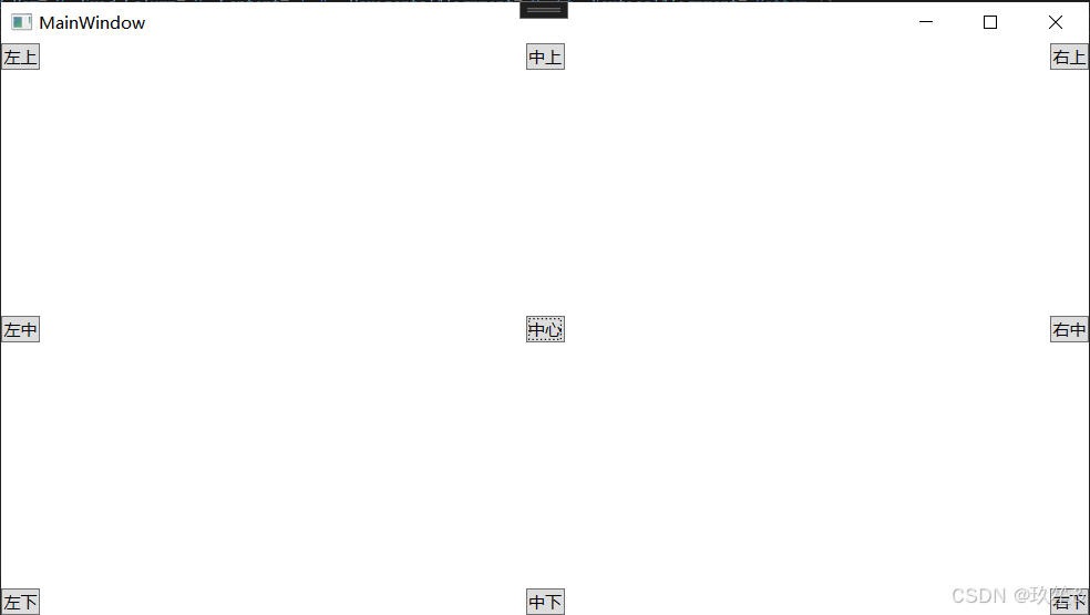
4. WPF布局原理整合案例 🐱👤
下面是一个完整的WPF应用程序,整合了所有布局原理和概念,可以直接运行测试。
4.1 项目结构
WpfLayoutDemo/
├── MainWindow.xaml
├── MainWindow.xaml.cs
├── CustomPanel.cs
├── LayoutTracker.cs
└── App.xaml
4.2 完整代码文件
4.2.1 App.xaml
XML
<Application x:Class="WpfLayoutDemo.App"
             xmlns="http://schemas.microsoft.com/winfx/2006/xaml/presentation"
             xmlns:x="http://schemas.microsoft.com/winfx/2006/xaml"
             StartupUri="MainWindow.xaml">
</Application>
4.2.2 App.xaml.cs
cpp
using System.Windows;

namespace WpfLayoutDemo
{
    public partial class App : Application
    {
    }
}
4.2.3 CustomPanel.cs - 自定义布局面板
cpp
using System;
using System.Windows;
using System.Windows.Controls;
using System.Windows.Media;

namespace WpfLayoutDemo
{
    public class CustomPanel : Panel
    {
        // 测量阶段:计算子元素期望尺寸
        protected override Size MeasureOverride(Size availableSize)
        {
            Console.WriteLine($"=== CustomPanel 测量阶段开始 ===");
            Console.WriteLine($"可用尺寸: {availableSize}");

            Size desiredSize = new Size(0, 0);

            foreach (UIElement child in InternalChildren)
            {
                if (child == null) continue;

                // 测量每个子元素
                child.Measure(availableSize);

                // 累加期望尺寸(垂直排列)
                desiredSize.Width = Math.Max(desiredSize.Width, child.DesiredSize.Width);
                desiredSize.Height += child.DesiredSize.Height;

                Console.WriteLine($"子元素期望尺寸: {child.DesiredSize}");
            }

            // 如果可用尺寸有限,则进行约束
            if (!double.IsInfinity(availableSize.Width))
                desiredSize.Width = Math.Min(desiredSize.Width, availableSize.Width);
            if (!double.IsInfinity(availableSize.Height))
                desiredSize.Height = Math.Min(desiredSize.Height, availableSize.Height);

            Console.WriteLine($"面板期望尺寸: {desiredSize}");
            Console.WriteLine($"=== CustomPanel 测量阶段结束 ===\n");

            return desiredSize;
        }

        // 排列阶段:确定子元素最终位置和尺寸
        protected override Size ArrangeOverride(Size finalSize)
        {
            Console.WriteLine($"=== CustomPanel 排列阶段开始 ===");
            Console.WriteLine($"最终尺寸: {finalSize}");

            double yPosition = 0;

            foreach (UIElement child in InternalChildren)
            {
                if (child == null) continue;

                double childHeight = child.DesiredSize.Height;

                // 如果剩余空间不足,调整子元素高度
                if (yPosition + childHeight > finalSize.Height)
                {
                    childHeight = Math.Max(0, finalSize.Height - yPosition);
                }

                // 排列每个子元素
                child.Arrange(new Rect(0, yPosition, finalSize.Width, childHeight));
                yPosition += childHeight;

                Console.WriteLine($"子元素实际尺寸: {child.RenderSize}, 位置: (0, {yPosition - childHeight})");
            }

            Console.WriteLine($"=== CustomPanel 排列阶段结束 ===\n");
            return finalSize;
        }

        // 绘制边界线以便观察布局
        protected override void OnRender(DrawingContext dc)
        {
            base.OnRender(dc);

            // 绘制面板边界
            dc.DrawRectangle(null, new Pen(Brushes.Red, 1), new Rect(0, 0, ActualWidth, ActualHeight));
        }
    }
}
4.2.4 LayoutTracker.cs - 布局跟踪器
cpp
using System;
using System.Windows;
using System.Windows.Controls;
using System.Windows.Media;
namespace WpfLayoutDemo
{
public class LayoutTracker : StackPanel
{
private int layoutCount = 0;
protected override Size MeasureOverride(Size availableSize)
{
layoutCount++;
Console.WriteLine($"\n🎯 布局循环 #{layoutCount} - 测量阶段");
Console.WriteLine($"可用尺寸: {availableSize}");
Size result = base.MeasureOverride(availableSize);
Console.WriteLine($"测量结果: {result}");
return result;
}
protected override Size ArrangeOverride(Size finalSize)
{
Console.WriteLine($"📐 布局循环 #{layoutCount} - 排列阶段");
Console.WriteLine($"最终尺寸: {finalSize}");
Size result = base.ArrangeOverride(finalSize);
int childIndex = 0;
foreach (UIElement child in Children)
{
Console.WriteLine($"子元素#{childIndex++} 实际尺寸: {child.RenderSize}");
}
return result;
}
}
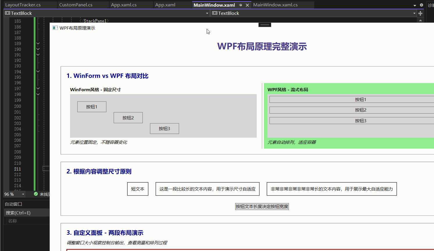
}4.2.5 MainWindow.xaml - 主界面
XML
<Window x:Class="WpfLayoutDemo.MainWindow"
        xmlns="http://schemas.microsoft.com/winfx/2006/xaml/presentation"
        xmlns:x="http://schemas.microsoft.com/winfx/2006/xaml"
        xmlns:local="clr-namespace:WpfLayoutDemo"
        Title="WPF布局原理演示" Height="800" Width="1200"
        Background="WhiteSmoke">

    <Window.Resources>
        <Style x:Key="DemoSectionStyle" TargetType="Border">
            <Setter Property="Background" Value="White"/>
            <Setter Property="BorderBrush" Value="Gray"/>
            <Setter Property="BorderThickness" Value="1"/>
            <Setter Property="Margin" Value="10"/>
            <Setter Property="Padding" Value="15"/>
        </Style>

        <Style x:Key="HeaderStyle" TargetType="TextBlock">
            <Setter Property="FontSize" Value="16"/>
            <Setter Property="FontWeight" Value="Bold"/>
            <Setter Property="Foreground" Value="DarkBlue"/>
            <Setter Property="Margin" Value="0,0,0,10"/>
        </Style>
    </Window.Resources>

    <ScrollViewer VerticalScrollBarVisibility="Auto">
        <StackPanel Margin="20">

            <!-- 标题 -->
            <TextBlock Text="WPF布局原理完整演示"
                       FontSize="24" FontWeight="Bold"
                       Foreground="DarkSlateBlue"
                       HorizontalAlignment="Center"
                       Margin="0,0,0,30"/>

            <!-- 1. 基础布局对比 -->
            <Border Style="{StaticResource DemoSectionStyle}">
                <StackPanel>
                    <TextBlock Style="{StaticResource HeaderStyle}"
                               Text="1. WinForm vs WPF 布局对比"/>

                    <Grid>
                        <Grid.ColumnDefinitions>
                            <ColumnDefinition Width="*"/>
                            <ColumnDefinition Width="10"/>
                            <ColumnDefinition Width="*"/>
                        </Grid.ColumnDefinitions>

                        <!-- WinForm风格布局 -->
                        <Border Grid.Column="0" Background="LightYellow" Padding="10">
                            <StackPanel>
                                <TextBlock Text="WinForm风格 - 固定尺寸" FontWeight="Bold" Margin="0,0,0,5"/>
                                <Canvas Background="LightGray" Height="120">
                                    <Button Content="按钮1" Width="80" Height="30" Canvas.Left="20" Canvas.Top="20"/>
                                    <Button Content="按钮2" Width="80" Height="30" Canvas.Left="120" Canvas.Top="50"/>
                                    <Button Content="按钮3" Width="80" Height="30" Canvas.Left="220" Canvas.Top="80"/>
                                </Canvas>
                                <TextBlock Text="元素位置固定,不随容器变化" FontStyle="Italic" Margin="0,5,0,0"/>
                            </StackPanel>
                        </Border>

                        <!-- 分隔线 -->
                        <Rectangle Grid.Column="1" Fill="Gray" Width="1" VerticalAlignment="Stretch"/>

                        <!-- WPF风格布局 -->
                        <Border Grid.Column="2" Background="LightGreen" Padding="10">
                            <StackPanel>
                                <TextBlock Text="WPF风格 - 流式布局" FontWeight="Bold" Margin="0,0,0,5"/>
                                <StackPanel Background="LightGray" Height="120">
                                    <Button Content="按钮1" Margin="5"/>
                                    <Button Content="按钮2" Margin="5"/>
                                    <Button Content="按钮3" Margin="5"/>
                                </StackPanel>
                                <TextBlock Text="元素自动排列,适应容器" FontStyle="Italic" Margin="0,5,0,0"/>
                            </StackPanel>
                        </Border>
                    </Grid>
                </StackPanel>
            </Border>

            <!-- 2. 根据内容调整尺寸 -->
            <Border Style="{StaticResource DemoSectionStyle}">
                <StackPanel>
                    <TextBlock Style="{StaticResource HeaderStyle}"
                               Text="2. 根据内容调整尺寸原则"/>

                    <StackPanel Orientation="Horizontal" HorizontalAlignment="Center">
                        <Border BorderBrush="Black" BorderThickness="1" Padding="10" Margin="10">
                            <TextBlock Text="短文本" TextWrapping="Wrap"/>
                        </Border>

                        <Border BorderBrush="Black" BorderThickness="1" Padding="10" Margin="10">
                            <TextBlock Text="这是一段比较长的文本内容,用于演示尺寸自适应" TextWrapping="Wrap"/>
                        </Border>

                        <Border BorderBrush="Black" BorderThickness="1" Padding="10" Margin="10">
                            <TextBlock Text="非常非常非常非常非常长的文本内容,用于展示最大自适应能力" TextWrapping="Wrap"/>
                        </Border>
                    </StackPanel>

                    <Button Content="按钮文本长度决定按钮宽度" HorizontalAlignment="Center" Margin="0,10,0,0"/>
                </StackPanel>
            </Border>

            <!-- 3. 自定义面板演示两段布局 -->
            <Border Style="{StaticResource DemoSectionStyle}">
                <StackPanel>
                    <TextBlock Style="{StaticResource HeaderStyle}"
                               Text="3. 自定义面板 - 两段布局演示"/>

                    <TextBlock Text="调整窗口大小观察控制台输出,查看测量和排列过程"
                               FontStyle="Italic" Margin="0,0,0,10"/>

                    <Border BorderBrush="DarkRed" BorderThickness="2" Padding="5">
                        <local:CustomPanel Background="LightCyan" Height="150">
                            <Button Content="自定义面板按钮1" Height="30" Background="LightSalmon"/>
                            <Button Content="自定义面板按钮2" Height="40" Background="LightSkyBlue"/>
                            <Button Content="自定义面板按钮3" Height="50" Background="LightGreen"/>
                        </local:CustomPanel>
                    </Border>
                </StackPanel>
            </Border>

            <!-- 4. 布局属性演示 -->
            <Border Style="{StaticResource DemoSectionStyle}">
                <StackPanel>
                    <TextBlock Style="{StaticResource HeaderStyle}"
                               Text="4. 布局通用属性演示"/>

                    <!-- 对齐方式演示 -->
                    <TextBlock Text="对齐方式对比:" FontWeight="SemiBold" Margin="0,0,0,5"/>
                    <Grid Height="120" Background="LightGray" ShowGridLines="True">
                        <Grid.RowDefinitions>
                            <RowDefinition Height="*"/>
                            <RowDefinition Height="*"/>
                            <RowDefinition Height="*"/>
                        </Grid.RowDefinitions>
                        <Grid.ColumnDefinitions>
                            <ColumnDefinition Width="*"/>
                            <ColumnDefinition Width="*"/>
                            <ColumnDefinition Width="*"/>
                        </Grid.ColumnDefinitions>

                        <Button Grid.Row="0" Grid.Column="0" Content="左上" HorizontalAlignment="Left" VerticalAlignment="Top" Margin="2"/>
                        <Button Grid.Row="0" Grid.Column="1" Content="中上" HorizontalAlignment="Center" VerticalAlignment="Top" Margin="2"/>
                        <Button Grid.Row="0" Grid.Column="2" Content="右上" HorizontalAlignment="Right" VerticalAlignment="Top" Margin="2"/>

                        <Button Grid.Row="1" Grid.Column="0" Content="左中" HorizontalAlignment="Left" VerticalAlignment="Center" Margin="2"/>
                        <Button Grid.Row="1" Grid.Column="1" Content="中心" HorizontalAlignment="Center" VerticalAlignment="Center" Margin="2"/>
                        <Button Grid.Row="1" Grid.Column="2" Content="右中" HorizontalAlignment="Right" VerticalAlignment="Center" Margin="2"/>

                        <Button Grid.Row="2" Grid.Column="0" Content="左下" HorizontalAlignment="Left" VerticalAlignment="Bottom" Margin="2"/>
                        <Button Grid.Row="2" Grid.Column="1" Content="中下" HorizontalAlignment="Center" VerticalAlignment="Bottom" Margin="2"/>
                        <Button Grid.Row="2" Grid.Column="2" Content="右下" HorizontalAlignment="Right" VerticalAlignment="Bottom" Margin="2"/>
                    </Grid>

                    <!-- 尺寸限制演示 -->
                    <TextBlock Text="尺寸限制属性:" FontWeight="SemiBold" Margin="0,15,0,5"/>
                    <StackPanel Orientation="Horizontal" HorizontalAlignment="Center">
                        <Border Width="100" Height="50" Background="IndianRed" Margin="5">
                            <TextBlock Text="固定尺寸" HorizontalAlignment="Center" VerticalAlignment="Center" Foreground="White"/>
                        </Border>

                        <Border Background="ForestGreen" Margin="5">
                            <TextBlock Text="自动尺寸" Padding="10" Foreground="White"/>
                        </Border>

                        <Border MinWidth="50" MaxWidth="150" Height="50" Background="RoyalBlue" Margin="5">
                            <TextBlock Text="尺寸限制" HorizontalAlignment="Center" VerticalAlignment="Center" Foreground="White"/>
                        </Border>
                    </StackPanel>

                    <!-- 边距演示 -->
                    <TextBlock Text="边距属性:" FontWeight="SemiBold" Margin="0,15,0,5"/>
                    <StackPanel Background="LightYellow" >
                        <StackPanel.Resources>
                            <Style TargetType="Button">
                                <Setter Property="Margin" Value="5"/>
                            </Style>
                        </StackPanel.Resources>
                        <Button Content="默认边距" Background="LightSkyBlue"/>
                        <Button Content="上边距10" Margin="0,10,0,0" Background="LightGreen"/>
                        <Button Content="左右边距20" Margin="20,5,20,5" Background="LightCoral"/>
                        <Button Content="下边距15" Margin="0,0,0,15" Background="Plum"/>
                    </StackPanel>
                </StackPanel>
            </Border>

            <!-- 5. 布局跟踪器 -->
            <Border Style="{StaticResource DemoSectionStyle}">
                <StackPanel>
                    <TextBlock Style="{StaticResource HeaderStyle}"
                               Text="5. 布局过程跟踪"/>

                    <TextBlock Text="调整此区域大小,观察控制台输出的布局过程"
                               FontStyle="Italic" Margin="0,0,0,10"/>

                    <Border BorderBrush="Purple" BorderThickness="2" Background="White">
                        <local:LayoutTracker Background="Lavender" Height="100">
                            <Button Content="跟踪按钮1" Margin="5" Background="LightPink"/>
                            <Button Content="跟踪按钮2" Margin="5" Background="LightSteelBlue"/>
                        </local:LayoutTracker>
                    </Border>
                </StackPanel>
            </Border>

            <!-- 操作说明 -->
            <Border Style="{StaticResource DemoSectionStyle}" Background="LightGoldenrodYellow">
                <StackPanel>
                    <TextBlock Text="💡 操作说明" FontWeight="Bold" Foreground="DarkRed"/>
                    <TextBlock Text="1. 运行程序后查看控制台输出,了解布局过程"/>
                    <TextBlock Text="2. 调整窗口大小观察布局的自适应行为"/>
                    <TextBlock Text="3. 注意观察不同布局属性的视觉效果"/>
                    <TextBlock Text="4. 查看控制台输出的测量和排列阶段信息"/>
                </StackPanel>
            </Border>

        </StackPanel>
    </ScrollViewer>
</Window>
4.2.6 MainWindow.xaml.cs - 主窗口代码
cpp
using System;
using System.Windows;

namespace WpfLayoutDemo
{
    public partial class MainWindow : Window
    {
        public MainWindow()
        {
            InitializeComponent();

            // 输出初始化信息
            Console.WriteLine("🚀 WPF布局演示程序已启动");
            Console.WriteLine("==========================================");
            Console.WriteLine("调整窗口大小可以观察布局过程的控制台输出");
            Console.WriteLine("==========================================\n");

            // 监听窗口大小变化
            this.SizeChanged += MainWindow_SizeChanged;
        }

        private void MainWindow_SizeChanged(object sender, SizeChangedEventArgs e)
        {
            Console.WriteLine($"🔄 窗口尺寸变化: {e.PreviousSize} -> {e.NewSize}");
        }
    }
}
4.3 运行说明
4.3.1 创建项目步骤:
-
打开Visual Studio
-
创建新的WPF应用程序项目(.NET Framework 或 .NET Core)
-
将上述代码文件分别添加到项目中
-
确保所有文件的命名空间一致(示例中使用
WpfLayoutDemo) -
编译并运行
4.3.2 运行效果:
控制台输出:程序启动后会在控制台显示详细的布局过程信息
可视化界面 :窗口显示各种布局示例,包含:
-
WinForm vs WPF布局对比
-
内容自适应演示
-
自定义布局面板
-
对齐方式网格
-
尺寸限制示例
-
边距属性演示
-
布局过程跟踪
关键观察点:
-
调整窗口大小时观察控制台输出的布局过程
-
比较不同布局方式的适应行为
-
查看测量和排列阶段的详细数据
-
理解尺寸关系:期望尺寸 ≤ 实际尺寸 ≤ 可用尺寸
5. 💖总结与展望
WPF布局系统以其强大的自适应能力和灵活的容器机制,彻底改变了Windows应用程序UI开发的方式。通过测量-排列的两阶段布局流程,配合Grid、StackPanel等多样化布局容器,WPF实现了真正意义上的响应式界面设计。其核心优势在于分离界面逻辑与业务逻辑,通过XAML声明式编程简化了复杂界面的构建过程。实践证明,遵循WPF布局原则(如避免固定尺寸、合理嵌套容器等)能够显著提升应用程序的可维护性和跨设备适配能力**。
未来展望
随着.NET生态的持续演进,WPF布局技术正与现代化开发需求深度融合。展望未来,以下几个方面值得关注:(1)WPF与MAUI的布局理念相互借鉴,为跨平台开发提供更统一的解决方案;(2)AI辅助布局设计可能成为新趋势,通过智能分析内容特性自动推荐最优布局方案;
(3)随着高DPI设备和触摸交互的普及,WPF布局系统将持续优化对新型交互模式的支持。对于开发者而言,掌握WPF布局核心思想将为学习新一代UI框架奠定坚实基础,在数字化转型浪潮中保持技术竞争力。
🎉 恭喜你成功突破了XAML类型转换器的技术壁垒!现在让我们正式开启WPF界面布局的奇妙旅程。基于扎实的XAML语法基础,我们将深入探索WPF布局系统的设计哲学:
🛠️ 核心价值
掌握WPF布局原则将让你:
✅ 彻底理解WPF响应式布局的设计思想
✅ 构建适应不同分辨率与DPI的专业界面
✅ 提升UI代码的可维护性和扩展性
✅ 为复杂企业级应用界面奠定坚实基础
如果本专题对你有帮助:
🔥 点赞 + 🌟 收藏 + ➕ 关注!
这是对我持续创作WPF深度内容的最大动力!
💬 欢迎在评论区积极参与:
👉 「布局经验分享!」 -- 展示你的界面布局作品与设计心得
👉 「下期重点投票!」 -- 留言最想深入研究的布局面板(Grid/StackPanel/DockPanel)
👉 「布局难题求助」 -- 描述具体布局挑战,共同探讨解决方案
👉 「企业实战案例」 -- 分享实际项目中的布局设计经验
愿你的界面布局精准优雅,用户体验流畅自然!我们布局实战篇再见!✨
💫 💫💫💫💫💫💫💫💫💫💫💫💫💫💫💫💫💫💫💫💫💫💫💫💫💫💫💫💫
实战预热:
接下来我们将进入《WPF编程基础【2.2】布局面板实战》
带你玩转Grid、StackPanel、DockPanel等五大布局神器,打造专业级UI界面!