中秋赏月互动页面:用前端技术演绎传统节日之美
中秋佳节,赏月、品饼、猜灯谜是流传千年的传统习俗。在数字化时代,我们如何用前端技术重现这些经典元素,打造沉浸式的节日体验?本文将分享一个中秋主题互动页面的开发亮点,看看HTML、CSS和JavaScript如何与传统文化碰撞出奇妙的火花。
视觉设计:营造中秋夜的氛围感
定制色彩系统传递节日意境
页面的核心视觉魅力来自于精心设计的色彩体系,通过Tailwind的自定义配置实现:
javascript
tailwind.config = {
  theme: {
    extend: {
      colors: {
        'night-sky': '#141b38',    // 夜空蓝,奠定深邃宁静的基调
        'moon-glow': '#f5f0e8',    // 月光白,呈现柔和的月色
        'lantern-red': '#d92121',  // 灯笼红,传递节日喜庆
        'mooncake-yellow': '#fbbf24', // 月饼黄,呼应传统糕点色彩
        // 更多定制色彩...
      }
    }
  }
}
这些色彩不仅符合中秋的视觉联想,更形成了和谐的对比与层次,从夜空到月光,从灯笼到月饼,每个元素都有其专属色彩语言。
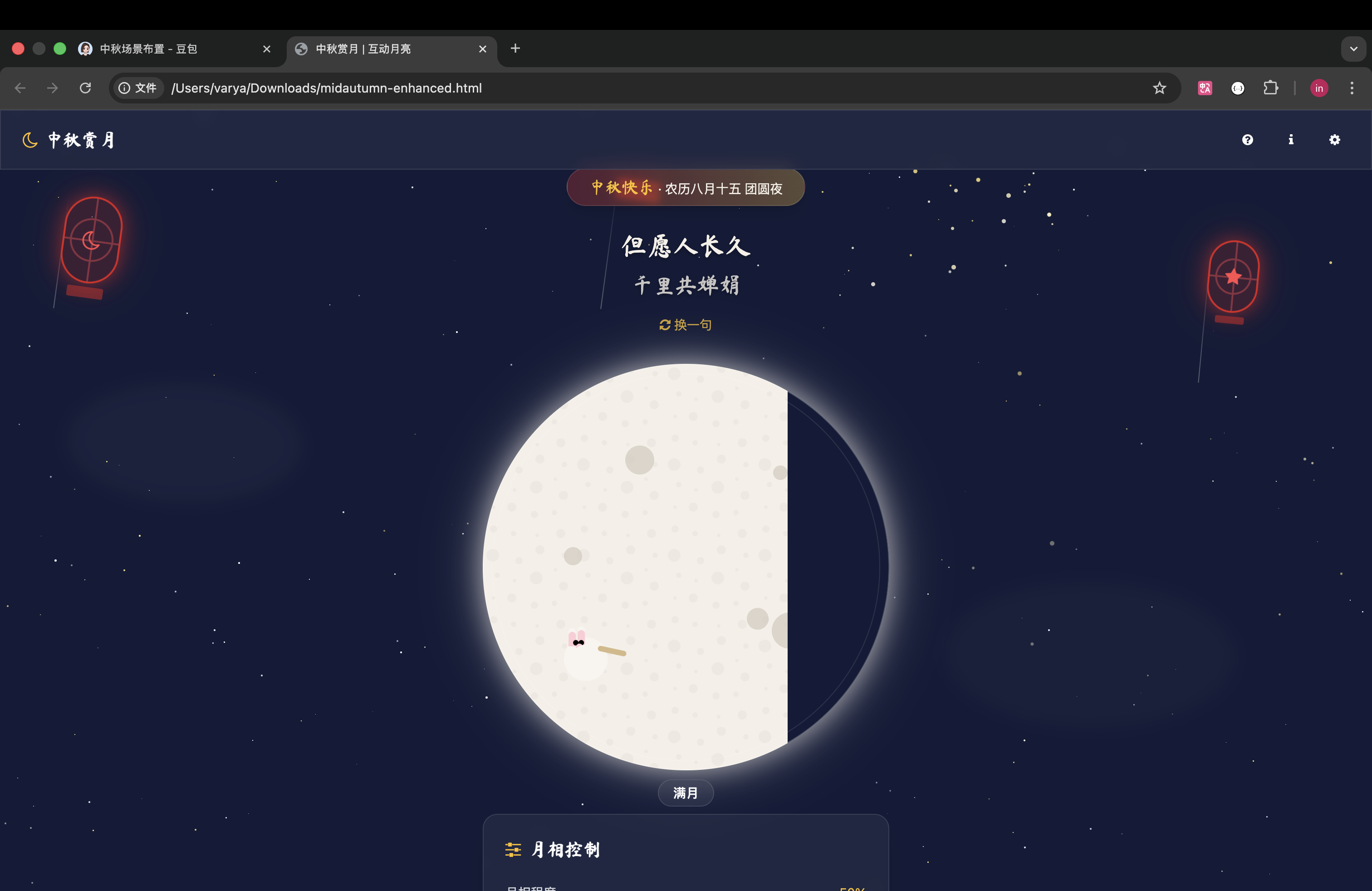
光影效果打造沉浸式体验
页面大量运用了CSS阴影效果模拟自然光影,创造出立体而生动的视觉体验:
css
.moon-glow {
  box-shadow: 0 0 30px rgba(245, 240, 232, 0.6),
              0 0 60px rgba(245, 240, 232, 0.3);
}

.lantern-glow {
  box-shadow: 0 0 20px rgba(217, 33, 33, 0.5),
              0 0 40px rgba(217, 33, 33, 0.3);
}
月光的朦胧、灯笼的暖光通过多层次阴影实现,让平面元素产生了真实的光照感,增强了场景的沉浸感。
动画设计:让中秋元素"活"起来
细腻的微交互动画
页面中的每个元素都有精心设计的动画效果,让整个场景充满生机:
- 星星的闪烁效果(
twinkle动画) - 灯笼的摇摆效果(
swing动画) - 月饼的漂浮效果(
float动画) - 兔子的跳跃效果(
rabbit-hop动画)
这些动画采用CSS关键帧实现,例如灯笼的摇摆效果:
css
@keyframes swing {
  0%, 100% { transform: rotate(-8deg); }
  50% { transform: rotate(8deg); }
}

.lantern {
  animation: swing 8s ease-in-out infinite;
}
每个动画都有不同的延迟时间和周期,形成错落有致的视觉节奏,避免了机械感。
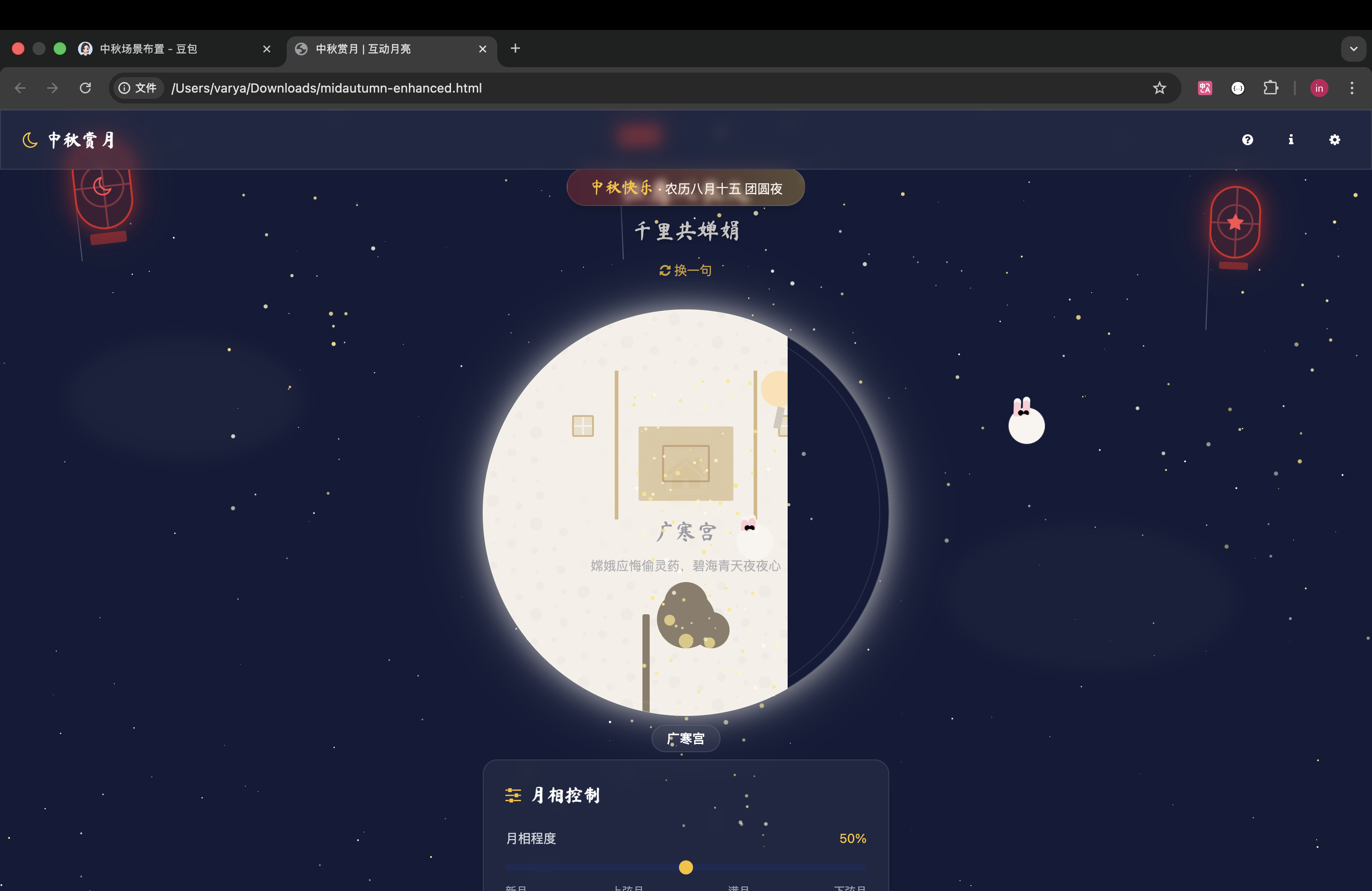
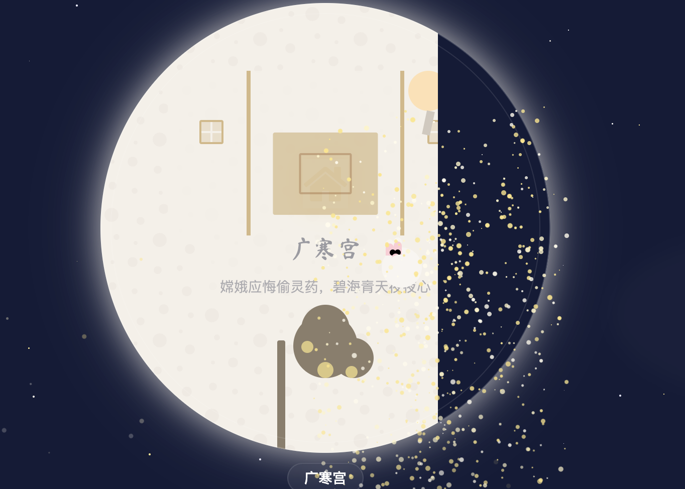
3D翻转效果呈现双重场景
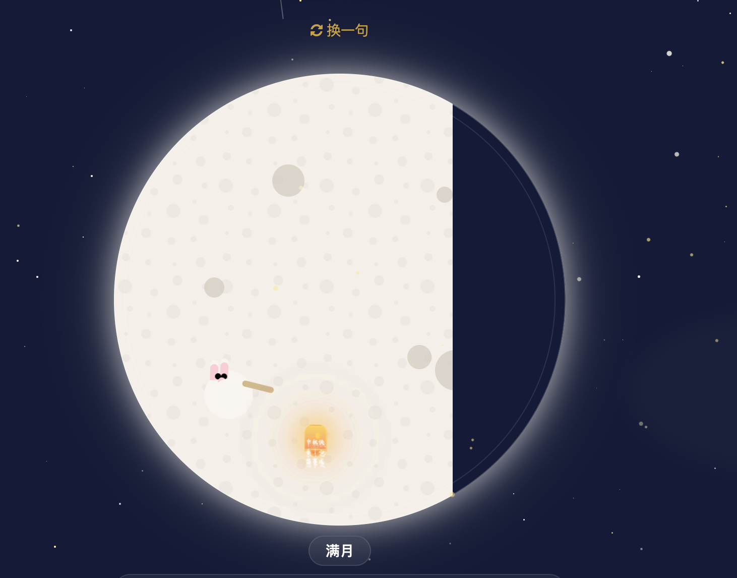
最具特色的设计是月亮的3D翻转效果,通过CSS 3D变换实现从月球表面到广寒宫的场景切换:
css
.preserve-3d {
  transform-style: preserve-3d;
}

.backface-hidden {
  backface-visibility: hidden;
}

.rotate-y-180 {
  transform: rotateY(180deg) !important;
}

.card-face {
  transition: transform 1.2s cubic-bezier(0.34, 1.56, 0.64, 1);
}
这种设计不仅增加了页面的趣味性,更巧妙地融入了"嫦娥奔月"的神话故事,让用户在交互中感受传统文化。
交互体验:让用户参与中秋故事
可交互的节日元素
页面实现了多种互动方式,让用户不再是被动观赏:
- 拖拽灯笼:通过JavaScript实现了灯笼的拖拽功能,增强参与感
- 点击月饼:触发粒子效果,模拟月饼碎裂的视觉体验
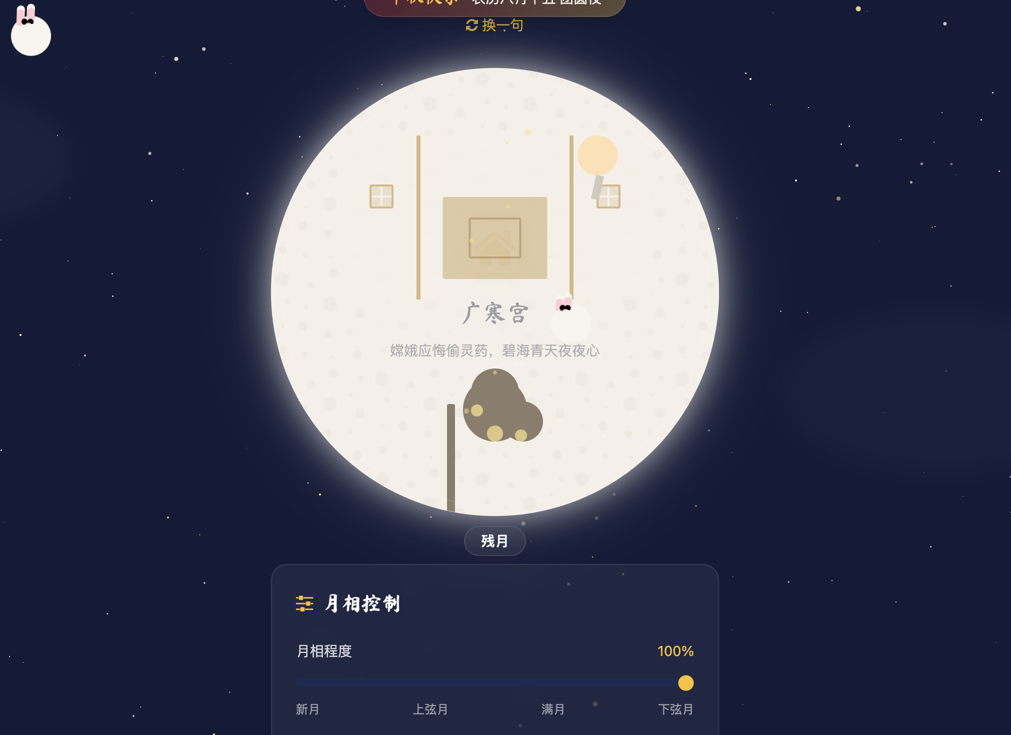
- 月相控制:通过滑块调节月相变化,直观展示月亮的圆缺规律
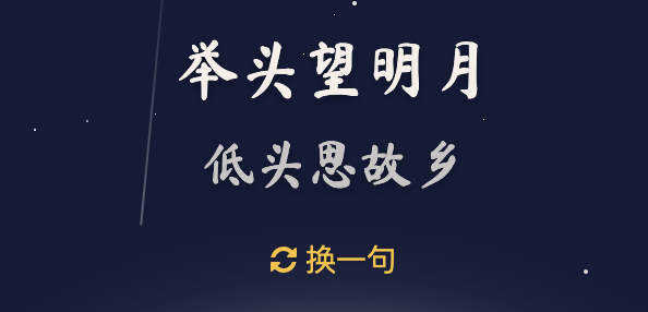
- 诗句切换:点击按钮更换中秋诗句,增添文化氛围
以灯笼拖拽为例,核心实现逻辑:
javascript
// 简化版拖拽逻辑
document.querySelectorAll('.lantern').forEach(lantern => {
  let isDragging = false;
  let offsetX, offsetY;

  lantern.addEventListener('mousedown', (e) => {
    isDragging = true;
    // 计算偏移量...
  });

  document.addEventListener('mousemove', (e) => {
    if (isDragging) {
      // 更新位置...
    }
  });

  document.addEventListener('mouseup', () => {
    isDragging = false;
  });
});
响应式设计适配多设备
页面采用移动优先的响应式设计,在不同尺寸的设备上都能呈现良好效果:
html
<!-- 只在中等屏幕以上显示的元素 -->
<div class="hidden md:block">...</div>
<!-- 使用clamp实现字体自适应 -->
<p class="text-[clamp(1.2rem,5vw,1.8rem)]">...</p>
从手机到桌面设备,用户都能获得一致且优化的体验,无论是单手操作还是鼠标交互,都设计了对应的交互方式。
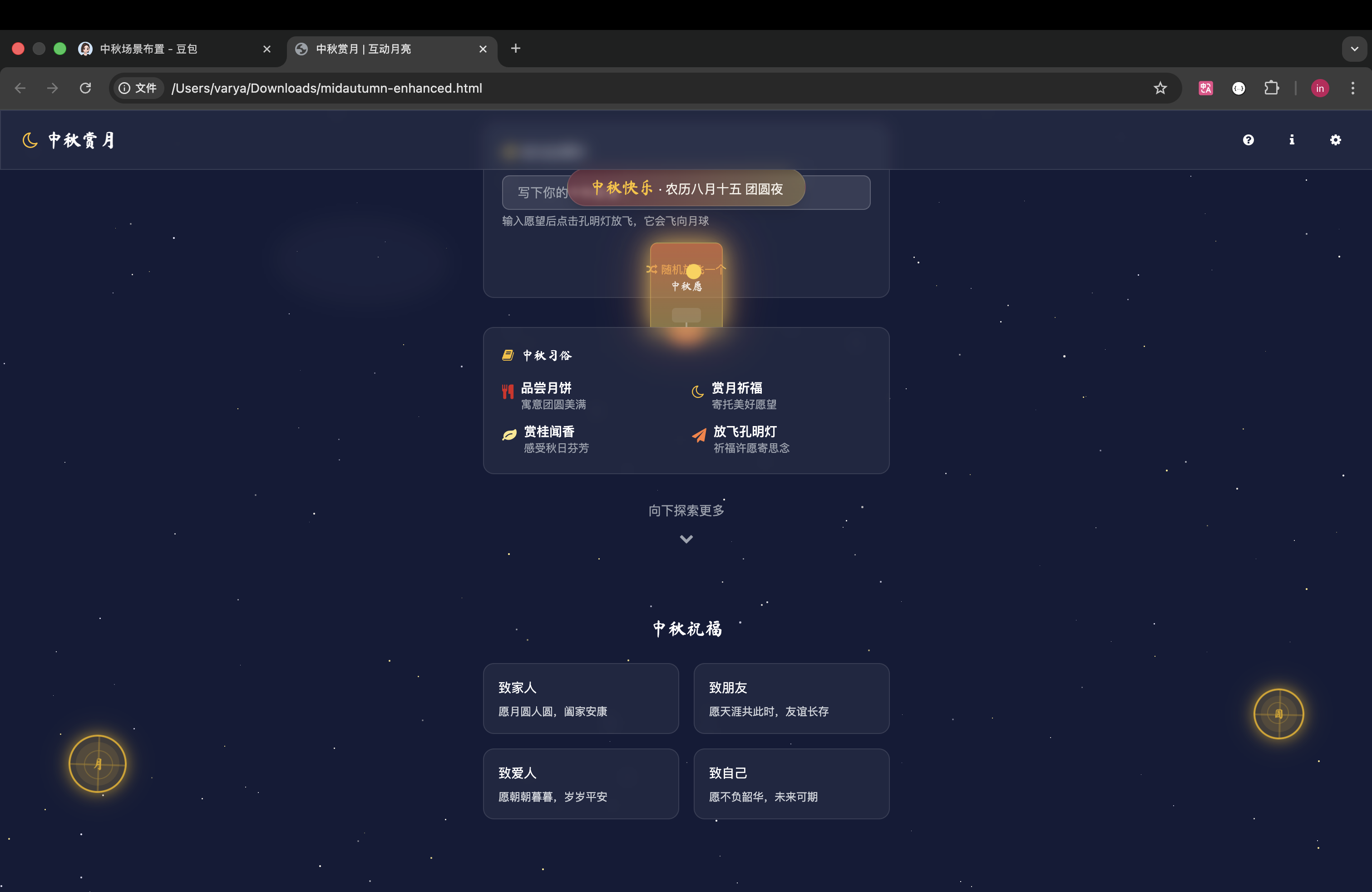
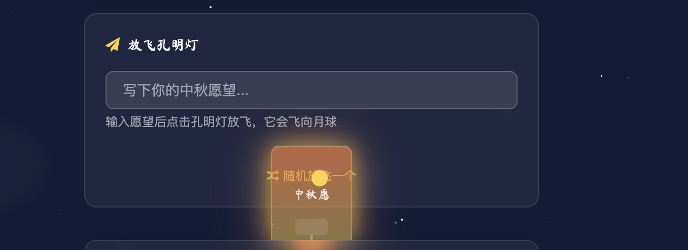
孔明灯:让祝福随光影升空
孔明灯作为中秋夜寄托思念与祝福的传统元素,在页面中被打造成极具互动性的核心模块。这个模块不仅视觉上仙气飘飘,更通过技术实现了"书写祝福-放飞心愿"的完整仪式感,成为连接传统习俗与现代交互的点睛之笔。
动态轨迹与物理感飞行
孔明灯的飞行轨迹并非简单的直线上升,而是通过CSS变量与JavaScript结合,实现了模拟真实气流的随机曲线运动:
css
@keyframes kongming-fly {
  0% { transform: translate(0, 0) scale(1); opacity: 1; }
  100% { transform: translate(var(--tx), var(--ty)) scale(0.1); opacity: 0.8; }
}

@keyframes kongming-sway {
  0%, 100% { transform: translateX(-5px) rotate(-1deg); }
  50% { transform: translateX(5px) rotate(1deg); }
}JavaScript动态计算飞行终点坐标,通过设置--tx(水平位移)和--ty(垂直位移)变量,让每个孔明灯都拥有独一无二的飞行路径:
javascript
// 孔明灯飞行轨迹计算
function launchKongmingLantern(lantern) {
  // 随机生成水平偏移(-30% 到 30% 视窗宽度)
  const tx = (Math.random() * 60 - 30) + 'vw';
  // 垂直方向飞出视窗顶部
  const ty = '-150vh';

  lantern.style.setProperty('--tx', tx);
  lantern.style.setProperty('--ty', ty);
  lantern.style.animation = 'kongming-fly 15s linear forwards';

  // 移除DOM防止性能损耗
  setTimeout(() => lantern.remove(), 15000);
}
这种实现既保证了视觉上的自然随机感,又通过CSS变量实现了样式与逻辑的解耦。
拖拽交互与放飞仪式
孔明灯模块将拖拽交互与"放飞"动作结合,创造了完整的情感体验闭环:
- 拖拽准备 :用户可随意拖动孔明灯调整初始位置,拖拽时保持微妙的摇摆动画(
kongming-sway),模拟未放飞时的状态 - 输入祝福:关联的输入框允许用户书写中秋祝福,输入内容会实时关联到当前孔明灯
- 松手放飞:释放鼠标/触摸时触发飞行动画,祝福语随灯升空逐渐变小消失
核心交互逻辑:
javascript
// 孔明灯拖拽实现
lanterns.forEach(lantern => {
  let isDragging = false;
  let startX, startY, initialX, initialY;

  lantern.addEventListener('mousedown', startDrag);
  lantern.addEventListener('touchstart', startDrag, { passive: true });

  function startDrag(e) {
    isDragging = true;
    // 记录初始位置和触摸点
    initialX = lantern.offsetLeft;
    initialY = lantern.offsetTop;
    startX = e.type.includes('mouse') ? e.clientX : e.touches[0].clientX;
    startY = e.type.includes('mouse') ? e.clientY : e.touches[0].clientY;

    // 拖拽时暂停飞行动画,保持摇摆
    lantern.style.animation = 'kongming-sway 3s infinite ease-in-out';
  }

  // 鼠标/触摸移动时更新位置
  document.addEventListener('mousemove', drag);
  document.addEventListener('touchmove', drag, { passive: true });

  function drag(e) {
    if (isDragging) {
      e.preventDefault();
      const dx = (e.type.includes('mouse') ? e.clientX : e.touches[0].clientX) - startX;
      const dy = (e.type.includes('mouse') ? e.clientY : e.touches[0].clientY) - startY;
      lantern.style.left = `${initialX + dx}px`;
      lantern.style.top = `${initialY + dy}px`;
    }
  }

  // 松手时放飞
  document.addEventListener('mouseup', endDrag);
  document.addEventListener('touchend', endDrag);

  function endDrag() {
    if (isDragging) {
      isDragging = false;
      // 获取输入的祝福内容并显示
      const wish = document.getElementById('wish-input').value || '中秋快乐';
      showWishText(lantern, wish);
      // 触发放飞动画
      launchKongmingLantern(lantern);
    }
  }
});
光影渐变与视觉层次
孔明灯的视觉效果通过多层光影叠加实现温暖而梦幻的质感:
css
.kongming-glow {
  box-shadow: 0 0 25px rgba(255, 208, 70, 0.7),
              0 0 50px rgba(255, 125, 59, 0.5);
}

.kongming-lantern {
  background: linear-gradient(
    to bottom,
    rgba(255, 208, 70, 0.2),
    rgba(255, 125, 59, 0.3)
  );
  border: 1px solid rgba(255, 208, 70, 0.4);
}
橙黄色的渐变与光影随飞行高度逐渐减弱,模拟真实光源在夜空中远去的效果,同时祝福语文本采用半透明处理,与灯笼光影融合,形成层次丰富的视觉体验。
文化寓意的技术承载
孔明灯模块最动人之处在于对传统习俗的数字化转译:
- 保留"书写祝福-放飞祈福"的核心仪式感,通过输入框与放飞动作的绑定,让数字交互拥有实体仪式的情感重量
- 飞行轨迹的随机性隐喻"心愿随风"的传统意象,技术实现强化了文化符号的表达
- 多盏孔明灯同时升空时,不同轨迹与速度形成的视觉韵律,重现了中秋夜众人共放孔明灯的热闹场景
这个模块证明了前端技术不仅能还原传统,更能通过交互设计让传统文化以更具参与感的方式被年轻用户感知和传承。
文化元素:技术承载传统
页面不仅是技术的展示,更是传统文化的载体:
- 书法字体:引入"Ma Shan Zheng"等书法字体,呈现中秋诗句的美感
- 神话元素:通过广寒宫、嫦娥、玉兔等形象再现中秋神话
- 传统符号:灯笼、月饼、桂花等元素传递节日氛围
- 灯谜功能:集成猜灯谜互动,延续传统习俗
这些元素通过现代技术得以重现和创新,让年轻用户更易接受和喜爱传统文化。
总结:技术与文化的融合之道
这个中秋互动页面展示了前端技术如何成为文化传播的载体。通过精心的视觉设计、细腻的动画效果和丰富的交互体验,不仅展现了现代前端技术的魅力,更让传统节日文化以新的形式焕发生机。
在开发过程中,我们始终思考:如何让技术服务于内容?如何让交互增强情感连接?最终的成果证明,当技术与文化深度融合时,能够创造出既具现代感又有温度的用户体验。
这个中秋,不妨打开这个页面,在互动中感受传统节日的新表达,让技术为团圆时刻增添一份特别的乐趣。
完整代码如下:
html
<!DOCTYPE html>
<html lang="zh-CN">
<head>
<meta charset="UTF-8">
<meta name="viewport" content="width=device-width, initial-scale=1.0">
<title>中秋赏月 | 互动月亮</title>
<script src="https://cdn.tailwindcss.com"></script>
<link href="https://cdn.jsdelivr.net/npm/font-awesome@4.7.0/css/font-awesome.min.css" rel="stylesheet">
<script>
// 配置Tailwind自定义颜色和字体
tailwind.config = {
theme: {
extend: {
colors: {
'night-sky': '#141b38',
'night-light': '#1e2952',
'moon-glow': '#f5f0e8',
'lantern-red': '#d92121',
'lantern-red-light': '#ff4d4f',
'mooncake-yellow': '#fbbf24',
'mooncake-gold': '#d9a404',
'osmanthus': '#fde68a',
'kongming-orange': '#ff7d3b',
'kongming-yellow': '#ffd046',
'rabbit-white': '#f8f5f0',
'rabbit-pink': '#ffccd5',
},
fontFamily: {
'sans': ['-apple-system', 'BlinkMacSystemFont', 'Segoe UI', 'Roboto', 'sans-serif'],
'chinese': ['"Ma Shan Zheng"', '"Noto Serif SC"', 'serif'],
},
}
}
}
</script>
<link href="https://fonts.googleapis.com/css2?family=Ma+Shan+Zheng&family=Noto+Serif+SC:wght@400;700&display=swap" rel="stylesheet">
<style type="text/tailwindcss">
@layer utilities {
.content-auto {
content-visibility: auto;
}
.text-shadow {
text-shadow: 0 2px 4px rgba(0, 0, 0, 0.3);
}
.moon-glow {
box-shadow: 0 0 30px rgba(245, 240, 232, 0.6),
0 0 60px rgba(245, 240, 232, 0.3);
}
.lantern-glow {
box-shadow: 0 0 20px rgba(217, 33, 33, 0.5),
0 0 40px rgba(217, 33, 33, 0.3);
}
.gold-glow {
box-shadow: 0 0 15px rgba(217, 164, 4, 0.6),
0 0 30px rgba(217, 164, 4, 0.3);
}
.kongming-glow {
box-shadow: 0 0 25px rgba(255, 208, 70, 0.7),
0 0 50px rgba(255, 125, 59, 0.5);
}
.paper-effect {
backdrop-filter: blur(8px);
background: rgba(255, 255, 255, 0.05);
border: 1px solid rgba(255, 255, 255, 0.1);
}
.star {
position: absolute;
background-color: white;
border-radius: 50%;
animation: twinkle 2s infinite alternate;
}
.cloud {
position: absolute;
background: rgba(255, 255, 255, 0.1);
border-radius: 50%;
filter: blur(10px);
animation: float 30s infinite ease-in-out;
}
.lantern {
position: absolute;
transform-origin: top center;
animation: swing 8s ease-in-out infinite;
cursor: grab;
}
.lantern:active {
cursor: grabbing;
}
.mooncake {
position: absolute;
animation: float 6s ease-in-out infinite;
}
.particle {
position: absolute;
pointer-events: none;
z-index: 20;
}
.osmanthus {
position: absolute;
pointer-events: none;
z-index: 20;
animation: osmanthus-fall 15s linear forwards;
}
.ripple {
position: absolute;
border-radius: 50%;
transform: scale(0);
animation: ripple 1.5s linear forwards;
background-color: rgba(245, 240, 232, 0.3);
pointer-events: none;
z-index: 15;
}
.rabbit {
position: absolute;
transition: transform 0.5s ease-out;
}
.poem-line {
transition: opacity 1s ease-in-out, transform 1s ease-in-out;
}
.transform-grab {
transition: transform 0.2s ease-out;
}
.lantern-string {
position: absolute;
width: 1px;
background: linear-gradient(to bottom, transparent, rgba(255,255,255,0.3));
transform-origin: top center;
}
.lantern-drag {
transition: transform 0.1s ease-out;
}
.scroll-indicator {
animation: bounce 2s infinite;
}
.灯谜-item {
transition: all 0.3s ease;
}
.灯谜-item:hover {
transform: translateX(5px);
}
.灯谜-answer {
max-height: 0;
overflow: hidden;
transition: max-height 0.5s ease;
}
.灯谜-answer.show {
max-height: 100px;
}
.rotate-y-180 {
transform: rotateY(180deg) !important;
}
.preserve-3d {
transform-style: preserve-3d;
}
.backface-hidden {
backface-visibility: hidden;
}
.perspective-1000 {
perspective: 1000px;
}
.card-face {
position: absolute;
width: 100%;
height: 100%;
transition: transform 1.2s cubic-bezier(0.34, 1.56, 0.64, 1);
}
.gyro-move {
transition: transform 0.1s ease-out;
}
.calligraphy {
font-family: 'Ma Shan Zheng', cursive;
}
.kongming-lantern {
position: absolute;
transform-origin: center bottom;
z-index: 15;
cursor: grab;
}
.kongming-lantern:active {
cursor: grabbing;
}
.wish-input {
background: rgba(255, 255, 255, 0.1);
border: 1px solid rgba(255, 255, 255, 0.2);
color: white;
transition: all 0.3s ease;
}
.wish-input:focus {
background: rgba(255, 255, 255, 0.15);
border-color: rgba(255, 208, 70, 0.5);
outline: none;
}
.rabbit-ear {
transition: transform 0.3s ease;
}
.rabbit:hover .rabbit-ear {
transform: rotate(5deg) translateY(-2px);
}
.palace-roof {
position: relative;
background: linear-gradient(135deg, #d92121 50%, transparent 50%) -10px 0,
linear-gradient(225deg, #d92121 50%, transparent 50%) 10px 0,
linear-gradient(315deg, #d92121 50%, transparent 50%),
linear-gradient(45deg, #d92121 50%, transparent 50%);
background-size: 20px 20px;
}
@keyframes twinkle {
from { opacity: 0.5; transform: scale(0.8); }
to { opacity: 1; transform: scale(1); }
}
@keyframes float {
0%, 100% { transform: translateY(0) rotate(0deg); }
50% { transform: translateY(-15px) rotate(2deg); }
}
@keyframes swing {
0%, 100% { transform: rotate(-8deg); }
50% { transform: rotate(8deg); }
}
@keyframes pulse {
0%, 100% { transform: scale(1); }
50% { transform: scale(1.05); }
}
@keyframes orbit {
from { transform: rotate(0deg); }
to { transform: rotate(360deg); }
}
@keyframes osmanthus-fall {
0% { transform: translateY(-10px) rotate(0deg); opacity: 1; }
100% { transform: translateY(100vh) rotate(720deg); opacity: 0; }
}
@keyframes kongming-fly {
0% { transform: translate(0, 0) scale(1); opacity: 1; }
100% { transform: translate(var(--tx), var(--ty)) scale(0.1); opacity: 0.8; }
}
@keyframes kongming-sway {
0%, 100% { transform: translateX(-5px) rotate(-1deg); }
50% { transform: translateX(5px) rotate(1deg); }
}
@keyframes fade-in {
from { opacity: 0; transform: translateY(10px); }
to { opacity: 1; transform: translateY(0); }
}
@keyframes ripple {
to {
transform: scale(4);
opacity: 0;
}
}
@keyframes bounce {
0%, 20%, 50%, 80%, 100% { transform: translateY(0); }
40% { transform: translateY(-10px); }
60% { transform: translateY(-5px); }
}
@keyframes rabbit-hop {
0%, 100% { transform: translateY(0) rotate(0deg); }
50% { transform: translateY(-8px) rotate(2deg); }
}
.fade-in {
animation: fade-in 0.8s ease-out forwards;
}
.moon-surface {
background-image: url("data:image/svg+xml,%3Csvg width='100' height='100' viewBox='0 0 100 100' xmlns='http://www.w3.org/2000/svg'%3E%3Cpath d='M11 18c3.866 0 7-3.134 7-7s-3.134-7-7-7-7 3.134-7 7 3.134 7 7 7zm48 25c3.866 0 7-3.134 7-7s-3.134-7-7-7-7 3.134-7 7 3.134 7 7 7zm-43-7c1.657 0 3-1.343 3-3s-1.343-3-3-3-3 1.343-3 3 1.343 3 3 3zm63 31c1.657 0 3-1.343 3-3s-1.343-3-3-3-3 1.343-3 3 1.343 3 3 3zM34 90c1.657 0 3-1.343 3-3s-1.343-3-3-3-3 1.343-3 3 1.343 3 3 3zm56-76c1.657 0 3-1.343 3-3s-1.343-3-3-3-3 1.343-3 3 1.343 3 3 3zM12 86c2.21 0 4-1.79 4-4s-1.79-4-4-4-4 1.79-4 4 1.79 4 4 4zm28-65c2.21 0 4-1.79 4-4s-1.79-4-4-4-4 1.79-4 4 1.79 4 4 4zm23-11c2.76 0 5-2.24 5-5s-2.24-5-5-5-5 2.24-5 5 2.24 5 5 5zm-6 60c2.21 0 4-1.79 4-4s-1.79-4-4-4-4 1.79-4 4 1.79 4 4 4zm29 22c2.76 0 5-2.24 5-5s-2.24-5-5-5-5 2.24-5 5 2.24 5 5 5zM32 63c2.76 0 5-2.24 5-5s-2.24-5-5-5-5 2.24-5 5 2.24 5 5 5zm57-13c2.76 0 5-2.24 5-5s-2.24-5-5-5-5 2.24-5 5 2.24 5 5 5zm-9-21c1.105 0 2-.895 2-2s-.895-2-2-2-2 .895-2 2 .895 2 2 2zM60 91c1.105 0 2-.895 2-2s-.895-2-2-2-2 .895-2 2 .895 2 2 2zM35 41c1.105 0 2-.895 2-2s-.895-2-2-2-2 .895-2 2 .895 2 2 2zM12 60c1.105 0 2-.895 2-2s-.895-2-2-2-2 .895-2 2 .895 2 2 2z' fill='%23d1c9be' fill-opacity='0.2' fill-rule='evenodd'/%3E%3C/svg%3E");
}
}
</style>
</head>
<body class="bg-night-sky text-white min-h-screen overflow-x-hidden relative">
<!-- 中秋祝福横幅 -->
<div class="fixed top-16 left-0 right-0 z-40 text-center pointer-events-none">
<div class="inline-block bg-gradient-to-r from-lantern-red/30 to-mooncake-yellow/30 px-6 py-1.5 rounded-full text-sm backdrop-blur-sm border border-white/10 shadow-lg">
<span class="calligraphy text-mooncake-yellow text-lg">中秋快乐</span> · <span class="text-moon-glow">农历八月十五 团圆夜</span>
</div>
</div>
<!-- 星空背景 -->
<div id="stars" class="fixed inset-0 z-0"></div>
<!-- 云朵装饰 -->
<div class="cloud w-64 h-32 top-[15%] left-[5%] opacity-30" style="animation-delay: 0s;"></div>
<div class="cloud w-80 h-40 top-[25%] right-[10%] opacity-20" style="animation-delay: 5s;"></div>
<div class="cloud w-48 h-24 bottom-[30%] left-[20%] opacity-25" style="animation-delay: 2s;"></div>
<!-- 移动的小兔子 -->
<div id="floating-rabbit" class="rabbit hidden md:block animate-[rabbit-hop_3s_infinite_ease-in-out]">
<!-- 更可爱的月兔设计 -->
<div class="w-12 h-10 relative">
<!-- 兔子头部 -->
<div class="absolute w-10 h-10 rounded-full bg-rabbit-white"></div>
<!-- 兔子耳朵 -->
<div class="rabbit-ear absolute top-[-10px] left-[5px] w-2 h-8 bg-rabbit-white rounded-t-full">
<div class="absolute top-1 w-2 h-4 bg-rabbit-pink rounded-t-full"></div>
</div>
<div class="rabbit-ear absolute top-[-12px] left-[15px] w-2 h-10 bg-rabbit-white rounded-t-full">
<div class="absolute top-1 w-2 h-5 bg-rabbit-pink rounded-t-full"></div>
</div>
<!-- 兔子眼睛 -->
<div class="absolute top-[3px] left-[10px] w-1.5 h-1.5 bg-black rounded-full"></div>
<div class="absolute top-[3px] left-[16px] w-1.5 h-1.5 bg-black rounded-full"></div>
<!-- 兔子鼻子 -->
<div class="absolute top-[7px] left-[13px] w-2 h-2 bg-rabbit-pink rounded-full"></div>
<!-- 兔子嘴巴 -->
<div class="absolute top-[9px] left-[13px] w-0 h-0 border-l-2px border-r-2px border-b-2px border-transparent border-b-black/30"></div>
<!-- 兔子身体 -->
<div class="absolute top-[8px] left-[8px] w-8 h-6 bg-rabbit-white rounded-full"></div>
<!-- 兔子腿 -->
<div class="absolute top-[12px] left-[10px] w-2 h-3 bg-rabbit-white rounded-full"></div>
<div class="absolute top-[12px] left-[16px] w-2 h-3 bg-rabbit-white rounded-full"></div>
<!-- 兔子尾巴 -->
<div class="absolute top-[8px] left-[20px] w-3 h-3 bg-rabbit-white rounded-full"></div>
</div>
</div>
<!-- 中秋装饰:传统灯笼(可拖拽) -->
<div class="lantern top-24 left-[5%] z-10 hidden md:block" style="animation-delay: 0s;" data-id="lantern1">
<div class="lantern-string h-32 mx-auto"></div>
<div class="lantern-drag w-16 h-24 rounded-full border-2 border-lantern-red bg-lantern-red/20 relative overflow-hidden lantern-glow">
<div class="absolute inset-0 flex items-center justify-center">
<div class="text-2xl text-lantern-red-light">
<i class="fa fa-moon-o"></i>
</div>
</div>
<!-- 灯笼上的传统花纹 -->
<div class="absolute inset-0 opacity-40">
<div class="h-full w-full flex items-center justify-center">
<div class="w-12 h-12 border-2 border-lantern-red-light rounded-full"></div>
</div>
<div class="absolute top-1/2 left-0 right-0 h-0.5 bg-lantern-red-light"></div>
<div class="absolute top-0 bottom-0 left-1/2 w-0.5 bg-lantern-red-light"></div>
</div>
</div>
<div class="mt-1 text-center">
<div class="w-10 h-3 bg-lantern-red/50 mx-auto rounded-sm"></div>
</div>
</div>
<div class="lantern top-36 right-[8%] z-10 hidden md:block" style="animation-delay: 1.5s;" data-id="lantern2">
<div class="lantern-string h-40 mx-auto"></div>
<div class="lantern-drag w-14 h-20 rounded-full border-2 border-lantern-red bg-lantern-red/20 relative overflow-hidden lantern-glow">
<div class="absolute inset-0 flex items-center justify-center">
<div class="text-xl text-lantern-red-light">
<i class="fa fa-star"></i>
</div>
</div>
<!-- 灯笼上的传统花纹 -->
<div class="absolute inset-0 opacity-40">
<div class="h-full w-full flex items-center justify-center">
<div class="w-10 h-10 border-2 border-lantern-red-light rounded-full"></div>
</div>
<div class="absolute top-1/2 left-0 right-0 h-0.5 bg-lantern-red-light"></div>
<div class="absolute top-0 bottom-0 left-1/2 w-0.5 bg-lantern-red-light"></div>
</div>
</div>
<div class="mt-1 text-center">
<div class="w-8 h-2 bg-lantern-red/50 mx-auto rounded-sm"></div>
</div>
</div>
<!-- 中间灯笼 -->
<div class="lantern top-20 left-[45%] z-10 hidden lg:block" style="animation-delay: 0.8s;" data-id="lantern3">
<div class="lantern-string h-36 mx-auto"></div>
<div class="lantern-drag w-18 h-26 rounded-full border-2 border-lantern-red bg-lantern-red/20 relative overflow-hidden lantern-glow">
<div class="absolute inset-0 flex items-center justify-center">
<div class="text-2xl text-lantern-red-light calligraphy">福</div>
</div>
<!-- 灯笼上的传统花纹 -->
<div class="absolute inset-0 opacity-40">
<div class="h-full w-full flex items-center justify-center">
<div class="w-14 h-14 border-2 border-lantern-red-light rounded-full"></div>
</div>
<div class="absolute top-1/2 left-0 right-0 h-0.5 bg-lantern-red-light"></div>
<div class="absolute top-0 bottom-0 left-1/2 w-0.5 bg-lantern-red-light"></div>
</div>
</div>
<div class="mt-1 text-center">
<div class="w-12 h-3 bg-lantern-red/50 mx-auto rounded-sm"></div>
</div>
</div>
<!-- 月饼装饰 -->
<div class="mooncake bottom-24 left-[5%] z-10 hidden lg:block" style="animation-delay: 0.5s;">
<div class="w-16 h-16 rounded-full bg-mooncake-yellow/20 border-2 border-mooncake-gold relative overflow-hidden gold-glow cursor-pointer" onclick="createMooncakeParticles(event)">
<div class="absolute inset-0 flex items-center justify-center">
<div class="w-12 h-12 rounded-full bg-mooncake-yellow/10 flex items-center justify-center">
<span class="text-mooncake-gold calligraphy text-sm">月</span>
</div>
</div>
<!-- 月饼花纹 -->
<div class="absolute inset-0 opacity-60">
<div class="absolute top-1/2 left-0 right-0 h-0.5 bg-mooncake-gold/50"></div>
<div class="absolute top-0 bottom-0 left-1/2 w-0.5 bg-mooncake-gold/50"></div>
<div class="absolute top-1/4 left-1/4 w-8 h-8 border border-mooncake-gold/50 rounded-full"></div>
</div>
</div>
</div>
<div class="mooncake bottom-40 right-[5%] z-10 hidden lg:block" style="animation-delay: 1.2s;">
<div class="w-14 h-14 rounded-full bg-mooncake-yellow/20 border-2 border-mooncake-gold relative overflow-hidden gold-glow cursor-pointer" onclick="createMooncakeParticles(event)">
<div class="absolute inset-0 flex items-center justify-center">
<div class="w-10 h-10 rounded-full bg-mooncake-yellow/10 flex items-center justify-center">
<span class="text-mooncake-gold calligraphy text-xs">圆</span>
</div>
</div>
<!-- 月饼花纹 -->
<div class="absolute inset-0 opacity-60">
<div class="absolute top-1/2 left-0 right-0 h-0.5 bg-mooncake-gold/50"></div>
<div class="absolute top-0 bottom-0 left-1/2 w-0.5 bg-mooncake-gold/50"></div>
<div class="absolute top-1/4 left-1/4 w-6 h-6 border border-mooncake-gold/50 rounded-full"></div>
</div>
</div>
</div>
<!-- 顶部导航 -->
<nav class="paper-effect fixed top-0 left-0 right-0 z-50 px-6 py-4 flex justify-between items-center">
<div class="flex items-center gap-2">
<div class="text-mooncake-yellow text-xl">
<i class="fa fa-moon-o"></i>
</div>
<h1 class="font-semibold tracking-tight calligraphy text-xl">中秋赏月</h1>
</div>
<div class="flex items-center gap-4">
<button id="riddle-btn" class="w-8 h-8 rounded-full flex items-center justify-center hover:bg-white/10 transition-colors">
<i class="fa fa-question-circle text-sm"></i>
</button>
<button id="info-btn" class="w-8 h-8 rounded-full flex items-center justify-center hover:bg-white/10 transition-colors">
<i class="fa fa-info text-sm"></i>
</button>
<button id="settings-btn" class="w-8 h-8 rounded-full flex items-center justify-center hover:bg-white/10 transition-colors">
<i class="fa fa-cog text-sm"></i>
</button>
</div>
</nav>
<!-- 主内容区 -->
<main class="relative z-10 pt-32 pb-20 px-6 flex flex-col items-center">
<!-- 中秋诗句(可切换) -->
<div id="poem-container" class="mb-8 text-center max-w-md fade-in" style="animation-delay: 0.3s;">
<p id="poem-line-1" class="calligraphy text-[clamp(1.2rem,5vw,1.8rem)] text-moon-glow text-shadow poem-line">
但愿人长久
</p>
<p id="poem-line-2" class="calligraphy text-[clamp(1rem,4vw,1.5rem)] text-moon-glow/80 mt-1 text-shadow poem-line">
千里共婵娟
</p>
<button id="change-poem" class="mt-4 text-sm text-mooncake-yellow/80 hover:text-mooncake-yellow transition-colors">
<i class="fa fa-refresh mr-1"></i>换一句
</button>
</div>
<!-- 月亮容器 -->
<div class="perspective-1000 w-full max-w-md aspect-square mb-12 relative fade-in" style="animation-delay: 0.5s;" id="moon-wrapper">
<div id="moon-container" class="relative w-full h-full preserve-3d">
<!-- 月亮3D容器 -->
<div id="moon-3d" class="relative w-full h-full preserve-3d transition-transform duration-1200 gyro-move">
<!-- 月球正面 -->
<div class="card-face backface-hidden absolute inset-0 rounded-full bg-moon-glow moon-glow overflow-hidden moon-surface">
<!-- 月球表面特征 -->
<div class="absolute top-[20%] left-[35%] w-8 h-8 bg-[#d1c9be] rounded-full opacity-70 pulse"></div>
<div class="absolute top-[45%] left-[20%] w-5 h-5 bg-[#d1c9be] rounded-full opacity-70 pulse" style="animation-delay: 0.5s"></div>
<div class="absolute bottom-[30%] right-[20%] w-10 h-10 bg-[#d1c9be] rounded-full opacity-70 pulse" style="animation-delay: 1s"></div>
<div class="absolute top-[25%] right-[25%] w-4 h-4 bg-[#d1c9be] rounded-full opacity-70 pulse" style="animation-delay: 1.5s"></div>
<div class="absolute top-[60%] left-[65%] w-6 h-6 bg-[#d1c9be] rounded-full opacity-70 pulse" style="animation-delay: 0.8s"></div>
<!-- 更可爱的月兔 -->
<div class="absolute bottom-[20%] left-[20%] w-16 h-14 animate-[rabbit-hop_3s_infinite_ease-in-out]">
<div class="relative">
<!-- 兔子头部 -->
<div class="absolute w-12 h-12 rounded-full bg-rabbit-white"></div>
<!-- 兔子耳朵 -->
<div class="rabbit-ear absolute top-[-10px] left-[5px] w-2 h-8 bg-rabbit-white rounded-t-full">
<div class="absolute top-1 w-2 h-4 bg-rabbit-pink rounded-t-full"></div>
</div>
<div class="rabbit-ear absolute top-[-12px] left-[15px] w-2 h-10 bg-rabbit-white rounded-t-full">
<div class="absolute top-1 w-2 h-5 bg-rabbit-pink rounded-t-full"></div>
</div>
<!-- 兔子眼睛 -->
<div class="absolute top-[3px] left-[10px] w-1.5 h-1.5 bg-black rounded-full"></div>
<div class="absolute top-[3px] left-[16px] w-1.5 h-1.5 bg-black rounded-full"></div>
<!-- 兔子鼻子 -->
<div class="absolute top-[7px] left-[13px] w-2 h-2 bg-rabbit-pink rounded-full"></div>
<!-- 兔子嘴巴 -->
<div class="absolute top-[9px] left-[13px] w-0 h-0 border-l-2px border-r-2px border-b-2px border-transparent border-b-black/30"></div>
<!-- 兔子身体 -->
<div class="absolute top-[8px] left-[8px] w-10 h-8 bg-rabbit-white rounded-full"></div>
<!-- 兔子腿 -->
<div class="absolute top-[14px] left-[10px] w-2 h-4 bg-rabbit-white rounded-full"></div>
<div class="absolute top-[14px] left-[18px] w-2 h-4 bg-rabbit-white rounded-full"></div>
<!-- 兔子尾巴 -->
<div class="absolute top-[8px] left-[24px] w-4 h-4 bg-rabbit-white rounded-full"></div>
<!-- 兔子手中的捣药杵 -->
<div class="absolute top-[12px] right-[-5px] w-8 h-1.5 bg-[#d4b886] rounded-full rotate-12"></div>
</div>
</div>
</div>
<!-- 月球背面 - 增强版广寒宫 -->
<div class="card-face backface-hidden absolute inset-0 rounded-full bg-moon-glow moon-glow rotate-y-180 overflow-hidden">
<div class="absolute inset-0 moon-surface opacity-70"></div>
<div class="absolute inset-0 flex flex-col items-center justify-center p-8">
<!-- 更精美的广寒宫 -->
<div class="absolute top-[15%] left-[15%] right-[15%] bottom-[30%]">
<!-- 宫殿主体 -->
<div class="w-full h-2/3 bg-[#f5f0e8]/80 rounded-t-lg relative overflow-hidden">
<!-- 宫殿屋顶 -->
<div class="palace-roof absolute -top-8 left-0 right-0 h-8"></div>
<!-- 宫殿柱子 -->
<div class="absolute left-1/4 top-0 bottom-0 w-1 bg-[#d4b886]"></div>
<div class="absolute right-1/4 top-0 bottom-0 w-1 bg-[#d4b886]"></div>
<!-- 宫殿门 -->
<div class="absolute left-1/2 top-1/2 -translate-x-1/2 -translate-y-1/4 w-1/3 h-1/2 bg-[#d4b886]/70 rounded-sm flex items-center justify-center">
<div class="w-1/2 h-1/2 border-2 border-[#8b4513]/30 rounded-sm"></div>
</div>
<!-- 宫殿窗户 -->
<div class="absolute left-[10%] top-[30%] w-6 h-6 border-2 border-[#d4b886] rounded-sm flex items-center justify-center">
<div class="w-full h-full grid grid-cols-2 grid-rows-2 gap-0.5">
<div class="bg-[#d4b886]/30"></div>
<div class="bg-[#d4b886]/30"></div>
<div class="bg-[#d4b886]/30"></div>
<div class="bg-[#d4b886]/30"></div>
</div>
</div>
<div class="absolute right-[10%] top-[30%] w-6 h-6 border-2 border-[#d4b886] rounded-sm flex items-center justify-center">
<div class="w-full h-full grid grid-cols-2 grid-rows-2 gap-0.5">
<div class="bg-[#d4b886]/30"></div>
<div class="bg-[#d4b886]/30"></div>
<div class="bg-[#d4b886]/30"></div>
<div class="bg-[#d4b886]/30"></div>
</div>
</div>
</div>
<!-- 宫殿台阶 -->
<div class="w-3/4 h-1/4 mx-auto bg-[#f5f0e8]/60 rounded-b-md"></div>
</div>
<!-- 嫦娥 -->
<div class="absolute top-[15%] right-[20%] w-16 h-24 z-10">
<div class="w-10 h-10 rounded-full bg-[#ffe0b2] mx-auto"></div>
<div class="w-16 h-18 bg-[#fce4ec] rounded-t-full -mt-2"></div>
<div class="absolute top-10 left-1/2 -translate-x-1/2 w-2 h-6 bg-[#d1c9be] rotate-12"></div>
</div>
<!-- 可爱的玉兔 -->
<div class="absolute bottom-[35%] right-[25%] w-14 h-12 animate-[rabbit-hop_3s_infinite_ease-in-out] z-10">
<div class="relative">
<!-- 兔子头部 -->
<div class="absolute w-10 h-10 rounded-full bg-rabbit-white"></div>
<!-- 兔子耳朵 -->
<div class="rabbit-ear absolute top-[-8px] left-[4px] w-2 h-7 bg-rabbit-white rounded-t-full">
<div class="absolute top-1 w-2 h-3 bg-rabbit-pink rounded-t-full"></div>
</div>
<div class="rabbit-ear absolute top-[-10px] left-[12px] w-2 h-9 bg-rabbit-white rounded-t-full">
<div class="absolute top-1 w-2 h-4 bg-rabbit-pink rounded-t-full"></div>
</div>
<!-- 兔子眼睛 -->
<div class="absolute top-[2px] left-[8px] w-1.5 h-1.5 bg-black rounded-full"></div>
<div class="absolute top-[2px] left-[13px] w-1.5 h-1.5 bg-black rounded-full"></div>
<!-- 兔子鼻子 -->
<div class="absolute top-[6px] left-[10px] w-2 h-2 bg-rabbit-pink rounded-full"></div>
<!-- 兔子身体 -->
<div class="absolute top-[7px] left-[6px] w-8 h-6 bg-rabbit-white rounded-full"></div>
<!-- 兔子腿 -->
<div class="absolute top-[12px] left-[8px] w-2 h-3 bg-rabbit-white rounded-full"></div>
<div class="absolute top-[12px] left-[14px] w-2 h-3 bg-rabbit-white rounded-full"></div>
</div>
</div>
<div class="text-5xl mb-6 text-mooncake-gold gold-glow">
<i class="fa fa-home"></i>
</div>
<h3 class="calligraphy text-2xl mb-3 text-night-sky">广寒宫</h3>
<p class="text-night-sky/80 text-sm text-center max-w-xs">
嫦娥应悔偷灵药,碧海青天夜夜心
</p>
<!-- 桂树剪影 -->
<div class="absolute bottom-0 left-0 right-0 h-1/3 flex justify-center">
<div class="w-24 h-full relative">
<div class="absolute bottom-0 w-2 h-3/4 bg-[#8b7d6b] rounded-sm"></div>
<div class="absolute bottom-1/2 left-1/2 -translate-x-1/2 w-16 h-16 bg-[#8b7d6b] rounded-full"></div>
<div class="absolute bottom-2/3 left-1/2 -translate-x-1/2 w-12 h-12 bg-[#8b7d6b] rounded-full"></div>
<div class="absolute bottom-1/2 right-0 w-10 h-10 bg-[#8b7d6b] rounded-full"></div>
<!-- 桂花 -->
<div class="absolute bottom-1/2 left-1/2 -translate-x-1/2 w-4 h-4 bg-osmanthus rounded-full opacity-70"></div>
<div class="absolute bottom-2/3 left-1/4 w-3 h-3 bg-osmanthus rounded-full opacity-70"></div>
<div class="absolute bottom-1/2 right-4 w-3 h-3 bg-osmanthus rounded-full opacity-70"></div>
</div>
</div>
</div>
</div>
</div>
<!-- 月相阴影 -->
<div id="moon-shadow" class="absolute inset-0 rounded-full bg-night-sky transition-all duration-1000 ease-in-out" style="clip-path: polygon(50% 0%, 100% 0%, 100% 100%, 50% 100%);"></div>
<!-- 月相装饰环 -->
<div class="absolute inset-0 rounded-full border border-white/20 pointer-events-none"></div>
<div class="absolute inset-[10px] rounded-full border border-white/10 pointer-events-none"></div>
</div>
<!-- 月相标签 -->
<div id="phase-label" class="absolute -bottom-10 left-1/2 -translate-x-1/2 paper-effect py-1 px-4 rounded-full text-sm font-medium">
上弦月
</div>
</div>
<!-- 控制面板 -->
<div class="w-full max-w-md paper-effect rounded-2xl p-6 shadow-xl fade-in" style="animation-delay: 0.7s;">
<h2 class="text-xl font-semibold mb-6 flex items-center calligraphy">
<i class="fa fa-sliders text-mooncake-yellow mr-2"></i>
月相控制
</h2>
<!-- 月相滑块 -->
<div class="mb-8">
<div class="flex justify-between items-center mb-2">
<label class="text-sm text-gray-300">月相程度</label>
<span id="phase-value" class="text-sm text-mooncake-yellow">50%</span>
</div>
<input type="range" id="moon-phase" min="0" max="100" value="50"
class="w-full h-2 bg-night-light rounded-lg appearance-none cursor-pointer accent-mooncake-yellow">
<div class="flex justify-between mt-2 text-xs text-gray-400">
<span>新月</span>
<span>上弦月</span>
<span>满月</span>
<span>下弦月</span>
</div>
</div>
<!-- 互动控制区 -->
<div class="grid grid-cols-2 gap-4 mb-6">
<button id="reset-btn" class="flex items-center justify-center gap-2 py-3 rounded-xl bg-night-light hover:bg-white/10 transition-colors">
<i class="fa fa-refresh text-gray-400"></i>
<span>重置月相</span>
</button>
<button id="flip-btn" class="flex items-center justify-center gap-2 py-3 rounded-xl bg-gradient-to-r from-lantern-red/20 to-mooncake-yellow/20 hover:from-lantern-red/30 hover:to-mooncake-yellow/30 transition-colors">
<i class="fa fa-exchange text-mooncake-yellow"></i>
<span>探秘广寒宫</span>
</button>
</div>
<!-- 数据显示 -->
<div class="grid grid-cols-2 gap-4">
<div class="bg-night-light rounded-xl p-4">
<p class="text-xs text-gray-400 mb-1">农历日期</p>
<p id="lunar-day" class="text-xl font-semibold">八月初八</p>
</div>
<div class="bg-night-light rounded-xl p-4">
<p class="text-xs text-gray-400 mb-1">月出时间</p>
<p id="moon-rise" class="text-xl font-semibold text-mooncake-yellow">18:30</p>
</div>
</div>
<!-- 中秋特色数据 -->
<div class="grid grid-cols-2 gap-4 mt-4">
<div class="bg-night-light rounded-xl p-4">
<p class="text-xs text-gray-400 mb-1">距中秋还有</p>
<p id="days-to-midautumn" class="text-xl font-semibold text-lantern-red">7天</p>
</div>
<div class="bg-night-light rounded-xl p-4">
<p class="text-xs text-gray-400 mb-1">最佳赏月时间</p>
<p id="best-time" class="text-xl font-semibold text-mooncake-yellow">20:15</p>
</div>
</div>
</div>
<!-- 孔明灯交互区 -->
<div class="mt-8 paper-effect rounded-xl p-5 max-w-md w-full fade-in" style="animation-delay: 0.8s;">
<h3 class="text-sm font-medium mb-4 flex items-center calligraphy text-lg">
<i class="fa fa-paper-plane text-kongming-yellow mr-2"></i>
放飞孔明灯
</h3>
<div class="mb-4">
<input type="text" id="wish-input" placeholder="写下你的中秋愿望..."
class="wish-input w-full px-4 py-2 rounded-lg text-sm">
<p class="text-xs text-gray-400 mt-1">输入愿望后点击孔明灯放飞,它会飞向月球</p>
</div>
<div class="flex justify-center">
<div id="kongming-preview" class="kongming-lantern w-20 h-28 cursor-pointer" onclick="releaseKongmingLantern()">
<!-- 孔明灯结构 -->
<div class="relative w-full h-full">
<!-- 灯罩 -->
<div class="absolute top-0 left-0 right-0 h-24 bg-gradient-to-b from-kongming-orange/70 to-kongming-yellow/50 rounded-t-lg border border-kongming-yellow/30 kongming-glow"></div>
<!-- 灯口 -->
<div class="absolute bottom-0 left-1/2 -translate-x-1/2 w-10 h-4 bg-kongming-orange/80 rounded-b-full border border-kongming-yellow/50"></div>
<!-- 灯内烛光 -->
<div class="absolute top-6 left-1/2 -translate-x-1/2 w-4 h-4 bg-kongming-yellow rounded-full animate-pulse"></div>
<!-- 灯绳 -->
<div class="absolute bottom-0 left-1/2 -translate-x-1/2 w-0.5 h-6 bg-white/30"></div>
<!-- 承载愿望的部分 -->
<div class="absolute bottom-6 left-1/2 -translate-x-1/2 w-8 h-4 bg-white/10 rounded"></div>
<!-- 初始愿望文字 -->
<div class="absolute top-10 left-1/2 -translate-x-1/2 text-center w-full text-xs text-white/80 calligraphy">
中秋愿
</div>
</div>
</div>
</div>
<div class="mt-4 text-center">
<button id="random-lantern" class="text-xs text-kongming-yellow/80 hover:text-kongming-yellow transition-colors">
<i class="fa fa-random mr-1"></i>随机放飞一个
</button>
</div>
</div>
<!-- 中秋习俗 -->
<div class="mt-8 paper-effect rounded-xl p-5 max-w-md w-full fade-in" style="animation-delay: 0.9s;">
<h3 class="text-sm font-medium mb-4 flex items-center calligraphy text-lg">
<i class="fa fa-book text-mooncake-yellow mr-2"></i>
中秋习俗
</h3>
<div class="grid grid-cols-2 gap-3">
<div class="flex items-start gap-2 灯谜-item">
<div class="text-lantern-red mt-0.5"><i class="fa fa-cutlery"></i></div>
<div>
<p class="text-sm font-medium">品尝月饼</p>
<p class="text-xs text-gray-400">寓意团圆美满</p>
</div>
</div>
<div class="flex items-start gap-2 灯谜-item">
<div class="text-mooncake-yellow mt-0.5"><i class="fa fa-moon-o"></i></div>
<div>
<p class="text-sm font-medium">赏月祈福</p>
<p class="text-xs text-gray-400">寄托美好愿望</p>
</div>
</div>
<div class="flex items-start gap-2 灯谜-item">
<div class="text-osmanthus mt-0.5"><i class="fa fa-leaf"></i></div>
<div>
<p class="text-sm font-medium">赏桂闻香</p>
<p class="text-xs text-gray-400">感受秋日芬芳</p>
</div>
</div>
<div class="flex items-start gap-2 灯谜-item">
<div class="text-kongming-orange mt-0.5"><i class="fa fa-paper-plane"></i></div>
<div>
<p class="text-sm font-medium">放飞孔明灯</p>
<p class="text-xs text-gray-400">祈福许愿寄思念</p>
</div>
</div>
</div>
</div>
<!-- 向下滚动提示 -->
<div class="mt-10 text-center scroll-indicator hidden md:block">
<p class="text-sm text-gray-400 mb-2">向下探索更多</p>
<i class="fa fa-chevron-down text-gray-400"></i>
</div>
<!-- 中秋祝福卡片区 -->
<div class="mt-16 w-full max-w-md fade-in" style="animation-delay: 1.1s;">
<h3 class="text-center calligraphy text-xl mb-6">中秋祝福</h3>
<div class="grid grid-cols-1 md:grid-cols-2 gap-4">
<div class="paper-effect rounded-xl p-4 hover:bg-white/5 transition-colors cursor-pointer transform-grab" onclick="showToast('已发送中秋祝福')">
<p class="text-sm mb-2">致家人</p>
<p class="text-xs text-gray-300">愿月圆人圆,阖家安康</p>
</div>
<div class="paper-effect rounded-xl p-4 hover:bg-white/5 transition-colors cursor-pointer transform-grab" onclick="showToast('已发送中秋祝福')">
<p class="text-sm mb-2">致朋友</p>
<p class="text-xs text-gray-300">愿天涯共此时,友谊长存</p>
</div>
<div class="paper-effect rounded-xl p-4 hover:bg-white/5 transition-colors cursor-pointer transform-grab" onclick="showToast('已发送中秋祝福')">
<p class="text-sm mb-2">致爱人</p>
<p class="text-xs text-gray-300">愿朝朝暮暮,岁岁平安</p>
</div>
<div class="paper-effect rounded-xl p-4 hover:bg-white/5 transition-colors cursor-pointer transform-grab" onclick="showToast('已发送中秋祝福')">
<p class="text-sm mb-2">致自己</p>
<p class="text-xs text-gray-300">愿不负韶华,未来可期</p>
</div>
</div>
</div>
</main>
<!-- 信息模态框 -->
<div id="info-modal" class="fixed inset-0 z-50 flex items-center justify-center p-6 opacity-0 pointer-events-none transition-opacity duration-300">
<div class="absolute inset-0 bg-black/70 backdrop-blur-sm" id="modal-backdrop"></div>
<div class="relative paper-effect rounded-2xl p-6 max-w-md w-full transform scale-95 transition-transform duration-300 shadow-2xl">
<button id="close-info" class="absolute top-4 right-4 w-8 h-8 rounded-full flex items-center justify-center hover:bg-white/10 transition-colors">
<i class="fa fa-times text-sm"></i>
</button>
<h3 class="text-xl font-semibold mb-4 calligraphy text-mooncake-yellow">中秋赏月</h3>
<p class="text-sm text-gray-300 mb-4">
中秋节是中国传统节日,源自天象崇拜,由上古时代秋夕祭月演变而来。中秋节自古便有祭月、赏月、吃月饼、玩花灯、赏桂花、饮桂花酒等民俗,流传至今,经久不息。
</p>
<p class="text-sm text-gray-300 mb-6">
中秋月圆象征着团圆,人们在这一天与家人团聚,共赏明月,寄托思念之情。放飞孔明灯也是中秋传统之一,人们通过孔明灯许下美好愿望。
</p>
<div class="text-center py-3 border-t border-b border-white/10 my-4">
<p class="text-mooncake-yellow font-medium calligraphy text-xl">中秋快乐,阖家团圆</p>
</div>
<div class="text-xs text-gray-400 text-center">
<p>愿月光所照,皆是故乡</p>
<p class="mt-1">愿牵挂之人,皆能团圆</p>
</div>
</div>
</div>
<!-- 设置模态框 -->
<div id="settings-modal" class="fixed inset-0 z-50 flex items-center justify-center p-6 opacity-0 pointer-events-none transition-opacity duration-300">
<div class="absolute inset-0 bg-black/70 backdrop-blur-sm" id="settings-backdrop"></div>
<div class="relative paper-effect rounded-2xl p-6 max-w-md w-full transform scale-95 transition-transform duration-300 shadow-2xl">
<button id="close-settings" class="absolute top-4 right-4 w-8 h-8 rounded-full flex items-center justify-center hover:bg-white/10 transition-colors">
<i class="fa fa-times text-sm"></i>
</button>
<h3 class="text-xl font-semibold mb-6 calligraphy">设置</h3>
<div class="space-y-6">
<div>
<div class="flex justify-between items-center mb-2">
<label class="text-sm">3D倾斜效果</label>
<label class="relative inline-flex items-center cursor-pointer">
<input type="checkbox" id="gyro-effect" class="sr-only peer" checked>
<div class="w-9 h-5 bg-night-light peer-focus:outline-none rounded-full peer peer-checked:after:translate-x-full peer-checked:after:border-white after:content-[''] after:absolute after:top-[2px] after:left-[2px] after:bg-white after:border-gray-300 after:border after:rounded-full after:h-4 after:w-4 after:transition-all peer-checked:bg-mooncake-yellow"></div>
</label>
</div>
</div>
<div>
<div class="flex justify-between items-center mb-2">
<label class="text-sm">桂花飘落效果</label>
<label class="relative inline-flex items-center cursor-pointer">
<input type="checkbox" id="particle-effect" class="sr-only peer" checked>
<div class="w-9 h-5 bg-night-light peer-focus:outline-none rounded-full peer peer-checked:after:translate-x-full peer-checked:after:border-white after:content-[''] after:absolute after:top-[2px] after:left-[2px] after:bg-white after:border-gray-300 after:border after:rounded-full after:h-4 after:w-4 after:transition-all peer-checked:bg-mooncake-yellow"></div>
</label>
</div>
</div>
<div>
<div class="flex justify-between items-center mb-2">
<label class="text-sm">中秋装饰</label>
<label class="relative inline-flex items-center cursor-pointer">
<input type="checkbox" id="midautumn-decoration" class="sr-only peer" checked>
<div class="w-9 h-5 bg-night-light peer-focus:outline-none rounded-full peer peer-checked:after:translate-x-full peer-checked:after:border-white after:content-[''] after:absolute after:top-[2px] after:left-[2px] after:bg-white after:border-gray-300 after:border after:rounded-full after:h-4 after:w-4 after:transition-all peer-checked:bg-lantern-red"></div>
</label>
</div>
</div>
<div>
<div class="flex justify-between items-center mb-2">
<label class="text-sm">兔子游动</label>
<label class="relative inline-flex items-center cursor-pointer">
<input type="checkbox" id="rabbit-animation" class="sr-only peer" checked>
<div class="w-9 h-5 bg-night-light peer-focus:outline-none rounded-full peer peer-checked:after:translate-x-full peer-checked:after:border-white after:content-[''] after:absolute after:top-[2px] after:left-[2px] after:bg-white after:border-gray-300 after:border after:rounded-full after:h-4 after:w-4 after:transition-all peer-checked:bg-mooncake-yellow"></div>
</label>
</div>
</div>
<div>
<div class="flex justify-between items-center mb-2">
<label class="text-sm">孔明灯效果</label>
<label class="relative inline-flex items-center cursor-pointer">
<input type="checkbox" id="kongming-effect" class="sr-only peer" checked>
<div class="w-9 h-5 bg-night-light peer-focus:outline-none rounded-full peer peer-checked:after:translate-x-full peer-checked:after:border-white after:content-[''] after:absolute after:top-[2px] after:left-[2px] after:bg-white after:border-gray-300 after:border after:rounded-full after:h-4 after:w-4 after:transition-all peer-checked:bg-kongming-orange"></div>
</label>
</div>
</div>
</div>
</div>
</div>
<!-- 灯谜模态框 -->
<div id="riddle-modal" class="fixed inset-0 z-50 flex items-center justify-center p-6 opacity-0 pointer-events-none transition-opacity duration-300">
<div class="absolute inset-0 bg-black/70 backdrop-blur-sm" id="riddle-backdrop"></div>
<div class="relative paper-effect rounded-2xl p-6 max-w-md w-full transform scale-95 transition-transform duration-300 shadow-2xl max-h-[80vh] overflow-y-auto">
<button id="close-riddle" class="absolute top-4 right-4 w-8 h-8 rounded-full flex items-center justify-center hover:bg-white/10 transition-colors">
<i class="fa fa-times text-sm"></i>
</button>
<h3 class="text-xl font-semibold mb-6 calligraphy text-mooncake-yellow">中秋灯谜</h3>
<div class="space-y-5">
<div>
<div class="flex justify-between items-center 灯谜-item cursor-pointer" onclick="toggleAnswer('answer1')">
<p class="text-sm">十五的月亮(打一成语)</p>
<i class="fa fa-chevron-down text-xs text-gray-400 transition-transform duration-300" id="icon1"></i>
</div>
<div class="text-xs text-gray-300 mt-2 pl-4 灯谜-answer" id="answer1">
答案:圆圆满满
</div>
</div>
<div>
<div class="flex justify-between items-center 灯谜-item cursor-pointer" onclick="toggleAnswer('answer2')">
<p class="text-sm">中秋佳节大团圆(打一电影名)</p>
<i class="fa fa-chevron-down text-xs text-gray-400 transition-transform duration-300" id="icon2"></i>
</div>
<div class="text-xs text-gray-300 mt-2 pl-4 灯谜-answer" id="answer2">
答案:《全家福》
</div>
</div>
<div>
<div class="flex justify-between items-center 灯谜-item cursor-pointer" onclick="toggleAnswer('answer3')">
<p class="text-sm">中秋赏菊(打一成语)</p>
<i class="fa fa-chevron-down text-xs text-gray-400 transition-transform duration-300" id="icon3"></i>
</div>
<div class="text-xs text-gray-300 mt-2 pl-4 灯谜-answer" id="answer3">
答案:花好月圆
</div>
</div>
<div>
<div class="flex justify-between items-center 灯谜-item cursor-pointer" onclick="toggleAnswer('answer4')">
<p class="text-sm">明月照我还(打一明代人名)</p>
<i class="fa fa-chevron-down text-xs text-gray-400 transition-transform duration-300" id="icon4"></i>
</div>
<div class="text-xs text-gray-300 mt-2 pl-4 灯谜-answer" id="answer4">
答案:归有光
</div>
</div>
<div>
<div class="flex justify-between items-center 灯谜-item cursor-pointer" onclick="toggleAnswer('answer5')">
<p class="text-sm">月有阴晴圆缺(打一经济学名词)</p>
<i class="fa fa-chevron-down text-xs text-gray-400 transition-transform duration-300" id="icon5"></i>
</div>
<div class="text-xs text-gray-300 mt-2 pl-4 灯谜-answer" id="answer5">
答案:自负盈亏
</div>
</div>
</div>
</div>
</div>
<!-- 提示框 -->
<div id="toast" class="fixed bottom-6 left-1/2 -translate-x-1/2 bg-black/70 backdrop-blur-sm px-4 py-2 rounded-full text-sm z-50 opacity-0 transition-opacity duration-300 pointer-events-none">
操作成功
</div>
<script>
// 创建星空背景
function createStars() {
const starsContainer = document.getElementById('stars');
const starCount = 200;
for (let i = 0; i < starCount; i++) {
const star = document.createElement('div');
star.classList.add('star');
// 随机位置
const x = Math.random() * 100;
const y = Math.random() * 100;
// 随机大小
const size = Math.random() * 2 + 0.3;
// 随机动画延迟和持续时间
const delay = Math.random() * 5;
const duration = Math.random() * 3 + 2;
// 随机颜色
const colors = ['#ffffff', '#f5f0e8', '#fde68a', '#e6e6fa'];
const color = colors[Math.floor(Math.random() * colors.length)];
star.style.left = `${x}%`;
star.style.top = `${y}%`;
star.style.width = `${size}px`;
star.style.height = `${size}px`;
star.style.animationDelay = `${delay}s`;
star.style.animationDuration = `${duration}s`;
star.style.backgroundColor = color;
starsContainer.appendChild(star);
}
}
// 创建粒子效果
function createParticles(x, y, color, count = 15, sizeRange = [2, 6]) {
// 检查粒子效果是否启用
if (!document.getElementById('particle-effect').checked) return;
const container = document.body;
for (let i = 0; i < count; i++) {
const particle = document.createElement('div');
particle.classList.add('particle');
// 随机大小
const size = Math.random() * (sizeRange[1] - sizeRange[0]) + sizeRange[0];
// 随机方向和距离
const angle = Math.random() * Math.PI * 2;
const distance = Math.random() * 80 + 30;
const endX = x + Math.cos(angle) * distance;
const endY = y + Math.sin(angle) * distance;
// 随机动画持续时间
const duration = Math.random() * 1.5 + 0.5;
particle.style.width = `${size}px`;
particle.style.height = `${size}px`;
particle.style.backgroundColor = color;
particle.style.borderRadius = '50%';
particle.style.left = `${x}px`;
particle.style.top = `${y}px`;
particle.style.opacity = '0.8';
particle.style.transition = `all ${duration}s cubic-bezier(0.16, 1, 0.3, 1)`;
container.appendChild(particle);
// 触发动画
setTimeout(() => {
particle.style.transform = `translate(${endX - x}px, ${endY - y}px)`;
particle.style.opacity = '0';
}, 10);
// 动画结束后移除粒子
setTimeout(() => {
particle.remove();
}, duration * 1000);
}
}
// 创建月饼粒子
function createMooncakeParticles(event) {
event.stopPropagation();
const x = event.clientX;
const y = event.clientY;
const colors = ['#fbbf24', '#d9a404', '#fde68a', '#fffbeb'];
for (let i = 0; i < 20; i++) {
const particle = document.createElement('div');
particle.classList.add('particle');
// 月饼形状可以是圆形或方形
const isCircle = Math.random() > 0.3;
const size = Math.random() * 8 + 4;
// 随机方向和距离
const angle = Math.random() * Math.PI * 2;
const distance = Math.random() * 100 + 50;
const endX = x + Math.cos(angle) * distance;
const endY = y + Math.sin(angle) * distance;
// 随机动画持续时间
const duration = Math.random() * 2 + 1;
particle.style.width = `${size}px`;
particle.style.height = `${size}px`;
particle.style.backgroundColor = colors[Math.floor(Math.random() * colors.length)];
particle.style.borderRadius = isCircle ? '50%' : '4px';
particle.style.left = `${x}px`;
particle.style.top = `${y}px`;
particle.style.opacity = '0.7';
particle.style.transition = `all ${duration}s cubic-bezier(0.16, 1, 0.3, 1)`;
// 添加月饼纹理
if (Math.random() > 0.5) {
particle.innerHTML = `<div class="absolute inset-1 border border-mooncake-gold/30 ${isCircle ? 'rounded-full' : 'rounded-sm'}"></div>`;
}
document.body.appendChild(particle);
// 触发动画
setTimeout(() => {
particle.style.transform = `translate(${endX - x}px, ${endY - y}px) rotate(${Math.random() * 360}deg)`;
particle.style.opacity = '0';
}, 10);
// 动画结束后移除粒子
setTimeout(() => {
particle.remove();
}, duration * 1000);
}
showToast('月饼分你一半!');
}
// 创建中秋桂花粒子
function createOsmanthusParticles(x, y, count = 60) {
// 检查粒子效果是否启用
if (!document.getElementById('particle-effect').checked) return;
const container = document.body;
const colors = ['#fde68a', '#fffbeb', '#ffe484', '#fef3c7']; // 桂花色调
for (let i = 0; i < count; i++) {
const particle = document.createElement('div');
particle.classList.add('osmanthus');
// 随机大小
const size = Math.random() * 4 + 1;
// 随机位置偏移
const offsetX = (Math.random() - 0.5) * 150;
const offsetY = (Math.random() - 0.5) * 150;
// 随机动画持续时间和延迟
const duration = Math.random() * 15 + 20;
const delay = Math.random() * 8;
// 随机桂花颜色
const color = colors[Math.floor(Math.random() * colors.length)];
particle.style.left = `${x + offsetX}px`;
particle.style.top = `${y + offsetY}px`;
particle.style.width = `${size}px`;
particle.style.height = `${size}px`;
particle.style.backgroundColor = color;
particle.style.borderRadius = '50%';
particle.style.opacity = '0.8';
particle.style.animationDelay = `${delay}s`;
container.appendChild(particle);
// 动画结束后移除
setTimeout(() => {
particle.remove();
}, (duration + delay) * 1000);
}
}
// 创建月亮点击涟漪效果
function createRippleEffect(x, y) {
const ripple = document.createElement('div');
ripple.classList.add('ripple');
// 计算大小为月亮直径的1.5倍
const size = Math.min(window.innerWidth, window.innerHeight) * 0.8 * 1.5;
ripple.style.width = `${size}px`;
ripple.style.height = `${size}px`;
ripple.style.left = `${x - size/2}px`;
ripple.style.top = `${y - size/2}px`;
document.body.appendChild(ripple);
// 动画结束后移除
setTimeout(() => {
ripple.remove();
}, 1500);
}
// 孔明灯相关功能
function setupKongmingLanterns() {
// 预设愿望列表
const defaultWishes = [
"家人平安健康",
"中秋团圆美满",
"事业顺利如意",
"友情天长地久",
"爱情甜蜜幸福",
"学业进步有成",
"年年有余富足",
"国泰民安祥和"
];
// 随机放飞孔明灯按钮
const randomBtn = document.getElementById('random-lantern');
if (randomBtn) {
randomBtn.addEventListener('click', () => {
// 随机选择一个愿望
const randomWish = defaultWishes[Math.floor(Math.random() * defaultWishes.length)];
document.getElementById('wish-input').value = randomWish;
releaseKongmingLantern();
});
}
// 允许拖拽预览孔明灯
const previewLantern = document.getElementById('kongming-preview');
if (previewLantern) {
let isDragging = false;
let initialX, initialY;
let currentX = 0, currentY = 0;
previewLantern.addEventListener('mousedown', startDrag);
previewLantern.addEventListener('touchstart', startDrag, { passive: true });
function startDrag(e) {
e.preventDefault();
isDragging = true;
const rect = previewLantern.getBoundingClientRect();
currentX = rect.left + rect.width/2;
currentY = rect.top + rect.height/2;
if (e.type === 'touchstart') {
initialX = e.touches[0].clientX;
initialY = e.touches[0].clientY;
} else {
initialX = e.clientX;
initialY = e.clientY;
}
document.addEventListener('mousemove', drag);
document.addEventListener('touchmove', drag, { passive: true });
document.addEventListener('mouseup', endDrag);
document.addEventListener('touchend', endDrag);
}
function drag(e) {
if (!isDragging) return;
let clientX, clientY;
if (e.type === 'touchmove') {
clientX = e.touches[0].clientX;
clientY = e.touches[0].clientY;
} else {
clientX = e.clientX;
clientY = e.clientY;
}
// 计算移动距离
const dx = clientX - initialX;
const dy = clientY - initialY;
// 应用移动和轻微旋转
const rotate = dx * 0.5;
previewLantern.style.transform = `translate(${dx}px, ${dy}px) rotate(${rotate}deg)`;
initialX = clientX;
initialY = clientY;
}
function endDrag() {
if (!isDragging) return;
isDragging = false;
// 回到原位的动画
previewLantern.style.transition = 'transform 0.5s ease-out';
previewLantern.style.transform = '';
// 清除过渡效果
setTimeout(() => {
previewLantern.style.transition = '';
}, 500);
document.removeEventListener('mousemove', drag);
document.removeEventListener('touchmove', drag);
document.removeEventListener('mouseup', endDrag);
document.removeEventListener('touchend', endDrag);
}
}
}
// 放飞孔明灯 - 改进为飞向月球并平滑变小
function releaseKongmingLantern() {
// 检查孔明灯效果是否启用
if (!document.getElementById('kongming-effect').checked) {
showToast('请先在设置中启用孔明灯效果');
return;
}
const wishInput = document.getElementById('wish-input');
let wishText = wishInput.value.trim() || "中秋快乐,心想事成";
// 限制愿望长度
if (wishText.length > 10) {
wishText = wishText.substring(0, 10) + "...";
}
// 获取月球位置
const moonWrapper = document.getElementById('moon-wrapper');
const moonRect = moonWrapper.getBoundingClientRect();
const moonCenterX = moonRect.left + moonRect.width / 2;
const moonCenterY = moonRect.top + moonRect.height / 2;
// 创建新的孔明灯
const lantern = document.createElement('div');
lantern.classList.add('kongming-lantern');
// 随机大小
const size = Math.random() * 5 + 18; // 18-23
lantern.style.width = `${size}px`;
lantern.style.height = `${size * 1.4}px`;
// 从预览位置开始
const preview = document.getElementById('kongming-preview');
const rect = preview.getBoundingClientRect();
lantern.style.left = `${rect.left}px`;
lantern.style.top = `${rect.top}px`;
lantern.style.zIndex = "25"; // 确保在月亮前面飞行
// 随机颜色
const hue = Math.random() > 0.5 ? 'from-kongming-orange/70 to-kongming-yellow/50' : 'from-kongming-yellow/70 to-kongming-orange/50';
// 孔明灯内部结构
lantern.innerHTML = `
<div class="relative w-full h-full">
<!-- 灯罩 -->
<div class="absolute top-0 left-0 right-0 h-[85%] bg-gradient-to-b ${hue} rounded-t-lg border border-kongming-yellow/30 kongming-glow"></div>
<!-- 灯口 -->
<div class="absolute bottom-0 left-1/2 -translate-x-1/2 w-[50%] h-[15%] bg-kongming-orange/80 rounded-b-full border border-kongming-yellow/50"></div>
<!-- 灯内烛光 -->
<div class="absolute top-[25%] left-1/2 -translate-x-1/2 w-[20%] h-[20%] bg-kongming-yellow rounded-full animate-pulse"></div>
<!-- 灯绳 -->
<div class="absolute bottom-0 left-1/2 -translate-x-1/2 w-[4%] h-[20%] bg-white/30"></div>
<!-- 承载愿望的部分 -->
<div class="absolute bottom-[15%] left-1/2 -translate-x-1/2 w-[40%] h-[10%] bg-white/10 rounded"></div>
<!-- 愿望文字 -->
<div class="absolute top-[45%] left-1/2 -translate-x-1/2 text-center w-full text-[${size * 0.3}px] text-white/80 calligraphy">
${wishText}
</div>
</div>
`;
// 添加到页面
document.body.appendChild(lantern);
// 计算飞行路径(飞向月球中心)
const startX = rect.left + rect.width / 2;
const startY = rect.top + rect.height / 2;
const targetX = moonCenterX;
const targetY = moonCenterY;
// 计算移动距离
const tx = targetX - startX;
const ty = targetY - startY;
// 设置飞行动画
setTimeout(() => {
// 飞行时间(根据距离调整,确保速度一致)
const distance = Math.sqrt(tx * tx + ty * ty);
const duration = Math.max(3, distance / 150); // 最小3秒
// 设置自定义属性用于CSS动画
lantern.style.setProperty('--tx', `${tx}px`);
lantern.style.setProperty('--ty', `${ty}px`);
// 应用飞行动画(飞向月球并缩小)
lantern.style.animation = `kongming-fly ${duration}s cubic-bezier(0.2, 0.8, 0.3, 1) forwards,
kongming-sway ${Math.random() * 4 + 6}s ease-in-out infinite`;
// 动画结束后移除
setTimeout(() => {
// 在月球位置创建粒子效果,表示到达
createParticles(moonCenterX, moonCenterY, '#ffd046', 20, [3, 8]);
lantern.remove();
}, duration * 1000);
// 创建放飞时的粒子效果
createParticles(startX, startY, '#ffd046', 30, [3, 8]);
// 显示提示
showToast('孔明灯已飞向月亮,愿望会实现哦!');
// 清空输入框
wishInput.value = '';
}, 10);
}
// 月相控制核心功能
function setupMoonPhase() {
const moonContainer = document.getElementById('moon-container');
const moon3d = document.getElementById('moon-3d');
const moonShadow = document.getElementById('moon-shadow');
const phaseSlider = document.getElementById('moon-phase');
const phaseValue = document.getElementById('phase-value');
const phaseLabel = document.getElementById('phase-label');
const lunarDay = document.getElementById('lunar-day');
const moonRise = document.getElementById('moon-rise');
const daysToMidautumn = document.getElementById('days-to-midautumn');
const resetBtn = document.getElementById('reset-btn');
const flipBtn = document.getElementById('flip-btn');
// 点击月亮互动
moonContainer.addEventListener('click', (e) => {
const rect = moonContainer.getBoundingClientRect();
const x = e.clientX - rect.left;
const y = e.clientY - rect.top;
createRippleEffect(e.clientX, e.clientY);
createOsmanthusParticles(e.clientX, e.clientY, 30);
});
let isFlipped = false;
let currentPhase = 50; // 0-100
// 月相名称映射
const phaseNames = [
"新月", "眉月", "上弦月", "盈凸月",
"满月", "亏凸月", "下弦月", "残月"
];
// 月出时间映射(根据月相)
const moonRiseTimes = [
"06:00", "09:00", "12:00", "15:00",
"18:00", "21:00", "00:00", "03:00"
];
// 设置月相
function setPhase(phase) {
// 限制在0-100范围内
phase = Math.max(0, Math.min(100, phase));
currentPhase = phase;
// 更新滑块
phaseSlider.value = phase;
phaseValue.textContent = `${phase}%`;
// 计算阴影位置
const shadowPos = 50 + (phase / 2);
moonShadow.style.clipPath = `polygon(
${shadowPos}% 0%,
100% 0%,
100% 100%,
${shadowPos}% 100%
)`;
// 更新月相标签
const phaseIndex = Math.min(7, Math.floor(phase / 12.5));
phaseLabel.textContent = phaseNames[phaseIndex];
// 更新农历日期
const day = Math.floor((phase / 100) * 30) + 1;
lunarDay.textContent = `八月${day}日`;
// 更新月出时间
moonRise.textContent = moonRiseTimes[phaseIndex];
// 计算距离中秋(农历八月十五)的天数
const midautumnDay = 15; // 农历八月十五
const diff = Math.abs(day - midautumnDay);
daysToMidautumn.textContent = `${diff}天`;
}
// 翻转月亮
function flipMoon() {
isFlipped = !isFlipped;
// 强制移除并重新添加类,确保动画触发
if (isFlipped) {
moon3d.classList.remove('rotate-y-180');
// 触发重绘
void moon3d.offsetWidth;
moon3d.classList.add('rotate-y-180');
flipBtn.innerHTML = '<i class="fa fa-exchange text-mooncake-yellow"></i><span>返回月球</span>';
phaseLabel.textContent = '广寒宫';
} else {
moon3d.classList.remove('rotate-y-180');
flipBtn.innerHTML = '<i class="fa fa-exchange text-mooncake-yellow"></i><span>探秘广寒宫</span>';
// 恢复当前月相标签
const phaseIndex = Math.min(7, Math.floor(currentPhase / 12.5));
phaseLabel.textContent = phaseNames[phaseIndex];
}
// 添加视觉反馈
createOsmanthusParticles(window.innerWidth/2, window.innerHeight/2, 50);
showToast(isFlipped ? '已进入广寒宫' : '已返回月球表面');
}
// 事件监听
phaseSlider.addEventListener('input', (e) => {
setPhase(parseInt(e.target.value));
});
resetBtn.addEventListener('click', () => {
setPhase(50);
// 重置翻转状态
if (isFlipped) {
flipMoon();
}
createParticles(resetBtn.getBoundingClientRect().left + 20,
resetBtn.getBoundingClientRect().top + 20,
'#fbbf24', 10);
showToast('月相已重置');
});
flipBtn.addEventListener('click', flipMoon);
// 初始化
setPhase(50);
}
// 设置模态框控制
function setupModals() {
const infoBtn = document.getElementById('info-btn');
const settingsBtn = document.getElementById('settings-btn');
const riddleBtn = document.getElementById('riddle-btn');
const infoModal = document.getElementById('info-modal');
const settingsModal = document.getElementById('settings-modal');
const riddleModal = document.getElementById('riddle-modal');
const closeInfo = document.getElementById('close-info');
const closeSettings = document.getElementById('close-settings');
const closeRiddle = document.getElementById('close-riddle');
const modalBackdrops = document.querySelectorAll('#modal-backdrop, #settings-backdrop, #riddle-backdrop');
function openModal(modal) {
modal.classList.remove('opacity-0', 'pointer-events-none');
modal.querySelector('div:not([id$="backdrop"])').classList.remove('scale-95');
modal.querySelector('div:not([id$="backdrop"])').classList.add('scale-100');
document.body.style.overflow = 'hidden';
}
function closeModal(modal) {
modal.classList.add('opacity-0', 'pointer-events-none');
modal.querySelector('div:not([id$="backdrop"])').classList.remove('scale-100');
modal.querySelector('div:not([id$="backdrop"])').classList.add('scale-95');
document.body.style.overflow = '';
}
infoBtn.addEventListener('click', () => openModal(infoModal));
settingsBtn.addEventListener('click', () => openModal(settingsModal));
riddleBtn.addEventListener('click', () => openModal(riddleModal));
closeInfo.addEventListener('click', () => closeModal(infoModal));
closeSettings.addEventListener('click', () => closeModal(settingsModal));
closeRiddle.addEventListener('click', () => closeModal(riddleModal));
modalBackdrops.forEach(backdrop => {
backdrop.addEventListener('click', () => {
closeModal(backdrop.parentElement);
});
});
// 装饰显示控制
const decorationCheckbox = document.getElementById('midautumn-decoration');
const decorations = document.querySelectorAll('.lantern, .mooncake');
decorationCheckbox.addEventListener('change', () => {
decorations.forEach(decor => {
decor.style.display = decorationCheckbox.checked ? '' : 'none';
});
});
}
// 设置3D倾斜效果
function setupGyroEffect() {
const moon3d = document.getElementById('moon-3d');
const gyroCheckbox = document.getElementById('gyro-effect');
let isGyroEnabled = true;
function handleMotion(event) {
if (!isGyroEnabled) return;
const x = event.beta; // 前后倾斜
const y = event.gamma; // 左右倾斜
// 限制角度范围,避免过度倾斜
const limitedX = Math.max(-15, Math.min(15, x));
const limitedY = Math.max(-15, Math.min(15, y));
// 应用变换,确保不会覆盖翻转效果
if (moon3d.classList.contains('rotate-y-180')) {
moon3d.style.transform = `rotateY(180deg) rotateX(${-limitedX}deg) rotateY(${-limitedY}deg)`;
} else {
moon3d.style.transform = `rotateX(${-limitedX}deg) rotateY(${limitedY}deg)`;
}
}
gyroCheckbox.addEventListener('change', () => {
isGyroEnabled = gyroCheckbox.checked;
if (!isGyroEnabled) {
// 保留翻转状态
if (moon3d.classList.contains('rotate-y-180')) {
moon3d.style.transform = 'rotateY(180deg)';
} else {
moon3d.style.transform = '';
}
}
});
window.addEventListener('deviceorientation', handleMotion);
}
// 实现灯笼拖拽功能
function setupLanternDrag() {
const lanterns = document.querySelectorAll('.lantern');
let activeLantern = null;
let initialX, initialY;
let currentX = 0, currentY = 0;
let initialRotate;
lanterns.forEach(lantern => {
// 记录初始位置
const style = window.getComputedStyle(lantern);
const matrix = new DOMMatrixReadOnly(style.transform);
currentX = matrix.e;
currentY = matrix.f;
lantern.addEventListener('mousedown', startDrag);
lantern.addEventListener('touchstart', startDrag, { passive: true });
});
function startDrag(e) {
e.preventDefault();
activeLantern = e.currentTarget;
// 记录初始旋转角度
const style = window.getComputedStyle(activeLantern);
const transform = style.transform;
const rotateMatch = transform.match(/rotate\(([^)]+)\)/);
initialRotate = rotateMatch ? parseFloat(rotateMatch[1]) : 0;
if (e.type === 'touchstart') {
initialX = e.touches[0].clientX - currentX;
initialY = e.touches[0].clientY - currentY;
} else {
initialX = e.clientX - currentX;
initialY = e.clientY - currentY;
}
// 暂停摆动动画
activeLantern.style.animationPlayState = 'paused';
document.addEventListener('mousemove', drag);
document.addEventListener('touchmove', drag, { passive: true });
document.addEventListener('mouseup', endDrag);
document.addEventListener('touchend', endDrag);
}
function drag(e) {
if (!activeLantern) return;
e.preventDefault();
let clientX, clientY;
if (e.type === 'touchmove') {
clientX = e.touches[0].clientX;
clientY = e.touches[0].clientY;
} else {
clientX = e.clientX;
clientY = e.clientY;
}
// 计算新位置
currentX = clientX - initialX;
currentY = clientY - initialY;
// 计算拖拽时的旋转角度(基于水平移动)
const rotate = initialRotate + (currentX / 20);
// 应用变换
activeLantern.style.transform = `translate(${currentX}px, ${currentY}px) rotate(${rotate}deg)`;
}
function endDrag() {
if (activeLantern) {
// 恢复摆动动画
activeLantern.style.animationPlayState = '';
activeLantern = null;
}
document.removeEventListener('mousemove', drag);
document.removeEventListener('touchmove', drag);
document.removeEventListener('mouseup', endDrag);
document.removeEventListener('touchend', endDrag);
}
}
// 实现漂浮兔子动画
function setupRabbitAnimation() {
const rabbit = document.getElementById('floating-rabbit');
const rabbitCheckbox = document.getElementById('rabbit-animation');
let isRabbitEnabled = true;
let animationFrame;
// 随机位置和移动
function moveRabbit() {
if (!isRabbitEnabled) return;
const viewportWidth = window.innerWidth;
const viewportHeight = window.innerHeight;
// 随机目标位置
const targetX = Math.random() * (viewportWidth - 50);
const targetY = Math.random() * (viewportHeight - 50);
// 随机持续时间(5-10秒)
const duration = Math.random() * 5000 + 5000;
const startTime = Date.now();
// 当前位置
const currentX = parseFloat(rabbit.style.left) || 0;
const currentY = parseFloat(rabbit.style.top) || 0;
// 动画函数
function animate() {
if (!isRabbitEnabled) return;
const elapsed = Date.now() - startTime;
const progress = Math.min(elapsed / duration, 1);
// 使用缓动函数使动画更自然
const easeProgress = progress * (2 - progress);
// 计算新位置
const x = currentX + (targetX - currentX) * easeProgress;
const y = currentY + (targetY - currentY) * easeProgress;
// 设置位置
rabbit.style.left = `${x}px`;
rabbit.style.top = `${y}px`;
if (progress < 1) {
animationFrame = requestAnimationFrame(animate);
} else {
// 到达目标后,短暂停留再移动
setTimeout(moveRabbit, Math.random() * 2000 + 1000);
}
}
animationFrame = requestAnimationFrame(animate);
}
// 控制兔子显示
rabbitCheckbox.addEventListener('change', () => {
isRabbitEnabled = rabbitCheckbox.checked;
rabbit.style.display = isRabbitEnabled ? '' : 'none';
if (isRabbitEnabled) {
moveRabbit();
} else if (animationFrame) {
cancelAnimationFrame(animationFrame);
}
});
// 初始化位置并开始动画
rabbit.style.left = `${Math.random() * window.innerWidth}px`;
rabbit.style.top = `${Math.random() * window.innerHeight}px`;
moveRabbit();
}
// 中秋诗句切换功能
function setupPoemRotation() {
const poemLine1 = document.getElementById('poem-line-1');
const poemLine2 = document.getElementById('poem-line-2');
const changeBtn = document.getElementById('change-poem');
// 中秋诗句库
const poems = [
["但愿人长久", "千里共婵娟"],
["举头望明月", "低头思故乡"],
["露从今夜白", "月是故乡明"],
["海上生明月", "天涯共此时"],
["明月几时有", "把酒问青天"],
["平分秋色一轮满", "长伴云衢千里明"]
];
let currentPoemIndex = 0;
function changePoem() {
// 淡出当前诗句
poemLine1.style.opacity = "0";
poemLine1.style.transform = "translateY(10px)";
poemLine2.style.opacity = "0";
poemLine2.style.transform = "translateY(10px)";
// 延迟后更换诗句并淡入
setTimeout(() => {
currentPoemIndex = (currentPoemIndex + 1) % poems.length;
const [line1, line2] = poems[currentPoemIndex];
poemLine1.textContent = line1;
poemLine2.textContent = line2;
poemLine1.style.opacity = "1";
poemLine1.style.transform = "translateY(0)";
poemLine2.style.opacity = "1";
poemLine2.style.transform = "translateY(0)";
}, 500);
}
changeBtn.addEventListener('click', changePoem);
}
// 显示提示框
function showToast(message) {
const toast = document.getElementById('toast');
toast.textContent = message;
toast.classList.remove('opacity-0');
setTimeout(() => {
toast.classList.add('opacity-0');
}, 2000);
}
// 切换灯谜答案显示
function toggleAnswer(answerId) {
const answer = document.getElementById(answerId);
const iconId = 'icon' + answerId.replace('answer', '');
const icon = document.getElementById(iconId);
answer.classList.toggle('show');
if (answer.classList.contains('show')) {
icon.style.transform = 'rotate(180deg)';
} else {
icon.style.transform = 'rotate(0)';
}
}
// 页面加载完成后初始化
window.addEventListener('DOMContentLoaded', () => {
createStars();
setupMoonPhase();
setupModals();
setupGyroEffect();
setupLanternDrag();
setupRabbitAnimation();
setupPoemRotation();
setupKongmingLanterns();
// 随机生成一些桂花粒子
setInterval(() => {
if (document.getElementById('particle-effect').checked) {
createOsmanthusParticles(
Math.random() * window.innerWidth,
Math.random() * window.innerHeight * 0.3,
10
);
}
}, 3000);
});
</script>
</body>
</html>