文章目录
- 动画-animation
- SVG动画
- [clip-path(裁剪盒子)](#clip-path(裁剪盒子))
- 滤镜-filter
- 动画时间线-animation-timeline
- 视图时间线-animation-timeline
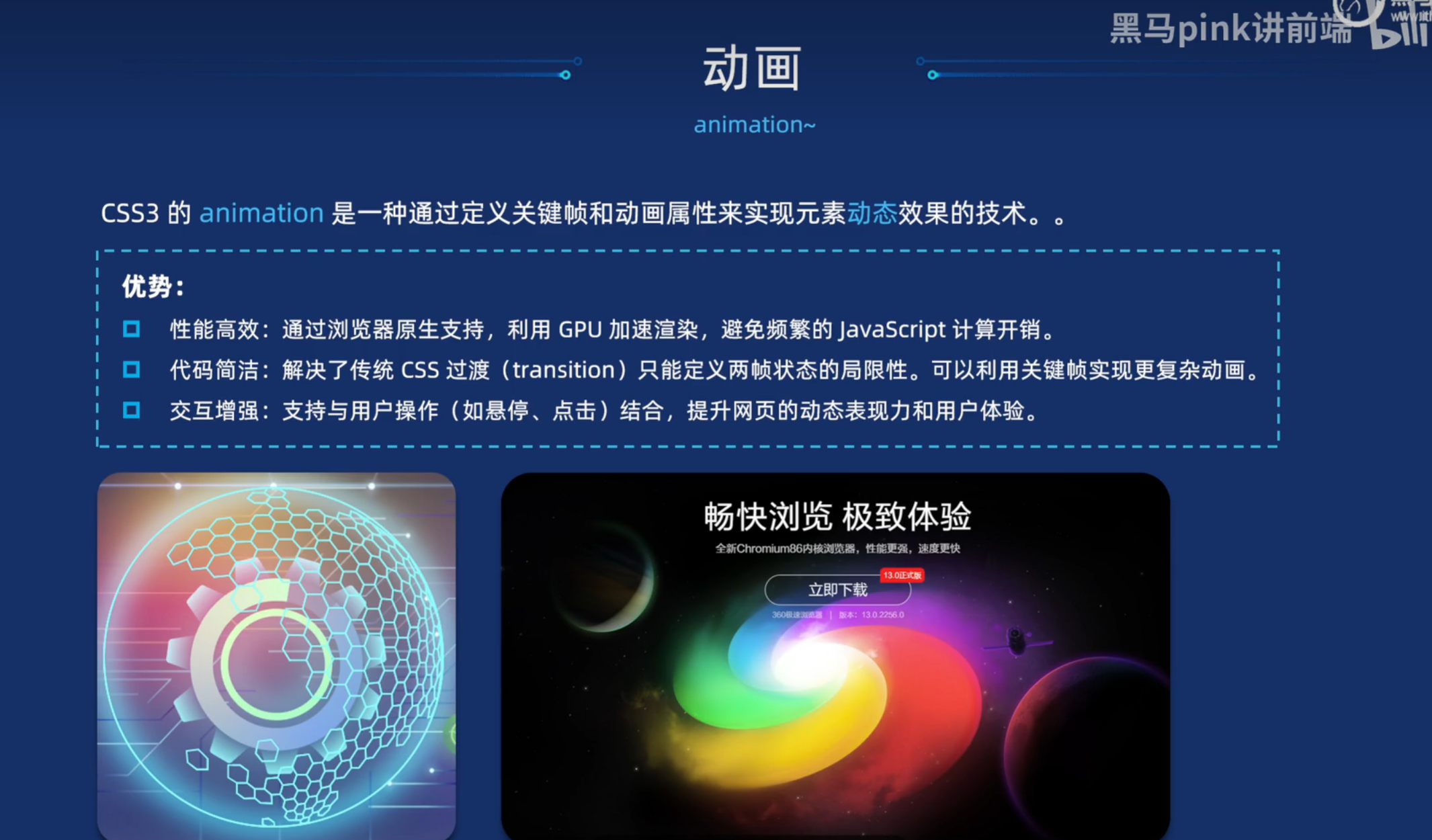
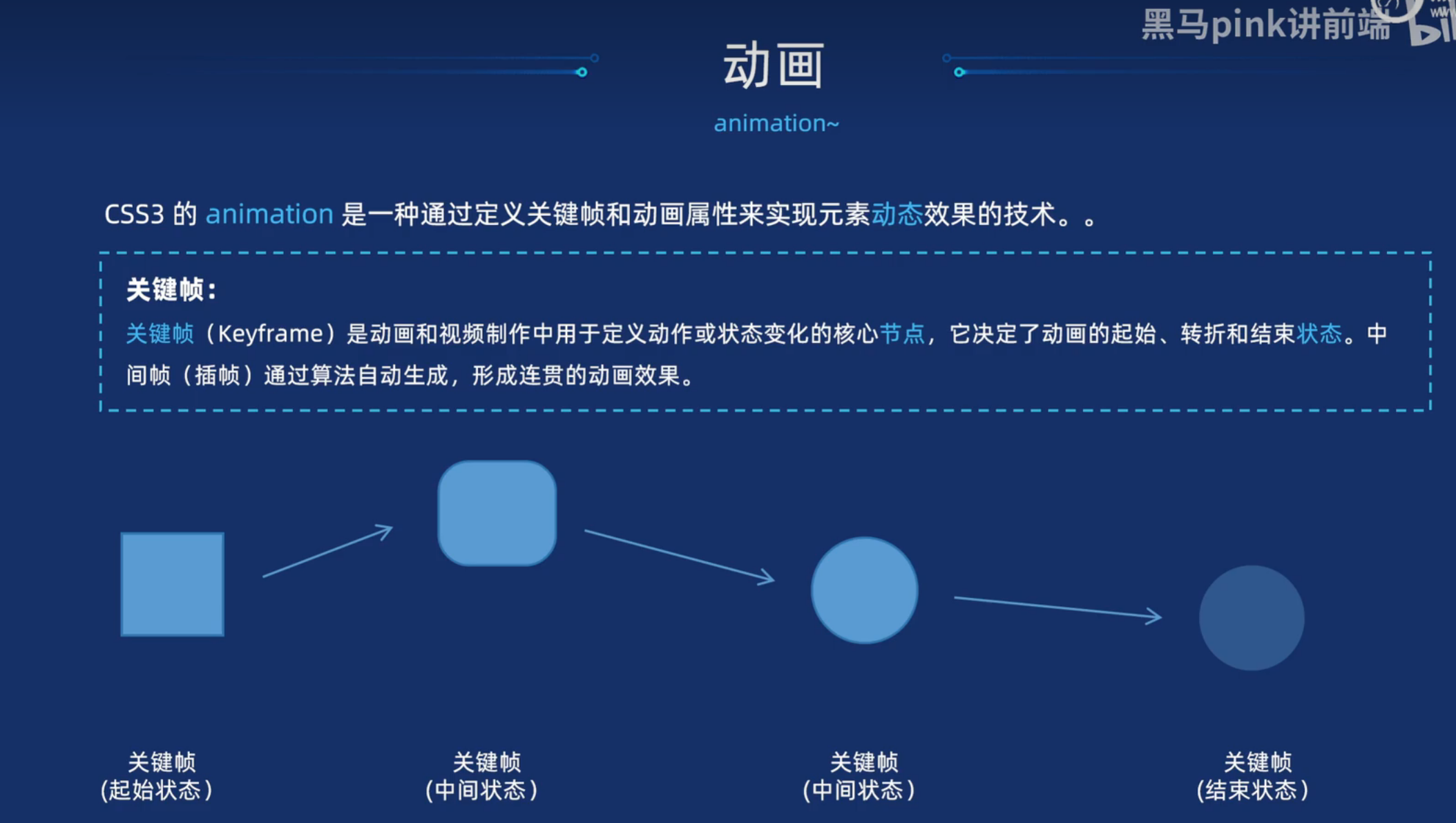
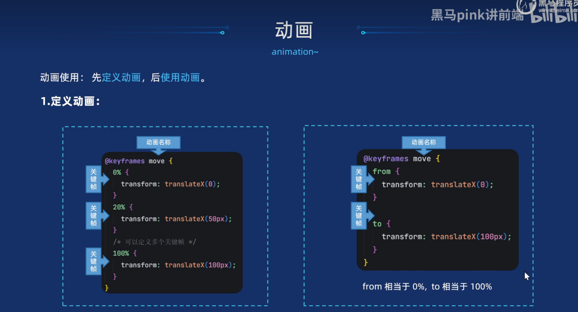
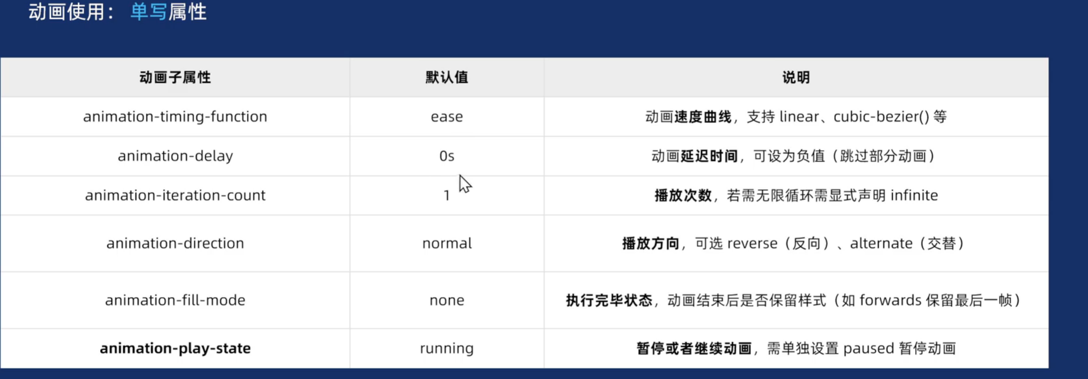
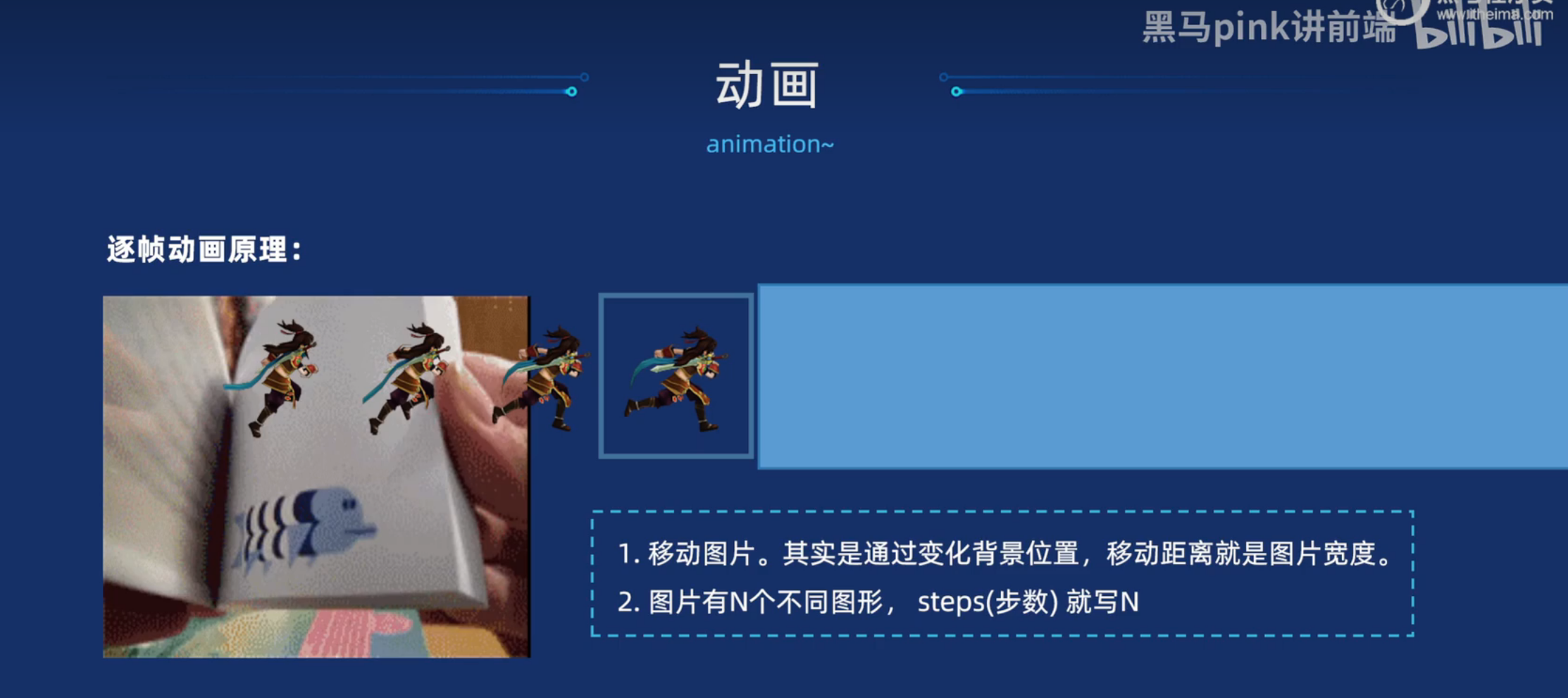
动画-animation
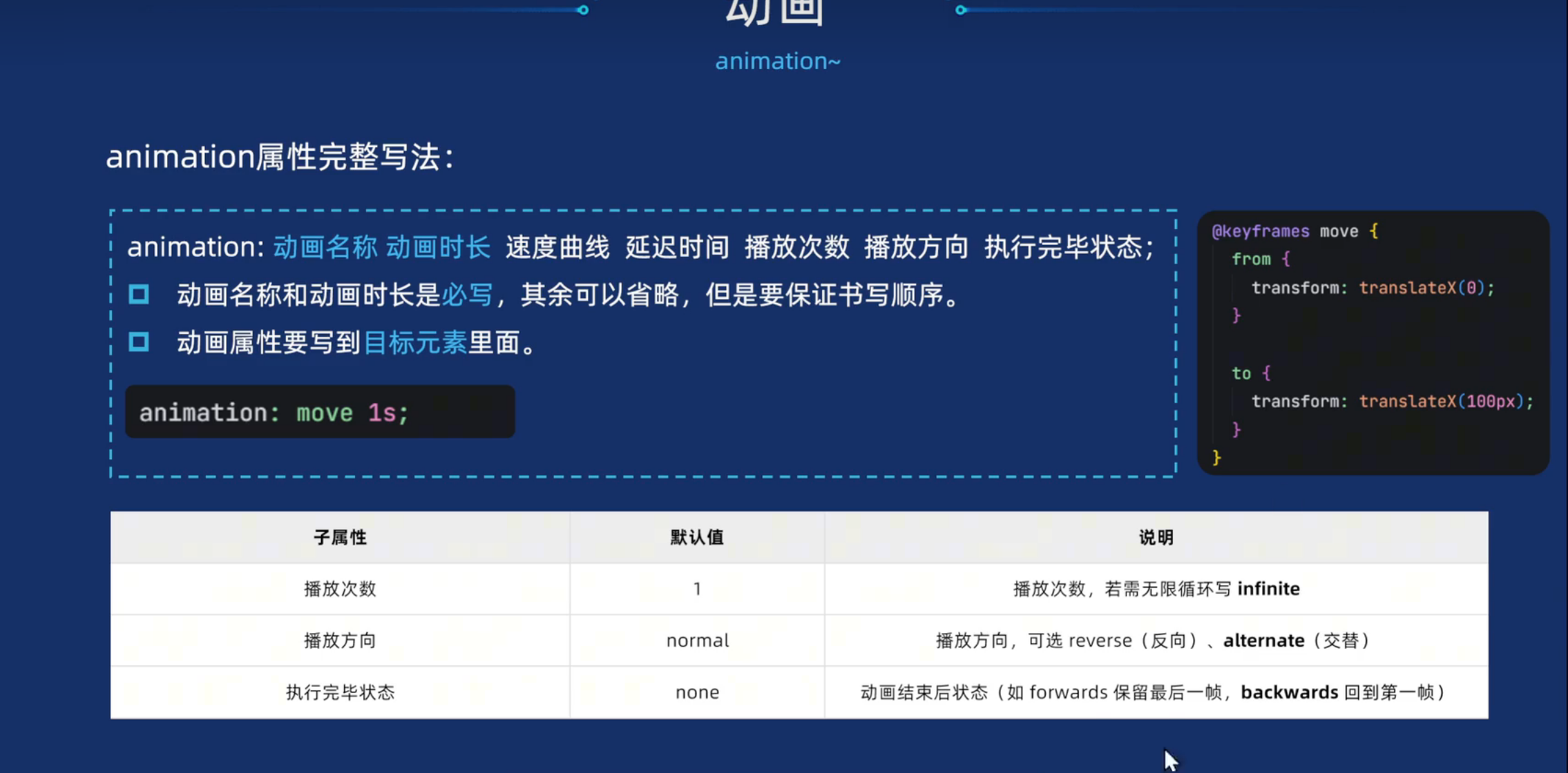
最后一个需要单写
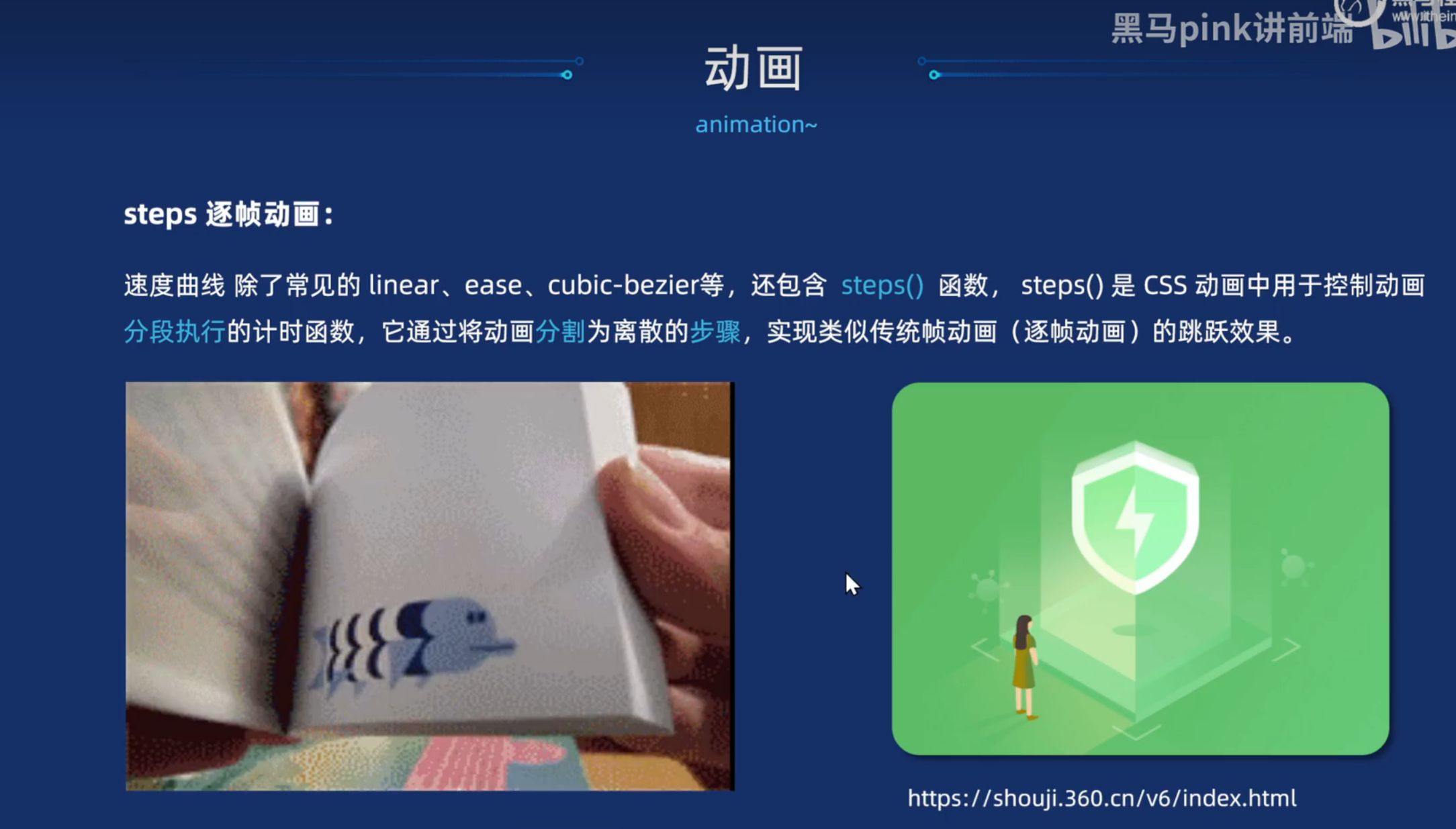
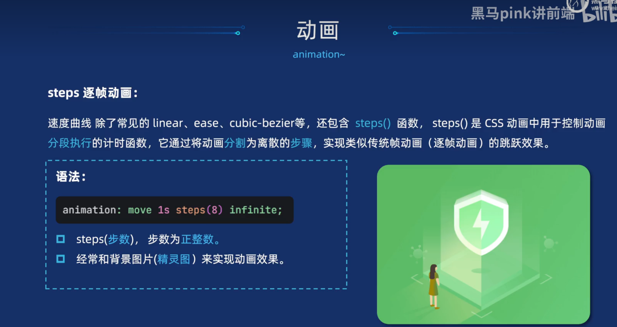
逐帧动画
案例
html
<!DOCTYPE html>
<html lang="en">
<head>
<meta charset="UTF-8">
<meta name="viewport" content="width=device-width, initial-scale=1.0">
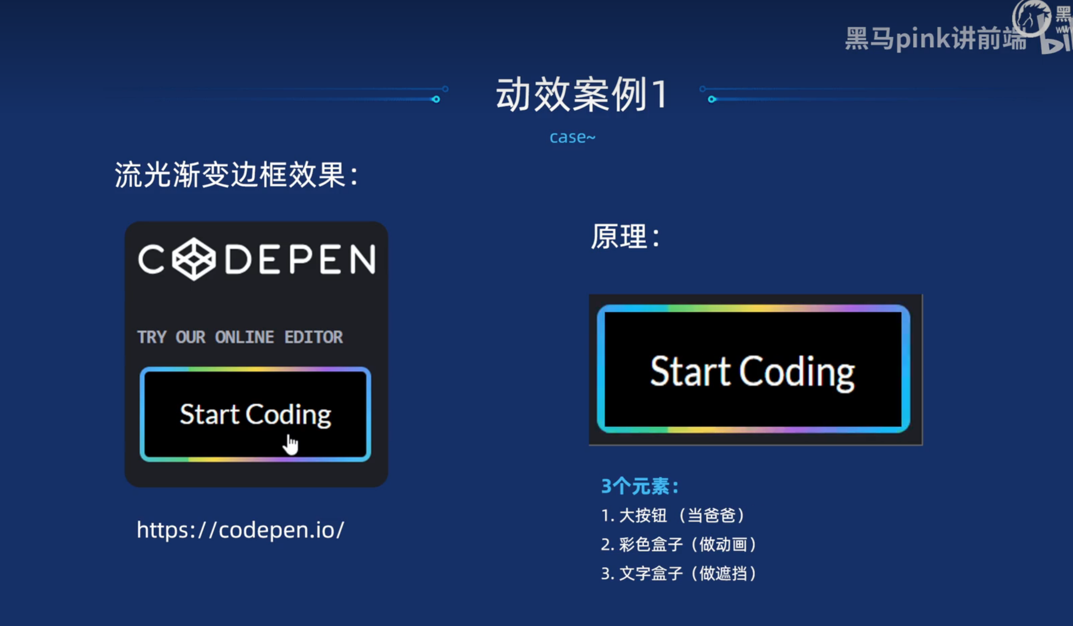
<title>流光渐变边框按钮</title>
<style>
* {
margin: 0;
padding: 0;
box-sizing: border-box;
}
body {
background-color: #1e1f26;
}
a {
text-decoration: none;
color: #fff;
}
/* 方式一 */
.btn1 {
overflow: hidden;
position: relative;
display: block;
width: 140px;
height: 60px;
margin: 100px;
padding: 3px;
border-radius: 6px;
text-align: center;
line-height: 57px;
/* background-color: pink; */
}
/* 彩色盒子 */
.btn1::before {
content: '';
position: absolute;
top: 0;
left: 0;
width: 200%;
height: 100%;
background-color: #fff;
/* 添加线性渐变 */
background: linear-gradient(115deg, #4fcf70, #fad648, #a767e5, #12bcfe, #44ce7b);
background-size: 50% 100%;
/* 动画 */
animation: move .75s linear infinite;
}
@keyframes move {
to {
transform: translateX(-50%);
}
}
.btn1 span {
position: relative;
display: block;
width: 100%;
height: 100%;
background-color: #000;
border-radius: 3px;
}
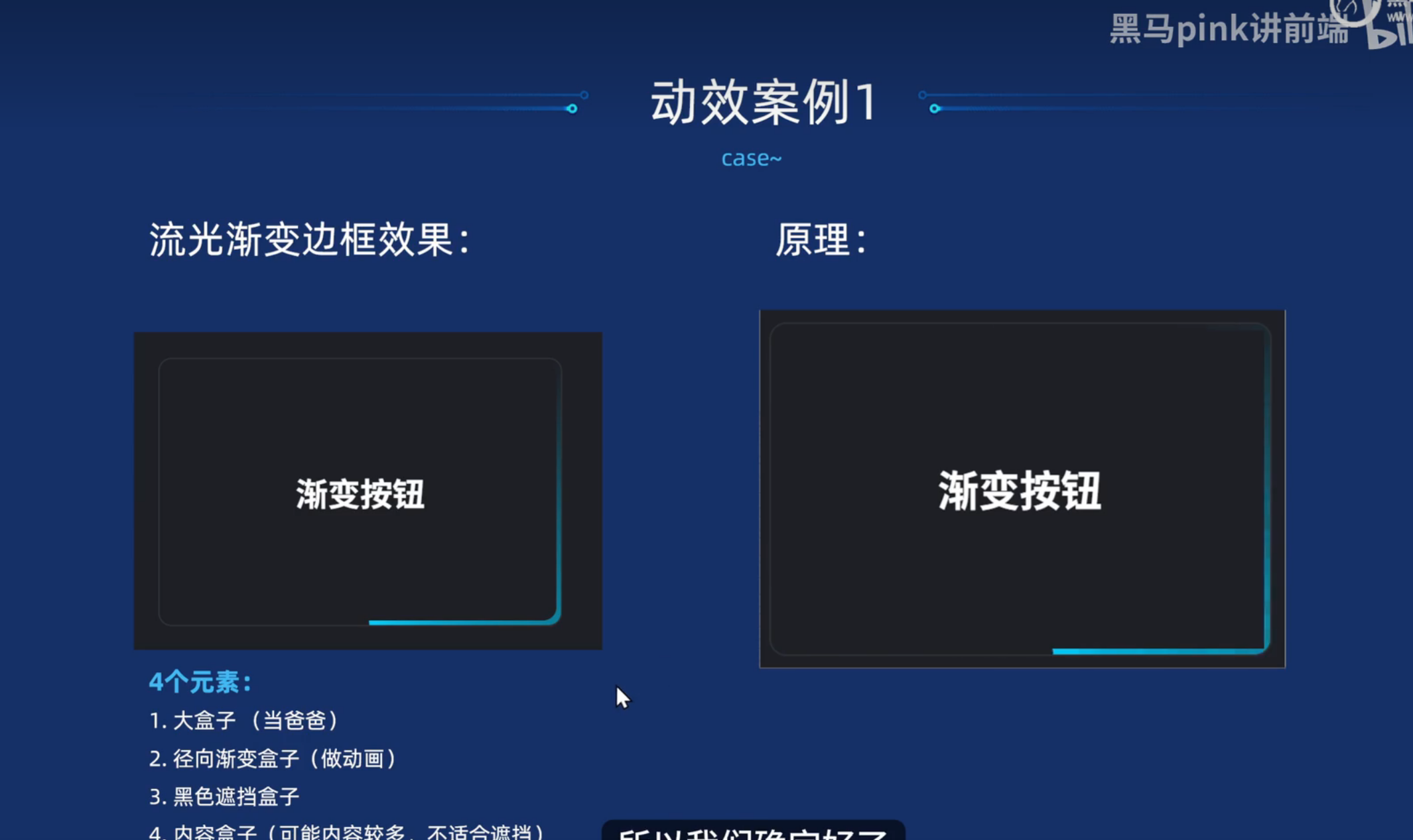
/* 方式2 */
.btn2 {
overflow: hidden;
display: flex;
justify-content: center;
align-items: center;
position: relative;
width: 300px;
height: 200px;
border: 1px solid #333;
border-radius: 10px;
margin: 50px;
color: #fff;
font-size: 24px;
font-weight: bold;
text-align: center;
line-height: 200px;
}
/* 镜像渐变的盒子 before */
.btn2::before {
content: '';
position: absolute;
width: 500px;
height: 500px;
background-image: conic-gradient(transparent, transparent, transparent, #00ccff);
/* 动画 */
animation: rotate 1s linear infinite;
z-index: -1;
}
/* 黑色遮挡的盒子 */
.btn2::after {
content: '';
position: absolute;
/* top: 3px;
left: 3px;
right: 3px;
bottom: 3px; */
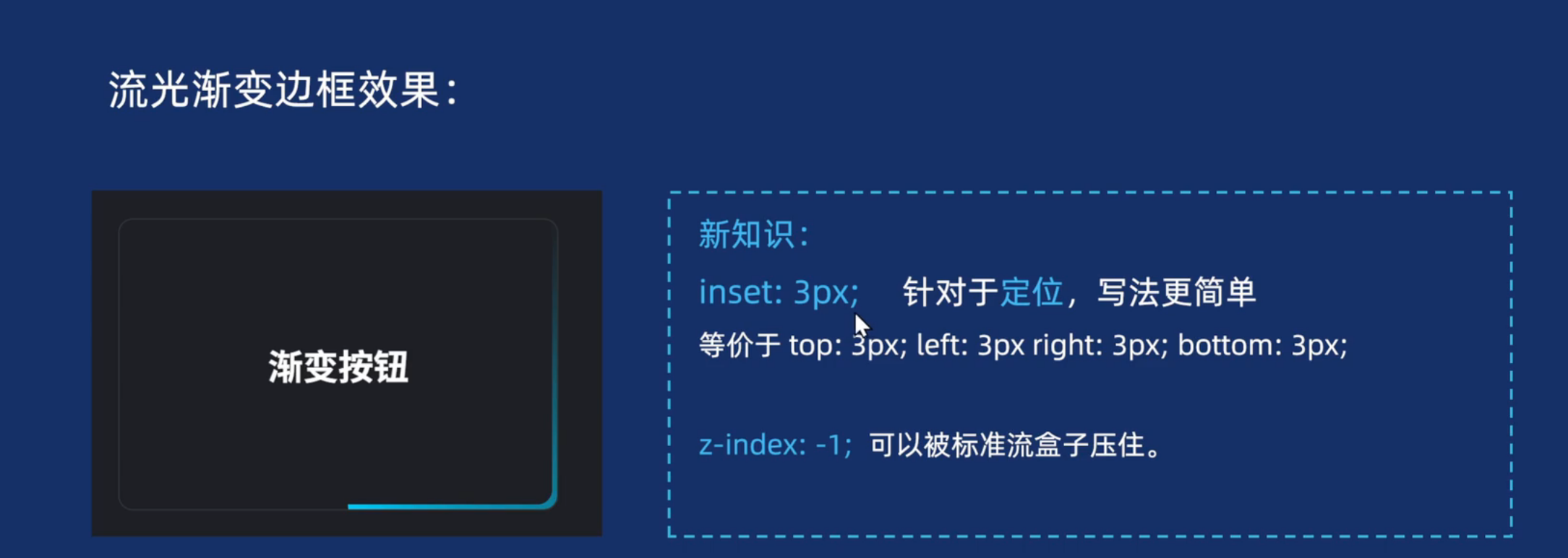
/* 新的写法 */
inset: 3px;
background-color: #000;
border-radius: 10px;
z-index: -1;
}
@keyframes rotate {
to {
transform: rotate(360deg);
}
}
</style>
</head>
<body>
<!-- 方式1 -->
<a href="#" class="btn1">
<span>开始按钮</span>
</a>
<!-- 方式2 -->
<div class="btn2">渐变边框</div>
</body>
</html>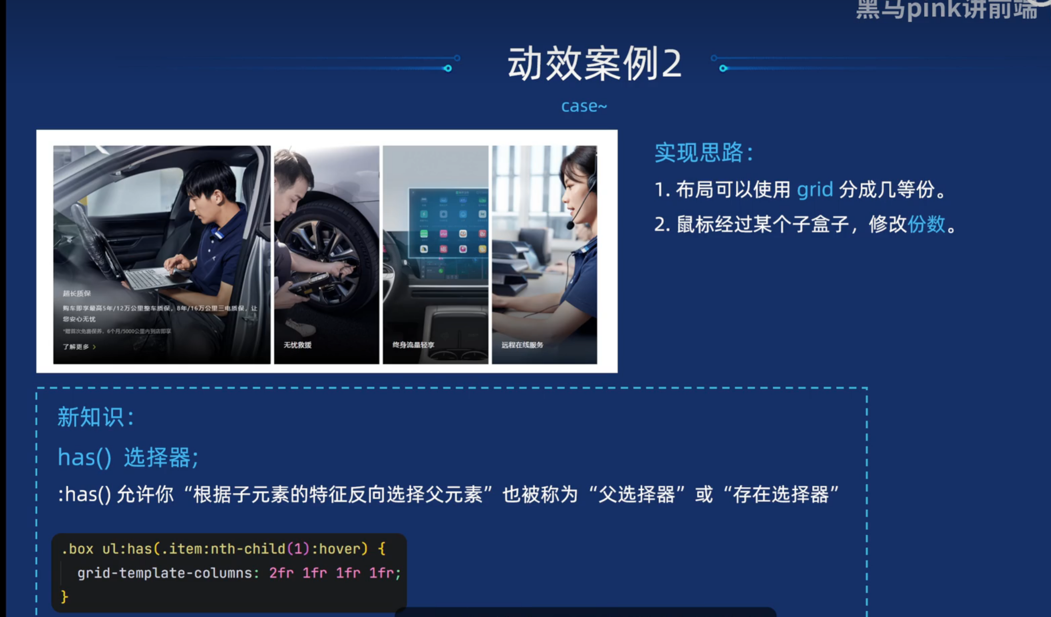
html
<!DOCTYPE html>
<html lang="en">

<head>
  <meta charset="UTF-8">
  <meta name="viewport" content="width=device-width, initial-scale=1.0">
  <title>卡片折叠效果</title>
  <style>
    * {
      margin: 0;
      padding: 0;
      box-sizing: border-box;
    }

    ul,
    ol {
      list-style: none;
    }

    .box {
      overflow: hidden;
      max-width: 1320px;
      height: 527px;
      margin: 100px auto;
    }

    .box ul {
      display: grid;
      grid-template-columns: 2fr 1fr 1fr 1fr;
      grid-template-rows: 527px;
      gap: 8px;
      transition: all .5s;
    }

    .box .item {
      position: relative;
      background: url(./img/pic1.jpg) no-repeat 50%/cover;

    }

    .box .item:nth-child(2) {
      background-image: url(./img/pic2.jpg);
    }

    .box .item:nth-child(3) {
      background-image: url(./img/pic3.jpg);
    }

    .box .item:nth-child(4) {
      background-image: url(./img/pic4.jpg);
    }

    /* 鼠标经过小li,让父亲 ul 修改里面的份数   has 父亲选择器 */
    /* 当我们鼠标经过了第一个小li(.item)的时候,选择 父亲 ul */
    .box ul:has(.item:nth-child(1):hover) {
      grid-template-columns: 2fr 1fr 1fr 1fr;
    }

    /* 当我们鼠标经过了第2个小li(.item)的时候,选择 父亲 ul */
    .box ul:has(.item:nth-child(2):hover) {
      grid-template-columns: 1fr 2fr 1fr 1fr;
    }

    /* 当我们鼠标经过了第3个小li(.item)的时候,选择 父亲 ul */
    .box ul:has(.item:nth-child(3):hover) {
      grid-template-columns: 1fr 1fr 2fr 1fr;
    }

    /* 当我们鼠标经过了第4个小li(.item)的时候,选择 父亲 ul */
    .box ul:has(.item:nth-child(4):hover) {
      grid-template-columns: 1fr 1fr 1fr 2fr;
    }


    .item p {
      position: absolute;
      left: 0;
      bottom: -100px;
      color: #fff;
      padding: 20px;
    }

    /* 鼠标经过 .item 里面的 p 升上来 */
    .item:hover p {
      bottom: 0;
      transition: all .5s;

    }
  </style>
</head>

<body>
  <div class="box">
    <ul>
      <li class="item">
        <p>超长质保</p>
      </li>
      <li class="item">
        <p>超长质保</p>
      </li>
      <li class="item">
        <p>超长质保</p>
      </li>
      <li class="item">
        <p>超长质保</p>
      </li>
    </ul>
  </div>
</body>

</html>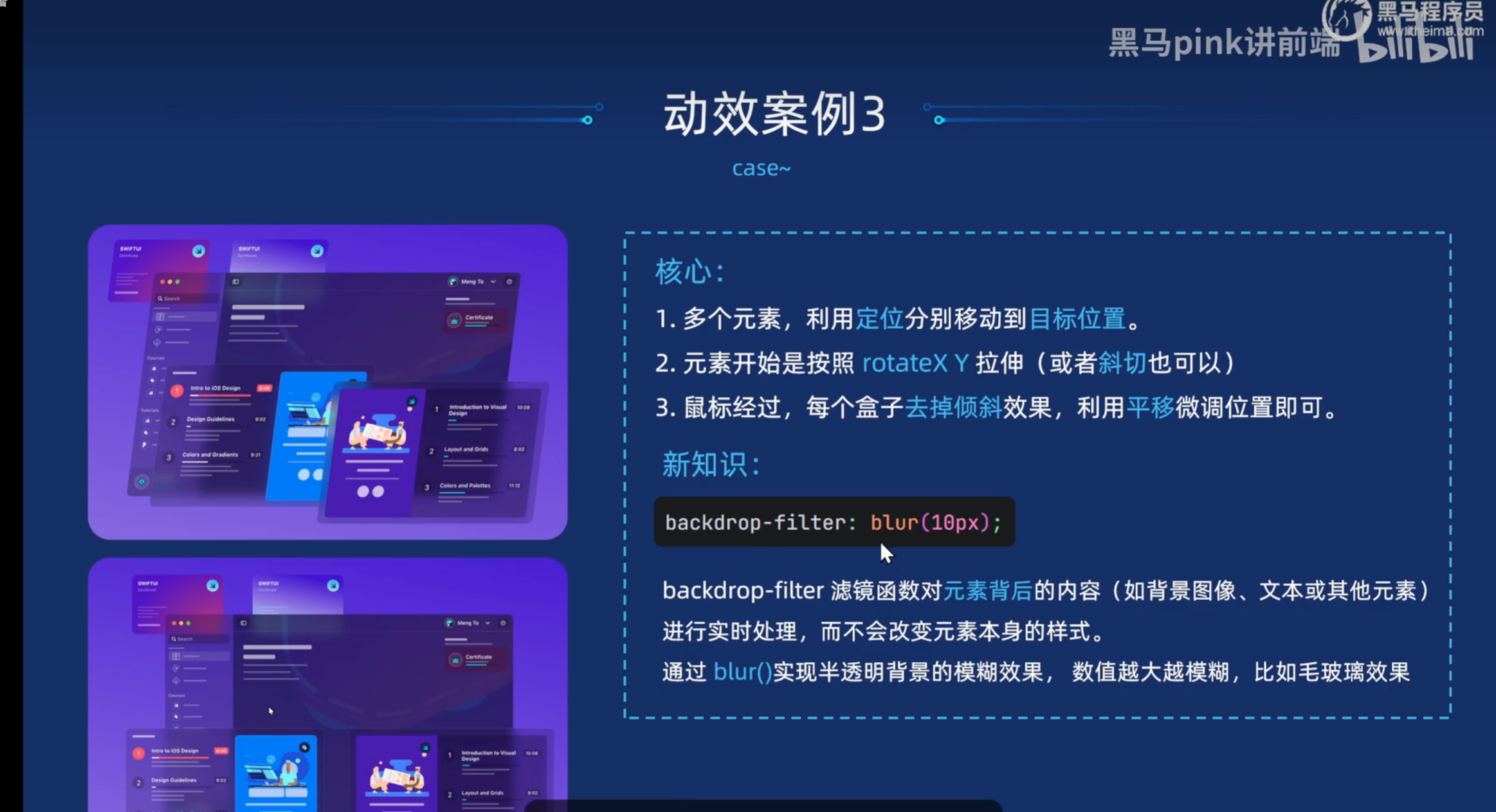
html
<!DOCTYPE html>
<html lang="en">

<head>
  <meta charset="UTF-8">
  <meta name="viewport" content="width=device-width, initial-scale=1.0">
  <title>漂亮的卡片动画效果</title>

  <style>
    * {
      margin: 0;
      padding: 0;
      box-sizing: border-box;
    }

    html,
    body {
      width: 100%;
      height: 100%;
    }

    body {
      background: linear-gradient(190deg, rgb(67, 22, 219) 13.57%, rgb(144, 118, 231) 98.38%) no-repeat;
    }

    .box {
      position: relative;
      width: 674px;
      height: 500px;
      /* background-color: pink; */
      margin: 0 auto;
    }

    .card1 {
      background: radial-gradient(218.51% 281.09% at 100% 100%, rgba(253, 63, 51, 0.6) 0%, rgba(76, 0, 200, 0.6) 45.83%, rgba(76, 0, 200, 0.6) 100%);
      width: 183px;
      height: 120px;
      position: absolute;
      top: 150px;
      left: -37px;
      border-radius: 10px;
    }

    .card2 {
      background: linear-gradient(192.64deg, rgb(67, 22, 219) 12.72%, rgb(144, 118, 231) 54.49%, rgb(162, 238, 255) 100.01%);
      width: 183px;
      height: 120px;
      position: absolute;
      top: 150px;
      left: 176px;
      border-radius: 10px;
    }

    .card3 {
      background: rgba(23, 12, 61, 0.3);
      width: 701px;
      height: 428px;
      border-radius: 10px;
      position: absolute;
      top: 200px;
      left: 0px;
      backdrop-filter: blur(10px);
    }

    .card4 {
      background: rgba(23, 12, 61, 0.2);
      width: 400px;
      height: 273px;
      border-radius: 10px;
      position: absolute;
      top: 370px;
      left: 40px;

      backdrop-filter: blur(10px);

      box-shadow: rgba(255, 255, 255, 0.2) 0px 0px 0px 0.5px inset;
    }

    .card5 {
      background: rgba(23, 12, 61, 0.2);
      width: 414px;
      height: 273px;
      border-radius: 10px;
      position: absolute;
      top: 400px;
      left: 340px;
      backdrop-filter: blur(10px);
      box-shadow: rgba(255, 255, 255, 0.2) 0px 0px 0px 0.5px inset;
    }

    /* 核心代码 */
    .box>* {
      transform: rotateY(-20deg) rotateX(20deg);
      /* transform: skewX(-8deg); */
      transition: all 2s cubic-bezier(0.075, 0.82, 0.165, 1);
    }

    /* 鼠标经过 box 里面的子元素 移动位置去掉 斜切 */
    .box:hover .card1 {
      transform: translate3d(-30px, -30px, 0);
    }

    .box:hover .card2 {
      transform: translate3d(0, -30px, 0);
    }

    .box:hover .card3 {
      transform: translate3d(0, 0, 0);
    }

    .box:hover .card4 {
      transform: translate3d(-120px, 60px, 0);
    }

    .box:hover .card5 {
      transform: translate3d(30px, 30px, 0);
    }
  </style>
</head>

<body>
  <div class="box">
    <div class="card1">
      <img src="./img/card1.svg" alt="">
    </div>
    <div class="card2">
      <img src="./img/card2.svg" alt="">
    </div>
    <div class="card3">
      <img src="./img/card3.svg" alt="">
    </div>
    <div class="card4">
      <img src="./img/card4.svg" alt="">
    </div>
    <div class="card5">
      <img src="./img/card5.svg" alt="">
    </div>
  </div>
</body>

</html>
html
<!DOCTYPE html>
<html lang="en">
<head>
<meta charset="UTF-8">
<meta name="viewport" content="width=device-width, initial-scale=1.0">
<title>图片轮播滚动效果</title>
<style>
* {
margin: 0;
padding: 0;
box-sizing: border-box;
}
body {
background-color: #ecf4ff;
}
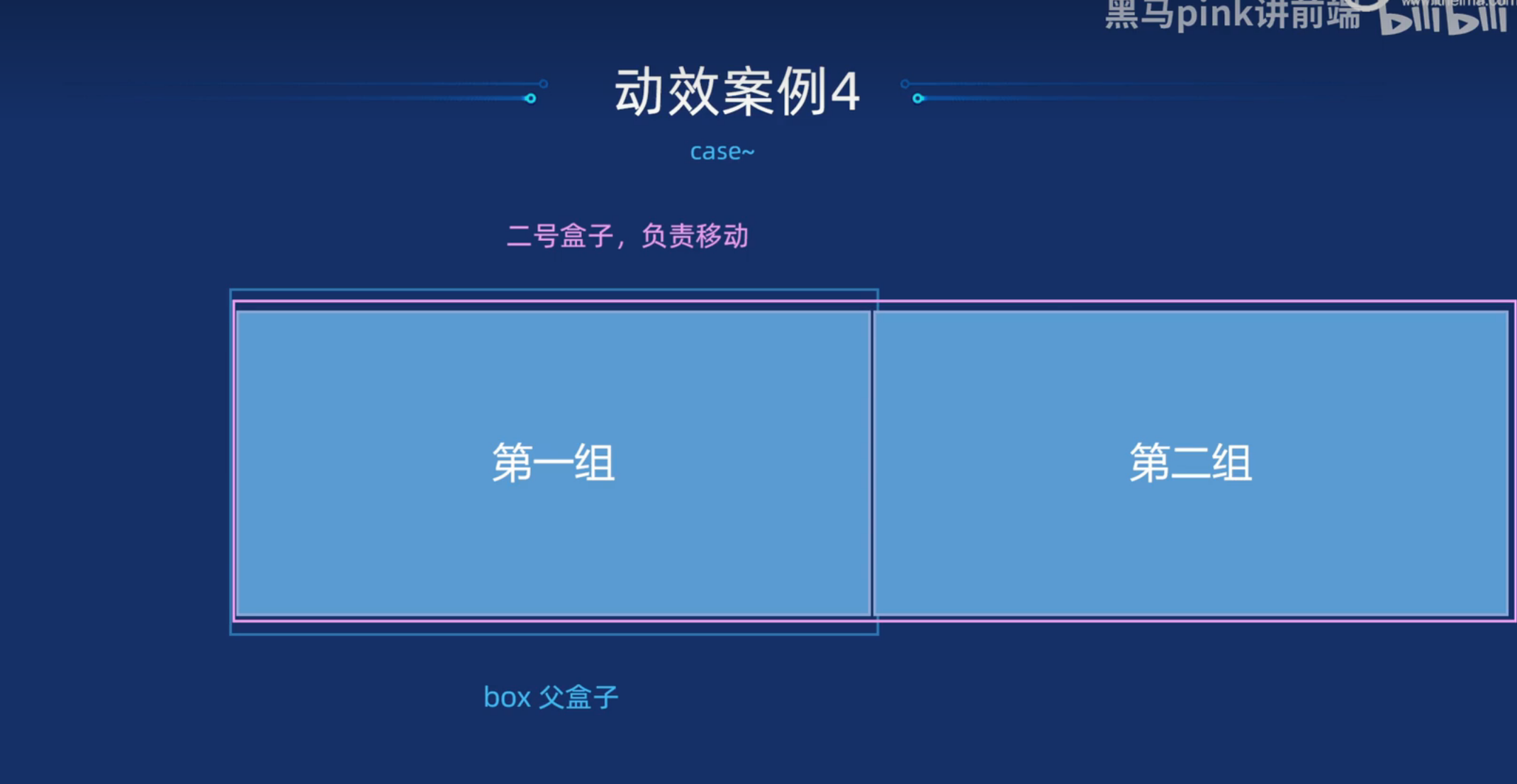
.box {
overflow: hidden;
width: 1180px;
margin: 100px auto;
/* border: 2px solid red; */
}
.box:hover .scroll {
animation-play-state: paused;
}
.scroll img {
width: 180px;
height: 90px;
border-radius: 6px;
}
.scroll {
display: flex;
animation: move 20s linear infinite;
}
.scroll .ad1 {
display: grid;
grid-template-columns: repeat(6, 180px);
grid-template-rows: repeat(4, 90px);
gap: 16px 20px;
margin-right: 20px;
}
@keyframes move {
0% {
transform: translateX(0);
}
100% {
transform: translateX(-1200px);
}
}
</style>
</head>
<body>
<div class="box">
<!-- 滚动盒子 -->
<div class="scroll">
<!-- 第一组 -->
<div class="ad1">
<img src="./img/ad1.jpg" alt="">
<img src="./img/ad2.jpg" alt="">
<img src="./img/ad3.jpg" alt="">
<img src="./img/ad4.jpg" alt="">
<img src="./img/ad5.jpg" alt="">
<img src="./img/ad6.jpg" alt="">
<img src="./img/ad1.jpg" alt="">
<img src="./img/ad2.jpg" alt="">
<img src="./img/ad3.jpg" alt="">
<img src="./img/ad4.jpg" alt="">
<img src="./img/ad5.jpg" alt="">
<img src="./img/ad6.jpg" alt="">
<img src="./img/ad1.jpg" alt="">
<img src="./img/ad2.jpg" alt="">
<img src="./img/ad3.jpg" alt="">
<img src="./img/ad4.jpg" alt="">
<img src="./img/ad5.jpg" alt="">
<img src="./img/ad6.jpg" alt="">
<img src="./img/ad1.jpg" alt="">
<img src="./img/ad2.jpg" alt="">
<img src="./img/ad3.jpg" alt="">
<img src="./img/ad4.jpg" alt="">
<img src="./img/ad5.jpg" alt="">
<img src="./img/ad6.jpg" alt="">
</div>
<!-- 第二组 -->
<div class="ad1">
<img src="./img/ad1.jpg" alt="">
<img src="./img/ad2.jpg" alt="">
<img src="./img/ad3.jpg" alt="">
<img src="./img/ad4.jpg" alt="">
<img src="./img/ad5.jpg" alt="">
<img src="./img/ad6.jpg" alt="">
<img src="./img/ad1.jpg" alt="">
<img src="./img/ad2.jpg" alt="">
<img src="./img/ad3.jpg" alt="">
<img src="./img/ad4.jpg" alt="">
<img src="./img/ad5.jpg" alt="">
<img src="./img/ad6.jpg" alt="">
<img src="./img/ad1.jpg" alt="">
<img src="./img/ad2.jpg" alt="">
<img src="./img/ad3.jpg" alt="">
<img src="./img/ad4.jpg" alt="">
<img src="./img/ad5.jpg" alt="">
<img src="./img/ad6.jpg" alt="">
<img src="./img/ad1.jpg" alt="">
<img src="./img/ad2.jpg" alt="">
<img src="./img/ad3.jpg" alt="">
<img src="./img/ad4.jpg" alt="">
<img src="./img/ad5.jpg" alt="">
<img src="./img/ad6.jpg" alt="">
</div>
</div>
</div>
</body>
</html>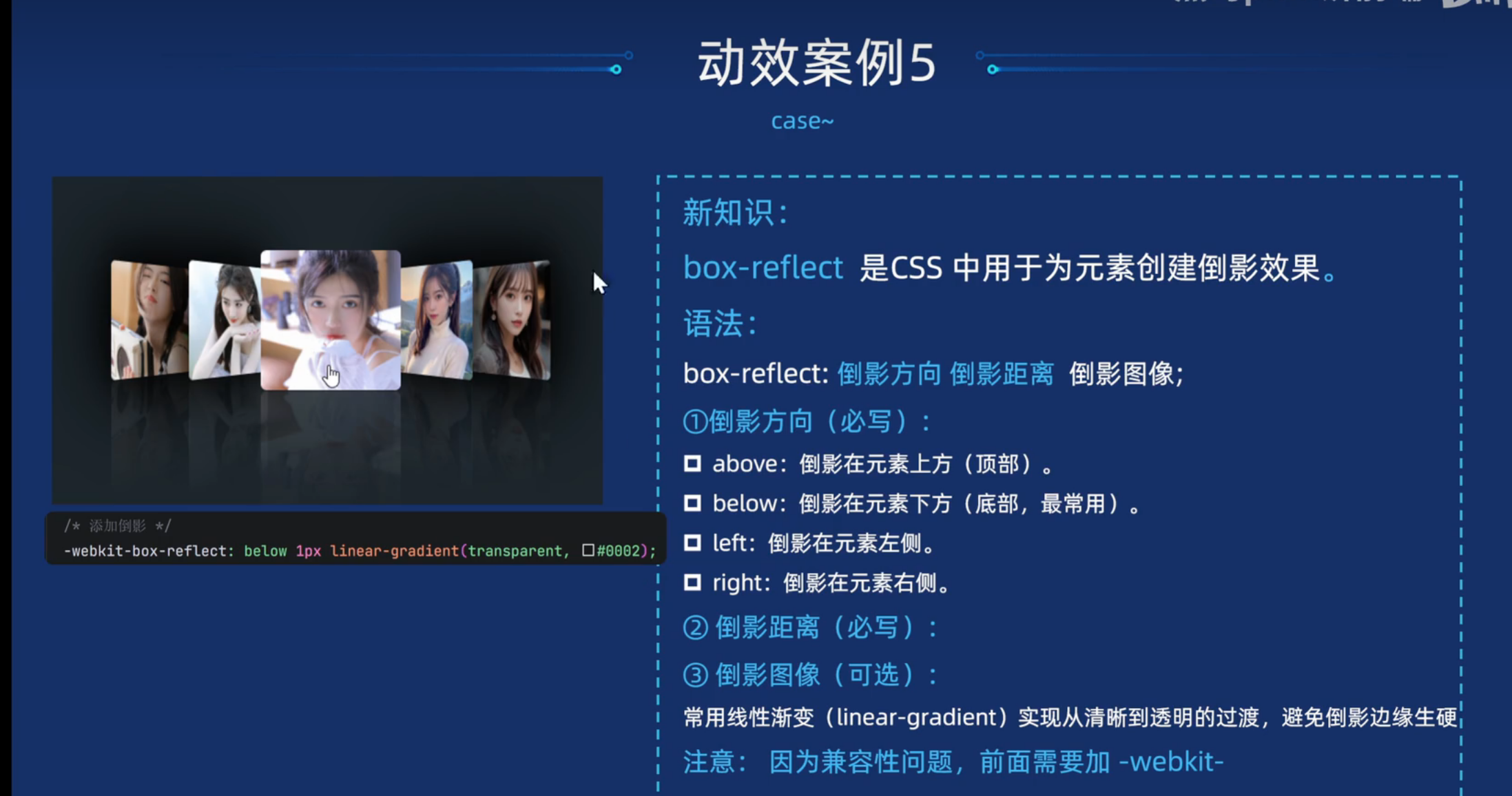
html
<!DOCTYPE html>
<html lang="en">
<head>
<meta charset="UTF-8">
<meta name="viewport" content="width=device-width, initial-scale=1.0">
<title>Document</title>
<style>
* {
margin: 0;
padding: 0;
box-sizing: border-box;
}
body {
background-color: #1a252c;
}
.box {
margin: 200px auto;
display: flex;
justify-content: center;
align-items: center;
}
.box .item {
position: relative;
width: 120px;
height: 120px;
margin: 0 2px;
cursor: pointer;
/* 添加倒影 */
-webkit-box-reflect: below 1px linear-gradient(transparent, #0002);
transition: all .6s;
}
.box .item img {
width: 100%;
height: 100%;
border-radius: 5px;
}
/* 核心代码 */
/* 鼠标经过某个盒子,当前盒子变大 */
.box .item:hover {
transform: scale(1.2);
z-index: 1;
}
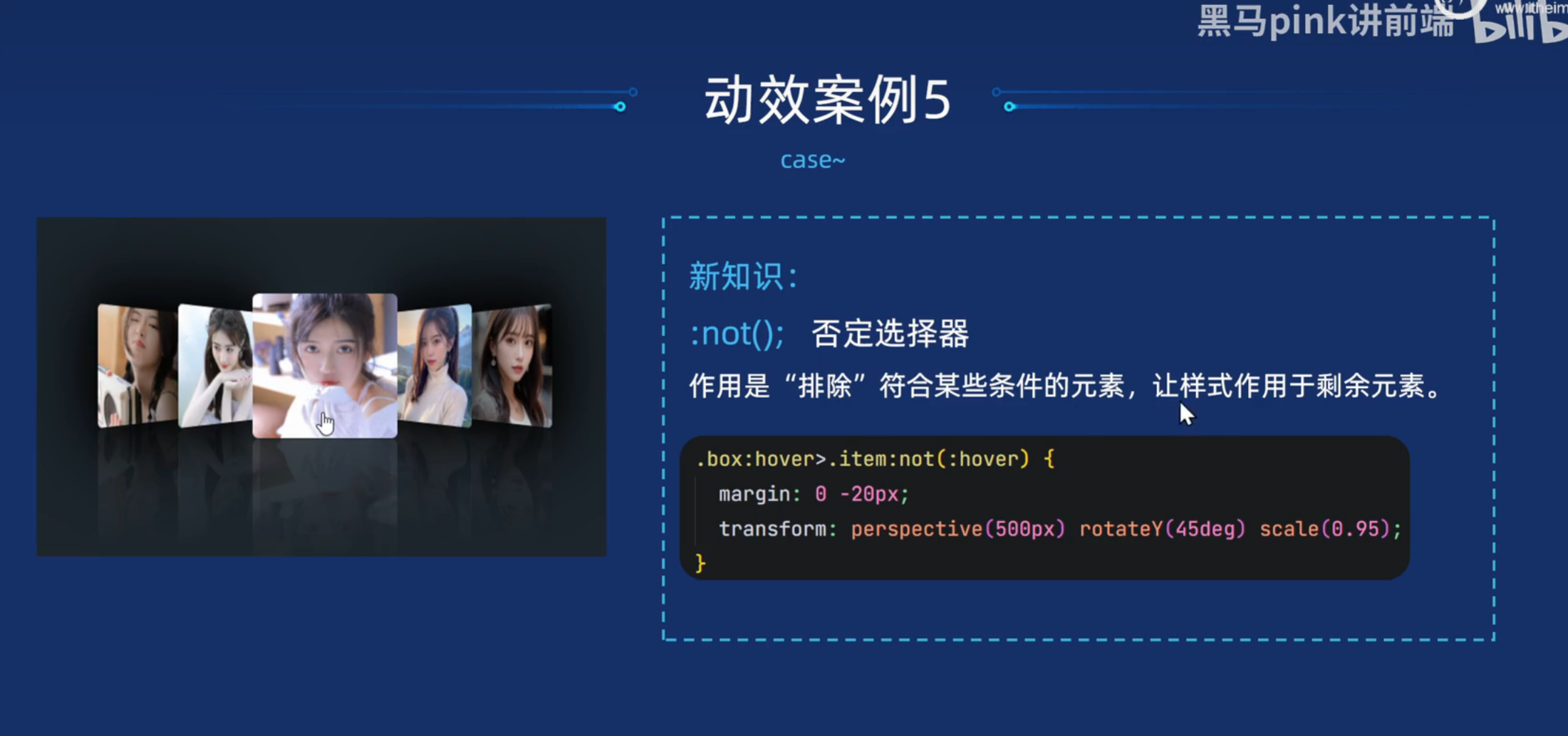
/* 鼠标经过某个盒子,其余的子盒子都变形,当前盒子保持不变 */
.box:hover .item:not(:hover) {
transform: perspective(500px) scale(0.9) rotateY(45deg);
margin: 0 -20px;
}
/* 鼠标经过的盒子,后面的兄弟(姐妹) 修改下变形 */
.box .item:hover~.item {
transform: perspective(500px) scale(0.9) rotateY(-45deg);
}
</style>
</head>
<body>
<div class="box">
<div class="item"><img src="img/1.png"></div>
<div class="item"><img src="img/2.png"></div>
<div class="item"><img src="img/3.png"></div>
<div class="item"><img src="img/4.png"></div>
<div class="item"><img src="img/5.png"></div>
</div>
</body>
</html>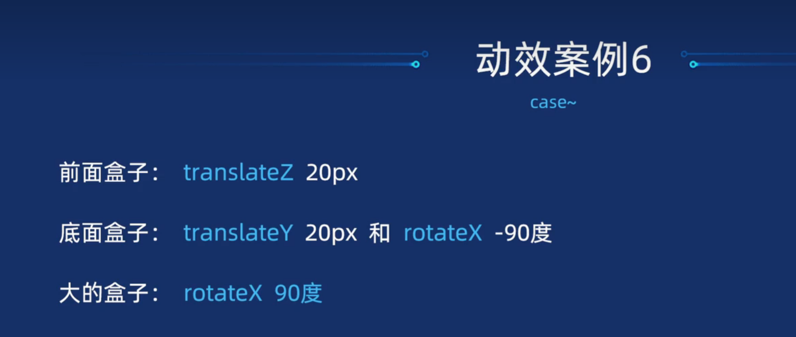
html
<!DOCTYPE html>
<html lang="en">
<head>
<meta charset="UTF-8">
<meta http-equiv="X-UA-Compatible" content="IE=edge">
<meta name="viewport" content="width=device-width, initial-scale=1.0">
<title>Document</title>
<link rel="stylesheet" href="http://at.alicdn.com/t/c/font_4096975_pswyqyk8tdo.css">
<style>
/* 1.去除默认样式 设置底色 */
* {
margin: 0;
padding: 0;
box-sizing: border-box;
}
body {
background-color: #ccc;
}
/* 2.准备导航的基本样式 */
ul {
position: absolute;
top: 50%;
left: 50%;
transform: translate(-50%, -50%);
display: flex;
list-style: none;
gap: 5px;
}
/* 3.1 准备导航里面图标的基本样式 */
ul li {
position: relative;
width: 80px;
height: 40px;
/* 开启子元素的3d空间 */
transform-style: preserve-3d;
transition: all .5s;
}
ul li span {
position: absolute;
top: 0;
left: 0;
display: block;
width: 100%;
height: 100%;
line-height: 40px;
font-size: 16px;
background: #fff;
color: #262626;
text-align: center;
}
ul li .front {
background: #fff;
color: #3b5999;
transform: translateZ(20px);
}
ul li .bottom {
background: #3b5999;
color: #fff;
transform: translateY(20px) rotateX(-90deg);
}
ul li:hover {
transform: rotateX(90deg);
}
</style>
</head>
<body>
<!-- 结构 -->
<ul>
<li>
<span class="front iconfont icon-QQ"></span>
<span class="bottom iconfont icon-QQ"></span>
</li>
<li>
<span class="front iconfont icon-weixin"></span>
<span class="bottom iconfont icon-weixin"></span>
</li>
<li>
<span class="front iconfont icon-douyin"></span>
<span class="bottom iconfont icon-douyin"></span>
</li>
<li>
<span class="front iconfont icon-xinlangweibo"></span>
<span class="bottom iconfont icon-xinlangweibo"></span>
</li>
<li>
<span class="front iconfont icon-shouji"></span>
<span class="bottom iconfont icon-shouji"></span>
</li>
</ul>
</body>
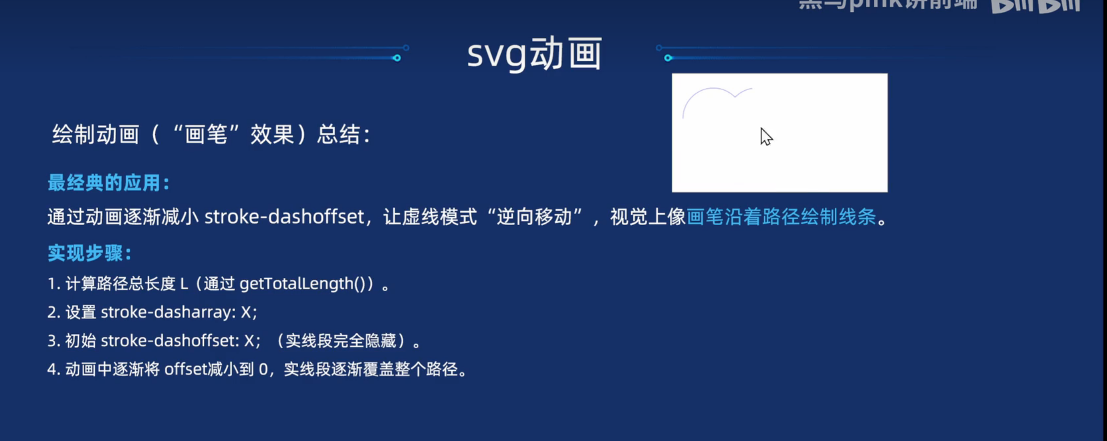
</html>SVG动画
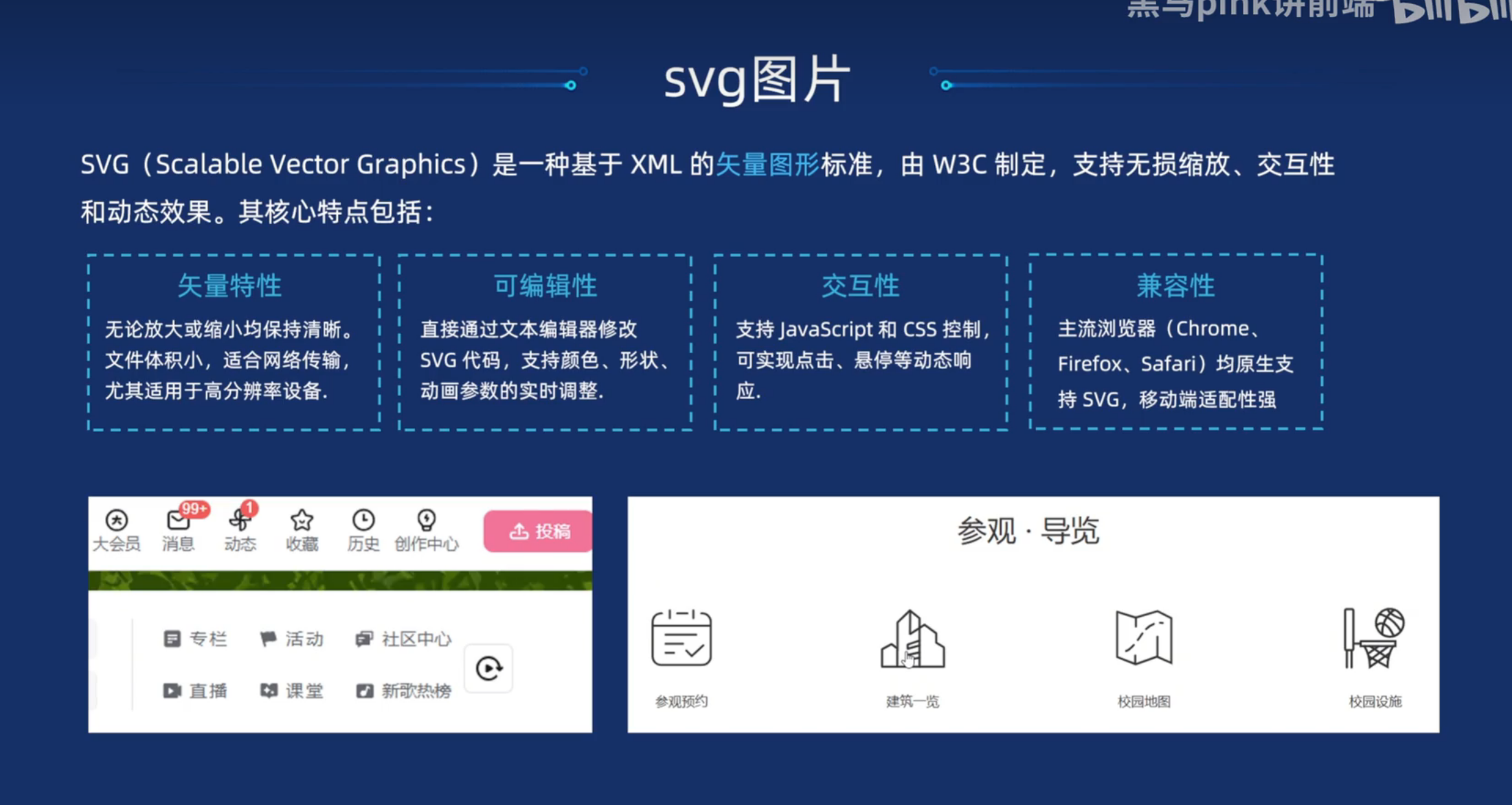
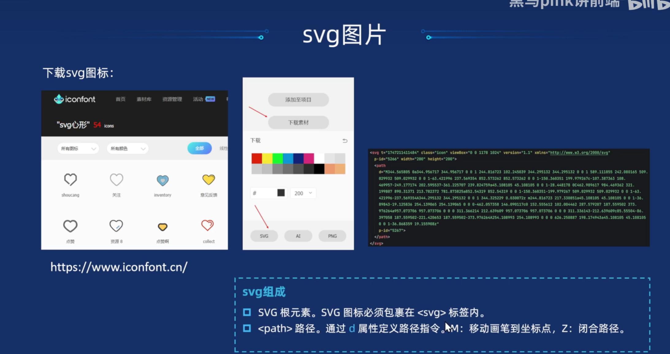
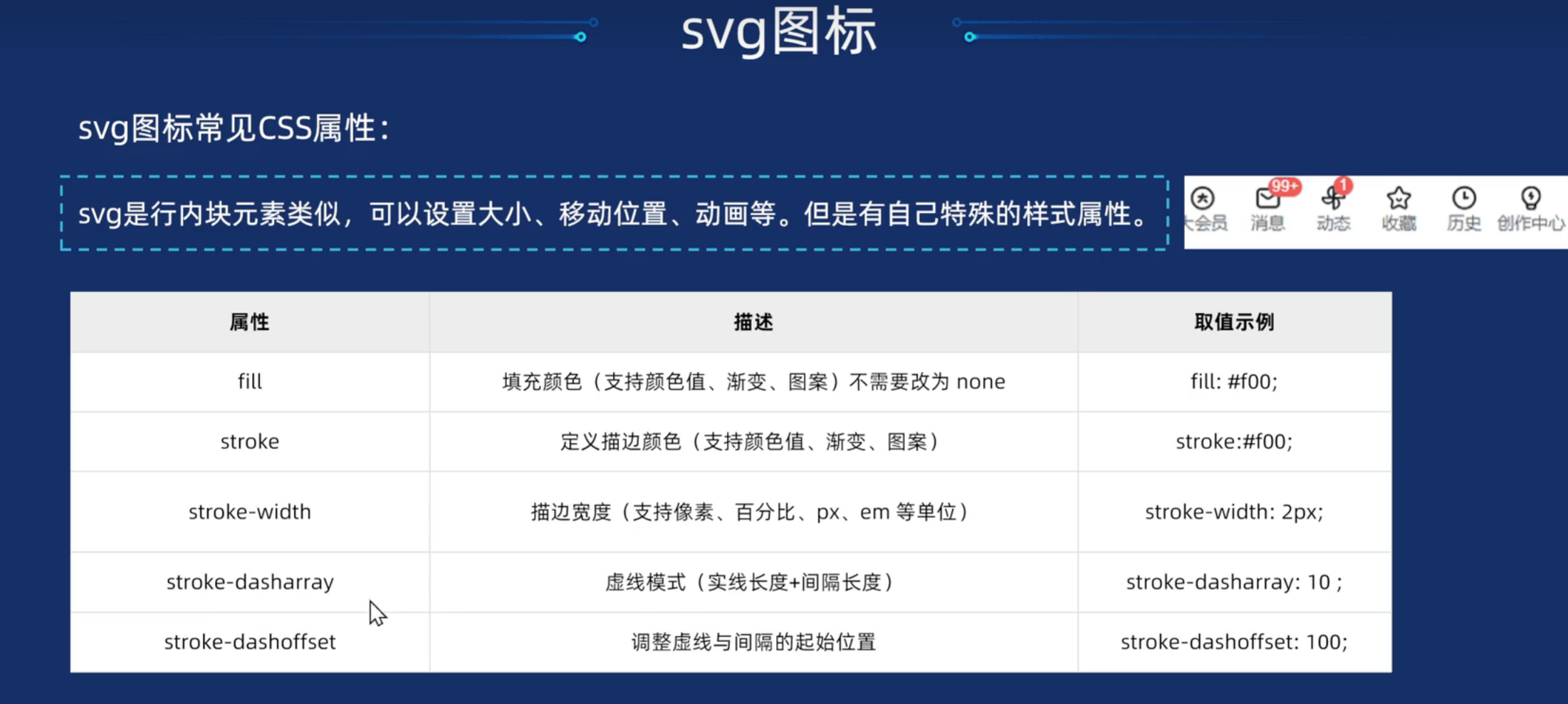
svg是图片格式,通过高度宽度来进行修改
html
<!DOCTYPE html>
<html lang="en">
<head>
<meta charset="UTF-8">
<meta name="viewport" content="width=device-width, initial-scale=1.0">
<title>svg常见属性以及描边效果</title>
<style>
svg {
/* color: red; */
/* 填充颜色 */
/* fill: red; */
fill: none;
/* 描边颜色 */
stroke: blue;
/* 描边宽度 */
stroke-width: 3;
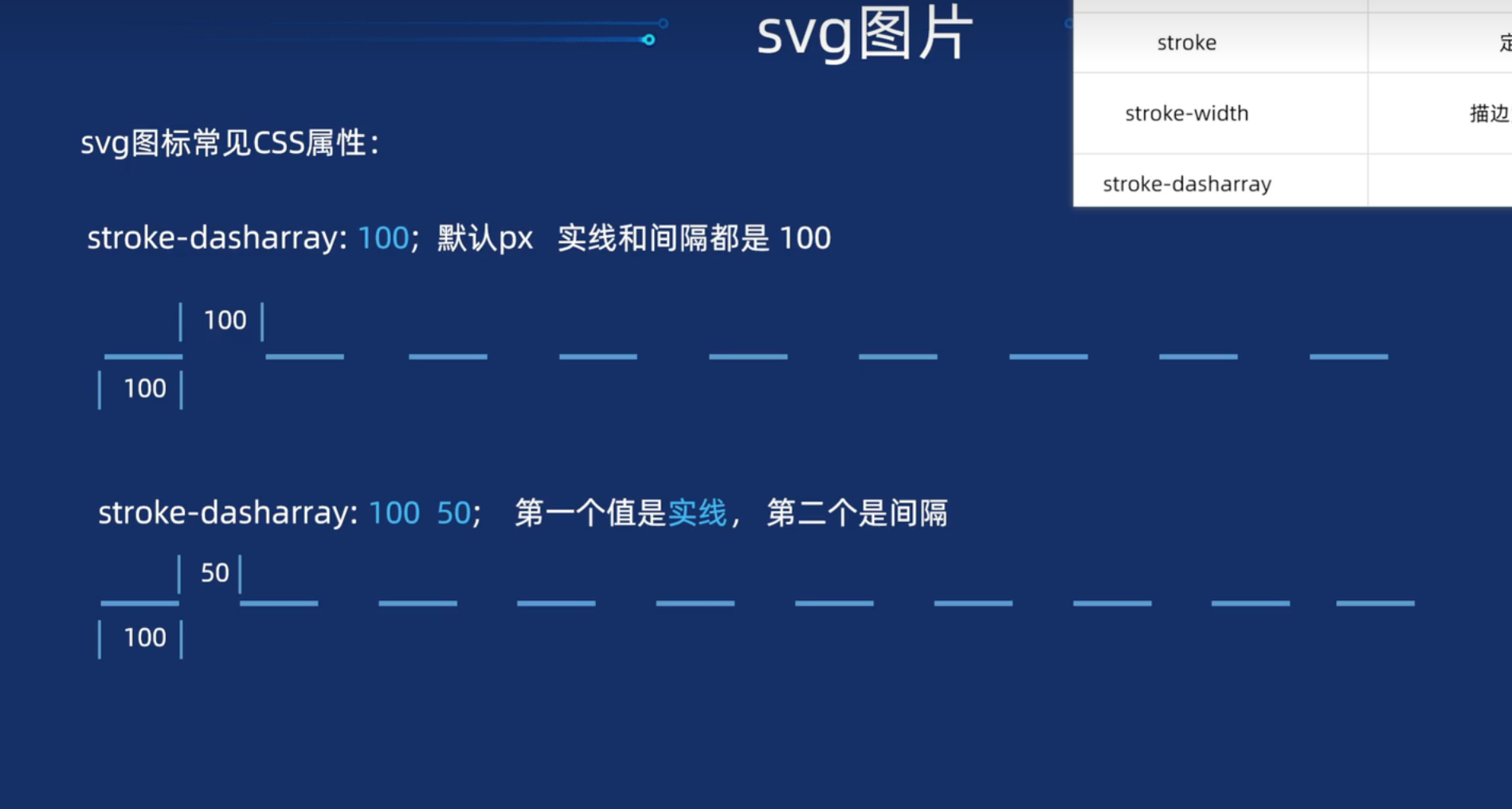
/* 虚线模式 */
/* stroke-dasharray: 100 100; */
}
/* 鼠标经过svg, 执行动画效果 */
svg:hover {
animation: move .5s;
}
/* 动画效果 */
@keyframes move {
0% {
stroke-dasharray: 0 300;
}
100% {
stroke-dasharray: 300 0;
}
}
</style>
</head>
<body>
<svg class="icon" width="200px" height="200.00px" viewBox="0 0 1024 1024" version="1.1"
xmlns="http://www.w3.org/2000/svg">
<path
d="M512 928A416 416 0 1 1 928 512 416 416 0 0 1 512 928z m0-768A352 352 0 1 0 864 512 352 352 0 0 0 512 160z m192 448H512a32 32 0 0 1-32-32V320a32 32 0 0 1 64 0v224H704a32 32 0 0 1 0 64z" />
</svg>
<svg t="1754637101704" class="icon" viewBox="0 0 1024 1024" version="1.1" xmlns="http://www.w3.org/2000/svg"
p-id="15279" xmlns:xlink="http://www.w3.org/1999/xlink" width="200" height="200">
<path
d="M920.100099 840.52688814L878.90460593 840.52688814 878.90460593 329.72164338C878.90460593 315.9911645 871.61479627 303.29426866 859.76276196 296.38022521L650.65350918 174.38069555C638.72886871 167.42001512 623.99320425 167.37337898 612.02196638 174.2570565 600.05506177 181.14181673 592.67314328 193.90595549 592.67314328 207.72211372L592.67314328 840.52688814 548.81833725 840.52688814 548.81833725 107.38333571C548.81833725 94.41096208 542.29901471 82.30297985 531.4753757 75.16009474 520.65173916 68.02154704 506.96614383 66.80142192 495.05450815 71.91944133L168.27016528 212.2544734C154.10234045 218.33883128 144.91611945 232.28947536 144.91611945 247.71945213L144.91611945 840.52688814 103.86800495 840.52688814C96.32136733 840.52688814 90.20408343 846.64812217 90.20408343 854.19771537L90.20408343 898.67752428C90.20408343 906.22711748 96.32136733 912.34835152 103.86800495 912.34835152L920.100099 912.34835152C927.6434852 912.34835152 933.76076828 906.22711748 933.76076828 898.67752428L933.76076828 854.19771537C933.76076828 846.64812217 927.6434852 840.52688814 920.100099 840.52688814L920.100099 840.52688814ZM699.19407672 312.56396736C699.19407672 305.01003676 705.31027793 298.88771837 712.85799905 298.88771837L756.25983081 298.88771837C763.80755277 298.88771837 769.92375314 305.01003676 769.92375314 312.56396736L769.92375314 356.00477312C769.92375314 363.55436631 763.80755277 369.67668471 756.25983081 369.67668471L712.85799905 369.67668471C705.31027793 369.67668471 699.19407672 363.55436631 699.19407672 356.00477312L699.19407672 312.56396736 699.19407672 312.56396736ZM699.19407672 421.94685878C699.19407672 414.39292653 705.31027793 408.27169249 712.85799905 408.27169249L756.25983081 408.27169249C763.80755277 408.27169249 769.92375314 414.39292653 769.92375314 421.94685878L769.92375314 465.38874724C769.92375314 472.93834045 763.80755277 479.05957448 756.25983081 479.05957448L712.85799905 479.05957448C705.31027793 479.05957448 699.19407672 472.93834045 699.19407672 465.38874724L699.19407672 421.94685878 699.19407672 421.94685878ZM699.19407672 531.32649467C699.19407672 523.77690065 705.31027793 517.65458308 712.85799905 517.65458308L756.25983081 517.65458308C763.80755277 517.65458308 769.92375314 523.77690065 769.92375314 531.32649467L769.92375314 574.76729796C769.92375314 582.32123021 763.80755277 588.4435486 756.25983081 588.4435486L712.85799905 588.4435486C705.31027793 588.4435486 699.19407672 582.32123021 699.19407672 574.76729796L699.19407672 531.32649467 699.19407672 531.32649467ZM699.19407672 640.70938444C699.19407672 633.15545219 705.31027793 627.03421815 712.85799905 627.03421815L756.25983081 627.03421815C763.80755277 627.03421815 769.92375314 633.15545219 769.92375314 640.70938444L769.92375314 684.15127208C769.92375314 691.70086775 763.80755277 697.82643837 756.25983081 697.82643837L712.85799905 697.82643837C705.31027793 697.82643837 699.19407672 691.70086775 699.19407672 684.15127208L699.19407672 640.70938444 699.19407672 640.70938444ZM699.19407672 750.09335857C699.19407672 742.53942797 705.31027793 736.41710793 712.85799905 736.41710793L756.25983081 736.41710793C763.80755277 736.41710793 769.92375314 742.53942797 769.92375314 750.09335857L769.92375314 793.53416267C769.92375314 801.08375752 763.80755277 807.20607592 756.25983081 807.20607592L712.85799905 807.20607592C705.31027793 807.20607592 699.19407672 801.08375752 699.19407672 793.53416267L699.19407672 750.09335857 699.19407672 750.09335857ZM376.74872564 203.17999324C376.74872564 195.63040004 382.86492602 189.5048286 390.41264634 189.5048286L433.81881467 189.5048286C441.36653498 189.5048286 447.48273535 195.63040004 447.48273535 203.17999324L447.48273535 246.62188169C447.48273535 254.17581394 441.36653498 260.29704799 433.81881467 260.29704799L390.41264634 260.29704799C382.86492602 260.29704799 376.74872564 254.17581394 376.74872564 246.62188169L376.74872564 203.17999324 376.74872564 203.17999324ZM376.74872564 312.56396736C376.74872564 305.01003676 382.86492602 298.88771837 390.41264634 298.88771837L433.81881467 298.88771837C441.36653498 298.88771837 447.48273535 305.01003676 447.48273535 312.56396736L447.48273535 356.00477312C447.48273535 363.55436631 441.36653498 369.67668471 433.81881467 369.67668471L390.41264634 369.67668471C382.86492602 369.67668471 376.74872564 363.55436631 376.74872564 356.00477312L376.74872564 312.56396736 376.74872564 312.56396736ZM376.74872564 421.94685878C376.74872564 414.39292653 382.86492602 408.27169249 390.41264634 408.27169249L433.81881467 408.27169249C441.36653498 408.27169249 447.48273535 414.39292653 447.48273535 421.94685878L447.48273535 465.38874724C447.48273535 472.93834045 441.36653498 479.05957448 433.81881467 479.05957448L390.41264634 479.05957448C382.86492602 479.05957448 376.74872564 472.93834045 376.74872564 465.38874724L376.74872564 421.94685878 376.74872564 421.94685878ZM376.74872564 531.32649467C376.74872564 523.77690065 382.86492602 517.65458308 390.41264634 517.65458308L433.81881467 517.65458308C441.36653498 517.65458308 447.48273535 523.77690065 447.48273535 531.32649467L447.48273535 574.76729796C447.48273535 582.32123021 441.36653498 588.4435486 433.81881467 588.4435486L390.41264634 588.4435486C382.86492602 588.4435486 376.74872564 582.32123021 376.74872564 574.76729796L376.74872564 531.32649467 376.74872564 531.32649467ZM376.74872564 640.70938444C376.74872564 633.15545219 382.86492602 627.03421815 390.41264634 627.03421815L433.81881467 627.03421815C441.36653498 627.03421815 447.48273535 633.15545219 447.48273535 640.70938444L447.48273535 684.15127208C447.48273535 691.70086775 441.36653498 697.82643837 433.81881467 697.82643837L390.41264634 697.82643837C382.86492602 697.82643837 376.74872564 691.70086775 376.74872564 684.15127208L376.74872564 640.70938444 376.74872564 640.70938444ZM376.74872564 750.09335857C376.74872564 742.53942797 382.86492602 736.41710793 390.41264634 736.41710793L433.81881467 736.41710793C441.36653498 736.41710793 447.48273535 742.53942797 447.48273535 750.09335857L447.48273535 793.53416267C447.48273535 801.08375752 441.36653498 807.20607592 433.81881467 807.20607592L390.41264634 807.20607592C382.86492602 807.20607592 376.74872564 801.08375752 376.74872564 793.53416267L376.74872564 750.09335857 376.74872564 750.09335857ZM245.16805631 312.56396736C245.16805631 305.01003676 251.28534103 298.88771837 258.83197864 298.88771837L302.23814532 298.88771837C309.78153152 298.88771837 315.90206601 305.01003676 315.90206601 312.56396736L315.90206601 356.00477312C315.90206601 363.55436631 309.78153152 369.67668471 302.23814532 369.67668471L258.83197864 369.67668471C251.28534103 369.67668471 245.16805631 363.55436631 245.16805631 356.00477312L245.16805631 312.56396736 245.16805631 312.56396736ZM245.16805631 421.94685878C245.16805631 414.39292653 251.28534103 408.27169249 258.83197864 408.27169249L302.23814532 408.27169249C309.78153152 408.27169249 315.90206601 414.39292653 315.90206601 421.94685878L315.90206601 465.38874724C315.90206601 472.93834045 309.78153152 479.05957448 302.23814532 479.05957448L258.83197864 479.05957448C251.28534103 479.05957448 245.16805631 472.93834045 245.16805631 465.38874724L245.16805631 421.94685878 245.16805631 421.94685878ZM245.16805631 531.32649467C245.16805631 523.77690065 251.28534103 517.65458308 258.83197864 517.65458308L302.23814532 517.65458308C309.78153152 517.65458308 315.90206601 523.77690065 315.90206601 531.32649467L315.90206601 574.76729796C315.90206601 582.32123021 309.78153152 588.4435486 302.23814532 588.4435486L258.83197864 588.4435486C251.28534103 588.4435486 245.16805631 582.32123021 245.16805631 574.76729796L245.16805631 531.32649467 245.16805631 531.32649467ZM245.16805631 640.70938444C245.16805631 633.15545219 251.28534103 627.03421815 258.83197864 627.03421815L302.23814532 627.03421815C309.78153152 627.03421815 315.90206601 633.15545219 315.90206601 640.70938444L315.90206601 684.15127208C315.90206601 691.70086775 309.78153152 697.82643837 302.23814532 697.82643837L258.83197864 697.82643837C251.28534103 697.82643837 245.16805631 691.70086775 245.16805631 684.15127208L245.16805631 640.70938444 245.16805631 640.70938444ZM245.16805631 750.09335857C245.16805631 742.53942797 251.28534103 736.41710793 258.83197864 736.41710793L302.23814532 736.41710793C309.78153152 736.41710793 315.90206601 742.53942797 315.90206601 750.09335857L315.90206601 793.53416267C315.90206601 801.08375752 309.78153152 807.20607592 302.23814532 807.20607592L258.83197864 807.20607592C251.28534103 807.20607592 245.16805631 801.08375752 245.16805631 793.53416267L245.16805631 750.09335857 245.16805631 750.09335857Z"
p-id="15280"></path>
</svg>
</body>
</html>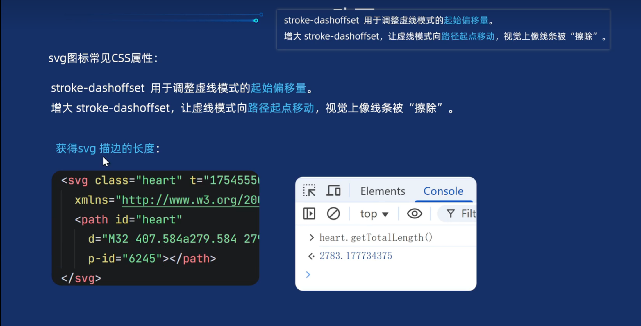
html
!DOCTYPE html>
<html lang="en">
<head>
<meta charset="UTF-8">
<meta name="viewport" content="width=device-width, initial-scale=1.0">
<title>svg描边动画效果</title>
<style>
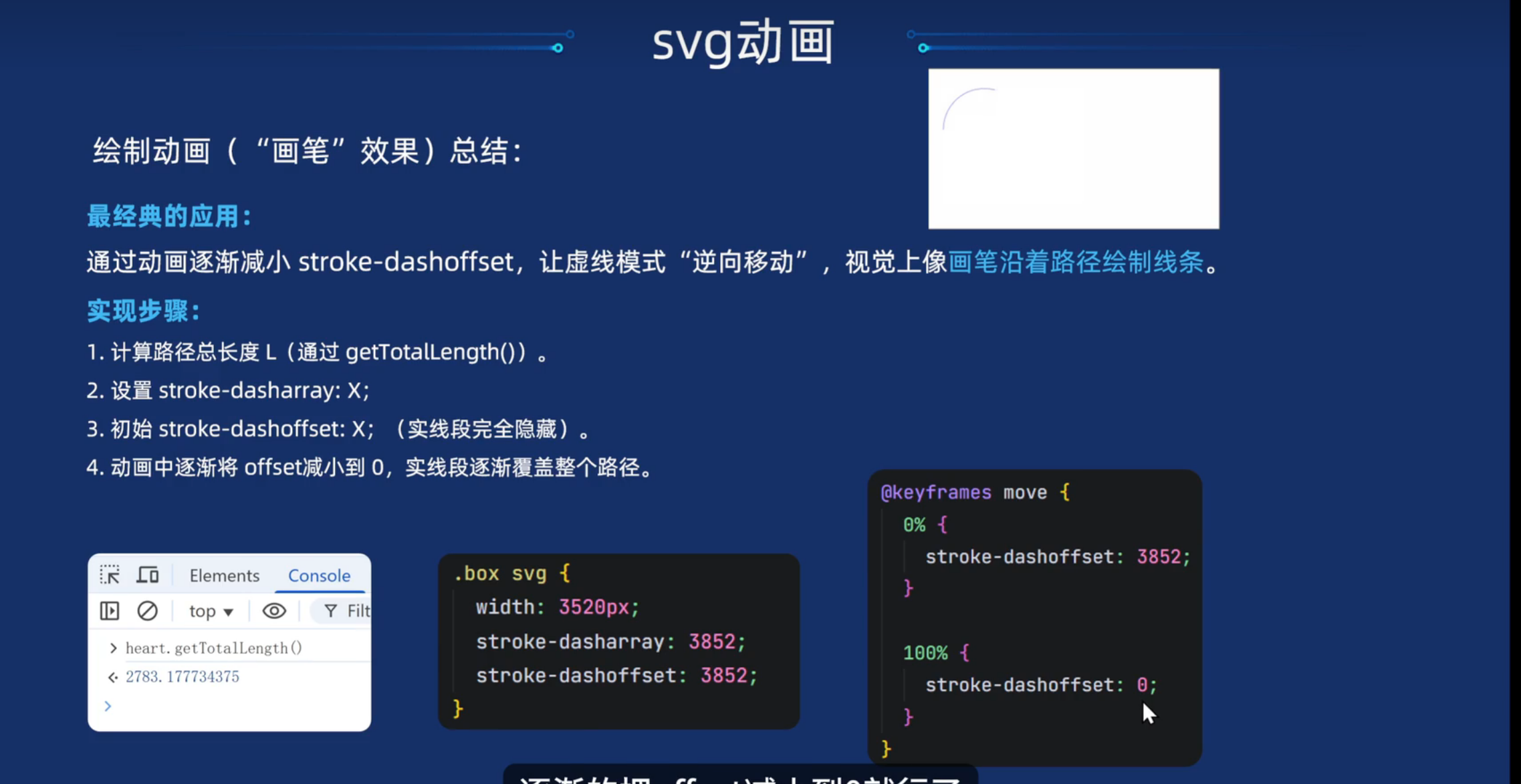
svg {
fill: none;
stroke: red;
stroke-width: 3px;
stroke-dasharray: 2783;
stroke-dashoffset: 2783;
animation: heart 5s linear infinite;
}
/* 我们想要做一画心形的效果 */
@keyframes heart {
0% {
stroke-dashoffset: 2783;
}
100% {
stroke-dashoffset: 0;
}
}
</style>
</head>
<body>
<svg class="heart" t="1754555014655" class="icon" viewBox="0 0 1024 1024" version="1.1"
xmlns="http://www.w3.org/2000/svg" p-id="6244" xmlns:xlink="http://www.w3.org/1999/xlink" width="200" height="200">
<path id="heart"
d="M32 407.584a279.584 279.584 0 0 1 480-194.944 279.584 279.584 0 0 1 480 194.944 278.144 278.144 0 0 1-113.024 224.512L562.592 892.8a96 96 0 0 1-124.416-1.952l-308.16-270.688A278.976 278.976 0 0 1 32 407.584z"
p-id="6245"></path>
</svg>
</body>
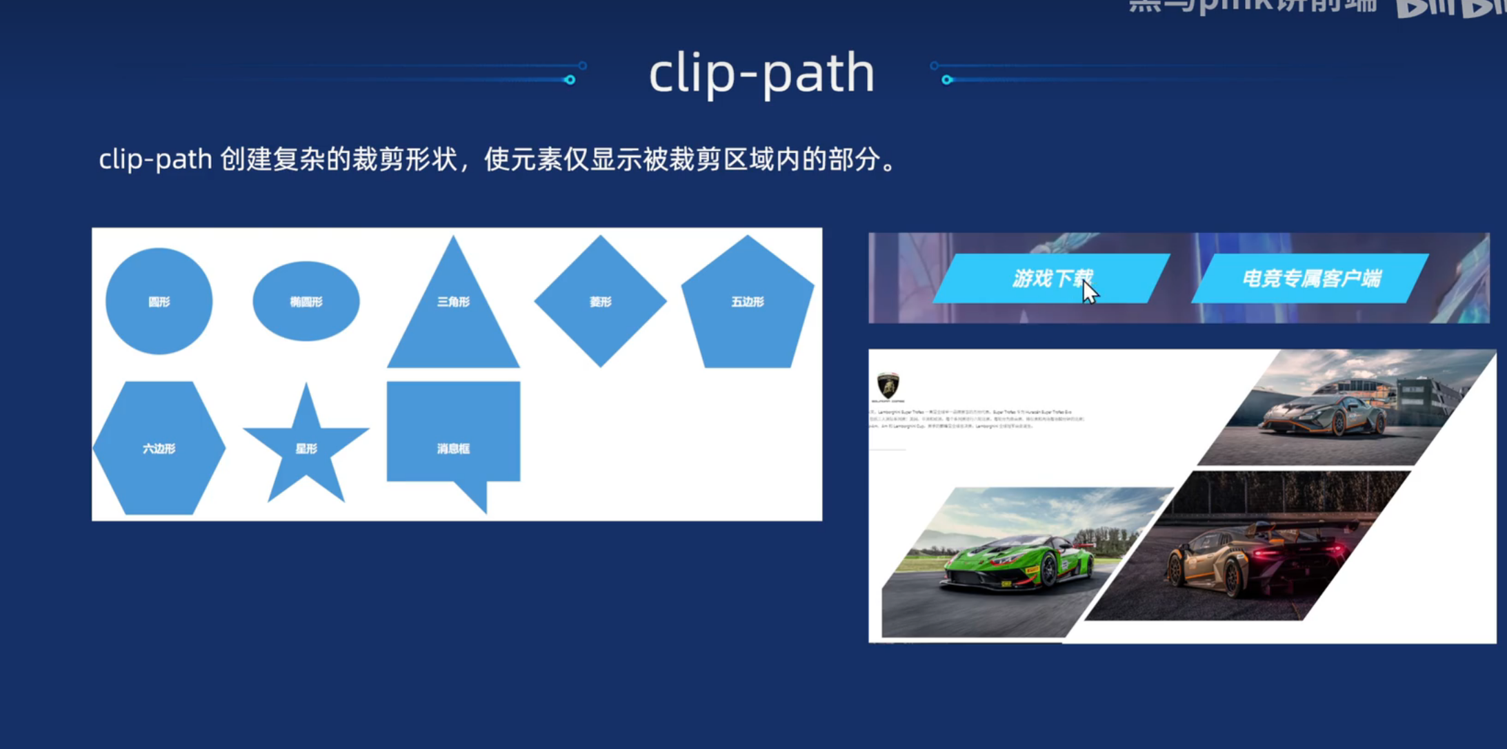
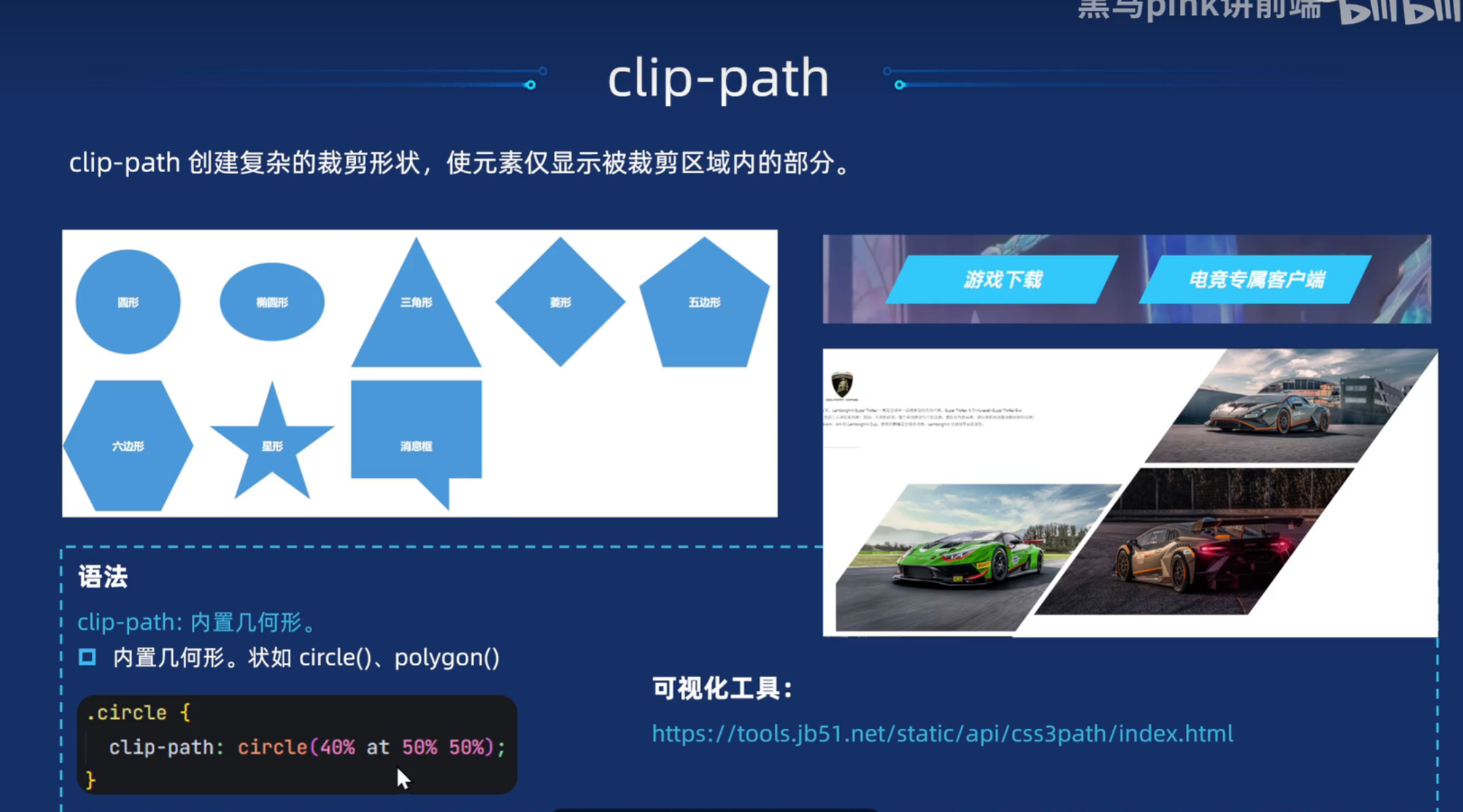
</html>clip-path(裁剪盒子)
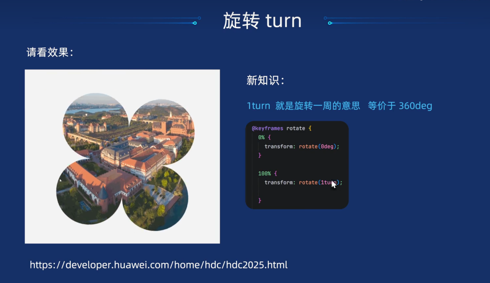
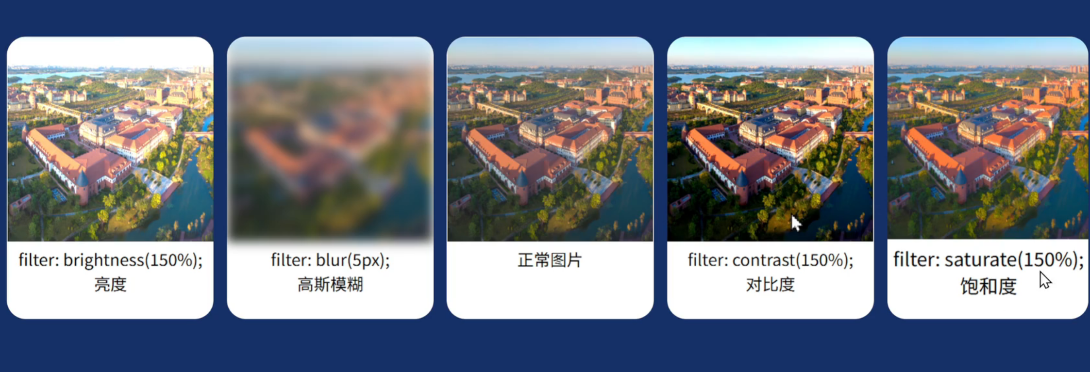
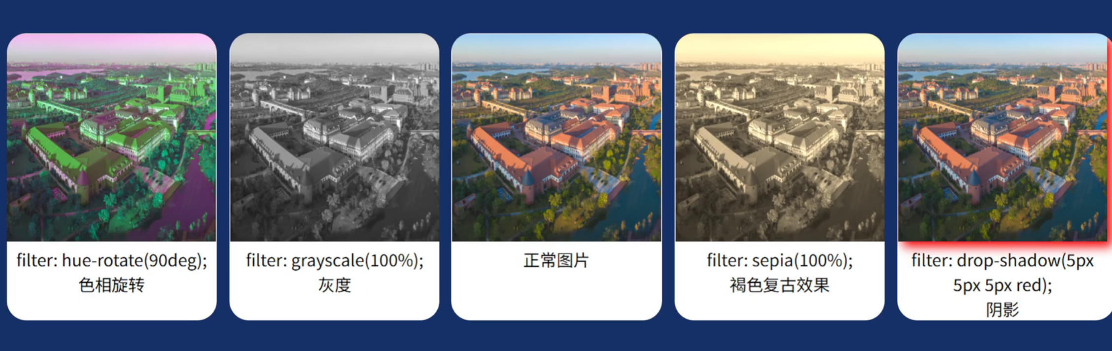
滤镜-filter
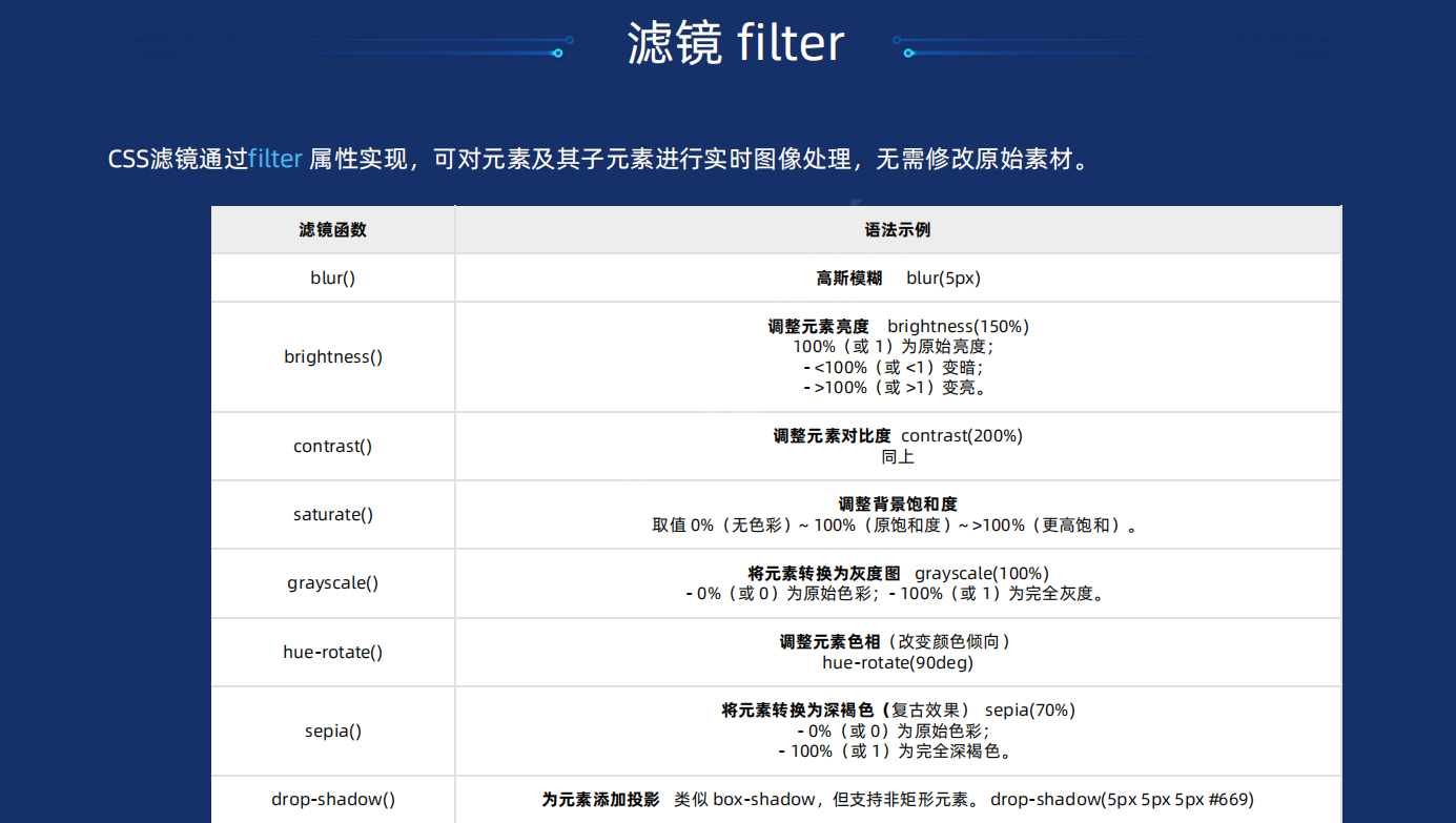
drop-shadow整体阴影
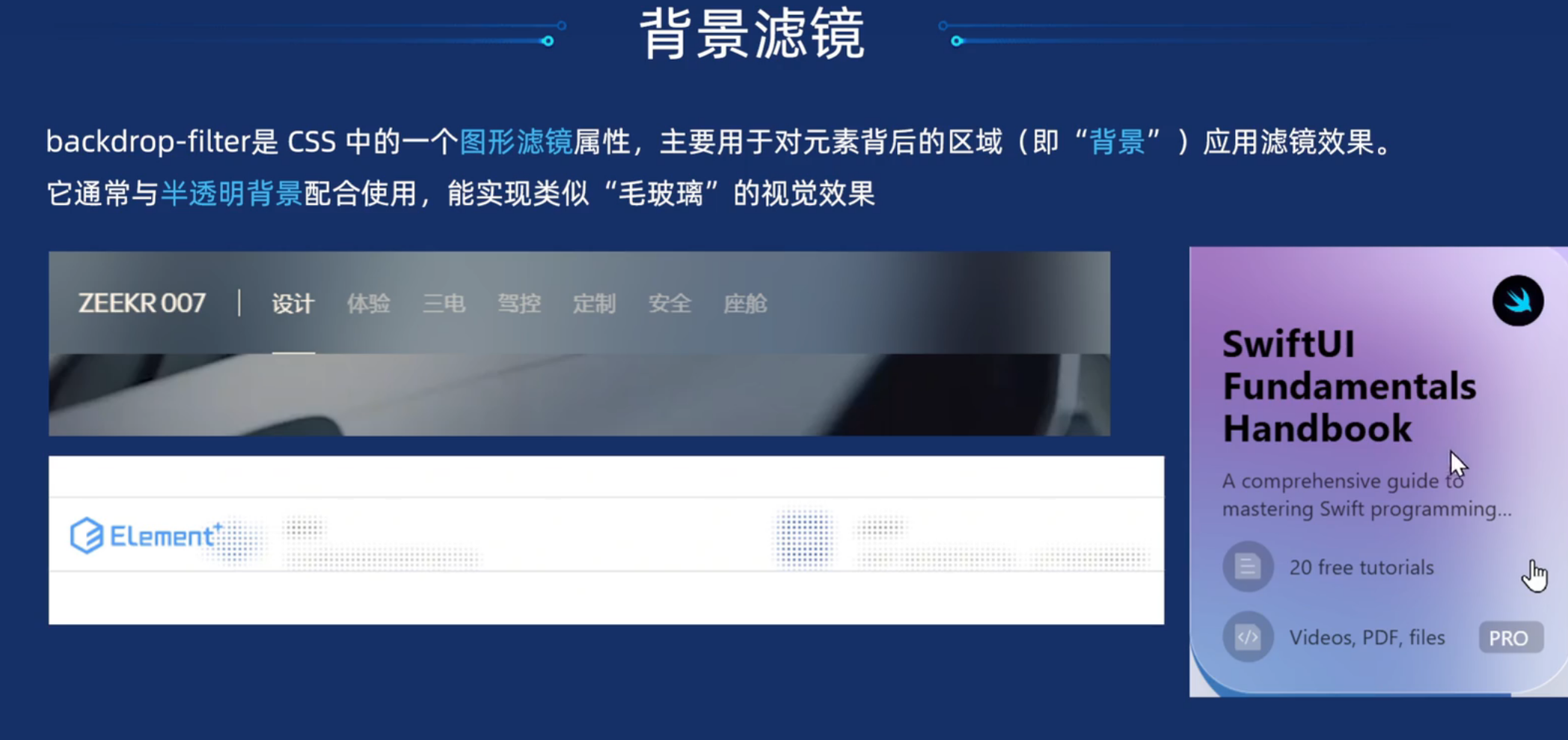
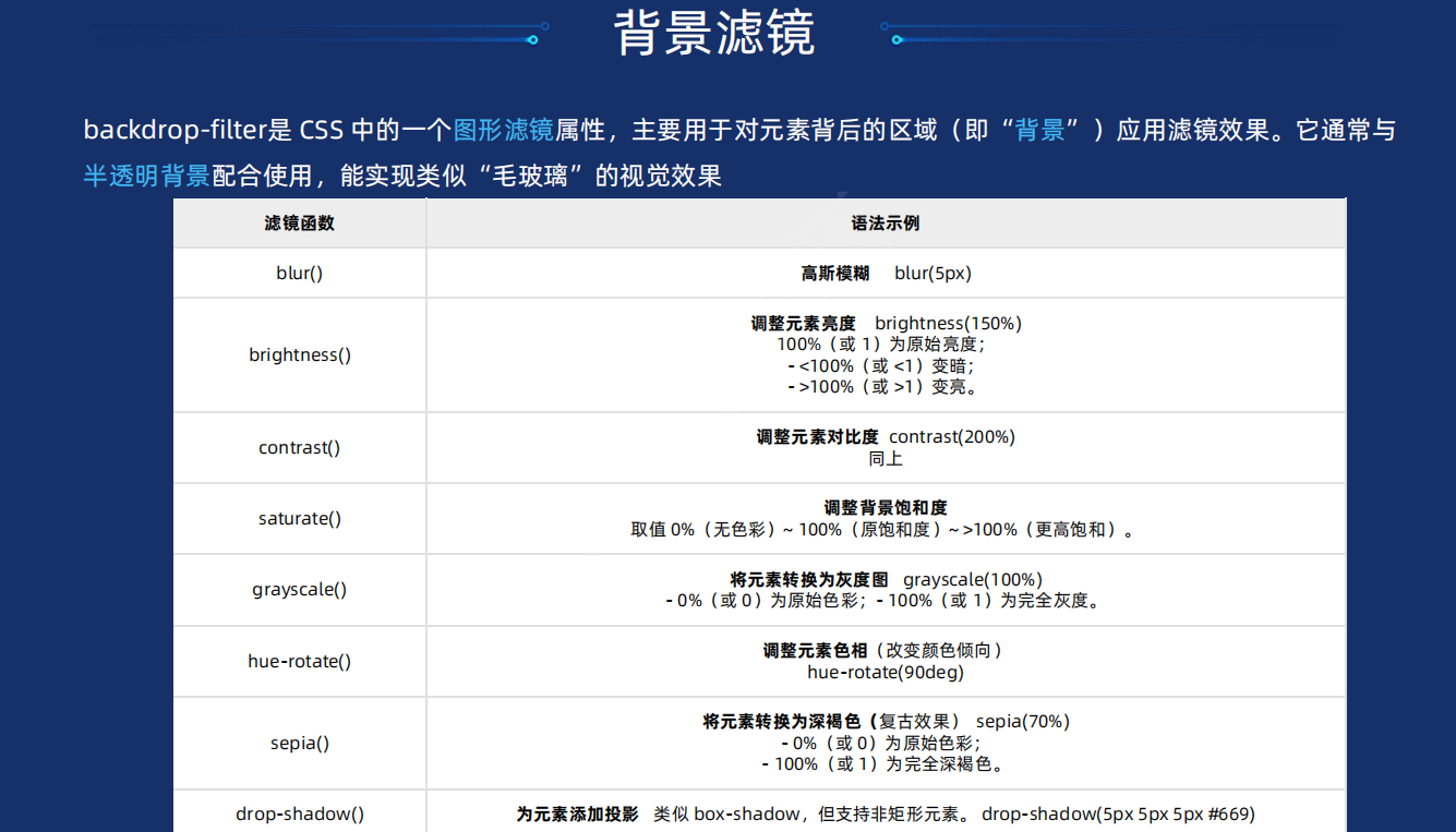
背景滤镜-backdrop-filter
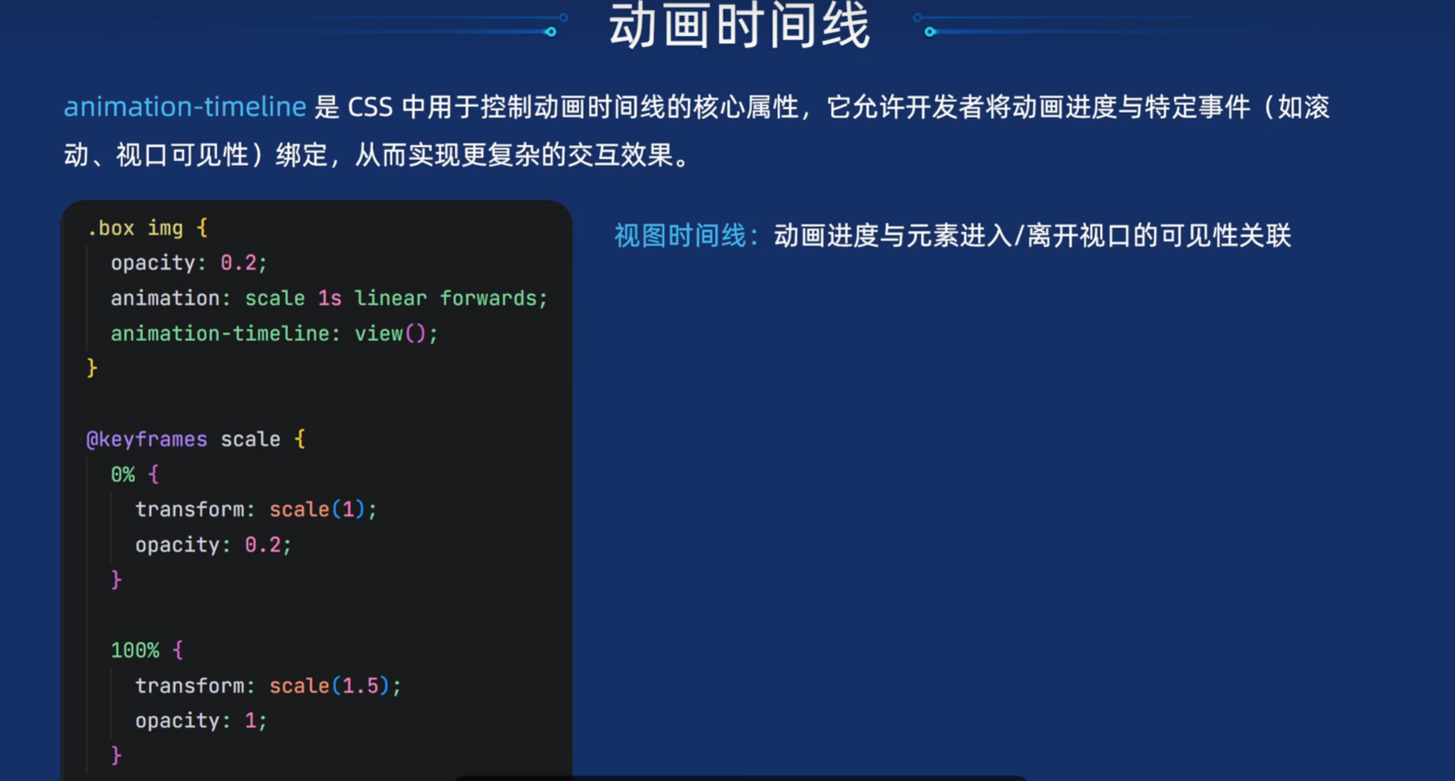
动画时间线-animation-timeline
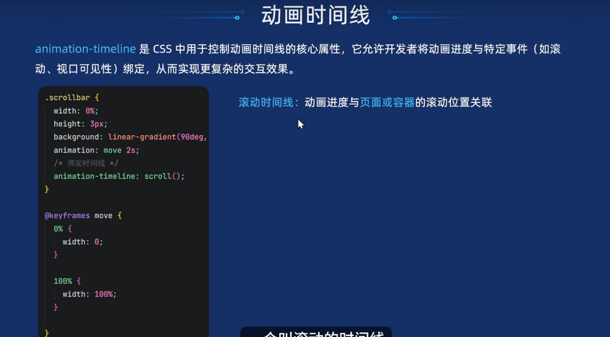
html
<!DOCTYPE html>
<html lang="en">

<head>
  <meta charset="UTF-8">
  <meta name="viewport" content="width=device-width, initial-scale=1.0">
  <title>Document</title>
  <style>
    * {
      margin: 0;
      padding: 0;

    }

    body {
      height: 3000px;
    }

    .navbar {
      position: fixed;
      top: 0;
      left: 0;
      width: 100%;
      height: 100px;
      background: #fff;
      box-shadow: 0 0 10px rgba(0, 0, 0, 0.5);
    }

    .content {
      width: 1000px;
      margin: 0 auto;
      background-color: #f5f5f5;
    }

    .scrollbar {
      width: 0%;
      height: 3px;
      background: linear-gradient(90deg, #96f, #bf70ff, #e67aff, #ff89dc, #ffa176, #ffb90f);
      animation: scrollbar 2s linear forwards;
      /* 添加滚动时间线 */
      /* 让动画绑定时间线 */
      animation-timeline: scroll();

    }

    /* 彩色线条动画效果 */
    @keyframes scrollbar {
      0% {
        width: 0%;
      }

      100% {
        width: 100%;
      }
    }
  </style>
</head>

<body>
  <div class="navbar">
    <div class="scrollbar"></div>
  </div>
  <div class="content">
    <p>里面有很多的文字</p>
    <p>里面有很多的文字</p>
    <p>里面有很多的文字</p>
    <p>里面有很多的文字</p>
    <p>里面有很多的文字</p>
    <p>里面有很多的文字</p>
    <p>里面有很多的文字</p>
    <p>里面有很多的文字</p>
    <p>里面有很多的文字</p>
    <p>里面有很多的文字</p>
    <p>里面有很多的文字</p>
    <p>里面有很多的文字</p>
    <p>里面有很多的文字</p>
    <p>里面有很多的文字</p>
    <p>里面有很多的文字</p>
    <p>里面有很多的文字</p>
    <p>里面有很多的文字</p>
    <p>里面有很多的文字</p>
    <p>里面有很多的文字</p>
    <p>里面有很多的文字</p>
    <p>里面有很多的文字</p>
    <p>里面有很多的文字</p>
    <p>里面有很多的文字</p>
    <p>里面有很多的文字</p>
    <p>里面有很多的文字</p>
    <p>里面有很多的文字</p>
    <p>里面有很多的文字</p>
    <p>里面有很多的文字</p>
    <p>里面有很多的文字</p>
    <p>里面有很多的文字</p>
    <p>里面有很多的文字</p>
    <p>里面有很多的文字</p>
    <p>里面有很多的文字</p>
    <p>里面有很多的文字</p>
    <p>里面有很多的文字</p>
    <p>里面有很多的文字</p>
    <p>里面有很多的文字</p>
    <p>里面有很多的文字</p>
    <p>里面有很多的文字</p>
    <p>里面有很多的文字</p>
    <p>里面有很多的文字</p>
    <p>里面有很多的文字</p>
    <p>里面有很多的文字</p>
    <p>里面有很多的文字</p>
    <p>里面有很多的文字</p>
    <p>里面有很多的文字</p>
    <p>里面有很多的文字</p>
    <p>里面有很多的文字</p>
    <p>里面有很多的文字</p>
    <p>里面有很多的文字</p>
    <p>里面有很多的文字</p>
    <p>里面有很多的文字</p>
    <p>里面有很多的文字</p>
    <p>里面有很多的文字</p>
    <p>里面有很多的文字</p>
    <p>里面有很多的文字</p>
    <p>里面有很多的文字</p>
    <p>里面有很多的文字</p>
    <p>里面有很多的文字</p>
    <p>里面有很多的文字</p>
    <p>里面有很多的文字</p>
    <p>里面有很多的文字</p>
    <p>里面有很多的文字</p>
    <p>里面有很多的文字</p>
    <p>里面有很多的文字</p>
    <p>里面有很多的文字</p>
    <p>里面有很多的文字</p>
    <p>里面有很多的文字</p>
    <p>里面有很多的文字</p>
    <p>里面有很多的文字</p>
    <p>里面有很多的文字</p>
    <p>里面有很多的文字</p>
    <p>里面有很多的文字</p>
    <p>里面有很多的文字</p>
    <p>里面有很多的文字</p>
    <p>里面有很多的文字</p>
    <p>里面有很多的文字</p>
    <p>里面有很多的文字</p>
    <p>里面有很多的文字</p>
    <p>里面有很多的文字</p>
    <p>里面有很多的文字</p>
    <p>里面有很多的文字</p>
    <p>里面有很多的文字</p>
    <p>里面有很多的文字</p>
    <p>里面有很多的文字</p>
    <p>里面有很多的文字</p>
    <p>里面有很多的文字</p>
    <p>里面有很多的文字</p>
    <p>里面有很多的文字</p>
    <p>里面有很多的文字</p>
    <p>里面有很多的文字</p>
    <p>里面有很多的文字</p>
    <p>里面有很多的文字</p>
    <p>里面有很多的文字</p>
    <p>里面有很多的文字</p>
    <p>里面有很多的文字</p>
    <p>里面有很多的文字</p>
    <p>里面有很多的文字</p>
    <p>里面有很多的文字</p>
    <p>里面有很多的文字</p>
    <p>里面有很多的文字</p>
    <p>里面有很多的文字</p>
    <p>里面有很多的文字</p>
    <p>里面有很多的文字</p>
    <p>里面有很多的文字</p>
    <p>里面有很多的文字</p>
    <p>里面有很多的文字</p>
    <p>里面有很多的文字</p>
    <p>里面有很多的文字</p>
    <p>里面有很多的文字</p>
    <p>里面有很多的文字</p>
    <p>里面有很多的文字</p>
    <p>里面有很多的文字</p>
    <p>里面有很多的文字</p>
    <p>里面有很多的文字</p>
    <p>里面有很多的文字</p>
    <p>里面有很多的文字</p>
    <p>里面有很多的文字</p>
    <p>里面有很多的文字</p>
    <p>里面有很多的文字</p>
    <p>里面有很多的文字</p>
    <p>里面有很多的文字</p>
    <p>里面有很多的文字</p>
    <p>里面有很多的文字</p>
    <p>里面有很多的文字</p>
    <p>里面有很多的文字</p>
    <p>里面有很多的文字</p>
    <p>里面有很多的文字</p>
    <p>里面有很多的文字</p>
    <p>里面有很多的文字</p>
    <p>里面有很多的文字</p>
    <p>里面有很多的文字</p>
    <p>里面有很多的文字</p>
    <p>里面有很多的文字</p>
    <p>里面有很多的文字</p>
    <p>里面有很多的文字</p>
    <p>里面有很多的文字</p>
    <p>里面有很多的文字</p>
    <p>里面有很多的文字</p>
    <p>里面有很多的文字</p>
    <p>里面有很多的文字</p>
    <p>里面有很多的文字</p>
    <p>里面有很多的文字</p>
    <p>里面有很多的文字</p>
    <p>里面有很多的文字</p>
    <p>里面有很多的文字</p>
  </div>
</body>

</html>
视图时间线-animation-timeline