目录
前言
该例子框架为React + TypeScript + Ant Design
📢注意:
本文使用React 18+和Ant Design 5.x版本
需要预先安装dayjs处理日期时间
示例包含完整的类型定义和实时显示功能
提示:以下是本篇文章正文内容,下面案例可供参考
一、实现步骤
完整示例
typescript
import React, { useState } from "react";
import ReactDOM from "react-dom/client";
import { TimePicker, Card, Typography } from "antd";
import type { Dayjs } from "dayjs";
import "antd/dist/reset.css";
const { RangePicker } = TimePicker;
const { Text } = Typography;
const App = () => {
const [timeRange, setTimeRange] = useState<
[Dayjs | null, Dayjs | null] | null
>(null);
const handleChange = (times: [Dayjs | null, Dayjs | null] | null) => {
setTimeRange(times);
if (times && times[0] && times[1]) {
console.log(
"选择的时间段:",
times[0].format("HH:mm"),
"至",
times[1].format("HH:mm")
);
}
};
return (
<div style={{ padding: 24 }}>
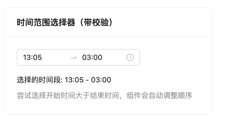
<Card title="时间范围选择器(带校验)" style={{ width: 400 }}>
<RangePicker
value={timeRange}
onChange={handleChange}
format="HH:mm"
placeholder={["开始时间", "结束时间"]}
order={false}
/>
{timeRange && timeRange[0] && timeRange[1] && (
<div style={{ marginTop: 16 }}>
<Text>
选择的时间段: {timeRange[0].format("HH:mm")} -{" "}
{timeRange[1].format("HH:mm")}
</Text>
</div>
)}
<Text type="secondary" style={{ display: "block", marginTop: 8 }}>
尝试选择开始时间大于结束时间,组件会自动调整顺序
</Text>
</Card>
</div>
);
};
// 渲染到DOM
const root = ReactDOM.createRoot(
document.getElementById("root") as HTMLElement
);
root.render(<App />);
export default App;二、主要核心
主要解决问题的核心点是,在AntDesign组件RangePicker中有一个属性:
order={false}