前言
大家好,我是大华!在现代 Web 开发中,用户体验越来越重要。一个简洁、美观又富有动效的登录页,不仅能提升品牌形象,还能增强用户的第一印象。这篇文章,我们将用 Vue3 + CSS3 动画 ,来实现一个悬浮动画和细腻交互效果的 Vue3 登录页面。
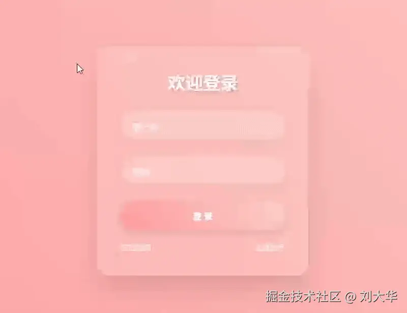
项目效果预览:
- 登录框悬浮微动 + 高光掠过动画
- 输入框标签滑动 + 聚焦反馈
- 按钮点击涟漪动效
- 浮动光点循环上升
- 忘记密码/注册链接悬停切换背景色
技术栈
- Vue 3 (
<script setup>语法) - Composition API (
ref,onMounted) - CSS3 渐变、动画、过渡、伪元素
- 响应式布局基础
一、页面结构(Template 部分)
html
<template>
  <div class="login-page" @mousemove="handleMouseMove">
    <div class="login-container">
      <!-- 浮动装饰图标 -->
      <div class="floating-icons">
        <span
          v-for="(icon, index) in icons"
          :key="index"
          :style="{
            left: icon.left + 'px',
            top: icon.top + 'px',
            width: icon.size + 'px',
            height: icon.size + 'px',
            animationDuration: (10 + Math.random() * 20) + 's',
            animationDelay: (Math.random() * 5) + 's'
          }"
        ></span>
      </div>

      <!-- 标题 -->
      <h2>欢迎登录</h2>

      <!-- 登录表单 -->
      <form @submit.prevent="handleSubmit">
        <!-- 用户名输入 -->
        <div class="input-group">
          <input type="text" required v-model="username">
          <label>用户名</label>
        </div>

        <!-- 密码输入 -->
        <div class="input-group">
          <input type="password" required v-model="password">
          <label>密码</label>
        </div>

        <!-- 登录按钮 -->
        <button type="submit" class="btn">登 录</button>

        <!-- 辅助链接 -->
        <div class="links">
          <a href="#" @mouseenter="changeBgColor('#a1c4fd')">忘记密码?</a>
          <a href="#" @mouseenter="changeBgColor('#fbc2eb')">注册账号</a>
        </div>
      </form>
    </div>
  </div>
</template>
💡 说明:
@mousemove="handleMouseMove"实现背景随鼠标移动而旋转渐变。floating-icons是背景中漂浮的圆形光点,通过v-for渲染多个。- 表单提交使用
@submit.prevent阻止默认刷新行为。
二、逻辑实现(Script 部分)
js
<script setup>
import { ref, onMounted } from 'vue';

// 用户输入数据
const username = ref('');
const password = ref('');

// 浮动图标数据
const icons = ref([]);

// 生成浮动图标
const createIcons = () => {
  const iconsCount = 10;
  const newIcons = [];
  for (let i = 0; i < iconsCount; i++) {
    newIcons.push({
      left: Math.random() * 380,     // 随机水平位置
      top: Math.random() * 400,      // 随机起始高度
      size: 20 + Math.random() * 30  // 随机大小(20~50px)
    });
  }
  icons.value = newIcons;
};

// 表单提交
const handleSubmit = () => {
  alert(`欢迎, ${username.value}!`);
};

// 鼠标悬停链接时改变背景色
const changeBgColor = (color) => {
  document.body.style.background = `linear-gradient(45deg, ${color}, ${color.replace(')', '')}80)`;
};

// 鼠标移动时动态改变背景角度
const handleMouseMove = (e) => {
  const x = e.clientX / window.innerWidth; // 0 ~ 1
  const angle = x * 180; // 0 ~ 180deg
  document.body.style.background = `linear-gradient(${angle}deg, #ff9a9e, #fad0c4)`;
};

// 组件挂载后初始化图标
onMounted(() => {
  createIcons();
});
</script>
🔍 关键点解析:
createIcons()在页面加载时生成 10 个随机位置和大小的"光点"。handleMouseMove根据鼠标 X 坐标控制渐变角度,实现"视角跟随"效果。changeBgColor在鼠标进入链接时切换背景主题色,增强交互反馈。
三、样式设计(Style 部分)
1. 全局重置与字体
css
* {
  margin: 0;
  padding: 0;
  box-sizing: border-box;
  font-family: 'Segoe UI', Tahoma, Geneva, Verdana, sans-serif;
}
2. 页面容器 .login-page
css
.login-page {
  display: flex;
  justify-content: center;
  align-items: center;
  min-height: 100vh;
  background: linear-gradient(45deg, #ff9a9e, #fad0c4);
  transition: background 0.5s ease;
}使用flex居中,背景为粉色系渐变,支持过渡动画。
3. 登录框 .login-container
css
.login-container {
  position: relative;
  width: 380px;
  padding: 40px;
  background: rgba(255, 255, 255, 0.15);
  backdrop-filter: blur(10px); /* 毛玻璃效果 */
  border-radius: 20px;
  box-shadow: 0 25px 45px rgba(0, 0, 0, 0.1);
  border: 1px solid rgba(255, 255, 255, 0.2);
  overflow: hidden;
  transition: transform 0.3s ease, box-shadow 0.3s ease;
}

.login-container:hover {
  transform: translateY(-5px);
  box-shadow: 0 30px 50px rgba(0, 0, 0, 0.15);
}
backdrop-filter: blur(10px) 实现毛玻璃质感,极具现代感!
4. 悬停高光掠过动画
css
.login-container::before {
  content: '';
  position: absolute;
  top: 0;
  left: -100%;
  width: 100%;
  height: 100%;
  background: linear-gradient(90deg, transparent, rgba(255, 255, 255, 0.4), transparent);
  transition: 0.5s;
}

.login-container:hover::before {
  left: 100%;
}
当鼠标悬停时,一束高光从左向右扫过登录框,视觉冲击力强。
5. 输入框动效
css
.input-group input {
  width: 100%;
  padding: 15px 20px;
  background: rgba(255, 255, 255, 0.2);
  border: none;
  outline: none;
  border-radius: 35px;
  color: #fff;
  font-size: 16px;
  box-shadow: 0 5px 15px rgba(0, 0, 0, 0.05);
  transition: all 0.3s ease;
}

.input-group input:focus, .input-group input:hover {
  background: rgba(255, 255, 255, 0.3);
  box-shadow: 0 8px 20px rgba(0, 0, 0, 0.1);
}

.input-group label {
  position: absolute;
  top: 15px;
  left: 20px;
  color: rgba(255, 255, 255, 0.8);
  pointer-events: none;
  transition: all 0.3s ease;
}

.input-group input:focus + label,
.input-group input:valid + label {
  top: -10px;
  left: 15px;
  font-size: 12px;
  background: rgba(255, 255, 255, 0.2);
  padding: 0 10px;
  border-radius: 10px;
}
实现 Material Design 风格的标签上滑动效,用户体验极佳。
6. 登录按钮动效
css
.btn {
  width: 100%;
  padding: 15px;
  background: linear-gradient(45deg, #ff9a9e, #fad0c4);
  border: none;
  border-radius: 35px;
  color: #fff;
  font-weight: 600;
  cursor: pointer;
  box-shadow: 0 5px 15px rgba(0, 0, 0, 0.1);
  transition: all 0.3s ease;
}

.btn:hover {
  transform: translateY(-3px);
  box-shadow: 0 10px 20px rgba(0, 0, 0, 0.2);
}

.btn::before {
  content: '';
  position: absolute;
  top: 0;
  left: -100%;
  width: 100%;
  height: 100%;
  background: linear-gradient(90deg, transparent, rgba(255, 255, 255, 0.4), transparent);
  transition: 0.5s;
}

.btn:hover::before {
  left: 100%;
}
悬停时按钮上浮 + 高光扫过,交互感满分!
7. 浮动光点动画
css
.floating-icons {
  position: absolute;
  top: 0;
  left: 0;
  width: 100%;
  height: 100%;
  pointer-events: none;
  z-index: -1;
}

.floating-icons span {
  position: absolute;
  display: block;
  width: 40px;
  height: 40px;
  background: rgba(255, 255, 255, 0.1);
  border-radius: 50%;
  animation: float 15s linear infinite;
  opacity: 0;
}

.login-container:hover .floating-icons span {
  opacity: 1;
}

@keyframes float {
  0% {
    transform: translateY(0) rotate(0deg);
    opacity: 1;
  }
  100% {
    transform: translateY(-1000px) rotate(720deg);
    opacity: 0;
  }
}
✨ 光点在登录框悬停时浮现,并向上漂浮、旋转、淡出,营造梦幻氛围。
四、完整代码
html
<template>
  <div class="login-page" @mousemove="handleMouseMove">
    <div class="login-container">
      <div class="floating-icons">
        <span
          v-for="(icon, index) in icons"
          :key="index"
          :style="{
            left: icon.left + 'px',
            top: icon.top + 'px',
            width: icon.size + 'px',
            height: icon.size + 'px',
            animationDuration: (10 + Math.random() * 20) + 's',
            animationDelay: (Math.random() * 5) + 's'
          }"
        ></span>
      </div>
      <h2>欢迎登录</h2>
      <form @submit.prevent="handleSubmit">
        <div class="input-group">
          <input type="text" required v-model="username">
          <label>用户名</label>
        </div>
        <div class="input-group">
          <input type="password" required v-model="password">
          <label>密码</label>
        </div>
        <button type="submit" class="btn">登 录</button>
        <div class="links">
          <a href="#" @mouseenter="changeBgColor('#a1c4fd')">忘记密码?</a>
          <a href="#" @mouseenter="changeBgColor('#fbc2eb')">注册账号</a>
        </div>
      </form>
    </div>
  </div>
</template>

<script setup>
import { ref, onMounted } from 'vue';

const username = ref('');
const password = ref('');
const icons = ref([]);

const createIcons = () => {
  const iconsCount = 10;
  const newIcons = [];
  for (let i = 0; i < iconsCount; i++) {
    newIcons.push({
      left: Math.random() * 380,
      top: Math.random() * 400,
      size: 20 + Math.random() * 30
    });
  }
  icons.value = newIcons;
};

const handleSubmit = () => {
  alert(`欢迎, ${username.value}!`);
};

const changeBgColor = (color) => {
  document.body.style.background = `linear-gradient(45deg, ${color}, ${color.replace(')', '')}80)`;
};

const handleMouseMove = (e) => {
  const x = e.clientX / window.innerWidth;
  document.body.style.background = `linear-gradient(${x * 180}deg, #ff9a9e, #fad0c4)`;
};

onMounted(() => {
  createIcons();
});
</script>

<style scoped>
* {
  margin: 0;
  padding: 0;
  box-sizing: border-box;
  font-family: 'Segoe UI', Tahoma, Geneva, Verdana, sans-serif;
}

.login-page {
  display: flex;
  justify-content: center;
  align-items: center;
  min-height: 100vh;
  background: linear-gradient(45deg, #ff9a9e, #fad0c4);
  transition: background 0.5s ease;
}

.login-container {
  position: relative;
  width: 380px;
  padding: 40px;
  background: rgba(255, 255, 255, 0.15);
  backdrop-filter: blur(10px);
  border-radius: 20px;
  box-shadow: 0 25px 45px rgba(0, 0, 0, 0.1);
  border: 1px solid rgba(255, 255, 255, 0.2);
  overflow: hidden;
  transition: transform 0.3s ease, box-shadow 0.3s ease;
}

.login-container:hover {
  transform: translateY(-5px);
  box-shadow: 0 30px 50px rgba(0, 0, 0, 0.15);
}

.login-container::before {
  content: '';
  position: absolute;
  top: 0;
  left: -100%;
  width: 100%;
  height: 100%;
  background: linear-gradient(90deg, transparent, rgba(255, 255, 255, 0.4), transparent);
  transition: 0.5s;
}

.login-container:hover::before {
  left: 100%;
}

h2 {
  color: #fff;
  text-align: center;
  margin-bottom: 30px;
  font-size: 2em;
  text-shadow: 2px 2px 4px rgba(0, 0, 0, 0.2);
}

.input-group {
  position: relative;
  margin-bottom: 30px;
}

.input-group input {
  width: 100%;
  padding: 15px 20px;
  background: rgba(255, 255, 255, 0.2);
  border: none;
  outline: none;
  border-radius: 35px;
  color: #fff;
  font-size: 16px;
  box-shadow: 0 5px 15px rgba(0, 0, 0, 0.05);
  transition: all 0.3s ease;
}

.input-group input:focus, .input-group input:hover {
  background: rgba(255, 255, 255, 0.3);
  box-shadow: 0 8px 20px rgba(0, 0, 0, 0.1);
}

.input-group label {
  position: absolute;
  top: 15px;
  left: 20px;
  color: rgba(255, 255, 255, 0.8);
  pointer-events: none;
  transition: all 0.3s ease;
}

.input-group input:focus + label,
.input-group input:valid + label {
  top: -10px;
  left: 15px;
  font-size: 12px;
  background: rgba(255, 255, 255, 0.2);
  padding: 0 10px;
  border-radius: 10px;
}

.btn {
  position: relative;
  width: 100%;
  padding: 15px;
  background: linear-gradient(45deg, #ff9a9e, #fad0c4);
  border: none;
  outline: none;
  border-radius: 35px;
  color: #fff;
  font-size: 16px;
  font-weight: 600;
  cursor: pointer;
  overflow: hidden;
  transition: all 0.3s ease;
  box-shadow: 0 5px 15px rgba(0, 0, 0, 0.1);
}

.btn:hover {
  transform: translateY(-3px);
  box-shadow: 0 10px 20px rgba(0, 0, 0, 0.2);
}

.btn::before {
  content: '';
  position: absolute;
  top: 0;
  left: -100%;
  width: 100%;
  height: 100%;
  background: linear-gradient(90deg, transparent, rgba(255, 255, 255, 0.4), transparent);
  transition: 0.5s;
}

.btn:hover::before {
  left: 100%;
}

.links {
  display: flex;
  justify-content: space-between;
  margin-top: 20px;
}

.links a {
  color: rgba(255, 255, 255, 0.8);
  text-decoration: none;
  font-size: 14px;
  transition: all 0.3s ease;
}

.links a:hover {
  color: #fff;
  text-shadow: 0 0 10px rgba(255, 255, 255, 0.5);
}

.floating-icons {
  position: absolute;
  top: 0;
  left: 0;
  width: 100%;
  height: 100%;
  pointer-events: none;
  z-index: -1;
}

.floating-icons span {
  position: absolute;
  display: block;
  width: 40px;
  height: 40px;
  background: rgba(255, 255, 255, 0.1);
  border-radius: 50%;
  animation: float 15s linear infinite;
  opacity: 0;
  transition: opacity 0.5s ease;
}

.login-container:hover .floating-icons span {
  opacity: 1;
}

@keyframes float {
  0% {
    transform: translateY(0) rotate(0deg);
    opacity: 1;
  }
  100% {
    transform: translateY(-1000px) rotate(720deg);
    opacity: 0;
  }
}
</style>
优化建议
- 性能优化:浮动图标数量可控制,避免过多影响性能。
- 响应式 :添加
@media查询适配移动端。 - 表单验证:增加正则校验、非空判断。
- 主题切换 :封装背景色切换逻辑为
themeService。 - 动画库 :可接入
Animate.css或GSAP增强动效。
总结
这篇文章一步步实现了一个高颜值、强交互的 Vue3 登录页,涵盖了:
- Vue3 Composition API 使用
- 动态样式绑定
- 鼠标事件监听
- CSS3 动画与过渡
- 毛玻璃(backdrop-filter)特效
- 渐变背景与视觉动效
这个登录页不仅适合个人项目、后台系统、SaaS 平台,还可以作为你作品集中的亮点之一。
本文首发于公众号:程序员刘大华,专注分享前后端开发的实战笔记。关注我,少走弯路,一起进步!
📌往期精彩
《SpringBoot 中的 7 种耗时统计方式,你用过几种?》