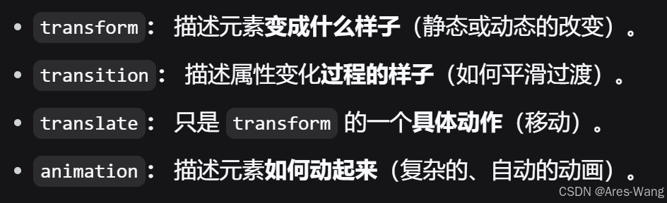
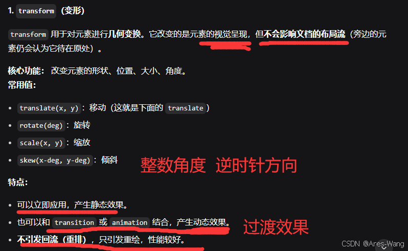
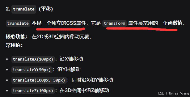
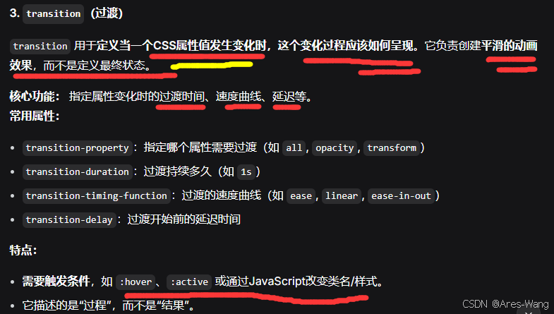
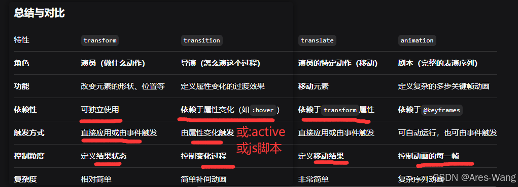
总结:transform是转换。transition是样式过渡。translate是移动,translate 是transform的属性值。
reflow-回流 和 repaint-重绘
css
.box {
  transform: rotate(45deg) scale(1.2); /* 静态:元素被旋转和放大 */
}
css
.box {
  transform: translate(100px, 50px); /* 将元素向右移动100px,向下移动50px */
}
css
/* 1. 先定义关键帧 */
@keyframes bounce {
  0%   { transform: translateY(0); }
  50%  { transform: translateY(-30px); }
  100% { transform: translateY(0); }
}

/* 2. 再将动画应用到元素上 */
.box {
  animation: bounce 2s ease-in-out infinite;
  /* 应用名为'bounce'的动画,时长2秒,无限循环 */
}
css
.button {
/* 初始状态 */
transform: scale(1);
/* transition 属性一般写在元素的默认状态(初始样式)中,而不是写在触发状态(如 :hover)里。*/
transition: transform 0.2s ease; /* 设置transform属性变化的过渡 */
/* 也可以直接写为:
transition: all 0.2s ease;
*/
}
.button:hover {
/* 最终状态:放大1.1倍 */
transform: scale(1.1);
/* transition 会负责让这个放大过程在0.2秒内平滑完成 */
}
//transform 定义了元素的视觉变化(从 scale(1) 到 scale(1.1))。
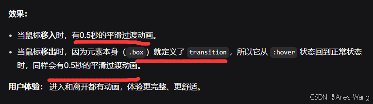
//transition 定义了这个变化如何发生(用0.2秒时间,以ease曲线平滑过渡)。transition 属性一般写在元素的默认状态(初始样式)中,而不是写在触发状态(如 :hover)里。这样为了过渡效果在"进入"和"离开"状态时都能生效。
》》❌ 错误的写法(只写在 :hover 里)
css
.box {
  width: 100px;
  height: 100px;
  background: blue;
}

.box:hover {
  background: red;
  width: 200px;
  /* 过渡只定义在hover状态 */
  transition: all 0.5s ease;
}
》》✅ 正确的写法(写在默认状态)
css
.box {
  width: 100px;
  height: 100px;
  background: blue;
  /* 过渡定义在默认状态,对所有状态变化都有效 */
  transition: all 0.5s ease;
}

.box:hover {
  background: red;
  width: 200px;
}
》》如果你想对"进入"和"离开"设置不同的过渡效果,可以这样做
css
.box {
  width: 100px;
  height: 100px;
  background: blue;
  /* 定义"离开"(返回初始状态)的过渡:慢速离开 */
  transition: all 1s ease-in-out;
}

.box:hover {
  background: red;
  width: 200px;
  /* 覆盖"进入"(到达hover状态)的过渡:快速进入 */
  transition: all 0.3s ease;
}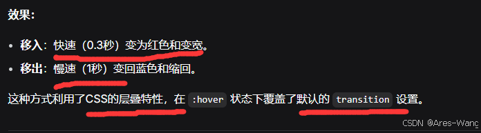
CSS层叠特性
相同的属性会覆盖,后面的CSS属性会覆盖前面的CSS属性
不同的属性会叠加,不同的CSS属性都会生效
特殊情况:仅需要单次动画时
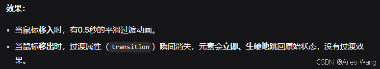
如果你确实只希望在状态改变的一个方向 上有动画,另一个方向上立即生效,那么写在触发状态里也是可以的。但这种情况相对少见。
css
/*一个模态框的关闭动作你希望是瞬间的,而打开是动画的。*/
.modal {
  opacity: 0;
  transform: scale(0.8);
}

.modal.open {
  opacity: 1;
  transform: scale(1);
  /* 只有添加.open类时有过渡 */
  transition: all 0.3s ease;
}