利用R绘制条形图
在R中绘制条形图主要使用barplot()函数(基础绘图)和ggplot2包。下面我将展示多种类型的条形图及其实现方法。
欢迎大家在评论区留言或私信,交流学习心得或学习R的过程中遇到的问题。感谢大家的支持和关注,您的支持是我创作的最大动力。
目录
1.基础数据准备
go
# 安装和加载必要的包(如果前期已安装可忽略)
#install.packages("ggplot2")
#install.packages("dplyr")
#install.packages("reshape2")

library(ggplot2)
library(dplyr)
library(reshape2)

# 创建示例数据
set.seed(123)
data <- data.frame(
  Category = c("A", "B", "C", "D", "E"),
  Value1 = c(23, 45, 56, 34, 67),
  Value2 = c(34, 38, 49, 28, 52),
  Group = c("X", "X", "Y", "Y", "Z")
)
2.使用barplot绘图
- 简单条形图
go
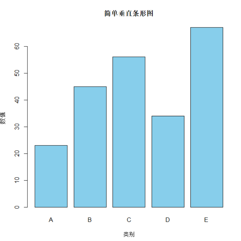
# 垂直条形图
barplot(data$Value1,
        names.arg = data$Category,
        main = "简单垂直条形图",
        xlab = "类别",
        ylab = "数值",
        col = "skyblue")
出图效果如下:
- 水平条形图
go
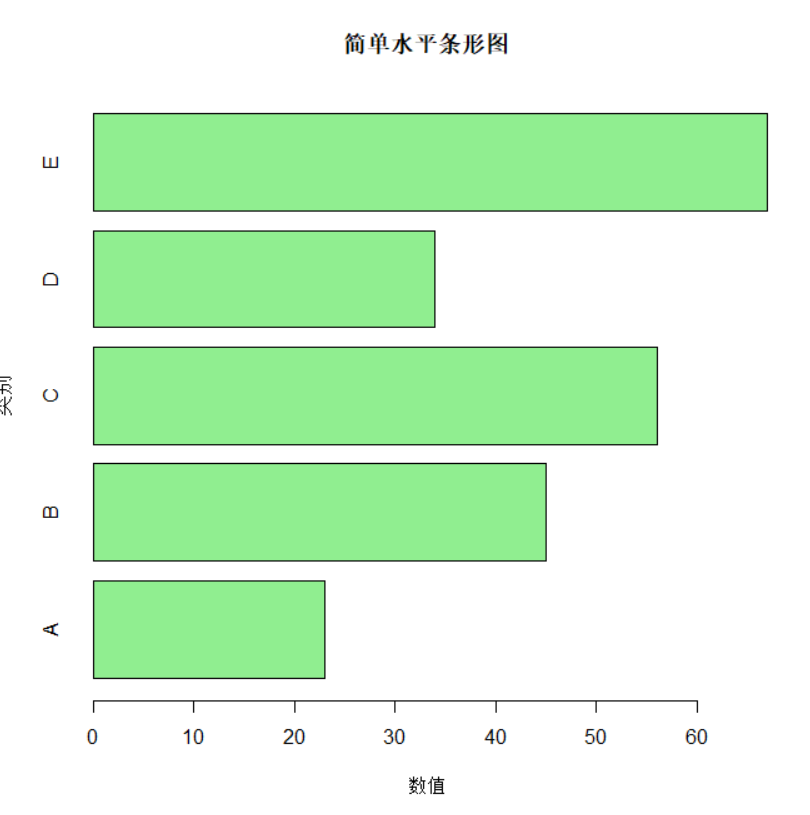
# 水平条形图
barplot(data$Value1,
        names.arg = data$Category,
        main = "简单水平条形图",
        xlab = "数值",
        ylab = "类别",
        col = "lightgreen",
        horiz = TRUE)
出图效果如下:
- 分组条形图
go
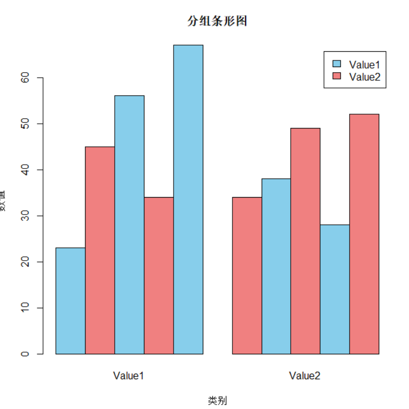
# 准备矩阵数据
matrix_data <- as.matrix(data[, c("Value1", "Value2")])
rownames(matrix_data) <- data$Category

# 分组条形图
barplot(matrix_data,
        beside = TRUE,
        main = "分组条形图",
        xlab = "类别",
        ylab = "数值",
        col = c("skyblue", "lightcoral"),
        legend.text = c("Value1", "Value2"))
出图效果如下:
- 堆叠条形图
go
# 堆叠条形图
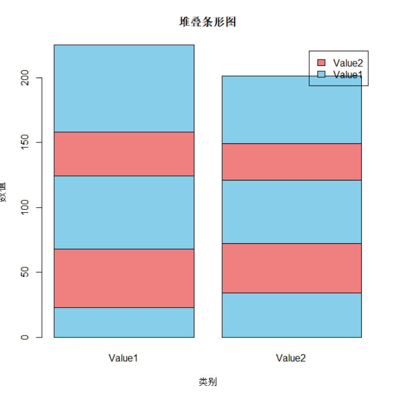
barplot(matrix_data,
beside = FALSE,
main = "堆叠条形图",
xlab = "类别",
ylab = "数值",
col = c("skyblue", "lightcoral"),
legend.text = c("Value1", "Value2"))出图效果如下:
3.使用ggplot2绘图
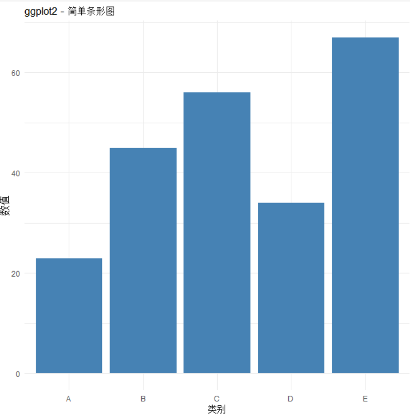
- 简单条形图
go
# 基本条形图
ggplot(data, aes(x = Category, y = Value1)) +
  geom_bar(stat = "identity", fill = "steelblue") +
  labs(title = "ggplot2 - 简单条形图",
       x = "类别", y = "数值") +
  theme_minimal()
出图效果如下:
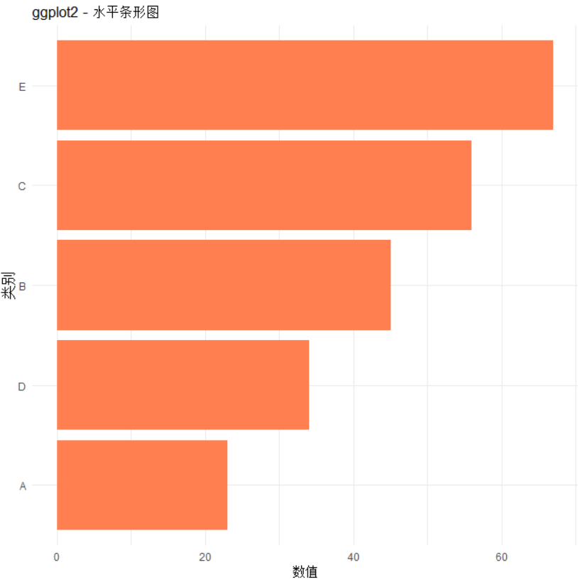
- 水平条形图
go
ggplot(data, aes(x = reorder(Category, Value1), y = Value1)) +
  geom_bar(stat = "identity", fill = "coral") +
  coord_flip() +
  labs(title = "ggplot2 - 水平条形图",
       x = "类别", y = "数值") +
  theme_minimal()
出图效果如下:
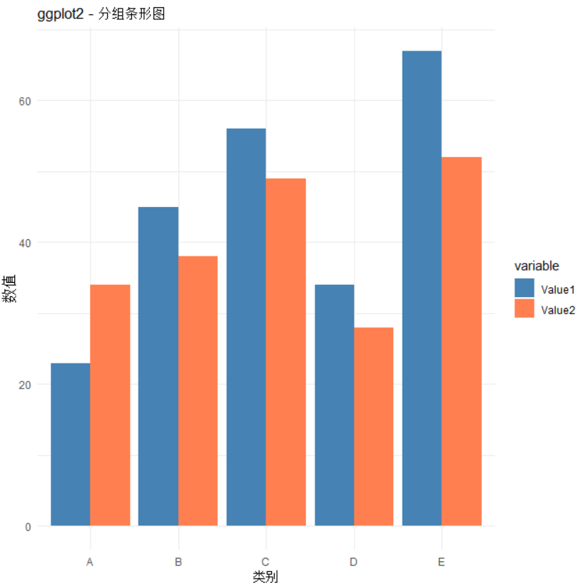
- 分组条形图
go
data_long <- melt(data[, 1:3], id.vars = "Category")

ggplot(data_long, aes(x = Category, y = value, fill = variable)) +
  geom_bar(stat = "identity", position = "dodge") +
  labs(title = "ggplot2 - 分组条形图",
       x = "类别", y = "数值") +
  scale_fill_manual(values = c("Value1" = "steelblue", "Value2" = "coral")) +
  theme_minimal()
出图效果如下:
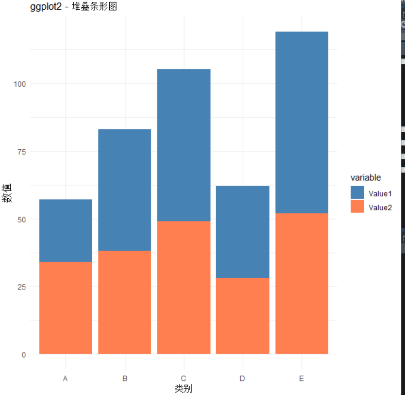
- 堆叠条形图
go
ggplot(data_long, aes(x = Category, y = value, fill = variable)) +
  geom_bar(stat = "identity", position = "stack") +
  labs(title = "ggplot2 - 堆叠条形图",
       x = "类别", y = "数值") +
  scale_fill_manual(values = c("Value1" = "steelblue", "Value2" = "coral")) +
  theme_minimal()
出图效果如下:
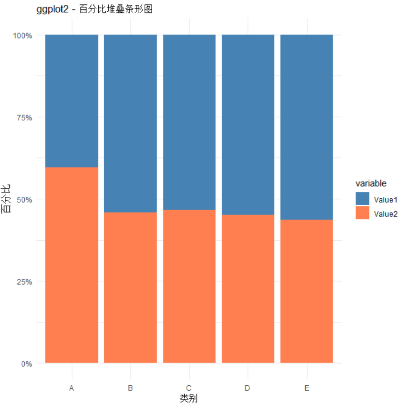
- 百分比条形图
go
ggplot(data_long, aes(x = Category, y = value, fill = variable)) +
  geom_bar(stat = "identity", position = "fill") +
  labs(title = "ggplot2 - 百分比堆叠条形图",
       x = "类别", y = "百分比") +
  scale_y_continuous(labels = scales::percent) +
  scale_fill_manual(values = c("Value1" = "steelblue", "Value2" = "coral")) +
  theme_minimal()
出图效果如下:
4.高级条形图绘制
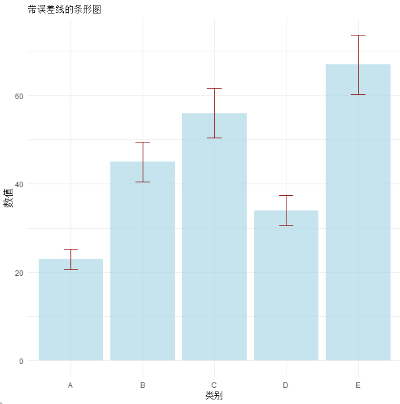
- 误差条形图
go
# 创建包含误差的数据
data_error <- data %>%
  mutate(se = Value1 * 0.1)  # 假设标准误为10%

ggplot(data_error, aes(x = Category, y = Value1)) +
  geom_bar(stat = "identity", fill = "lightblue", alpha = 0.7) +
  geom_errorbar(aes(ymin = Value1 - se, ymax = Value1 + se),
                width = 0.2, color = "darkred") +
  labs(title = "带误差线的条形图", x = "类别", y = "数值") +
  theme_minimal()
出图效果如下:
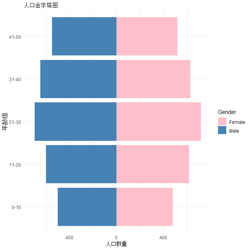
- 金字塔条形图(人口金字塔)
go
# 创建示例数据
pyramid_data <- data.frame(
  AgeGroup = rep(c("0-10", "11-20", "21-30", "31-40", "41-50"), 2),
  Gender = rep(c("Male", "Female"), each = 5),
  Population = c(500, 600, 700, 650, 550, 480, 620, 720, 630, 520)
)

ggplot(pyramid_data, aes(x = AgeGroup, y = ifelse(Gender == "Male",
                                                  -Population, Population),
                         fill = Gender)) +
  geom_bar(stat = "identity") +
  coord_flip() +
  scale_y_continuous(labels = abs, limits = max(pyramid_data$Population) * c(-1, 1)) +
  labs(title = "人口金字塔图", x = "年龄组", y = "人口数量") +
  scale_fill_manual(values = c("Male" = "steelblue", "Female" = "pink")) +
  theme_minimal()
出图效果如下:
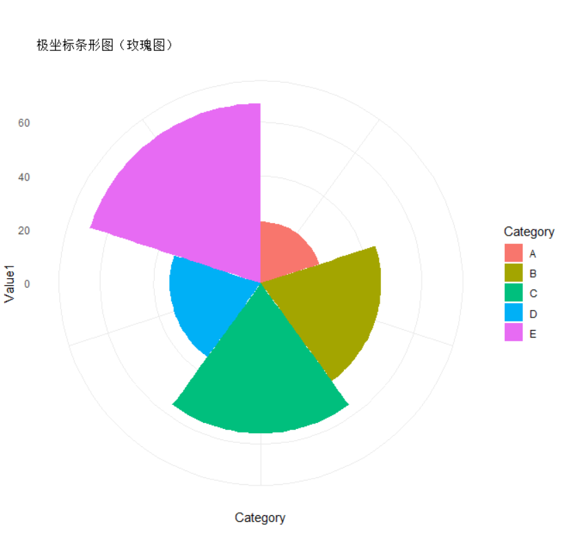
- 极坐标条形图(玫瑰图)
go
ggplot(data, aes(x = Category, y = Value1, fill = Category)) +
  geom_bar(stat = "identity", width = 1) +
  coord_polar() +
  labs(title = "极坐标条形图(玫瑰图)") +
  theme_minimal() +
  theme(axis.text.x = element_blank())
出图效果如下:
※※大家在使用的时候遇到任何问题欢迎留言,您的支持是我创作的最大动力。※※