Flexbox布局三剑客
flexbox布局的三大核心概念:
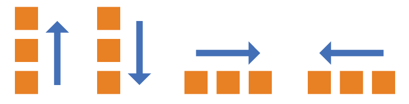
1. 方向(flex-direction)
flex-direction属性定义了主轴的方向,决定项目是水平排列还是垂直排列。
可选值:
-
row(默认):主轴为水平方向,项目从左到右排列。 -
row-reverse:主轴为水平方向,项目从右到左排列。 -
column:主轴为垂直方向,项目从上到下排列。 -
column-reverse:主轴为垂直方向,项目从下到上排列。
示例代码:.box {
flex-direction: row | row-reverse | column | column-reverse;
}
2. 主轴对齐属性(justify-content)
justify-content属性管理项目在主轴上的对齐和分布。
对齐类:
-
flex-start(默认):项目向主轴起点对齐。 -
flex-end:项目向主轴终点对齐。 -
center:项目在主轴上居中对齐。
分布类: -
space-between:项目均匀分布在主轴上,两端不留空隙。 -
space-around:项目两侧间距相等,项目之间空隙是其他间隔的一半。 -
space-evenly:所有项目之间的间隔完全相等,包括两端。
示例代码:.box {
justify-content: flex-start | flex-end | center | space-between | space-around | space-evenly;
}
这样优化后的内容结构更清晰,描述更准确,方便读者理解和应用Flexbox布局。
3.交叉轴对齐(Align Items)
align-items 管理项目在交叉轴上的对齐方式。
- stretch (默认值)
效果:拉伸所有 Flex 项目,使其在交叉轴方向上填满整个容器的高度。
条件:只有当项目没有设置固定高度(或 min-height / max-height)时,拉伸才会生效。如果项目设置了高度,则会使用该高度。
视觉表现:所有项目看起来都一样高,并且和容器一样高。
- flex-start
效果:所有项目在交叉轴上紧贴容器起始点对齐。
视觉表现:项目从顶部开始排列,高度由自身内容或高度属性决定。
- flex-end
效果:所有项目在交叉轴上紧贴容器结束点对齐。
视觉表现:项目从底部开始排列,高度由自身内容或高度属性决定。
- center
效果:所有项目在交叉轴上居中对齐。
视觉表现:项目在垂直方向上居中,高度由自身内容或高度属性决定。这是非常常用的一个值。
- baseline
效果:所有项目根据它们文本的基线进行对齐。
视觉表现:无论每个项目的高度是否相同,它们的文字都会在同一水平线上对齐。这对于对齐不同字体大小的文本内容非常有用。
实战一下
掌握了基础知识,我们来个小案例实践以下,我们现在要制作如下的效果,想让他拥有一定的自适应,又不会变形很严重,应该怎么制作呢?
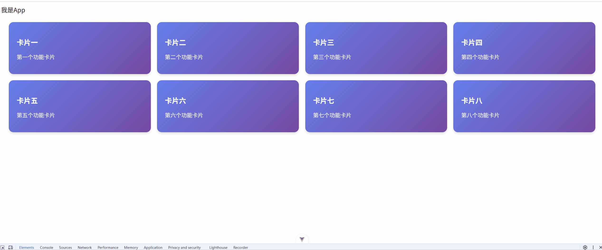
整体布局结构
- 使用嵌套
flex布局实现两行四列的卡片布局 - 外层容器垂直排列,内层容器水平排列
主要布局代码分析
1. 外层容器 card-container
.card-container {
  display: flex;
  flex-direction: column;
  gap: 16px;
  padding: 20px;
  width: 100%;
  box-sizing: border-box;
}
display: flex+flex-direction: column: 创建垂直方向的弹性布局gap: 16px: 设置子元素(两行)之间的垂直间距padding: 20px: 容器内边距,确保内容不贴边box-sizing: border-box: 盒模型计算包含padding和border
2. 行容器 card-row
.card-row {
  display: flex;
  flex-wrap: nowrap;
  gap: 16px;
  width: 100%;
}
display: flex: 创建水平方向的弹性布局flex-wrap: nowrap: 禁止换行,强制所有卡片在一行内显示gap: 16px: 设置卡片间的水平间距width: 100%: 占满父容器宽度
3. 卡片项 card-item
.card-item {
  flex: 1 1 calc(25% - 12px);
  min-width: 300px;
}
flex: 1 1 calc(25% - 12px):
-
flex-grow: 1: 有剩余空间时可以放大flex-shrink: 1: 空间不足时可以缩小flex-basis: calc(25% - 12px): 初始宽度为25%减去间隙占用空间
min-width: 300px: 设置最小宽度,防止卡片过小
HTML结构说明
<template>
  <div class="card-container">
    <!-- 第一行 -->
    <div class="card-row">
      <div v-for="card in cardList.slice(0, 4)" :key="card.id" class="card-item">
        <!-- 卡片内容 -->
      </div>
    </div>
    <!-- 第二行 -->
    <div class="card-row">
      <div v-for="card in cardList.slice(4, 8)" :key="card.id" class="card-item">
        <!-- 卡片内容 -->
      </div>
    </div>
  </div>
</template>
cardList.slice(0, 4): 取前4个卡片用于第一行cardList.slice(4, 8): 取后4个卡片用于第二行- 每行独立的
card-row容器确保两行布局的稳定性
这种布局方式在 flex-wrap: nowrap 的约束下实现了稳定的两行四列布局,并具有良好的响应式特性。
完整代码
<!-- FlexLab.vue -->
<script setup lang="ts">
  interface CardItem {
    id: number;
    title: string;
    description: string;
  }

  const cardList: CardItem[] = [
    { id: 1, title: '卡片一', description: '第一个功能卡片' },
    { id: 2, title: '卡片二', description: '第二个功能卡片' },
    { id: 3, title: '卡片三', description: '第三个功能卡片' },
    { id: 4, title: '卡片四', description: '第四个功能卡片' },
    { id: 5, title: '卡片五', description: '第五个功能卡片' },
    { id: 6, title: '卡片六', description: '第六个功能卡片' },
    { id: 7, title: '卡片七', description: '第七个功能卡片' },
    { id: 8, title: '卡片八', description: '第八个功能卡片' }
  ];
</script>

<template>
  <div class="card-container">
    <!-- 第一行 -->
    <div class="card-row">
      <div
        v-for="card in cardList.slice(0, 4)"
        :key="card.id"
        class="card-item"
        >
        <h3 class="card-title">{{ card.title }}</h3>
        <p class="card-description">{{ card.description }}</p>
      </div>
    </div>
    <!-- 第二行 -->
    <div class="card-row">
      <div
        v-for="card in cardList.slice(4, 8)"
        :key="card.id"
        class="card-item"
        >
        <h3 class="card-title">{{ card.title }}</h3>
        <p class="card-description">{{ card.description }}</p>
      </div>
    </div>
  </div>
</template>

<style scoped>
  .card-container {
    display: flex;
    flex-direction: column;
    gap: 16px;
    padding: 20px;
    width: 100%;
    box-sizing: border-box;
  }

  .card-row {
    display: flex;
    flex-wrap: nowrap;
    gap: 16px;
    width: 100%;
  }

  .card-item {
    flex: 1 1 calc(25% - 12px);
    background: linear-gradient(135deg, #667eea 0%, #764ba2 100%);
    border-radius: 12px;
    padding: 20px;
    color: white;
    box-shadow: 0 4px 6px rgba(0, 0, 0, 0.1);
    transition: all 0.3s ease;
    box-sizing: border-box;
    min-width: 300px;
  }

  .card-item:hover {
    transform: translateY(-5px);
    box-shadow: 0 8px 15px rgba(0, 0, 0, 0.2);
  }

  .card-title {
    font-size: 18px;
    margin-bottom: 8px;
    font-weight: 600;
  }

  .card-description {
    font-size: 14px;
    opacity: 0.9;
  }


</style>