目录
[弹性盒模型(flex box)](#弹性盒模型(flex box))
css盒模型
CSS 把每个元素看作一个矩形"盒子",由四层构成:内容区 content 、内边距 padding 、边框 border 、外边距 margin。其中外边距是透明的,用于与其他元素拉开距离。
可以点开一个网页右键'检查',右侧看到
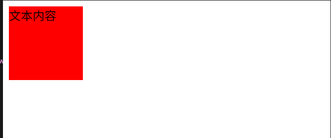
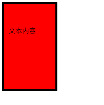
先只设置内容content
html
		div{
			width: 100px;
			height: 100px;
			background-color: red;
		}
添加一个padding :50px 10px;可以看到他相对四周边框在变化(margin/padding/border-width :四值顺序为 上 右 下 左 ;三值:上 左右 下 ;两值:上下 左右;单值:四边相同。)
添加一个border: 5px solid black;
增加一个margin:50px 10px;四周会是透明的
弹性盒模型(flex box)
是css3的一种新的布局模式,弹性盒模型就是为了适应不同屏幕大小,可以更好的调整布局。(一个大盒子里面有很多小盒子)
组成:弹性容器和弹性项目
-
弹性容器(Flex Container) :通过
display: flex或display: inline-flex定义的父元素,其直接子元素自动成为 弹性项目(Flex Items)。 -
弹性项目(Flex Items):容器的子元素,可以灵活调整大小、顺序和对齐方式。
html
#弹性项目设置了3个
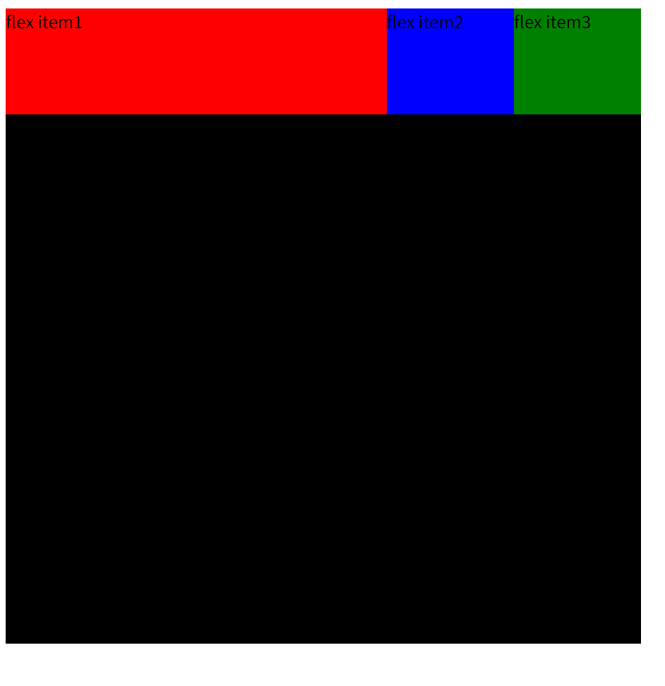
<div class="flex-container">
<div class="flex-item1">flex item1</div>
<div class="flex-item2">flex item2</div>
<div class="flex-item3">flex item3</div>
</div>
#弹性容器
<style>
.flex-container{
display: flex;
width: 600px;
height: 600px;
background-color: black;
}
</style>
<style>
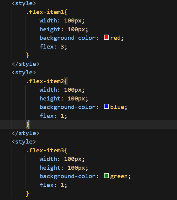
.flex-item1{
width: 100px;
height: 100px;
background-color: red;
}
</style>
<style>
.flex-item2{
width: 100px;
height: 100px;
background-color: blue;
}
</style>
<style>
.flex-item3{
width: 100px;
height: 100px;
background-color: green;
}
</style>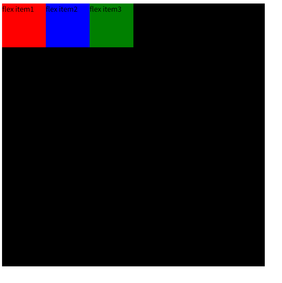
1.display属性
display: flex开启弹性盒,默认水平放置
2.flex_direction属性
可以指定子元素在父容器的位置(小盒子在大盒子里面怎么摆放)
语法:
.flex-container {
flex-direction: row; /* 默认:水平(左→右) */
flex-direction: row-reverse; /* 水平(右→左) */
flex-direction: column; /* 垂直(上→下) */
flex-direction: column-reverse; /* 垂直(下→上) */
}
3.align-items属性
控制 子元素在交叉轴(默认垂直方向)上的对齐方式:
.flex-container {
  align-items: stretch;     /* 默认:拉伸填满容器高度(若未设高度) */
  align-items: flex-start;  /* 交叉轴起点对齐(顶部对齐)(就是居左摆放) */
  align-items: flex-end;    /* 交叉轴终点对齐(底部对齐)(居右摆放) */
  align-items: center;      /* 交叉轴居中(上下左右都居中) */
  align-items: baseline;    /* 按文本基线对齐(较少用) */
}
4.flex-grow/flex
定义子元素如何 分配剩余空间 (默认 0,不放大):
就是按照小盒子占整个大盒子的多少比例放大。假设我想红色盒子占3/5,其他盒子占1/5