线性布局是开发中最常用的布局,通过线性容器Row和Column构建。线性布局是其他布局的基础,其子元素在线性方向上(水平方向和垂直方向)依次排列。线性布局的排列方向由所选容器组件决定,Row容器内子元素按照水平方向排列,Column容器内子元素按照垂直方向排列。根据不同的排列方向,开发者可选择使用Row或Column容器创建线性布局。
主轴和交叉轴
- 主轴:线性布局容器在布局方向上的轴线,子元素默认沿主轴排列。Row容器主轴为水平方向,Column容器主轴为垂直方向。
- 交叉轴:垂直于主轴方向的轴线。Row容器交叉轴为垂直方向,Column容器交叉轴为水平方向。
在布局容器内,可以通过space属性设置主轴排列方向上子元素的间距,使各子元素在排列方向上有等间距效果。
- Column容器内排列方向的间距
typescript
Column({ space: 20 }) {
  Text('space: 20').fontSize(15).fontColor(Color.Gray).width('90%')
  Row().width('90%').height(50).backgroundColor(0xF5DEB3)
  Row().width('90%').height(50).backgroundColor(0xD2B48C)
  Row().width('90%').height(50).backgroundColor(0xF5DEB3)
}.width('100%')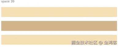
- Row容器内排列方向上的间距
typescript
Row({ space: 35 }) {
  Text('space: 35').fontSize(15).fontColor(Color.Gray)
  Row().width('10%').height(150).backgroundColor(0xF5DEB3)
  Row().width('10%').height(150).backgroundColor(0xD2B48C)
  Row().width('10%').height(150).backgroundColor(0xF5DEB3)
}.width('90%')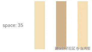
justifyContent设置子元素在主轴上的排列方式
在布局容器内,可以通过justifyContent属性设置子元素在容器主轴上的排列方式。可以从主轴起始位置开始排布,也可以从主轴结束位置开始排布,或者均匀分割主轴的空间。
- Column容器内子元素在垂直方向上的排列
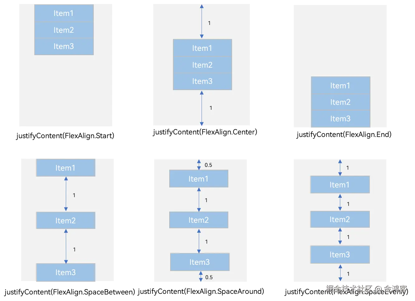
- Row容器内子元素在水平方向上的排列
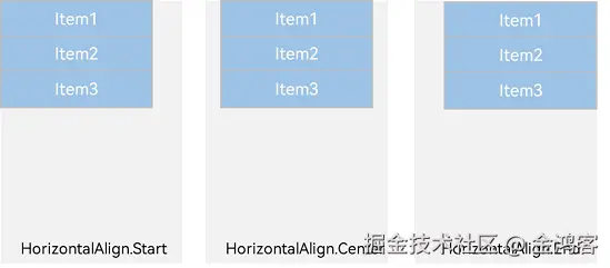
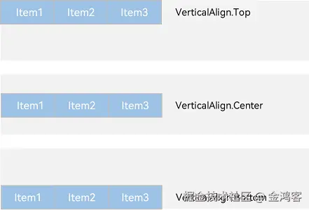
alignItems设置子元素在交叉轴上的排列方式
在布局容器内,可以通过alignItems属性设置子元素在交叉轴(排列方向的垂直方向)上的对齐方式,且在各类尺寸屏幕中表现一致。其中,交叉轴为垂直方向时,取值为VerticalAlign类型,水平方向取值为HorizontalAlign类型。
alignSelf属性用于控制单个子元素在容器交叉轴上的对齐方式,其优先级高于alignItems属性,如果设置了alignSelf属性,则在单个子元素上会覆盖alignItems属性。
- Column容器内子元素在水平方向上的排列
- Row容器内子元素在垂直方向上的排列
自适应拉伸
在线性布局下,常用空白填充组件Blank,在容器主轴方向自动填充空白空间,达到自适应拉伸效果。Row和Column作为容器,只需要添加宽高为百分比,当屏幕宽高发生变化时,会产生自适应效果。
typescript
@Entry
@Component
struct BlankExample {
  build() {
    Column() {
      Row() {
        Text('Bluetooth').fontSize(18)
        Blank()
        Toggle({ type: ToggleType.Switch, isOn: true })
      }.backgroundColor(0xFFFFFF).borderRadius(15).padding({ left: 12 }).width('100%')
    }.backgroundColor(0xEFEFEF).padding(20).width('100%')
  }
}
自适应缩放
自适应缩放是指子元素随容器尺寸的变化而按照预设的比例自动调整尺寸,适应各种不同大小的设备。在线性布局中,可以使用以下两种方法实现自适应缩放。
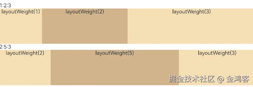
- 父容器尺寸确定时,使用layoutWeight属性设置子元素和兄弟元素在主轴上的权重,忽略元素本身尺寸设置,使它们在任意尺寸的设备下自适应占满剩余空间。
typescript
@Entry
@Component
struct layoutWeightExample {
  build() {
    Column() {
      Text('1:2:3').width('100%')
      Row() {
        Column() {
          Text('layoutWeight(1)')
            .textAlign(TextAlign.Center)
        }.layoutWeight(1).backgroundColor(0xF5DEB3).height('100%')

        Column() {
          Text('layoutWeight(2)')
            .textAlign(TextAlign.Center)
        }.layoutWeight(2).backgroundColor(0xD2B48C).height('100%')

        Column() {
          Text('layoutWeight(3)')
            .textAlign(TextAlign.Center)
        }.layoutWeight(3).backgroundColor(0xF5DEB3).height('100%')

      }.backgroundColor(0xffd306).height('30%')

      Text('2:5:3').width('100%')
      Row() {
        Column() {
          Text('layoutWeight(2)')
            .textAlign(TextAlign.Center)
        }.layoutWeight(2).backgroundColor(0xF5DEB3).height('100%')

        Column() {
          Text('layoutWeight(5)')
            .textAlign(TextAlign.Center)
        }.layoutWeight(5).backgroundColor(0xD2B48C).height('100%')

        Column() {
          Text('layoutWeight(3)')
            .textAlign(TextAlign.Center)
        }.layoutWeight(3).backgroundColor(0xF5DEB3).height('100%')
      }.backgroundColor(0xffd306).height('30%')
    }
  }
}
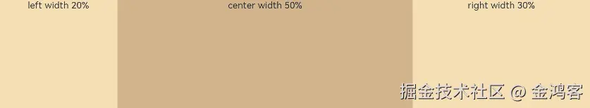
- 父容器尺寸确定时,使用百分比设置子元素和兄弟元素的宽度,使他们在任意尺寸的设备下保持固定的自适应占比。
typescript
@Entry
@Component
struct WidthExample {
  build() {
    Column() {
      Row() {
        Column() {
          Text('left width 20%')
            .textAlign(TextAlign.Center)
        }.width('20%').backgroundColor(0xF5DEB3).height('100%')

        Column() {
          Text('center width 50%')
            .textAlign(TextAlign.Center)
        }.width('50%').backgroundColor(0xD2B48C).height('100%')

        Column() {
          Text('right width 30%')
            .textAlign(TextAlign.Center)
        }.width('30%').backgroundColor(0xF5DEB3).height('100%')
      }.backgroundColor(0xffd306).height('30%')
    }
  }
}