前言
如果要从并排显示的选项中选择,我们可以使用分段按钮(Segmented Button)。
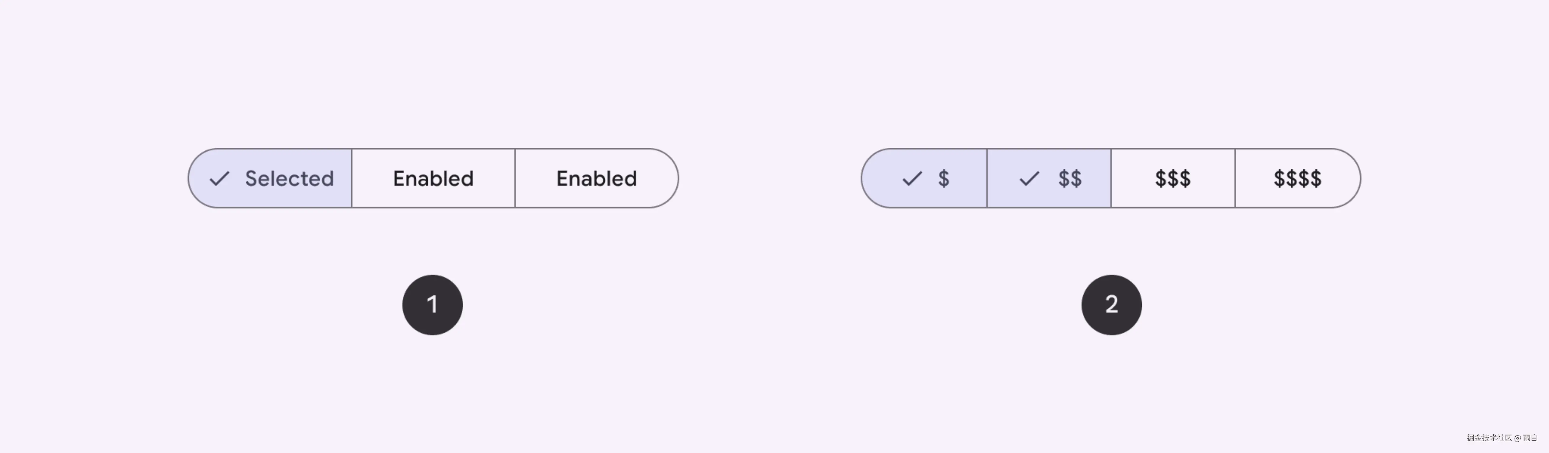
图片来自:分段按钮
分段按钮有两种类型:单选 和多选 ,对应了 SingleChoiceSegmentedButtonRow 和 MultiChoiceSegmentedButtonRow 布局。
我这里只演示一下单选分段按钮。
单选分段按钮
代码如下:
kotlin
@Preview
@Composable
fun SingleChoiceSegmentedButton() {
    // 当前选中按钮的索引
    var selectedIndex by remember { mutableIntStateOf(0) }
    val options = listOf("Sleep", "Work")

    SingleChoiceSegmentedButtonRow {
        options.forEachIndexed { index, label ->
            SegmentedButton(
                // 根据按钮索引和按钮总数获取按钮的形状
                // 只有一项时:全圆;
                // 第一项:起始端圆角(Start);
                // 最后一项:末端圆角(End);
                // 中间项:直角
                shape = SegmentedButtonDefaults.itemShape(
                    index = index,
                    count = options.size
                ),
                onClick = { selectedIndex = index },
                selected = index == selectedIndex,
                label = { Text(label) }
            )
        }
    }
}
运行效果:
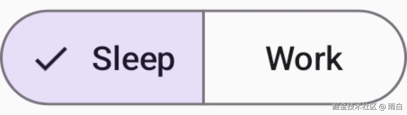
上述代码逻辑并不难,我们只是提供了一个标签列表 [ "Sleep", "Work" ],然后使用了 SingleChoiceSegmentedButtonRow 和 SegmentedButton 的组合,就实现了以上效果。
这个效果在大多时候都很不错,但有时按钮中的文本会显得有些拥挤,例如:

这时,我们就需要自定义组件,让被选中的按钮的大小动态变化。
自适应分段按钮
分段按钮的 Material 3 规范:Segmented buttons
首先定义出可选项的数据模型:
kotlin
@Immutable // 优化重组检查
data class OptionItem<T>(
    val value: T,
    val label: String,
    val selected: Boolean = false
)
然后就来完成外面的布局和内部的每一项:
kotlin
@Composable
fun <T> LitheSegmentedButton(
    modifier: Modifier = Modifier,
    items: List<OptionItem<T>>,
    onClick: (T) -> Unit
) {
    val itemSize = items.size

    // 外层容器:负责绘制整体的边框和圆角
    Row(
        modifier = modifier
            .clip(CircleShape)
            .border(
                width = 0.5.dp,
                color = SegmentedButtonDefaults.colors().activeBorderColor,
                shape = CircleShape
            )
            .padding(0.5.dp)
    ) {
        items.forEachIndexed { index, item ->
            // 缓存 Shape 对象,避免每次重组时都重新创建
            val shape = remember(index, itemSize) {
                itemShape(index, itemSize)
            }

            SingleSegmentedButton(
                item = item,
                shape = shape,
                onClick = { onClick(item.value) }
            )
        }
    }
}

@Composable
private fun <T> SingleSegmentedButton(
    item: OptionItem<T>,
    shape: Shape,
    colors: SegmentedButtonColors = SegmentedButtonDefaults.colors(),
    onClick: () -> Unit
) {
    Row(
        Modifier
            .height(40.dp)
            .clip(shape)
            .clickable(onClick = onClick)
            .border(
                width = 0.5.dp,
                color = colors.activeBorderColor,
                shape = shape
            )
            .padding(0.5.dp)
            .background( // 选中状态下的背景色
                if (item.selected) colors.activeContainerColor
                else Color.Transparent,
                shape = shape
            )
            .padding(horizontal = 18.dp),
        verticalAlignment = Alignment.CenterVertically
    ) {
        if (item.selected) {
            Row {
                Icon(
                    imageVector = Icons.Default.Done,
                    contentDescription = null,
                    modifier = Modifier
                        .size(18.dp),
                    tint = colors.activeContentColor
                )
                Spacer(modifier = Modifier.width(8.dp))
            }
        }

        Text(
            text = item.label,
            style = MaterialTheme.typography.labelLarge.copy(
                color = if (item.selected) colors.activeContentColor
                else colors.inactiveContentColor
            )
        )
    }
}

/**
 * 根据索引和总数计算按钮的形状
 */
fun itemShape(index: Int, count: Int): Shape {
    if (count == 1) {
        return CircleShape
    }
    return when (index) {
        // 第一个:起始端(左侧)圆角
        0 -> RoundedCornerShape(topStartPercent = 50, bottomStartPercent = 50)
        // 最后一个:末端(右侧)圆角
        count - 1 -> RoundedCornerShape(topEndPercent = 50, bottomEndPercent = 50)
        // 中间:直角
        else -> RoundedCornerShape(0)
    }
}
预览一下:
kotlin
@Preview(showBackground = true)
@Composable
fun LitheSegmentedButtonPreview() {
    var selectedIndex by remember { mutableIntStateOf(0) }
    val items = listOf(
        OptionItem(0, "Day", selected = selectedIndex == 0),
        OptionItem(1, "Month", selected = selectedIndex == 1),
        OptionItem(2, "Week", selected = selectedIndex == 2),
    )
    Box(modifier = Modifier.fillMaxSize()) {
        LitheSegmentedButton(
            items = items,
            onClick = {
                selectedIndex = it
            },
            modifier = Modifier.align(Alignment.Center)
        )
    }
}
运行效果:

最后一步就是加上动画,我们使用 AnimatedVisibility 来完成。
具体内容可以看我的这篇博客:控制内容的显隐:AnimatedVisibility
为了实现"推动"效果,我们使用了 expandIn 和 shrinkOut。并且为了让这个效果看起来更好,又加上淡入淡出、缩放以及滑动效果:
- 出现时,是淡入、水平展开、缩放以及轻微的纵向滑入效果。
- 离开时,则是淡出、水平收缩、缩放以及纵向滑出的组合。
kotlin
AnimatedVisibility(
    visible = item.selected,
    enter = fadeIn() + expandHorizontally() + scaleIn() + slideInVertically(initialOffsetY = { it / 2 }),
    exit = fadeOut() + shrinkHorizontally() + scaleOut() + slideOutVertically(targetOffsetY = { it / 2 })
) {
    Row {
        Icon(
            imageVector = Icons.Default.Done,
            contentDescription = null,
            modifier = Modifier
                .size(18.dp),
            tint = colors.activeContentColor
        )
        Spacer(modifier = Modifier.width(8.dp))
    }
}
最终效果: