十一、分段选择组件:UISegmentedControl
UISegmentedControl 是用于单选项分段选择 的组件(继承自 UIControl),支持多选项横向排列,可自定义颜色、默认选中项,通过 valueChanged 事件响应选择变化,适用于视图切换(如"全部/已完成/未完成")、分类筛选等场景。
11.1 核心功能
- 支持文字或图片选项(
items参数可传入[String]或[UIImage]); - 自定义整体颜色(
tintColor)、背景色(backgroundColor); - 支持默认选中项设置(
selectedSegmentIndex); - 选择变化时触发回调,获取当前选中项的索引或文字。
11.2 关键属性与方法
| 类别 | 属性/方法 | 作用说明 |
|---|---|---|
| 初始化 | UISegmentedControl(items:) |
初始化分段控制器,items 为选项数组(如 ["早餐","午餐","晚餐"]) |
| 外观配置 | tintColor |
选中项的颜色(文字/边框,默认蓝色) |
backgroundColor |
整体背景色(默认透明) | |
| 选中控制 | selectedSegmentIndex |
设置/获取默认选中项索引(从 0 开始,如 0 表示选中第一个选项) |
| 交互回调 | addTarget(_:action:for:) |
绑定 valueChanged 事件,选择变化时触发回调 |
| 选中项信息 | titleForSegment(at:) |
获取指定索引的选项文字(如 sender.titleForSegment(at: sender.selectedSegmentIndex)) |
11.3 代码逻辑解析
Swift
class ViewController: UIViewController {
let fullScreenSize = UIScreen.main.bounds.size
override func viewDidLoad() {
super.viewDidLoad()
// 1. 初始化分段控制器:选项为["早餐","午餐","晚餐","宵夜"]
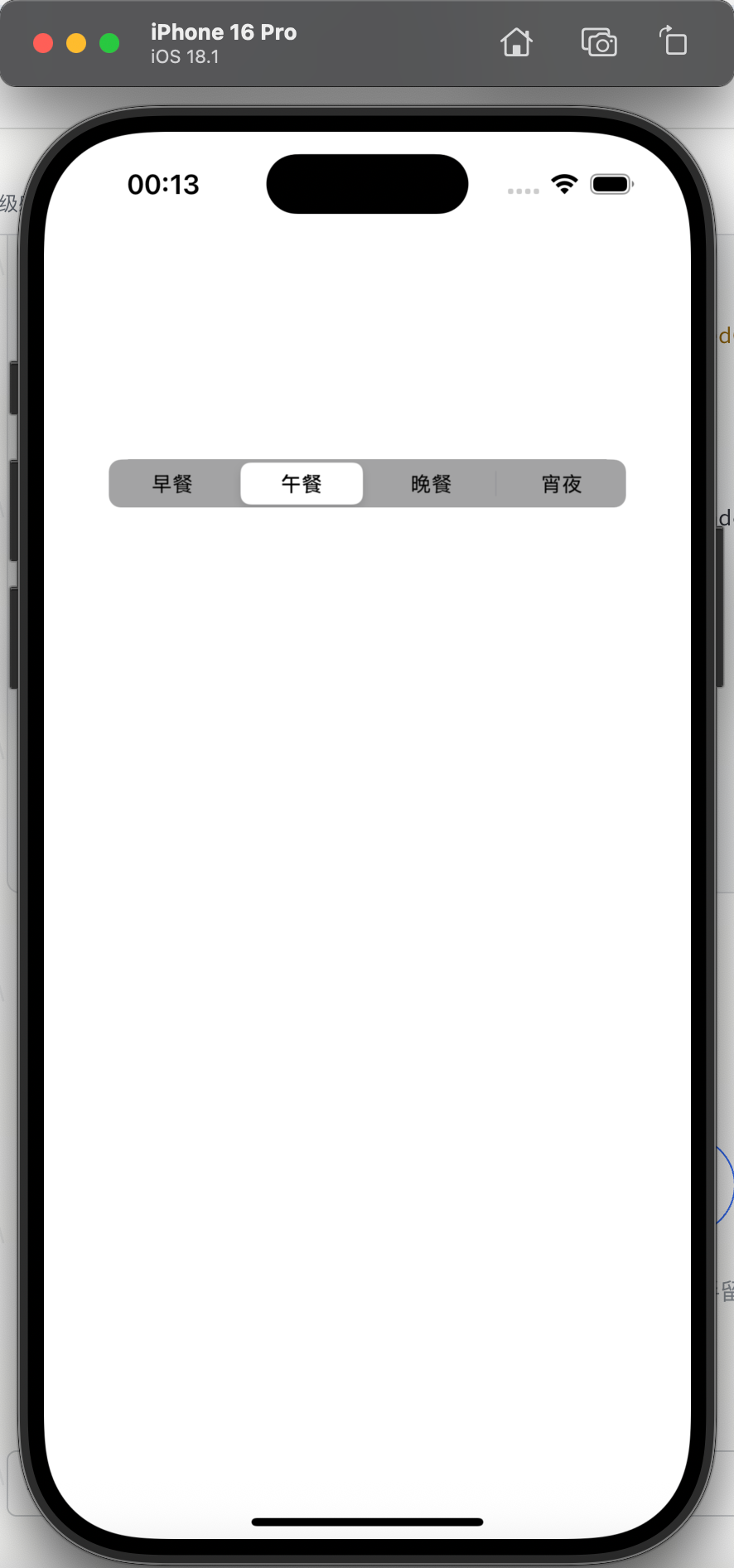
let mySegmentedControl = UISegmentedControl(items: ["早餐","午餐","晚餐","宵夜"])
// 2. 外观配置
mySegmentedControl.tintColor = .black // 选中项颜色为黑色
mySegmentedControl.backgroundColor = .lightGray // 背景色为浅灰
// 3. 默认选中第一个选项(索引0)
mySegmentedControl.selectedSegmentIndex = 0
// 4. 绑定选择变化事件
mySegmentedControl.addTarget(self, action: #selector(onChange(_:)), for: .valueChanged)
// 5. 布局:宽度为屏幕80%,高度30,居中显示
mySegmentedControl.frame.size = CGSize(
width: fullScreenSize.width * 0.8,
height: 30
)
mySegmentedControl.center = CGPoint(
x: fullScreenSize.width * 0.5,
y: fullScreenSize.height * 0.25
)
self.view.addSubview(mySegmentedControl)
}
// 选择变化回调:打印选中索引和文字
@objc func onChange(_ sender: UISegmentedControl) {
let selectedIndex = sender.selectedSegmentIndex // 选中索引
let selectedTitle = sender.titleForSegment(at: selectedIndex)! // 选中文字
print("选中索引:\(selectedIndex),选中文字:\(selectedTitle)")
}
}
11.4 注意事项
- 选项类型一致性 :
items数组中元素类型需统一(全为 String 或全为 UIImage),混合类型会导致显示异常; - 索引有效性 :
selectedSegmentIndex需设置为 0 到items.count - 1之间的值,超出范围会导致无选中项; - 动态修改选项 :可通过
insertSegment(withTitle:at:animated:)或removeSegment(at:animated:)动态添加/删除选项,修改后需调用setNeedsLayout()刷新布局。
十二、滑块调节组件:UISlider
UISlider 是用于连续数值调节 的滑块组件(继承自 UIControl),支持设置数值范围、步长,可自定义滑块和轨道颜色,通过 valueChanged 事件实时响应数值变化,适用于音量调节、亮度调节、进度控制等场景(如代码中调节图片透明度)。
12.1 核心功能
- 支持连续数值调节(如 0~100 的透明度值);
- 自定义数值范围(
minimumValue/maximumValue)、初始值(value); - 自定义外观(滑块颜色、轨道填充/未填充颜色);
- 支持实时回调(
isContinuous = true)或滑动结束后回调(isContinuous = false)。
12.2 关键属性与方法
| 类别 | 属性/方法 | 作用说明 |
|---|---|---|
| 数值控制 | minimumValue |
最小值(如 0,默认 0.0) |
maximumValue |
最大值(如 100,默认 1.0) |
|
value |
当前值(如 100,默认 0.5),需在 minimumValue~maximumValue 之间 |
|
| 外观配置 | thumbTintColor |
滑块颜色(如 UIColor.brown) |
minimumTrackTintColor |
滑块左侧已填充轨道颜色(如 UIColor.purple,表示已调节的部分) |
|
maximumTrackTintColor |
滑块右侧未填充轨道颜色(如 UIColor.orange,表示未调节的部分) |
|
| 回调控制 | isContinuous |
布尔值,是否实时触发 valueChanged 事件(true 实时,false 滑动结束后,默认 true) |
| 交互回调 | addTarget(_:action:for:) |
绑定 valueChanged 事件,数值变化时触发回调 |
12.3 代码逻辑解析
Swift
class ViewController: UIViewController {
    let fullScreenSize = UIScreen.main.bounds.size
    var imageView: UIImageView!
    var mySlider: UISlider!

    override func viewDidLoad() {
        super.viewDidLoad()

        // 1. 创建图片视图:显示"01.jpg",按比例适配
        imageView = UIImageView(image: UIImage(named: "01.jpg"))
        imageView.contentMode = .scaleAspectFit
        imageView.frame = CGRect(x: 0, y: 0, width: 250, height: 250)
        imageView.center = CGPoint(x: fullScreenSize.width * 0.5, y: fullScreenSize.height * 0.3)
        self.view.addSubview(imageView)

        // 2. 创建滑块:宽度为屏幕90%,高度50
        mySlider = UISlider(frame: CGRect(
            x: 0, y: 0,
            width: fullScreenSize.width * 0.9,
            height: 50
        ))

        // 3. 滑块配置
        mySlider.backgroundColor = .lightGray          // 滑块背景色
        mySlider.maximumTrackTintColor = .orange       // 右侧未填充轨道橙色
        mySlider.minimumTrackTintColor = .purple       // 左侧已填充轨道紫色
        mySlider.thumbTintColor = .brown              // 滑块棕色
        mySlider.minimumValue = 0                     // 最小值0
        mySlider.maximumValue = 100                   // 最大值100
        mySlider.value = 100                          // 初始值100(不透明)
        mySlider.isContinuous = true                  // 实时触发回调

        // 4. 绑定数值变化事件:调节图片透明度
        mySlider.addTarget(self, action: #selector(onSliderChange), for: .valueChanged)

        // 5. 布局:居中显示在图片下方
        mySlider.center = CGPoint(x: fullScreenSize.width * 0.5, y: fullScreenSize.height * 0.65)
        self.view.addSubview(mySlider)
    }

    // 滑块数值变化回调:更新图片透明度
    @objc func onSliderChange() {
        // 透明度 = 当前值 / 最大值(0~100 → 0~1)
        imageView.alpha = CGFloat(mySlider.value / mySlider.maximumValue)
    }
}
12.4 注意事项
-
数值类型转换 :
UISlider.value是Float类型,赋值给alpha(CGFloat)时需显式转换,避免类型不匹配; -
步长****控制 :UISlider 无直接步长属性,若需固定步长(如每次增减 5),需在回调中手动修正
value(如mySlider.value = round(mySlider.value / 5) * 5); -
滑块交互区域 :滑块默认交互区域较小,可通过自定义
thumbImage扩大点击范围(如mySlider.setThumbImage(UIImage(named: "large_thumb"), for: .normal))。
十三、步进调节组件:UIStepper
UIStepper 是用于固定步长数值调节的步进组件(继承自 UIControl),支持"加/减"按钮快速调节数值,可设置数值范围、步长、是否循环,适用于数量选择(如购物车商品数量)、计数器等场景。
13.1 核心功能
- 支持固定步长调节(如每次增减 2);
- 自定义数值范围(
minimumValue/maximumValue)、初始值(value); - 支持长按持续调节(
autorepeat = true)、数值循环(wraps = true,如最大值+1 → 最小值); - 数值变化时触发回调,更新显示(如 UILabel 显示当前数值)。
13.2 关键属性与方法
| 类别 | 属性/方法 | 作用说明 |
|---|---|---|
| 数值控制 | minimumValue/maximumValue |
最小值/最大值(如 0/100) |
value |
当前值(如 0),需在 minimumValue~maximumValue 之间 |
|
stepValue |
每次点击"加/减"按钮的数值变化量(如 2,默认 1.0) |
|
| 交互控制 | autorepeat |
布尔值,是否支持长按持续调节(true 支持,默认 true) |
wraps |
布尔值,是否支持数值循环(true 时,最大值+1 → 最小值,默认 false) |
|
isContinuous |
布尔值,是否实时触发 valueChanged 事件(true 实时,默认 true) |
|
| 交互回调 | addTarget(_:action:for:) |
绑定 valueChanged 事件,数值变化时触发回调 |
13.3 代码逻辑解析
Swift
class ViewController: UIViewController {
let fullScreenSize = UIScreen.main.bounds.size
var myLabel: UILabel!
var myStepper: UIStepper!
override func viewDidLoad() {
super.viewDidLoad()
// 1. 创建标签:显示当前数值,居中
myLabel = UILabel(frame: CGRect(x: 0, y: 0, width: 100, height: 40))
myLabel.text = "0" // 初始数值0
myLabel.textColor = .black
myLabel.textAlignment = .center
myLabel.center = CGPoint(x: fullScreenSize.width * 0.5, y: fullScreenSize.height * 0.3)
self.view.addSubview(myLabel)
// 2. 创建步进器
myStepper = UIStepper()
// 3. 步进器配置
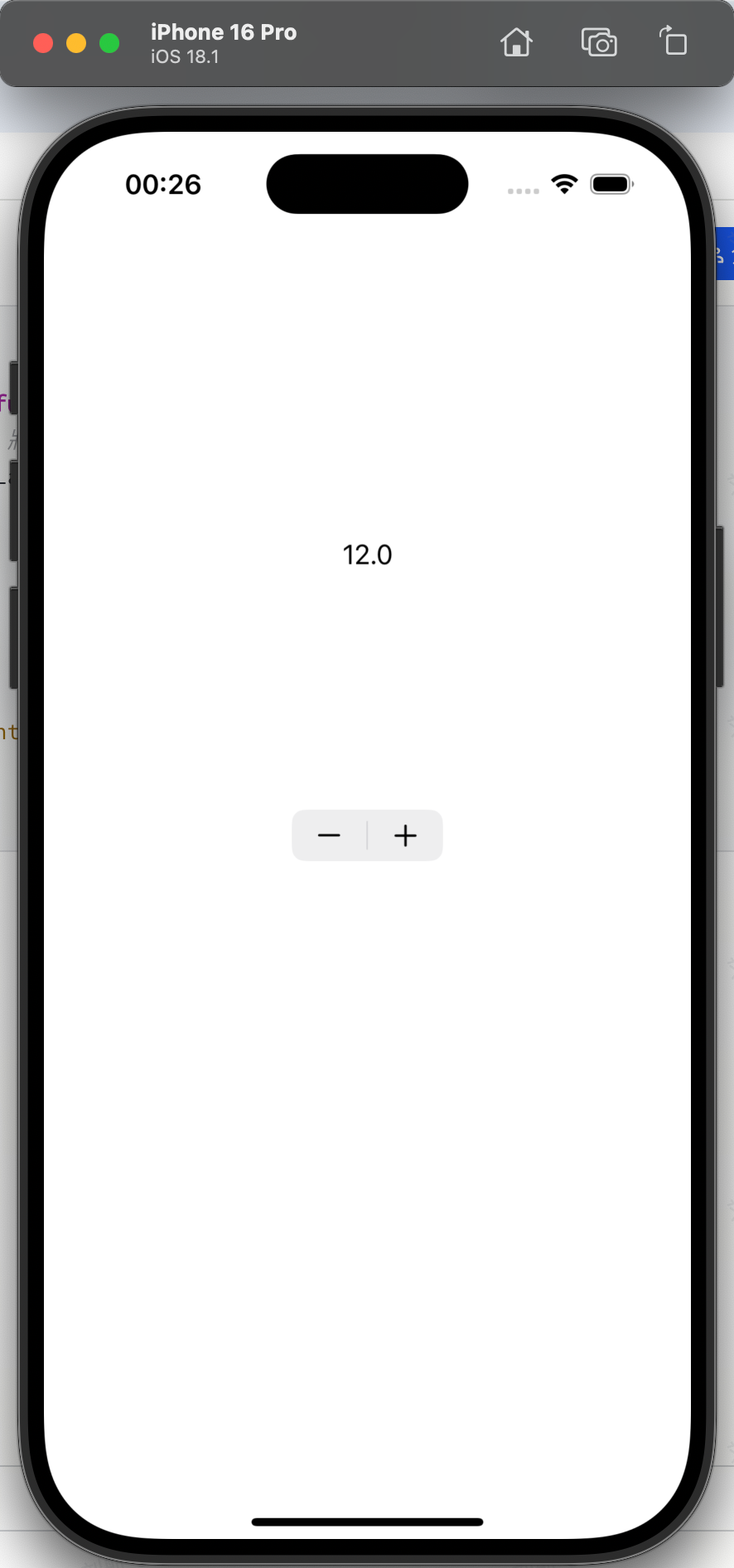
myStepper.value = 0 // 初始值0
myStepper.minimumValue = 0 // 最小值0
myStepper.maximumValue = 100 // 最大值100
myStepper.stepValue = 2 // 每次增减2
myStepper.autorepeat = true // 长按持续调节
myStepper.isContinuous = true // 实时触发回调
myStepper.wraps = true // 数值循环(100+1→0)
// 4. 绑定数值变化事件:更新标签
myStepper.addTarget(self, action: #selector(onStepperChange), for: .valueChanged)
// 5. 布局:在标签下方居中
myStepper.center = CGPoint(x: fullScreenSize.width * 0.5, y: fullScreenSize.height * 0.5)
self.view.addSubview(myStepper)
}
// 步进器数值变化回调:更新标签文字
@objc func onStepperChange() {
// 将Float类型的value转为String,显示在标签上
myLabel.text = "\(myStepper.value)"
}
}
13.4 注意事项
- 数值显示格式 :
myStepper.value是Double类型,直接转为 String 会显示小数(如2.0),若需整数显示,可通过Int(myStepper.value)转换; - 循环逻辑 :
wraps = true仅在minimumValue和maximumValue都设置时生效,否则循环无效; - 禁用状态 :若需禁用步进器,设置
myStepper.isEnabled = false,此时按钮变灰,无法点击。
十四、列表展示组件:UITableView
UITableView 是用于垂直滚动列表展示 的核心组件(继承自 UIScrollView),支持分组/非分组样式,通过代理模式(UITableViewDelegate/UITableViewDataSource)实现数据配置与交互,适用于联系人、消息、商品列表等场景,是 iOS 开发中最常用的列表组件。
14.1 核心功能
-
支持两种样式:
plain(普通列表)、grouped(分组列表,如代码中"篮球""棒球"分组); -
自定义单元格(
UITableViewCell),支持文字、图片、 accessory 按钮(如复选框、详情按钮); -
支持单元格复用(优化性能,避免重复创建);
-
交互支持:单元格点击、 accessory 按钮点击、下拉刷新、上拉加载等。
14.2 关键属性与方法
| 类别 | 属性/方法 | 作用说明 |
|---|---|---|
| 初始化 | UITableView(frame:style:) |
初始化列表,style 为 .plain(普通)或 .grouped(分组) |
| 数据配置(必须实现) | numberOfSections(in:) |
数据源方法:返回分组数量(如 return 2 表示 2 组) |
tableView(_:numberOfRowsInSection:) |
数据源方法:返回指定分组的单元格数量(如第 0 组返回 2 行) | |
tableView(_:cellForRowAt:) |
数据源方法:返回复用的单元格,配置单元格内容(必须实现) | |
| 单元格复用 | register(_:forCellReuseIdentifier:) |
注册单元格类型,指定复用标识(如 register(UITableViewCell.self, forCellReuseIdentifier: "Cell")) |
dequeueReusableCell(withIdentifier:for:) |
从复用池获取单元格,避免重复创建(性能优化) | |
| 外观配置 | separatorStyle |
分隔线样式(如 .singleLine 显示单线,.none 隐藏) |
separatorInset |
分隔线缩进(如 UIEdgeInsets(top:0, left:20, bottom:0, right:20) 左缩进20) |
|
| 交互控制 | allowsSelection |
是否允许选中单元格(true 允许,默认 true) |
allowsMultipleSelection |
是否允许多选(true 允许,默认 false) |
|
| 交互回调 | tableView(_:didSelectRowAt:) |
代理方法:单元格点击时触发,返回选中的分组和行索引 |
tableView(_:accessoryButtonTappedForRowWith:) |
代理方法:accessory 按钮点击时触发 |
14.3 代码逻辑解析
Swift
class ViewController: UIViewController, UITableViewDelegate, UITableViewDataSource {
let fullScreenSize = UIScreen.main.bounds.size
// 数据源:2组,分别对应"篮球""棒球"运动员
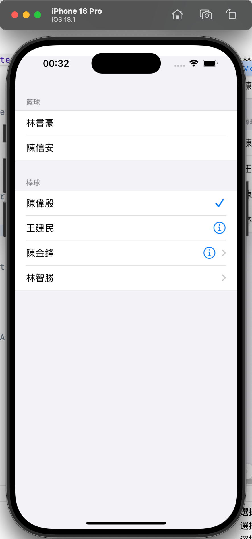
var info = [
["林書豪","陳信安"], // 第0组(篮球):2行
["陳偉殷","王建民","陳金鋒","林智勝"] // 第1组(棒球):4行
]
override func viewDidLoad() {
super.viewDidLoad()
// 1. 初始化分组列表:frame从y=20开始(避开状态栏),style为.grouped
let myTableView = UITableView(frame: CGRect(
x: 0, y: 20,
width: fullScreenSize.width,
height: fullScreenSize.height - 20
), style: .grouped)
// 2. 注册单元格:复用标识"Cell",使用系统默认单元格
myTableView.register(UITableViewCell.self, forCellReuseIdentifier: "Cell")
// 3. 绑定代理和数据源
myTableView.delegate = self
myTableView.dataSource = self
// 4. 外观配置:显示分隔线,左缩进20
myTableView.separatorStyle = .singleLine
myTableView.separatorInset = UIEdgeInsets(top: 0, left: 20, bottom: 0, right: 20)
// 5. 交互配置:允许单选,禁止多选
myTableView.allowsSelection = true
myTableView.allowsMultipleSelection = false
self.view.addSubview(myTableView)
}
// 必须实现:分组数量(2组)
func numberOfSections(in tableView: UITableView) -> Int {
return info.count
}
// 必须实现:指定分组的行数(第0组2行,第1组4行)
func tableView(_ tableView: UITableView, numberOfRowsInSection section: Int) -> Int {
return info[section].count
}
// 必须实现:配置单元格内容
func tableView(_ tableView: UITableView, cellForRowAt indexPath: IndexPath) -> UITableViewCell {
// 从复用池获取单元格(indexPath指定当前行位置)
let cell = tableView.dequeueReusableCell(withIdentifier: "Cell", for: indexPath)
// 配置accessory按钮样式(第1组不同行显示不同样式)
if indexPath.section == 1 {
switch indexPath.row {
case 0: cell.accessoryType = .checkmark // 复选框
case 1: cell.accessoryType = .detailButton // 详情按钮
case 2: cell.accessoryType = .detailDisclosureButton // 详情+箭头
case 3: cell.accessoryType = .disclosureIndicator // 箭头
default: break
}
}
// 配置单元格文字(indexPath.section=分组索引,indexPath.row=行索引)
cell.textLabel?.text = info[indexPath.section][indexPath.row]
return cell
}
// 单元格点击回调:取消选中状态(提升用户体验)
func tableView(_ tableView: UITableView, didSelectRowAt indexPath: IndexPath) {
tableView.deselectRow(at: indexPath, animated: true) // 取消选中高亮
let name = info[indexPath.section][indexPath.row]
print("選擇的是 \(name)")
}
// accessory按钮点击回调
func tableView(_ tableView: UITableView, accessoryButtonTappedForRowWith indexPath: IndexPath) {
let name = info[indexPath.section][indexPath.row]
print("按下的是 \(name) 的 detail 按钮")
}
// 配置分组标题(第0组"篮球",第1组"棒球")
func tableView(_ tableView: UITableView, titleForHeaderInSection section: Int) -> String? {
return section == 0 ? "籃球" : "棒球"
}
}
14.4 注意事项
-
单元格复用核心 :必须通过
register注册单元格,并使用dequeueReusableCell获取复用单元格,否则会导致性能问题或崩溃; -
indexPath 含义 :
indexPath.section是分组索引,indexPath.row是分组内的行索引,配置数据时需对应正确; -
取消选中状态 :
didSelectRowAt中建议调用deselectRow取消选中高亮,避免用户再次点击前单元格一直处于选中状态; -
自定义单元格 :系统默认单元格样式有限,复杂列表(如图片+文字+副标题)需自定义
UITableViewCell,重写init(style:reuseIdentifier:)配置子视图。
十五、网格展示组件:UICollectionView
UICollectionView 是用于灵活网格布局展示的组件(继承自 UIScrollView),支持自定义行列数、单元格大小、间距,通过代理模式实现数据配置与交互,适用于图片画廊、商品网格、卡片布局等场景,比 UITableView 更灵活(可横向/纵向滚动,支持复杂布局)。
15.1 核心功能
-
支持自定义布局(通过
UICollectionViewLayout,如代码中UICollectionViewFlowLayout流式布局); -
自定义单元格(
UICollectionViewCell),支持图片、文字、复杂视图组合; -
支持分组展示,自定义分组的 header/footer;
-
支持水平/垂直滚动,灵活适配不同屏幕尺寸。
15.2 关键属性与方法
| 类别 | 属性/方法 | 作用说明 |
|---|---|---|
| 布局配置 | UICollectionViewFlowLayout |
流式布局(最常用),支持设置单元格大小、间距、header/footer 尺寸 |
sectionInset |
分组内边距(如 UIEdgeInsets(top:5, left:5, bottom:5, right:5)) |
|
minimumLineSpacing |
行间距(垂直布局时为上下行间距,水平布局时为左右列间距) | |
itemSize |
单元格大小(如代码中按屏幕宽度分3列,减去间距) | |
| 数据配置(必须实现) | numberOfSections(in:) |
数据源方法:返回分组数量 |
collectionView(_:numberOfItemsInSection:) |
数据源方法:返回指定分组的单元格数量 | |
collectionView(_:cellForItemAt:) |
数据源方法:返回复用的单元格,配置内容(必须实现) | |
| 单元格复用 | register(_:forCellWithReuseIdentifier:) |
注册自定义单元格,指定复用标识(如 register(MyCollectionViewCell.self, forCellWithReuseIdentifier: "Cell")) |
| header/footer配置 | register(_:forSupplementaryViewOfKind:withReuseIdentifier:) |
注册 header/footer 视图,kind 为 UICollectionView.elementKindSectionHeader/Footer |
collectionView(_:viewForSupplementaryElementOfKind:at:) |
代理方法:配置 header/footer 内容 | |
| 交互回调 | collectionView(_:didSelectItemAt:) |
代理方法:单元格点击时触发,返回选中的分组和单元格索引 |
15.3 代码逻辑解析
步骤1:自定义单元格(MyCollectionViewCell.swift)
Swift
class MyCollectionViewCell: UICollectionViewCell {
    var imageView: UIImageView!
    var titleLabel: UILabel!

    // 初始化自定义单元格
    override init(frame: CGRect) {
        super.init(frame: frame)

        // 1. 创建图片视图:填充整个单元格
        let cellWidth = frame.width
        imageView = UIImageView(frame: CGRect(x: 0, y: 0, width: cellWidth, height: cellWidth))
        self.addSubview(imageView)

        // 2. 创建标题标签:在图片下方,居中
        titleLabel = UILabel(frame: CGRect(x: 0, y: 0, width: cellWidth, height: 40))
        titleLabel.textAlignment = .center
        titleLabel.textColor = .orange
        self.addSubview(titleLabel)
    }

    required init?(coder aDecoder: NSCoder) {
        fatalError("init(coder:) has not been implemented")
    }
}
步骤2:主控制器配置CollectionView(ViewController.swift)
Swift
class ViewController: UIViewController, UICollectionViewDelegate, UICollectionViewDataSource {
var fullScreenSize: CGSize! = UIScreen.main.bounds.size
override func viewDidLoad() {
super.viewDidLoad()
self.view.backgroundColor = .white
// 1. 配置流式布局
let layout = UICollectionViewFlowLayout()
layout.sectionInset = UIEdgeInsets(top: 5, left: 5, bottom: 5, right: 5) // 分组内边距
layout.minimumLineSpacing = 5 // 行间距5
// 单元格大小:屏幕宽度分3列,减去左右内边距(5*2)和行间距(5*2)
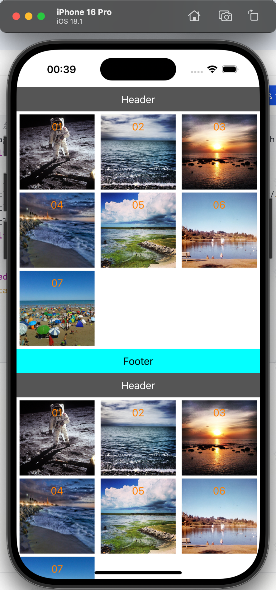
let itemWidth = (fullScreenSize.width - 5*2 - 5*2) / 3
layout.itemSize = CGSize(width: itemWidth, height: itemWidth)
// header/footer尺寸:宽度全屏,高度40
layout.headerReferenceSize = CGSize(width: fullScreenSize.width, height: 40)
layout.footerReferenceSize = CGSize(width: fullScreenSize.width, height: 40)
// 2. 初始化CollectionView:frame从y=20开始(避开状态栏)
let myCollectionView = UICollectionView(frame: CGRect(
x: 0, y: 20,
width: fullScreenSize.width,
height: fullScreenSize.height - 20
), collectionViewLayout: layout)
// 3. 注册自定义单元格:复用标识"Cell"
myCollectionView.register(MyCollectionViewCell.self, forCellWithReuseIdentifier: "Cell")
// 注册header和footer:复用标识"Header""Footer"
myCollectionView.register(
UICollectionReusableView.self,
forSupplementaryViewOfKind: UICollectionView.elementKindSectionHeader,
withReuseIdentifier: "Header"
)
myCollectionView.register(
UICollectionReusableView.self,
forSupplementaryViewOfKind: UICollectionView.elementKindSectionFooter,
withReuseIdentifier: "Footer"
)
// 4. 绑定代理和数据源
myCollectionView.delegate = self
myCollectionView.dataSource = self
self.view.addSubview(myCollectionView)
}
// 必须实现:分组数量(2组)
func numberOfSections(in collectionView: UICollectionView) -> Int {
return 2
}
// 必须实现:指定分组的单元格数量(每组7个)
func collectionView(_ collectionView: UICollectionView, numberOfItemsInSection section: Int) -> Int {
return 7
}
// 必须实现:配置单元格内容
func collectionView(_ collectionView: UICollectionView, cellForItemAt indexPath: IndexPath) -> UICollectionViewCell {
// 从复用池获取自定义单元格,强转为MyCollectionViewCell
let cell = collectionView.dequeueReusableCell(
withReuseIdentifier: "Cell",
for: indexPath
) as! MyCollectionViewCell
// 配置图片(01.jpg~07.jpg)和标题
cell.imageView.image = UIImage(named: "0\(indexPath.item + 1).jpg")
cell.titleLabel.text = "0\(indexPath.item + 1)"
return cell
}
// 单元格点击回调
func collectionView(_ collectionView: UICollectionView, didSelectItemAt indexPath: IndexPath) {
print("你選擇了第 \(indexPath.section + 1) 組的第 \(indexPath.item + 1) 張圖片")
}
// 配置header/footer内容
func collectionView(_ collectionView: UICollectionView, viewForSupplementaryElementOfKind kind: String, at indexPath: IndexPath) -> UICollectionReusableView {
var reusableView = UICollectionReusableView()
// 创建标题标签
let label = UILabel(frame: CGRect(x: 0, y: 0, width: fullScreenSize.width, height: 40))
label.textAlignment = .center
// 配置header
if kind == UICollectionView.elementKindSectionHeader {
reusableView = collectionView.dequeueReusableSupplementaryView(
ofKind: kind,
withReuseIdentifier: "Header",
for: indexPath
)
reusableView.backgroundColor = .darkGray
label.text = "Header(第\(indexPath.section + 1)组)"
label.textColor = .white
}
// 配置footer
else if kind == UICollectionView.elementKindSectionFooter {
reusableView = collectionView.dequeueReusableSupplementaryView(
ofKind: kind,
withReuseIdentifier: "Footer",
for: indexPath
)
reusableView.backgroundColor = .cyan
label.text = "Footer(第\(indexPath.section + 1)组)"
label.textColor = .black
}
reusableView.addSubview(label)
return reusableView
}
}
15.4 注意事项
-
自定义单元格强转 :从复用池获取单元格后,必须强转为自定义的
MyCollectionViewCell才能访问自定义属性(imageView/titleLabel),否则会崩溃; -
布局适配 :
itemSize需根据屏幕宽度动态计算(如代码中(fullScreenSize.width - 内边距 - 间距) / 列数),避免不同屏幕尺寸下布局错乱; -
header/footer 注册 :必须先注册 header/footer 视图,再通过
dequeueReusableSupplementaryView获取,否则无法显示; -
复杂布局扩展 :除
UICollectionViewFlowLayout外,还可自定义UICollectionViewLayout实现瀑布流、环形布局等复杂效果。
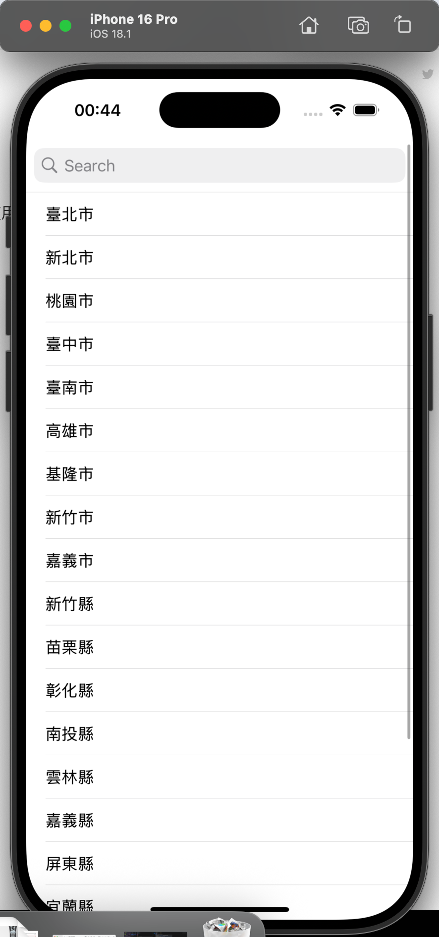
十六、搜索组件:UISearchController
UISearchController 是用于实现搜索功能的组件(iOS 8+),核心作用是提供搜索输入框、实时过滤数据,并将搜索结果集成到现有视图(如 UITableView)中。它无需自定义输入框,可直接绑定到列表的头部,通过协议回调更新搜索结果,适用于联系人搜索、商品筛选等场景。
16.1 核心功能
- 提供原生搜索框(支持占位提示、清除按钮、键盘隐藏);
- 实时监听搜索输入,通过协议回调(
UISearchResultsUpdating)过滤数据; - 支持区分"搜索中"和"非搜索中"状态,分别显示原数据或搜索结果;
- 可集成到 UITableView 的
tableHeaderView,实现搜索框与列表的无缝结合。
16.2 关键属性与方法
| 类别 | 属性/方法 | 作用说明 |
|---|---|---|
| 初始化 | UISearchController(searchResultsController:) |
初始化搜索控制器,nil 表示搜索结果在当前控制器显示(非新控制器) |
| 搜索回调 | searchResultsUpdater |
设置搜索结果更新的代理对象(需遵循 UISearchResultsUpdating 协议) |
| 外观配置 | hidesNavigationBarDuringPresentation |
搜索时是否隐藏导航栏(无导航栏时无效) |
dimsBackgroundDuringPresentation |
搜索时是否暗化背景(false 表示不暗化,避免遮挡列表) |
|
searchBarStyle |
搜索框样式(.prominent 带背景,.minimal 无背景) |
|
| 布局适配 | searchBar.sizeToFit() |
自动适配搜索框尺寸(集成到 tableHeaderView 时必须调用,否则显示异常) |
| 状态判断 | isActive |
布尔值,判断当前是否处于搜索状态(true 显示搜索结果,false 显示原数据) |
| 数据筛选 | Array.filter(_:) |
根据搜索文本筛选数据(如 cities.filter { $0.contains(searchText) }) |
16.3 代码逻辑解析
Swift
class ViewController: UIViewController {
    var tableView: UITableView!
    var searchController: UISearchController!
    // 原数据:台湾地区城市列表
    let cities = ["臺北市","新北市","桃園市","臺中市","臺南市","高雄市",...]
    // 搜索结果数据(更新时自动刷新列表)
    var searchArr: [String] = [] {
        didSet { tableView.reloadData() } // 属性观察器:数据变化时刷新表格
    }

    override func viewDidLoad() {
        super.viewDidLoad()
        let fullScreenSize = UIScreen.main.bounds.size

        // 1. 初始化表格(基础配置,注册单元格)
        tableView = UITableView(frame: CGRect(
            x: 0, y: 20,
            width: fullScreenSize.width,
            height: fullScreenSize.height - 20
        ), style: .plain)
        tableView.register(UITableViewCell.self, forCellReuseIdentifier: "Cell")
        tableView.delegate = self
        tableView.dataSource = self
        self.view.addSubview(tableView)

        // 2. 初始化搜索控制器(搜索结果在当前控制器显示)
        searchController = UISearchController(searchResultsController: nil)
        searchController.searchResultsUpdater = self // 绑定搜索更新代理
        searchController.hidesNavigationBarDuringPresentation = false // 不隐藏导航栏
        searchController.dimsBackgroundDuringPresentation = false // 不暗化背景
        searchController.searchBar.searchBarStyle = .prominent // 带背景的搜索框
        searchController.searchBar.sizeToFit() // 适配尺寸

        // 3. 将搜索框集成到表格头部
        tableView.tableHeaderView = searchController.searchBar
    }
}

// 4. 扩展:实现 UITableView 数据源与代理(分离代码,更清晰)
extension ViewController: UITableViewDataSource, UITableViewDelegate {
    // 行数:搜索中显示搜索结果,否则显示原数据
    func tableView(_ tableView: UITableView, numberOfRowsInSection section: Int) -> Int {
        return searchController.isActive ? searchArr.count : cities.count
    }

    // 单元格内容:根据搜索状态显示对应数据
    func tableView(_ tableView: UITableView, cellForRowAt indexPath: IndexPath) -> UITableViewCell {
        let cell = tableView.dequeueReusableCell(withIdentifier: "Cell", for: indexPath)
        cell.textLabel?.text = searchController.isActive ?
            searchArr[indexPath.row] : cities[indexPath.row]
        return cell
    }

    // 单元格点击:打印选中内容
    func tableView(_ tableView: UITableView, didSelectRowAt indexPath: IndexPath) {
        tableView.deselectRow(at: indexPath, animated: true)
        let selectedText = searchController.isActive ?
            searchArr[indexPath.row] : cities[indexPath.row]
        print("你選擇的是 \(selectedText)")
    }
}

// 5. 扩展:实现 UISearchResultsUpdating 协议(核心:实时更新搜索结果)
extension ViewController: UISearchResultsUpdating {
    func updateSearchResults(for searchController: UISearchController) {
        // 安全获取搜索文本(为空时显示全部数据)
        guard let searchText = searchController.searchBar.text, !searchText.isEmpty else {
            searchArr = cities // 搜索文本为空,重置为原数据
            return
        }
        // 筛选包含搜索文本的城市(不区分大小写,可添加 .caseInsensitive 优化)
        searchArr = cities.filter { $0.contains(searchText) }
    }
}
16.4 注意事项
- 搜索状态判断 :必须通过
searchController.isActive区分数据来源(原数据/搜索结果),否则搜索时会显示空列表; - 协议实现 :
UISearchResultsUpdating协议的updateSearchResults(for:)必须实现,否则无法监听搜索输入; - 搜索文本为空处理 :当搜索文本清空时,需手动将
searchArr重置为原数据,否则会显示空列表; - 性能优化 :若数据量较大(如万级以上),建议在
updateSearchResults(for:)中添加延迟搜索(如DispatchQueue.main.asyncAfter),避免频繁筛选导致卡顿。