说在前面
封装的easyexcel,基于注解实现excel的导入导出,以场景来说,就是你有一个现成的分页接口或者一个list接口,只需要添加几个简单的注解,就可以实现excel的导出,也是为了方便有模板生成代码的情况下直接生成导出功能。
这是封装的依赖库源码:github.com/chenqi92/al...
这是这个依赖库的使用示例:github.com/chenqi92/al...
依赖库运行后在浏览器中打开:http://localhost:8080/ 即可测试各种示例,参照示例进行使用可以不用看后续的使用说明。
这篇比较无聊,主要是导出数据时添加额外的chart属性自动生成图表。实际上数据导出后手动也可以指定生成图表,还更灵活。
使用说明
添加maven依赖
xml
<dependency>
    <groupId>cn.allbs</groupId>
    <artifactId>allbs-excel</artifactId>
    <version>3.0.0</version>
</dependency>
折线图
代码示例(视图对象所有都用的同一样,区别只有chat属性设置,所以我后续就不放下面这个ChartDataDTO视图对象了):
java
@GetMapping("/line")
@ExportExcel(
    name = "折线图-销售趋势",
    sheets = @Sheet(sheetName = "Sales Data"),
    chart = @ExcelChart(
       title = "Monthly Sales Trend",
       enabled = true,
       type = ExcelChart.ChartType.LINE,
       xAxisField = "Month",
       yAxisFields = {"Sales", "Cost", "Profit"},
       startRow = 0,
       startColumn = 8,
       endRow = 20,
       endColumn = 18,
       xAxisTitle = "Month",
       yAxisTitle = "Amount (USD)",
       showLegend = true,
       legendPosition = ExcelChart.LegendPosition.BOTTOM
    )
)
public List<ChartDataDTO> exportLineChart(@RequestParam(defaultValue = "12") int months) {
    log.info("Exporting line chart with {} months of data", months);
    return testDataService.generateChartData(Math.min(months, 12));
}
java
@Data
@NoArgsConstructor
@AllArgsConstructor
public class ChartDataDTO {

    @ExcelProperty(value = "Month", index = 0)
    private String month;

    @ExcelProperty(value = "Sales", index = 1)
    private BigDecimal sales;

    @ExcelProperty(value = "Cost", index = 2)
    private BigDecimal cost;

    @ExcelProperty(value = "Profit", index = 3)
    private BigDecimal profit;

    @ExcelProperty(value = "Growth Rate (%)", index = 4)
    private Double growthRate;

    @ExcelProperty(value = "Units Sold", index = 5)
    private Integer unitsSold;
}
生成效果: 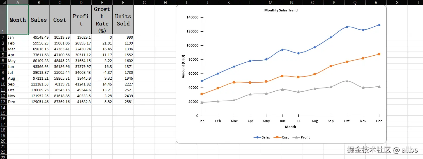
柱状图(纵向)
java
@GetMapping("/column")
@ExportExcel(
    name = "柱状图-销售对比",
    sheets = @Sheet(sheetName = "Sales Comparison"),
    chart = @ExcelChart(
       title = "Monthly Sales vs Cost",
       enabled = true,
       type = ExcelChart.ChartType.COLUMN,
       xAxisField = "Month",
       yAxisFields = {"Sales", "Cost"},
       startRow = 0,
       startColumn = 8,
       endRow = 20,
       endColumn = 18,
       xAxisTitle = "Month",
       yAxisTitle = "Amount (USD)",
       showLegend = true,
       legendPosition = ExcelChart.LegendPosition.TOP
    )
)
public List<ChartDataDTO> exportColumnChart(@RequestParam(defaultValue = "12") int months) {
    log.info("Exporting column chart with {} months of data", months);
    return testDataService.generateChartData(Math.min(months, 12));
}
实际效果: 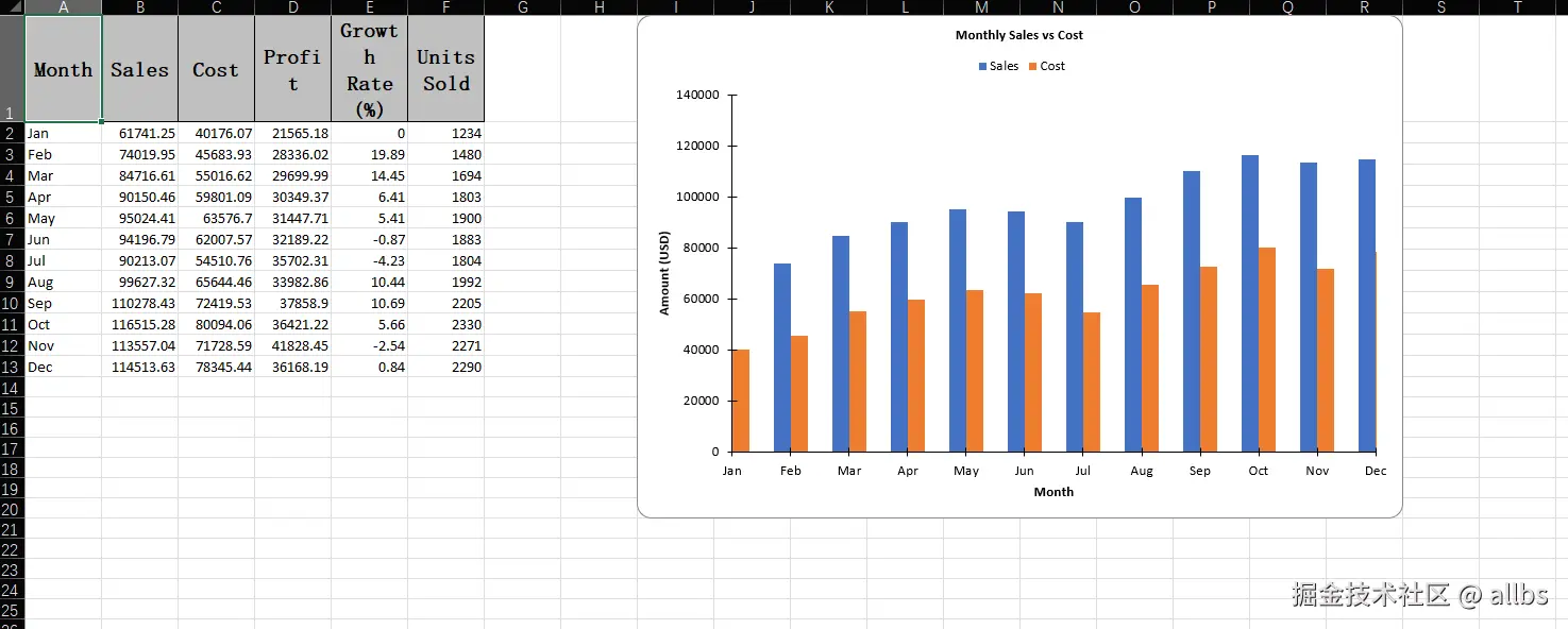
条形图(横向)
java
@GetMapping("/bar")
@ExportExcel(
    name = "条形图-月度利润",
    sheets = @Sheet(sheetName = "Monthly Profit"),
    chart = @ExcelChart(
       title = "Monthly Profit Analysis",
       enabled = true,
       type = ExcelChart.ChartType.BAR,
       xAxisField = "Month",
       yAxisFields = {"Profit"},
       startRow = 0,
       startColumn = 8,
       endRow = 20,
       endColumn = 18,
       xAxisTitle = "Month",
       yAxisTitle = "Profit (USD)",
       showLegend = true,
       legendPosition = ExcelChart.LegendPosition.RIGHT
    )
)
public List<ChartDataDTO> exportBarChart(@RequestParam(defaultValue = "12") int months) {
    log.info("Exporting bar chart with {} months of data", months);
    return testDataService.generateChartData(Math.min(months, 12));
}
实际效果: 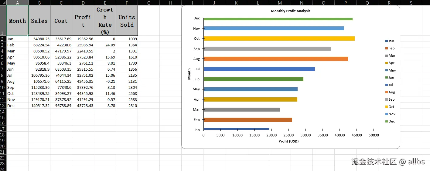
饼图
代码示例:
java
@GetMapping("/pie")
@ExportExcel(
    name = "饼图-销售分布",
    sheets = @Sheet(sheetName = "Sales Distribution"),
    chart = @ExcelChart(
       title = "Sales Distribution by Month",
       enabled = true,
       type = ExcelChart.ChartType.PIE,
       xAxisField = "Month",
       yAxisFields = {"Sales"},
       startRow = 0,
       startColumn = 8,
       endRow = 20,
       endColumn = 18,
       showLegend = true,
       legendPosition = ExcelChart.LegendPosition.RIGHT
    )
)
public List<ChartDataDTO> exportPieChart(@RequestParam(defaultValue = "12") int months) {
    log.info("Exporting pie chart with {} months of data", months);
    return testDataService.generateChartData(Math.min(months, 12));
}
实际效果: 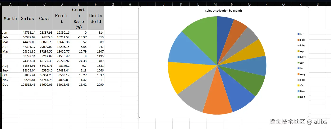
面积图
java
@GetMapping("/area")
@ExportExcel(
    name = "面积图-累计销售",
    sheets = @Sheet(sheetName = "Cumulative Sales"),
    chart = @ExcelChart(
       title = "Cumulative Sales and Cost",
       enabled = true,
       type = ExcelChart.ChartType.AREA,
       xAxisField = "Month",
       yAxisFields = {"Sales", "Cost"},
       startRow = 0,
       startColumn = 8,
       endRow = 20,
       endColumn = 18,
       xAxisTitle = "Month",
       yAxisTitle = "Amount (USD)",
       showLegend = true,
       legendPosition = ExcelChart.LegendPosition.BOTTOM
    )
)
public List<ChartDataDTO> exportAreaChart(@RequestParam(defaultValue = "12") int months) {
    log.info("Exporting area chart with {} months of data", months);
    return testDataService.generateChartData(Math.min(months, 12));
}
实际效果: 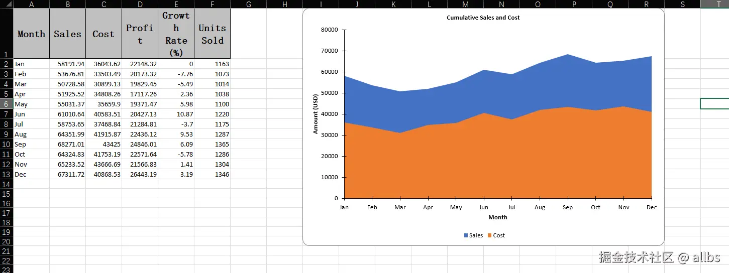
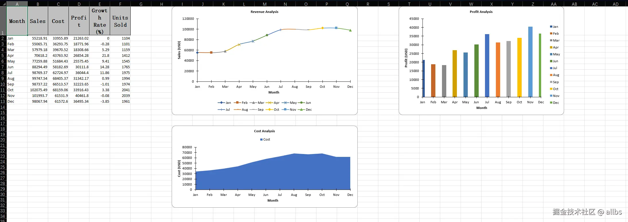
多个独立图表导出
java
@GetMapping("/layered-analysis")
@ExportExcel(
    name = "分层分析-多图表",
    sheets = @Sheet(sheetName = "Layered Analysis"),
    charts = {
       @ExcelChart(
          title = "Revenue Analysis",
          enabled = true,
          type = ExcelChart.ChartType.LINE,
          xAxisField = "Month",
          yAxisFields = {"Sales"},
          startRow = 0,
          startColumn = 8,
          endRow = 15,
          endColumn = 17,
          xAxisTitle = "Month",
          yAxisTitle = "Sales (USD)",
          showLegend = true,
          legendPosition = ExcelChart.LegendPosition.BOTTOM
       ),
       @ExcelChart(
          title = "Cost Analysis",
          enabled = true,
          type = ExcelChart.ChartType.AREA,
          xAxisField = "Month",
          yAxisFields = {"Cost"},
          startRow = 17,
          startColumn = 8,
          endRow = 32,
          endColumn = 17,
          xAxisTitle = "Month",
          yAxisTitle = "Cost (USD)",
          showLegend = true,
          legendPosition = ExcelChart.LegendPosition.TOP
       ),
       @ExcelChart(
          title = "Profit Analysis",
          enabled = true,
          type = ExcelChart.ChartType.COLUMN,
          xAxisField = "Month",
          yAxisFields = {"Profit"},
          startRow = 0,
          startColumn = 19,
          endRow = 15,
          endColumn = 27,
          xAxisTitle = "Month",
          yAxisTitle = "Profit (USD)",
          showLegend = true,
          legendPosition = ExcelChart.LegendPosition.RIGHT
       )
    })
public List<ChartDataDTO> exportLayeredAnalysis(@RequestParam(defaultValue = "12") int months) {
    log.info("Exporting layered analysis with {} months of data", months);
    return testDataService.generateChartData(Math.min(months, 12));
}
实际效果: