Matplotlib 是 Python 生态系统中功能最全面的绘图库,其 pyplot 模块提供了类似于 MATLAB 的简洁接口,让数据可视化变得直观而高效。本文将深入探讨 pyplot 的核心功能,从基础绘图到高级可视化技巧。
环境配置与基础设置
在开始之前,确保已安装 matplotlib:
bash
pip install matplotlib numpy让我们从基础导入和配置开始:
python
import matplotlib.pyplot as plt
import numpy as np

# 配置中文字体支持
plt.rcParams['font.sans-serif'] = ['SimHei', 'Microsoft YaHei']
plt.rcParams['axes.unicode_minus'] = False

# 设置全局样式
plt.style.use('default')  # 使用默认样式
基础绘图功能
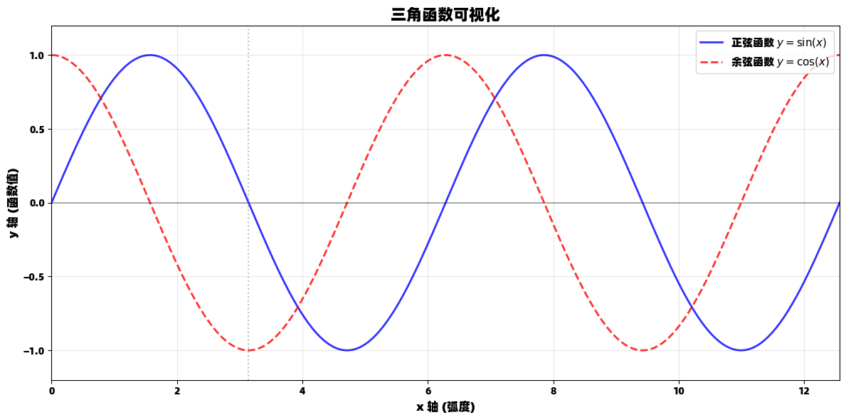
线图:展示连续数据趋势
线图是最常用的图表类型之一,适合展示数据随时间或其他连续变量的变化趋势。
python
import matplotlib.pyplot as plt
import numpy as np

# 生成数据
x = np.linspace(0, 4*np.pi, 200)
y1 = np.sin(x)
y2 = np.cos(x)

# 创建图形
plt.figure(figsize=(12, 6))

# 绘制多条曲线
plt.plot(x, y1, 'b-', linewidth=2, label='正弦函数 $y = \\sin(x)$', alpha=0.8)
plt.plot(x, y2, 'r--', linewidth=2, label='余弦函数 $y = \\cos(x)$', alpha=0.8)

# 添加标签和标题
plt.title('三角函数可视化', fontsize=16, fontweight='bold')
plt.xlabel('x 轴 (弧度)', fontsize=12)
plt.ylabel('y 轴 (函数值)', fontsize=12)

# 添加图例和网格
plt.legend(loc='upper right', fontsize=11)
plt.grid(True, alpha=0.3)

# 设置坐标轴范围
plt.xlim(0, 4*np.pi)
plt.ylim(-1.2, 1.2)

# 添加特殊点标记
plt.axhline(y=0, color='k', linestyle='-', alpha=0.3)
plt.axvline(x=np.pi, color='gray', linestyle=':', alpha=0.5, label='$x = \\pi$')

plt.tight_layout()
plt.show()
散点图:揭示变量关系
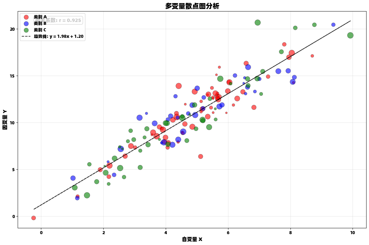
散点图是探索两个变量之间关系的强大工具,特别适合发现相关性、聚类和异常值。
python
import matplotlib.pyplot as plt
import numpy as np

# 生成模拟数据
np.random.seed(42)
n_points = 150
x = np.random.normal(5, 2, n_points)
y = 2 * x + 1 + np.random.normal(0, 1.5, n_points)
categories = np.random.choice(['A', 'B', 'C'], n_points)
sizes = np.random.uniform(20, 200, n_points)

# 创建图形
plt.figure(figsize=(12, 8))

# 为不同类别使用不同颜色
colors = {'A': 'red', 'B': 'blue', 'C': 'green'}
for category in ['A', 'B', 'C']:
    mask = categories == category
    plt.scatter(x[mask], y[mask],
                c=colors[category],
                s=sizes[mask],
                alpha=0.6,
                label=f'类别 {category}',
                edgecolors='black',
                linewidth=0.5)

# 添加趋势线
z = np.polyfit(x, y, 1)
p = np.poly1d(z)
plt.plot(x, p(x), "k--", alpha=0.8, linewidth=1.5, label=f'趋势线: y = {z[0]:.2f}x + {z[1]:.2f}')

plt.title('多变量散点图分析', fontsize=16, fontweight='bold')
plt.xlabel('自变量 X', fontsize=12)
plt.ylabel('因变量 Y', fontsize=12)
plt.legend()
plt.grid(True, alpha=0.3)

# 添加相关系数文本
correlation = np.corrcoef(x, y)[0, 1]
plt.text(0.05, 0.95, f'相关系数: r = {correlation:.3f}',
         transform=plt.gca().transAxes,
         fontsize=12,
         bbox=dict(boxstyle="round,pad=0.3", facecolor="white", alpha=0.8))

plt.tight_layout()
plt.show()
柱状图:分类数据比较
柱状图是展示分类数据对比的理想选择,能够清晰显示不同类别之间的数值差异。
python
import matplotlib.pyplot as plt
import numpy as np

# 创建示例数据
categories = ['产品A', '产品B', '产品C', '产品D', '产品E']
sales_2023 = [120, 85, 140, 75, 110]
sales_2024 = [135, 92, 158, 88, 125]

# 设置位置和宽度
x = np.arange(len(categories))
width = 0.35

# 创建图形
plt.figure(figsize=(12, 7))

# 绘制分组柱状图
bars1 = plt.bar(x - width/2, sales_2023, width,
                label='2023年销售额',
                color='skyblue',
                edgecolor='navy',
                alpha=0.8)

bars2 = plt.bar(x + width/2, sales_2024, width,
                label='2024年销售额',
                color='lightcoral',
                edgecolor='darkred',
                alpha=0.8)

plt.title('年度销售额对比分析', fontsize=16, fontweight='bold')
plt.xlabel('产品类别', fontsize=12)
plt.ylabel('销售额 (万元)', fontsize=12)
plt.xticks(x, categories)
plt.legend()

# 在柱子上添加数值标签
def add_value_labels(bars):
    for bar in bars:
        height = bar.get_height()
        plt.text(bar.get_x() + bar.get_width()/2., height + 1,
                f'{height:.0f}', ha='center', va='bottom', fontweight='bold')

add_value_labels(bars1)
add_value_labels(bars2)

# 计算并显示增长率
plt.text(0.02, 0.98, '增长率分析:', transform=plt.gca().transAxes, fontsize=11)
for i, (s23, s24) in enumerate(zip(sales_2023, sales_2024)):
    growth = (s24 - s23) / s23 * 100
    plt.text(i, max(s23, s24) + 10, f'+{growth:.1f}%',
             ha='center', va='bottom', fontsize=10, color='green' if growth > 0 else 'red')

plt.grid(axis='y', alpha=0.3)
plt.ylim(0, max(sales_2023 + sales_2024) * 1.15)
plt.tight_layout()
plt.show()
高级可视化技巧
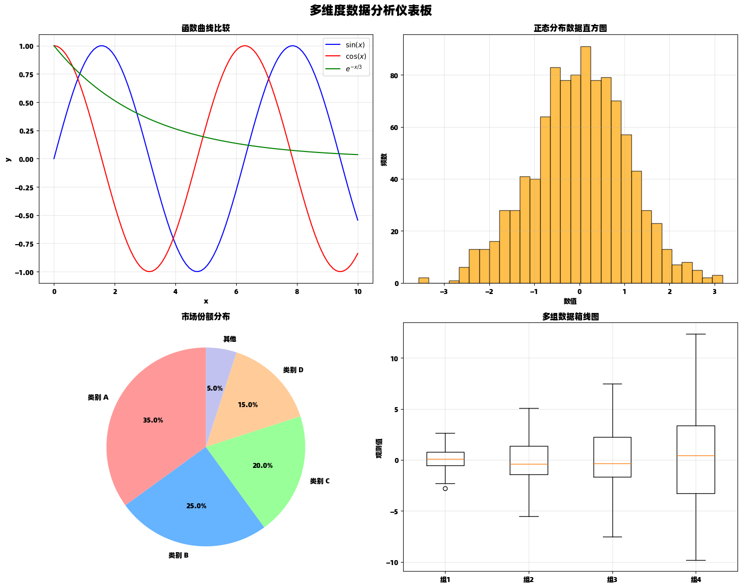
多子图布局:综合数据展示
多子图布局允许我们在一个图形中展示多个相关的图表,便于综合分析和比较。
python
import matplotlib.pyplot as plt
import numpy as np
# 创建数据和子图布局
fig, axes = plt.subplots(2, 2, figsize=(15, 12))
fig.suptitle('多维度数据分析仪表板', fontsize=18, fontweight='bold')
# 子图1: 函数曲线
x = np.linspace(0, 10, 100)
axes[0, 0].plot(x, np.sin(x), 'b-', label='$\\sin(x)$')
axes[0, 0].plot(x, np.cos(x), 'r-', label='$\\cos(x)$')
axes[0, 0].plot(x, np.exp(-x/3), 'g-', label='$e^{-x/3}$')
axes[0, 0].set_title('函数曲线比较')
axes[0, 0].set_xlabel('x')
axes[0, 0].set_ylabel('y')
axes[0, 0].legend()
axes[0, 0].grid(True, alpha=0.3)
# 子图2: 直方图
data_hist = np.random.normal(0, 1, 1000)
axes[0, 1].hist(data_hist, bins=30, alpha=0.7, color='orange', edgecolor='black')
axes[0, 1].set_title('正态分布数据直方图')
axes[0, 1].set_xlabel('数值')
axes[0, 1].set_ylabel('频数')
axes[0, 1].grid(True, alpha=0.3)
# 子图3: 饼图
sizes = [35, 25, 20, 15, 5]
labels = ['类别 A', '类别 B', '类别 C', '类别 D', '其他']
colors = ['#ff9999', '#66b3ff', '#99ff99', '#ffcc99', '#c2c2f0']
axes[1, 0].pie(sizes, labels=labels, colors=colors, autopct='%1.1f%%', startangle=90)
axes[1, 0].set_title('市场份额分布')
# 子图4: 箱线图
data_box = [np.random.normal(0, std, 100) for std in range(1, 5)]
axes[1, 1].boxplot(data_box, labels=['组1', '组2', '组3', '组4'])
axes[1, 1].set_title('多组数据箱线图')
axes[1, 1].set_ylabel('观测值')
axes[1, 1].grid(True, alpha=0.3)
plt.tight_layout()
plt.subplots_adjust(top=0.93)
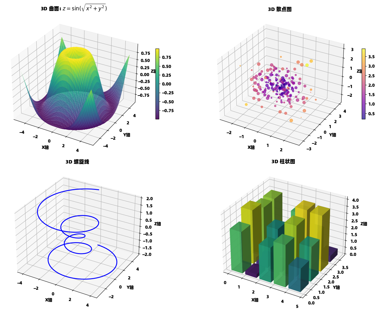
plt.show()3D 数据可视化
matplotlib 支持创建引人入胜的 3D 可视化,帮助理解复杂的数据结构。
python
import matplotlib.pyplot as plt
import numpy as np
from mpl_toolkits.mplot3d import Axes3D

# 创建 3D 图形
fig = plt.figure(figsize=(14, 10))

# 3D 曲面图
ax1 = fig.add_subplot(221, projection='3d')

# 生成网格数据
x = np.linspace(-5, 5, 50)
y = np.linspace(-5, 5, 50)
X, Y = np.meshgrid(x, y)
Z1 = np.sin(np.sqrt(X**2 + Y**2))

# 绘制曲面
surf = ax1.plot_surface(X, Y, Z1, cmap='viridis', alpha=0.9)
ax1.set_title('3D 曲面: $z = \\sin(\\sqrt{x^2 + y^2})$', fontsize=12)
ax1.set_xlabel('X轴')
ax1.set_ylabel('Y轴')
ax1.set_zlabel('Z轴')
fig.colorbar(surf, ax=ax1, shrink=0.5, aspect=20)

# 3D 散点图
ax2 = fig.add_subplot(222, projection='3d')

# 生成随机三维数据
np.random.seed(42)
n_points = 200
x_scatter = np.random.randn(n_points)
y_scatter = np.random.randn(n_points)
z_scatter = np.random.randn(n_points)
colors_scatter = np.sqrt(x_scatter**2 + y_scatter**2 + z_scatter**2)
sizes_scatter = 50 * np.random.rand(n_points)

scatter = ax2.scatter(x_scatter, y_scatter, z_scatter,
                     c=colors_scatter, cmap='plasma',
                     s=sizes_scatter, alpha=0.7)
ax2.set_title('3D 散点图', fontsize=12)
ax2.set_xlabel('X轴')
ax2.set_ylabel('Y轴')
ax2.set_zlabel('Z轴')
fig.colorbar(scatter, ax=ax2, shrink=0.5, aspect=20)

# 3D 线图
ax3 = fig.add_subplot(223, projection='3d')

# 生成螺旋线数据
theta = np.linspace(-4 * np.pi, 4 * np.pi, 300)
z_line = np.linspace(-2, 2, 300)
r = z_line**2 + 1
x_line = r * np.sin(theta)
y_line = r * np.cos(theta)

ax3.plot(x_line, y_line, z_line, 'b-', linewidth=2)
ax3.set_title('3D 螺旋线', fontsize=12)
ax3.set_xlabel('X轴')
ax3.set_ylabel('Y轴')
ax3.set_zlabel('Z轴')

# 3D 柱状图
ax4 = fig.add_subplot(224, projection='3d')

# 生成柱状图数据
x_pos = np.arange(5)
y_pos = np.arange(4)
x_pos, y_pos = np.meshgrid(x_pos, y_pos)
x_pos = x_pos.flatten()
y_pos = y_pos.flatten()
z_pos = np.zeros_like(x_pos)
dx = dy = 0.8
dz = np.random.rand(20) * 5

colors_bar = plt.cm.viridis(dz / dz.max())
ax4.bar3d(x_pos, y_pos, z_pos, dx, dy, dz, color=colors_bar, alpha=0.8)
ax4.set_title('3D 柱状图', fontsize=12)
ax4.set_xlabel('X轴')
ax4.set_ylabel('Y轴')
ax4.set_zlabel('Z轴')

plt.tight_layout()
plt.show()
专业统计图表
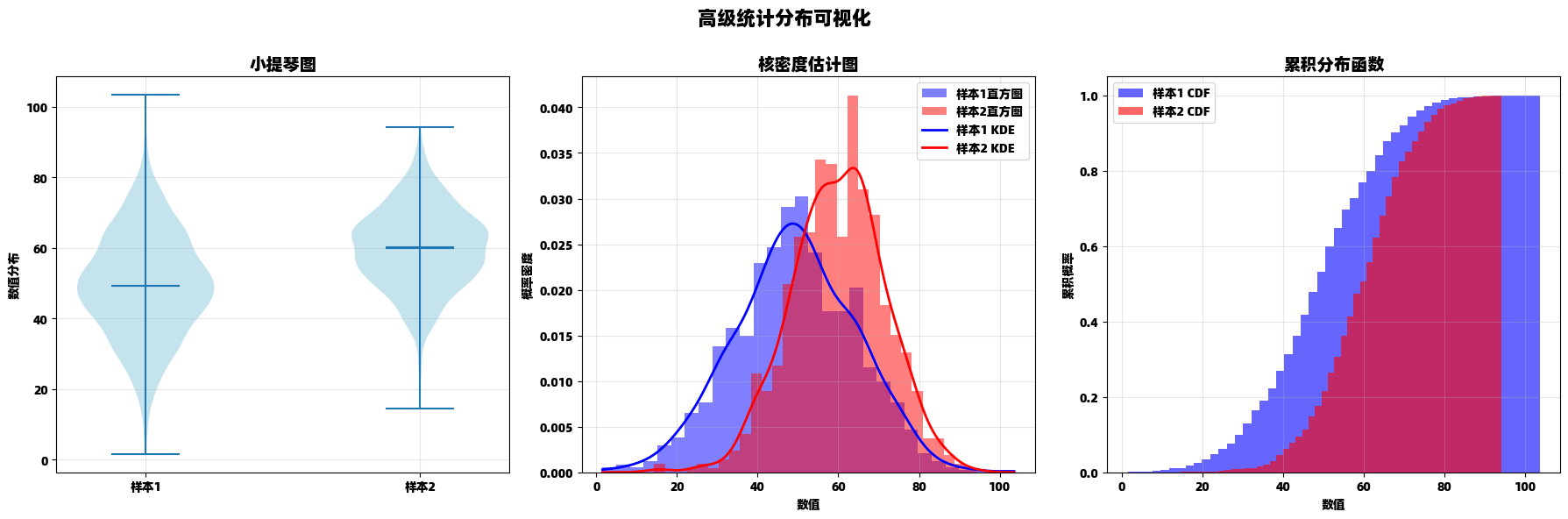
分布可视化组合
python
import matplotlib.pyplot as plt
import numpy as np
from scipy import stats
# 创建数据
np.random.seed(123)
data1 = np.random.normal(50, 15, 1000)
data2 = np.random.normal(60, 12, 800)
# 创建图形和子图
fig, (ax1, ax2, ax3) = plt.subplots(1, 3, figsize=(18, 6))
fig.suptitle('高级统计分布可视化', fontsize=16, fontweight='bold')
# 小提琴图
violin_parts = ax1.violinplot([data1, data2], showmeans=True, showmedians=True)
ax1.set_title('小提琴图', fontsize=14)
ax1.set_xticks([1, 2])
ax1.set_xticklabels(['样本1', '样本2'])
ax1.set_ylabel('数值分布')
ax1.grid(True, alpha=0.3)
# 为小提琴图着色
for pc in violin_parts['bodies']:
pc.set_facecolor('lightblue')
pc.set_alpha(0.7)
# 核密度估计图
ax2.hist(data1, bins=30, density=True, alpha=0.5, color='blue', label='样本1直方图')
ax2.hist(data2, bins=30, density=True, alpha=0.5, color='red', label='样本2直方图')
# 计算和绘制KDE
kde1 = stats.gaussian_kde(data1)
kde2 = stats.gaussian_kde(data2)
x_range = np.linspace(min(min(data1), min(data2)), max(max(data1), max(data2)), 200)
ax2.plot(x_range, kde1(x_range), 'b-', linewidth=2, label='样本1 KDE')
ax2.plot(x_range, kde2(x_range), 'r-', linewidth=2, label='样本2 KDE')
ax2.set_title('核密度估计图', fontsize=14)
ax2.set_xlabel('数值')
ax2.set_ylabel('概率密度')
ax2.legend()
ax2.grid(True, alpha=0.3)
# 累积分布函数图
ax3.hist(data1, bins=50, density=True, cumulative=True,
alpha=0.6, color='blue', label='样本1 CDF')
ax3.hist(data2, bins=50, density=True, cumulative=True,
alpha=0.6, color='red', label='样本2 CDF')
ax3.set_title('累积分布函数', fontsize=14)
ax3.set_xlabel('数值')
ax3.set_ylabel('累积概率')
ax3.legend()
ax3.grid(True, alpha=0.3)
plt.tight_layout()
plt.subplots_adjust(top=0.85)
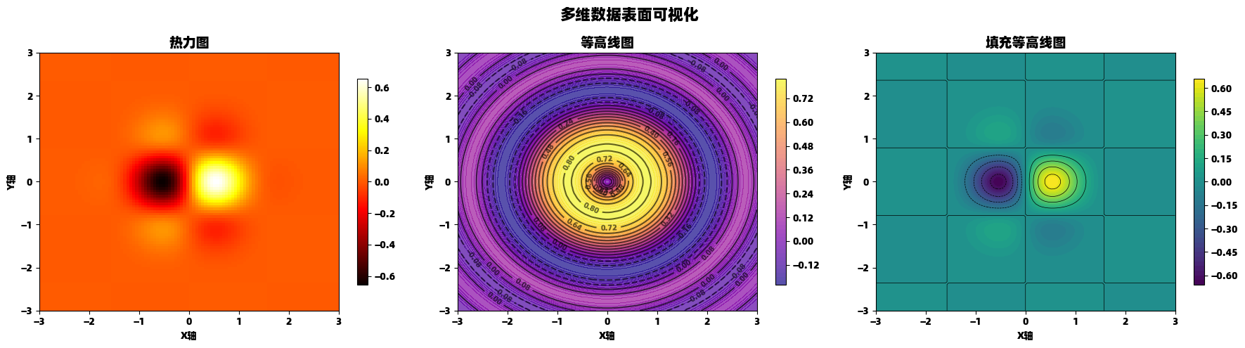
plt.show()热力图与等高线图
python
import matplotlib.pyplot as plt
import numpy as np

# 创建数据网格
x = np.linspace(-3, 3, 100)
y = np.linspace(-3, 3, 100)
X, Y = np.meshgrid(x, y)

# 定义多元函数
Z1 = np.exp(-(X**2 + Y**2)) * np.sin(2*X) * np.cos(2*Y)
Z2 = np.sin(X**2 + Y**2) / (X**2 + Y**2 + 0.1)

# 创建图形
fig, (ax1, ax2, ax3) = plt.subplots(1, 3, figsize=(18, 5))
fig.suptitle('多维数据表面可视化', fontsize=16, fontweight='bold')

# 热力图
im1 = ax1.imshow(Z1, extent=[-3, 3, -3, 3], origin='lower', cmap='hot', aspect='auto')
ax1.set_title('热力图', fontsize=14)
ax1.set_xlabel('X轴')
ax1.set_ylabel('Y轴')
plt.colorbar(im1, ax=ax1, shrink=0.8)

# 等高线图
contour = ax2.contour(X, Y, Z2, levels=15, colors='black', alpha=0.6)
ax2.clabel(contour, inline=True, fontsize=8)
im2 = ax2.contourf(X, Y, Z2, levels=50, cmap='plasma', alpha=0.7)
ax2.set_title('等高线图', fontsize=14)
ax2.set_xlabel('X轴')
ax2.set_ylabel('Y轴')
plt.colorbar(im2, ax=ax2, shrink=0.8)

# 填充等高线图
im3 = ax3.contourf(X, Y, Z1, levels=50, cmap='viridis')
ax3.contour(X, Y, Z1, levels=10, colors='black', linewidths=0.5)
ax3.set_title('填充等高线图', fontsize=14)
ax3.set_xlabel('X轴')
ax3.set_ylabel('Y轴')
plt.colorbar(im3, ax=ax3, shrink=0.8)

plt.tight_layout()
plt.subplots_adjust(top=0.85)
plt.show()
实用技巧与最佳实践
图形导出与样式配置
python
import matplotlib.pyplot as plt
import numpy as np

# 演示不同样式和导出选项
styles = ['default', 'seaborn-v0_8', 'ggplot', 'seaborn-v0_8-whitegrid']

# 创建示例数据
x = np.linspace(0, 10, 100)
functions = {
    '线性函数': x,
    '二次函数': x**2,
    '对数函数': np.log(x + 1),
    '指数函数': np.exp(x/3)
}

# 使用不同样式创建图表
for i, style in enumerate(styles):
    plt.style.use(style)

    fig, axes = plt.subplots(2, 2, figsize=(12, 10))
    axes = axes.flatten()

    fig.suptitle(f'样式: {style}', fontsize=16, fontweight='bold')

    for j, (name, y) in enumerate(functions.items()):
        axes[j].plot(x, y, linewidth=2.5)
        axes[j].set_title(name, fontsize=12)
        axes[j].set_xlabel('x', fontsize=10)
        axes[j].set_ylabel('y', fontsize=10)
        axes[j].grid(True, alpha=0.3)

    plt.tight_layout()
    plt.subplots_adjust(top=0.92)

    # 保存为不同格式
    filename = f'plot_style_{style}.png'
    plt.savefig(filename, dpi=300, bbox_inches='tight',
                facecolor='white', edgecolor='none')
    print(f'已保存: {filename}')

    plt.show()

# 重置为默认样式
plt.style.use('default')
动画与交互功能
python
import matplotlib.pyplot as plt
import numpy as np
from matplotlib.animation import FuncAnimation
from matplotlib.widgets import Slider

# 创建动态可视化
fig, (ax1, ax2) = plt.subplots(1, 2, figsize=(15, 6))
plt.subplots_adjust(bottom=0.25)

# 准备数据
x = np.linspace(0, 4*np.pi, 200)
initial_freq = 1.0
initial_amp = 1.0

# 左图:静态参考
line1, = ax1.plot(x, initial_amp * np.sin(initial_freq * x), 'b-', linewidth=2)
ax1.set_title('参数可控的正弦波', fontsize=14)
ax1.set_xlabel('x')
ax1.set_ylabel('y')
ax1.grid(True, alpha=0.3)
ax1.set_ylim(-2, 2)

# 右图:动画演示
line2, = ax2.plot([], [], 'r-', linewidth=2)
scat = ax2.scatter([], [], s=30, color='red', alpha=0.6)
ax2.set_xlim(0, 4*np.pi)
ax2.set_ylim(-2, 2)
ax2.set_title('实时动画演示', fontsize=14)
ax2.set_xlabel('x')
ax2.set_ylabel('y')
ax2.grid(True, alpha=0.3)

# 创建滑块
ax_freq = plt.axes([0.2, 0.1, 0.6, 0.03])
ax_amp = plt.axes([0.2, 0.05, 0.6, 0.03])

freq_slider = Slider(ax_freq, '频率', 0.1, 5.0, valinit=initial_freq)
amp_slider = Slider(ax_amp, '振幅', 0.1, 2.0, valinit=initial_amp)

# 更新函数
def update_slider(val):
    freq = freq_slider.val
    amp = amp_slider.val
    y = amp * np.sin(freq * x)
    line1.set_ydata(y)
    fig.canvas.draw_idle()

freq_slider.on_changed(update_slider)
amp_slider.on_changed(update_slider)

# 动画函数
def animate(frame):
    freq = freq_slider.val
    amp = amp_slider.val
    current_x = x[:frame]
    current_y = amp * np.sin(freq * current_x)

    line2.set_data(current_x, current_y)

    # 更新散点(显示最近的点)
    if len(current_x) > 0:
        scat.set_offsets(np.column_stack([current_x[-1], current_y[-1]]))

    return line2, scat

# 创建动画
ani = FuncAnimation(fig, animate, frames=len(x),
                    interval=20, blit=True, repeat=True)

plt.tight_layout()
plt.show()

print("注意:在实际运行环境中,此代码将显示交互式滑块和动画")
总结
Matplotlib 的 pyplot 模块提供了极其丰富和灵活的数据可视化功能。通过本文的详细介绍,我们可以看到:
- 基础图表类型 如线图、散点图、柱状图构成了数据可视化的基础
- 高级布局技巧 如多子图、3D 可视化让我们能够创建复杂的仪表板
- 统计可视化 工具如箱线图、小提琴图、热力图支持专业的数据分析
- 自定义和交互功能 使得图表能够适应各种专业需求
掌握这些技术后,你将能够创建从简单探索到复杂演示的各种数据可视化作品,有效传达数据背后的故事和洞察。matplotlib 的强大之处在于其灵活性------几乎可以创建任何你能想象到的图表类型。
记住优秀可视化的关键原则:清晰、准确、有效传达信息。选择合适的图表类型,精心设计视觉元素,让你的数据讲述引人入胜的故事。